Elderscrollers Sketchy Stuff
#1
Hi everyone!

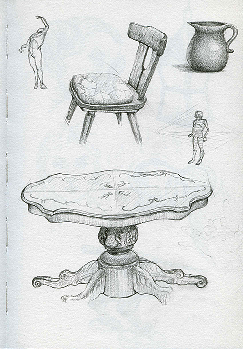
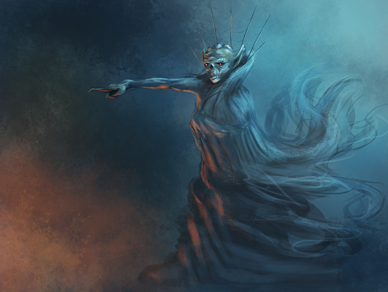
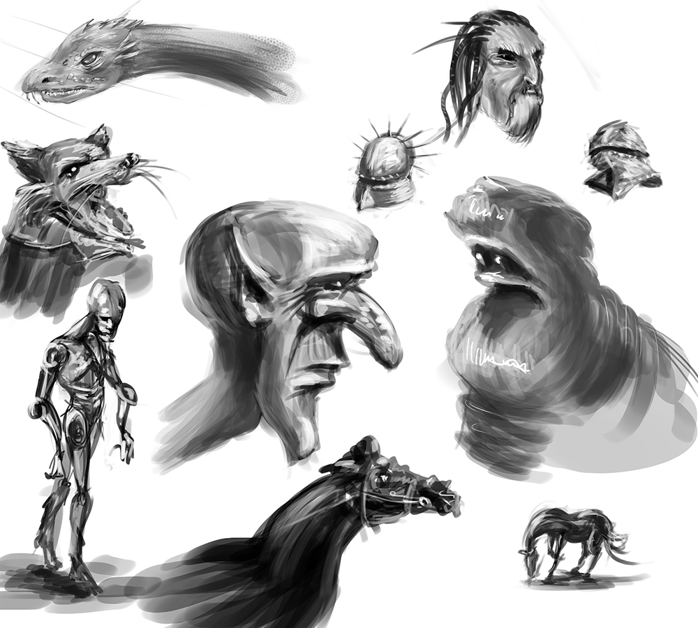
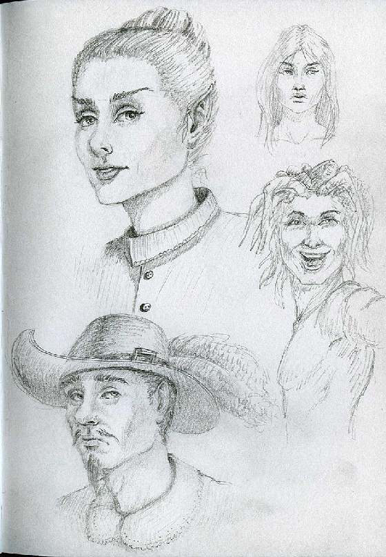
Here are some recent sketches. I mostly sketch in pencils, so expect some traditional works :) Most of this stuff is done without reference, except for some studies of course. Stuff I need to work on: anatomy, anatomy, anatomy


Reply
#2
Here is a study from today from one of the promo pictures for "The Hobbit":

[Image: gloin_study_by_elderscroller-d5qrk0g.jpg]

Reply
#3
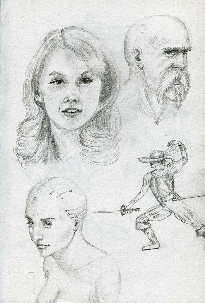
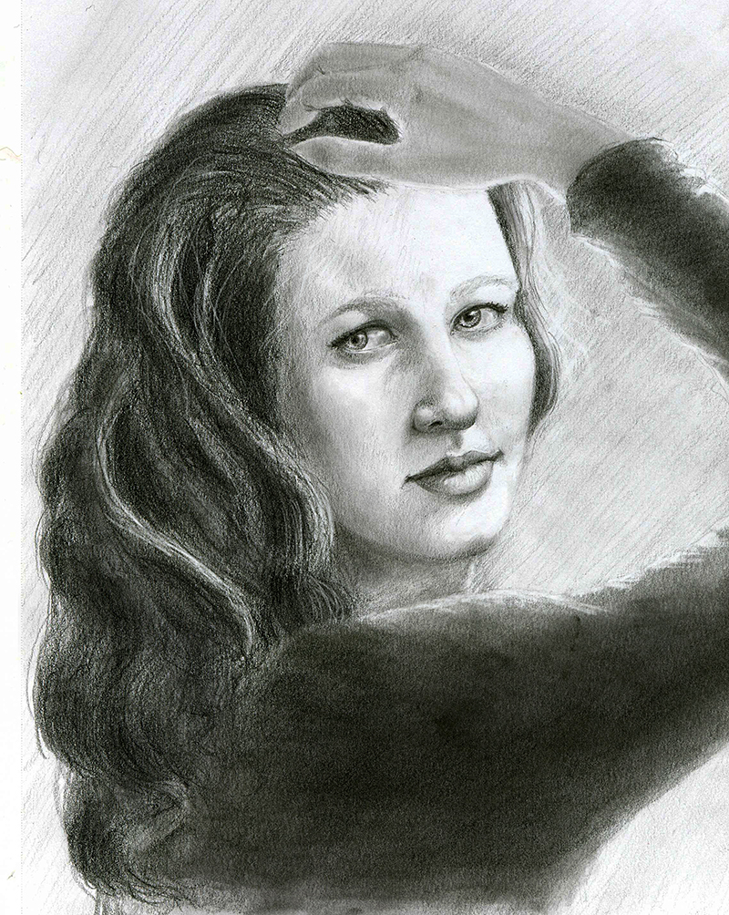
Some portrait study in pencil/charcoal I did yesterday:


Reply
#4
Wow thats great. I like your face-drawings. And that pencilstudy, I wish I can do that too.

My Sketchbook
My DA
My Blog
Reply
#5
Your sketches of faces look pretty nice, as well as the monochromatic monster heads. I would like to see some fo your figure sketches though if that's ok.
Reply
#6
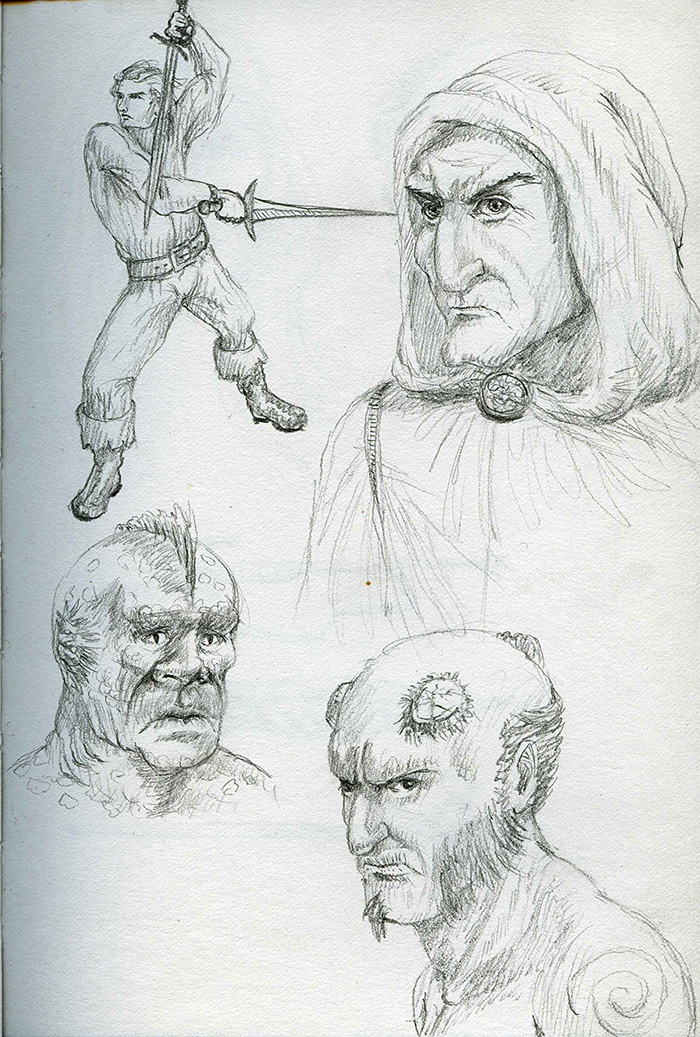
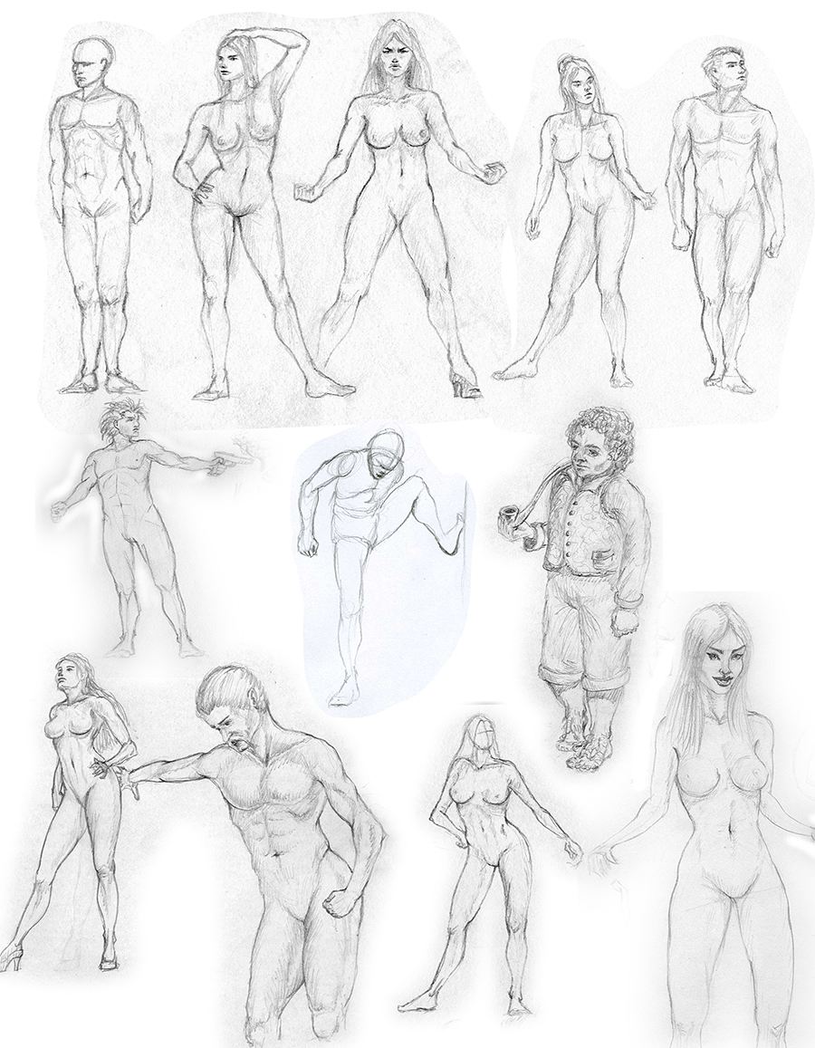
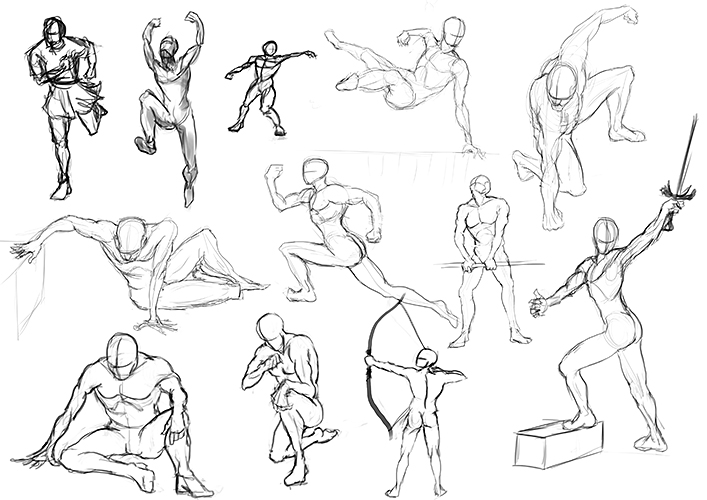
Here are some figure sketches from imagination in pencil. Not really great though. I still need to work lots on my anatomy and foremost more dynamic, fluid and natural poses. And don´t talk about my hand and feet drawing....seriously....don´t


Reply
#7
One book I like to recommend people is the Vilppu figure drawing book, it helped me a lot in the anatomy field and I am still reading it. I would suggest you check it out.
Reply
#8
Thanks for your tip. I already have that book. Plus tons of similar others :) I just need to practice more and do more studies.

Reply
#9
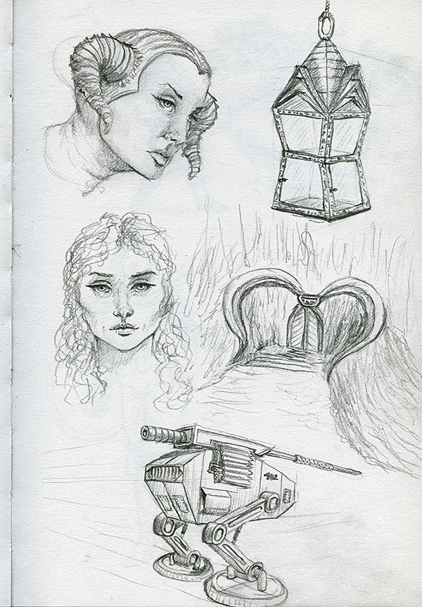
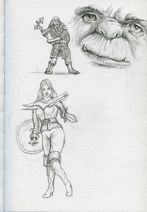
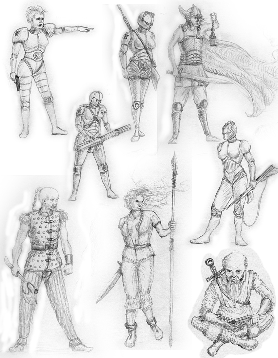
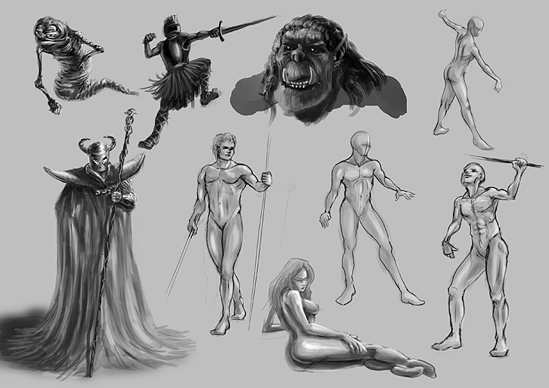
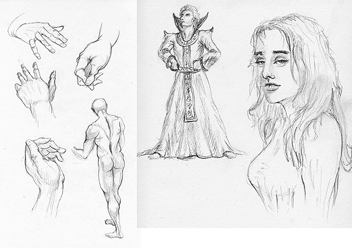
Some doodles and figure sketches from mind (except for the woman, that is a very quick study with reference)


Reply
#10
Keep it up! Your imagination has some great ref inside it. Nice anatomy work. Keep it up!

Live everyday like its your last one.
Facebook: http://www.facebook.com/gdsstudio
Twitter: https://twitter.com/gdsworld
Deviantart: http://gdsworld.deviantart.com/
Reply
#11
Strong start to your sketchbook here. You have a nice sense of light and dark, I see some Anthony jones influences in your work. Keep up the good work. :)

Reply
#12
i saw some stills up there that were really really great, i like the emphasis on the figue and on the characetrs, i encourage you to exaggerate the pose as much as you can, try to give personality to it also a bit of story, sometimes it takes you to draw one pose several times, exaggerating more each time you are doing really great, also why no landscapes? just a question :)

PS: have you read michael hamptons book: Figure drawing design and construction? i think its right up your alley, you can look at alot of free samples at www.figuredrawing.info i recommend you to draw EVERY one of those and i assure you you will understand anatomy a bit better by the end :)
keep the awesome works coming!
Reply
#13
@gdsworld:
Thanks Gagan! Your support is always appreciated! :)

@leonardZC:
Hamptons book is one of my favorite anatomy books! The idea of separating anatomy parts with color is simply awesome and makes is very easily readable.
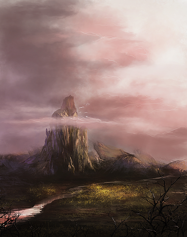
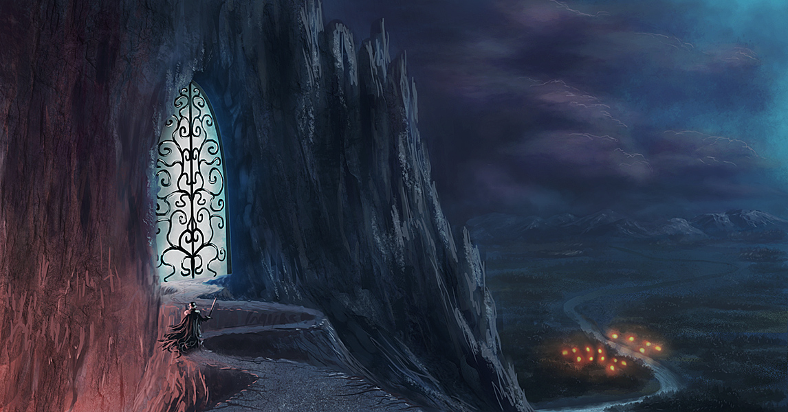
Since you asked for landscapes, here is one from yesterday, trying out some techniques with lasso and custom shapes:


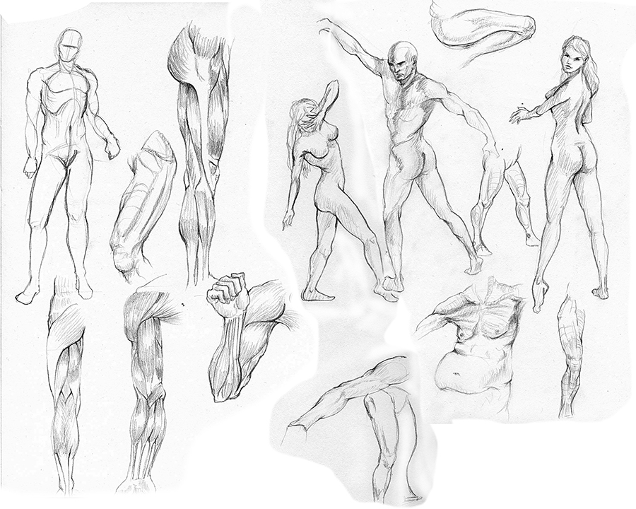
And some anatomy/pose studies:


Reply
#14
And it goes on and on...still boring anatomy studies and some doodles


Reply
#15
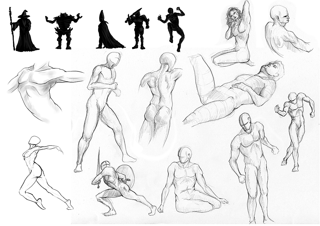
The sketches continue...Some landscape, silhouettes and pose studies. I have to do more of those...


Reply
#16
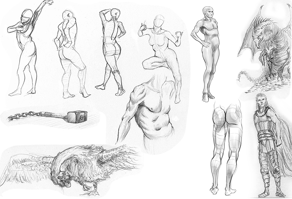
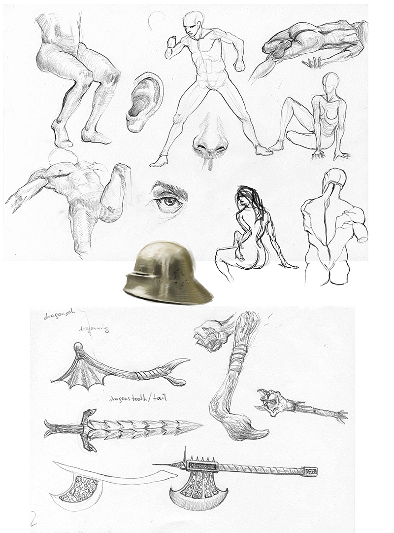
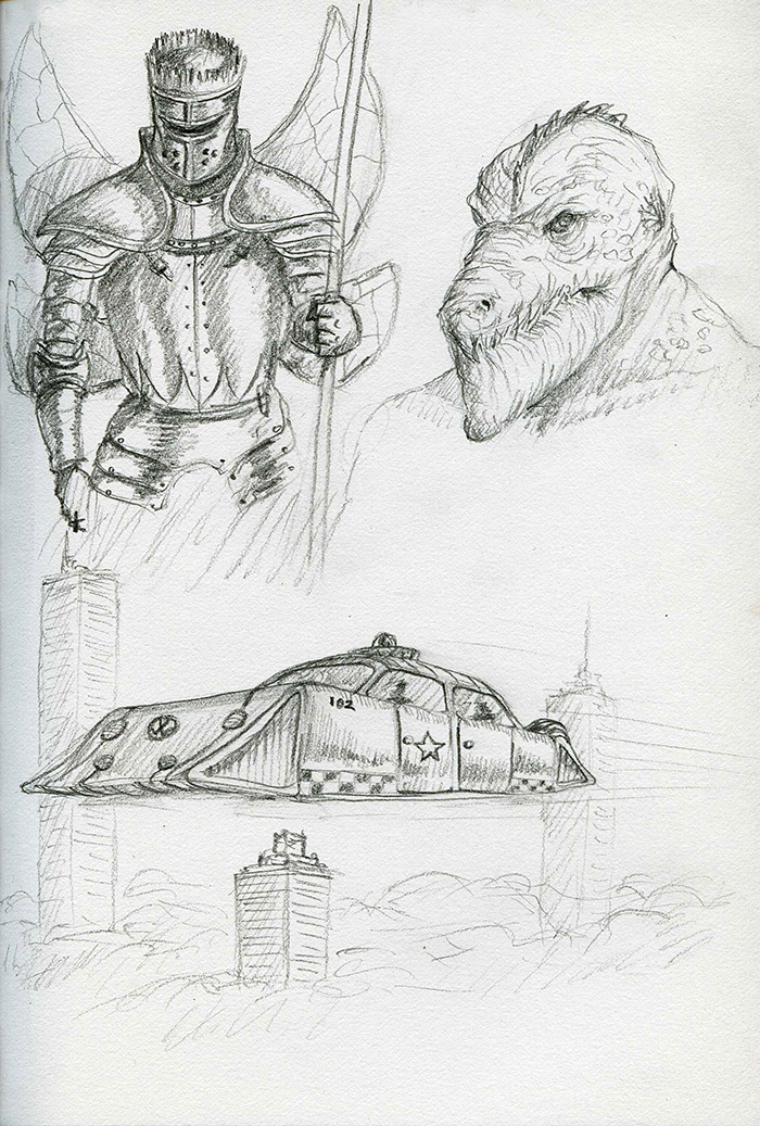
Some crappy anatomy studies, a small armor study and some sketches for a weapon sheet


Reply
#17
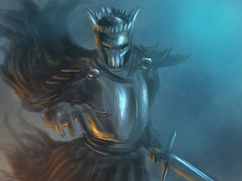
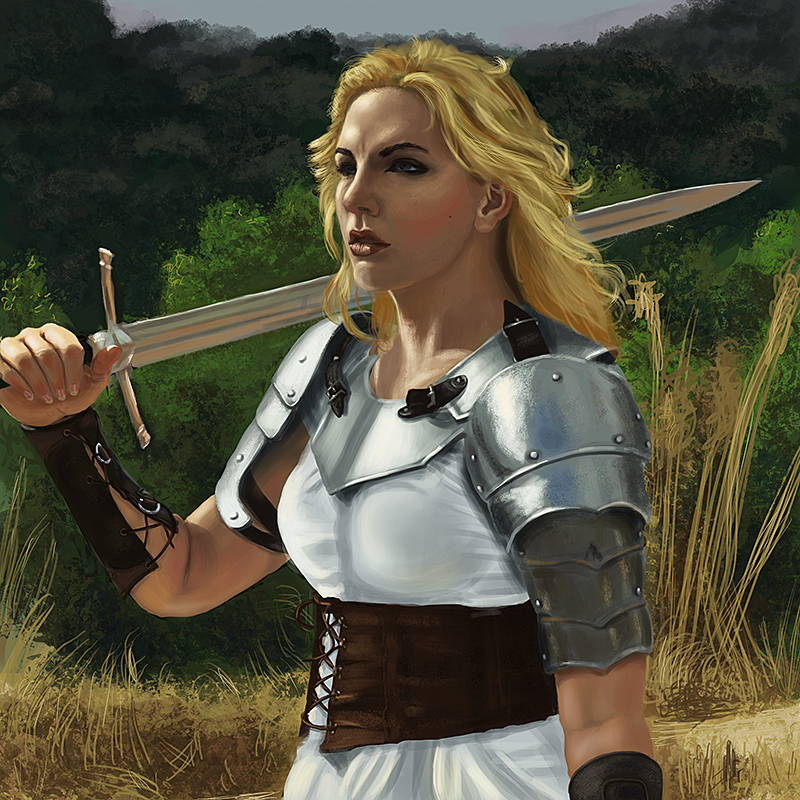
Aaaaand a painting study. I still take too long to do those...


Reply
#18
I like to see yours landscape. I see uin them more depth that in in pieces with humans. And they also have this aura that gives this specific feeling of a scene.
Keep doodling figures :)

Mannequin's Blog :)

Mannequin's CD sketchbook

Deviantart - Add me to Friend list :)

Reply
#19
@Mannequin: Thanks :) I´ll try to make a figure painting that is not a study with some depth in it.

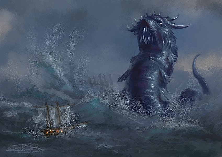
Some studies and sketches. I tried to sketch some figures from mind. They are just crude sketches with emphasis on movement and trying out poses without reference. And a small speedpainting. I just felt like doing a sea serpent :)


Reply
#20
Wow, I gotta say I'm loving the colors in your paintings, especially those first few blue and orange ones. You're lines could use more confident strokes, and paintings would like twice as good with a bit more polish than you're already giving them. This last one with the serpent is nice, the creature itself is rendered pretty well, nice strokes and etc. The water and ship look as if they could've gotten a bit more attention, though. Again, really loving your colors. :]
Reply


Forum Jump:


Users browsing this thread: 123 Guest(s)