Posts: 1,098
Threads: 11
Joined: Aug 2012
Reputation:
34
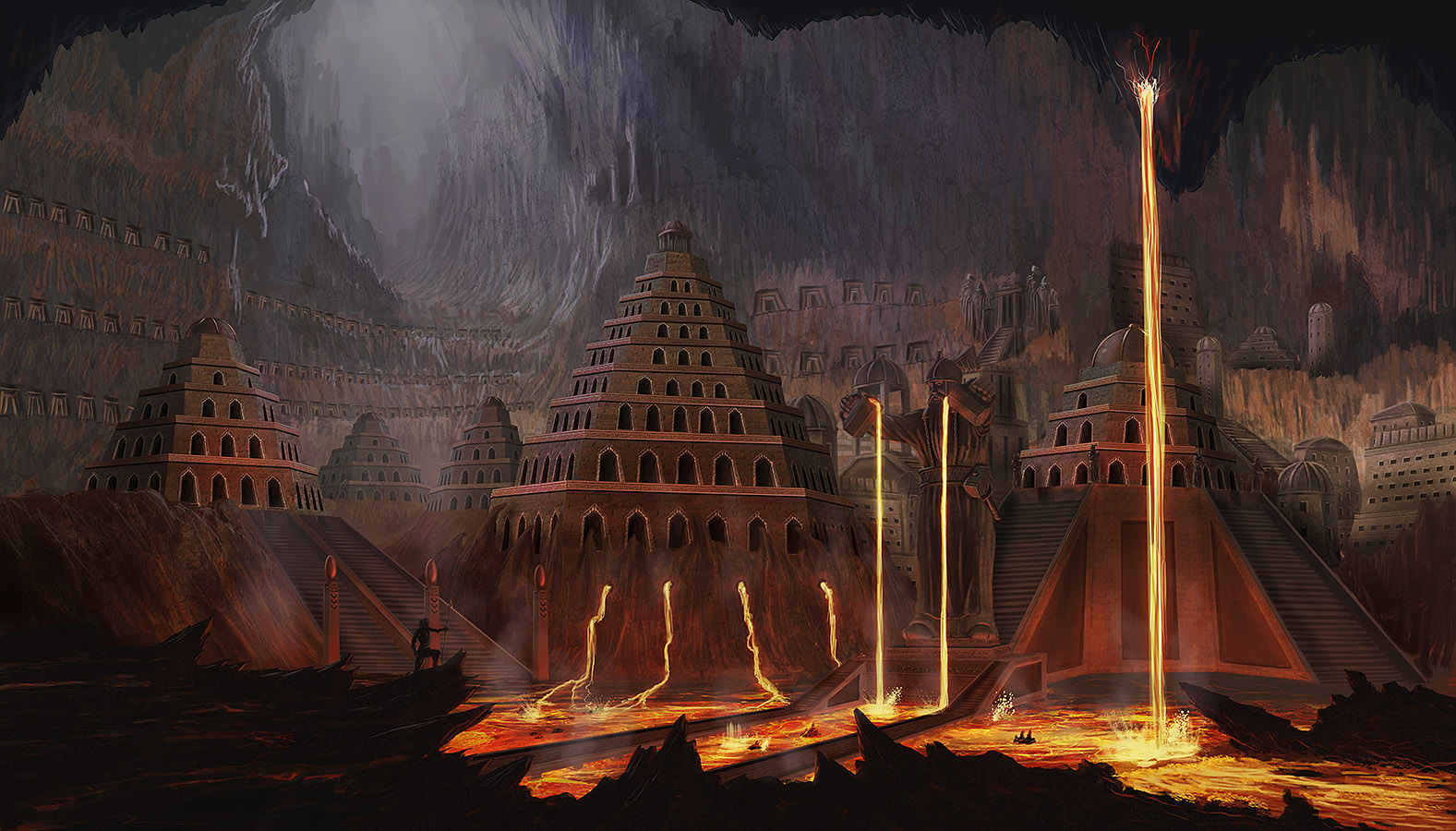
you have a nice sense of color and light, but drawing and rendering are your weak spots right now, focus on them for a while and you will take your art to a new whole level!
Keep working, i would like to see more.
Posts: 782
Threads: 5
Joined: Jan 2013
Reputation:
22
Thanks very much Eduardo! I have to do more studies...I´m still too lazy with those
Posts: 782
Threads: 5
Joined: Jan 2013
Reputation:
22
[/quote]
I love the facial expression Markus you really outdid yourself on the rendering this round ;)
[/quote]
Thanks a lot, Bee! Glad you like it :)
erick sambora
Unregistered
Posts: 41
Threads: 4
Joined: Nov 2012
Reputation:
3
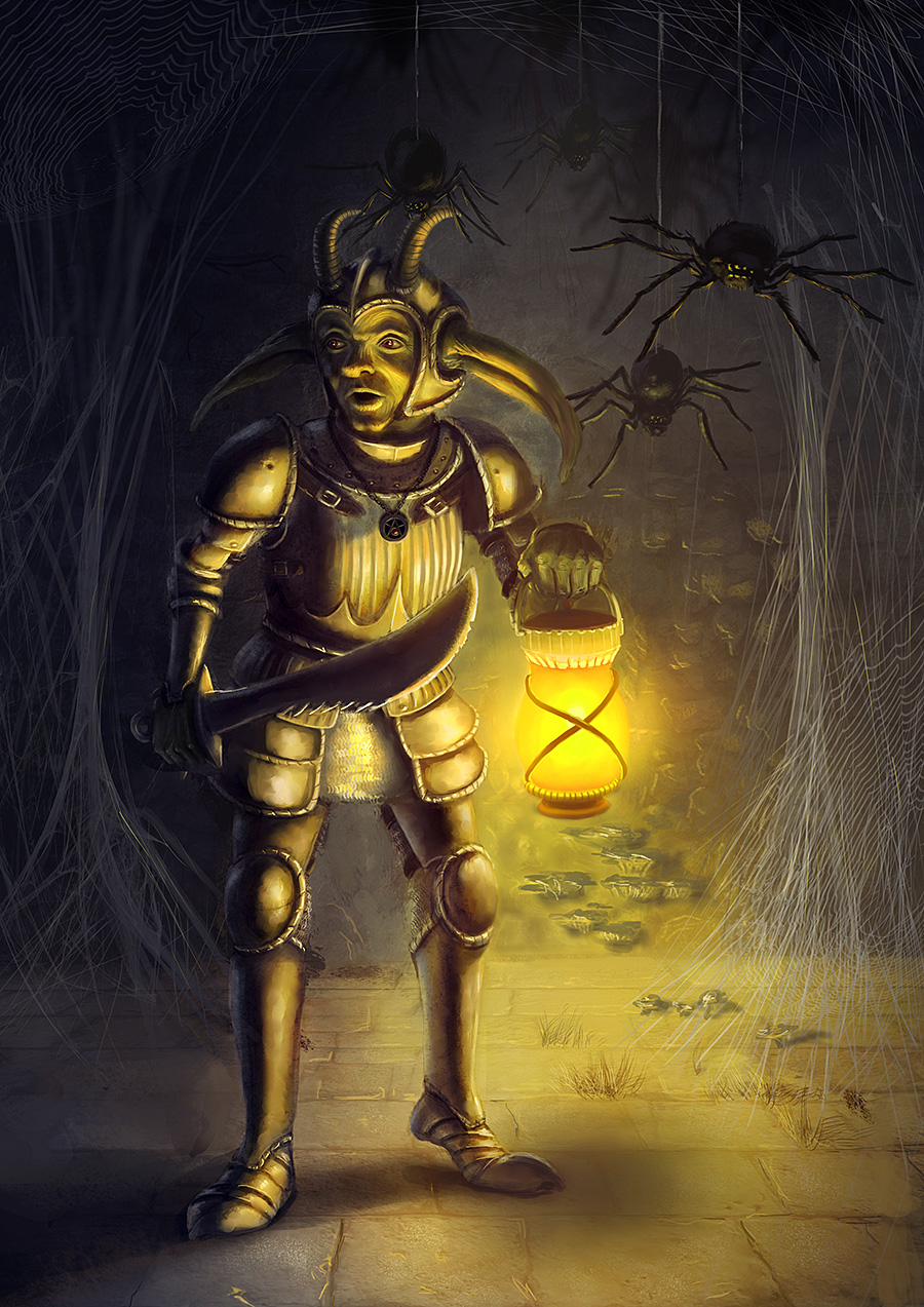
I think hands are your weak side. You should train them more. In the new one i kinda don't understand what is going on around the lamp. The reflections on the stone texture killed the depth of it. After 2 minutes I understood this is the wall, not a path into the cave or sth. This shrooms seem to be set on the floor, not on the floor and wall.
But rendering and details are very well done. I love the weapon sets you did :D
Posts: 9
Threads: 1
Joined: May 2014
Reputation:
0
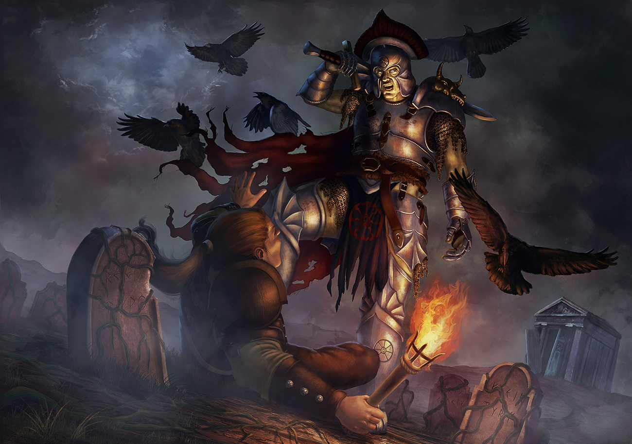
I just wanna say that the first image of the thread hits all the right "horrible thing that should not be" buttons, great work on that one. Sadly not much else to say except keep up the good work and I'd wish you do more "horrible things that should not be" things ^^
![[Image: the_pacifier_by_shaggadelic-d5flyjd.jpg]](http://th07.deviantart.net/fs70/PRE/i/2012/274/3/f/the_pacifier_by_shaggadelic-d5flyjd.jpg)
![[Image: dont_enter_the_woods_by_shaggadelic-d5k93jl.jpg]](http://th00.deviantart.net/fs71/PRE/i/2012/311/2/0/dont_enter_the_woods_by_shaggadelic-d5k93jl.jpg)
![[Image: my_little_friend_by_elderscroller-d5mbsbl.jpg]](http://th08.deviantart.net/fs70/PRE/i/2012/331/9/6/my_little_friend_by_elderscroller-d5mbsbl.jpg)
![[Image: 33fcd61a4a80aca621554e5a8885bf14-d5n1t8q.jpg]](http://th02.deviantart.net/fs71/PRE/f/2012/338/3/3/33fcd61a4a80aca621554e5a8885bf14-d5n1t8q.jpg)
![[Image: portrait_of_a_lizard_lord_by_elderscroller-d5os08j.jpg]](http://th04.deviantart.net/fs71/PRE/i/2012/358/1/7/portrait_of_a_lizard_lord_by_elderscroller-d5os08j.jpg)


