04-30-2013, 01:21 AM

hey all,
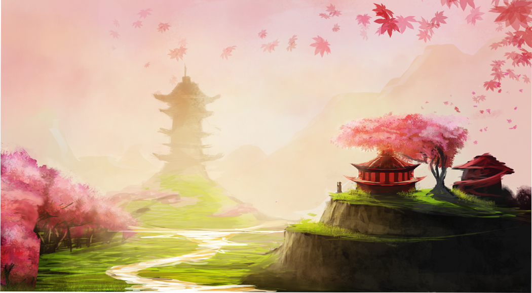
just tried out a new method and I am so much more comfortable with it- i used to almost fully render in b/w then do colour overlays, but it left the piece looking flat and fake.
So i tried just sketching it in b/w and then going full out colour form there, checking the values every so often in B/W.
Hopefully anyone whos seen my work before can see a small improvement.
The lighting on the back of the asian building will be edited too, i just wanted to block in the mid section in red.
Also I need to add the shadow of the tower on the hill. Sorry just noticing things after I posted it!
What have I done wrong so far with this? Gonna tidy up the river etc, and I think the perspective is ok but I could be wrong. Any help would be very appreciated :D
Cheers.
update.


