Posts: 656
Threads: 6
Joined: May 2013
Reputation:
12
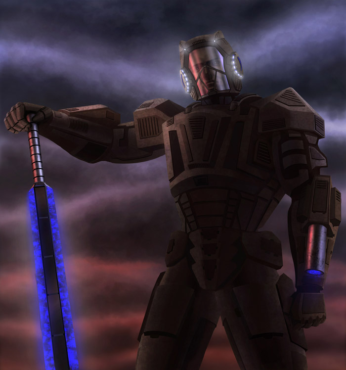
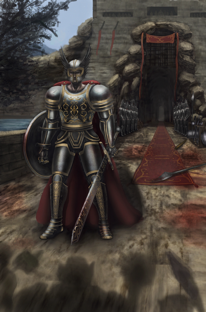
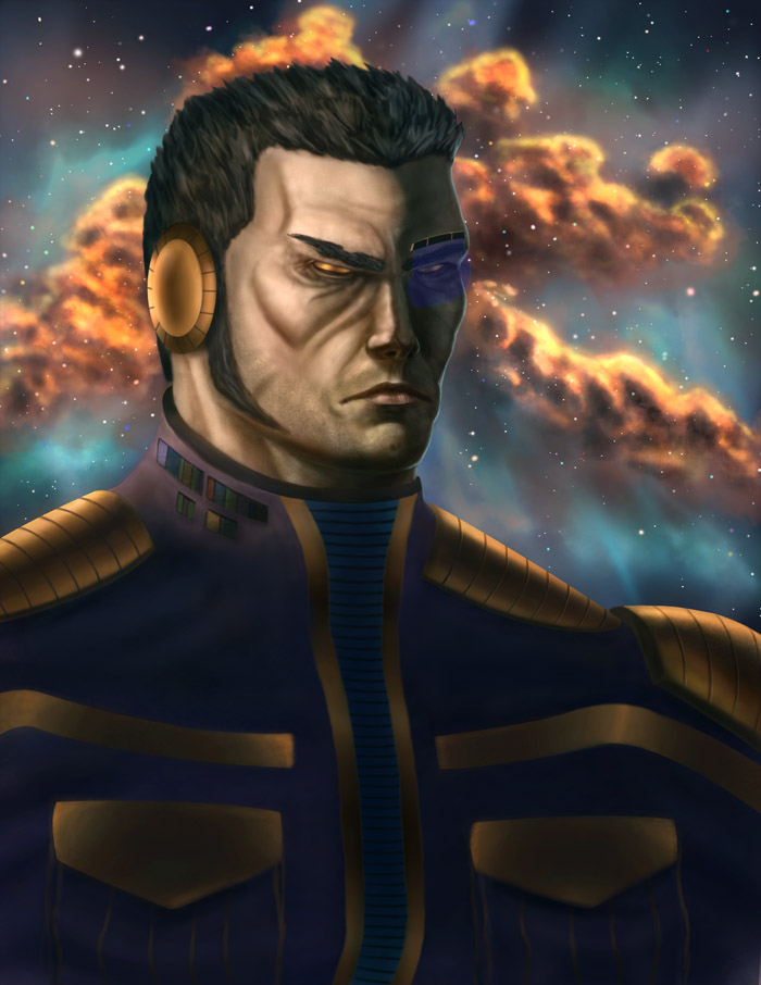
Really great armor there! I like the rhythm of light and dark across the form.
_________________________________________________________________________
The best time to plant a tree was 20 years ago. The second best time is now.
-Chinese proverb
Sketchbook
Posts: 114
Threads: 7
Joined: Feb 2013
Reputation:
1
Thank you, I was going for that distant maybe sunset type ominous light source.
Posts: 3,346
Threads: 37
Joined: Aug 2013
Reputation:
234
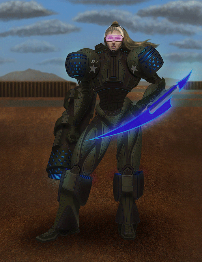
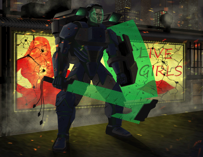
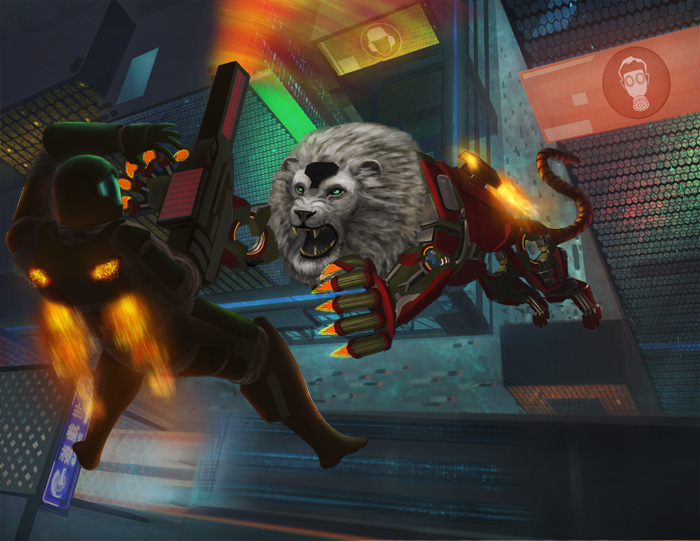
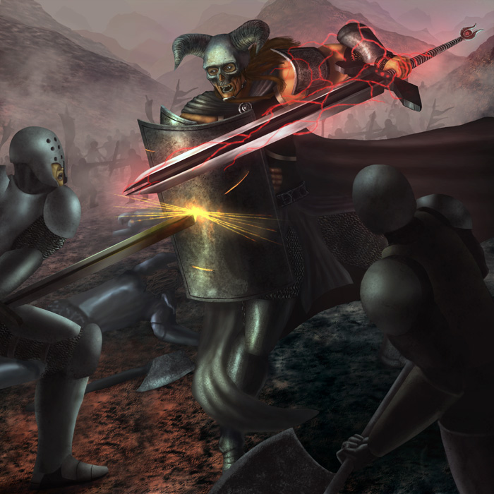
lol the last concept seem a little bit bizzare(why a sword when you can shoot with gun) but i like what you did with the force field shield
Posts: 3,346
Threads: 37
Joined: Aug 2013
Reputation:
234
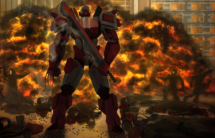
ok the pose really show is courage or it not appropriate did you try different posture before doing this?
Posts: 114
Threads: 7
Joined: Feb 2013
Reputation:
1
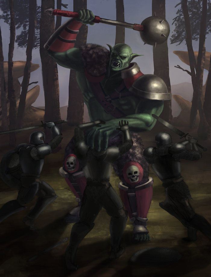
Im ok with him showing courage, maybe the description was too vague or misleading. This guy is good, he's not going to lose. I think that the information provided implies this. Although I will admit that there was not a ton of planning. It was just a basic pose and a chance to render some nice metal with cool details and what not. I then added the composition and adjusted as I went, basically winging it. I had to add the orcs and battle elements because I couldn't justify him standing there like that. I really wanted to add another character to imply that this guy was royal somehow and that they were having like a royal receiving of some kind of guests or something, but I didn't want to double the time spent on this by adding more characters. I'm actually working on an orc illustration, this time I'll take the traditional route and do plenty of roughs and posing, comp and stuff.
Posts: 41
Threads: 4
Joined: Nov 2012
Reputation:
3
Whoa. That's hella good artwork. I love the colours you have used. But there is a lot anatomical problems. Look what you did under his armlet. Like the collarbone is completly broken, and shoulder is moved very low.
But trees in the backroung are nearly flawless. Very simple, yet very organical and believeable.
Posts: 114
Threads: 7
Joined: Feb 2013
Reputation:
1
Thanks for the help. I see what you mean. I think this happened when i adjusted his outward arm. I tried to use a little too extreme foreshortening and I ended up with a really long forearm compared to the back one, i saying it's foreshortening would have been wrong so. I have the original sketch in my sketchbook. I will have to make some adjustments. Thanks Typhon!
Posts: 140
Threads: 7
Joined: Aug 2012
Reputation:
6
Hey Trevor! Cool work you got here :-)
I see one big thing I'd like to point out, especially in your most recent painting, and it's that you could choose diffrent moments in the action to create a lot more tension and interest! I warmly recommend you watch/listen to this old episode of Crimson Critters:
In the first image Dave and Dan critiques they explain very well what I mean, in any action scene you want to show the most dramatic and tense moment, to create as much interest as possible. I'm not gonna harp about it, they explain it way better than I could :-)
Keep up the great work!
Posts: 41
Threads: 4
Joined: Nov 2012
Reputation:
3
I think you are trying too much to render everything. Give it a breath, dont paint every single fragment. Make it more loosy and sketchy. And don't try to paint like a Dave or Luvisi. They are masters and they understand what they paint, trying to get photorealistic look will slow down your learning process. They know how things look cause they have studied them thousands times. The most important in my opinion is to get free hand in painting. Your rendering is ok, but everything is very rigid.
