Posts: 1,970
Threads: 22
Joined: Apr 2012
Reputation:
243
I'm pretty busy with work and running the crucible amongst other stuff so I wasn't going to participate. But a scene popped into my head this evening, so I figured I'd dump whatever I do manage to do in the remaining time in here.
Probably won't be able to finish for the challenge deadline, but then again, I can't enter so haha, it's all good
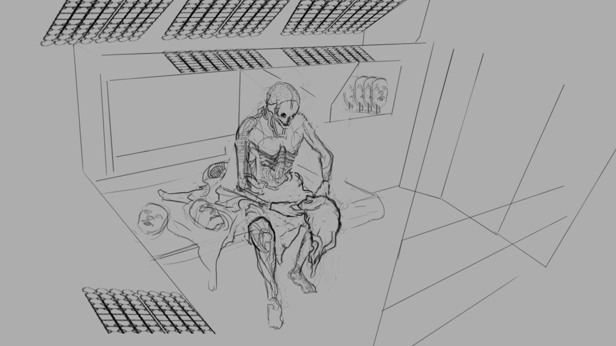
My idea is to do a biomechanoid Jaquen H'ghar (the faceless man) "Valar Dohaeris!", and maybe a cameo by Arya.
It is a futuristic setting but still mystical and ancient in feel. We are catching him in a quiet moment in his quarters between faces, or perhaps at the end of a day of being nobody. His robes made of natural fabric, lay stripped down around him in stark contrast to his biomechanical body. Discarded faces (probably from the GoT cast) lay on the floating sleeping slab. I'm probably going to have Arya peeking in from somewhere observing something she shouldn't.
I normally wouldn't work this way, so definitive to start with, but I had such a strong visual of the comp I wanted to go for which I was happy with that a lot of the thumbnailing process was taken out. I might do a couple more quick sketches just to be sure something better isn't in my head. The final comp will probably be cropped in some way once all the elements are in. There will be LOTS of design stuff to do and mood board gathering. Thoughts welcome!
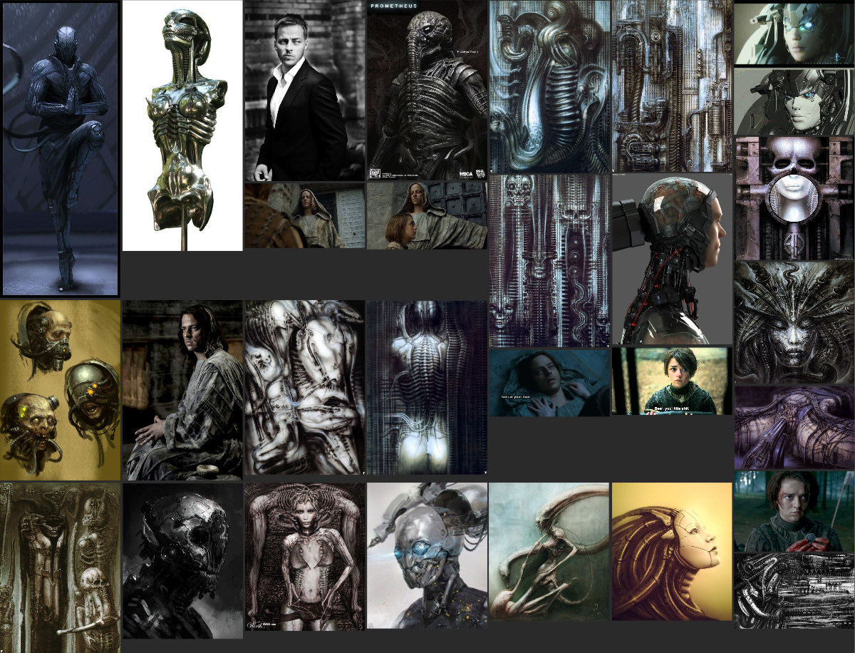
some quick initial refs
Posts: 1,527
Threads: 24
Joined: Dec 2012
Reputation:
70
Well slap me silly and call me Fabio
Amit what the hell this is sofcukasdginDajacooooooooooooooooooooooool!
Simply; I love the idea and I really hope you're able to finish it... but y'know, it's cool if you don't either... *coughilieditwouldsuckifyoucouldn'tcough*
ok gotta murder some hay
this has been a
good way to
end the day
o/
sketchbook | pg 52
"Not a single thing in this world isn't in the process of becoming something else."
I'll be back - it's an odyssey, after all
Posts: 1,098
Threads: 11
Joined: Aug 2012
Reputation:
34
YESSSS :D
i had a similar idea a few days ago, so im really looking forward to this one!
Posts: 1,342
Threads: 17
Joined: Jul 2013
Reputation:
45
This idea is awesome! Looking forvard to more.
Posts: 50
Threads: 3
Joined: Jun 2013
Reputation:
2
Damn, I need to come up with an idea that ties into the story like this. The faces are a great element to tie it back to GOT.
Excited to see this progress :)
Posts: 297
Threads: 7
Joined: Mar 2016
Reputation:
14
Posts: 220
Threads: 5
Joined: Jun 2013
Reputation:
8
ooh nice idea <3 I would loove to see you finish this
Posts: 1,970
Threads: 22
Joined: Apr 2012
Reputation:
243
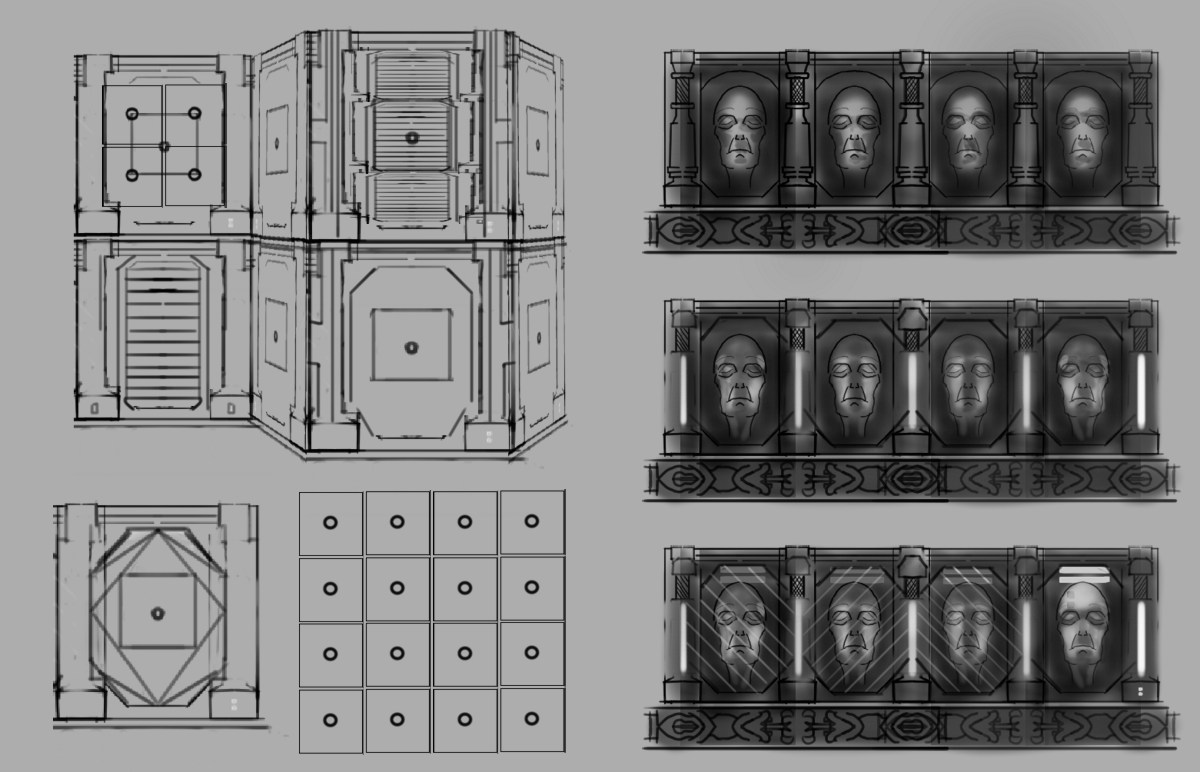
Haven't had much time, but pooped out some random design stuff when I should be sleeping, that may or may not make it as elements in the interior, including face repositories. Thinking ancient hall of faces style but sci fi lighting and dohickies. Maybe one of the vents in a wall is where Arya will be peeking out of. Naughty.
Posts: 220
Threads: 5
Joined: Jun 2013
Reputation:
8
Look s really cool dude. It's awesome that you're able to do stuff despite time constraints.
Posts: 1,109
Threads: 18
Joined: Apr 2014
Reputation:
68
Neat idea, a memory of that movie I-Robot came into my head, how they did the robots in that with the faces hanging off the machinery behind. Could be cool if his true robot face under the masks didn't even resemble a face - like just a curved surface to put them on - then he'd really be the 'faceless one'.
Posts: 1,970
Threads: 22
Joined: Apr 2012
Reputation:
243
Sorry I totally forgot to thank peeps:
@Smrrr: haha I shall try, but this one is for testing new workflowz, so we shall seee
@Eduardo: Thanks dude, hope I can do it justice :)
@Cracked: Thanks man
@Bereobo: You can do it! The idea is everything :)
@Brushnoir: :D
@Bjork: Thankssss! I will definitely finish it, just perhaps not in time for the deadline. I just don't sleep. That seems to get stuff done.
@Jyonny: Thanks man, I was going to do exactly that I thought. Would make it way creepier :)
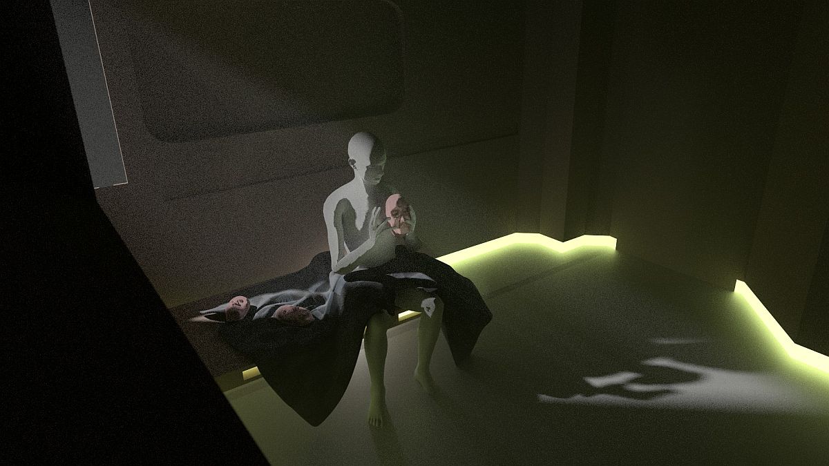
Ok so I experimented with doing a total 3D blockout this time. First time ever going full 3d with all major elements. I bloody loved it. I used Daz Studio and Blender..both totally free.
I still need to do some proper design sketches for the environment so I can model some better stuff than what is there now, and definitely going real slow because of breaking new territory. Hopefully the precise output that comes with the upfront time in 3D will pay off when it comes to painting over.
Here are some progressions and playing. Nothing is settled at this stage, but I think I've got a general idea of the lighting. Might play with a comp that is closer to the original sketch and see how that goes. Best thing is, that is piss easy in 3D. takes 2 minutes to re-comp. :) Forgive the poor render quality, these were just test renders throughout the day.

Posts: 1,970
Threads: 22
Joined: Apr 2012
Reputation:
243
Another comp. Thoughts on which you guys prefer would be great. I like this one because I can get more design into the environment and make it more 'mystical'. Might have to change the way he is holding the face. maybe like he just removed it and it is facing us, so we can see who it is.

Posts: 7
Threads: 0
Joined: Mar 2016
Reputation:
0
The forth and fifth images in you previous post catch my eye. The most recent post would look really cool with a different cropping. Is the grainy atmosphere an artifact from the program or intentional? I think if you could carry that into the final it would give it a nice creepy, surreal tone. Almost feels like looking through a slightly distorted surveillance camera. Really nice Sci-Fi/Horror type theme.
Posts: 1,527
Threads: 24
Joined: Dec 2012
Reputation:
70
Aaah man! Smart idea using a 3D software to solve a lot of the problems etc ~
I personally dig the last comp from the batch that you posted, really has this eerie mood about it and the lighting reminds me of this:
![[Image: The-Calling-of-Saint-Matthew.jpg]](http://www.caravaggio-foundation.org/The-Calling-of-Saint-Matthew.jpg) & ya can't argue with Caravaggio's comps/lighting scenarios haha
Although I'd like to see an update of the above image where you apply that different pose, 'cause I reckon that could look boss as well-!
sketchbook | pg 52
"Not a single thing in this world isn't in the process of becoming something else."
I'll be back - it's an odyssey, after all
Posts: 530
Threads: 14
Joined: Dec 2015
Reputation:
51
I like the initial sketch most of all compositionally. The camera angle is interesting and there's some environment elements, too. On the last one, faces are turned such a way that I it's hard to guess those are faces if you don't already know it. And the camera position is more boring imho.
As for lighting variations, I prefer the 3rd comp because there's no stripe on the face in Jaquen'shands and I can see the details best and there are nice value variations on Jaquen's head. The 5th one is more dramatic, though I don't like very much that his "face" is in the darks, because it implies less detail. Maybe it's ok as he is faceless but I still prefer the 3rd one.
I like the dramatic lighting in Caravaggio's picture! All the faces are well lit btw.
Anyway, awesome idea Amit, I bet your final will look epic!
Posts: 164
Threads: 5
Joined: Feb 2016
Reputation:
7
yea I like your last image too, it seem more interesting and you feel more involved with the character in that composition, lightings great too, cant wait to see it finished...
Posts: 1,970
Threads: 22
Joined: Apr 2012
Reputation:
243
@Kopper. Thanks. Haha maybe I will go for a survival horror feel :) The grain is an effect of the volumetric light (which I wanted in there) and a relatively low render sample. I really like the grain as well. I won't uber render the heck out of the final comp, so it retains some of that good stuff. I am a little concerned about painting over grain, it's a pain, but let's see what happens. I have ideas for that last image as well, so I might do something with it later.
@Smrr: Thankksssss. ah I did the new pose, but totally forgot to save out the render from that angle. It's in the new comp instead.
@Neo. Thanks! It's a very good point, I never actually recreated my original sketch properly, I got too excited having all sorts of other fun :) So I will do one as close as I can and then choose. Also took out those bars...they were just for me to work on the volume lighting, but yeah, totally distracting!
@slash: Thanks man, I might still use it. I have some ideas where to take it :)
Here's another comp. I tried to recreate the original sketch mostly, though the room is bigger and I didn't bother changing it, so it has effected the scene a bit. I do still think it has some intimacy to it, which I quite like, and there is a bit of room to add some fun stuff, nice gritty floor and wall textures etc. As always I will tweak lighting and arrange the faces around and do some basic form models for the walls, but perhaps this is the winner.

Posts: 671
Threads: 8
Joined: Feb 2016
Reputation:
113
Hi! Not really a critique because the piece is so technically sound that I think I fried my own brain synapses just to figure out the lighting.
It's just that, comparing to what you got now, something got lost or changed drastically from the first piece. The very first composition has a more somber, defeated look the way the subject is looking down on the object. How the torso is slumped over, how the arm is angled while the hand is resting on the leg really gave that hint that the subject is heavily troubled, and contemplating on something.
While the latest one, with the subject, having his mouth gaped open, back straight, a hand gesture that's indicating discovery and wonder, has a more positive mood. Probably the yellow light helped push towards that mood.
Regardless whether the change is intentional or not, I dig them both.
If you are reading this, I most likely just gave you a crappy crit! What I'm basically trying to say is, don't give up!
----
IG: @thatpuddinhead
Posts: 1,970
Threads: 22
Joined: Apr 2012
Reputation:
243
@john, You're totally right. My idea kind of shifted a bit from the first sketch. Jaquen is a very strong silent figure, I didn't think even when alone, he would exhibit weariness :) so I will be going for a more pensive body language, with a touch of reverence/mysticism and a good dollop of creepy as f*ck biomechanoid aloofness. Haha, good luck me, getting that into one pose. Also he won't really have a face.
I will take all your thoughts on board as I develop this. :)
Posts: 1,970
Threads: 22
Joined: Apr 2012
Reputation:
243
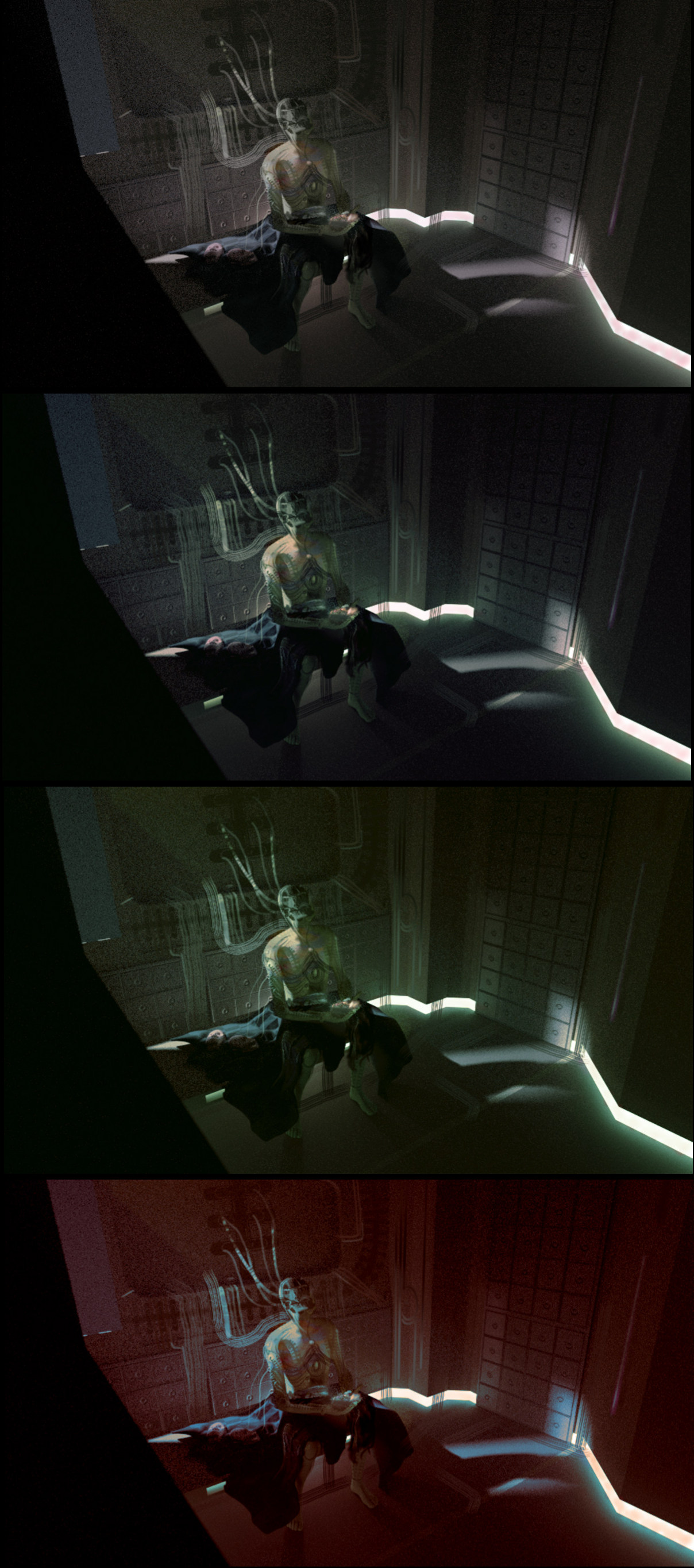
Moar stuff. Took a low res render and bashed some shit into it. It was so easy, I can see why people use 3D blockouts now. Tested a few colour schemes (just colorized, so not much variation going on) Seeing this is good, because I know I really need to figure out the pose and get that face he's holding visible, or it's just some random sci fi scene. Also definitely need to figure out the design of the biomechs non-face and where to maybe stick Arya. Thinking that bright spot at the bottom right if it hits a vent or something.
Plus need more GoT bells and whistles and easter eggs if I can figure that out, oh and face repositories!

|


![[Image: The-Calling-of-Saint-Matthew.jpg]](http://www.caravaggio-foundation.org/The-Calling-of-Saint-Matthew.jpg) & ya can't argue with Caravaggio's comps/lighting scenarios haha
& ya can't argue with Caravaggio's comps/lighting scenarios haha

