04-14-2013, 09:59 AM
Very great job man !
|
My finished stuff
|
|
04-14-2013, 09:59 AM
Very great job man !
04-23-2013, 03:49 PM
Thank you everyone! I have not posted anything here for a while as it's been all about the Bloodsports lately for me :-D
After Bloodsport 15 I was dissatisfied with the look of my work and decided it was time to let go of my round brush purism and try new things! So for this next one I worked in a similar fashion I have seen artists like Dave Rapoza work, using more loose strokes with a bit of texture brushes and staying zoomed out until the image started to look decent from a distance, and only then moving in to refine and add some detail. This is my fastest finsihed painting ever I believe, I think I spent at most 10 hours doing it, which is fast for being me haha. 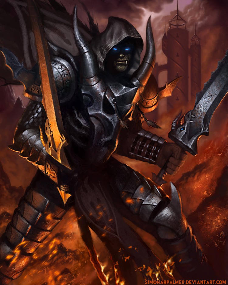
04-26-2013, 10:03 PM
Simonarpalmer, Awesome! In my opinion this is the best your work! I'am gonna add it in favs on DA )
04-27-2013, 06:00 PM
Looks amazing! There's just a tiny thing bothering me with his face, it looks to me like it's not in the right spot and might have to be skewed a little bit.
Loving the armor design though, awesome!
04-28-2013, 12:22 AM
Hey, nice!
(I concur with Dana thought, face seems out of place in relation to the body. He is looking straigh up at us whereas the body is 3/4...) Love the crazy looking armor with that metal dragon skull on the torso^^
04-30-2013, 09:50 PM
Thanks guys/girls :-) You were right about the face of course and I adjusted it!
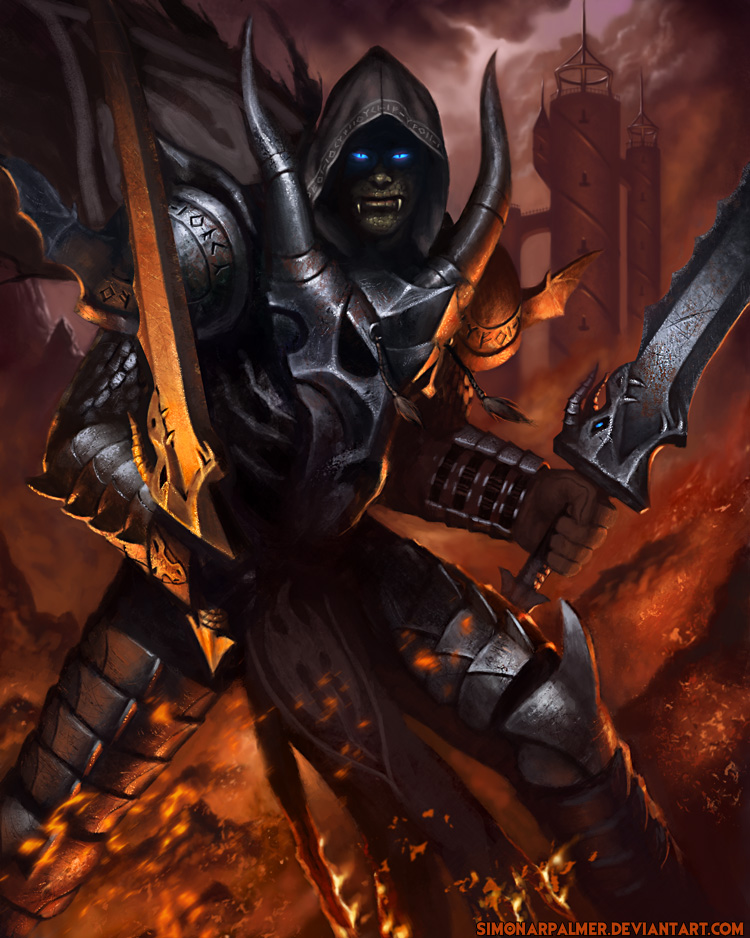 Also new piece, not 100% happy with it, but I figured I might as well start something else rather than waste time trying to tinker with an image that probably has some fundamental flaw :-) 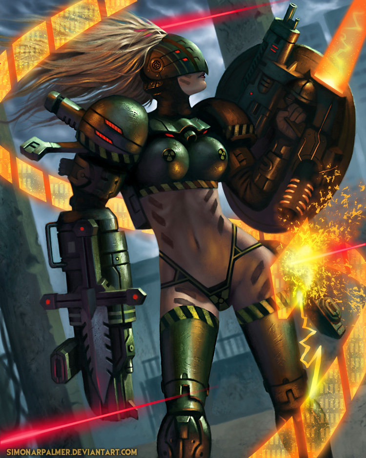
05-04-2013, 03:50 PM
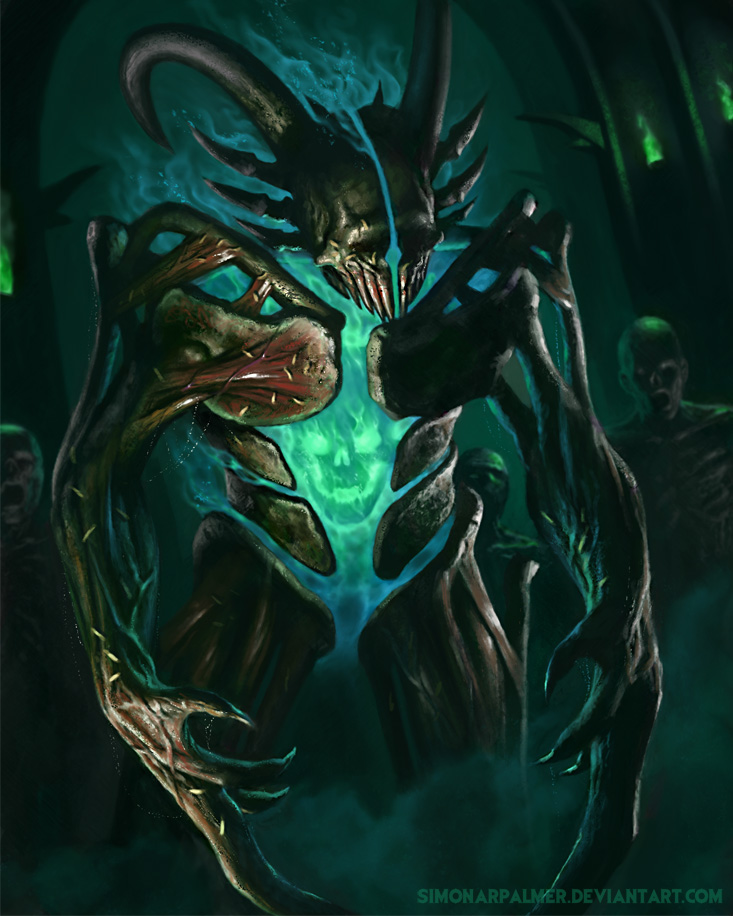
Yet another new piece :-) Not much to say about this
05-09-2013, 10:28 PM
good work with the textures :) the last illustrations, I saw an improve ^^
05-10-2013, 07:28 AM
holy crap this last one is amazing! I like how as i scrolled down, i could see you using harder brushes in the paintings and that really makes them jump!
Loving your work! :)
05-10-2013, 06:10 PM
Thanks 1oushart and Kungfusalsa :-) Yes I feel like my new approach is giving me better results, using a full range of really soft to razor sharp edges and using textured brushes, and it also cuts down the time spent on each image considerably!
New piece 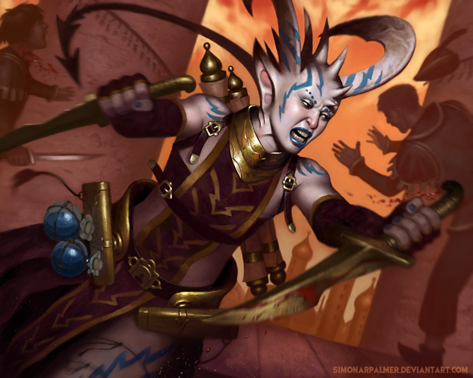
05-22-2013, 03:48 PM
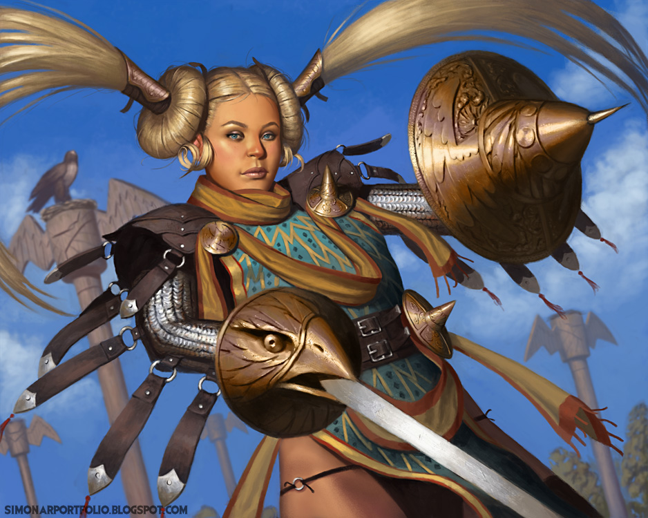
New piece! Nothing to say about this really :-)
06-05-2013, 01:36 AM
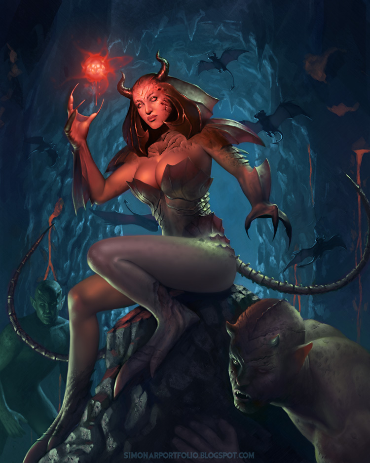
New piece again, took a little more time working on this, not super excited with how it turned out, but as we often have to do I had to call it done and move on. If anyone has some critique to give on this, I'd be grateful!
06-05-2013, 03:22 AM
wow, looks really powerful in my opinion. Maybe even better than your recent illustrations.
I like the red lightning and the overall theme of the picture. Since you are looking for critiques, i would say that the body of the demon guy in the background and the lava flowing from the rocks could be a bit more defined but those are just tiny details. Overall the whole picture is damn great.
"Stand tall, and shake the Heavens!"
Tumblr for my comic!: http://rainfallcomic.tumblr.com/ Sketchbook: http://crimsondaggers.com/forum/thread-1227.html Facebook: http://www.facebook.com/eduardogarayart Deviantart: http://eduardogaray.deviantart.com/
07-02-2013, 05:16 AM
Thanks Eduardo!
I'm still alive, and I still paint, but it's been a while since I took anything to finish now. I had to put the freelance illustration dream on the shelf for the time being. I ran out of money entirely and had to choose between trying to find a job doing things I really don't wanna and live on welfare in the meantime, or get an education for something I would at least not hate to do. So I'll be attending a school for game art this fall, it's mostly 3D oriented and they have you be part of making functional games right from the start, it's all good, and I'm honestly looking forward to getting out and have a social life again. But enough about the shortcomings of my life and on to the shortcomings of my art! :-) I got back into playing a little bit of the Baldur's Gate series again and decided to create a portrait for my character since the game lets you import your own. All done in Painter this time.
07-03-2013, 02:12 AM
Beautiful pieces, love the woman on the rock with the red ball, nicely done! The last one is also very very nice. Really enjoyed going trough your stuff:-)
weapons and other props > http://crimsondaggers.com/forum/thread-2683.html
For hi-res (original) images of these designs, please got to nenadgojkovic.deviantart.com Available for freelance work, contact me via [email protected]
07-14-2013, 07:45 PM
Thanks Nenad!
Here's a new one, I decided to do a hardcore Hard Round Brush challenge. I have done it before in the past, essentially the idea is to use no other tool than the hard round brush in photoshop, make all level adjustments and whatnot by hand to gain some deeper understanding. Takes a lot of extra time obviously, but it's satisfying to me and I feel like a learn stuff! 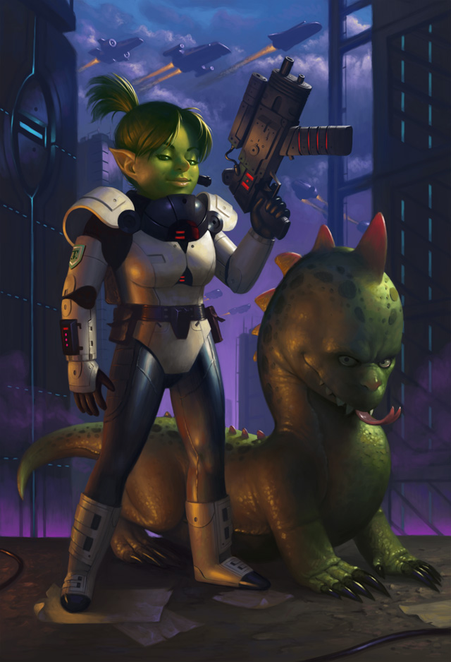
08-05-2013, 03:54 AM
Wow Simon, your freaking awesome man! Great work!
08-14-2013, 04:59 AM
Thanks Trevor! Though I hardly deserve such praise :-)
Motivation is coming back as the school start is closing in! Been goofing around playing some games and just doodling and shit, was a little bit of a struggle to get back into painting finished work, and it kind of shows I think, but I'll get better! I made up an IP for fun, I call it EXOskeleton, people (probably just girls because I can't help myself) don the powerful EXOskeleton armors and become heroes/villians with insectiod/skeletal themes and do battle. Got a TON of "cool" names made up, using the simple idea generation techniques Dave and Dan have been promoting haha :-D This is MEGAMOTH! 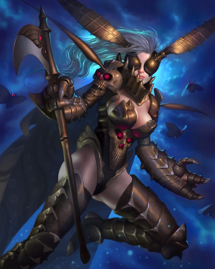
08-14-2013, 11:17 PM
Wow! inspiring stuff, your work just keeps getting better.
The only crit I can come up with is anatomy really, heads being a bit too big or small on a few I've noticed and also torso's, hips and boooobs of the women are a bit too smooth (and round) to look realistic, some folds and creases and maybe a muffin top or two might help with the realism. But that's really nit-picky :) love it alllll!
08-19-2013, 01:14 PM
Real nice simon! Applibot work yet? I've been wanting to use that name technique!
|
|
« Next Oldest | Next Newest »
|