12-06-2012, 08:48 AM


|
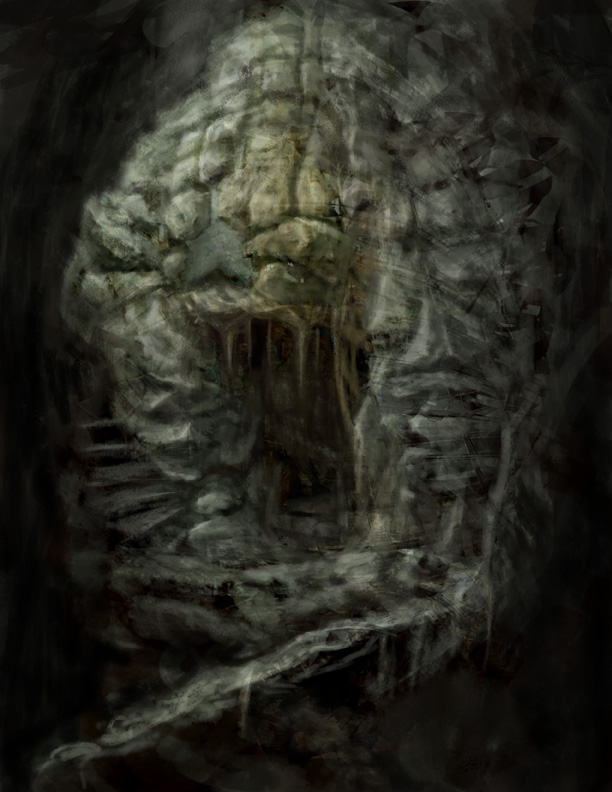
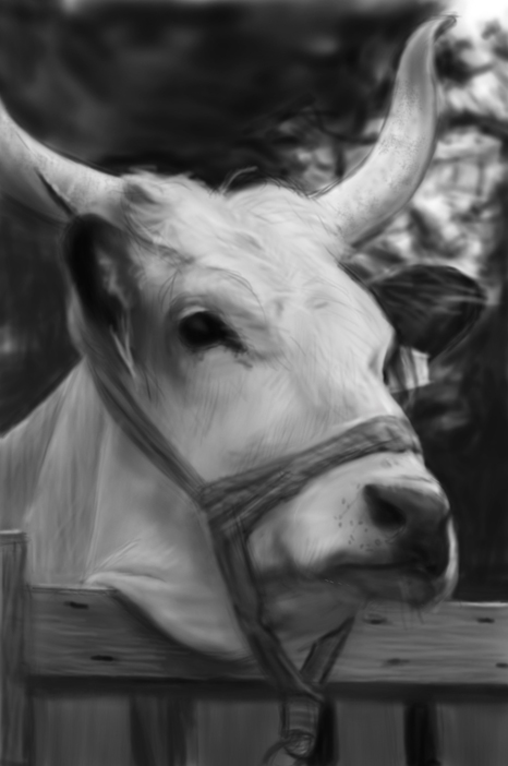
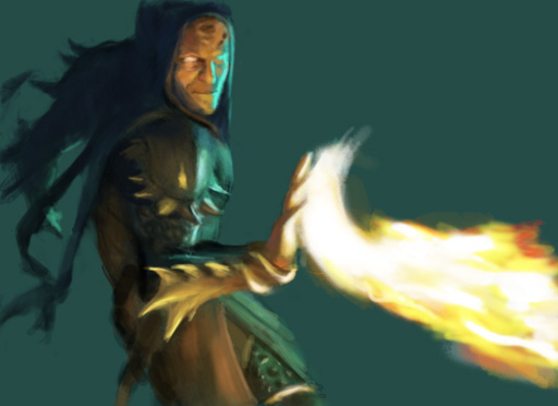
Jared Dennis's SKETCHBOOK
|
|
12-06-2012, 09:50 AM
Good start! Hope to see more soon!
12-06-2012, 11:05 AM
(12-06-2012, 09:50 AM)Ursula Dorada Wrote: Good start! Hope to see more soon! Thank you very much Ursala, there will be more very soon ;)
12-08-2012, 07:06 AM
10-16-2013, 05:15 PM
That is a really solid start! The knife rocks... Is it painted from nature or your own design?
It's a somewhat solitary existence, a bit like a lighthouse keeper throwing a beam out into the darkness, in faith that this action might help someone unseen.
 My Sketchbook (critique welcome) My Sketchbook (critique welcome)
10-18-2013, 05:09 AM
I need some major help in the dramatic lighting realm so many studies, many not polished will be dedicated to just that :)

10-21-2013, 06:27 AM
Hey, there are some really nice studies in your sketch book so far. That first one is really nice and clean, and you're able to capture the proper lighting pretty well in many of these.
If it's lighting that's tripping you up (I don't think it's your biggest problem at this point), James Gurney's Color and Light is a great read packed with loads of information. Check it out if you haven't already. Keep focusing on construction and anatomy, and don't forget to apply what you've been studying to your personal work. So far it looks like you've got a lot of studies, try doing some stuff from your head and where that takes you. :D Keep it up!
10-22-2013, 04:02 AM
Hey thank for the kind words and advice! Yeah I've been loading my sketchbook with just studies and applying those to my personal work, but I'll have to start throwing in some sketches from imagination in here. Thanks again.
(10-21-2013, 06:27 AM)Archreux Wrote: Hey, there are some really nice studies in your sketch book so far. That first one is really nice and clean, and you're able to capture the proper lighting pretty well in many of these. I consider this one a fail for today but forced myself through it and really didn't even finish it fully, it wouldn't hurt my feelings if anatomy and faces showed themselves out the door lol.
10-23-2013, 02:02 AM
Hey everyone, I did some color comps to get an idea of the direction I wanted to go with this piece, it's a sketch so don't judge the very rough look and composition, I just wanted to get an opinion on what colors resonated more with you guys, maybe none of them lol but let me know what colors could be added to make it better or what not. Mood mood mood is what I really want to be able to nail, the mysterious, dark, and what some would call epic kinds of mood like Mike Azevedo and others in a way. Thanks
|
|
« Next Oldest | Next Newest »
|