Posts: 1,527
Threads: 24
Joined: Dec 2012
Reputation:
70
Aww yeeeeaahh welcome back!!
I hear taking vacations/breaks from art is a great re-motivator & allows you to see your art in a new light, so cheers to that and I hope you had an awesome vaycay!
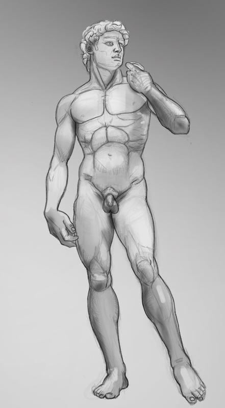
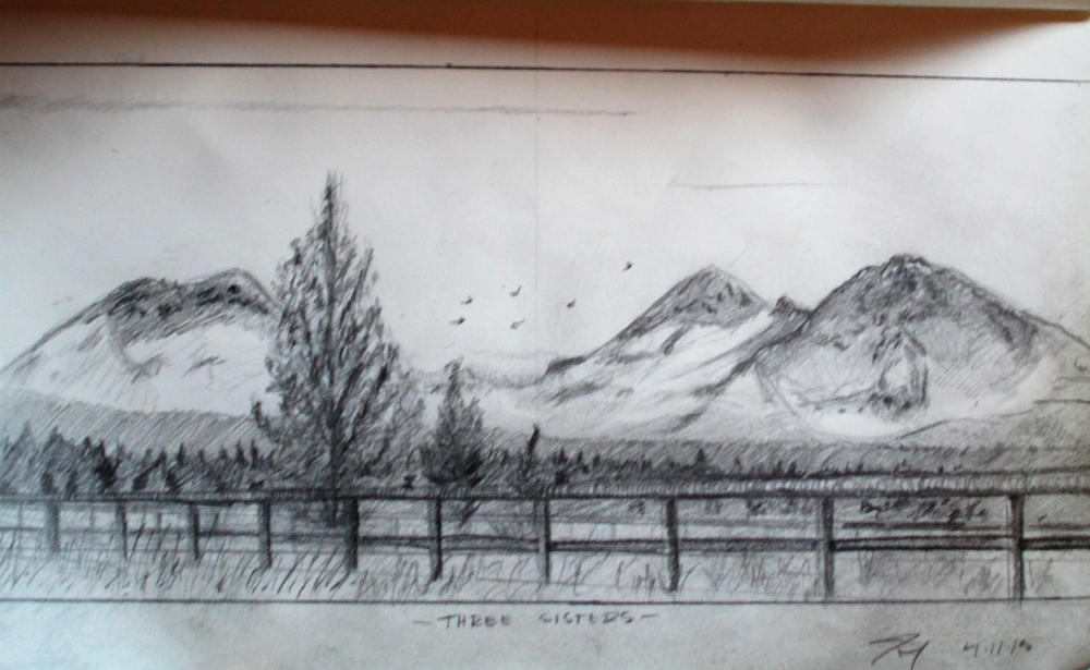
onto the art side: my goodness...! I'm in love with those landscapes! You really have improved a bunch since page 1, it's astounding! Looking forward to more posts from you! And yes, CA is definitely welcoming the Reaper... :s
Keep pushing Stray!
sketchbook | pg 52
"Not a single thing in this world isn't in the process of becoming something else."
I'll be back - it's an odyssey, after all
Posts: 1,098
Threads: 11
Joined: Aug 2012
Reputation:
34
welcome mate! the second landscape you just posted (the one with the road and the sea) is kinda beautiful, i really like it.
Yes, looks like CA is not going back any time soon, which is a shame of course, all that knowledge lost...
Anyway, welcome back, stay motivated, and keep going! :)
Posts: 99
Threads: 1
Joined: Mar 2013
Reputation:
5
Definite inprovement throughout this thread. Great variety of study too. Keep up the good work.
Hey guys, Ed And Smrrfette, thanks for having me back. If only CA.org would follow. Sure it had it's issues, but I was addicted to trolling the crit section, and SB's, and just started the Jadis Chow. So kinda bummed to not get that in. On the plus side I've had assloads of time to tear it down and keep going on it. Maybe I'll post a wip tomorrow. It's pretty close, could use it's own crits badly. Thankfuly there's Crimson Daggers to save the day. Anyways, yeah thanks guys. I feel fresh, for now. At the end of this week I move across country, so hopefully that doesn't slow me to bad. The break was great. Anyone out in Michigan??
Ignatz, thanks bunches man. I like to study all kinds of things. I hope to be the greatest general artist ever, specializing in nothing. Haha. Thanks for stopping by!!
Here's this I did today, working values, and edges, and technique. Old man faces give me a hard on. Haha gross, but they have lots of cool forms to check out. I think I could have gone overkill on the smoke, oh well it was kind of fun!!

Posts: 1,970
Threads: 22
Joined: Apr 2012
Reputation:
243
Wow, are you the same dude as on page 1? Great progress mate
(05-31-2013, 04:07 PM)monkeybread Wrote: Wow, are you the same dude as on page 1? Great progress mate
Monkeybread, perhaps not. Same skin for sure. But I would like to think I've come a little ways since. Thanks man!!
Here's this I've been working on, originated from CHOW at CA.org for Jadis the White Witch from Narnia books. Clearly that contest wont be going down on the deadline, so I went ahead and just played with it more. I'm close to moving to color, but maybe not want to get B/W solid. Have a ways to go, and intend to poke along with it. Crits would be more then welcome as I proceed.

Posts: 71
Threads: 4
Joined: Nov 2012
Reputation:
4
sweet improvement. I like your still life trad in the first pages. but the last pieces are definitely strong :)
for the last piece , i have a strange feeling than the girl doesn't belong to the environnement. this is just my feeling :p
May be because she is very detailed in comparison to the background. I may blurred/darker the columns. Or may be add a little lens distortion to help to get a full sense of room .
also the lighting could help a lot. Here you have one background light ( very north ) and the girl get a light in her face. The two column seems getting another light almost like the space behind the throne was the main source of lighting. Reducing the light sources will help the clarity and the readibility.
Last details i can suggest is about your black level , you can make the column darker to harmonize with the darker pixel of the girl, it will help to integrate them. if you want :). I know i guess you wanted a focal interest but the difference is slightly too much. (my job was vfx digital compositor). Hope it helps :)
I was thinking about begin again a CA thread but it seems to be hopeless ^_^ thx for sharing it.
Posts: 1,527
Threads: 24
Joined: Dec 2012
Reputation:
70
That ChOW is incrediballs!! You've improved ridiculously, Stray!! Where the hell are you?!
Come back soon, we miss ya!
sketchbook | pg 52
"Not a single thing in this world isn't in the process of becoming something else."
I'll be back - it's an odyssey, after all
Posts: 59
Threads: 4
Joined: Feb 2013
Reputation:
0
Hey dude. we started CA accounts at almost the same time so I wanted to check how are things. Great improvement sir!
Take care!:)
|


