Le sketchbook
#1
Rainbow 
Hey, guys. My name is Petyo and I'm from Bulgaria, currently living in Paris, France. I spent the last 5 years doing law studies and doing art now and then (I'm the 'lawyer guy' who argued with Dan on the youtube comments and got mentioned in one of the livestreams haha), but since January I've been drawing and painting 12 hours a day. I hope I can become a professional someday. I wanted to be an artist since I was 4 and now I finally have the time to do it. I must admit I don't do enough studies, so I could use the pressure that a sketchbook will create. I'll try to update this sketchbook as much as I can.

First some portfolio pieces I finished last month. These are some characters for a personal project (except the first), but the compositions are kinda boring so this month I'll be redesigning them and making cooler illustrations.


[Image: 2134_DEUX_petyo_1200_tt.jpg]
[Image: malice_petyo_1200_tt.jpg]
[Image: malice_intimate_petyo_1200_tt.jpg]
[Image: livia_petyo_1200_tt.jpg]
[Image: aries_petyo_1200_tt.jpg]

And here's a couple of photostudies from yesterday, 1,5 hours each. Thanks for visiting!


Attached Files Image(s)


Reply
#2
Thanks for the help on the dragon man.

I love your character designs, and am very envious of how you use colour!

Will definitely be following this SB :)

Reply
#3
Cool stuff, I would recommend to read up on composition, also some black and white value studies would be beneficial making some depth and defining a shape more clearly.

Reply
#4
@Corza334: Thanks a lot! I'm glad you found it helpful :)

@DomSinkevic: Thanks for your visit. I saw you have a bunch of stuff on your dA, some of it about composition. I'll check them out :)

And here are two perspective exercises dealing with projection and placing stuff in perspective.


Attached Files Image(s)


Reply
#5
Heya Petyo!
Very nice work in here, I can tell you work a lot on them. Some very nice character work. Do you really manage 12h a day, gosh thats's loads : )

Are you looking for crits/paintovers?

The perspective exercise looks useful, I need to work on that so I might try something similar

"If you want liberation in this life, there is no area that you do not watch. Watch the breathing, watch the posture, watch the flow of energy, watch the texture of the mind, watch the response to objects." - Namgyal Rinpoche
Reply
#6
I really like the work here, looking forward to more perspective stuff (it kills me XD). stay well!
Reply
#7
aks9, natori, thank you for the comments!

aks9, yeah I'm trying to work for at least 12 hours, even if I'm, as expected, not working at 100% all of the time. But I'm not playing any video games or watching movies so I'm not wasting time. Crits and paintovers are always welcome, since this is a sketchbook, but I won't be updating old work anymore, especially if it's 'finished'. I'd rather repaint it from scratch so if you have crits, I will take them into consideration for future work. Half of these painting I won't even post on dA. because they are a bit weak so it's useless to polish them when the foundation doesn't work. I'll just repaint them from scratch.

I guess It's time to update the sketchbook.

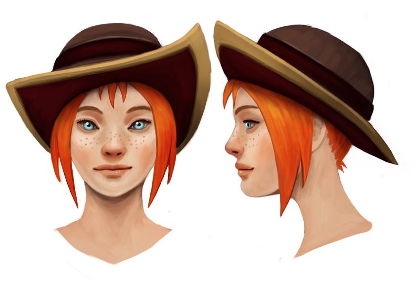
Last month I designed/redesigned 7 characters for a personal project. Three of the illustrations in my first post are the older versions. I redesigned them because I just wasn't entirely happy with them, the reasons being 1) the designs weren't as solid as I wanted them and 2) the illustrations are a bit stiff. I rendered them well I think, but I wish I made more dynamic poses and compositions. So I went back to the drawing board and this time focused on the design only. Here's a sneak peak of the designs for all 7 and the heads of 2 of them. I did the heads for all of them, but no need to spam it all. I will make at least 3 full illustrations with backgrounds (applibot/wizards style) and the rest will be only the character on a white background. They are intended for my portfolio, so I won't rush them this time.


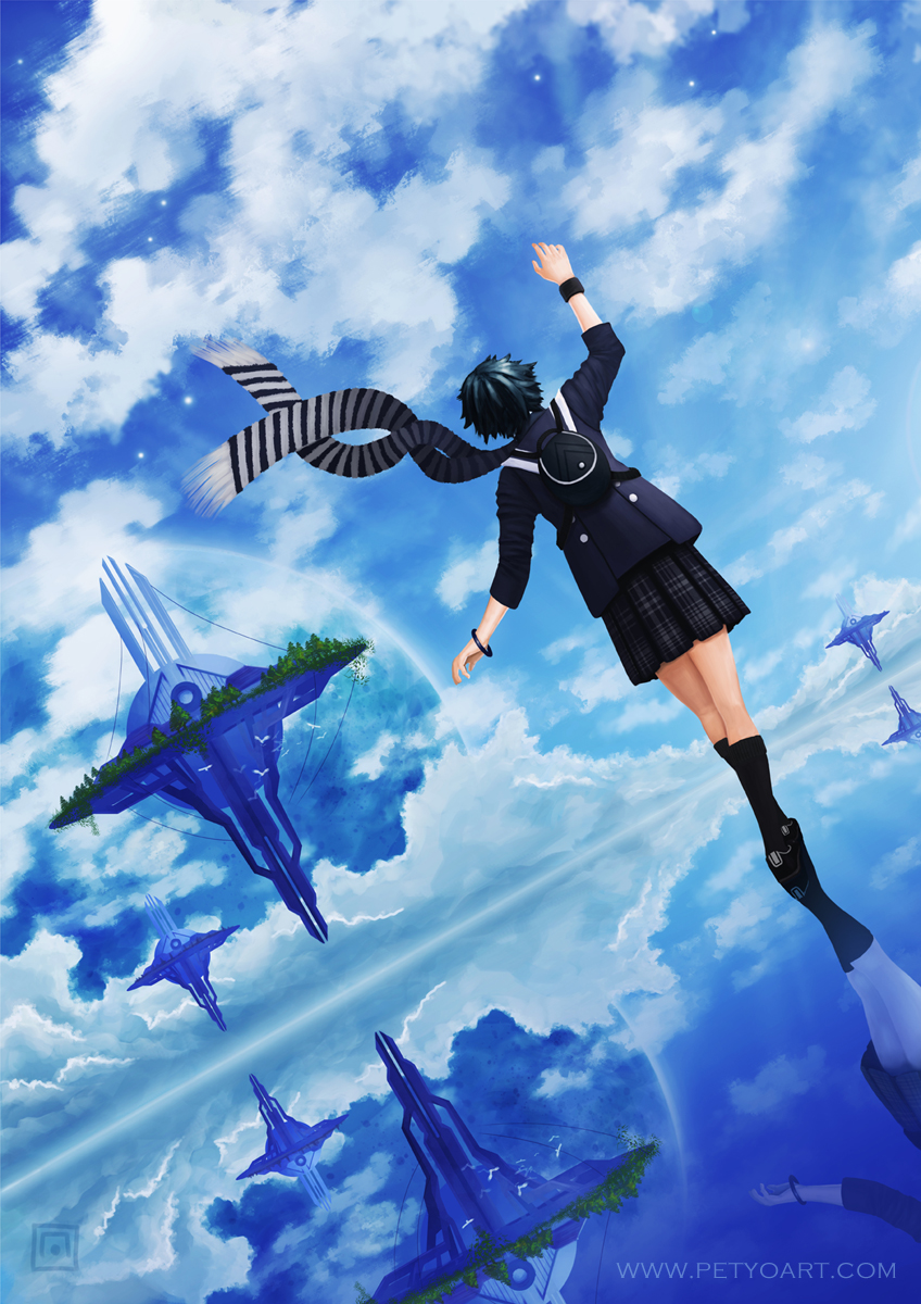
Next is my latest finished illustration, that has nothing to do with these characters. It's very personal. I'll also show you the initial comp/colors sketch and the background without the character. They had to be done separately, because the background was a bit more complex than usual due to all the reflections.


I think that's it for now, I will keep the rest for future posts xD
Reply
#8
nice work on the designs! nox is pretty cool especially.


the blue personal piece is nice, and it's great to see the evolution it took on. the clouds in this are really beautiful and the structures are really nice too. the whole thing has a very pleasant and joyful or peaceful vibe, nice blues, etc, good job : )

i've got a few minor comments for it: (edit: this turned out quite long but its still just a few minor points)

lifting the figure's right heel so its "peeling" off the ground might make it look a little more like she's walking, and not just balancing - I'm not sure if that's your intention.
also, her body relative to the camera is being seen from a straight-on-angle, even though the camera is at quite a strong inclination on all its axis', which makes it seem a little stiff. her left hand, we see from a perfect side-view and her right hand we see from a perfect frontal view, it would be more convincing perhaps if we saw them from an ever so slightly different angle. the same goes for her back, it looks like we are standing right behind her, but we're actually slightly to the side and downwards.
i guess this same critique could go to the floating structures, they are all facing the viewer, but from our angle, we should be seeing them from different angles (the circular center-point would have to be off center). i put some perspective on the scarf too, which was also seen a "too perfect" an angle from the camera.


here's a paintover:


i adjusted the things i mentioned. i adjusted the structures and scarf by selecting and duplicating the area i wanted to change, and then just shifting it with either the warp and distort tools, its quick but it gets the point across. this is also useful for drawing complex geometry in perspective, you can draw a flat version of what you want and then shift it into place and then paint over it so it looks right

-aks

"If you want liberation in this life, there is no area that you do not watch. Watch the breathing, watch the posture, watch the flow of energy, watch the texture of the mind, watch the response to objects." - Namgyal Rinpoche
Reply


Forum Jump:


Users browsing this thread: 5 Guest(s)