Sketches :)


Mmm....will bust out some more sketches.
P.S: If you can't see the attachments then do let me know :)


Mmm....will bust out some more sketches.
P.S: If you can't see the attachments then do let me know :)
|
Super Mango Sketchbook!
|
|
Sketches :)
  Mmm....will bust out some more sketches. P.S: If you can't see the attachments then do let me know :)
04-23-2013, 06:47 PM
I spent like 2 hours coloring it. I wanted to make it realistic but it didn't work out.
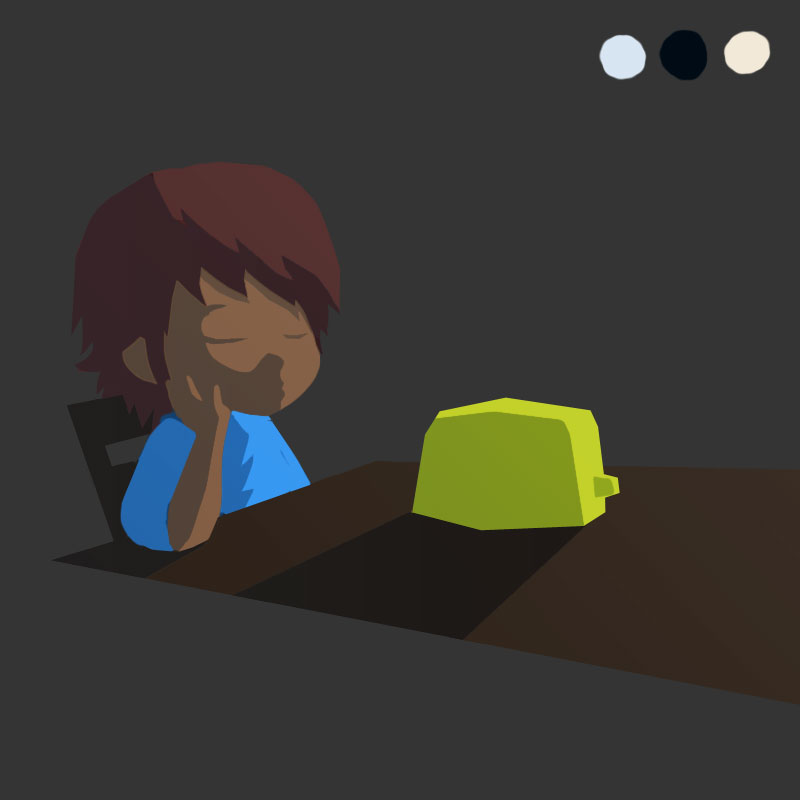 Then spent an hour softening the edges :/ 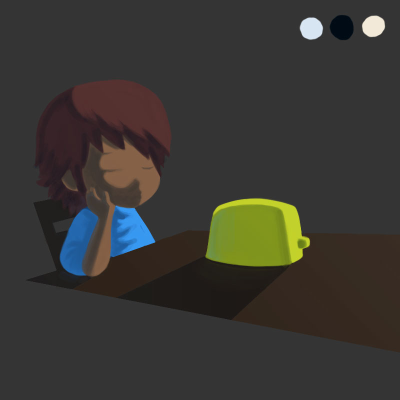 Will try recoloring it.
09-21-2013, 12:47 AM
Hey Prabu thanks for your feedback =) Your avatar is the cuteness ahhhh and so are your sketches! I need more of them ;v;
AND WHAT DO I SEE THERE, LAST UPDATE SO LONG AGO? Now this can't possibly be allowed *gets out the whip*
09-21-2013, 01:10 AM
Damn Bro, You bumped up my old thread :D
Thanks for the tough love. I'll start posting artwork soon. :)
09-22-2013, 03:44 PM
Thanks for the comment! Now go forth, and draw more stuff, and post it!
_________________________________________________________________________
The best time to plant a tree was 20 years ago. The second best time is now. -Chinese proverb Sketchbook
10-01-2013, 01:07 PM
More drawings, man! Nice fun stuff going on in here :)
Clean up your lines a bit though, will make your stuff a lot better.
10-01-2013, 02:42 PM
this is fresh stuff, I like your style! keep posting more :)
My crimson dagger sketchbook! : http://crimsondaggers.com/forum/thread-4079.html  http://ladymignon.deviantart.com/ http://missingtool.blogspot.pt/
10-08-2013, 05:07 AM
Nice, cute characters! They contrast nicely with your well-thought out environments and props. That motorcycle made me die.
Don't feel bad with your coloring though! If you're having trouble, try really thinking about the light in 3d space and not just the left side is light and the right side is dark. I'm not going to hotlink these images because that would be rude, but consider these if you have trouble understanding. http://fav.me/d6hk3j3 http://fav.me/d6otc0f See how the shading is on both sides?
10-23-2013, 05:38 PM
Hope this will be helpful: you do have a nice collection o photos on your blog. Try to do color studies out of them. You will learn how to paint realistic color in this way :)
It's a somewhat solitary existence, a bit like a lighthouse keeper throwing a beam out into the darkness, in faith that this action might help someone unseen.
 My Sketchbook (critique welcome) My Sketchbook (critique welcome)
10-26-2013, 02:19 PM
Thanks for the comment! I liked the sketches in your first post, they could be really cool with some thick lines and manga-like screentones, imo.
Cool stuff, looking forward to you posting some recent stuff POST SOME RECENT STUFF
10-27-2013, 08:08 PM
Hey, thanks for the SB comment. Hope to see you posting some new works soon in here!
11-05-2013, 02:01 AM
Hi! thanks for the welcome, i'll try to give you some tips...
1- Try to clean your sketches, you can check out my sketchbook for some reference. 2- If you want to make it look realistic, you should put a smoother transition between light and dark, so it get a better volume. I hope i could help you somehow, good luck!
12-03-2013, 12:41 AM
I love that trike, makes me think of Toriyama :D If you want to improve it, do an overlay with clean pure black lines, it helps a lot!
A tip on lighting:Lighting objects can only be successful if you can draw them from absolutely any angle and have the entire form stored in your head like a 3d file. Once you got that down, lighting is relatively easy and you can place the lightsource wherever you want. In this way, lighting objects is a great test if you really understand the forms. If certain areas appear flat it's not because you need to practice lighting but because you need to get a better picture of the forms in your mind. Hope that helps! Keep it going and post more stuff!
02-15-2014, 02:45 AM
Thanks for the help & support guys :3 <3
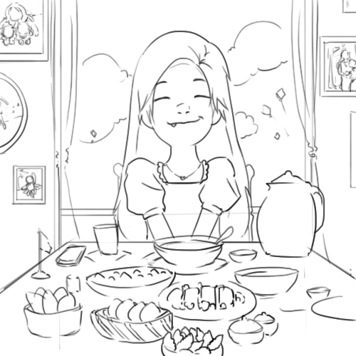 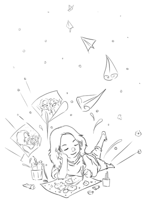 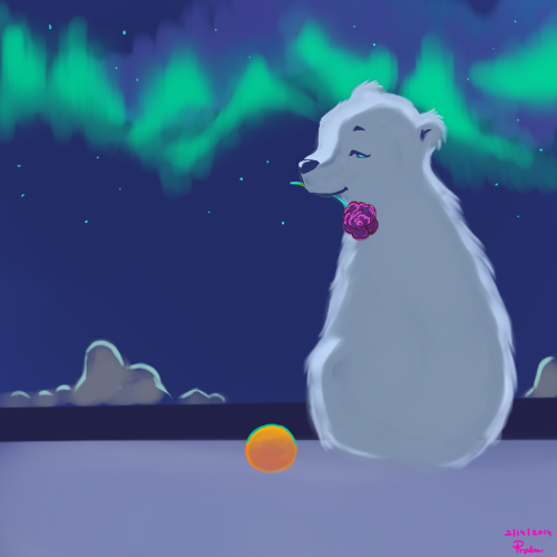 You guys have been very kind. :)
02-15-2014, 05:43 AM
Lovely to know you've still been working hard, Prabu!
How do I know? - You've taken the feedback given to you and worked on weaknesses; your lines especially look be-a-utiful! My only crit: y u no post moar?!! Haha either way, keep grinding! :D
sketchbook | pg 52
"Not a single thing in this world isn't in the process of becoming something else." I'll be back - it's an odyssey, after all
02-15-2014, 06:20 AM
I'm with Smrrfette, I wanna see more goodies!
Seriously though, Your stuff is just rich with appeal. I can see you laying down some amazing colors to all of these. Keep it up :3.
02-19-2014, 11:55 PM
smrrfette : Thanks :3... Its fear of posting mistakes :P
Einver : Thank you. Not so good with colors but I will start coloring more :] 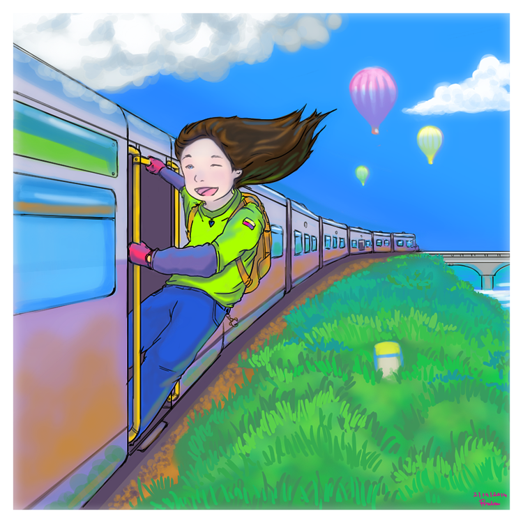 Made a Chai Recipe for my friend...well, there you go :) 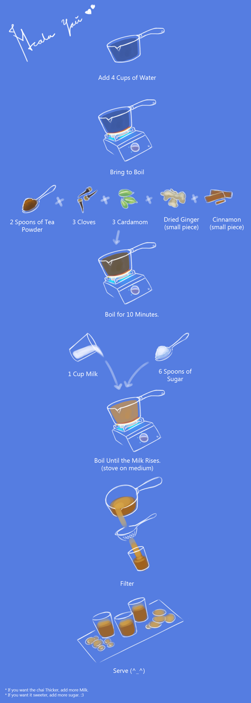
02-20-2014, 01:19 AM
lovely train piece! you have some really nice colors.
some suggestions: i see you're working in some atmospheric perspective with the grass, which is awesome. apply that to the train as well! try lightening your lineart as you go further back in space. also, generally sky gets lighter when it comes closer to the horizon, so keep that in mind esp. when drawing sky on a sunny day. as for the girl, i think she looks a little too big compared with the scale of the train? and i'd suggest looking at references of hair blowing in the wind. try breaking up the hair into smaller pieces instead of one solid mass, it'll flow better. but ahh, i love how lighthearted your art is. it makes me happy to look at it :3
sketchbook ~~~ tumblr
05-04-2014, 04:37 AM
@elm: I'm looking into things related to perspective :)
Hmm, I haven't drawn much lately but did spend a lot of time looking at nature. I have taken some notes. Just need to make sense of it all. Slow & Steady :) [attachment=49368]
07-04-2015, 11:15 AM
Hey Prabu, update this thing!
It will help to look at master paintings to understand light. Try to break down color into temperature, look at a color wheel. Everything touched by the sunlight ends up being warm, so shift the local color of the grass (green) towards yellow. If you shift the other way you are making the color colder. Many planes that are facing down will catch the bounce light hitting the ground from the sun making it warm as well. Everything not touched by sunlight facing towards the sky is cool (blue-green) ![[Image: 1883_2.jpg]](http://design-kmv.ru/wp-content/gallery/shishkin/1883_2.jpg) The painting is by Ivan Shishkin by the way. |
|
« Next Oldest | Next Newest »
|