Posts: 1,342
Threads: 17
Joined: Jul 2013
Reputation:
45
EDIT 2.
Finished.

EDIT 1.
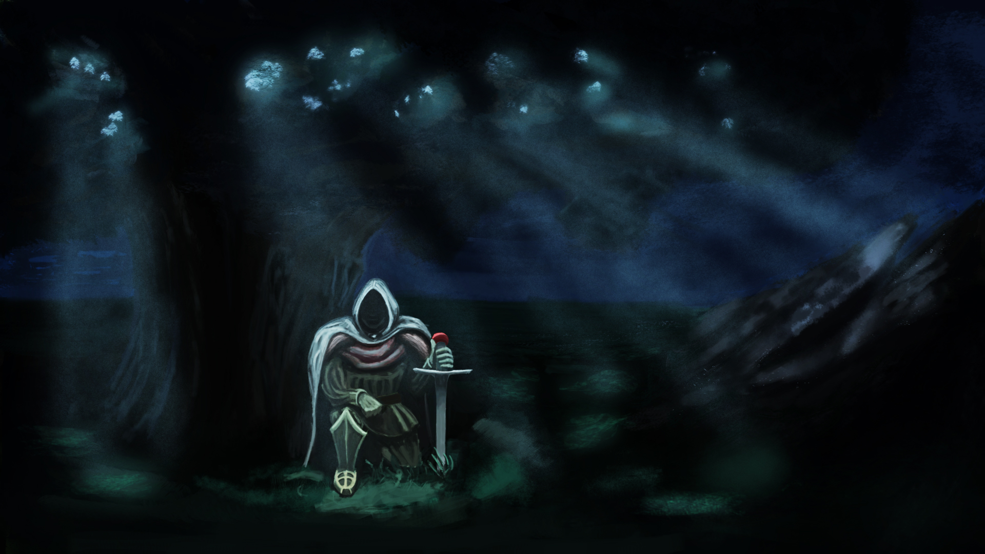
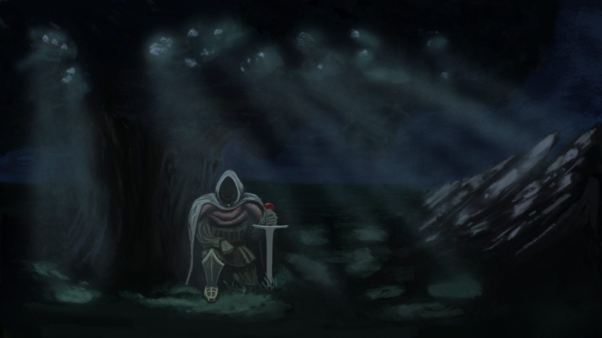
Update on the piece.
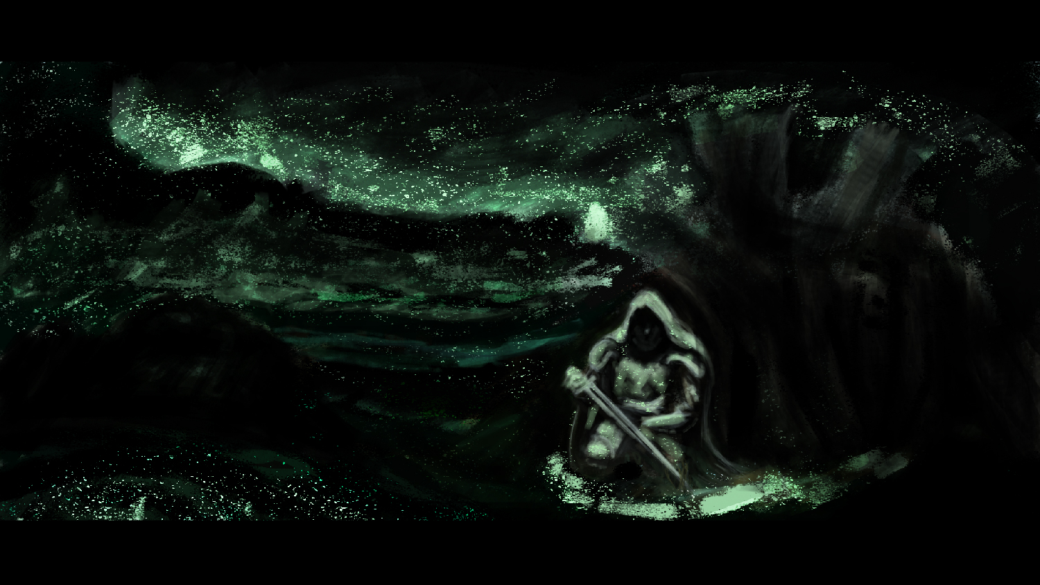
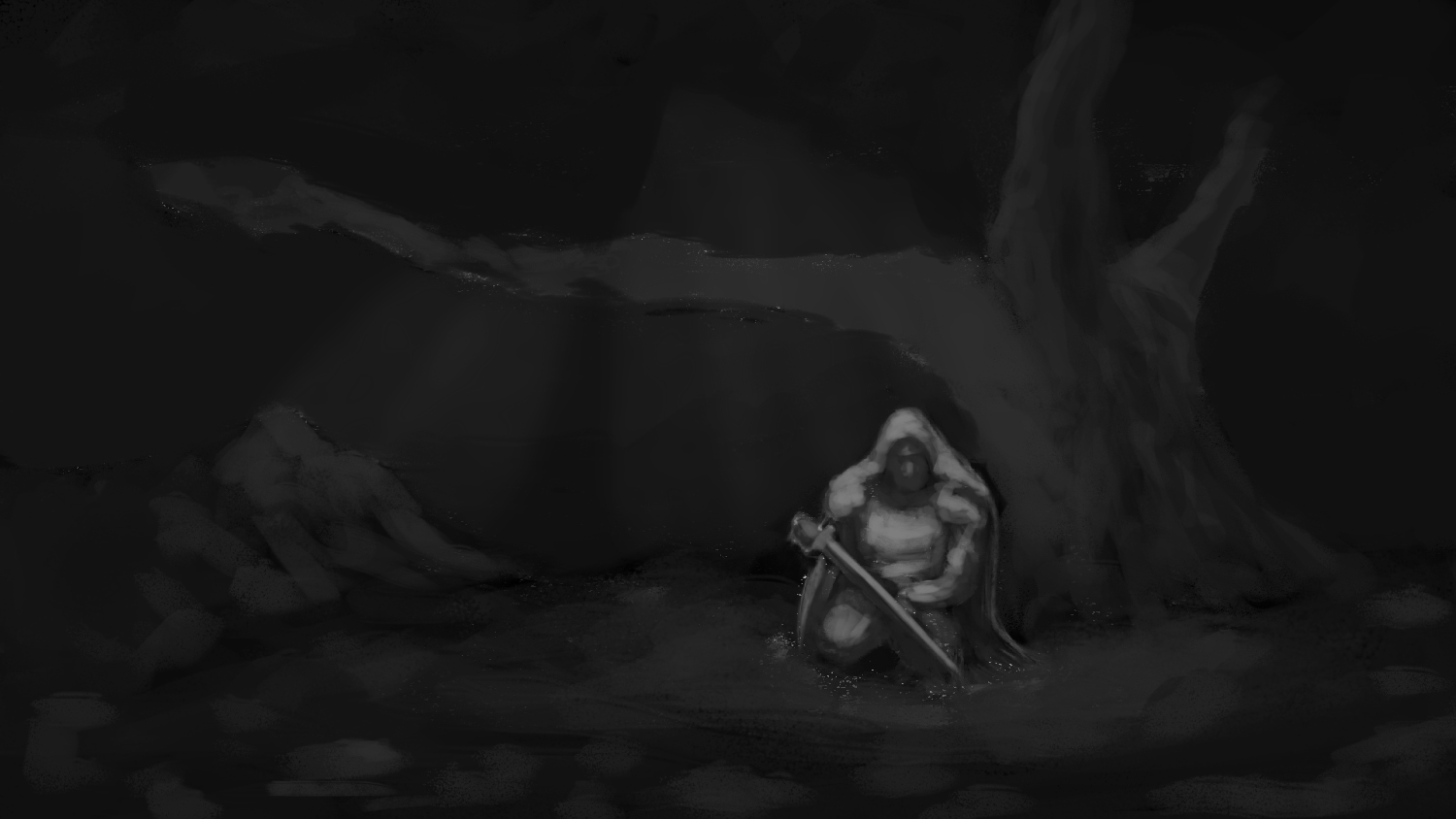
Worked on this the whole day, got around 73 layers, because got lazy. I will continue working on it tomorrow, right now I still need to render the sword and his left arm. Also critique on my current progress needed and appreciated. Right now my thumbnail image says I got to push values more other than that the anatomy is wrong, but I already messed with it around 2 hours so I'll let that one slip for this piece.

------------------------------------------------------------
Old content below.
-----------------------------------------------------------
Hello daggers.
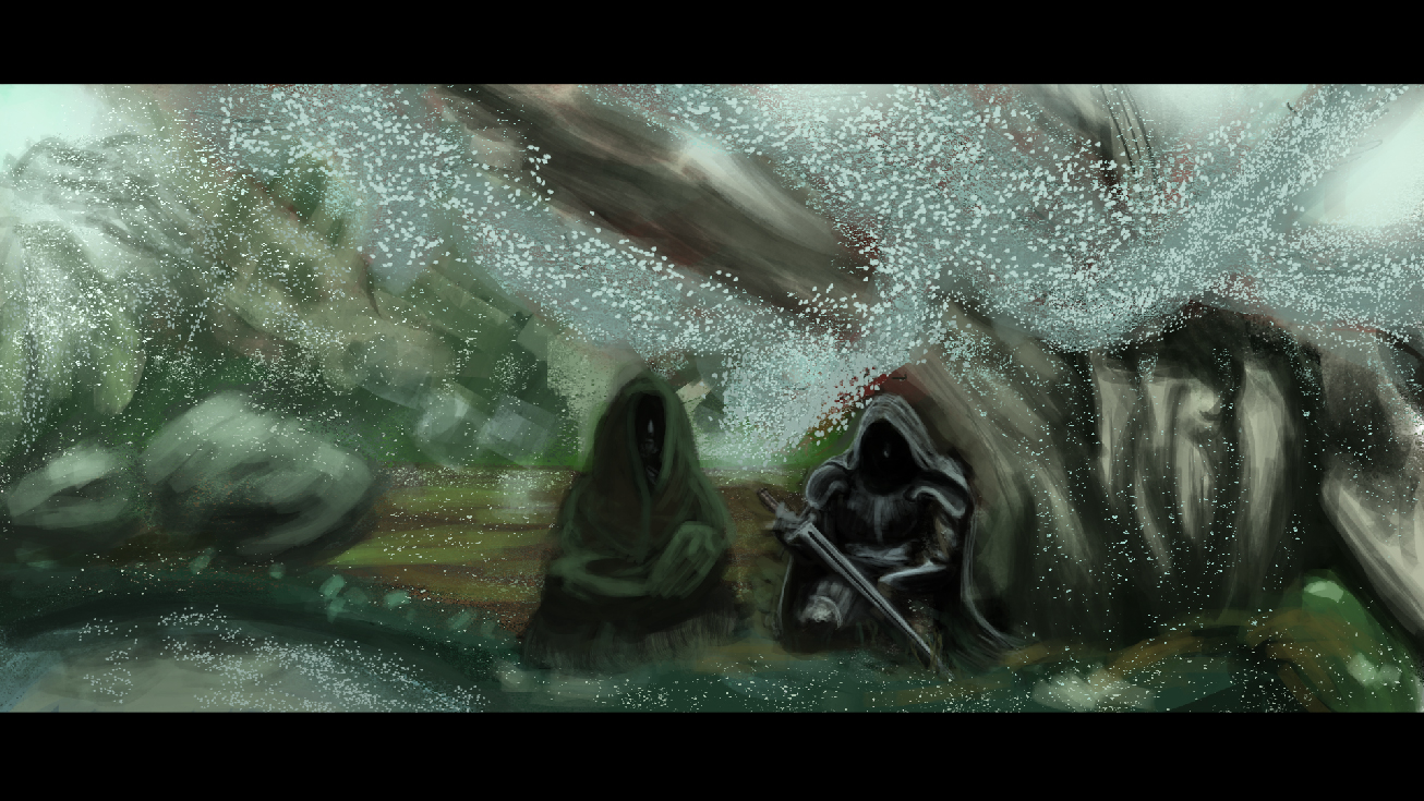
I would like you to help me with this piece, Its about this antihero warrior guy, that is resting in a magical forest, the 2nd character is supposed to be a monk of some sorts, although im thinking of scrapping him from the picture. Any advice and critique is appreciated.
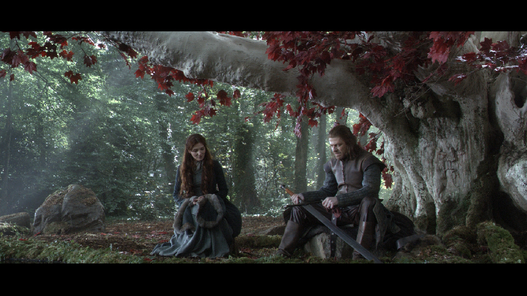
The piece was heavily influenced by this ref.

Havent rendered it yet because it will be easier to make changes that way.

Posts: 345
Threads: 4
Joined: Jun 2013
Reputation:
2
Maybe You could show a bit more of the entire environment, and give more depth (aerial perspective?) to the pic.. also I suggest not putting in so many additional elements (the magic stuff flying around) so early on, You'll only have to cover it..
Posts: 1,970
Threads: 22
Joined: Apr 2012
Reputation:
243
I'd recommend doing a value sketch first to nail the fundamentals of the image before committing to colour and effects. Don't jump all in right away; build up your comp, values and depth, and perspective first. These are the things that will make the painting successful. While you're at it do a few different comp ideas to pick the best ones, unless your goal is to stick to the reference pretty closely, in which case you may as well do that and setup everything more as it is in the picture.
Posts: 1,342
Threads: 17
Joined: Jul 2013
Reputation:
45
Appreciate it Kaffer, will do :)
Thanks monkeybread, I kinda jumped right in, because I was using the reference picture as my guide.
Posts: 282
Threads: 2
Joined: Aug 2013
Reputation:
3
Just a thought, shouldn't he be taller (higher up) than her...? I know it's your re-creative interpretation... just thoughts on my part. But I would like to see how this turns out :)
mii
Posts: 1,342
Threads: 17
Joined: Jul 2013
Reputation:
45
Thanks for feedback missimoinsane. At first I tried to make a female character wearing similar armor, but the posture was flawed, then I went with the monk, who is kind of an ancient forest being or something.
This time I went in a different direction, it looks way different now, but Its still not there yet. Might have to rework it from the start because going over my work making major changes, while still trying to leave in the semi rendered parts is though.
Changed it to nightime, its a total mess, but I see the potential at some parts, not sure how to bring it out right now, so back to practising art in general. Didnt use a ref for this one.

Posts: 282
Threads: 2
Joined: Aug 2013
Reputation:
3
I'm loving how this is coming on :)
I think it actually looks better with one figure. "Lonely knight resting under a tree" - tells a story!! While I do like your reference image, I think one character is best. I too struggle with getting two characters to read well in the same one piece... Your choice of course. But I do like the do over and look forward to seeing your next steps with this... :) Hope it helped. Of course you can put her back in, as she was was fine... she just seemed taller which typically guys are taller than women so it looked a little off (to me). Good luck :)
Posts: 1,342
Threads: 17
Joined: Jul 2013
Reputation:
45
Posts: 282
Threads: 2
Joined: Aug 2013
Reputation:
3
Posts: 112
Threads: 5
Joined: Mar 2013
Reputation:
6
Even when you draw characters wearing a cloak or robe or another piece of clothing that obscures their silhouette, you have to take care with the anatomy. Construct it from the basics. Here you have very good references. Draw the characters naked or as skeletons, no need for details, just put all the joints and major bones in the right place. Only when you know that the proportions are right and make sense should you add the clothes on top. As it is now, it's not possible to know if the character in green is a lady or E.T. waiting for his bike ride.
Posts: 1,342
Threads: 17
Joined: Jul 2013
Reputation:
45
Thank you, Chantal. Yeah the character in green looked wonky to me aswell, so I earsed him...from existance!
Anyway read your comment before and used the basic structure method in a different piece I did. Posted it on sketchbook. Thanks again.
Posts: 263
Threads: 28
Joined: Sep 2012
Reputation:
13
http://livestre.am/4A7wl
I streamed a quick paintover/break down about the values for you.

Posts: 282
Threads: 2
Joined: Aug 2013
Reputation:
3
Mike. I like what you did here, thank you for sharing the livestream too, it was most helpful - I know this isn't my work. Heck it's not even my forum. But just couldn't resist watching :)
Posts: 1,342
Threads: 17
Joined: Jul 2013
Reputation:
45
Thank you so much Mike. That really helped with everything.
The crazy glowy parts in the image were actually leaves, since they were magical, they emitted a greenish glow, but that is too much for me to work at on my current skill level.
I will use the information and fix in values to finish the piece correctly. Thanks again.
Posts: 1,342
Threads: 17
Joined: Jul 2013
Reputation:
45
Posts: 263
Threads: 28
Joined: Sep 2012
Reputation:
13
Hey man looks great! I'm glad I could help!
|
