01-03-2014, 06:13 PM
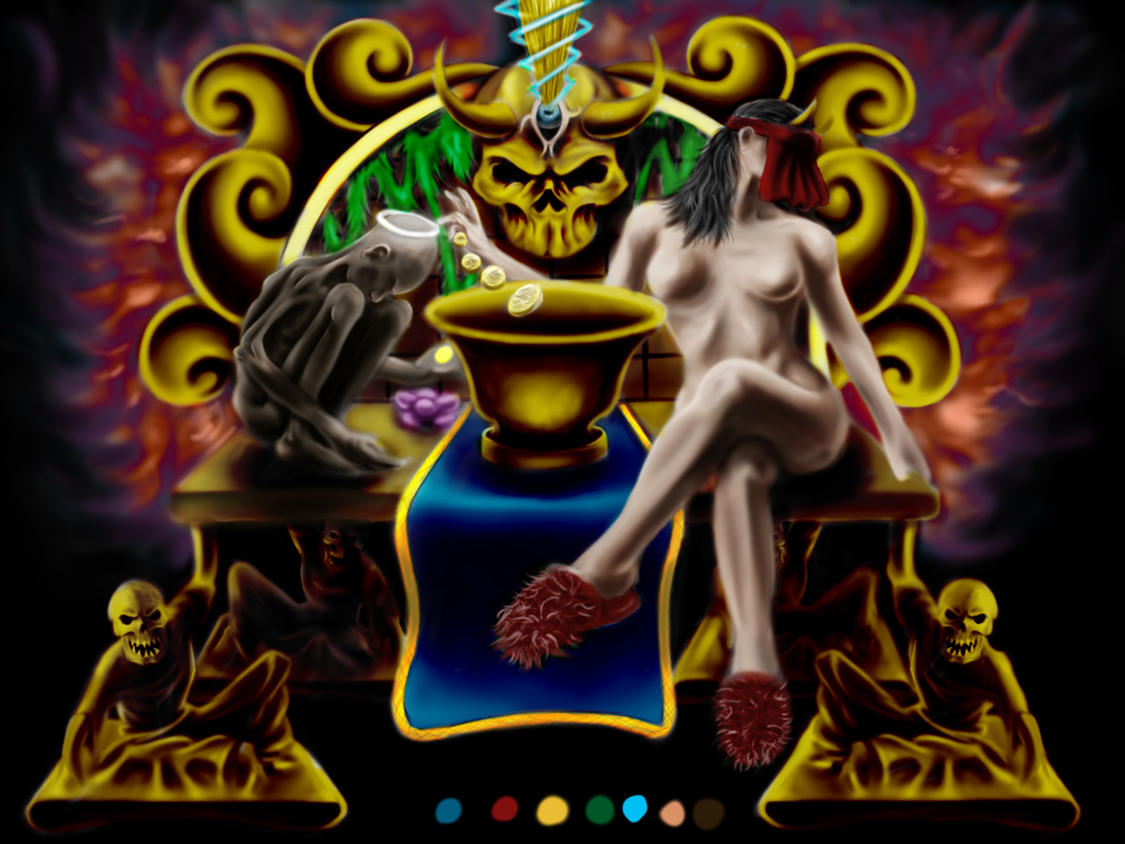
i still have to polish the drawing some more but do the colors look good? i have everything on separate layers so changing something is not a problem. thanks for check out the post.

|
do my colors look good? updated.
|
|
01-03-2014, 06:13 PM
i still have to polish the drawing some more but do the colors look good? i have everything on separate layers so changing something is not a problem. thanks for check out the post.

01-04-2014, 09:04 AM
Your colors are very saturated. That is causing the eye to not have a place to settle. The green behind the alter is drawing attention from the alter, but that maybe a good thing if you want the skull in the back to be a focus. I feel like the naked woman is your focus, so right now she is competing with the other elements. Switch to greyscale and fix up the values, then add in your color based on your focus.
Right now you have no real mid tones, it's a very dark image, and by dark I mean literally black. You can use "selective color" in photoshop to take the blacks up a few notches into a lighter value. The slippers seem really out of place too, do some feet studies and paint the feet in, they really don't match with your other elements. OR you can add more silly elements like the slippers and make it more comic, maybe curlers in her hair? My general read of the image is that a woman is dropping coins into a basin that are gradually getting bigger as they fall next to some skinny dude on a golden devil alter. I'm not sure if that is your intention… Good luck! I can stream a paint over on the week if you'd like me to really show you what I'm talking about.
Livestream Crits/Paintovers: www.twitch.tv/mike086
Loomis Study videos: http://www.youtube.com/user/mike086 My Facebook page: MCIII
01-04-2014, 01:29 PM
(01-04-2014, 09:04 AM)Mike086 Wrote: Your colors are very saturated. That is causing the eye to not have a place to settle. The green behind the alter is drawing attention from the alter, but that maybe a good thing if you want the skull in the back to be a focus. I feel like the naked woman is your focus, so right now she is competing with the other elements. Switch to greyscale and fix up the values, then add in your color based on your focus. thanks for the feedback!! it is my intention to have the colors very saturated because this is for a tattoo portfolio that i am doing so i can get an apprenticeship, and saturation is key for tattoo designs. with the focus i do want the skull to be more of the focal point but i am not really trying to capture a whole lot of depth i just want everything to POP really bright like graffiti art.... the slipper ha yea i am horrible at feet and do need to study them more the slippers are a way of me laughing at my inability. they look alot better than any foot i can draw. maybe i will put some lil skull slippers on her? i will upload grey scale image that i applied the colors to maybe then you can show me my shortcomings with the values. thank you for your time 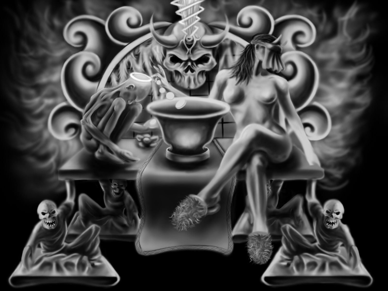
01-04-2014, 06:04 PM
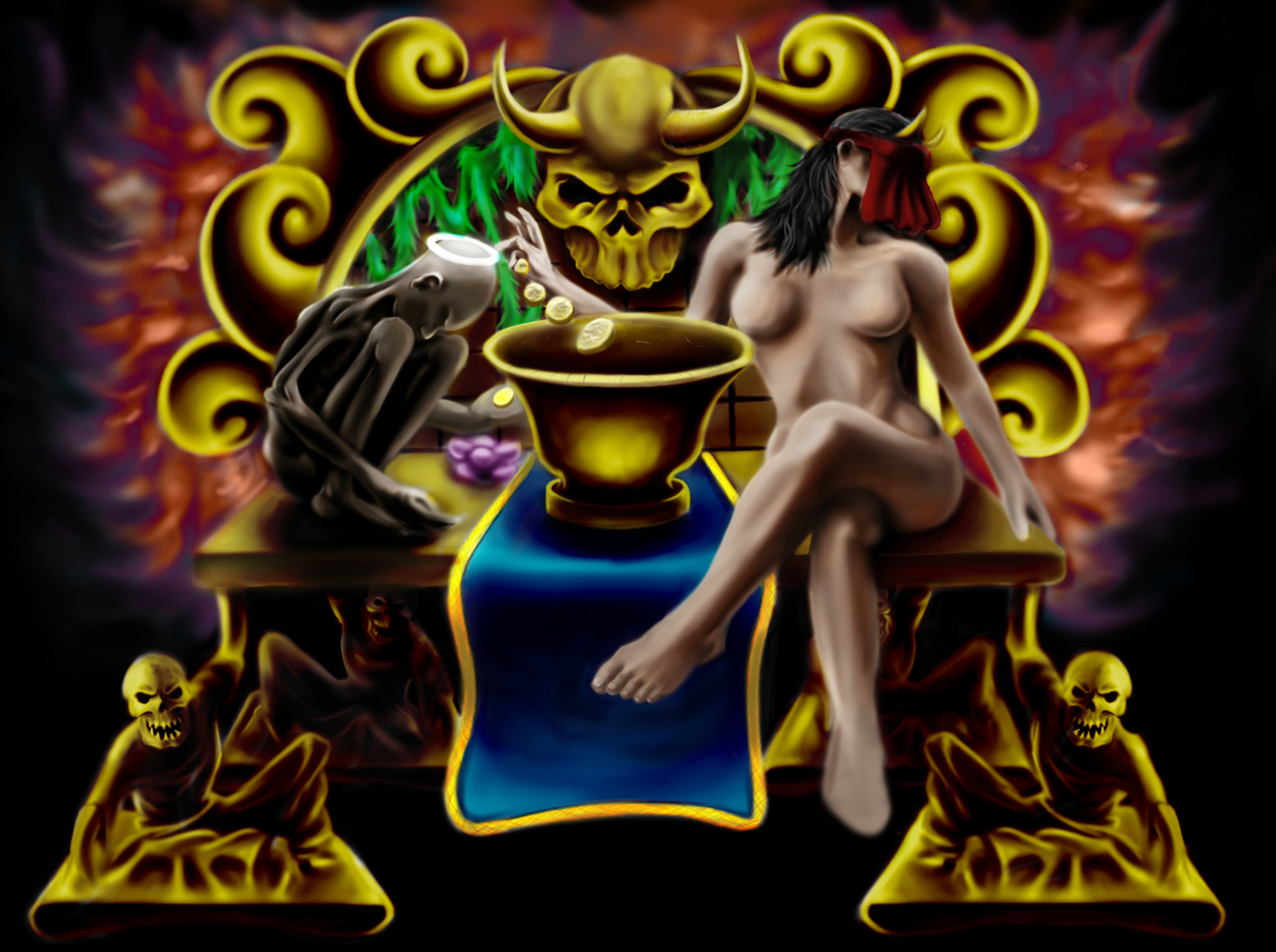
changed it a bit. does it look better?
01-04-2014, 07:16 PM
Not knowing anything about tattoo art, my two cents is that tattoo design isn't about saturation foremost.
In fact I would suggest you would be better served doing tight line drawings instead for your folio. Tattooing is mostly about good design and neat line drawing isn't it? It's about design. Don't bother doing 3D shading and colours digitally when your 2D design requires work. My recommendation is do your designs as black and white line drawings first. I think this is what gets stenciled on in the first instance anyway before any colouring right? You can always add colour afterwards.
01-05-2014, 01:52 AM
(01-04-2014, 07:16 PM)monkeybread Wrote: Not knowing anything about tattoo art, my two cents is that tattoo design isn't about saturation foremost. i have like 30 other drawings in the portfolio that are typical tattoo work this is the cover art. i have already been tattooing and selling tattoo designs for seven years know i am also half covered in art. heres a link this stuff is poppin of the page and is very bright heavy saturation http://dollyeyes.deviantart.com/art/New-...-256471861
01-05-2014, 03:46 AM
Her left hand just kinda merges with her forearm. You should shave off a little on the inside of her wrist and also slim down her thumb a bit. I would draw her face as well. The thing covering her face looks odd. If you're just trying to avoid drawing her face then maybe cover it with some kind of mask. It would be more interesting than a cloth. Faces are what people look at first in any piece so you want the first focal point to be designed well.
And her hair looks like it needs to be brushed. I think you're using too many lines to describe the texture of her hair. Try to break the hair down into 3 or 4 larger shapes. I would definitely use a photo reference of a woman with the hair you're going for.
01-05-2014, 04:08 AM
(01-05-2014, 03:46 AM)Hypnagogic_Haze Wrote: Her left hand just kinda merges with her forearm. You should shave off a little on the inside of her wrist and also slim down her thumb a bit. I would draw her face as well. The thing covering her face looks odd. If you're just trying to avoid drawing her face then maybe cover it with some kind of mask. It would be more interesting than a cloth. Faces are what people look at first in any piece so you want the first focal point to be designed well. thanks for the advice. i was not finished with the arm and hand yet, but you are right. i was not avoiding drawing the face i do want it covered with something but will remove the cloth if its not workin. your totally right with the hair to it literally is a bunch of lines lol.
01-06-2014, 01:17 AM
I've no idea how tattoo art works, but if you're looking for popping, you could even add white highlights to, especially, the metallic parts of the image. Or even the lady herself, although her skin might look oiled. I'm saying this because you have a lot of pure black, so the opposite of that is pure white highlight, which could work in this case, but in controlled small amount, and strategically placed to make things pop out. Give it a try and see if you like it.
Another thing is the lady's boobs are too far apart. They also stick up too stiffly, and too spherically (especially the left one). Boobs behave kind of like, ladies of this forum please don't kill me, sacks, when they're natural. They do... drift apart in the end, but they're still close on top... if that makes sense. So, reference time! The newest issue of ImagineFX, if you have access to it, has an article on tattoo art, which you might find interesting to look at.
01-07-2014, 07:02 AM
Hey,
I did a bit of a paint over for you. I think some of the things I have changed have been mentioned above saturation values etc. Saturation would probably be the biggest one for me. Its hard to find a focal point on your pic due to all the saturation and lack of value change. I'll list my changes below. 1. Colour scheme. I made most of the centre of the image warm and changed the back to a cool colour. This should help draw the eye to the action at the middle. I made the table cloth red for the same reason. The human eye is drawn to that colour. 2. Mask removed and anatomy changes for the lady. 3. Added detail to the pot thing on the table. the contrast of detail with the surroundings should again draw the eye into the middle of the pic. I think thats it. I hope that helps. ![[Image: tatt.jpg]](http://i267.photobucket.com/albums/ii284/darkleap/tatt.jpg)
01-07-2014, 07:58 AM
you kept the brightness that i wanted in the drawing. i am just starting to learn how colors work and where they should be placed in my drawings and this is very informative. i normally just wing it and hope the colors pans out. thank you adam for your time
01-07-2014, 10:10 PM
Your very welcome. I'm glad I could help.
01-10-2014, 03:29 AM
i just wanted to say thanks again to all for the advice on this drawing i made the changes requested to the best of my abilities. i still have a more to do but i just wanted to show my progress please more crits are welcome. thanks again to all for the help.
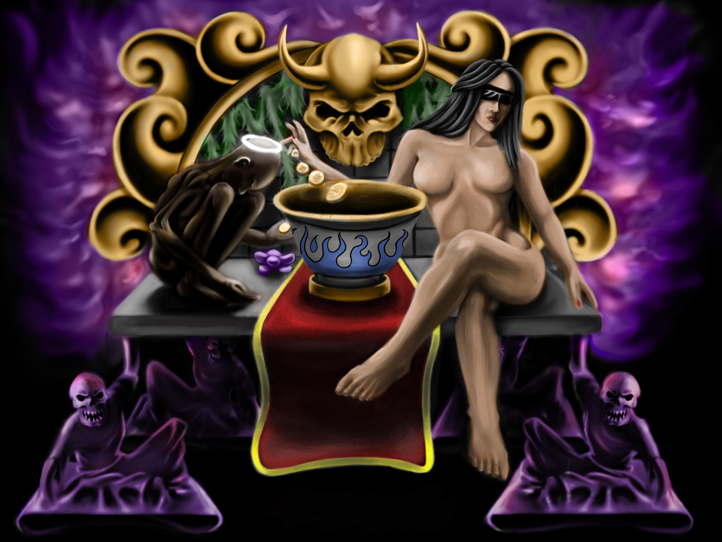 just realized the boob thing i will fix it now
01-12-2014, 03:21 AM
Hey I streamed a paintover for you, I talk for a while about someone else's piece beforehand so you'll have to skip ahead.
Video: http://livestre.am/4JPmg 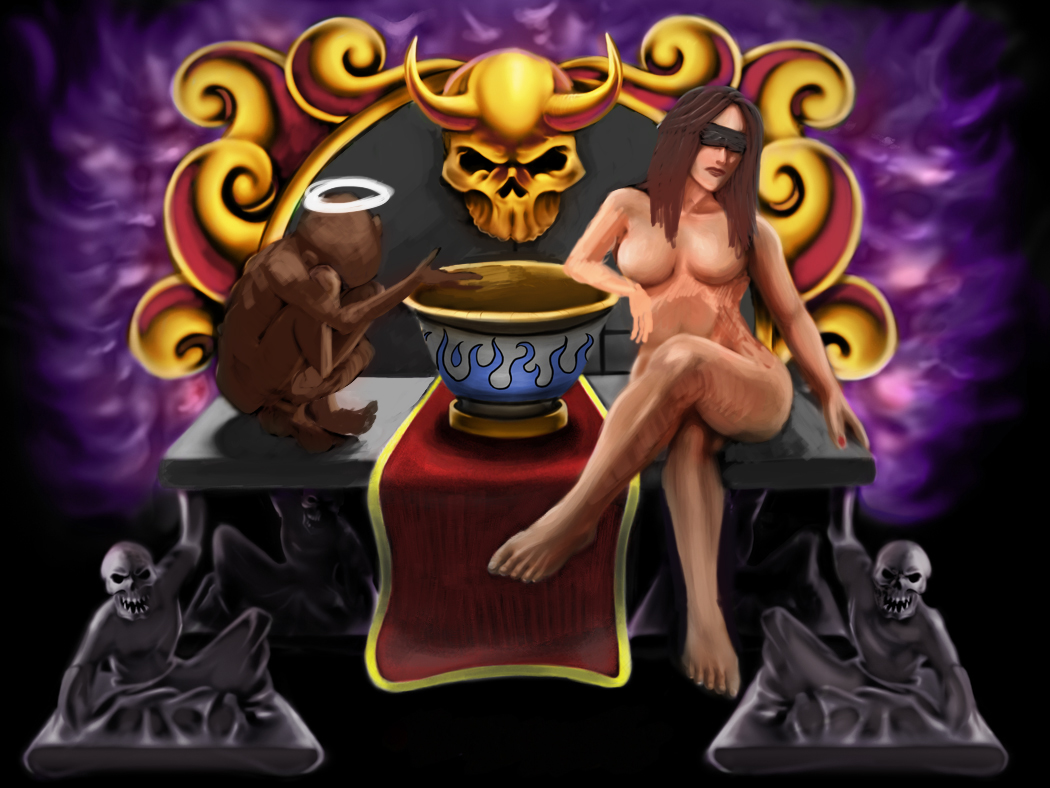
Livestream Crits/Paintovers: www.twitch.tv/mike086
Loomis Study videos: http://www.youtube.com/user/mike086 My Facebook page: MCIII |
|
« Next Oldest | Next Newest »
|