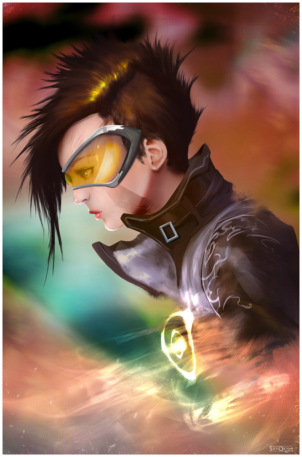
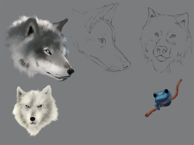
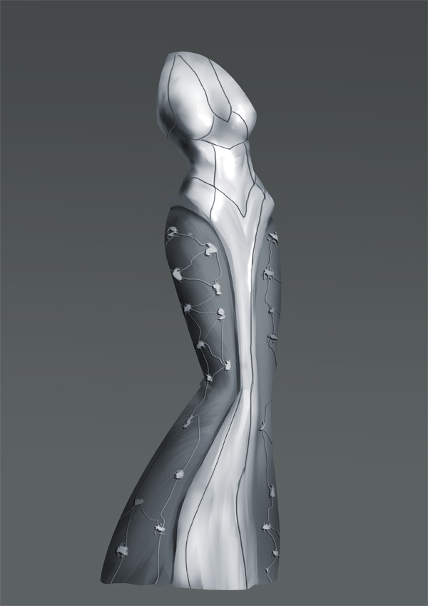
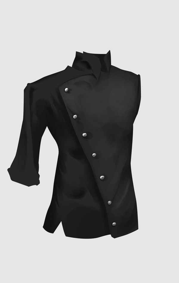
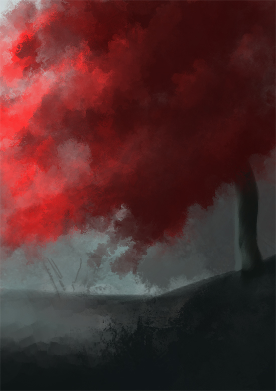
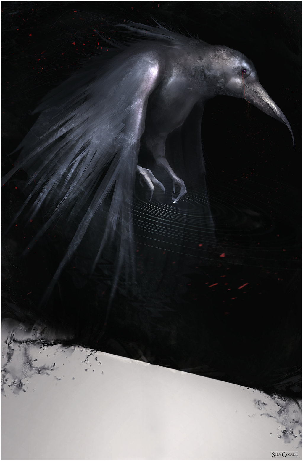
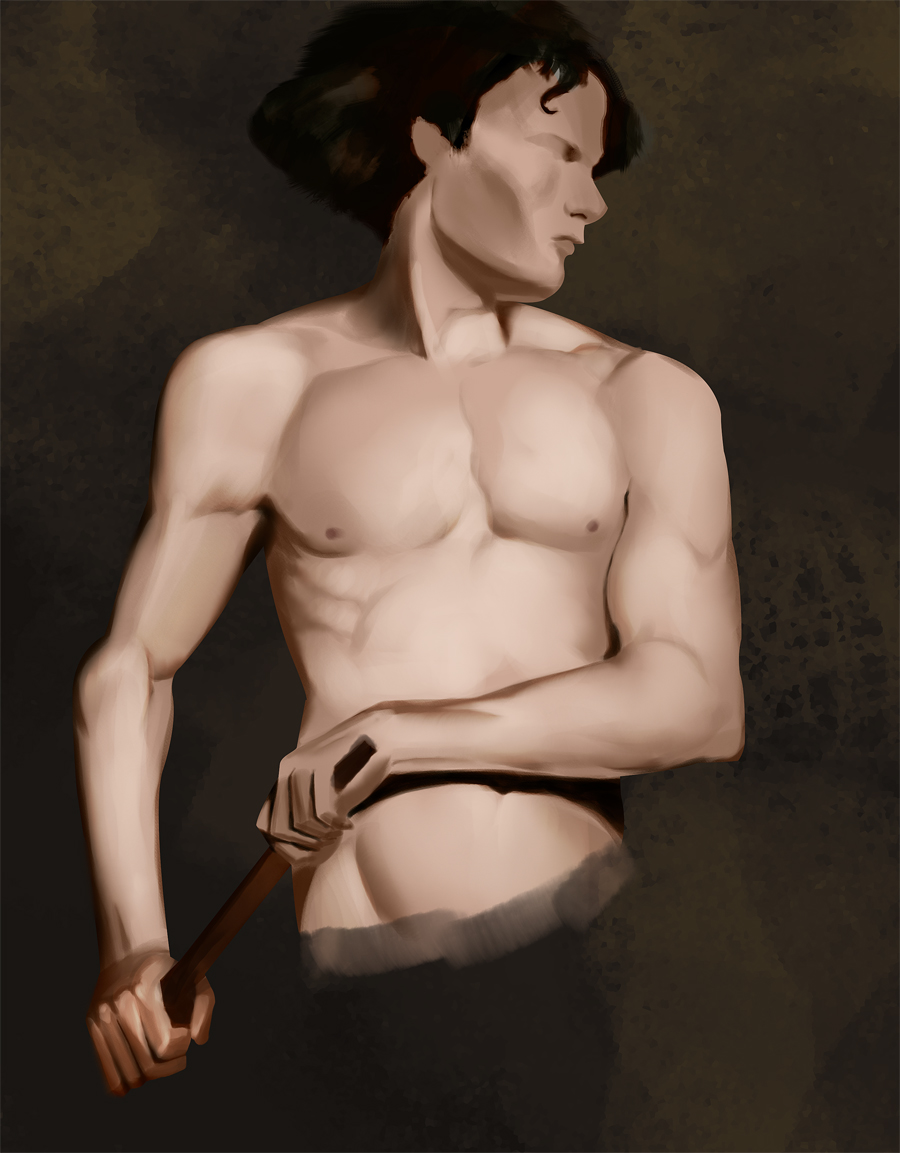
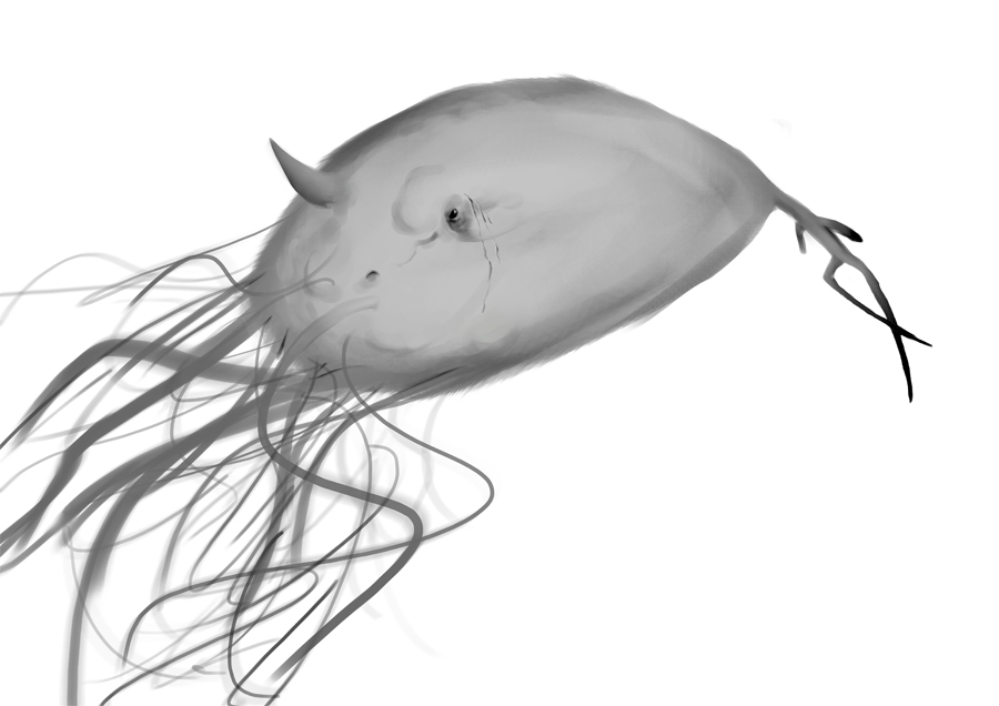
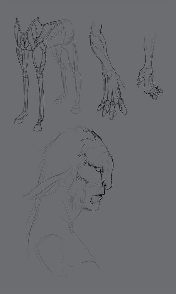
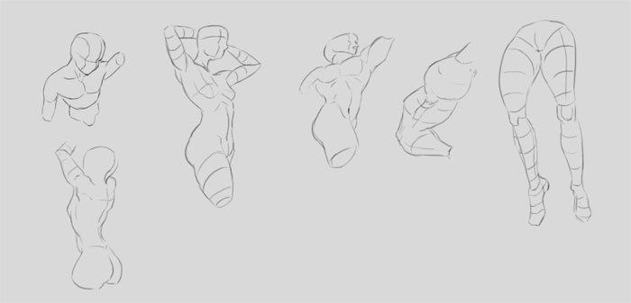
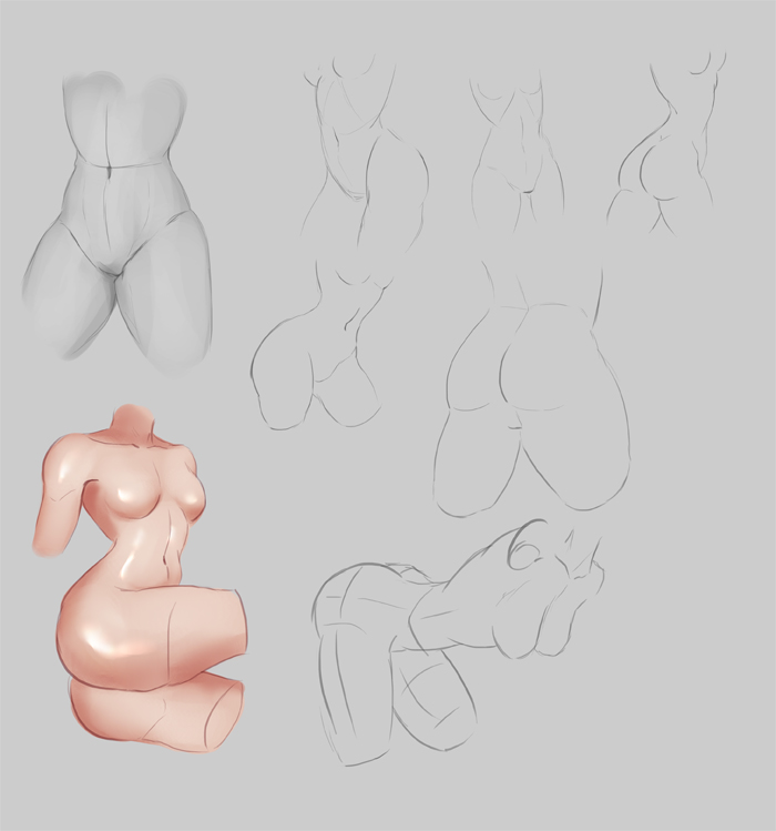
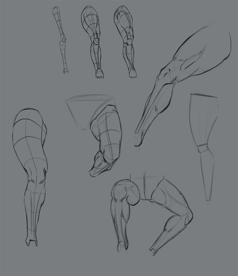
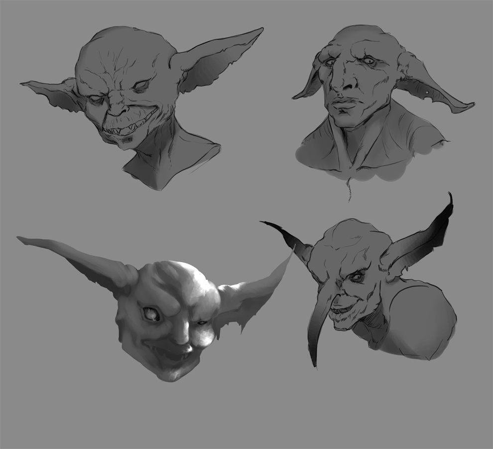
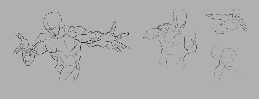
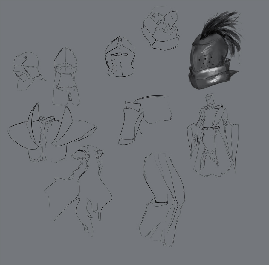
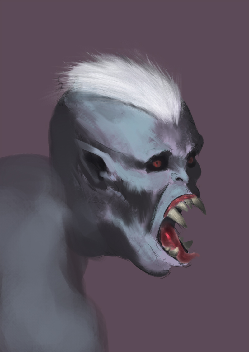
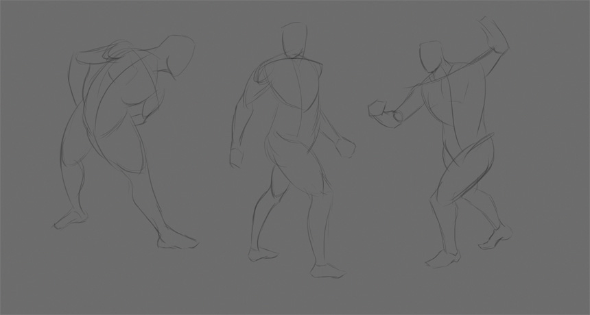
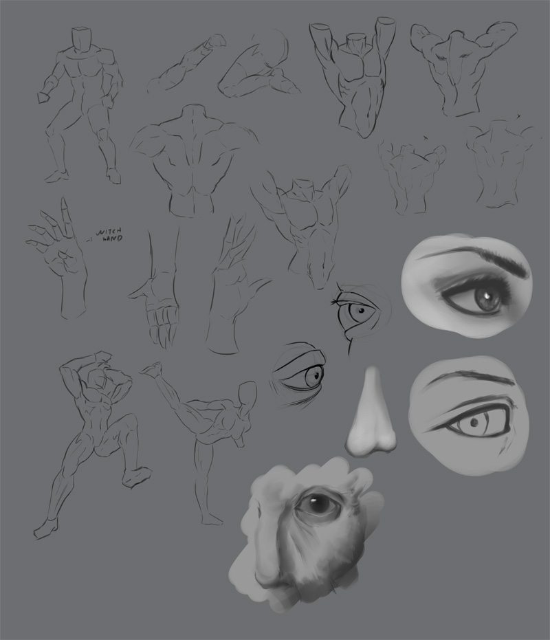
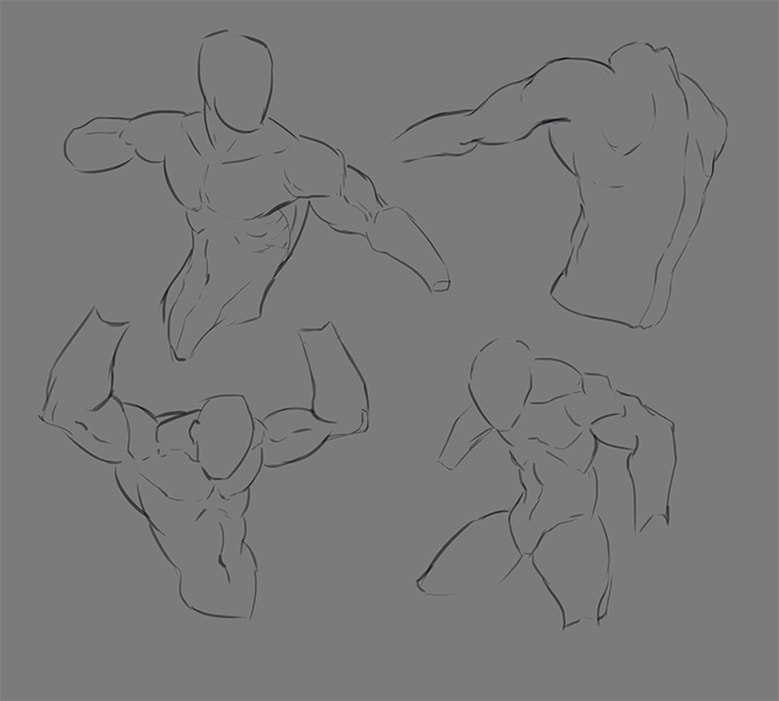
Cool stuff, man. A lot of the design oriented stuff reminds me of Anthony Jone's stuff, maybe you've been checking our his videos?
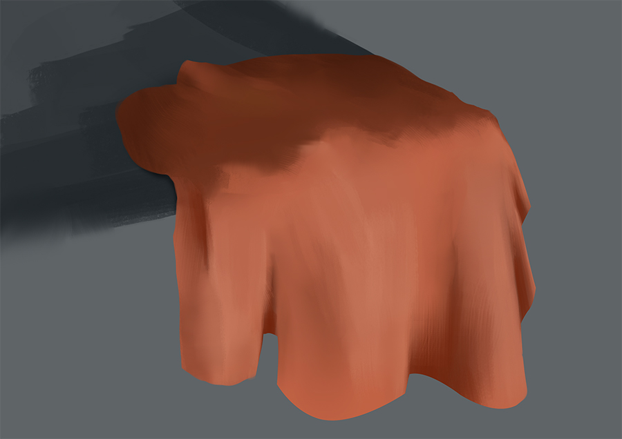
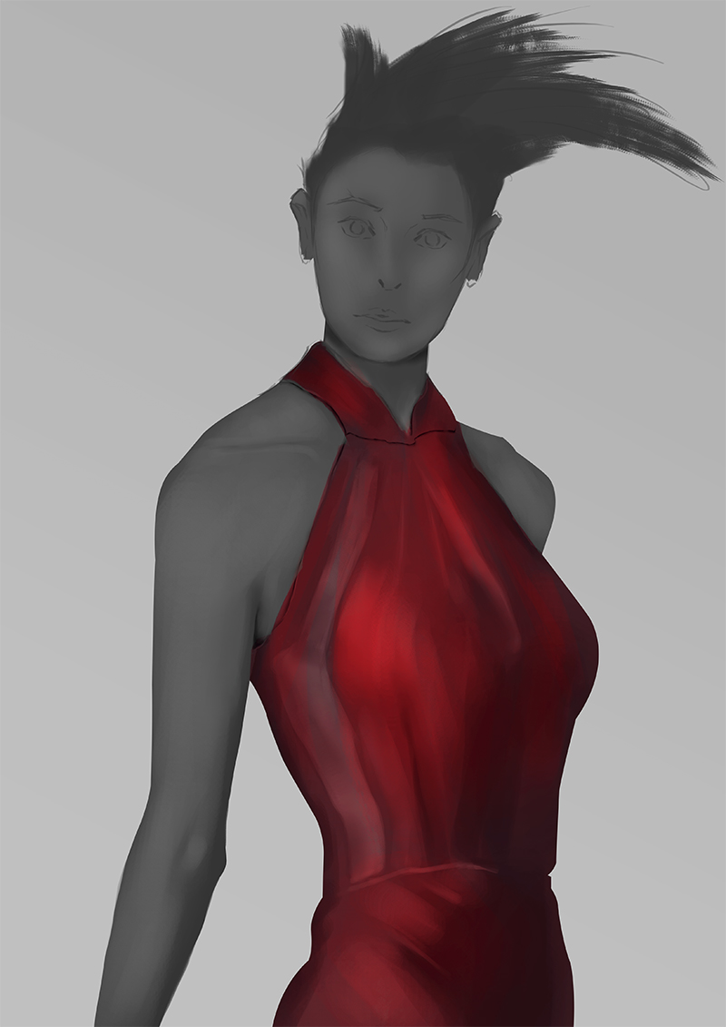
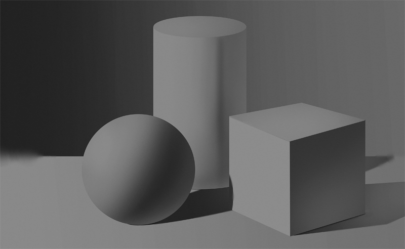
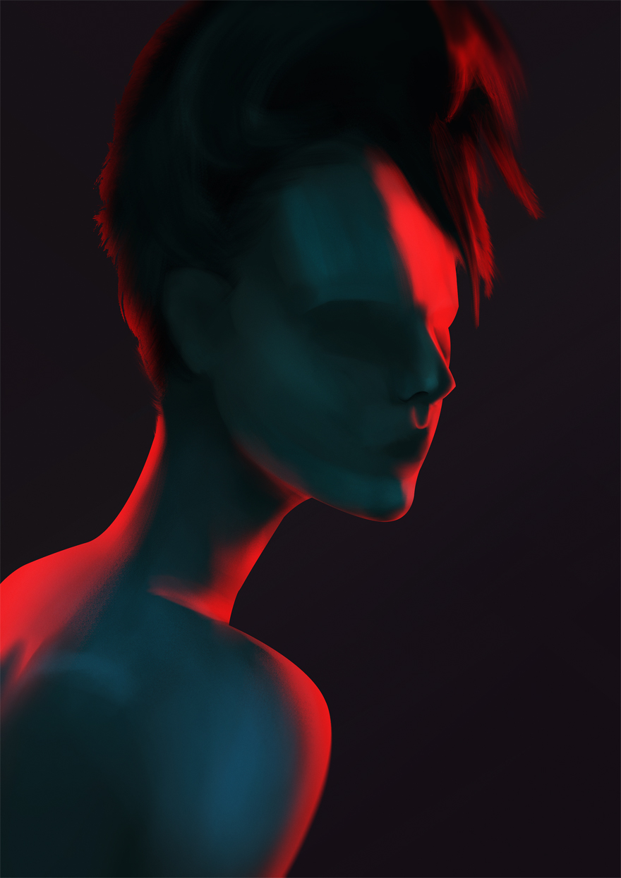
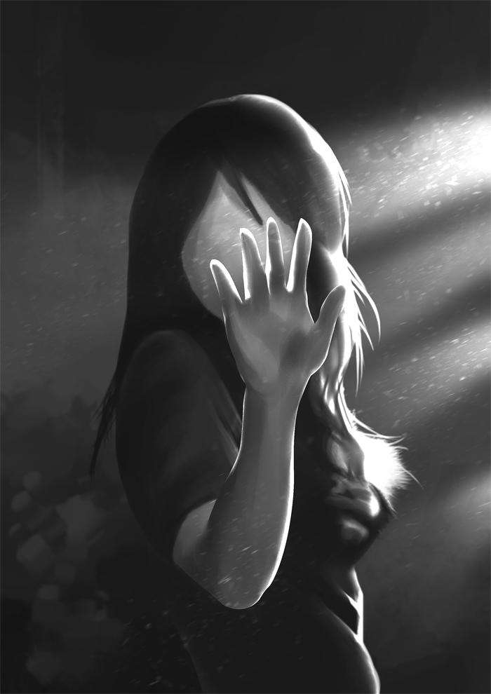
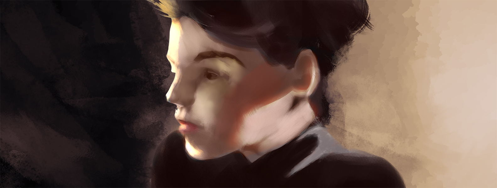
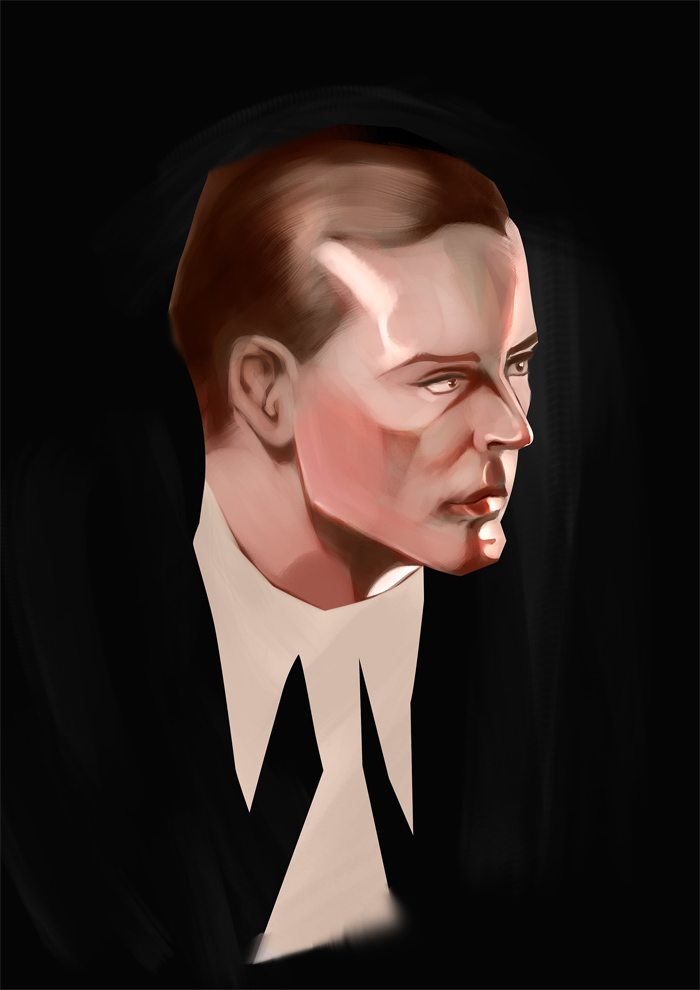
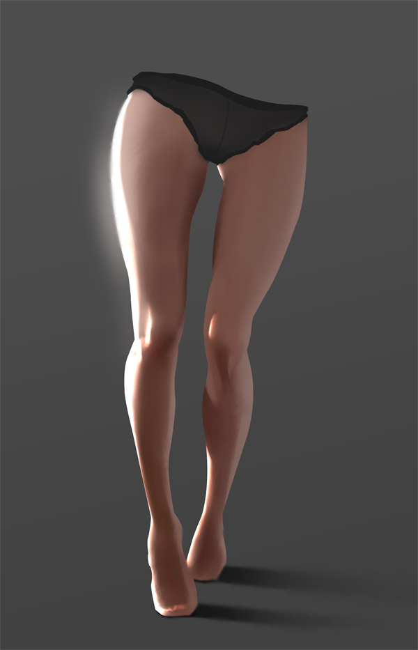
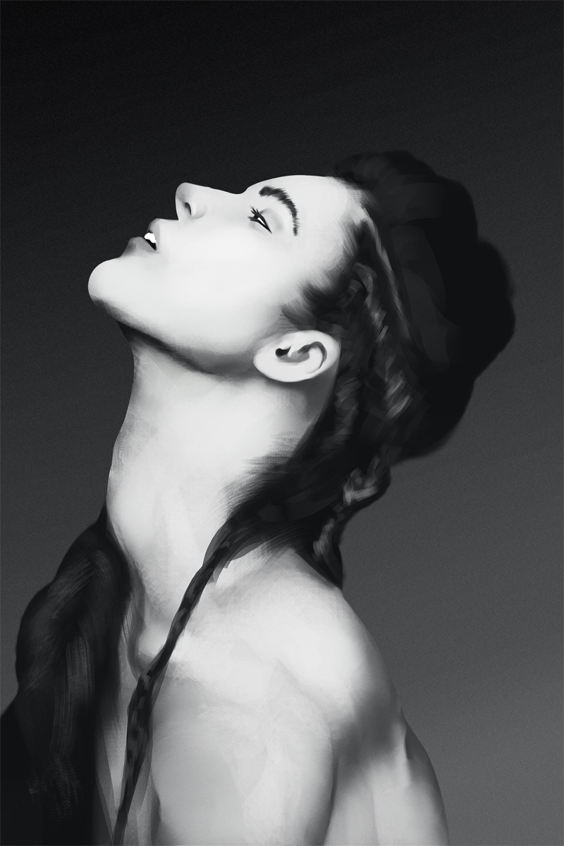
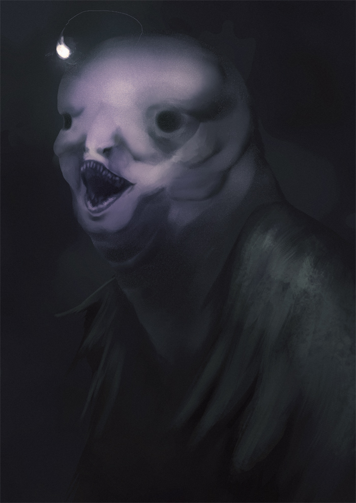
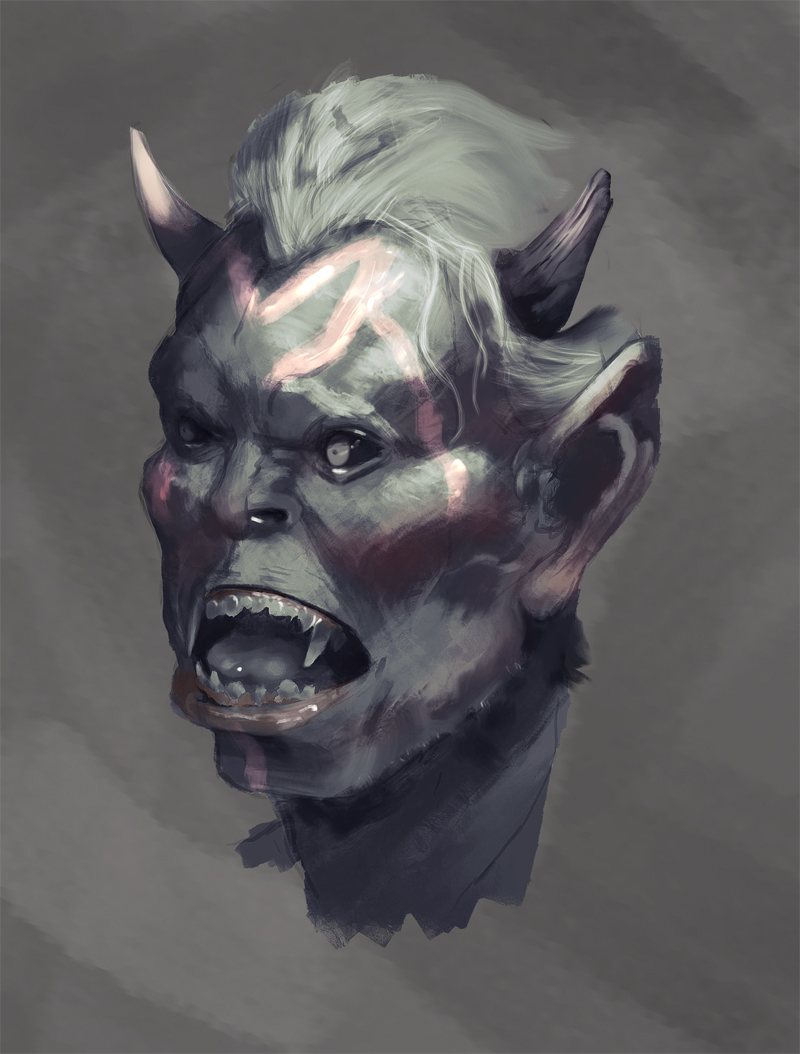
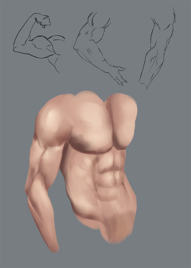
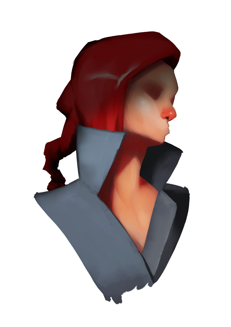
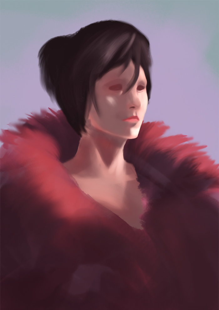
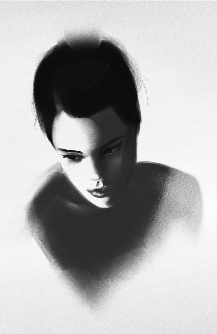
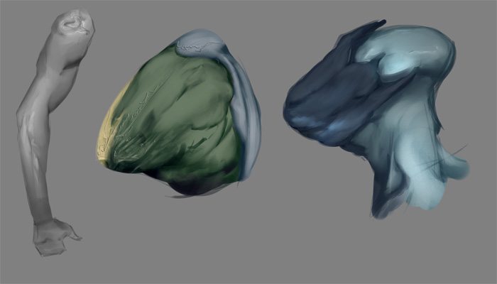
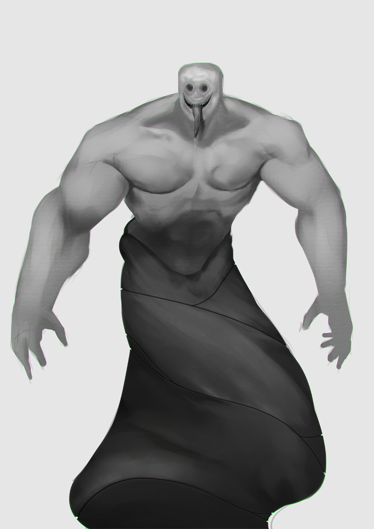
I figured I'd do a paintover to illustrate a point.
You do one thing very well. You capture the visual effect of the things you paint, meaning, the design of the images holds up fairly well. The thing I see missing is what ties it all together properly. There is a lack of drawing and form in your work. There is a general sense of what makes something round and structured but the understanding or application is not complete. Now I do not doubt that you have a proper theoretical understanding of light, planes and form. Your work shows that you do, but what you are missing is the ability to quickly call upon this information and apply it to your work. This requires focused drawing where you carefully study these things, ideally from life but photos work as well.
I also believe you are missing some of the "tools" that would allow you to more easily do this. In your work, there is a lot of what I call "bleeding". This is when your colors and values are not grounded in anything solid and they can slip around all over the place. Maybe you've experienced it when you work on an area and push in some lighter tones, then you realise, oops, that was too far and start pushing back, and this goes on, back and forth. The are different ways to control this bleeding and I'd like to suggest one way that I believe to be the best of all available options. This is a use of flat, 2D shapes. The reason I'd suggest using flat 2D shapes is that they already exist in your work regardless of what you do. if you zoom into any painting, you'll be able to find these shapes if you think abstractly. Now these shapes can have a few different qualities. they can have a certain value, a certain color, a specific design of it's contour and quality in edge (and this can vary so one side can be sharp while another is simultaneously soft)
Great artists have used shapes as tools to orient themselves in their work and it allows you to approach painting from a much more principled way. Take this Sargent painting as an example
http://www.wikiart.org/en/john-singer-sa...n=referral . Try and identify some shapes in it. Now obviously we have some major shapes like that of the light and that of the shadow. These are very important and are called light and shadow shape. There is also a highlight shape on the nose as well as the forehead that are easy to identify. Now notice that within these primary shapes, we have secondary shapes. Now, pay attention to how sharp and soft these shapes are. You see in a lot of tight painting work that at times, soft areas are not necessarily made up of soft shapes. At times they can be a lot of sharp shapes that are close in value. This is often used in the light shape to show structure. Shadow on the other hand is often desirable to be kept atmospheric so softer shapes are frequently used there.
While shapes are 2D and we want to represent the 3D world, they represent something to the viewer. A change in value often means a change in form and if we also combine that with shapes, we can be very specific that when this change in form occurs, we correctly represent that plane of shifting form through a 2D shape. The edges of shapes don't only establish where a plane's bored with another is but the softness and hardness of it can represent how the form is turning (softly or in a sharp way). This isn't just a way for ourselves to orient ourselves but also has representational value.
I believe that if you considered this when painting, you will have an easier time orienting yourself in your work. You will be able to use primary shapes as a tool to design and establish structure in your work while then later using secondary shapes to better construct smaller variations of form. I hope this quick paintover helps illustrate some of my points.


