Posts: 469
Threads: 3
Joined: Dec 2013
Reputation:
9
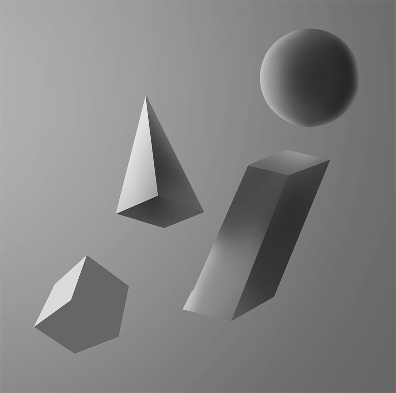
(07-25-2015, 08:03 AM)Archreux Wrote: Really nice progress! I'm liking the consistent practice of your values, and it really is starting to show through in your colors.
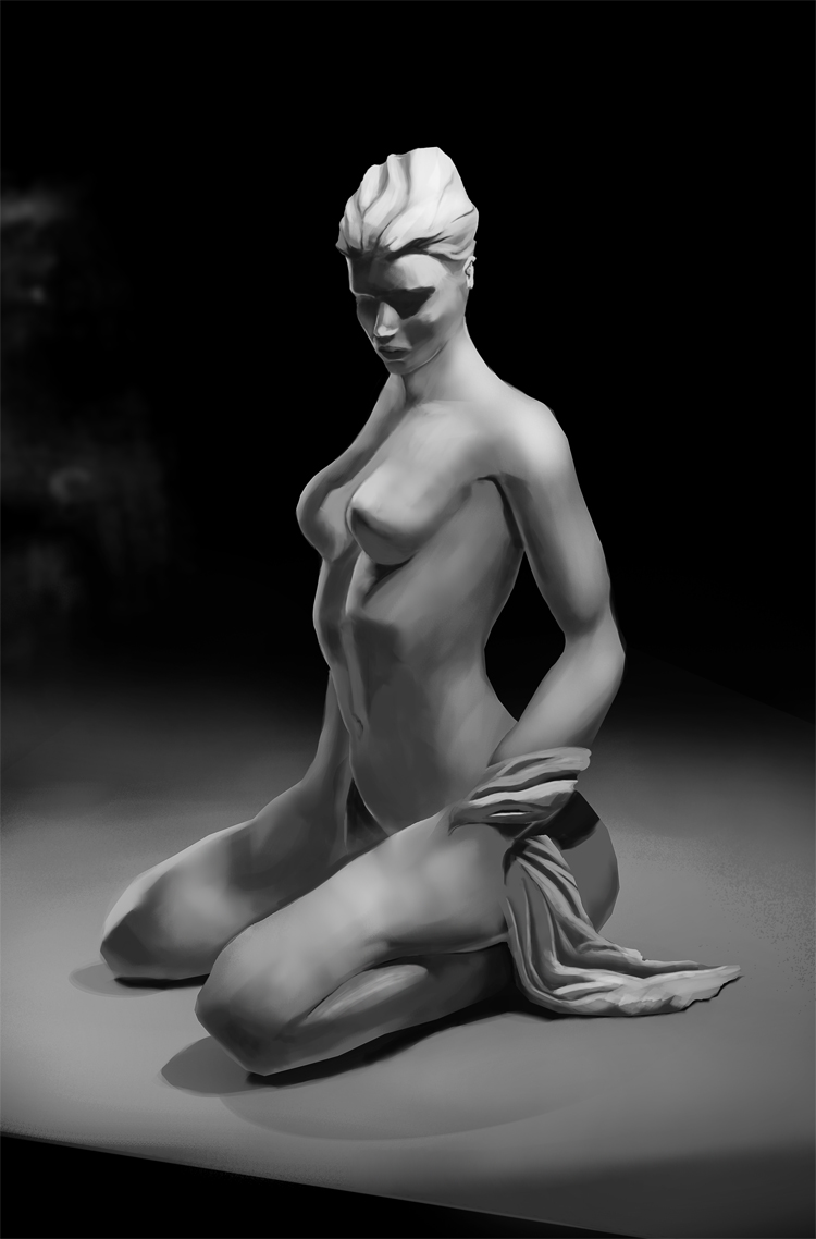
Since you're sticking with you B&W values, I'd say to be mindful of the value separation between your light and your darks. Your current values are a little muddied, and that might be due to a lack of a central light source, which you seem to be introducing more and more.
The muddiness is more or less apart of the skin tones, as a lot of your shapes, cloth, and other objects have much cleaner value separation. Keep using those light sources, and be deliberate with them as much as possible to help define the separations better, and you should be good! It will also help you with your volume as well.
Besides that, just watch the smudge tool usage. On a couple of these it's overly apparent, and aside from that, they look nice. Keep up the good work! :]
Thank you for the feedback !
Yes, I'm still working on geting the cleanness in values and overall lighting the forms so hopefuly I'll get that done soon enough. : )
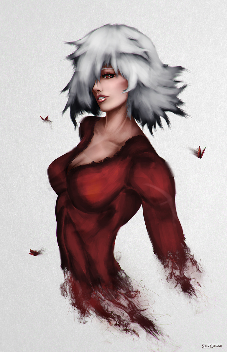
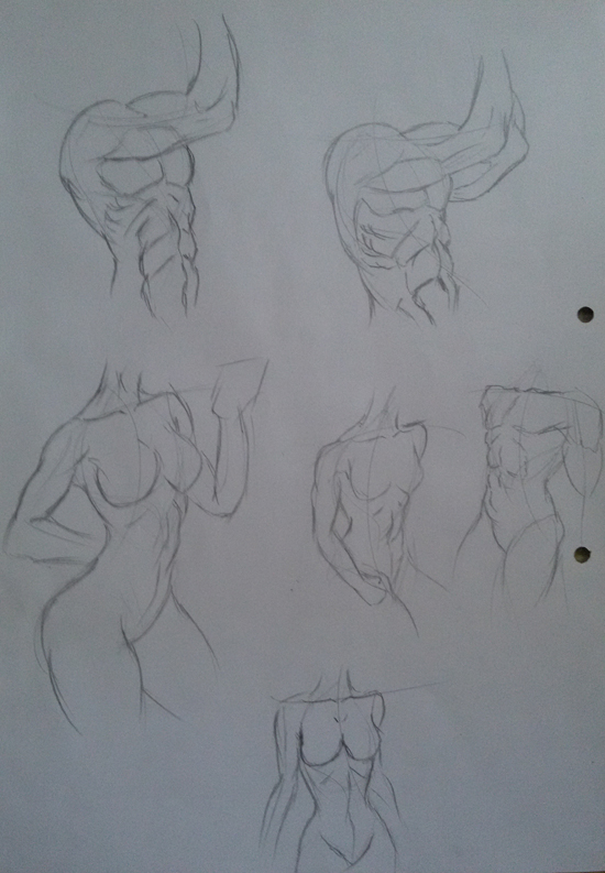
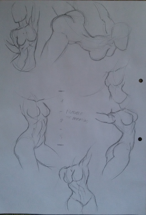
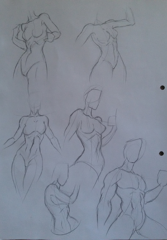
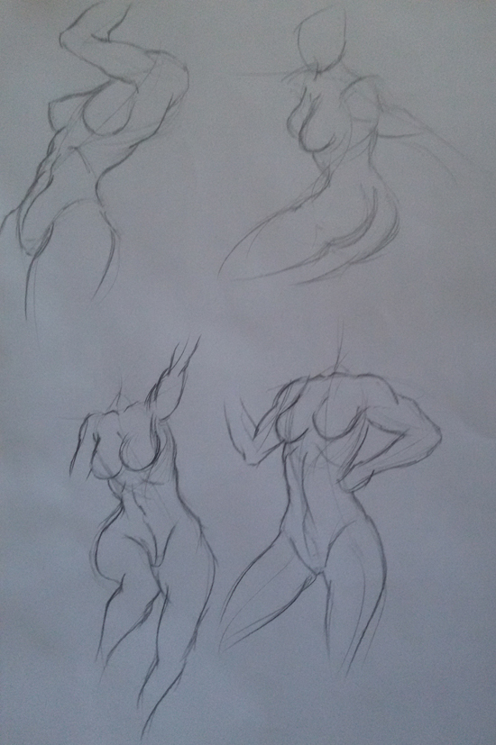
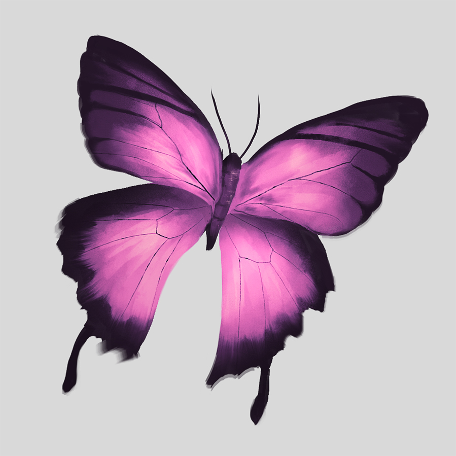
Something new, exploring styles.

Posts: 469
Threads: 3
Joined: Dec 2013
Reputation:
9
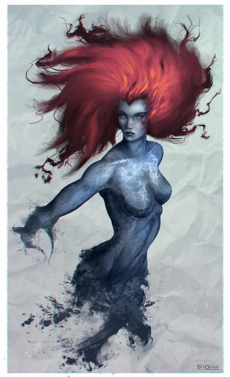
Personal project.

Posts: 37
Threads: 1
Joined: Jun 2015
Reputation:
3
It is amazing and inspiring to see how much you have improved in a year.
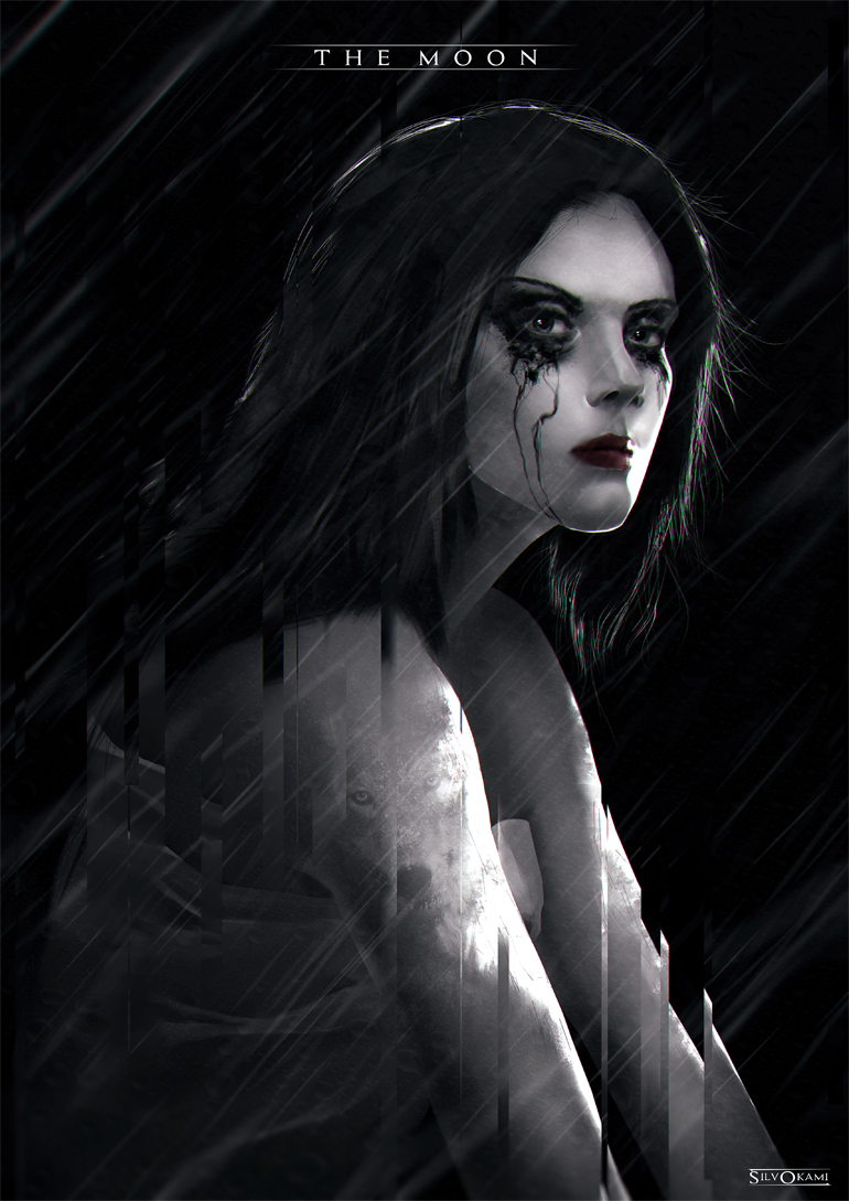
I was curious about the pieces that have the moon label on it. Are they based on story or game design? Or just concept practice. The last one is really cool and it reminds me of a book illustration. The wolf fading is a nice touch and adds to the story of the piece.
Keep up the good work!
Posts: 469
Threads: 3
Joined: Dec 2013
Reputation:
9
Posts: 469
Threads: 3
Joined: Dec 2013
Reputation:
9
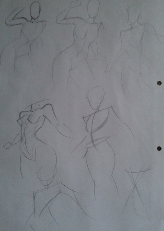
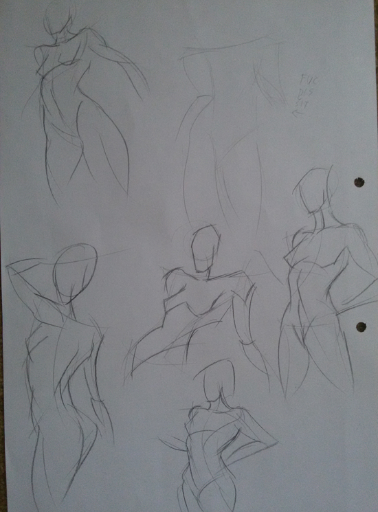
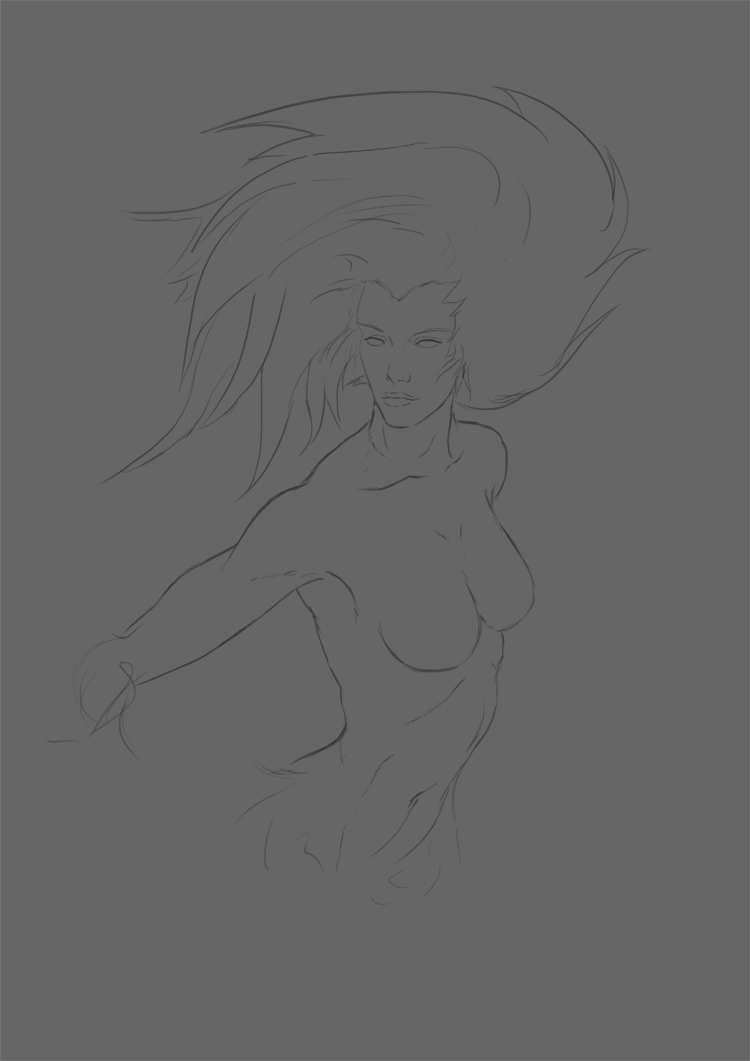
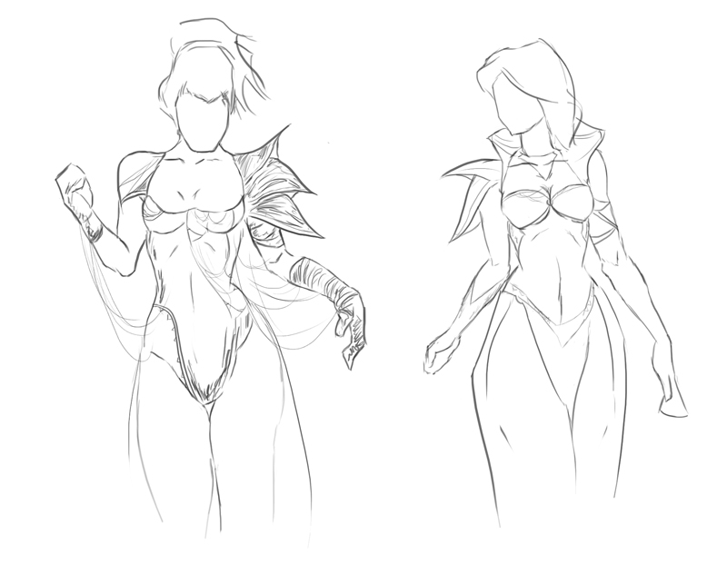
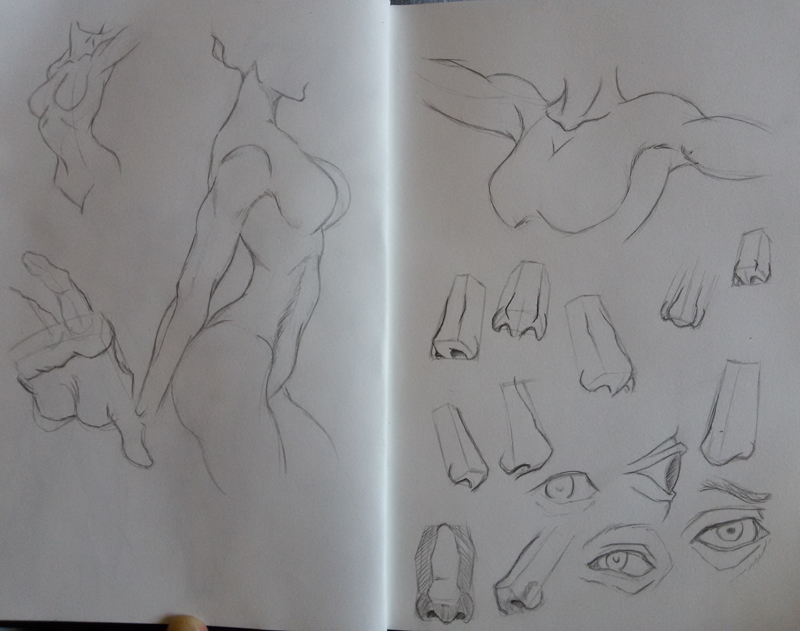
A quick wip sketch.

Posts: 469
Threads: 3
Joined: Dec 2013
Reputation:
9
Posts: 469
Threads: 3
Joined: Dec 2013
Reputation:
9
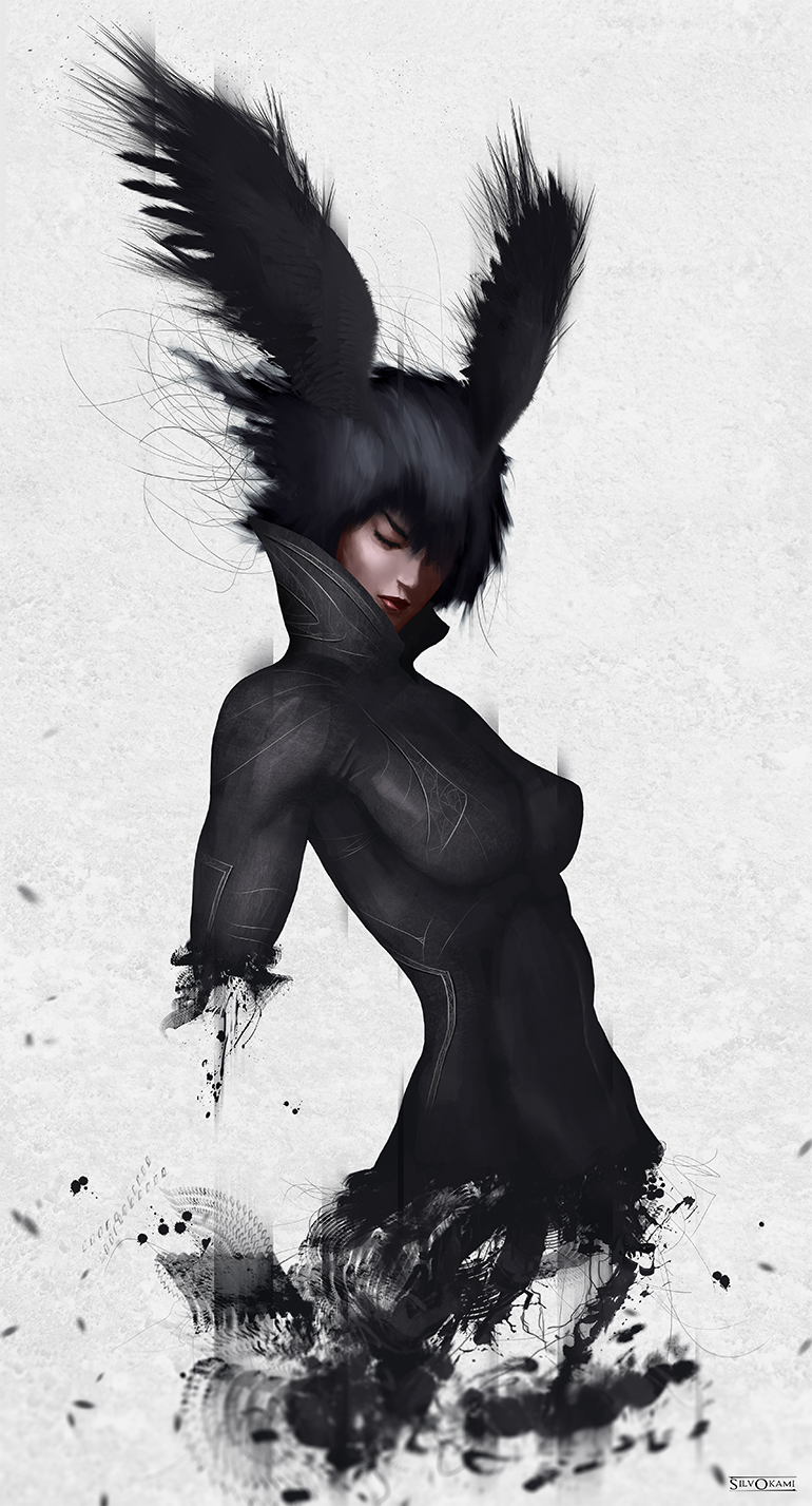
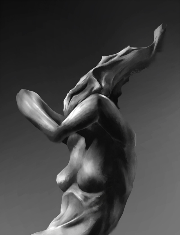
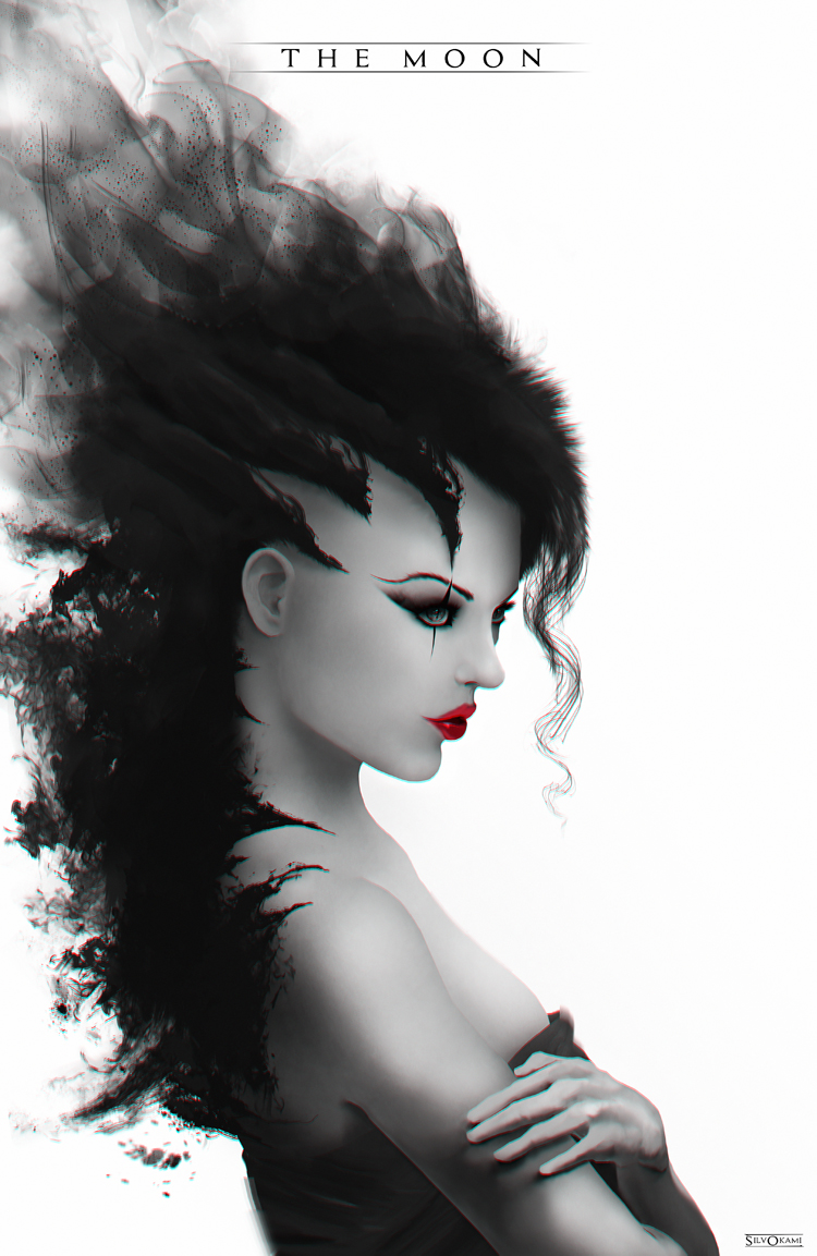
Something.

Posts: 733
Threads: 7
Joined: Dec 2014
Reputation:
32
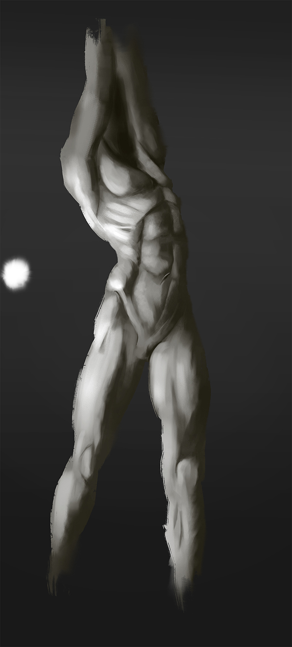
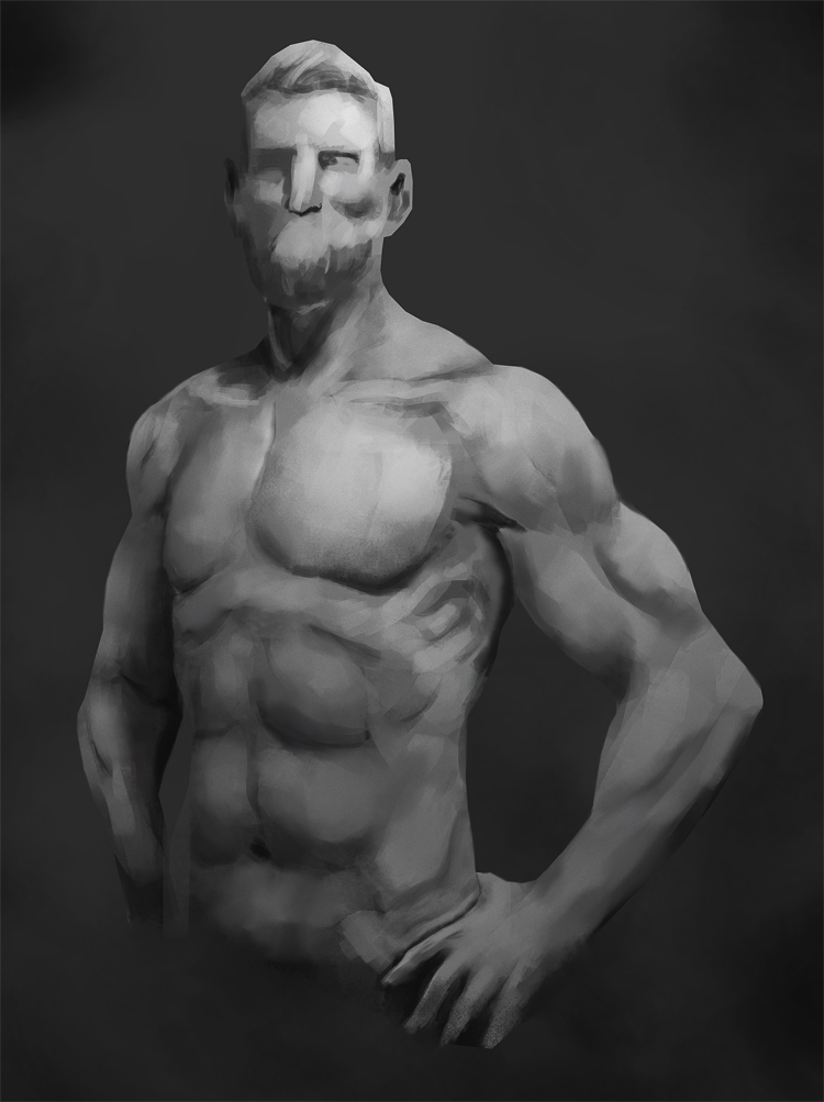
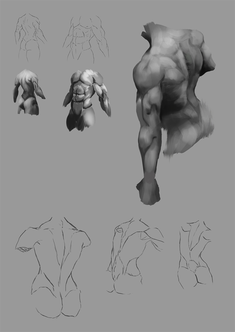
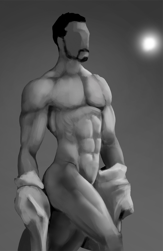
Very cool. You're really getting the 'painting like a sculptor' thing down. Keep it up! Let's see some studies. 
Posts: 469
Threads: 3
Joined: Dec 2013
Reputation:
9
Posts: 469
Threads: 3
Joined: Dec 2013
Reputation:
9
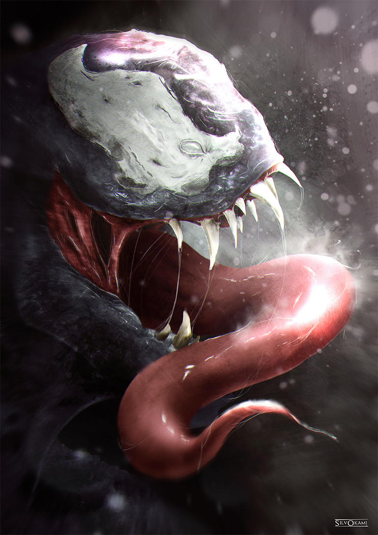
Fanart ! :)

Posts: 469
Threads: 3
Joined: Dec 2013
Reputation:
9
Having fun !

Posts: 46
Threads: 0
Joined: Jul 2015
Reputation:
6
That Venom piece looks absolutely disgusting in the best way possible, great work!
Posts: 469
Threads: 3
Joined: Dec 2013
Reputation:
9
Posts: 733
Threads: 7
Joined: Dec 2014
Reputation:
32
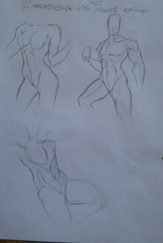
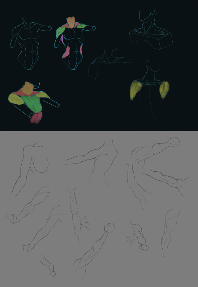
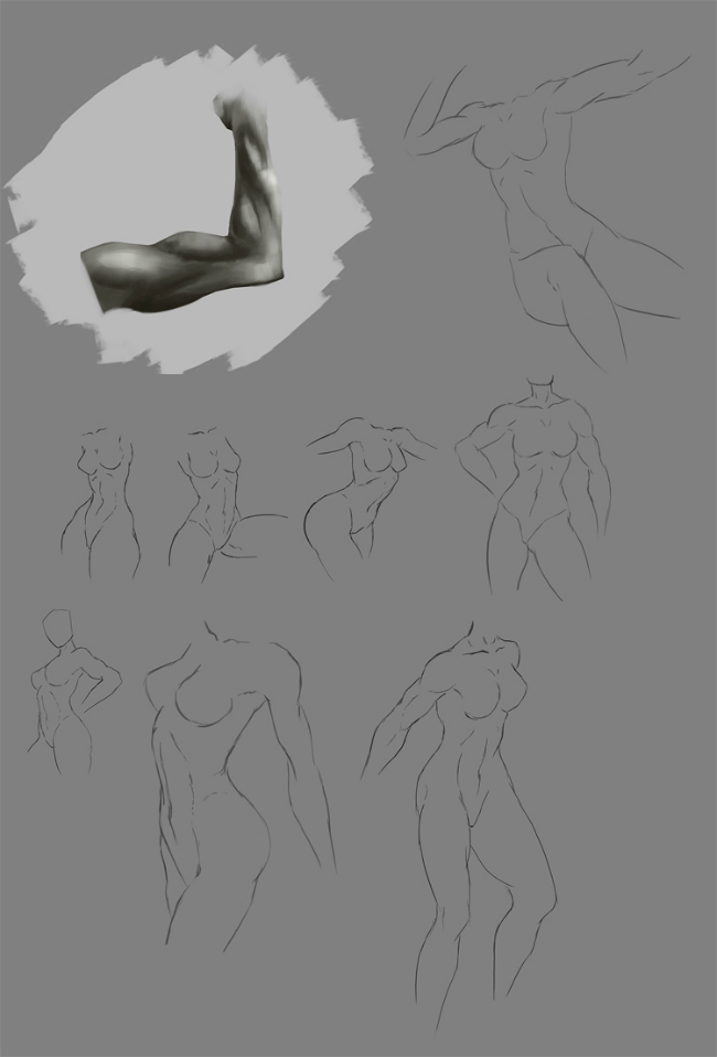
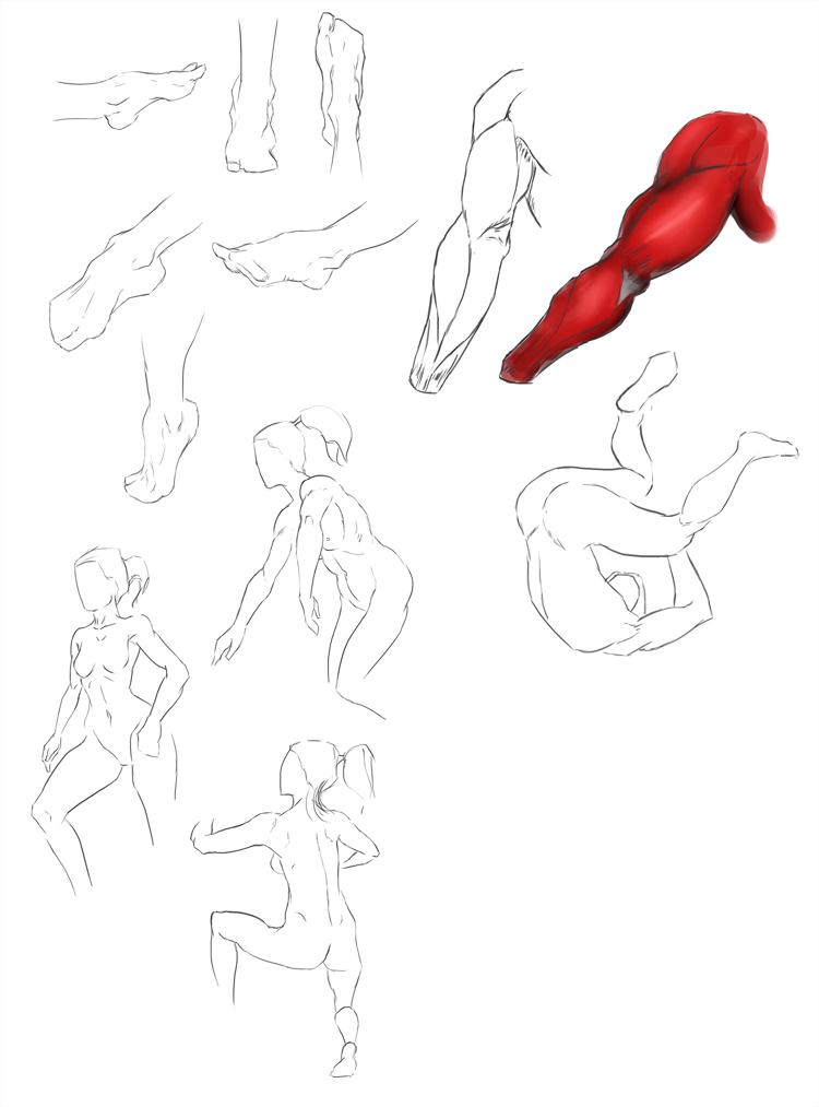
Great work! Looks like you're working hard and churning out lots of studies and your own pieces. Can't really ask for more than that! Except maybe... A landscape study and/or still life! But, it looks like you've got your own process here-- So, keep going! 
Posts: 469
Threads: 3
Joined: Dec 2013
Reputation:
9
Posts: 469
Threads: 3
Joined: Dec 2013
Reputation:
9
Posts: 733
Threads: 7
Joined: Dec 2014
Reputation:
32
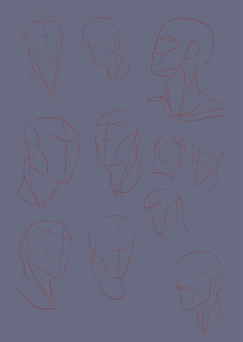
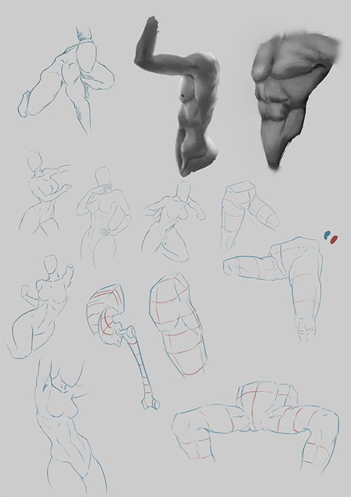
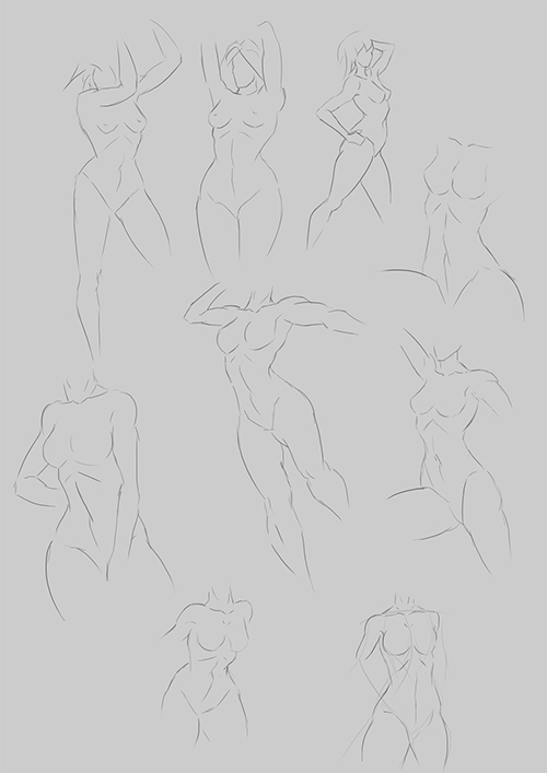
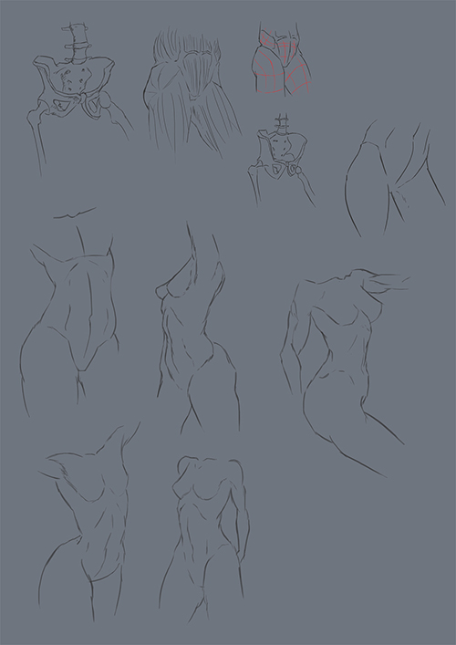
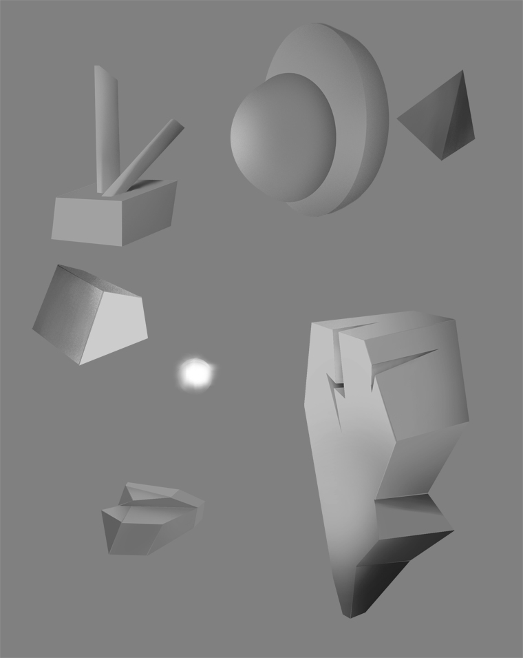
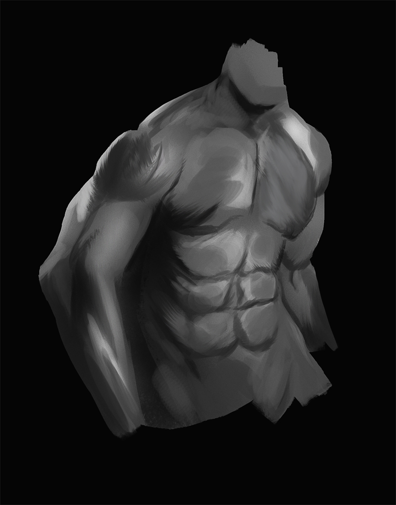
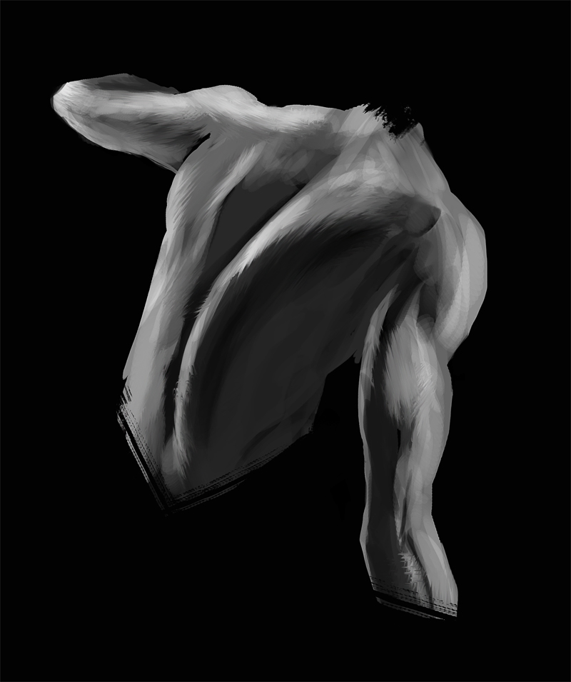
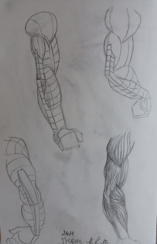
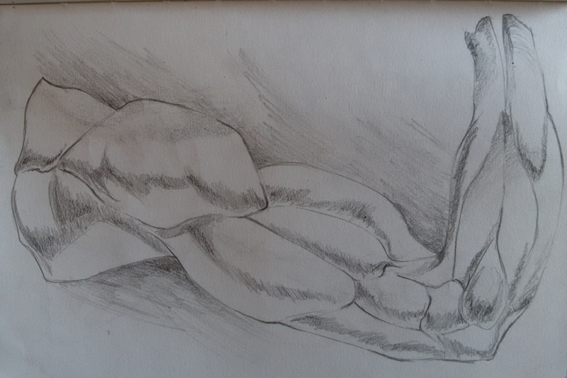
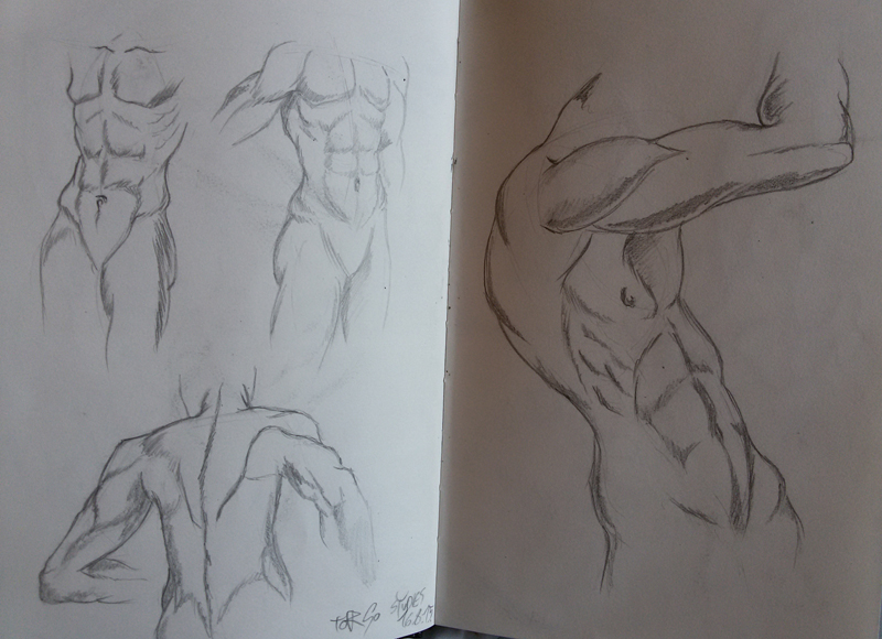
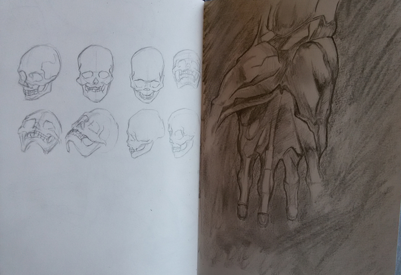
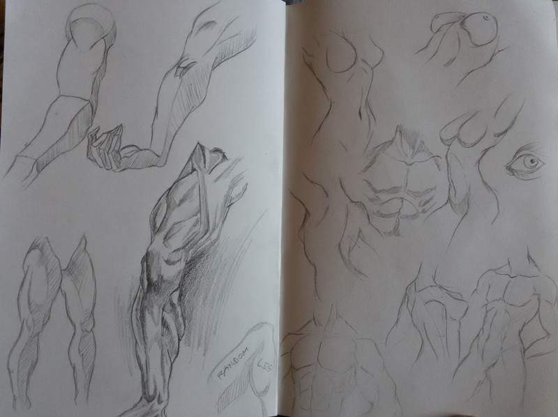
Great studies! Keep pushing and working on those values. Draw some spherical objects, maybe-- I think it'll bring a softness/roundness to your work, as it's kinda looking a bit flat in some areas.
Awesome personal work-- Really nice touches to them! Keep going! 
Posts: 469
Threads: 3
Joined: Dec 2013
Reputation:
9
(09-05-2015, 11:17 PM)Bookend Wrote: Great studies! Keep pushing and working on those values. Draw some spherical objects, maybe-- I think it'll bring a softness/roundness to your work, as it's kinda looking a bit flat in some areas.
Awesome personal work-- Really nice touches to them! Keep going! 
Thanks ! :)
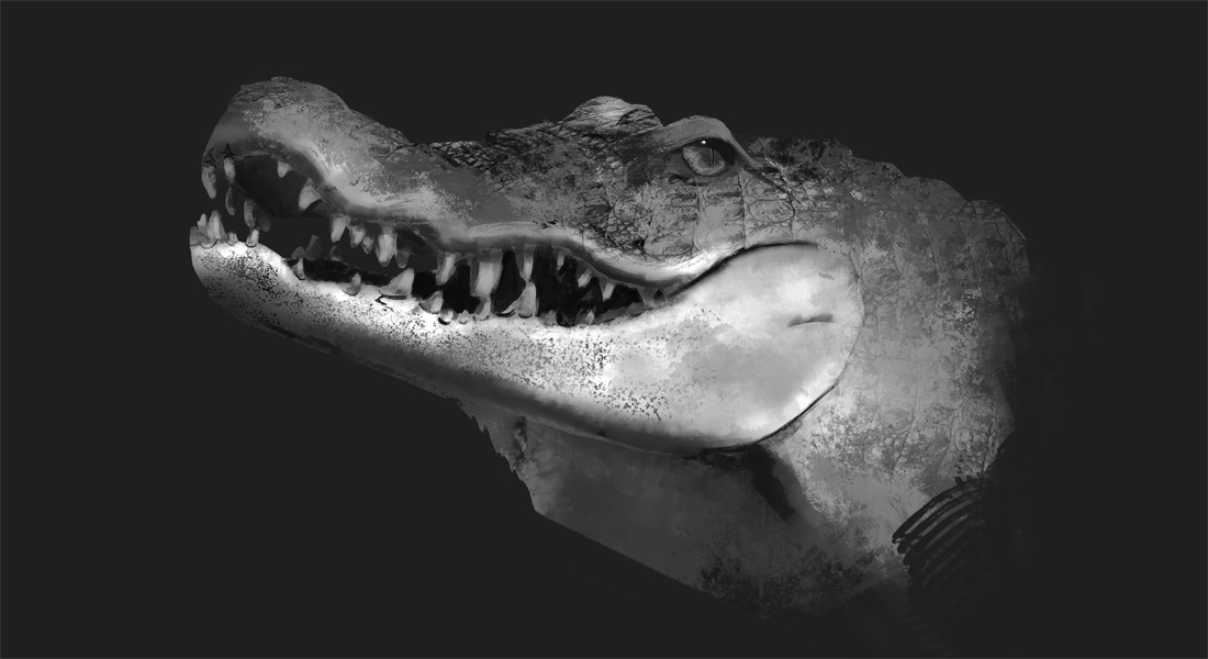
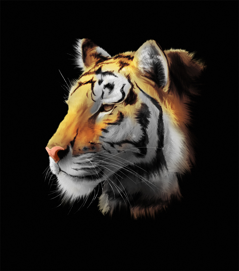
Small update.. RAWR !!

Posts: 37
Threads: 7
Joined: Jan 2012
Reputation:
1
Not sure if you see this from your perspective, but when you're making your fanart, you're clearly in a different mood and mindset about things. That Venom and winged haired black "Something" piece you made both have this bold fun aspect to them that straight up scream "I had motherfucking fun with this." Studying is important, but your fanart screams fun, and those are awesome to look at. MOAR!
Posts: 469
Threads: 3
Joined: Dec 2013
Reputation:
9
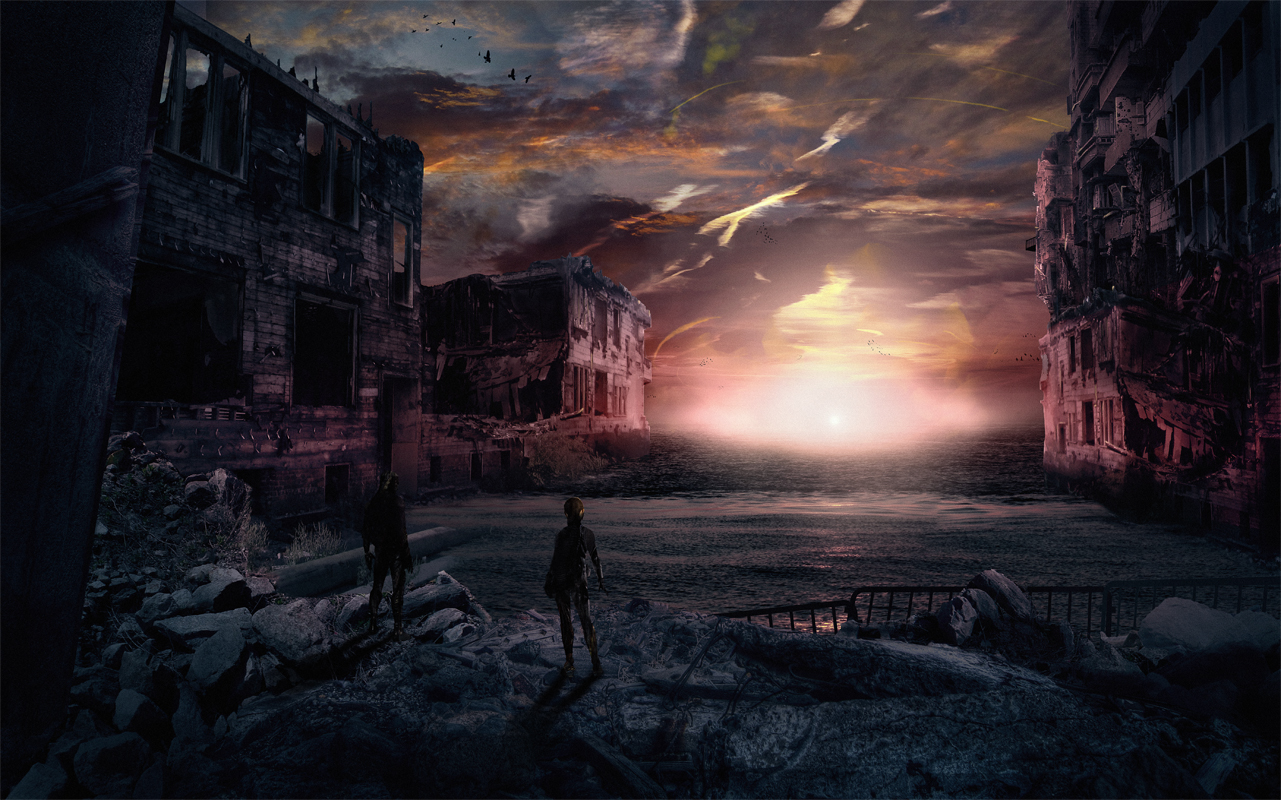
Trying something new.

|
