Posts: 905
Threads: 39
Joined: Sep 2013
Reputation:
51
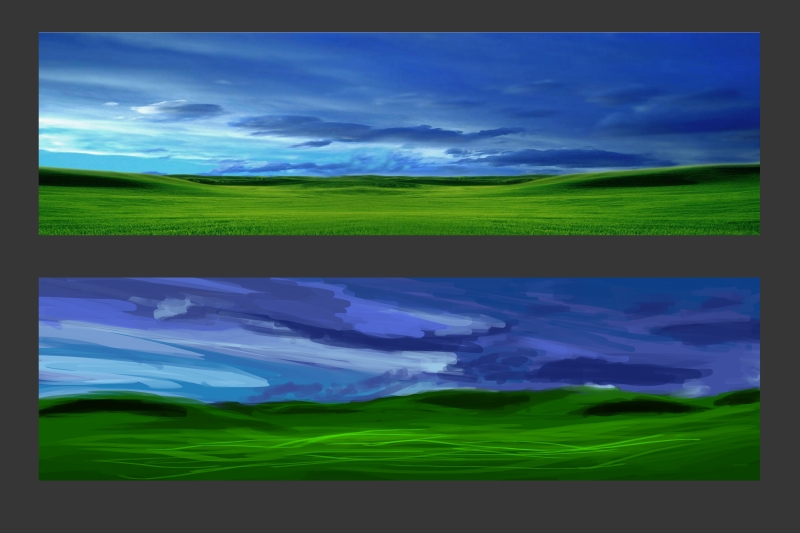
Clouds are worth studying - there're so many kinds of clouds! And, unlike landscape, that's about the only thing in the skyscape. So if your image has sky in it, you'll need good clouds to make it interesting! John Constable has a massive collection of cloud studies he did, and he's a cloudscape master. Check him out if you're still doing cloud studies.
Posts: 88
Threads: 1
Joined: May 2014
Reputation:
5
Hey meat and thanks for stoping by! :)
You're right I just realized it how important clouds really are now that you said it! I was just interested in clouds and drawing them because for a half beginner like me cloud are a mystery they seem to be so simple but are actually very complex shapes. I decided not to study them further for now but if I will I'll look into Constable's studies, they look really great for practicing.. I just want to focus on figure drawing for now, to draw clouds I need to understand values and color a lot more than I do now so yeah.. I'll come back to it for sure so thanks for the advice! :)
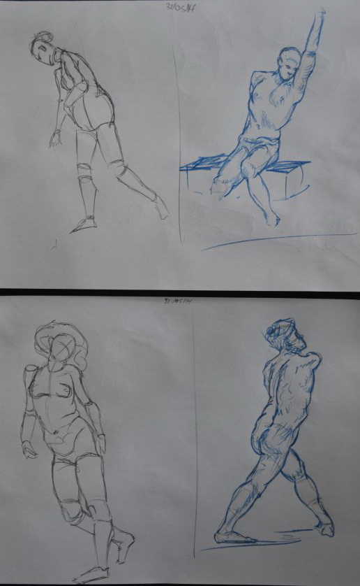
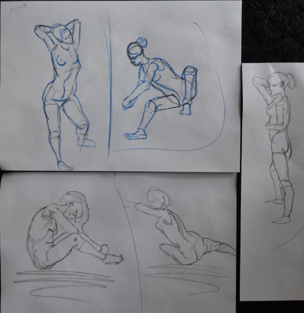
Here's some stuff from this morning I don't want to post without showing something :D
Posts: 88
Threads: 1
Joined: May 2014
Reputation:
5
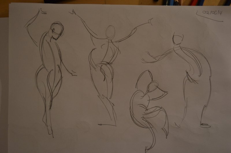
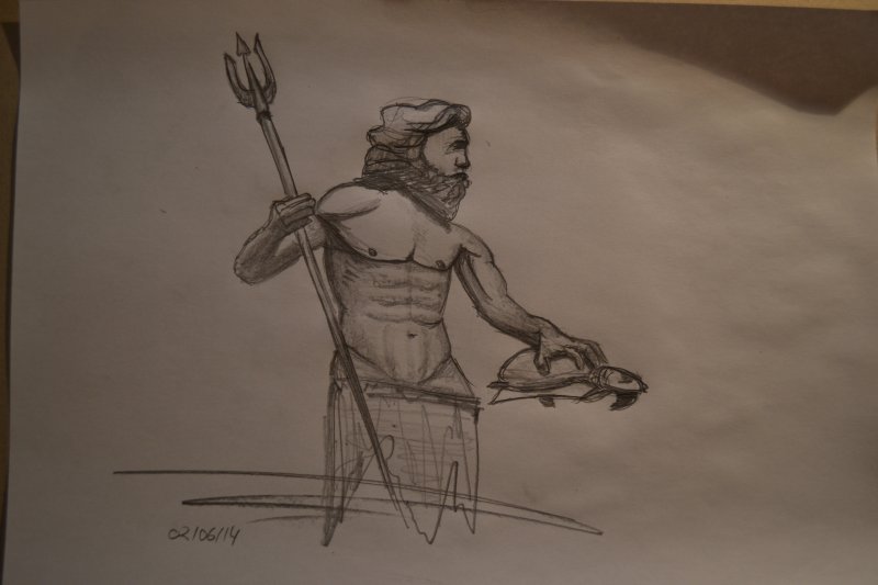
Finally I got through a few bad days, I still have nothing great to show and I'm feeling very unconfident with the stuff I do but anyways here are some ugly gesture drawings and some god guy I did looking at his statue
Posts: 88
Threads: 1
Joined: May 2014
Reputation:
5
Some digital scribbles for today ;)


Posts: 88
Threads: 1
Joined: May 2014
Reputation:
5
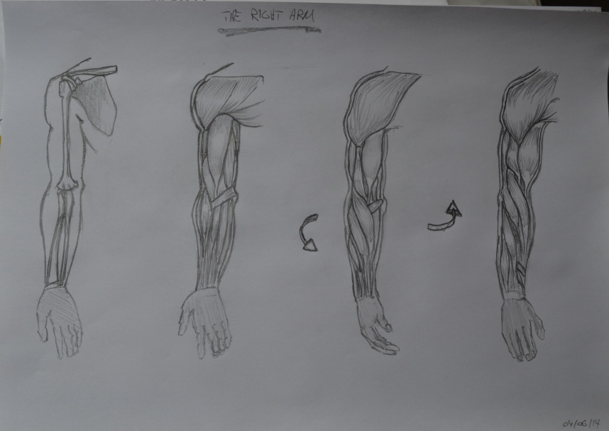
Some arm studies and some stuff from the kitchen

Posts: 26
Threads: 1
Joined: May 2014
Reputation:
0
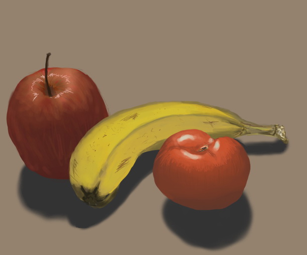
I think the gestures look very sweet! Here and there could use some less lines but the flow looks great in my opinion! For your digital stuff I'd say, try to do some colour studies, and focus on coloured light. Right now your objects don't blend in with the environment because there is no colour of the environment returning in your objects. The picture on the fruit for example: the values of the fruit are many times lighter than the shadow that's right beneath them, and the blue tone of the cast shadow does not return in the object shadow. this makes your fruit look cut out and pasted, almost as if it is floating on top of your background.
The floating is also due to some minor perspective issues. Your fruit looks actually quite well rendered and voluminous, however there are parts where they seem as if they are intersecting (the apple and banana) or where they don't follow the same perspective as their cast shadow. What might help is construct basic forms (cylinders and spheres) and make sure the 'hidden parts' don't intersect with each other.
All in all, looks great, great to see you update daily. Can't wait to see more!
Posts: 88
Threads: 1
Joined: May 2014
Reputation:
5
Hey Eve and thanks for your great feedback!! You really hit a nerve there, my colors are pretty bad and this was seriously like one of the first attempts to get better at that by painting this stuff digitally but from life which I havent done before. I think I'll just try to get better and do this kinda stuff more often or maybe just go in and do a paintover tomorrow trying to watch out for the things you wrote me so thanks for that! I didn't even realize how bad the perspective of the fruits is!
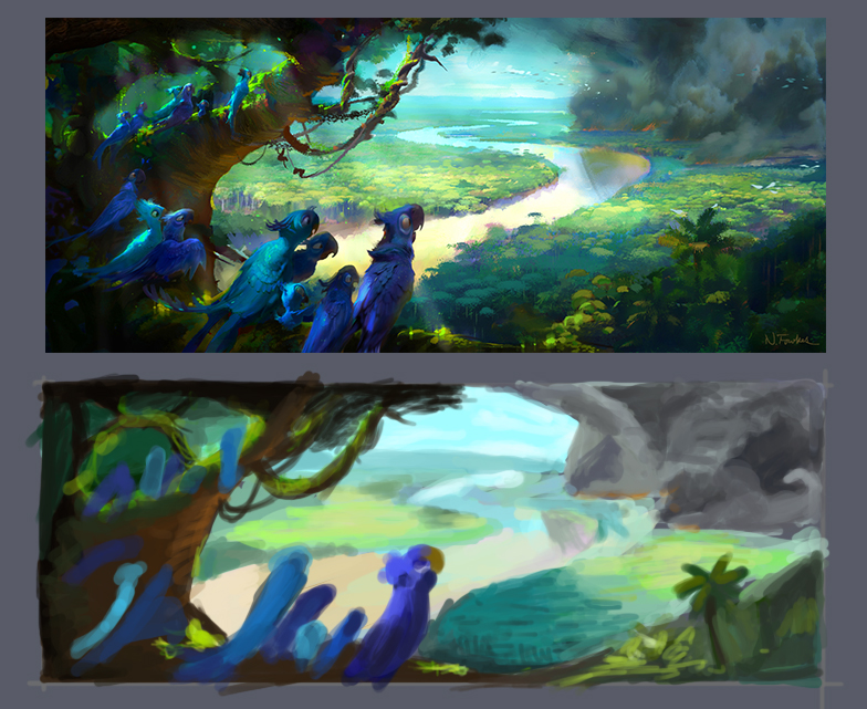
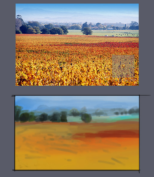
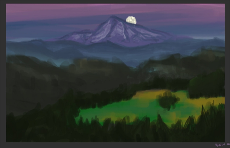
Anyways so I jumped right into color studies after I read your post and I guess those kinda studies don't help me that much with my fruits but I always wanted to get better at coloring so yeah I just grabbed some environments and tried to match em without color-picking.
I always just color-picked before because I felt like I had to learn color theory before being able to find the right colors but I figured I just have to pay a lot of attention to the colors and I'd finally get them close to being right! :)
So hey don't color pick! :D


Posts: 782
Threads: 5
Joined: Jan 2013
Reputation:
22
Hey! Lots of hard work going on here! Keep that up!
If you want some advice on learning:
- Mix studies with drawings from imagination (so you can apply your studies)
- Do a study and redraw it from memory afterwards ( so you can really see what you have learnt from the study)
As you are also doing lots of gestures and I´m also currently focussing a bit more on that thematic, I can really recommend you Michael Mattesis book about force (he even has a short 4-part video on youtube about force in a gesture drawing), and if you haven´t found it already: Stan Prokopenkos youtube channel (Proko) is great for figure drawing (his demonstration of Loomis head drawings also made things a lot clearer for me than from Loomises book alone)
Looking forward to seeing more from you!
Posts: 470
Threads: 3
Joined: Dec 2013
Reputation:
9
Hey, keep on doing those colour studies and life studies to work on forms, it really helps ! :)
Posts: 26
Threads: 1
Joined: May 2014
Reputation:
0
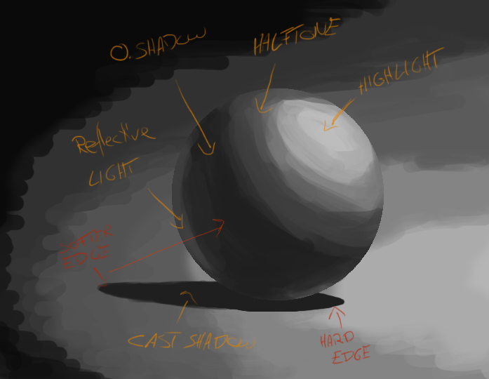
No problem, I'm glad my tips have been of help! If you experience a lot of difficulties with colour and shading, consider starting out simple. Try to draw some spheres with different light, colour and shadow, focussing on highlight, object shadow, cast shadow and reflective light and how they relate to each other. As has been said, after you've done that, you can try more complicated stuff such as a drawing from imagination, applying what you've just learned. If you are still unsure about certain things or mess up certain parts, note that down, and work on that in the next study session.
On perspective: don't worry, when you decide to construct every basic shape beforehand, it will make acing the perspective a lot easier.
The colour picking practice looks good, can't wait to see the next step!
Posts: 88
Threads: 1
Joined: May 2014
Reputation:
5
Elderscroller Thank you for stoping by here and for giving some advice as well! I'm still in that kind of mindset or in fact it is just like that that my drawings from imagination look worse than a childs drawings so when I do them I get frustrated very quickly and I never upload them :D I guess I just got to push through those bad drawings.
ShinOkami Thanks a lot buddy I try to keep it all up although sometimes it seems to me like I'm attacking everything at once which feels like it stops me from learning fast!
Eve Thank you for your answer effort man that's great! I jumped back into the lighting of the sphere today and everything was kinda obvious and clear to me so I guess the problem is trying it out with the more complicated stuff.
I'll keep on practicing and see how it goes that's the only way the get better.
So as I said some sphere stuff and another color study where I was trying to get skintones right but oh that was a struggle :D


Posts: 88
Threads: 1
Joined: May 2014
Reputation:
5
Hi there!
It's crazy I do so much stuff that I could upload a lot more but I have to choose between the stuff now to not overdo this sketchbook.. maybe I'll try to only upload one image per day or so let's see :D
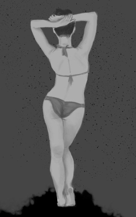
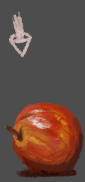
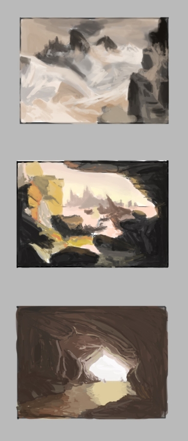
So this morning I wanted to do a full body greyscale painting in 1 hour but there was not enough time to finish it up so it looks super flat.. some apple from imagination applying color theory a little bit and some master studies where I tried to figure out color again.


masterstudies: thomas moran (the tetons), thomas cole (The Subsiding of the Waters of the Deluge), Joseph Wright (Grotte)
Posts: 88
Threads: 1
Joined: May 2014
Reputation:
5
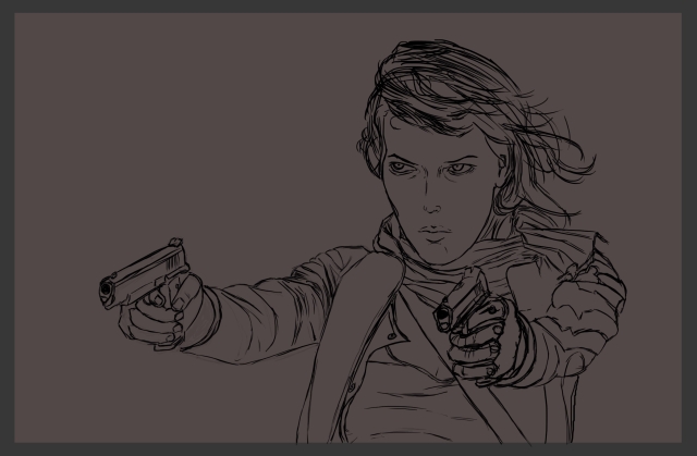
So thanks to JyonnyNovice who suggested me Scott Robertsons book I'm now spending time on learning his art of sketching a little bit, nothing to upload though because it's just practice line quality and doing perspective grids for now :D but here's a little sketch I did to get better with my lines digitally..

Posts: 88
Threads: 1
Joined: May 2014
Reputation:
5
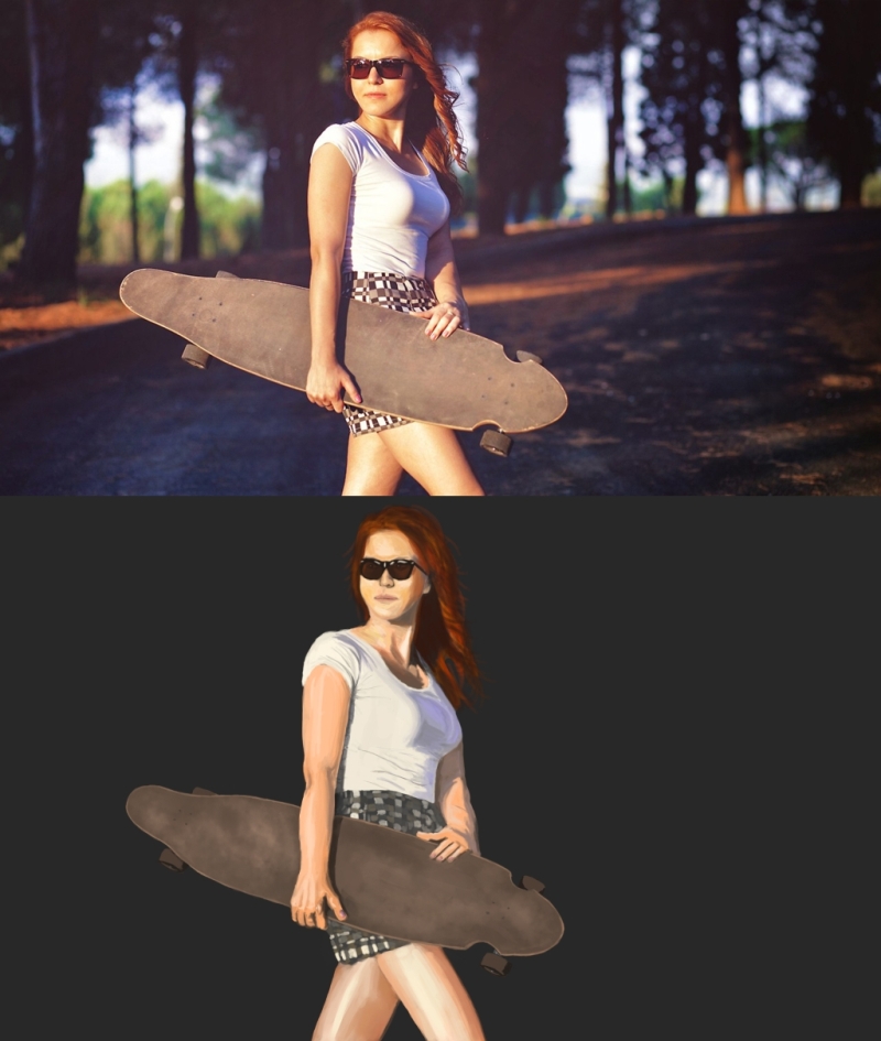
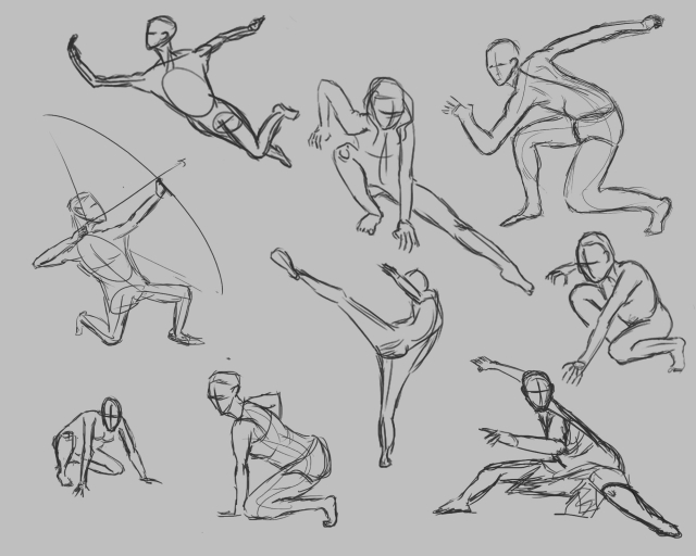
Here are some gestures from this morning and something that started off as a quick color study from photo on which I ended up spending 3 hours on .. :)


Posts: 26
Threads: 1
Joined: May 2014
Reputation:
0
Hey, that's cool! Regarding the picture of the skin: if you take a solid gray background when painting from a photo ref, it will look realy different and weird. Right now, you probably did not notice the shadows on the female's skin and hair having a purple tone, and a blue tone on the shirt.
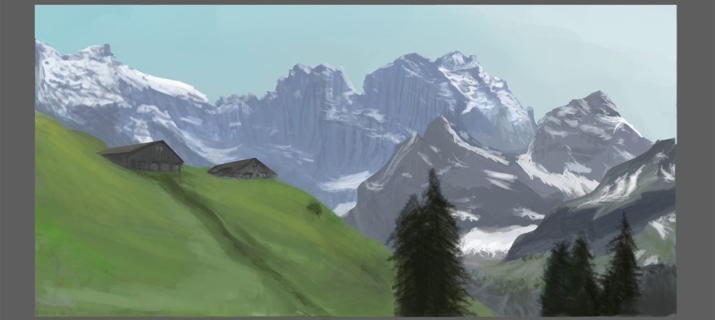
Your last painting of the landscape looks quite good actually, I love the mountains! A question but, do you turn your drawing to greyscale sometimes when painting? It may help you to spot your values, since the main problem you got now would be that your painting looks washed out, because the value difference between your foreground and midground is not that apparent.
I like the poses in your gestures. They are rather solid and their intention is clear. However try to use more fluent lines and they will be perfect! Right now they miss their dynamics because the flow of lines are interrupted as there are so many.
I love to see more imagination apples with applied colour theory ;) Nah, anything is fine, keep it up!
Posts: 88
Threads: 1
Joined: May 2014
Reputation:
5
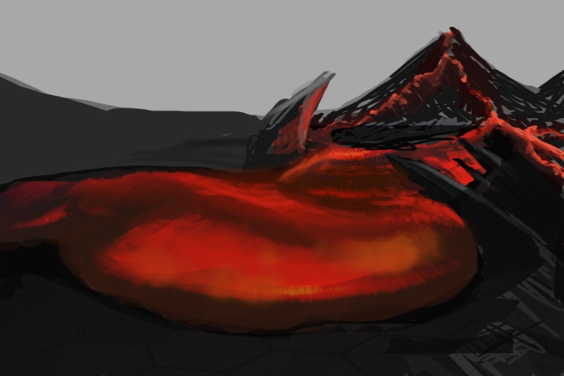
Hey Eve thanks for the comment again! You're always pointing out important things/flaws which is great. The greyscale, I wasn't thinking about that! I was only focused on color and to get more into blue colors with distance but values are much more important. For the gestures I'll just continue doing them and post some here and there, you're right of course there are no long lines with flow and I think these are not dynamic at all but hopefully it all comes with time and practice.
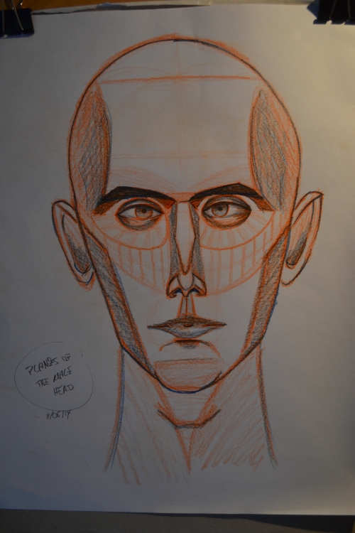
For today I though I do another landscape to test out the greyscale stuff and I was actually quite happy at the end, did some construction of the head/planes of the head stuff but nah felt weird and looks weird :D
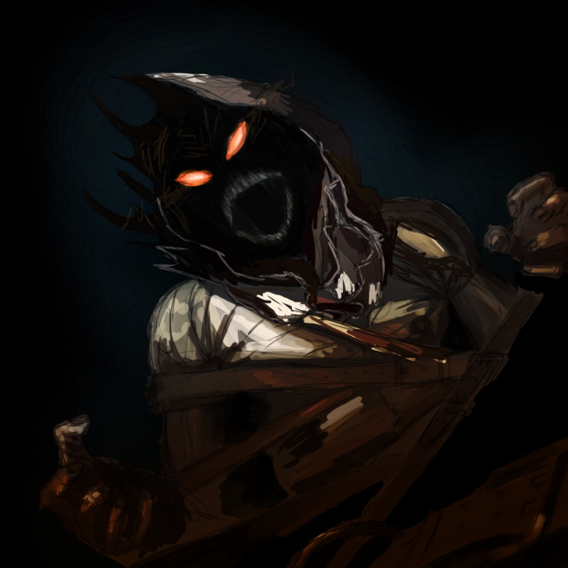
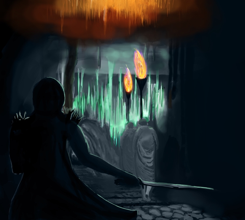
Imagination time in the afternoon but the scene that came to my mind looked a lot cooler in my head than in photoshop... anyways this was supposed to be a guy right before assassinating some monks/cultists in a crazy cave but it's not really finished.


Posts: 88
Threads: 1
Joined: May 2014
Reputation:
5
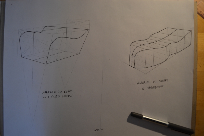
Learning with the how to draw book nothing special yet just practicing these over and over
Posts: 88
Threads: 1
Joined: May 2014
Reputation:
5
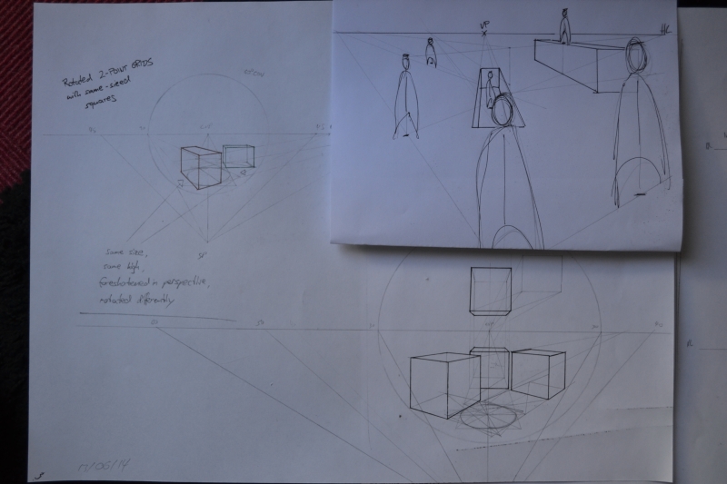
Going crazy with perspective stuff now really trying to get it all rigth in my head and it's actually fun :)
Posts: 88
Threads: 1
Joined: May 2014
Reputation:
5
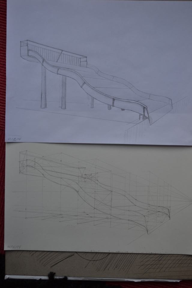
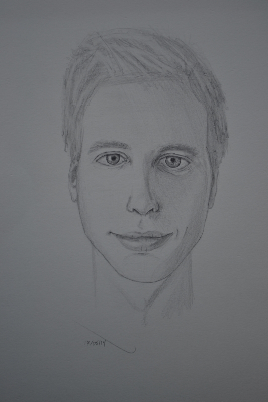
Gotta stick to the daily update otherwise I'll begin to find excuses for not drawing so here a construction of a water slide and a self portrait.
I noticed afterwards that there are no stairs for the waterslide and my face is actually not that skinny but I learned something from both so that's good I guess :)
Posts: 88
Threads: 1
Joined: May 2014
Reputation:
5
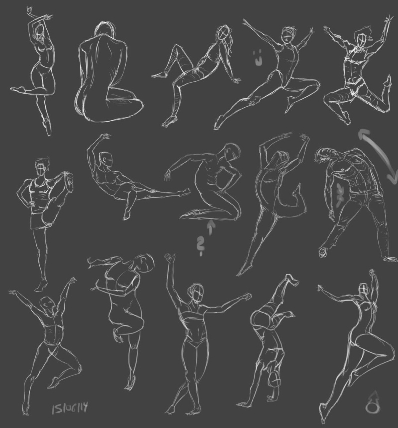
More gesture/figure drawing, I tried to work on my linework a lot but using less lines takes actually more time.
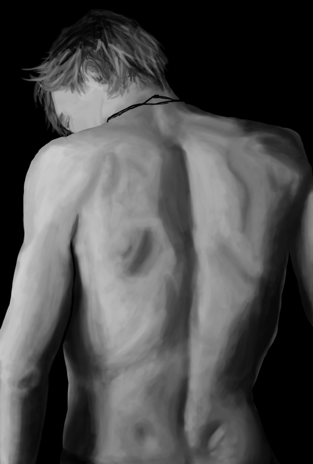
And a greyscale study, all I wanted to get out of this was to get better at blending in PS but I was quite happy with the outcome.. :)


|


