Oh noooo, I'm late for the poll! Oh well, I'll have to be sure to make it on time next go! Sorry guys

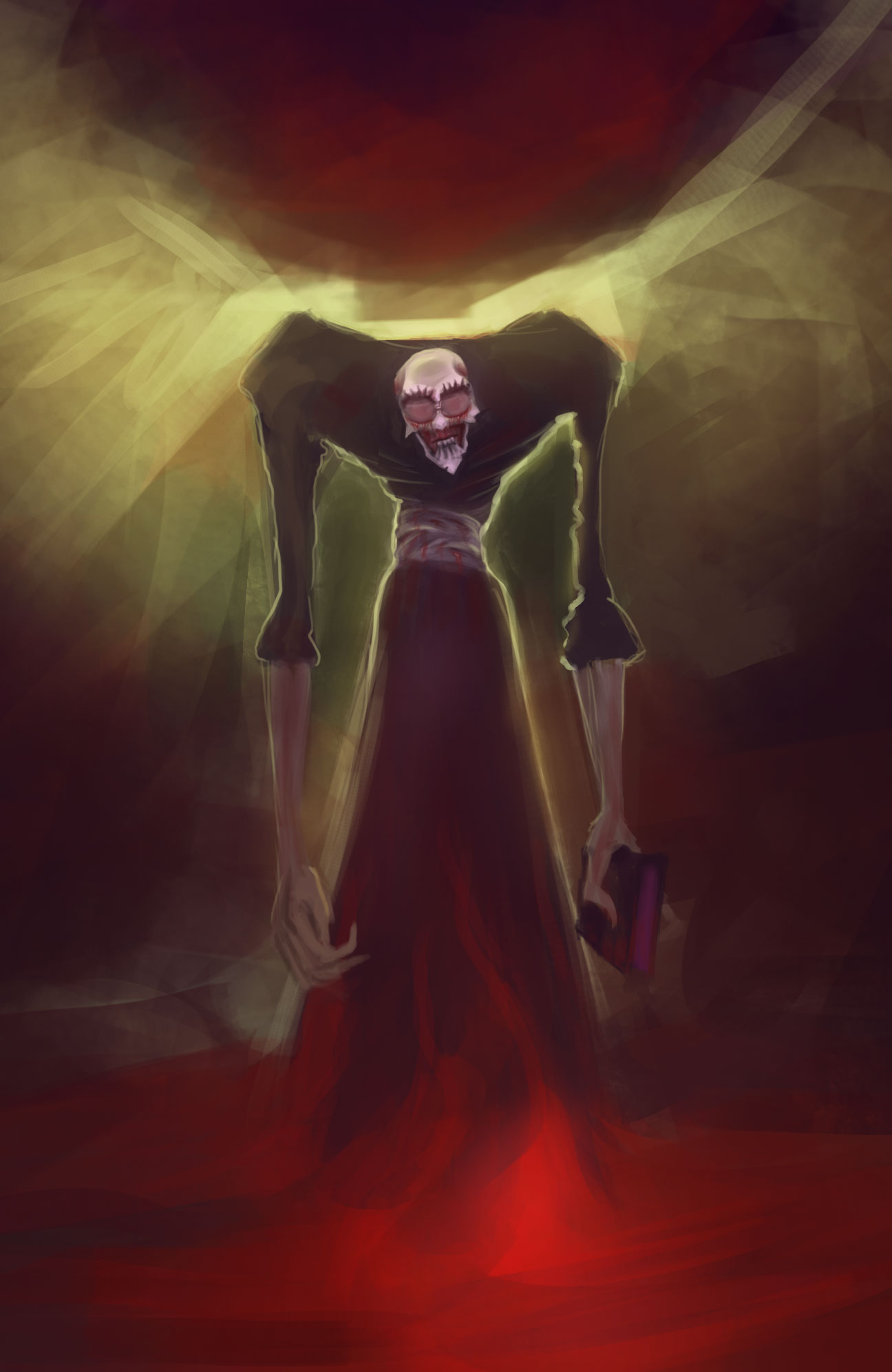
Cracked - Thanks for bringing it in a good bit so we can see him! Right now your values are very flat. If I blur my vision it almost looks like a flat color drop. I don't know what those wings are actually suppose to be right now as well because they are so vague. Is it just a neat lighting situation or does he actually have glowing wings? Some value studies and maybe think more about your designs and/or how you convey them. It'll do you a ton!
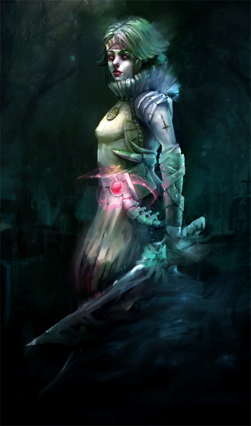
Beardley - This is a pretty cool direction you went in! Wasn't expecting it at all. The bootless foot looks a bit broken right now. The shin is at to much of an angle while the pants are implying the leg is much more straightened. Her elbow on the right looks just a bit low as well. Other than that, I can't tell what that black checked thing is around her neck. Maybe try to describe it visually a little clearer? And as a nitpick I would have liked not to seen the black facepaint. She is already black so it doesn't really add for the sake of contrast with the white paint and at first glance I just thought you didn't paint her face the same skin tone as the rest of her. Nice job, really cool concept and direction!
Mike, Fedo & Corey - You're all sharing the same problem in that you are going very high contrast across all materials. Nothing is reading as different materials because everything is equally contrasted. You're sinking into blacks in some places you really shouldn't be as well.
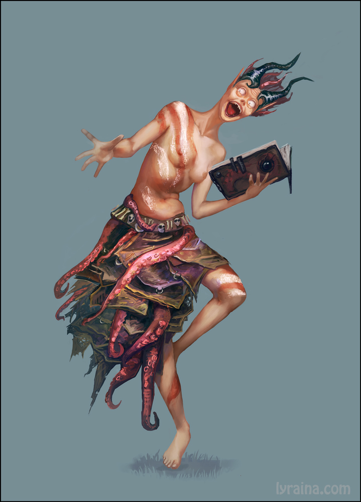
Lyraina - Thanks for the cool topic! Most of the problems I'm seeing are anatomy ones right now. On the side she is leaning to, there is a section between the hip and rib cage I don't think should be there, they just lap right onto each other(or at least on men they do.) She is missing her pectoral muscle on the left side and the feet could use work, but that is normal. Good job on the hands though! A big break in the concept for me is her eyes though. It looks like you went for more realistic anatomy and then you have these beady cartoonish eyes. I like the dress piece, it's pretty cool. A nitpick, the color of the paper shouldn't be that desatured. It looks like you were thinking of printer paper as opposed to older pages you'de find in a book.
Aaron - Glad you decided to push it! turned out cool! I think you could have gone a bit more saturated around his head with the gems/eyes. Other than that I would have liked to see more calls to lovecraft, or none at all. It looks like you last minute got nervous and just scribbled in that octopus tentacle. You could have carved some stuff into the armor on the chest. Designs on the book satchel, made his headpiece some kind of crustacean theme, etc. Also from an uninformed perspective, I'd have no idea that was a book on his hip if I didn't know beforehand, it reads as a bag right now.
Great job everyone, keep pushing yourselves! Looking forward to the next one!


![[Image: necromancer_dev_by_afternoon63-d84v2yt.jpg]](http://fc07.deviantart.net/fs70/f/2014/305/1/1/necromancer_dev_by_afternoon63-d84v2yt.jpg)
![[Image: 3vs5k.jpg]](http://i57.tinypic.com/3vs5k.jpg)


![[Image: NecroCHow2_zps5272e38c.jpg~original]](http://i886.photobucket.com/albums/ac62/jonas1221/NecroCHow2_zps5272e38c.jpg~original)

