CRIMSON REVOLVER 10 - Frozen WIP
#1
[Image: zpdl1OW.jpg]

This week: Environment of the Week!

This week's topic comes from meat! (Hope the edits are ok, meat <3)

The land had frozen long ago; none now live who remember its genesis. Some sought refuge within the deep sub-levels of earth underneath the frozen landscape, while others lived closer to the surface of the vast broken continents of shifting ice. Relentless earthquakes and volcanic eruptions, along with the sheer blasts of cold blistering from every direction, made it necessary for sentient life to adapt, to not only survive in the buckling and swaying of the world but to evolve with it.

Your task: Design the Frozen Land.

Guidelines:
  • The focus of the illustration must be the environment and its design
  • You may include characters or creatures but they must not be the focus
  • Photo textures, 3D, and traditional mediums are allowed.
  • Studies are recommended, but not required.
  • There is no restriction on image formats (horizontal, vertical, square).
  • Keep in mind you are not required to strictly stick to what is in the passage. It is more of a guide in terms of mood.
Rules:
  • You must post at least one WIP in the WIP thread to be accepted into the final poll.
  • Finals must be posted in the finals thread before the deadline.
  • Only ONE final entry please.
  • Sketches, WIPs, or rushed artwork will not be accepted into the poll.
  • No fanart. We want to see your original, unique interpretations!
  • Have fun!

Deadline is Sunday, April 26 @10pm GMT

Reply
#2
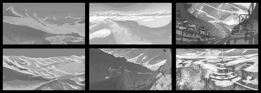
started with these thumbnails.


♥ ♦ ♣ ♠
Also you can visit:
C.D. Sketchbook
My personal blog
My DA
Reply
#3
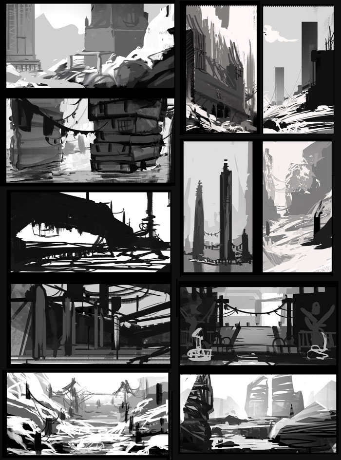
Me too! Rather rushed... not sure if I can finish... but I'll try! Thinking along the lines of a civilisation trying to build and rebuild their architecture in this icy hostile world each time it gets destroyed. Adapting their architecture and technology to this environment for easy rebuilding in snow and ice.


SketchbookDeviantartArtblog | Portfolio
Every feedback is appreciated!
Reply
#4
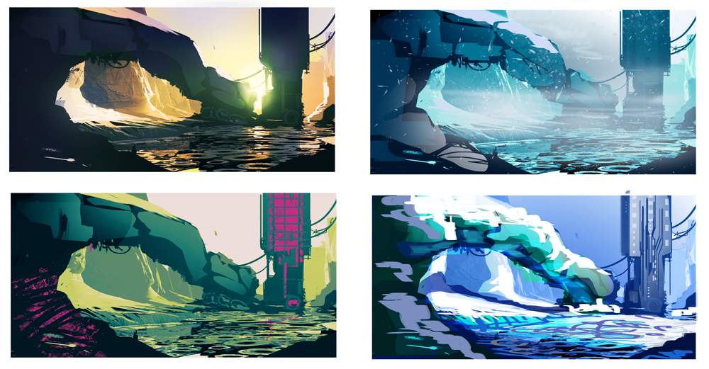
looking for a color scheme...


♥ ♦ ♣ ♠
Also you can visit:
C.D. Sketchbook
My personal blog
My DA
Reply
#5
artleech, nice colors so far, I like the blue/orange contrast. maybe try not having the strongest orange area this far at the bottom of your image though, because it pulls attention right out of the image border…

WIP/color comps


SketchbookDeviantartArtblog | Portfolio
Every feedback is appreciated!
Reply
#6
I'm sorry I can't be more active in these challenges... T_T

So I'm going to crash your party.

With a snow rat that might live here.


Focus.
Reply
#7
(04-26-2015, 06:33 AM)Lyraina Wrote: artleech, nice colors so far, I like the blue/orange contrast. maybe try not having the strongest orange area this far at the bottom of your image though, because it pulls attention right out of the image border…

Hey Lyraina. Really cool color thumbnails. I like the first one.
Thanks for the advice!

♥ ♦ ♣ ♠
Also you can visit:
C.D. Sketchbook
My personal blog
My DA
Reply
#8
meat, awesome, thanks for contributing some food for my people! ;)

artleech: Thanks! Yup, I went for that one :)

SketchbookDeviantartArtblog | Portfolio
Every feedback is appreciated!
Reply


Forum Jump:


Users browsing this thread: 9 Guest(s)