Posts: 94
Threads: 2
Joined: Sep 2012
Reputation:
3
Hello.
Fisrtly. Congrats on master pieces. Especially the one with angel and lady. I like it most.
Last piece here. The colors looks too saturated maybe. And the background looks like You didn't finish it. It would be okay to finish it a little bit more, because contrast with background and the girl is too big.
You have your 2nd year of improvement now. I have my first year, but I'm in the same position as You. I'm waitning for my graduation to make things really serious :) I hope all the best for You!
Posts: 491
Threads: 6
Joined: Jan 2012
Reputation:
4
Hey thank you, yeah and about the image being saturated. I was painting from a photo and was just trying to get the colors to match, it was a bit of a color study really. It was hard for me. And yeah the background I left unfinished... Wasn't happy about it, but I just wanted some sort of background for her. Thanks, and good luck to you!!!!
So now in the pinup class we're doing sketches for our own pinup. i was thinking something futuristic. I wanted to do full body poses... gonna do a LOT more until I'm happy. These were just starters.
![[Image: Sketchy.png]](http://i1139.photobucket.com/albums/n558/Zesiul/Sketchy.png)
Posts: 189
Threads: 10
Joined: Jan 2012
Reputation:
2
(11-07-2012, 01:28 PM)Zesiul Wrote: Figured I hadn't done a self portrait in awhile so I put together one rather quickly.
![[Image: SP.png]](http://i1139.photobucket.com/albums/n558/Zesiul/SP.png)
You're very tan here. But it looks really good.
Posts: 491
Threads: 6
Joined: Jan 2012
Reputation:
4
@Tyler hey bro, yeah I noticed half way along making it. I am pretty tan, just not that tan haha. Needed to add more yellows. Well I plan on doing a lot more SP's so maybe the next one will be closer! :D
Nothing says futuristic like a naked girl! hah, just a pose, maybe i'll throw some clothes on her and see what sticks.
![[Image: Pose_1.png]](http://i1139.photobucket.com/albums/n558/Zesiul/Pose_1.png)
Dude that's a beautiful study, you have a good eye for color. Keep up the good work.
(10-26-2012, 02:26 PM)Zesiul Wrote: Hey thanks guys, studying the masters taught me a lot about color and form. My favorite people to study painting skin :]
The artist was Bouguereau.
Done with this one. Smooth-d in the background and fixed up the 2 individuals, calling it done.
![[Image: Classic_Copy.png]](http://i1139.photobucket.com/albums/n558/Zesiul/Classic_Copy.png)
Posts: 491
Threads: 6
Joined: Jan 2012
Reputation:
4
On the master study.... i can't even explain it. The colors were just easier for me to mix together. I mean compare it to my thor girl study and it's such a difference. Those saturated colors just, I can't even compute. But with the cool and soft colos on the master study, the mixing, the everything. It rocked.
Did some more poses, just doodling around.
![[Image: Poses_Nov_15.png]](http://i1139.photobucket.com/albums/n558/Zesiul/Poses_Nov_15.png)
Posts: 491
Threads: 6
Joined: Jan 2012
Reputation:
4
Costume concepts! I like how this class has really varied it's applications, yet still all goes to the one final goal. Nice!
![[Image: Final_Concepts.png]](http://i1139.photobucket.com/albums/n558/Zesiul/Final_Concepts.png)
Posts: 491
Threads: 6
Joined: Jan 2012
Reputation:
4
wip!
Futuristic punk girl. Still playing around with ideas, I was thinking about throwing a passed out guy under one of her feet. background is still sorta a place holder. We'll see~
![[Image: Future_Punk_Girl.png]](http://i1139.photobucket.com/albums/n558/Zesiul/Future_Punk_Girl.png)
Posts: 491
Threads: 6
Joined: Jan 2012
Reputation:
4
Posts: 491
Threads: 6
Joined: Jan 2012
Reputation:
4
Reworking her a bit. My brain feels all mushy. I just feel like I'm missing something obvious, could really use a paint over or some words.
![[Image: Progress.png]](http://i1139.photobucket.com/albums/n558/Zesiul/Progress.png)
Posts: 1,098
Threads: 11
Joined: Aug 2012
Reputation:
34
hey Zesiul, the only problem i see with her is the face and hands.
The rest is ok, watch carefully the nose and lips.
Do you use reference? if not, use it.
Posts: 350
Threads: 15
Joined: Jun 2012
Reputation:
18
Beforehand, I'm getting the feeling you have been staring at this for awhile now and you can't really see the image anymore(I suffer from this badly.) I know this is for Shy's class so I don't know what your time restraints are, but maybe take a day away from it to let your mind rest, it normally helps me.
Now to the crit~
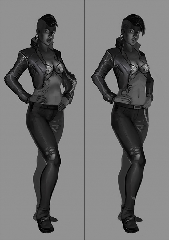
The big thing wrong, is the arms. The shoulders are to broad, I know the jacket type has wide shoulders but even still they are just to wide. The arm on the right seems to have a bicep the size of her forearm and the jacket lays on it oddly.
The second main problem is the concept. I think you've pushed this image around so many times you strayed from your original idea too much and lost it(also something I suffer from.) You went from a punk/rock chick to a rougher female Fonz and then mixed them, getting this weird early 90s feeling chick. I think you should push your original punk/rock idea back into the piece! I gave her a head tattoo with brow piercing to push it a bit more, you can do this too or come up with something else. Just get your concept back!
After those two problems it's just small things here and there. - Her collar's far side lines up with her jaw.
- Her lips are to dark, if she has lip's stick on their fine but will need some strong highlights since lipstick is glossy.
- The pants rip and fray in the thighs then meld into good condition below the knee, also her belt buckle is off.
I am a beginner so take my advice with a grain of salt.
I like what you have so far. I hope this was helpful and didn't come off as negative! 
Posts: 77
Threads: 5
Joined: Jan 2012
Reputation:
0
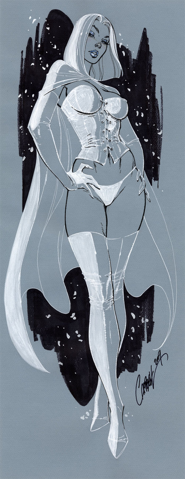
Hey nice work man. You might try tilting the hips & shoulders in opposing directions a little more, makes for a more sexy pose, and hide her left arm behind her torso a bit more(looks awkward). J Scott Campbell does this so well I hunted up some of his stuff in a similar pose. Also the lighting seems off a little bit, underlit in some places, then her breasts have the light from above. Use ref. for hard lighting setups, take pics of action figures or whatever. Thanks.

Posts: 1,074
Threads: 9
Joined: Jan 2012
Reputation:
53
My quick 2 cents: her cloth is badass and the attitude is.... mellow? Get her in a badass pose :) She is strong, she wouldnt side glance people with a soft smile!
Makes sense?
Posts: 491
Threads: 6
Joined: Jan 2012
Reputation:
4
Hey everyone, thanks for all the great words. I'll keep them all in mind.
In the morning I'll probably do a quick rework with what you all said and see where that leaves me. That being said I've been meaning to start another piece for awhile now, and I'm at the point where the idea for that piece is really clear now, and I've even started sketching. So I'll probably put my punk girl down for a day or two and start up that just to do something extremely different.
I appreciate all you've said, thanks for your time guys!
@EduardoGaray I did use reference here and there... but I think my problems were that I applied things wrong and lost my construction early on just to pre-render. Thanks man.
@Atrenr Super thanks for the paint overs! Yes, as I've been telling Shyam, I really need to work on my construction!!!!! I always jump in and render. Bad me! haha. And yes, I've been just looking at the piece too much, and will most likely take a day break. The arms! I was trying to create an interesting pose- didn't realize I had ripped her arms around though hah. I just knew it was awkward. I notice it a lot more now though. You're right that I've changed the concept. Mainly because I couldn't figure out exactly what I wanted to paint. I should've done a few more sketches... but now I have an archetype that I could paint, and hopefully it shows in the next draft. Thank you for this really great critique!!!
@AaronJordan Ah yes! Campbell is great, isn't he just? Yeah about the lighting- in my third one I actually completely moved the light last minute. I wanted there to be less black, the image felt flat. I painted a face with the lighting from that angle, but me not really that great with faces made it more masculine. Yes, some reference studies could help. Thanks for the critique! It helped!
@Ursula Yes, Perhaps I will rework the pose some more, espically after what AaronJordan said. Thanks man.
Posts: 623
Threads: 36
Joined: Jan 2012
Reputation:
50
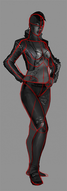
Hey Zesiul, lookin good. I thought I'd rework the latest pose on the girl a little. Had some trouble with how to place her left arm but hopefully this helps give you some kind of ideas; Although it's pretty much the same, just with a few fixes here and there
Edit: Added another one, thought it might be sexier, who knows.
Posts: 491
Threads: 6
Joined: Jan 2012
Reputation:
4
Hey thanks dennis. I actually did a quick redo. But who knows where this is going.
Okay so, new pose. I added in slightly more feminine stuff... not super stellar towards the leather torso piece as I was with the jacket. Might sill mingle around with that. Like none of the costume-or evern the pose- is final yet. I like her upper half pose way more, but putting her off balance... idk, it feels like she's more of a poppy teen instead of a badass punk. Working on it!
WIPPPP
![[Image: Costume_2.png]](http://i1139.photobucket.com/albums/n558/Zesiul/Costume_2.png)
Side note- I'm trying to focus on SHAPE, render later. Woo!
Posts: 491
Threads: 6
Joined: Jan 2012
Reputation:
4
Reworked pose and design, much more happy with this one!
![[Image: Punk_Sit.png]](http://i1139.photobucket.com/albums/n558/Zesiul/Punk_Sit.png)
Posts: 491
Threads: 6
Joined: Jan 2012
Reputation:
4
Did a quick couple of renders of lighting. I originally had my heart stuck on the left, but now I really like the middle.. I'm not sure just yet, but I'll definitely keep posting my progress!
![[Image: LightingSetup.png]](http://i1139.photobucket.com/albums/n558/Zesiul/LightingSetup.png)
Posts: 491
Threads: 6
Joined: Jan 2012
Reputation:
4
Started to render, hum hum hum.
![[Image: Let_There_Be.png]](http://i1139.photobucket.com/albums/n558/Zesiul/Let_There_Be.png)
|


![[Image: Sketchy.png]](http://i1139.photobucket.com/albums/n558/Zesiul/Sketchy.png)
![[Image: SP.png]](http://i1139.photobucket.com/albums/n558/Zesiul/SP.png)
![[Image: Pose_1.png]](http://i1139.photobucket.com/albums/n558/Zesiul/Pose_1.png)
![[Image: Classic_Copy.png]](http://i1139.photobucket.com/albums/n558/Zesiul/Classic_Copy.png)
![[Image: Poses_Nov_15.png]](http://i1139.photobucket.com/albums/n558/Zesiul/Poses_Nov_15.png)
![[Image: Final_Concepts.png]](http://i1139.photobucket.com/albums/n558/Zesiul/Final_Concepts.png)
![[Image: Future_Punk_Girl.png]](http://i1139.photobucket.com/albums/n558/Zesiul/Future_Punk_Girl.png)
![[Image: Future_Punk_W2.png]](http://i1139.photobucket.com/albums/n558/Zesiul/Future_Punk_W2.png)
![[Image: Progress.png]](http://i1139.photobucket.com/albums/n558/Zesiul/Progress.png)
![[+] [+]](images/collapse_collapsed.png) Spoiler
Spoiler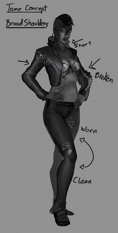


![[Image: ziesPaint.jpg]](https://crimsondaggers.com/dennis/images/stuff/ziesPaint.jpg)
![[Image: ziesPaint1.jpg]](https://crimsondaggers.com/dennis/images/stuff/ziesPaint1.jpg)
![[Image: Costume_2.png]](http://i1139.photobucket.com/albums/n558/Zesiul/Costume_2.png)
![[Image: Punk_Sit.png]](http://i1139.photobucket.com/albums/n558/Zesiul/Punk_Sit.png)
![[Image: LightingSetup.png]](http://i1139.photobucket.com/albums/n558/Zesiul/LightingSetup.png)
![[Image: Let_There_Be.png]](http://i1139.photobucket.com/albums/n558/Zesiul/Let_There_Be.png)