Posts: 189
Threads: 10
Joined: Jan 2012
Reputation:
2
Just had a thought. Maybe study Lava too? And tint it bluuue. Could be realllly coool
Posts: 94
Threads: 2
Joined: Sep 2012
Reputation:
3
The last sketch of this rock... WHOA! Lighting work great here !
And I like what You did there, with usage of red color in the middle. I just adore details like that <3
Posts: 1,098
Threads: 11
Joined: Aug 2012
Reputation:
34
i saw your last updates of facebook man, that squid studies are among my favourites.
And good job with the rocks too!
Posts: 809
Threads: 2
Joined: Mar 2012
Reputation:
16
Nice work man. Really like the bottom right dragon. And if its glowing, the light could be fun to play around with if you're gonna oush the full illustration. Cool approach btw, nice to see you pushing the design. Might have to try that some time. :)
Posts: 556
Threads: 5
Joined: Dec 2012
Reputation:
8
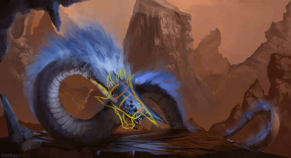
Looking good, I can see you've put those snake and rock studies to use.
Have you figured out your lighting yet?
update on the serpent piece is great, keep going!
Posts: 237
Threads: 3
Joined: Jan 2013
Reputation:
1
cool dragon! In my oppinion this picture missing hero, who standing in front of dragon. no?)
![[Image: Squid_Studies_Jan_31_2013.png]](http://i1139.photobucket.com/albums/n558/Zesiul/Squid_Studies_Jan_31_2013.png)
![[Image: Squid_Studies_Jan_31_2013.png]](http://i1139.photobucket.com/albums/n558/Zesiul/Squid_Studies_Jan_31_2013.png)


![[Image: Dragon.png]](http://i1139.photobucket.com/albums/n558/Zesiul/Dragon.png)
![[Image: Rock-Studies_Feb_2_2013.png]](http://i1139.photobucket.com/albums/n558/Zesiul/Rock-Studies_Feb_2_2013.png)
![[Image: Rocks_Feb_2_2013.png]](http://i1139.photobucket.com/albums/n558/Zesiul/Rocks_Feb_2_2013.png)
![[Image: Snake_Studies_Feb_3_2013.png]](http://i1139.photobucket.com/albums/n558/Zesiul/Snake_Studies_Feb_3_2013.png)
![[Image: Rocks_Imagination_Feb_4_2013.png]](http://i1139.photobucket.com/albums/n558/Zesiul/Rocks_Imagination_Feb_4_2013.png)
![[Image: Lava_Study_Feb_4_2013.png]](http://i1139.photobucket.com/albums/n558/Zesiul/Lava_Study_Feb_4_2013.png)
![[Image: Lava_Study_2_Feb_4_2013.png]](http://i1139.photobucket.com/albums/n558/Zesiul/Lava_Study_2_Feb_4_2013.png)
![[Image: Dragon_Studies_Feb_5_2013.png]](http://i1139.photobucket.com/albums/n558/Zesiul/Dragon_Studies_Feb_5_2013.png)
![[Image: Blue_Dragon.png]](http://i1139.photobucket.com/albums/n558/Zesiul/Blue_Dragon.png)
![[Image: Blue_Dragon-1.png]](http://i1139.photobucket.com/albums/n558/Zesiul/Blue_Dragon-1.png)

![[Image: 30_Sketches_Feb_9_2013.png]](http://i1139.photobucket.com/albums/n558/Zesiul/30_Sketches_Feb_9_2013.png)
![[Image: Giant_1_Feb_10_2013.png]](http://i1139.photobucket.com/albums/n558/Zesiul/Giant_1_Feb_10_2013.png)
![[Image: Giant_2_Feb_10_2013.png]](http://i1139.photobucket.com/albums/n558/Zesiul/Giant_2_Feb_10_2013.png)
![[Image: Giant_3_Feb_10_2013.png]](http://i1139.photobucket.com/albums/n558/Zesiul/Giant_3_Feb_10_2013.png)