02-28-2025, 01:51 PM
Hey George! The 'Sword-Girl' turned out GREAT. Love the colors, the pose, her expression, and the cool background. The skull study is excellent — that lighting really makes it jump off the screen!
|
CGMythology's Sketchbook
|
|
02-28-2025, 01:51 PM
Hey George! The 'Sword-Girl' turned out GREAT. Love the colors, the pose, her expression, and the cool background. The skull study is excellent — that lighting really makes it jump off the screen!
03-09-2025, 09:19 PM
darktiste: Great suggestions! I'm currently studying anatomy using traditional media, I'm almost done filling the sketchbook so I'll post those studies soon. Thanks!
JosephCow: Thanks, glad to hear you enjoy the studies, they were a lot of fun to tackle! Crowbit: Thanks! Having a lot of fun with these studies and more importantly and getting more comfortable with dynamic lighting so they're helpful! Domincque: Thank you and great suggestions! I'm a bit too eager to put my final lines when working traditionally (digitally sometimes I have the same problem but it's much easier to clean up mistakes). I'll try to be more conscious of this ; glad you enjoy the new illustration! Jephyr: Thank you kindly! Had a blast with all the material so I'm glad you enjoy them as well :) .............. I'm doing a crapload of anatomy studies traditionally which I'll be posting soon and I'm learning quite a bit. For now I thought I would take a small break from them and try out a new illustration. Here's a sketch of Spider-Woman. The pose was referenced from this photo here. I just wanted to hear any input before I begin to paint it in, so if something feels off please let me know! 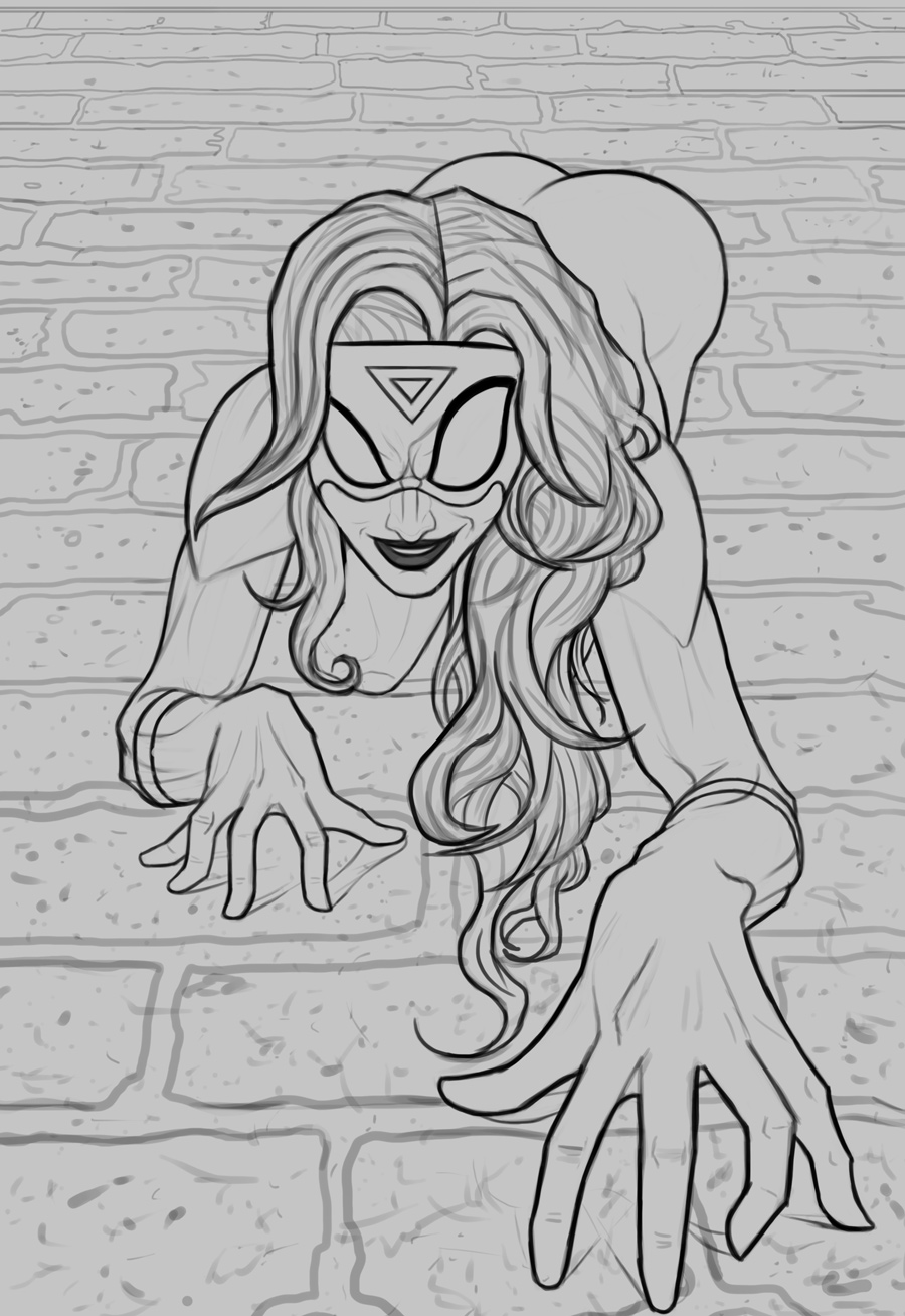 Edit: Fixed some issues with the figure, hopefully it's an improvement. Please let me know if the figure looks ok now!
03-11-2025, 10:22 AM
The hands are looking very well done, and the overall pose looks good to me ^-^
03-13-2025, 02:46 PM
I did notice in the reference, the upper right arm bends further back into space than in ur sketch. I wanna say the forearm appears a little short in the sketch because of that.
Everything else looks pretty awesome to me. Feel free to change that if you'd like, final result should look great anyway :)
03-20-2025, 03:04 AM
Crowbit: Thank you, glad to hear it!
ruthwood: Thanks and great points! Did some minor changes to the sketch for a more natural look and went ahead and finished up the painting process. ................. I finished up the painting process. At the last stage I decided to make the eyes more symmetrical as it felt too stylized against a realistic look I was going for. Hopefully that was the correct choice. Any final input on the image would be appreciated before I add it to my portfolio, so if something looks off kindly let me know! Below is the current progress followed by the steps for those interested:  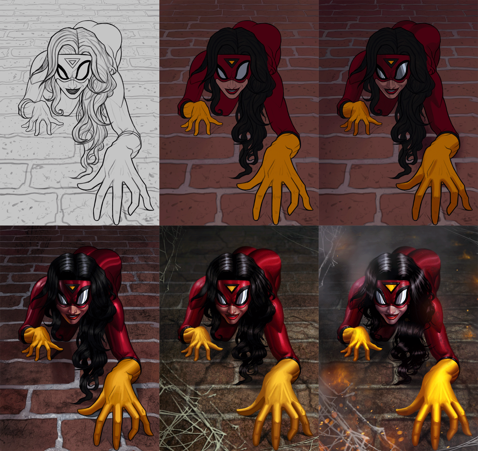
03-20-2025, 04:33 AM
Would give more love to the finger and check back at the reference i felt something was off you made some finger bend to much outward.Finger bend inward not so much outwardly.
One other odd thing is the hair they make zero sense they are zero gravity hair? She is climbing a wall? Where is the ground? If she climbing than the hair should move toward the ground naturally not what i feel is a brick wall. Actually now that i think of it maybe i am just wrong about the scene but the ''ground'' look like a wall so excuse me for my confusion it just that i am expecting a ''spider'' on a wall. The only thing that lead me to believe she on the ground is you made the fire go up and there some kind of web... if there fire on the ground why is she crawling in it... sorry there so many question on this one. This one didn't seem problematic at first but the more it move toward it seem hard to determine if some choose are intentional or bad planning due to sticking to much to the reference to the point physic no longer make sense.
03-21-2025, 02:17 AM
Spiderwoman looks great, George! Kool color choices, background and pose. Small nit — I agree with Dark about her fingers especially that forward hand. But, otherwise, as usual, you knocked another one outa the park!
03-27-2025, 10:18 PM
I like her devious smirk. From glaring at the reference, Jessica's bum appears really curved, like she has a very long torso. Unless that's a deliberate stylistic choice, in which you can ignore this comment. :D
04-15-2025, 12:02 AM
darktiste: Great point, I think I stylized them too much regarding the fingers. I updated them to keep them simpler and more natural now. I also agree with the rest of your input as well, the image wasn't too well thought out in terms of the environment I admit. Took another shot at it and updated it heavily, please let me know if it's an improvement!
Jephyr: Thank you kindly! Agree about the fingers, just updated them! Dominicque: Thanks! The torso is a bit stylized to give her a more appealing look, hopefully it's not too unnatural looking! ............ I took a very long break to avoid burnout, and also wanted to take another look at the image with a fresh eye, so I reworked it significantly based on the input. I'm quite happy with it, but I'm still open to feedback if something major is off, so please let me know! 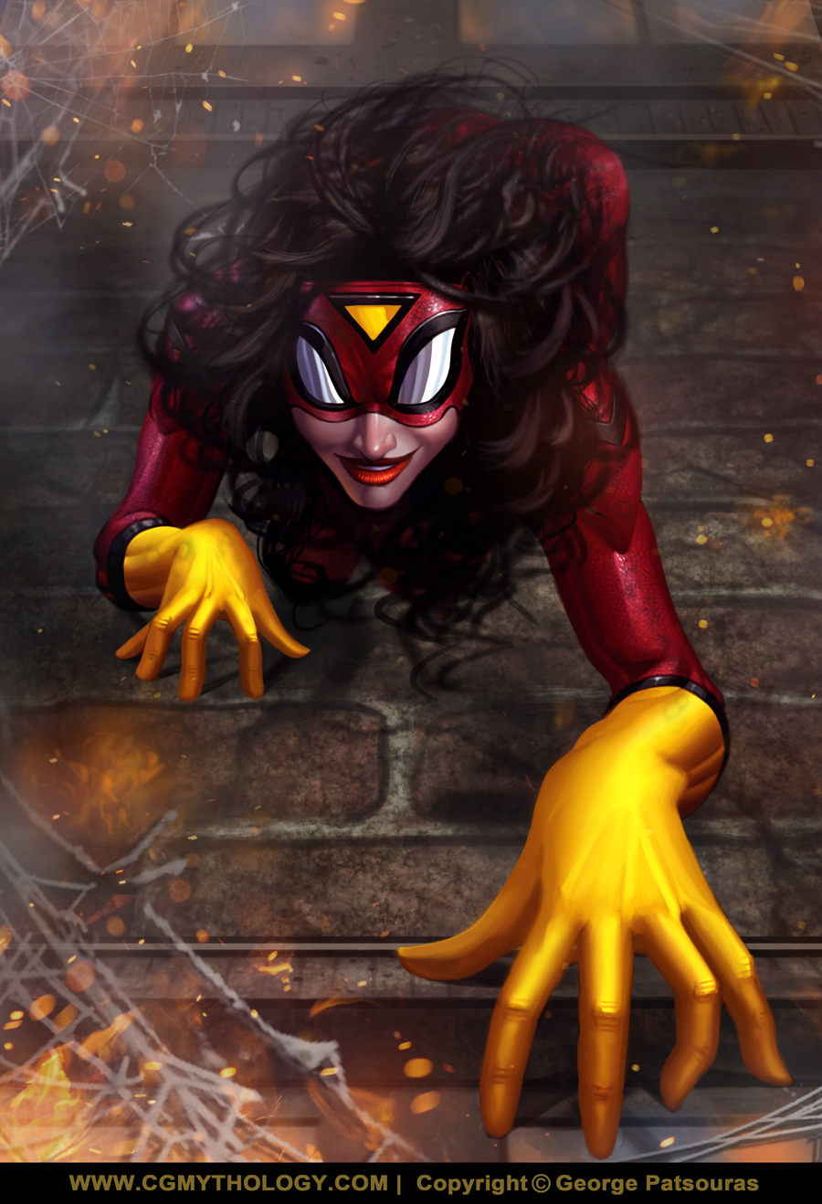
04-15-2025, 04:04 AM
The addition of the window is a good call but ultimately i think a better composition would have done a lot more. The addition of the hair even if i feel as a purpose now conflict with a clear gesture she almost become like a ball of hair and arm if you had only shown me this stage i would have a problem knowing what i am looking at which is often what happen with extreme foreshorten where many body part hide what behind itself .
See how in this reference picture they split the frame to include a clear ground plane as well as make the ''surface'' spider men sit on mostly glass to help establish direction. The gesture is clear every leg and arm add dynamism and clarity they don't overlap to a degree with the action loose it punch or become unclear .The fact your character had hair required a bit of addition planning but also made this piece so much harder because where do you find hair reference for such a pose... I think some of the take away is using reference can be limiting to what you can put inside the composition to establish a clear context. At this point what hurting you is relying so heavily on those reference. I feel it only normal that you feel burn by what i am saying your face with a choose do you keep relying heavily on reference or do you move away from that and go down the hard road. There a use to reference let make no mistake it to establish context not to constrain your option. Try to avoid tunnel vision when you have a reference and i personally would say stay away from gesture reference they are the one who will hurt the most when you need to move thing around . Reference are great for inspiration but it my personal opinion that they are for inspiration they also are not bad to study from just not be carbon copy. The problem of illustration is prep work not being willing to do thumbnailing is for me a problem it show you are lagging behind in gesture and working from imagination. Maybe what you forgot to do was to also find example such as the one i show here to fill the gap.So really my advise is if you want to use reference try not to limit yourself to one only. Your anatomy should be strong enough that your not getting the anatomy correct from the reference alone .The reference are more for an idea of the general proportion and gesture you want to materialize. Moving on from this project is what i advise to do the problem i am bring up should have been address at much earlier stage but it often to late for me to do any meaningful feedback due to the feedback format. I wish you the best growth possible i think keeping thing honesty on my part and repeating what i think is best practice is the least i can do to try to break a habit that in my personal belief is hindering growth. Let be positive for a second look at the bright side you have room for growth.
04-26-2025, 07:30 AM
Hi George! The changes to Spiderwoman are excellent. The wild hair is a great update!
Hope all is well!
05-06-2025, 04:39 AM
darktiste: Thanks, and I agree about the composition. I definitely should have put more thought into it in the earlier stages, so it definitely pays to plan ahead. As for relying on references, it goes hand in hand with my realistic style so there's not much I can do about it short of adopting a different style, which I don't plan to do.
Jephyr: Thanks! The wild hair wasn't exactly intentional to be honest, just something I decided to change at the end of the painting process as it didn't look too natural before. Glad you like the image and keep up the great work! ............ Had a bit of an art block but I decided to start on a new illustration for Mermay as I made it a yearly habit to paint a Mermaid every May I finished up a sketch based on one of Grafit Studio's reference packs (you can view the pack here), taking some artistic liberties to make the gesture more dynamic as well as giving her a more interesting character design. Overall I'm quite pleased with the sketch but I wanted to hear any input before I begin doing some color tests for this one, so please let me know! Below is the sktech: 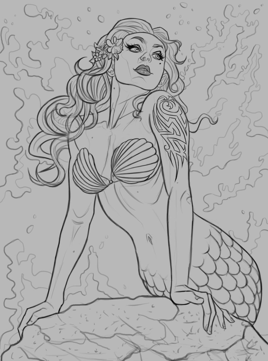
05-06-2025, 05:51 AM
Why not play with fish pattern instead of a tattoo. Will you make her skin tone like a human or will you go colored?
Why not try to get some tropical fish inspiration for color and pattern or do you prefer the pin up mermaid? I am curious what a clown fish mermaid would look like. The water splash will be a pain in the ass i suspect careful not to bit more then you can chew there already those fish scale to deal with and hair.
05-06-2025, 06:17 AM
Nice sketch on the new piece! I think the colors used in that reference pack could make this one really cool if you chose to go in that direction , but i suppose that would require you making her under water and not on the surface. Personally i would love to see her totally submerged and really play with the lighting on this one but that's just me.
My only crits on the sketch so far would be the bikini shell shapes are currently looking asymmetrical. If that's by design then ignore, but if not, you could tweak either one to better match the shell ridge pattern. And if you did move forward with her coming out of the water and climbing a rock her lower half could use some attention. currently it gives a look that her lower half is like a bowling pin and not a long tail, maybe widening a bit at the bottom, and playing with the scale formations to give a stronger impression that her body continues offscreen. also i agree with the crits on the tattoo, tribal is not in vogue at the minute :-) i would much rather see a cool glowing scale formation or maybe even some barnacles :) But nice work so far, looking forward to how you approach this one
05-06-2025, 10:23 AM
Really cool sketchbook! So solid. Just the sheer amount of work tackling different subject matter and all the improvements over the years - extremely inspiring!
05-07-2025, 10:59 PM
darktiste: I feel the tattoo gives it a bit more of a modern flavor, but I went ahead and replaced it with that of a fish tattoo as opposed to a tribal one as I feel that works better given the subject matter. Regarding the water, I'll try to keep it simply and loose as opposed to overdetailing everything, we'll see how it goes!
CBinnsIllustration: Thank you! An underwater scene sounds fun, but I don't feel it suits this particular image! I'll definitely give that suggestion a go in the future however as that seems like a fun challenge. Thanks for your suggestions as well, went ahead and tweaked the sketch a bit based on your input! Jaye23: Thank you kindly, appreciate the kind words! ............................ I updated the sketch and did a series of color tests. My personal favorite is 'B' but I'm open to hearing suggestions on what you feel works best, so please let me know which one you prefer! Below are the color tests: 
05-08-2025, 12:25 AM
I would go with D for the color choose of ''shell'' but i would mostly work from F .The skin in F might be a bit of a more realistic choose i am just thinking how depth is the water and does she come to take some sun on the surface often to ''justify'' the tan.
Would be nice to have a round of just crazy color skin not just fleshy tone. Would you consider adding fish gill do you want her to be glamour pin up ish. I am think of what you could add to make it a bit more realistic animal inspired instead of just the classical ''little mermaid'' take For the tattoo it a nice idea to play with the ocean theme but i was referring to the skin that could have real fish pattern not ''tattoo'' that why i was giving an example like a clown fish. Here a pinboard of fish pattern if that something you feel inspired by https://ca.pinterest.com/paws333/exotic-fish/ .All that skin is an opportunity to make sometime unique.
05-19-2025, 11:25 PM
darktiste: Thanks for your input! I decided to begin with 'B' as the colors appealed to me the most there, although it evolved to something else entirely as I proceeded to paint it in. For this one I wanted to create a classical mermaid inspired by the 'Little Mermaid', although next time I paint one I'm definitely going to go for something drastically different, more of a creature/animal as you suggested.
............ Went ahead and finished up the painting process. The waves gave me a bit of trouble, I wasn't handling them correctly initially but I'm happy with how they turned out now. The image is pretty much done but I'm open to tweaking it and doing some light adjustments if something feels off, so please let me know! Below is the current progress followed by the steps for those interested:  
05-20-2025, 03:33 AM
I didn't expect a night scene. One thing i am not sure is why so much red is above her head why so much ''glare'' it not metal it not that shiny. Also i want to justify the light in the water so i am thinking of a light house far behind or perhaps one of those lantern fish in the water you seen in the deep sea that could emit light otherwise i don't think the moon light would be strong enough to give you that result and what ever light source from the left i don't know what i could be... For the red of her head i would rework that it to strong .The blue on the cheek also is exaggerated it could be turn down. I am not against exaggeration i think it fine to go with a lil more saturation where you want the eye to go but don't make it bleed like an armor does with a ''glare''
I tried to fix that chin but anatomy in those extreme angle are certain outside my expertise so i tried what i could. I also play a bit with liquify if you have that tool(i am using photoshop cs6) to see if anything seem natural i end up liquifying the head to make it a bit more rectangula. Something was off with the right side of her face the cheek and the chin seem to flat. I rework the plane of the chin and cheek to reflect how i see the light would hit those plane. Oh and quick note i deleted her right ears because it was deform beyond recognition(after my liquify) and i had a lil stroke of genius just stamp clone the hair where there a hole. Note those blurry line over her head it was just me trying to remove some of that red glow on her head but it give me idea like why not add shooting star over her head that would add a bit of story and magic to drive the eye toward her face by placing them over her head going from left to right. |
|
« Next Oldest | Next Newest »
|