03-13-2016, 04:29 PM
I chose House of Negrea for the challenge.
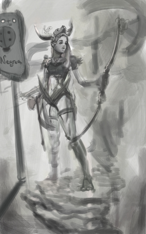

|
Crimson Crucible Liberty WIP
|
|
03-13-2016, 04:29 PM
I chose House of Negrea for the challenge.

03-13-2016, 05:17 PM
Congrats! You win the "Quickest off the mark" award! :) Will be good to see how you develop this.
03-14-2016, 04:50 AM
The character looks nice so far. Have you considered other concepts as well?
Also i don't quite understand what is happening in the lower part of the drawing. There are some rocks? So she's higher than the ground. But the House Negrea flag seems like it is on the ground? (looking how there's a shade suggesting it) Looking forward to see it progress. :)
03-14-2016, 08:21 AM
Thank you guys for checking out.
BlackDelphin, I havnt considered other concepts, thank you for your observations. Man with one day already gone, this is gonna fly so fast. 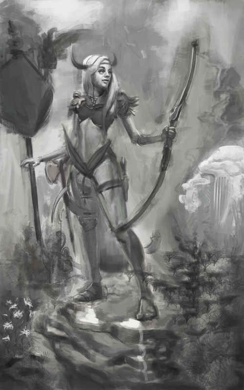
03-14-2016, 09:53 AM
Time flies, so true. Looks really cool already! Looking forward to the rest of your progress.
03-15-2016, 05:12 AM
Thanks BrushNoir.
Im totally lost, my painting kept getting worse and I painted on one layer so I cant get back... I really dont know what Im gonna do next, the ideation is not there and the painting sucks. I tried to do lines to save myself. Doing proper illustration is so much harder than sketchin random things floating in air. 
03-15-2016, 10:47 AM
I think what you have finished so far looks great! But I really understand what you mean, I think the painting part will be hardest for me, too.
But maybe you could try a different style that does not include painting? Or, if you lost connection to your work, maybe collect some more ideas or do thumbnails. That always helps me to get motivated to keep trying.
03-15-2016, 12:40 PM
tinDeer I lost connection to my brain, while ago :D Thanks
Oh Lord heres the main idea, my house since hardworking and smart will be very rich, so the kid is accountant and scout, big girl leads, does the heavy lifting and protecting, little girl is the simbol for spring. Theres gonna be a statue of a lion, if i manage to pain it later. exe.cution >??? 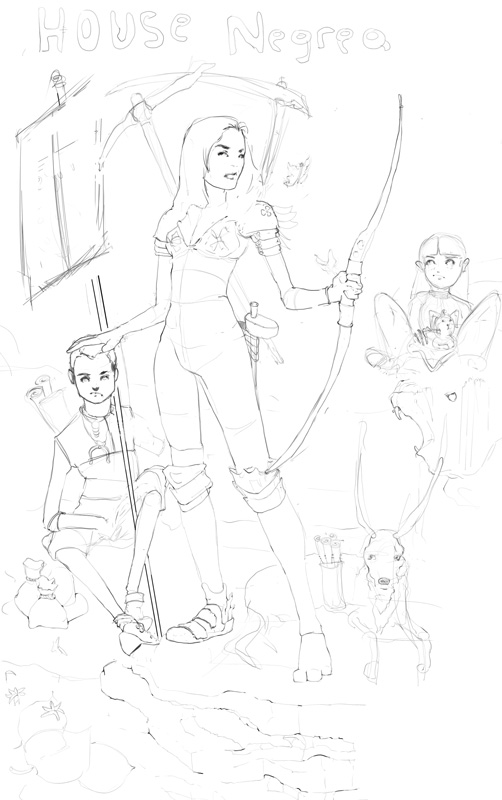
03-15-2016, 01:28 PM
Really nice linework. Better idea to do that first if you tend to go astray painting. Love that dog :)
I am a little concerned about the random elements not coming together in your concept. For example the warrior alone, has a hammer, a bow, a scythe and a pickaxe! Then the accountant angle, and on top of that a lion statue! I think you need to really have a think about what you are going for, and make your design complement that idea. I also don't feel there are enough GoT elements to make it recognizable as fitting in that world which is a pretty gritty low-fantasy style. I sensed from the beginning that you jumped in too quickly. Maybe take a step sideways, and go back to reference gathering and working on some more basic design sketches for the character before you think about finishing the illustration. The beetle while being a sigil, could give you some thoughts on mirroring the design language into the character and/or environment as well. You seem to be able to work quickly, so it shouldn't be a problem to spend a bit of time and effort into getting the design part working.
03-16-2016, 08:55 PM
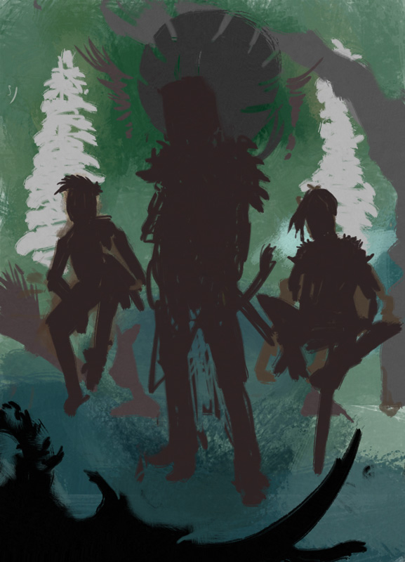
I took your critique Amit, and changed composition, hope its better now.
03-16-2016, 09:35 PM
Sorry If I wasn't being clear, but I didn't mean the composition, I meant the design elements. Both comps work, I like the new one, because it has more connection of the characters to their setting and is more compelling. I'm going to shut up now...I don't want to push people too far off course where they are headed. Just carry on, don't second guess too much! Remember crit is to be taken or ignored as you feel is right! ^.^
03-17-2016, 09:08 AM
Sure man, whatever you think is right.

03-18-2016, 10:30 AM
I just dont uderstand value and color, will be looking for solutions.
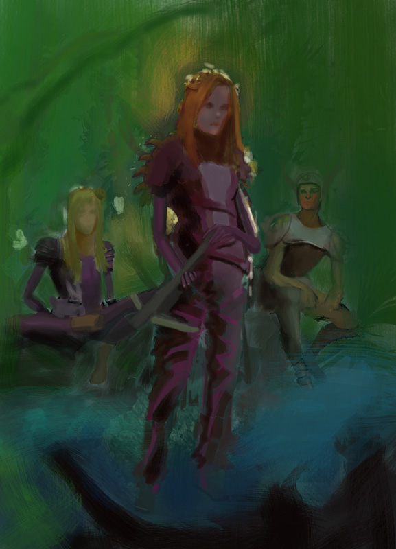
03-18-2016, 04:08 PM
Make sure to pick a light source and stay consistent with it, looking forward to more!
03-19-2016, 04:18 PM
Thank you Hobitt.
Some more work, solving problems as I go. 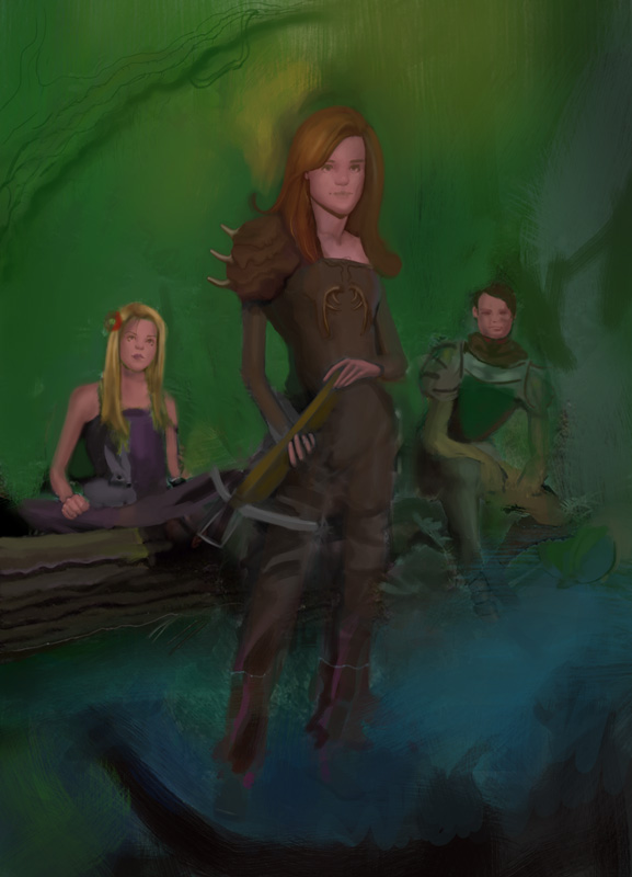
03-20-2016, 10:16 AM
I learned that smallest change can impact the feel of whole image to something else, weird.
Heres more baby steps. 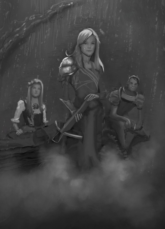
03-20-2016, 11:06 AM
nice, yeah I agree especially with values.
right now you could go darker in value in places where light couldn't get in (occlusion shadows) that will make your painting more 3d
03-24-2016, 03:48 AM
Thank you Kurt for exposing the flatness, there are occlusion tutorials on the web, will see
if I can do any of that. After hitting the ceiling again I gave up and ended reading the random articles on wikipedia the whole day, where I found some Norge tv show full of hot chicks, it was great. And today national football team plays friendly match and I cant do anything till it ends. But after that, no excuses left, to finish this piece. 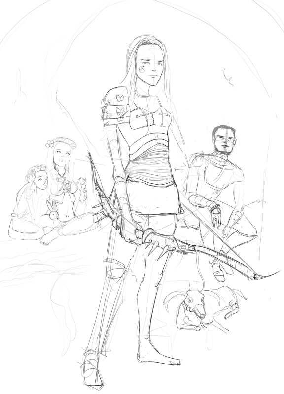
03-24-2016, 01:44 PM
Great I think you much improved the comp. Push it to finish this time!
|
|
« Next Oldest | Next Newest »
|