Posts: 501
Threads: 10
Joined: Jan 2013
Reputation:
20
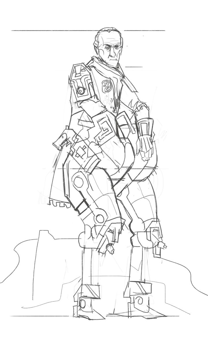
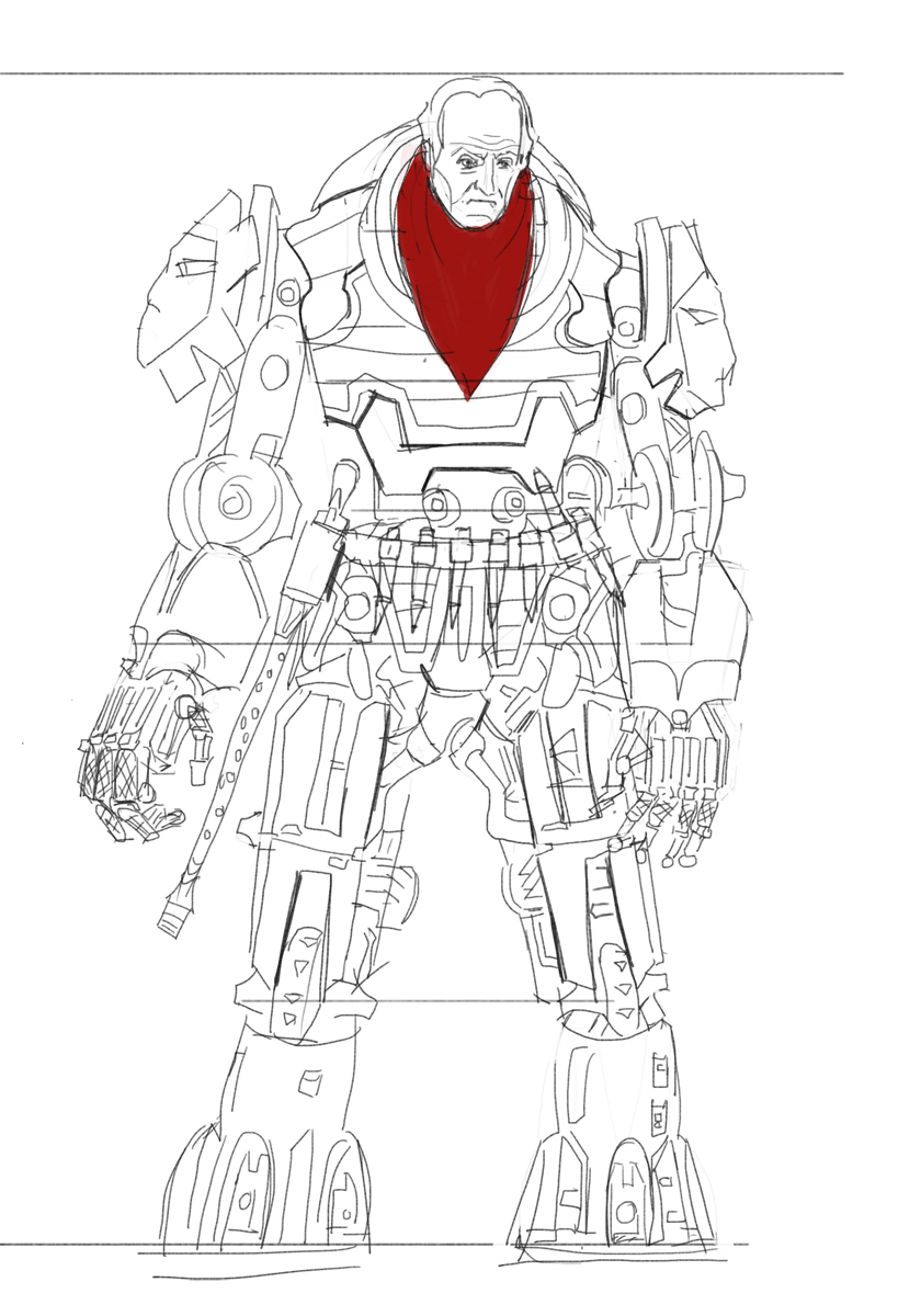
Alright i gathered a bunch of reference and my idea will be this Tywin Lannister, set in a space western on mars!
And ill try to not use a cowboy hat thats too obvious and doesent work with the design ill study the reference later need to understand how to make it all work.Heres a sketch meanwhile

Posts: 54
Threads: 3
Joined: Mar 2016
Reputation:
0
Very cool idea! Looking forward to seeing more of this :)
Posts: 30
Threads: 7
Joined: Oct 2015
Reputation:
3
space cowboy! please make him ride monsters :)
Posts: 297
Threads: 7
Joined: Mar 2016
Reputation:
14
Cool! Love to see more of this ^^
Posts: 742
Threads: 28
Joined: Jan 2012
Reputation:
44
My piece of advice would be to study tywins outfit from GoT and some space cowboy designs. Then try to mix some common characteristics in the final piece.
Good luck :)
Posts: 501
Threads: 10
Joined: Jan 2013
Reputation:
20
@TinDeer thanks!
@kazenodino Dont know about that, that is a whole design in itself! perhaps some other time
@thanks will do more
@Piotr yeah im currently looking at his armor design since i want him to look battle ready ill try to incorporate it
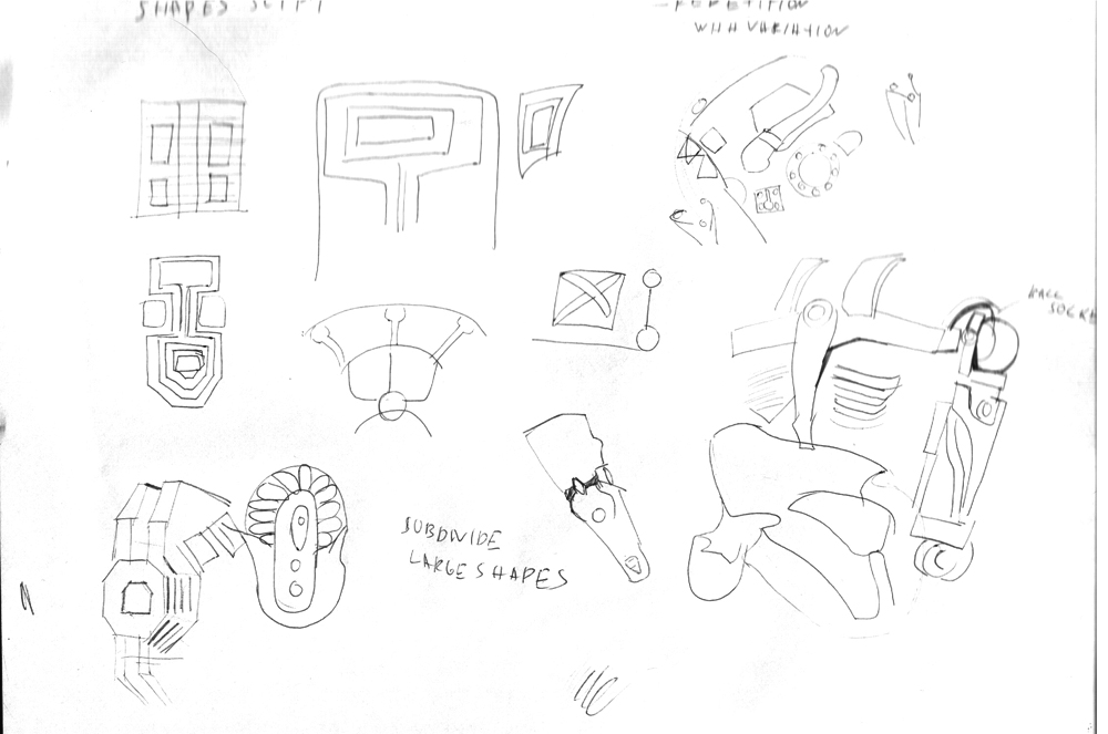
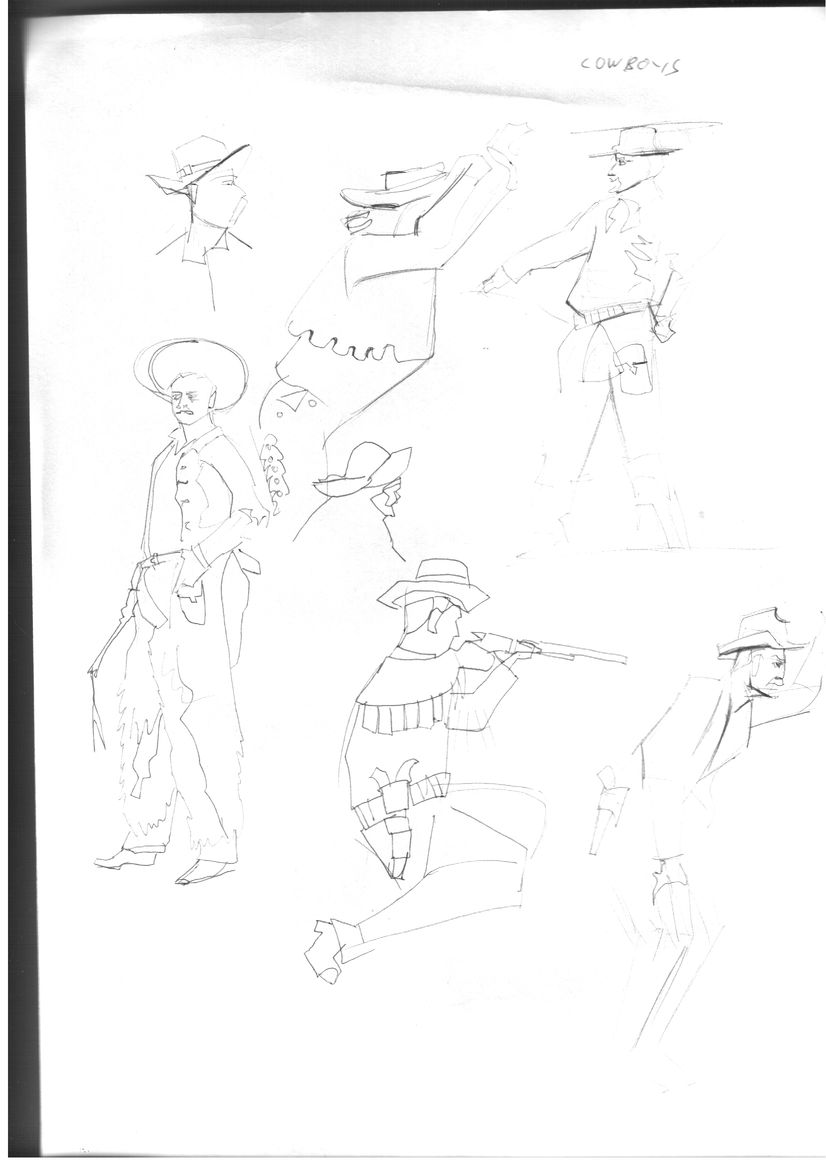
some studies trying to get the feeling for the cowboy stuff , and studying different shapes that will influence the design


Posts: 501
Threads: 10
Joined: Jan 2013
Reputation:
20
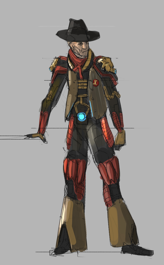
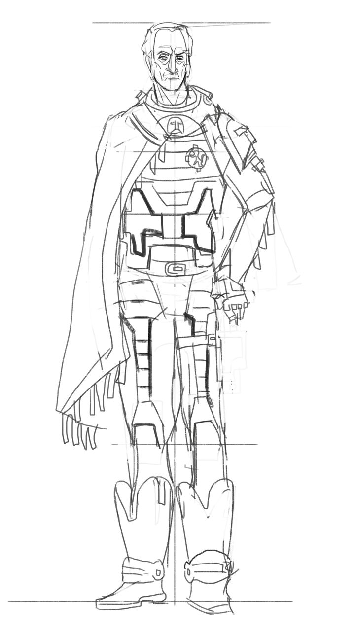
Alright another sketch this time decided to switch it up and start with a drawing, toned down the power armor idea and added a cowboy hat i couldn't resist.

Posts: 234
Threads: 11
Joined: Nov 2015
Reputation:
17
Nice, it does have a Tywin Lannister feel!
Posts: 1,098
Threads: 11
Joined: Aug 2012
Reputation:
34
hah! i definitely like where this is going, i would take a good look at covers and other artwork from the pulp era, specially flash gordon and stuff like that.
But so far i like it, maybe the first concept more than the second, since i have a hard time trying to imagine someone like Tywin with an extravagant outfit.
Nice work on those gestures too!
Posts: 1,109
Threads: 18
Joined: Apr 2014
Reputation:
68
great idea! looking good so far - I think you should lose the hat though, feels too cheesy and doesn't suit his character (for me anyway). Also his receding hair line is one of his distinctive features (I think!). Looking forward to see where this goes ^^
Posts: 501
Threads: 10
Joined: Jan 2013
Reputation:
20
@Eyliana thanks!
@Eduardo yeah i agree ill try to keep the costume ideas more low key and practical
@Jyonny i know the hat is so much cheesecake the design police should lock me up for this! ill avoid it its a very easy shorthand and a cop out of a design problem
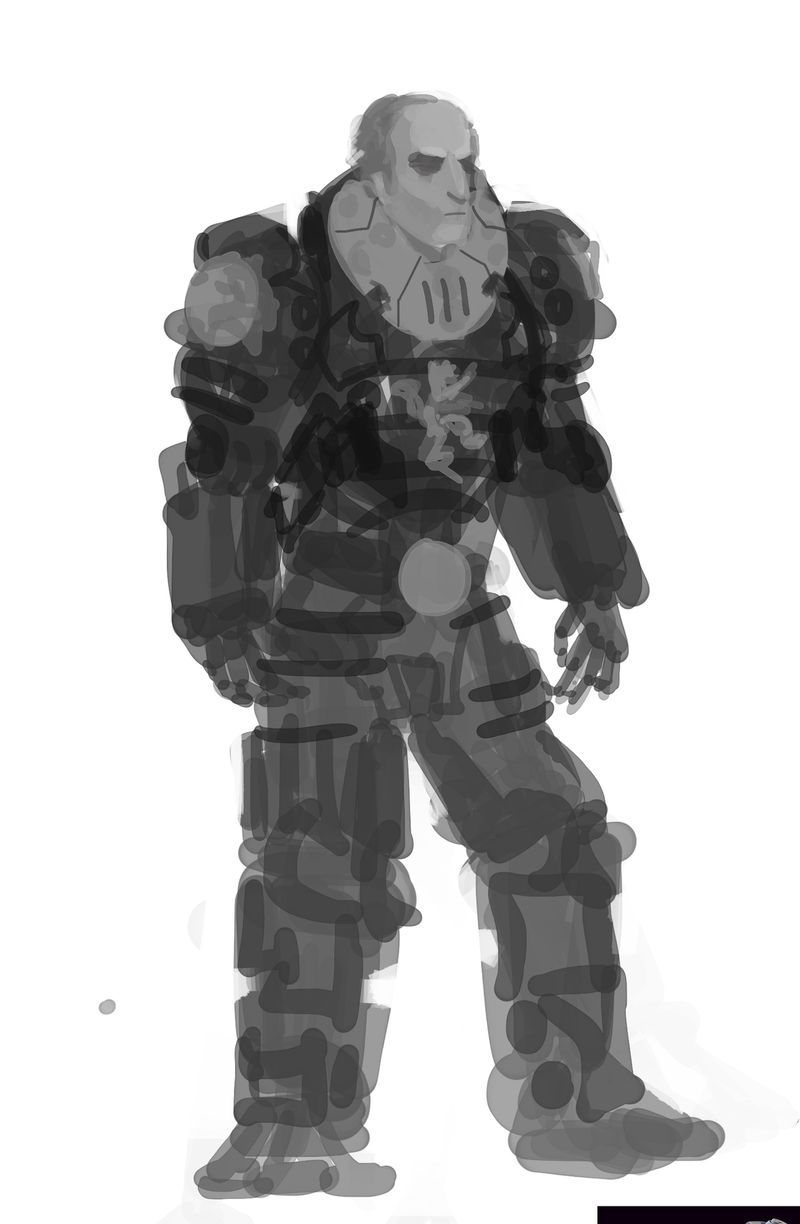
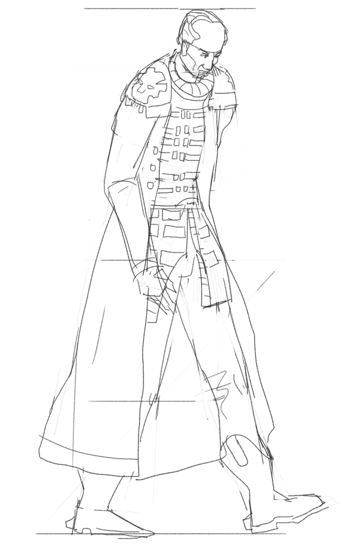
two more sketches first is playing around with an idea of a bit of power armor, second one closer to the western feel, tomorrow ill go back to full on power armor want to see if i can make it work.And maybe start thinking of the composition who knows.


Posts: 501
Threads: 10
Joined: Jan 2013
Reputation:
20
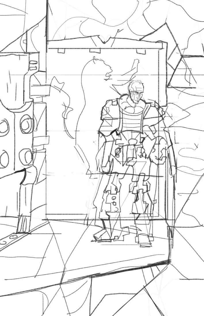
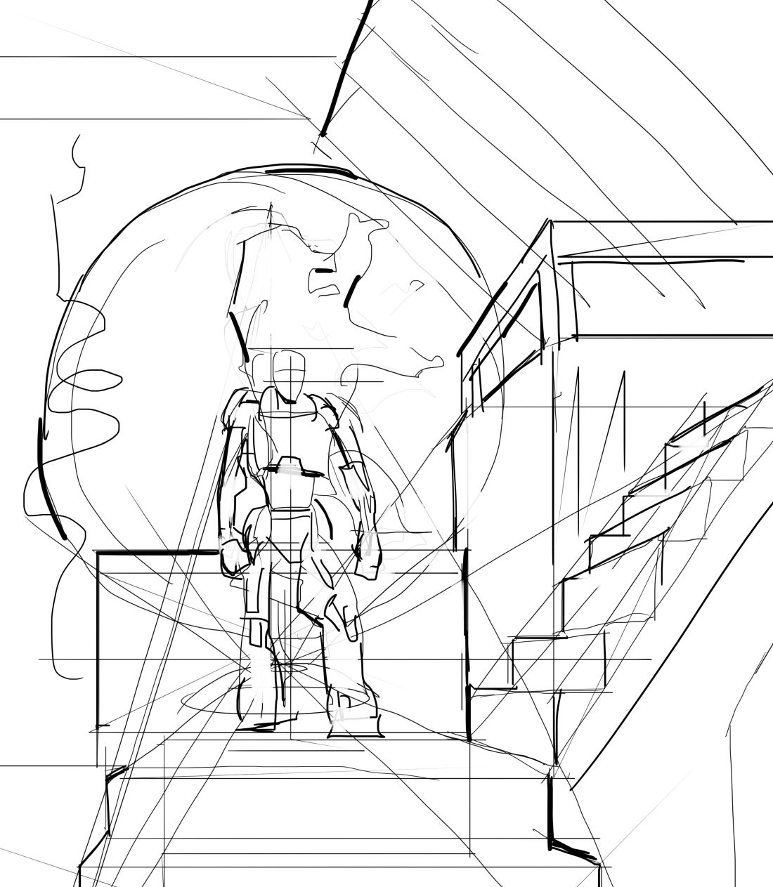
Alright another design and a quick composition will do more thumbnails since the first idea usually the weakest.


Posts: 178
Threads: 6
Joined: Jul 2015
Reputation:
18
You've come up with some pretty cool concepts for your armor. Maybe at this point you could try doing some studies of Tywins posture and facial features, and attempt to carry over some of the visual cues of his attire into the robot armor. Having the Lannister Flag in the background is a good idea. It can be used as a compositional element, and it also helps to make the connection with the setting clear.
Posts: 1,098
Threads: 11
Joined: Aug 2012
Reputation:
34
this last designs are so much better, have you though about taking some ref from the warhammer 40k universe? some imperial commisar outfits would be very fitting for a space tywin.
Im suggesting it because the last two concepts give me that warhammer vibe and its awesome.
Posts: 501
Threads: 10
Joined: Jan 2013
Reputation:
20
@Lodratio yeah thats the plan and yeah i figured the lannister logo makes sense since tywin always goes on about his legacy and the house etc so it seems fitting
@Eduardo I love warhammer 40k! and in general that whole bulky huge power armor thing is amazing.
Well i come full circle and i think i like this design and ill stick with it or close to it, onto the compositions and other things!

Posts: 501
Threads: 10
Joined: Jan 2013
Reputation:
20
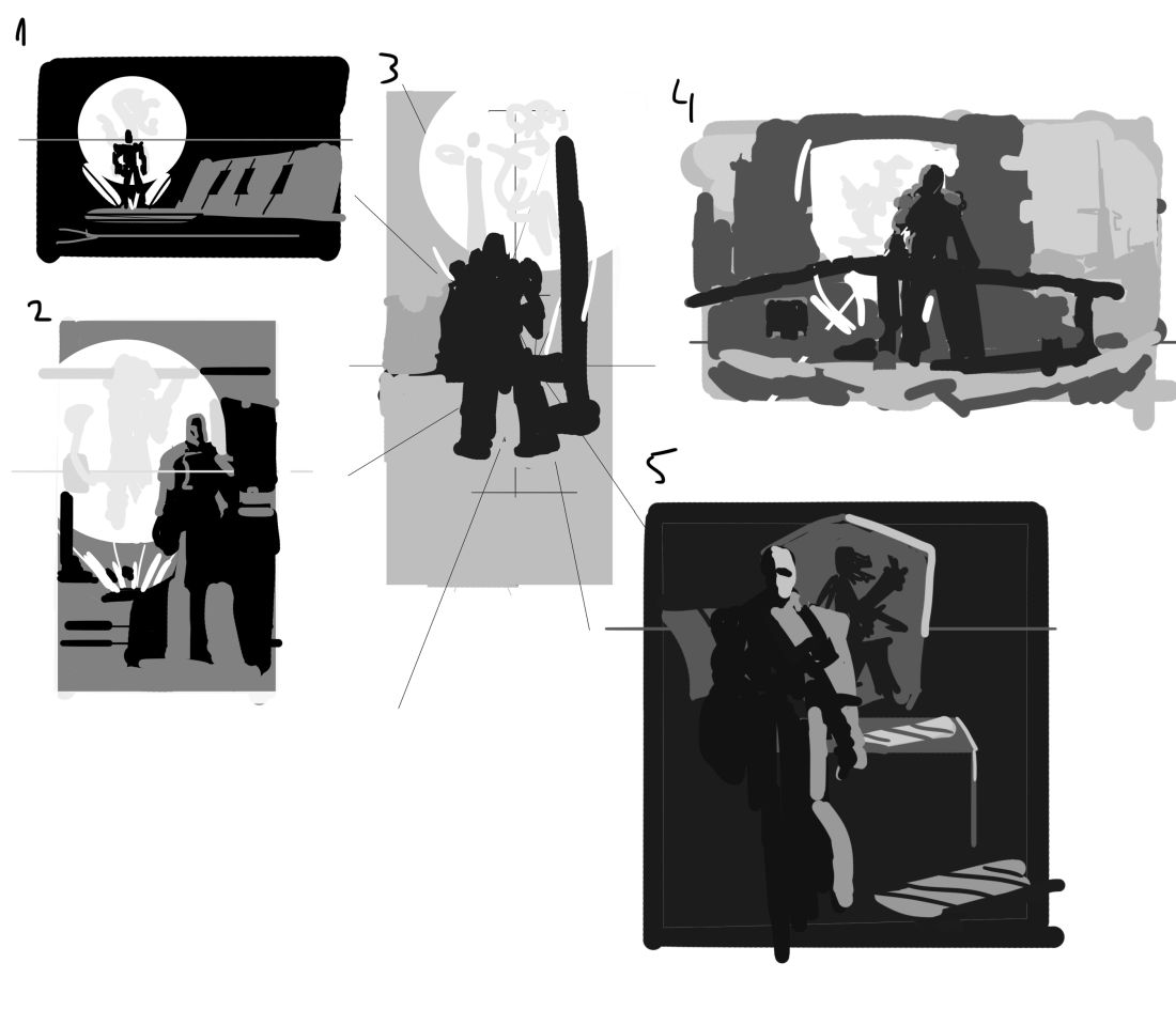
Alright compositions


Posts: 7
Threads: 0
Joined: Mar 2016
Reputation:
0
Thumbnail 5 looks good to me, it's got that "regal" Tywin feel about it. Placing his head in the near the top of the composition also gives him more powerful position in the frame (compared to the other thumbs), like an old master painting of a king. Might be a good idea to analyze a master painting that has a similar quality.
Posts: 1,970
Threads: 22
Joined: Apr 2012
Reputation:
243
I agree with Kopper. Thumb 5 is pretty evocative and the lighting scheme suits nicely. Perhaps he is standing in front of his space desk, in his space office, with his space banner behind him (could be a screen or holo of some sort?). We often see Tywin at a desk working in the series. If you choose that one, do a few more comps, just to get it as balanced and dynamic as possible, and begin to work out more fundamentals, like his pose (very stiff atm, even if he is standing there, there can be dynamic rhythm to his gesture and pose to keep it interesting). Might also want to try extending the canvas up a little more and have a longer banner, as it feels a little claustrophobic atm. Koppers suggestion to go to master paintings of full figure portraits of royalty etc might be very useful.
Posts: 164
Threads: 5
Joined: Feb 2016
Reputation:
7
great stuff Hobitt, not sure how the Imp is suppose to kill his father Tywin Cyborg Lannister lol he looks unstoppable... but it definitely looks like him, has his charisma and the feel of a very powerful man, well done!... also your comps are spot on, just has that feel of power, I do like 5 but I'm leaning more towards 4 just looks like you looking up at him as he surveys his subjects....
Posts: 1,098
Threads: 11
Joined: Aug 2012
Reputation:
34
hey man, since you like WH40K, i think something along the lines of the armor and design of the emperor, i mean THE GOD EMPEROR OF MANKIND would be awesome for Tywin.
|
