04-13-2016, 12:13 AM
Wow, looks awesome! That environment fits the theme so well. Nicely done!
|
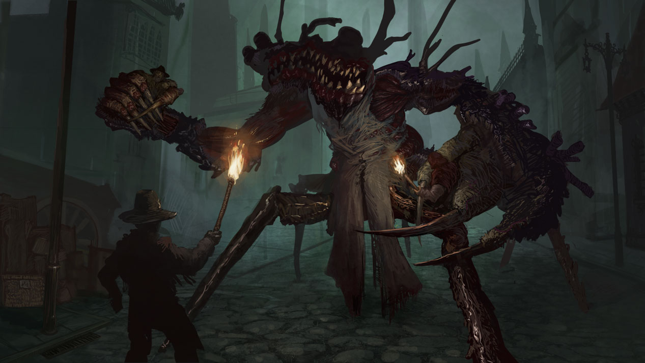
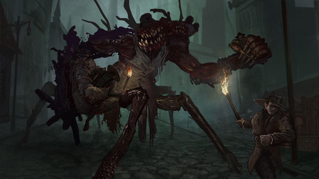
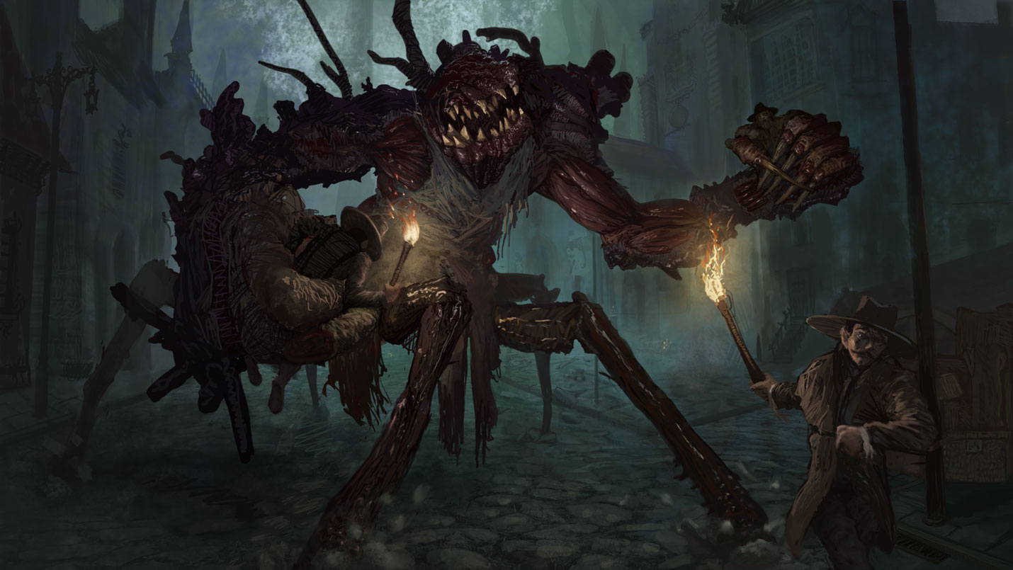
CC 2: Crackedskulls bloodborne monsters.
|
|
04-13-2016, 12:13 AM
Wow, looks awesome! That environment fits the theme so well. Nicely done!
04-13-2016, 12:51 AM
Eyliana - Thank you :)
Neopatogen - I tried to make it more clear, it is another villager holding a torch, I appreciate you pointing it out- Nada - Thanks Hobitt - good to know :) Legion - Cheers! 
04-13-2016, 12:54 AM
Make sure to get some depth within the creature as well, a bit of atmo between that that villager and claw and the main body would make it a bit more readable. I think you could do a more intersting pose for the fore villager...it's a bit meh atm. Might consider showing us at least one expression on a face turned towards us, to emphasise the horror. Watch the scales of the people...that other hand guy looks way too small. In general starting to look great though :)
04-13-2016, 04:03 PM
Awesome work on this guy dude...
04-13-2016, 09:36 PM
damn crackedskull no hassle to you to pump it out, im still plodding along, will I ever get there lol...
anyway great job, love your painting style, would be good to see a video process to see how you go about it... I do agree with what Amit posted. also the lighting from that torch should really come through on the creature and really give of reflections and bounced light, the foreground guy also looks off, cant pinpoint it? maybe torso/hip area needs lengthening... keep pushing
04-15-2016, 02:19 PM
Thank you for the crits Amit, I tried to fix it :D
Thanks Black Phoenix Appreciate the advice slash :) 
04-16-2016, 07:39 PM
The storytelling in your latest update is so much better. You certainly turned the dramatic volume up by changing how the your characters act in that scenario.
Hmm.. the environment could use a little bit of destruction maybe? Hat fallen off the floor. Some blood on the streets. Not quite sure.. Unless the monster has an OCD complex and kept cleaning after himself haha!
If you are reading this, I most likely just gave you a crappy crit! What I'm basically trying to say is, don't give up!
---- IG: @thatpuddinhead
04-17-2016, 01:32 PM
I love the last update. Great storytelling. You caught the mood of the game really well, it looks like some real screenshot from it.
04-17-2016, 05:35 PM
Lol! That dude in the foreground is like, Nope! sorry buddy! Awesome work by the way.
04-18-2016, 07:04 AM
Ah, this is looking so good! I can't wait to see it finished!
04-20-2016, 10:52 AM
Hobitt - Thank you :D
John - I have added some debree, and also rocks flying, thanks for pointing it out, will probably add some more. Purplescissors - I am flattered :) Legion Brewer - Yay! Thanks. Arapersonica - Thank you, in the current version below its pretty much finished, just gotta do some tiny renders and tweaking. 
04-22-2016, 09:05 PM
Amazing imo, really nice painting! Great work.
04-24-2016, 03:12 AM
Thanks Brush, I am happy with it, but it doesnt look like its from bloodborne :P
Still it looks like a good addition to the portfolio, gonna listen to the crit stream in the future and might change a few things and ta-dah.
04-24-2016, 03:26 AM
Your submission is my favourite one so far! Great work on lighting and rendering, the image improved substantiously comparing to the sketch.
|
|
« Next Oldest | Next Newest »
|