05-09-2016, 05:51 PM
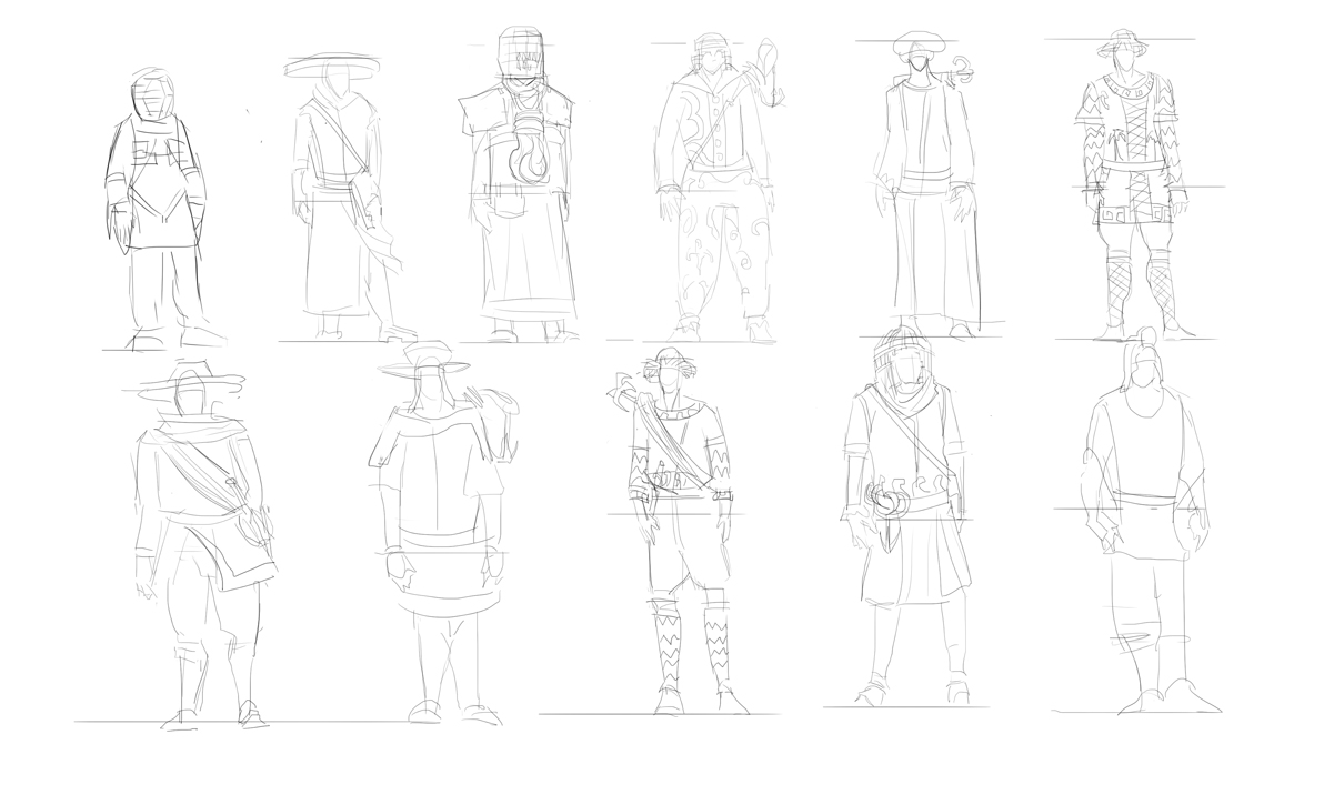
Alright here are some character thumbnails right now im still in exploration stage so just throwing around ideas and see what sticks.

|
CC3 The vault of questionable design decisions
|
|
05-09-2016, 05:51 PM
Alright here are some character thumbnails right now im still in exploration stage so just throwing around ideas and see what sticks.

05-10-2016, 08:32 AM
Ive decided to reverse my working pipeline - the composition shall be the goal since its a very narrative heavy picture. That being sed after a lot of sketching i think i know the direction im going with this in terms of design.So ill figure out composition then finalize the designs and then studies. Atleast thats the plan.
Throwing around some ideas  And costume designs ill go with something like the left one 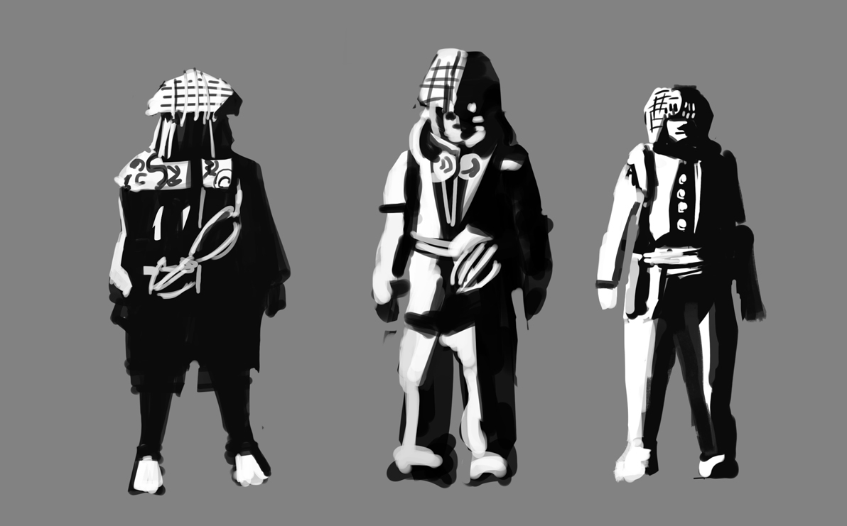
05-10-2016, 08:42 AM
Yeah, the left design seems like the strongest of the three to me as well. We still have a lot of time though, so don't narrow things down too quickly. If you do go with what you have right now, I think there's quite a bit of room for making a cool shape language for both the treasure hunter and the ruins, and making it read well.
05-10-2016, 08:54 AM
(05-10-2016, 08:42 AM)Lodratio Wrote: Yeah, the left design seems like the strongest of the three to me as well. We still have a lot of time though, so don't narrow things down too quickly. If you do go with what you have right now, I think there's quite a bit of room for making a cool shape language for both the treasure hunter and the ruins, and making it read well. Yeah i agree i will explore more (these are very very rough) ,but i think the composition must come first ,reversing working habits can lead to unexpected results if i did the same approach that i did last time i wont learn as much!
05-10-2016, 11:41 PM
Alright first set of thumbnails don't like them they are too literal
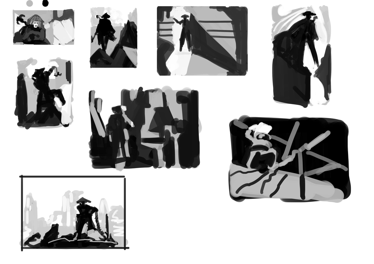 So here is a first study took master painting and did thumbnails of theirs and i noticed that their compositions tend to be more abstract and most work in 2 values, which is indicative of strong design. 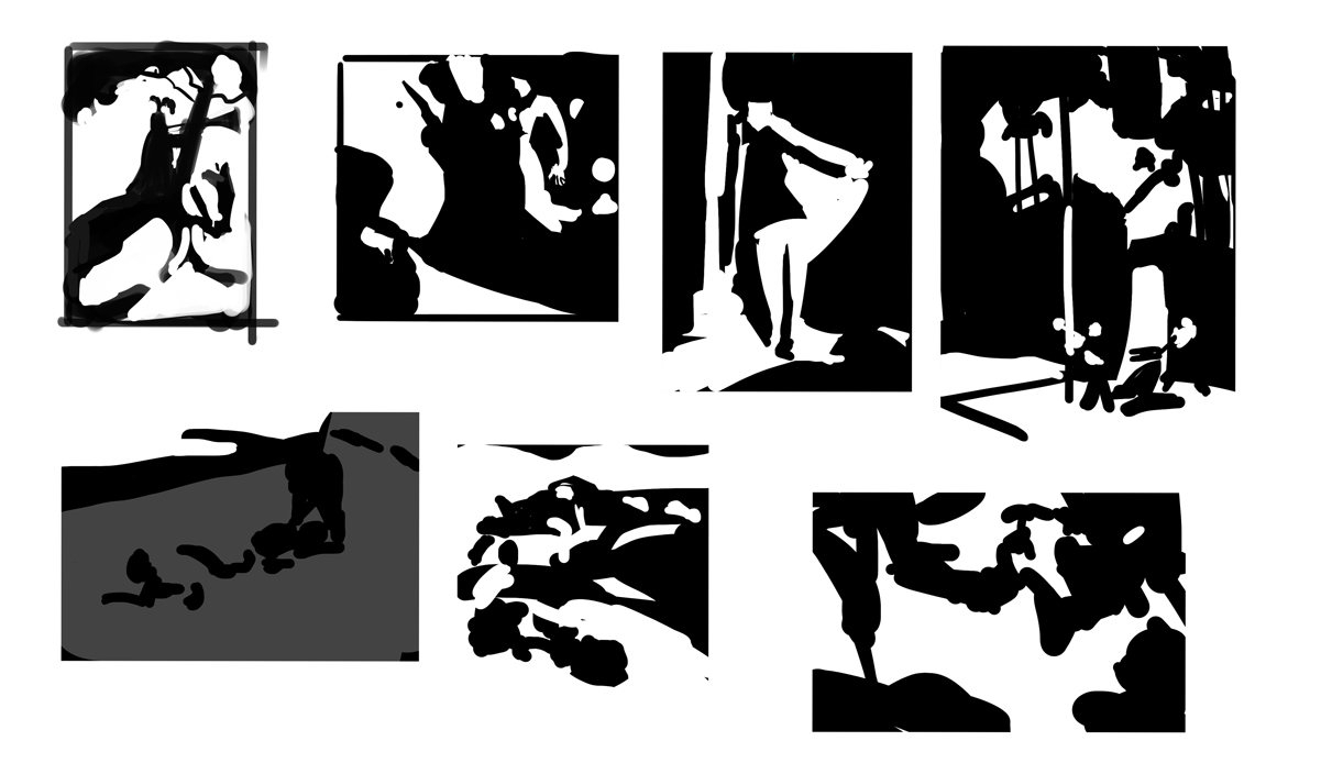 Will take that into account when doing the next set of thumbnails
05-11-2016, 10:35 PM
Great designs so far Hobitt!
I like how you're prioritising composition, you're gonna smash this man - and the fact that you did those 2-value master comp studies... unf! Good shit man  Gonna be eyeballing your thread like ala perv ala does (?)
sketchbook | pg 52
"Not a single thing in this world isn't in the process of becoming something else." I'll be back - it's an odyssey, after all
05-12-2016, 08:42 AM
@Smrr Thanks! will you be participating?
@BRushnoir NO! it has to be better! Sadly didin't have much time today due to real life stuff ,but did a few more thumbnails.Should have a lot of time tommorow! 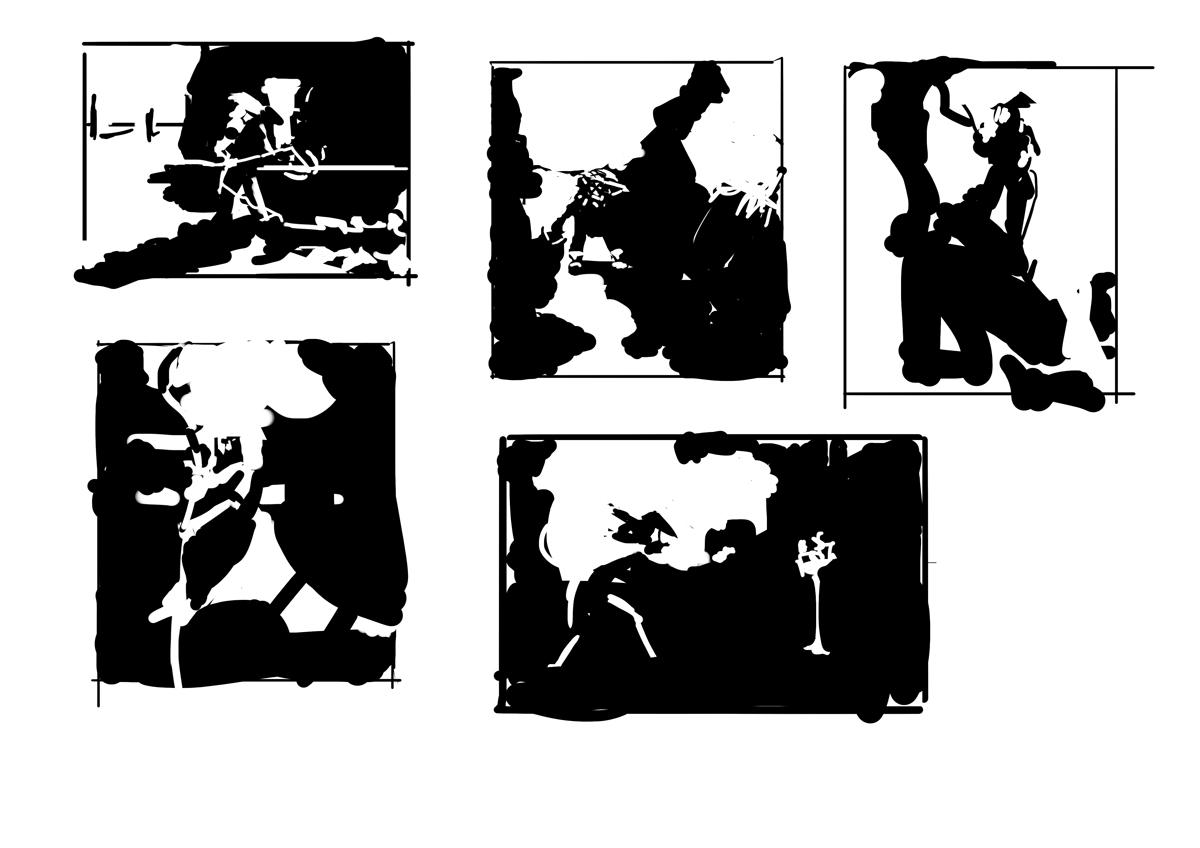
05-12-2016, 10:46 AM
Great approach. I am a huge fan of notans. I would suggest you tighten up your brush strokes a bit more. Abstract simple shapes, don't have to mean sloppy ones. If things look like mush (talking about your last ones) at this stage, they may not get much better in future stages. Try a brush with size connected to pressure, to get a more tapered stroke.
I personally pay more attention to precise shapes at this stage, than at any other time in the entire illustration process, because this is where being precise and intentional and not rushed will help. It's a dichotomy, freely pumping out ideas while also being precise about things.
05-12-2016, 06:41 PM
I like your concepts, it's going in a good direction. As for notans I've found that pen pressure and a more edgy brush works best. It's also good to use one pixel brush to indicate some shapes. Good luck.
And don't forget to pay for your 3rd place subscription in time. Sketchbook | Gallery | Twitch
05-13-2016, 05:37 AM
Notans are so fun to do, and I think your going down the right direction. Try not to rush during this sketching phase the notan sketches are a good way to focus on the big shapes. Take this time to arrange interesting shapes and composition. Try to be economical with what you put down.
05-13-2016, 08:32 AM
@Amit absolutely agree need more precise control of shapes so picked a different brush for the job!
@Piotr [money has been transferred to the secret CC bank account] @Tienchi Yeah i find less is more in art, simplification is key! Alright i feel the theme for this crucible for me is experimentation. SO today played around with the mixer brush and did a master study , in short i did not like it. 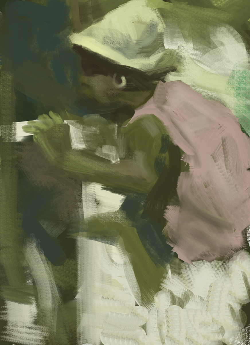 more black and white comps 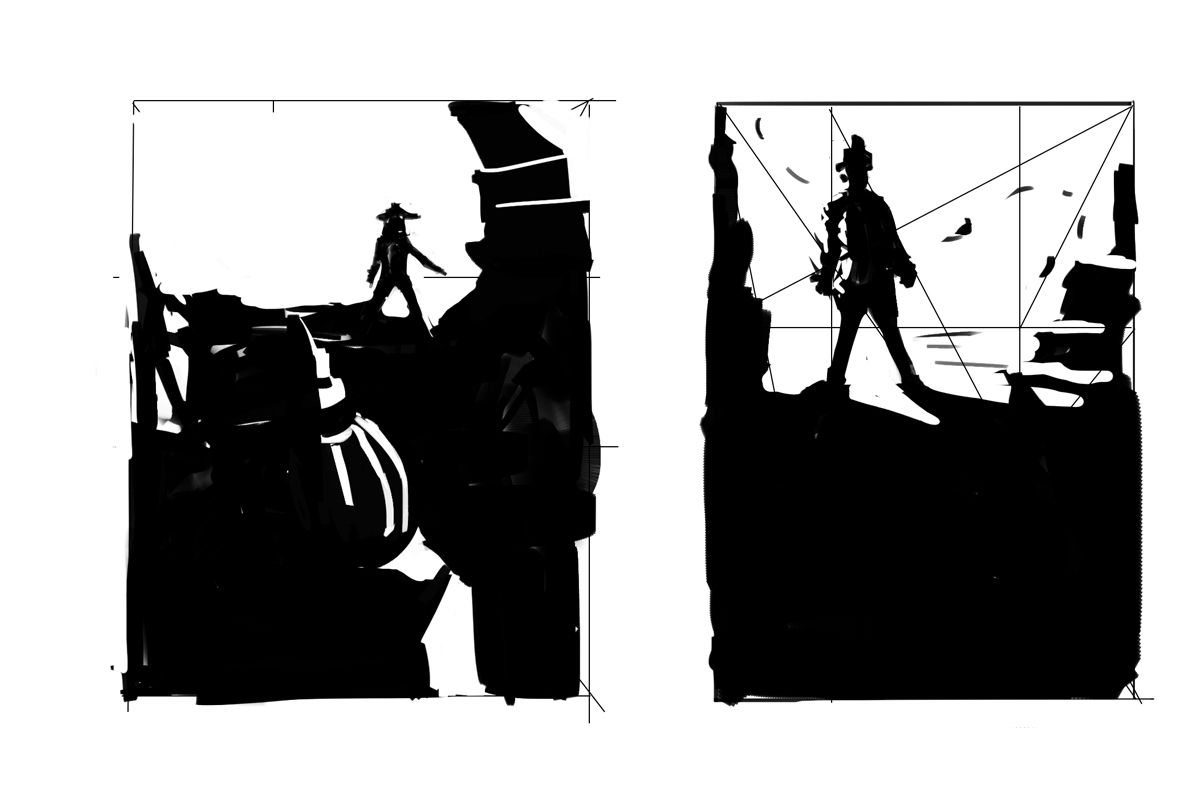 And here i picked the comps i like and refined them, i really like #2 it has a very good read even when zoomed out really far, and has a iconic look, for now i think this will be my comp of choice, i think i might jump back into designing stuff again and then see where it goes from there. 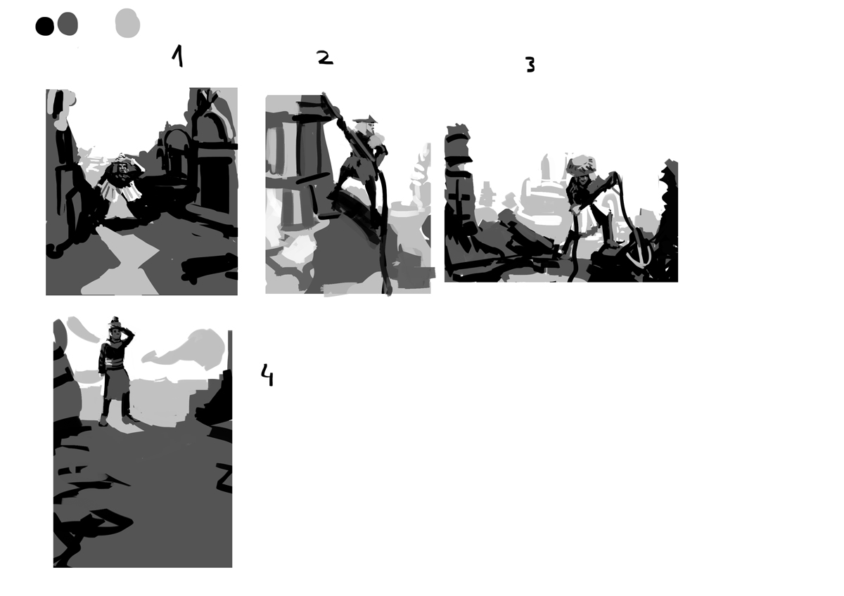
05-14-2016, 08:43 PM
That master study isnt actually that bad. I think if you just hardened some edges and brought out some of the values more it would come together.
Out of the compositons 1 has the most potential for showing the ruins, and telling a good story, 2 and 3 feel the most appealing. You could try using gradients in your value maps. It won't be stricly 3 values anymore, but it can really change the way you think about how values inheract with eachother.
05-15-2016, 08:16 AM
@Lodratio Thanks! i usually think of gradations as a final touch might be interesting to think about, in terms of comps still unsure which one to pick ill probably will make more
Alright costume sketches i might combine them into one 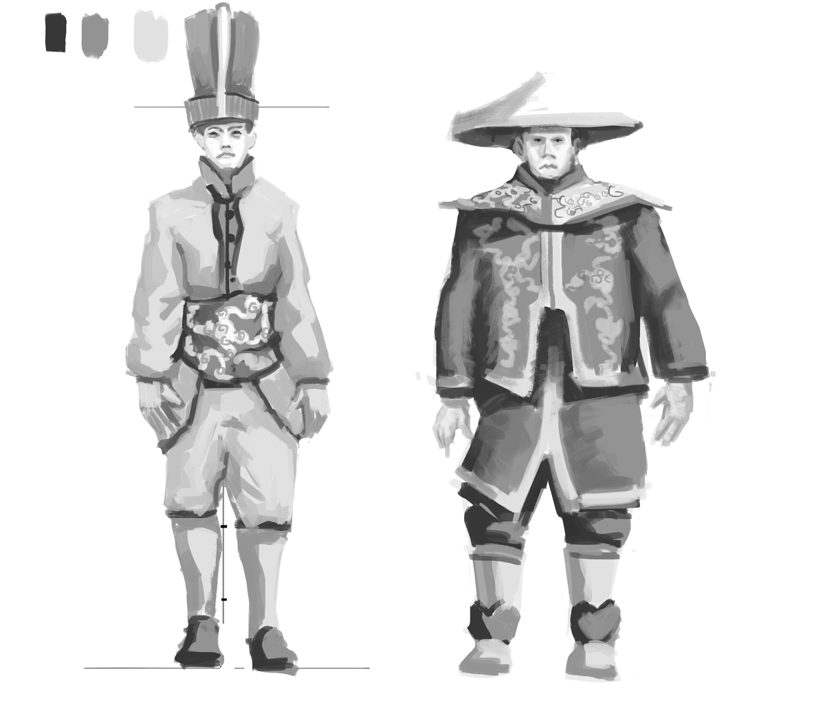 And a study this is kind of sand im going for 
05-15-2016, 03:15 PM
Parts of that mixer brush master study are real great, Hobitt! Liking these updates - not the kinda costumes I was expecting so that's cool!
Yeah defs continue playing around As for your question- probably not this time round, I'm still tryna work on the crits I got from the last CC, among other personal deadlines n_n
sketchbook | pg 52
"Not a single thing in this world isn't in the process of becoming something else." I'll be back - it's an odyssey, after all
05-20-2016, 06:57 AM
@smrr Thanks!
Alright i think i need to start already so here is a master study and color comps ill pick one and will go for it. 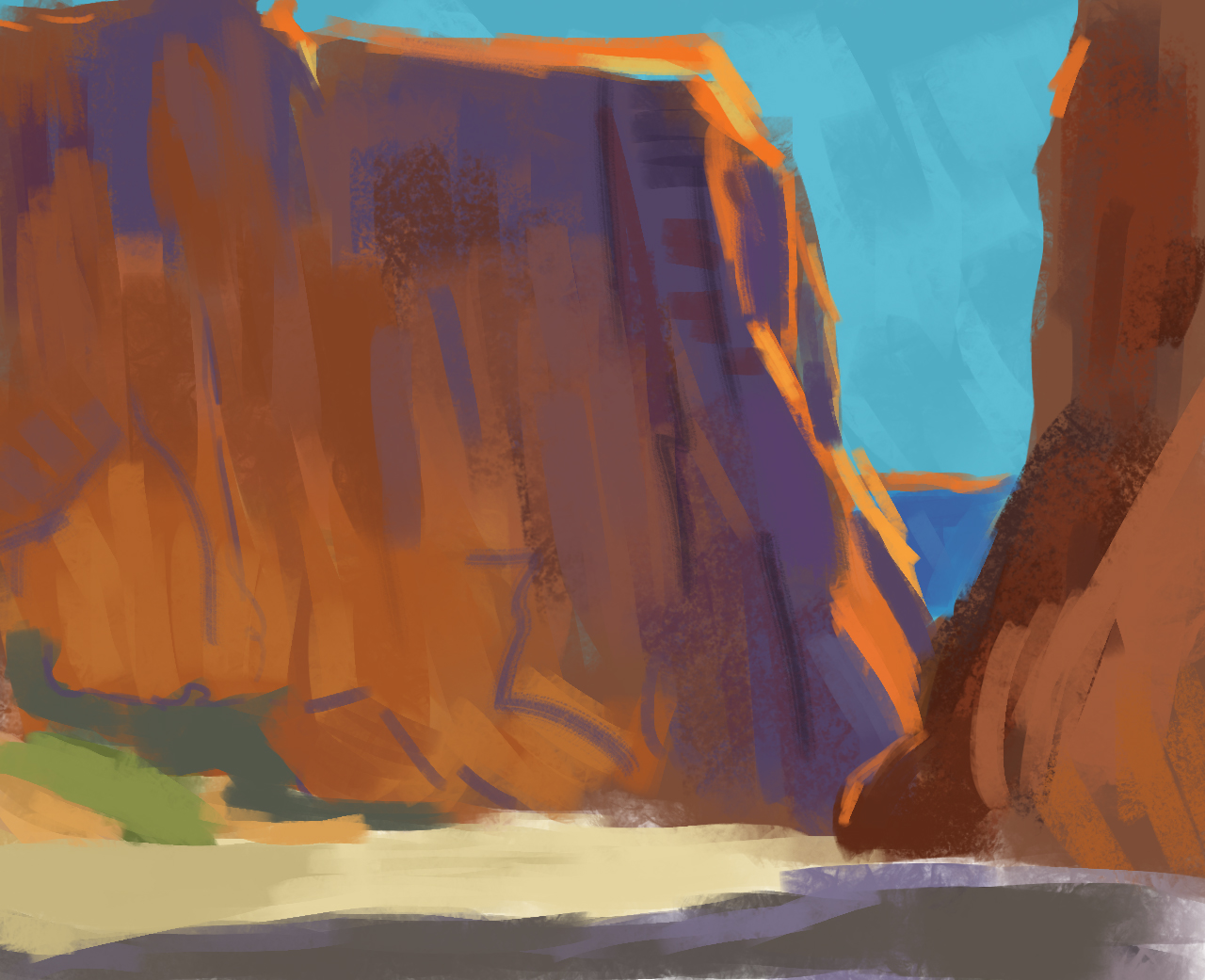 
05-27-2016, 03:53 AM
Really loving the colors!! :D I think you might have a bit of a tangent going on with like the way the guy overlaps the ruin there... maybe he could be out just a little bit more to the left? That's a bit nitpicky though; it's looking really great!
05-28-2016, 01:23 AM
I like the mood and colors/lighting, too!
Though there's something with scale, the tower doesn't look high from the ground and the buildings below seem a bit like toy houses. Maybe some color variations would help, I mean a bit of atmosphere for the lower buildings and the form/shading of the rock on which the big tower stands. It's great that you finished your piece a day before the deadline, I planned to do the same but got lost in colors :) |
|
« Next Oldest | Next Newest »
|