Posts: 460
Threads: 10
Joined: Mar 2016
Reputation:
64
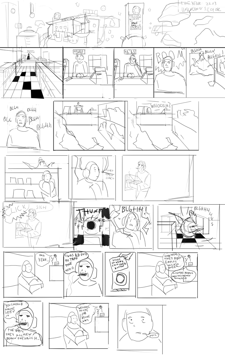
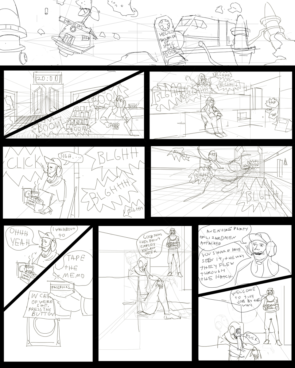
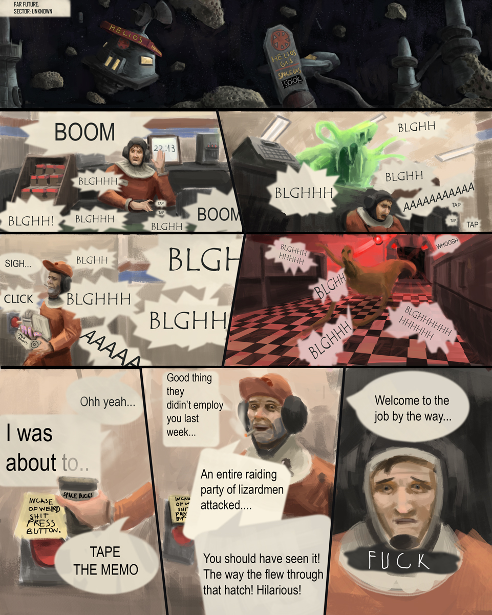
Way to go man, its coming along fine. I think there may be some wasted space in the middle panel furhest down on the page. Maybe move the main character clooser to the camera? Try to check out some comics to see what camera angles and composition they use!
Posts: 1,118
Threads: 12
Joined: Nov 2013
Reputation:
63
Zorrentos has a point. A few of the panels, like the diagonal split panels I think could be simplified down to one panel and still convey whats needed.
Posts: 1,109
Threads: 18
Joined: Apr 2014
Reputation:
68
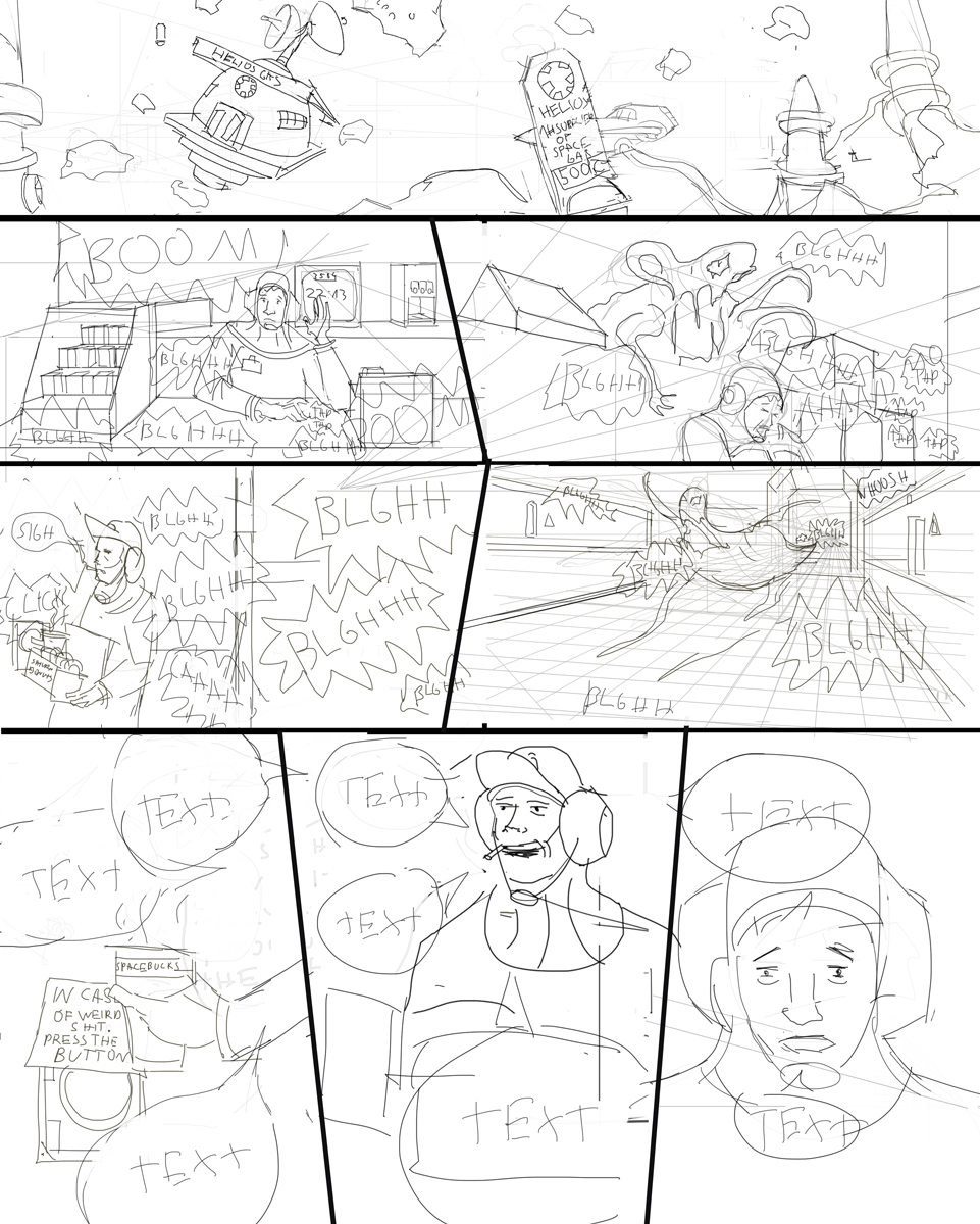
Man I think you did really great! It really came to life! I really like the look of the painting, looks like it's rough looking on purpose! Only thing I'd say, since we have more time now is to make the 'click ' sound effect when he pushes the button more obvious, it gets lost among the other sounds and is so crucial to the narrative. Also the whoosh / sucking of the alien out the hatch could be do with being more obvious. Hope you get to work it up a bit more ^^
Posts: 1,118
Threads: 12
Joined: Nov 2013
Reputation:
63
Its starting to look cinematic with how you composed it. I like that second panel the most with the guy being surprised. Id get some hand reference for that bottom left panel. The signage for the gas station in the first panel could be better. Maybe you could base it on a a real gas station sign.
Posts: 1,109
Threads: 18
Joined: Apr 2014
Reputation:
68
you have a typo in the second to last panel! (didin't <--- )
