Posts: 30
Threads: 0
Joined: Jan 2017
Reputation:
4
I really like all the designs from your project, too! Especially the logo and the animation of it! The animation looks very smooth and the logo very crisp and bright. I like that! :)
I wish you good look with your search for a stable job in the industry as you've mentioned above. It's really tough, but keep going. You have some great stuff in here. I am sure the recruiters won't look past that. Plus you've got experience, too! That's worth a lot! :)
All the best and keep up the great work! :)
Posts: 460
Threads: 10
Joined: Mar 2016
Reputation:
64
@ darktiste.
Thanks a lot for the critique! I am re-working the presentation and updating these two concepts for my portfolio. Will keep your pointers in mind.
@ tchangchang.
Great critiques! Really appreciate it! I am re-working and updating these two concepts. 
@ Kaiko.
Thank you so much for the visit and the kind words! Really appreciate it!
So, I am working on a major 3D piece for my portfolio. Lots of technical stuff going on, so I will wait a bit with showing it until it's a bit more stable. I have also been working on some 2D stuff. Here is a new presentation of a character design for my personal project. Would love some feedback on the presentation too! Does it read ok?

More to come very soon! Lots of stuff is in the works!
Posts: 181
Threads: 0
Joined: Oct 2017
Reputation:
41
The character's rendering/style looks really good! In terms of the presentation, the text under Sir Mittens III is quite hard to read. It's alright if you have the image at full screen, but in the size above it kinda blurs together. I would also suggest playing around with the sizes and placement of the text and Secret Valley logo. Everything is close together and almost makes the image feel claustrophobic. The characters need to 'breathe' a bit more and dominate the space imo (like if you compare the characters to the logo they are almost the same size, and the logo is brighter and colourful so your eye is naturally drawn to that first)
Hope that helps!
Posts: 42
Threads: 2
Joined: Jan 2020
Reputation:
8
I like the overall character design. Even though its a pretty simple character it definitely conveys the "war dog" vibe through his expression and the moustache (kind of gives him a macho look I). The story is pretty cute and funny as well :) Like chubby_cat mentioned I would consider doing something to the text to make it easier to read, I think the font, color, and size are all kind of working against the clarity. The shadows of the text make them harder to read because the letter kind of run together, and the white letters are a bit close to the background color also at the top. As another suggestion maybe consider aligning the text to form a shape around the toy kitten's head so that they dont get so close to it.
Nice work on this project so far, I really like where it's going! You may have said this already earlier in the thread but is The Secret Valley a personal project of yours or professional work? Do you already have a full background story/spec or are you making it up as you go?
Posts: 1,109
Threads: 18
Joined: Apr 2014
Reputation:
68
hey man! the project is looking great, love the dog, your drawing style is very personal I could tell your drawings without even seeing the name.
I'm no graphic designer, but some concept I picked up somewhere is to keep things in 'blocks' and don't overlap the blocks. I put blue boxes around your elements to show how they overlap, below it is a page from an artbook showing how they make it look really neat by keeping the blocks separate and kind of lined up with each other.

Posts: 460
Threads: 10
Joined: Mar 2016
Reputation:
64
Wow, guys! Thank you so much for your criticism and feedback! It helps so much to be able to post these artworks on the forum first so that I can fix the errors before I post them to my main galleries! I really appreciate you taking the time! :)
@ chubby_cat:
Thank you for the crits. I have re-arranged the elements and replaced the font color. Hopefully, it reads better now. Also, I will post the final image with a fully rendered character as well, hopefully, this will help the weight of the image composition.
@ tchangchang.
Thanks for the crits! I am applying them to the final composition of the image. The project is 100% a personal project that I'm making just to learn and have a nice final portfolio piece. I like the idea of working and learning towards making one big, final product for my portfolio.
@ JyonnyNovice
Thanks a lot for the crits and the kind words! Your suggestion was really excellent, so I decided to change the format to match that artbook style better! Hope it works better now :)
So I have continued to work. I'm trying to constantly research, iterate, and work on these tasks and make sure to finish them all. Now and then, I get an interview with some company that I need to prioritize since I'm still looking for a full-time position at a studio.
These past few weeks, I have visited some family and friends. I brought my computer, so I could still work half-time and relax the other half with my family and friends. I am now back home, so hopefully my productivity will go up significantly! I also got a freelance job I need to finish, so that will take some priority.
Here is a small update with a new layout for my design. Not final in any way, but maybe it works better?

Also, I want to share two AMAZING articles about character design in Mobile Games that I found on Linkedin. They are written in Russian, but you should be able to follow along nicely with google translate:
https://ab-games.com/2021/01/12/kak-sozd...rsonazhej/
https://ab-games.com/2020/04/01/kak-sozd...-hopa-igr/
They contain some very useful pointers about the process in overall character design and art direction.
Ok, that's it for now. I Will update you soon again because I have a lot of stuff in the making! Cheers guys! :)
Posts: 1,109
Threads: 18
Joined: Apr 2014
Reputation:
68
definitely looking much more slick! Maybe 'justified' type? You know where the lines all end in the same place can make it look neater still.
The backstory is nice too, concise and comedic ^^
Posts: 460
Threads: 10
Joined: Mar 2016
Reputation:
64
What's up, guys? I'm still working hard on my personal project, but I'm not ready to show an update of it yet.
Here are some thumbnails I made today for a commission. The client is a US military veteran that wanted a picture of himself and his Iraqi colleague in a battle that took place in 2008.
Here are the compositional/color thumbnails. Feedback is welcome! 

Posts: 1,452
Threads: 12
Joined: Dec 2015
Reputation:
139
Hey man, the poster design for Sir Smittens III is looking better after that awesome feedback from our main man Jyonny :). Love the backstory to this as well - keep up the good work!
And I like your thumbnails - I prefer versions 1, 4 and 7 because the viewer's eye-line is down somewhere around the soldiers' waist-level so it makes them appear more heroic and adds a bit more drama than the other layouts. I think version 4 is my overall favourite due to the warm colours. Just some thoughts for you to consider - good luck with it anyway though dude.
“Today, give a stranger one of your smiles. It might be the only sunshine he sees all day.” -- H. Jackson Brown Jr.
CD Sketchbook
Posts: 181
Threads: 0
Joined: Oct 2017
Reputation:
41
Nice looking thumbs. I personally find 1 and 4 to be the best. The composition is a lot more personal in those ones, whereas the other two compositions feel very detached from the scene with how small the figures are. Since it's for a veteran, I'm sure having them be the focal point would be something they'd enjoy (though idk, I'm not the client and could be wrong haha)
Posts: 853
Threads: 6
Joined: May 2018
Reputation:
116
Man that commission brief is kind of grim! I don't know if I'd be up for that, it's so personal, but I'm sure you'll make good on it! I like the close up shot versions the best as well.
Posts: 460
Threads: 10
Joined: Mar 2016
Reputation:
64
Posts: 60
Threads: 2
Joined: Nov 2020
Reputation:
4
Nice! The cats, especially Mr. Mittens actually made me smile a bit :)
Love the way you work with your colors and lines. Really crisp and confident stuff here.
I think I'd only turn down the saturation a liiiittle bit on the girls scarf, because it's a bit too overwhelming and it's pulling my focus away from the nice posture and face.
BUT, that could also just be my opinion or personal taste.
Keep it up :)
-------------------------------------------------------
SKETCHBOOK // INSTAGRAM // WEBSITE
-------------------------------------------------------
"Losing all hope was freedom."
Posts: 1,076
Threads: 4
Joined: Jan 2016
Reputation:
45
Looking great! Love the designs of the figures as well as the characters, they have such a great style. Would love to see more!
Posts: 288
Threads: 8
Joined: Nov 2012
Reputation:
9
Those designs are fantastic. Really love your colors and line work - so clean.
Posts: 202
Threads: 3
Joined: Jan 2021
Reputation:
4
I agree with MixedMax about the scarf. It seems like the focal point of the image, unless that's what you want. You've managed to develop a very solid design language.
Posts: 76
Threads: 1
Joined: Oct 2019
Reputation:
5
Posts: 460
Threads: 10
Joined: Mar 2016
Reputation:
64
Thank you so much for the continued support everyone! :)
@mixedmax: Thanks for the input! I will adjust it!
@cgmythology: Thanks for the kind words!
@CoreyH: Thanks! And thanks for dropping by! :)
@Dominicque: Thanks for the input and for visiting!
@Ash: Thanks for the kind words!
So I have been continuing to work on my projects. I decided to take a step back and try to re-evaluate my understanding of shape language, composition, and design. I started out tackling the shape language first. I watched a lot of videos, sketched, and took notes. I decided to try and arrange my notes in an organized manner. Maybe they can be of some help to anybody here:


More updates coming soon!
Posts: 460
Threads: 10
Joined: Mar 2016
Reputation:
64
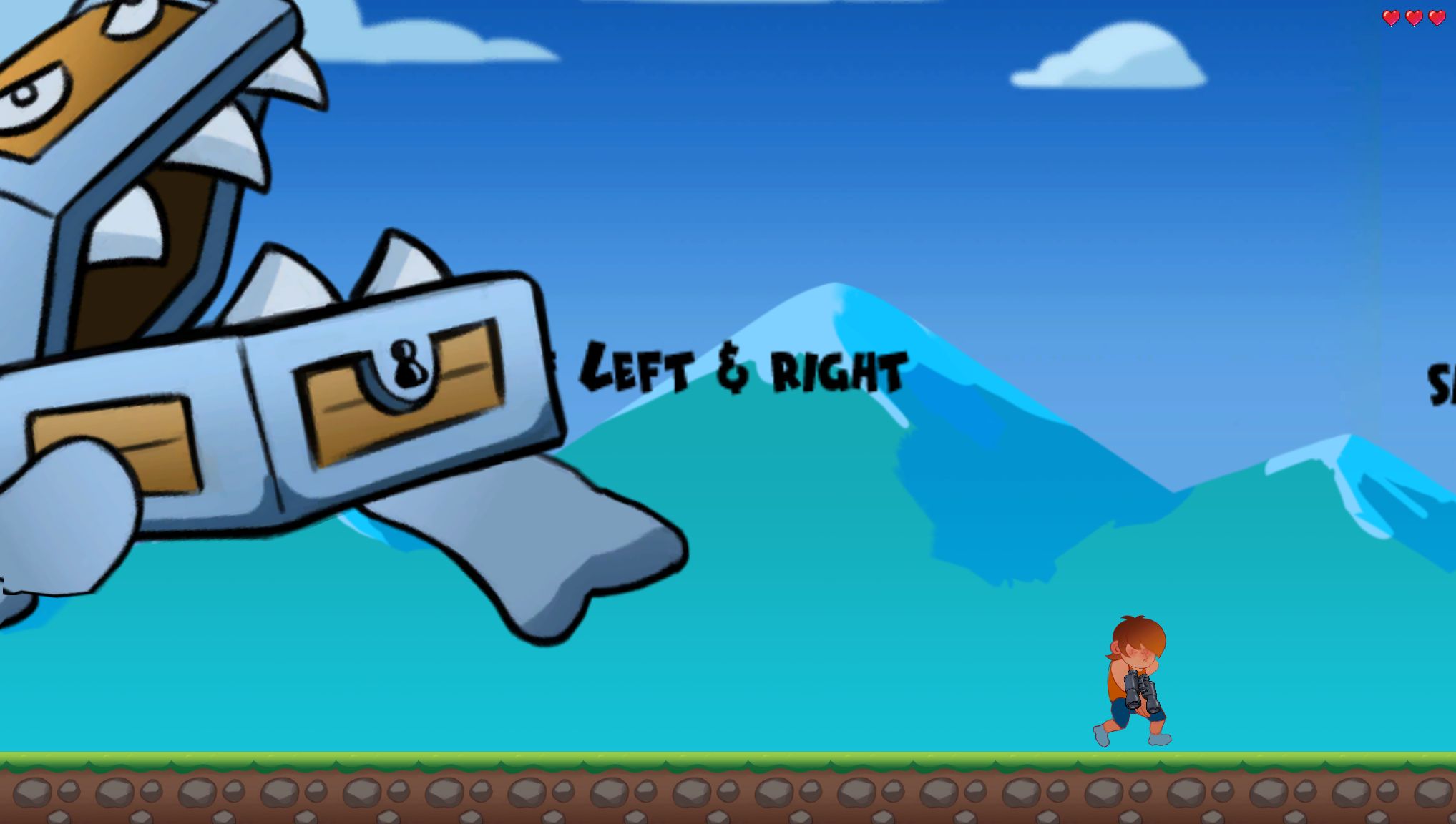
I almost forgot. I participated in the Global Game Jam last weekend. I made all the graphics for a small game project made in Unity. It was a great time and I learned a lot!
I'm just gonna paste the text from my Linkedin post here. You can try out the game if you have Unity:
Quote:Global Game Jam 2021 was a blast! Even when working remotely it was a lot of fun! Learned a ton about Unity as well!
I and my group made this fun little platformer game! Control the guy and his magic binoculars that shrinks him, or turns him into a giant!
We were only four guys working on it, but it still turned out really good if you ask me!
Credits goes to:
Graphics: Dennis Praetorius Holmgren (https://lnkd.in/dCh-mf5)
Programming: Viktor Enhörning (https://lnkd.in/gcvk47u)
Programming: Carl-Magnus Embring Klang (https://lnkd.in/epSdCPG)
Music/Sound: Mattias Larsson (https://lnkd.in/eKaKP4Q)
The Game is available for download here (Needs Unity to run): https://lnkd.in/eMGwgRR
#mjt2101 #malmojamstoo #GGJ21
.jpg "Filename: 1612106242406 (1).jpg
Size: 128.07 KB02-05-2021, 04:30 PM")


Posts: 181
Threads: 0
Joined: Oct 2017
Reputation:
41
Great update Zorrentos - I feel like I'm learning a lot just by reading your notes haha. At its core shape language is pretty easy, but it feels less so when you're trying to apply it (especially to more realistic characters that require more subtleness lol). I can't wait to see you apply your knowledge to some new characters!
(I see you've done some studies of Big hero 6 - those designs are sooooo good to study and I always find I go back to looking at that concept art when I need a refresher hah)
|


