02-06-2021, 06:11 PM
Agreed with Chubby_cat, I learn a lot reading your studies! Downloading the GameJam game to have a crack now.
|
Zorrentos Sketchbook
|
|
02-06-2021, 06:11 PM
Agreed with Chubby_cat, I learn a lot reading your studies! Downloading the GameJam game to have a crack now.
02-06-2021, 10:58 PM
I must agree too. Really good notes and really respect the effort you put in them!
-------------------------------------------------------
SKETCHBOOK // INSTAGRAM // WEBSITE ------------------------------------------------------- "Losing all hope was freedom."
02-07-2021, 04:49 AM
Thank you so much for the visits guys! I'm happy that my notes were of some use to all of you as well :)
I guess I may as well share my other notes on details and composition than as well. I have used the following resources here and tried to compile the notes into good JPGs that I can keep in my Pureref file: * The secret to high-quality Art (In Blender and elsewhere). https://www.youtube.com/watch?v=qMH_J_vc...el=Blender * Primary, Secondary and Tertiary Details. http://www.neilblevins.com/art_lessons/p...shapes.htm 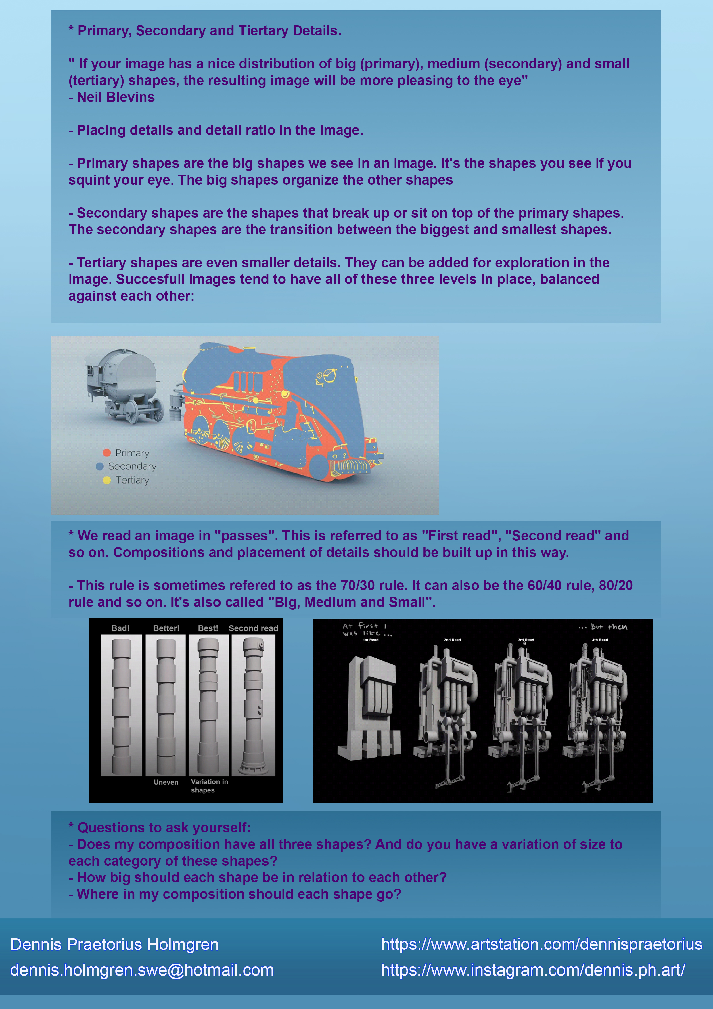 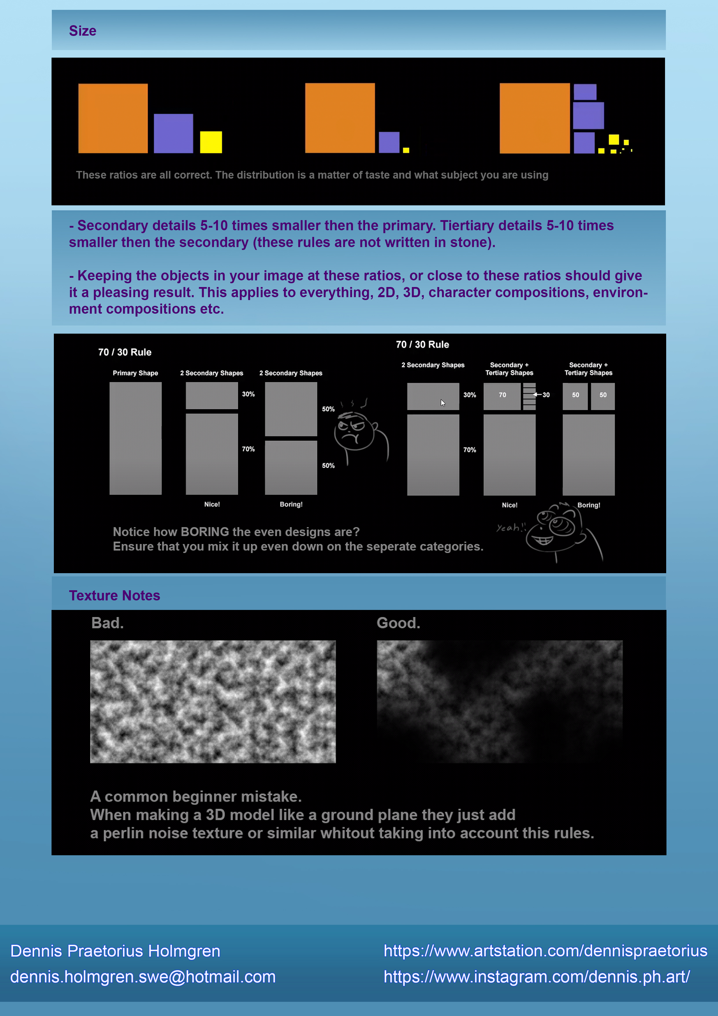 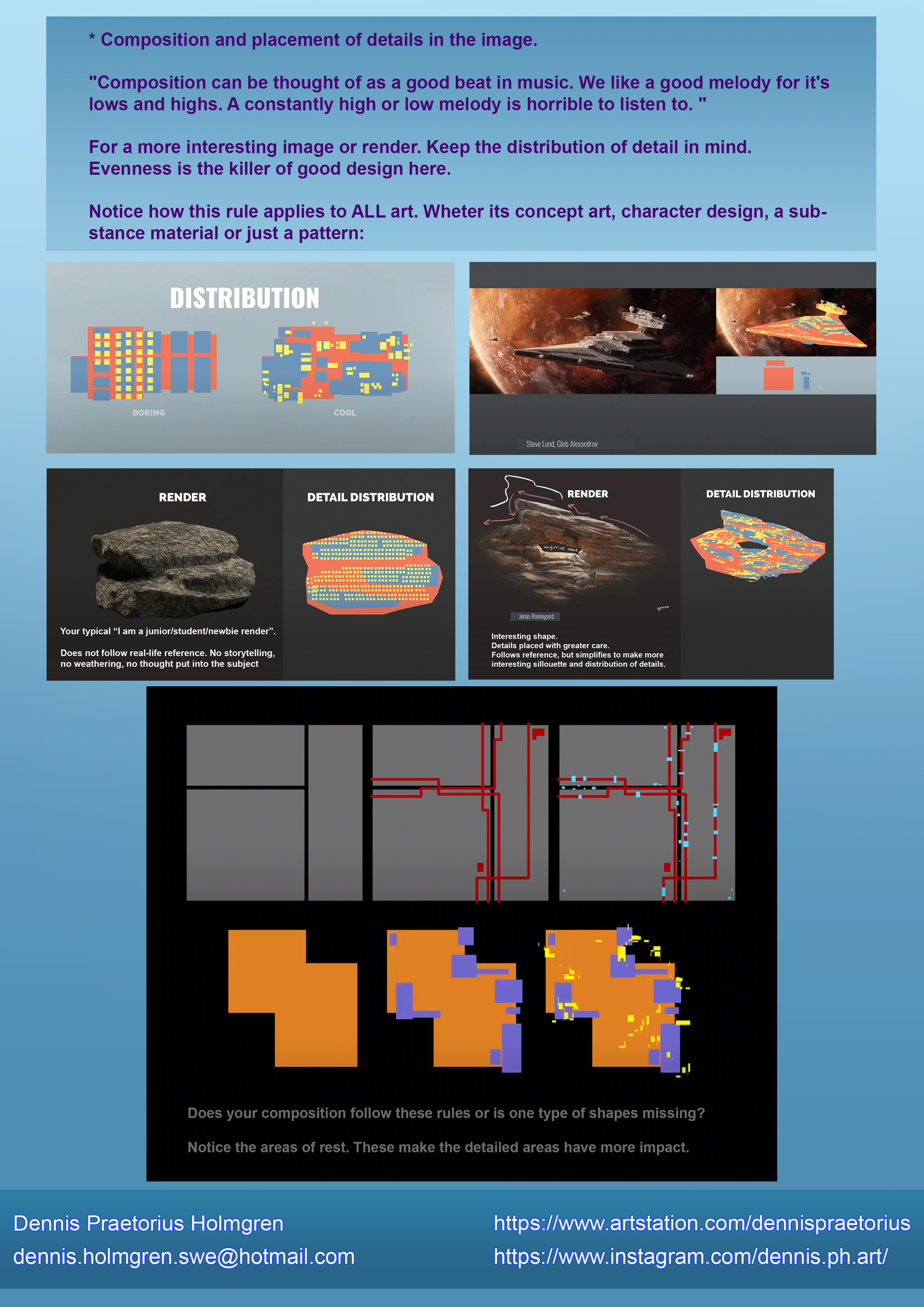 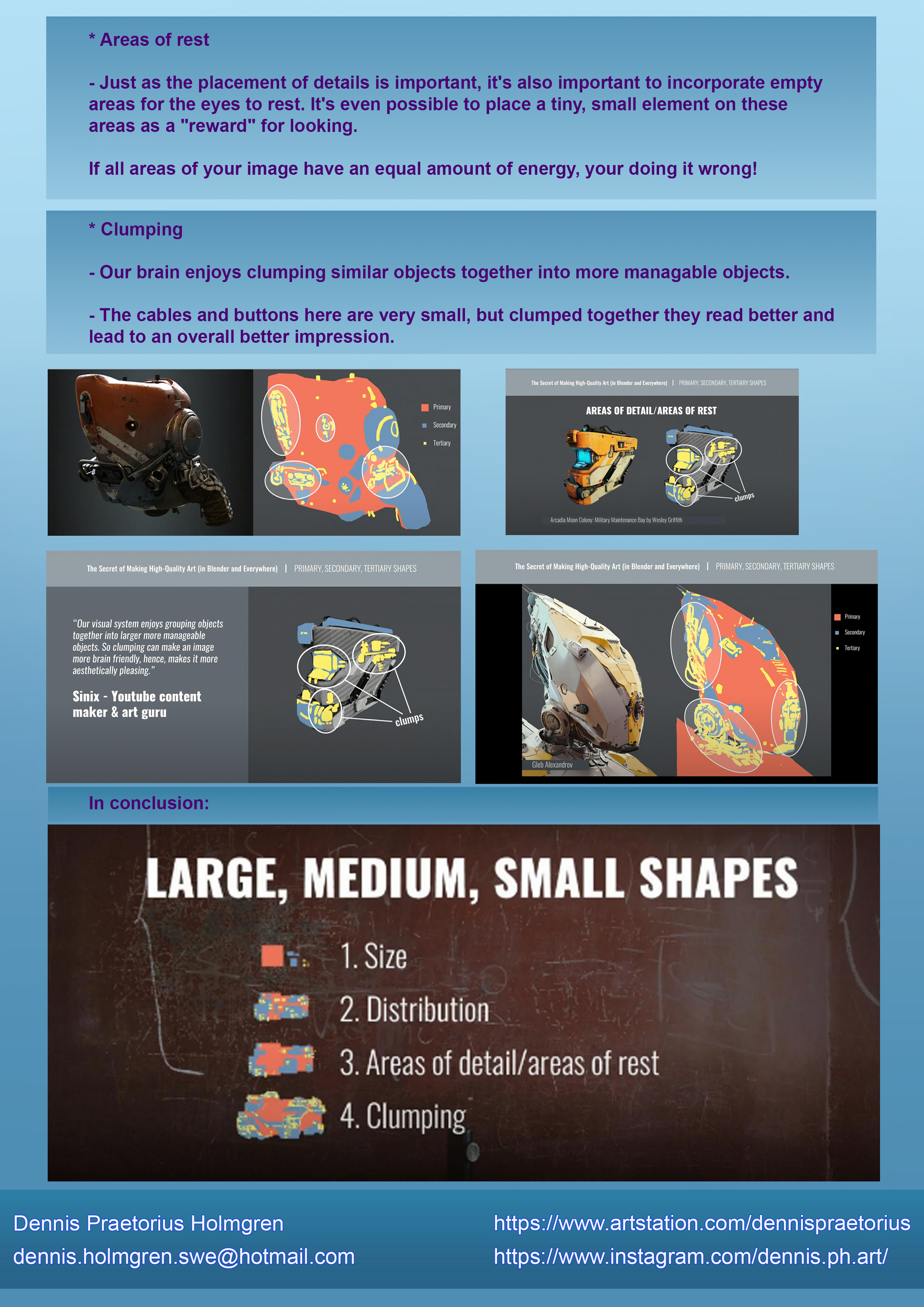 I did some studies afterward to hopefully solidify the knowledge, and boy lemme tell you! Those studies kicked my ass! I definitely need to make many many more! 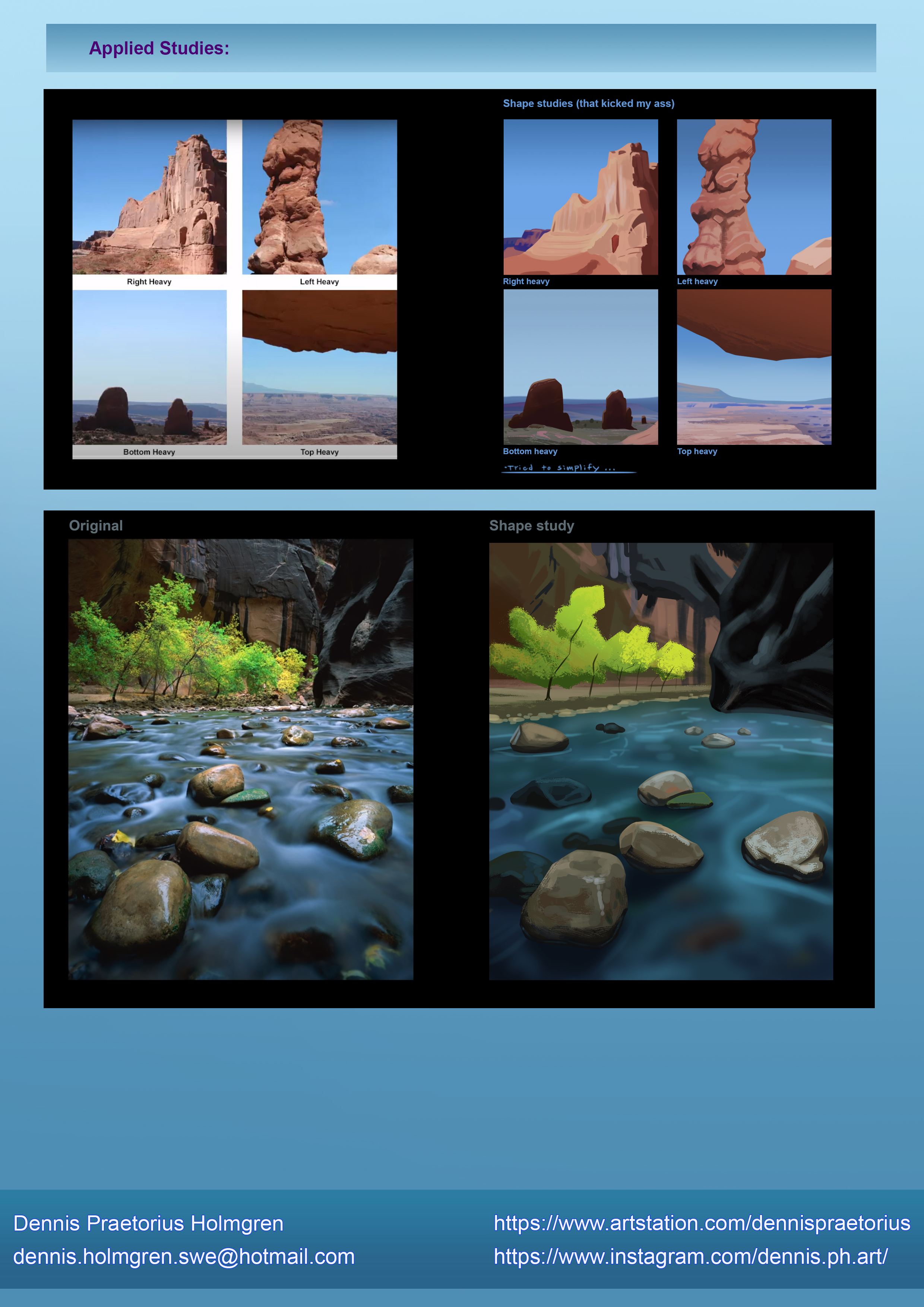
02-07-2021, 05:00 AM
The WIP version of the commission I was working at. Still got a LOT of work to do. I will also use some Blender features to add a lens blur to the background to make it more painterly and less hard edges.
Any critique and advice here are really appreciated! I would love to make this one really good, so if you have any input or advice on how to improve it so far, feel free to share! :) 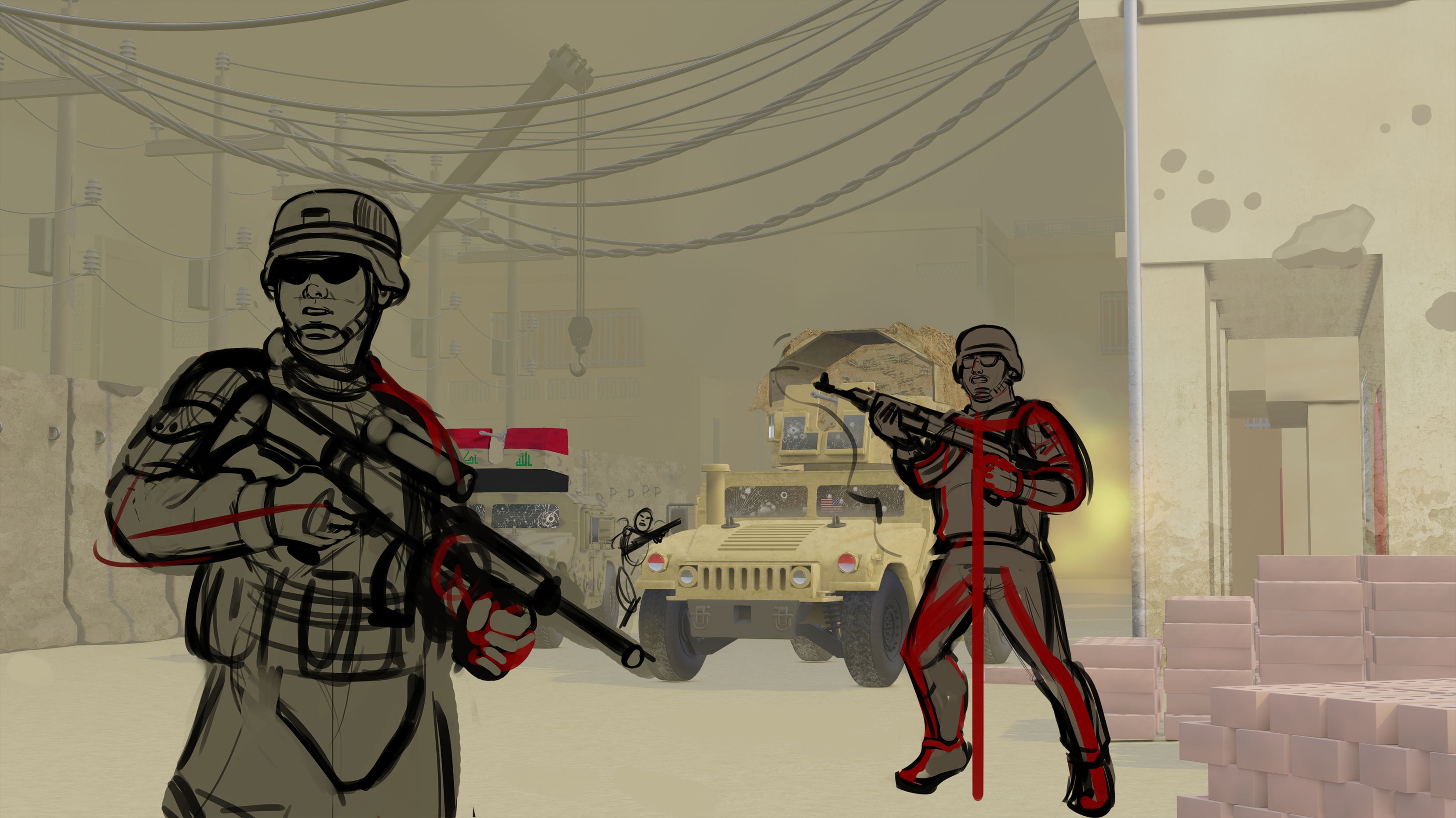
02-09-2021, 09:41 PM
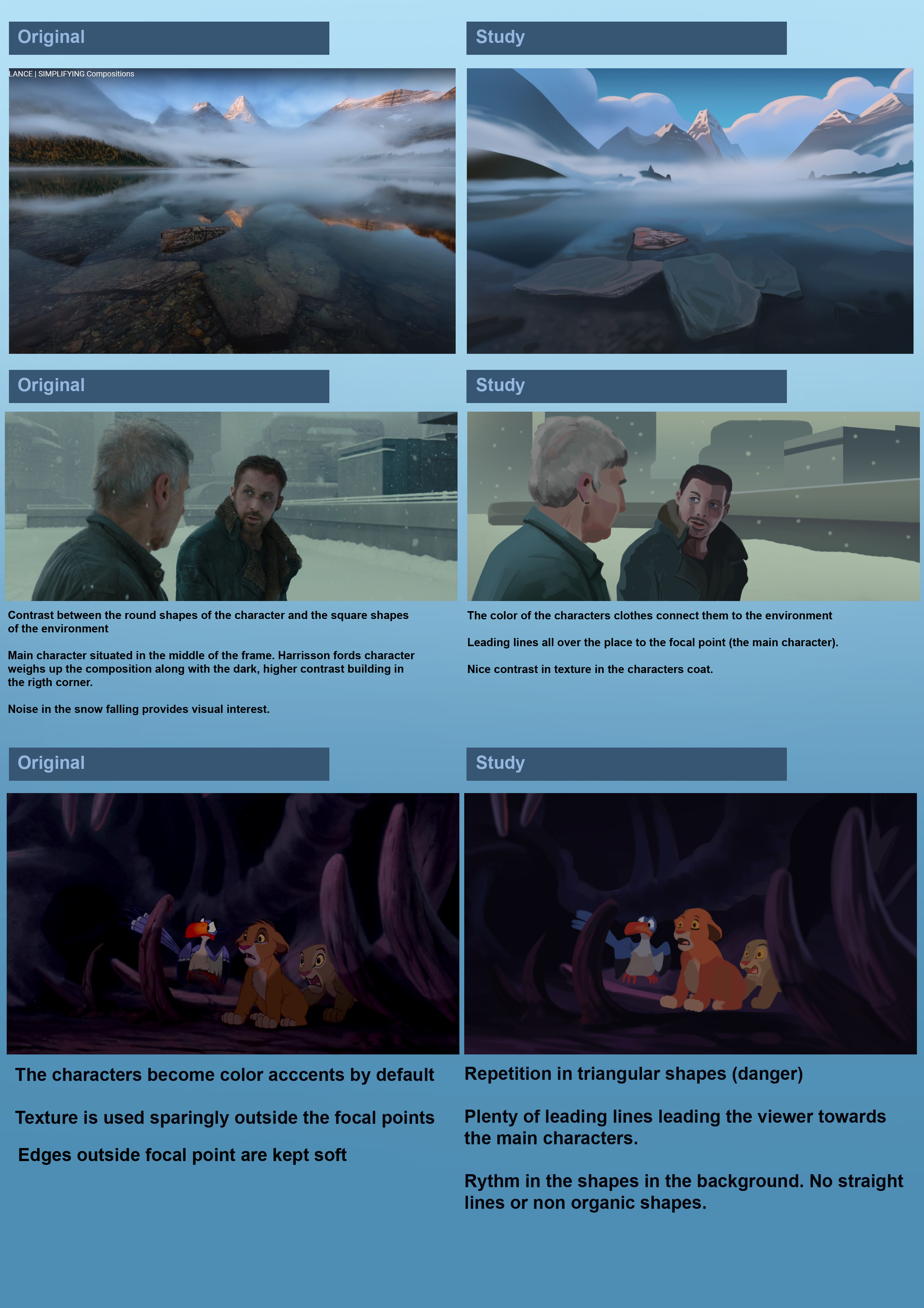
Just keeping the momentum going with some studies and notes. More soon!
02-11-2021, 05:34 AM
Jumping on the bandwagon to say thanks for the notes - these are really useful and I've saved all of them. The only in depth compostion resource I found was the beginners level up composition program on conceptart.org - and that sites been dead for a while. Unfortunately the notes I took lacked any example images so they weren't that useful to me when I finally found them again.
02-11-2021, 08:21 AM
(02-07-2021, 05:00 AM)Zorrentos Wrote: The WIP version of the commission I was working at. Still got a LOT of work to do. I will also use some Blender features to add a lens blur to the background to make it more painterly and less hard edges. Hey Zorrentos! I don't know how far you got already with this but I felt like it could be much improved with some simple adjustments! Mostly changing the lens type and moving the guys a bit. Here's my take, sorry for the 11 pm handwriting. 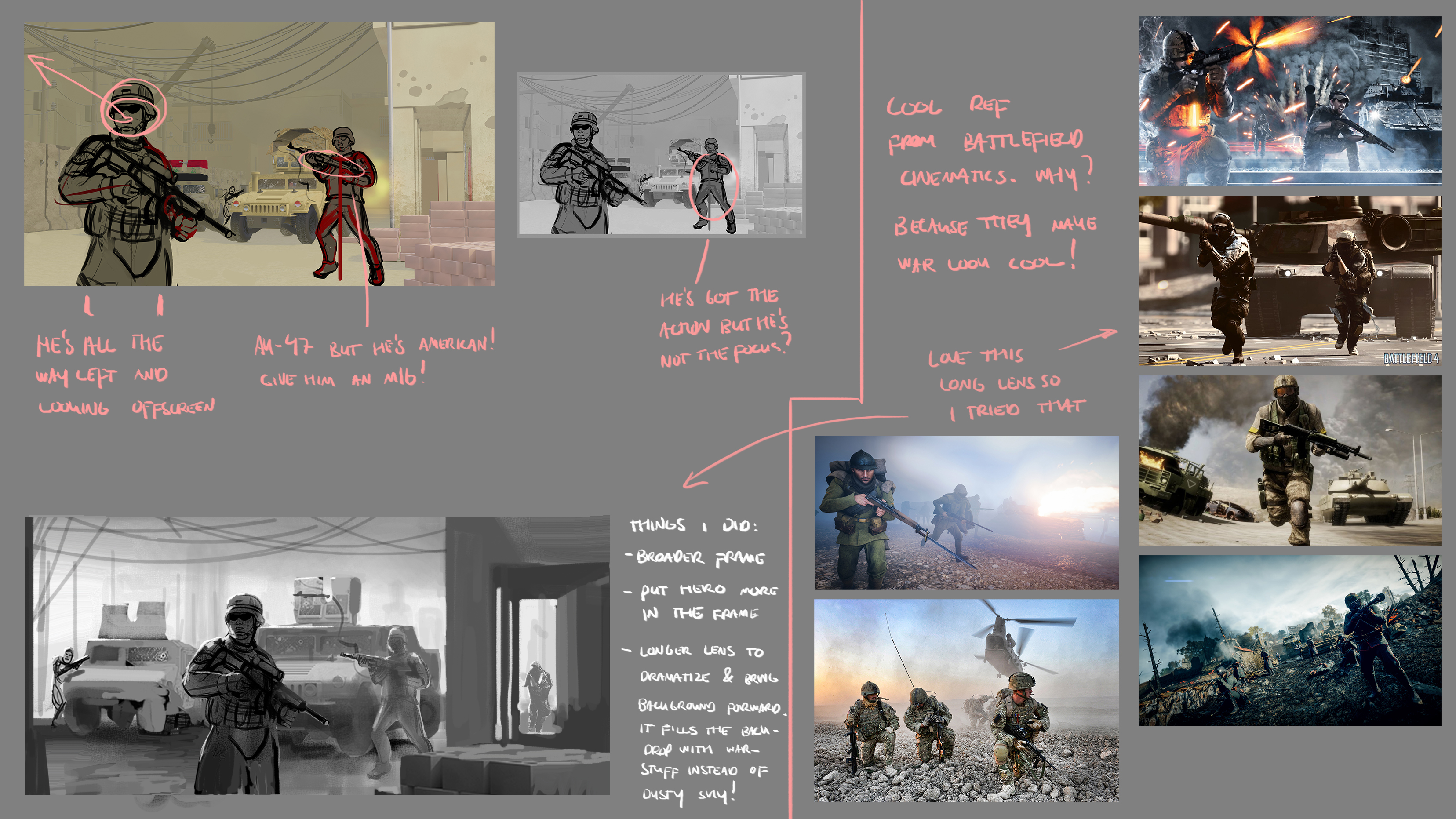 Hope it's useful! "No man is more unhappy than he who never faces adversity. For he is not permitted to prove himself." - Seneca
02-11-2021, 04:32 PM
@ Skeffin:
Thanks a lot for dropping by! I'm so happy you found my notes useful! @ gerbenpajses: Wow! Thanks for the amazing overpaint! I'm gonna re-arrange some of it and see what my client thinks. Here is what the image is looking like right now: 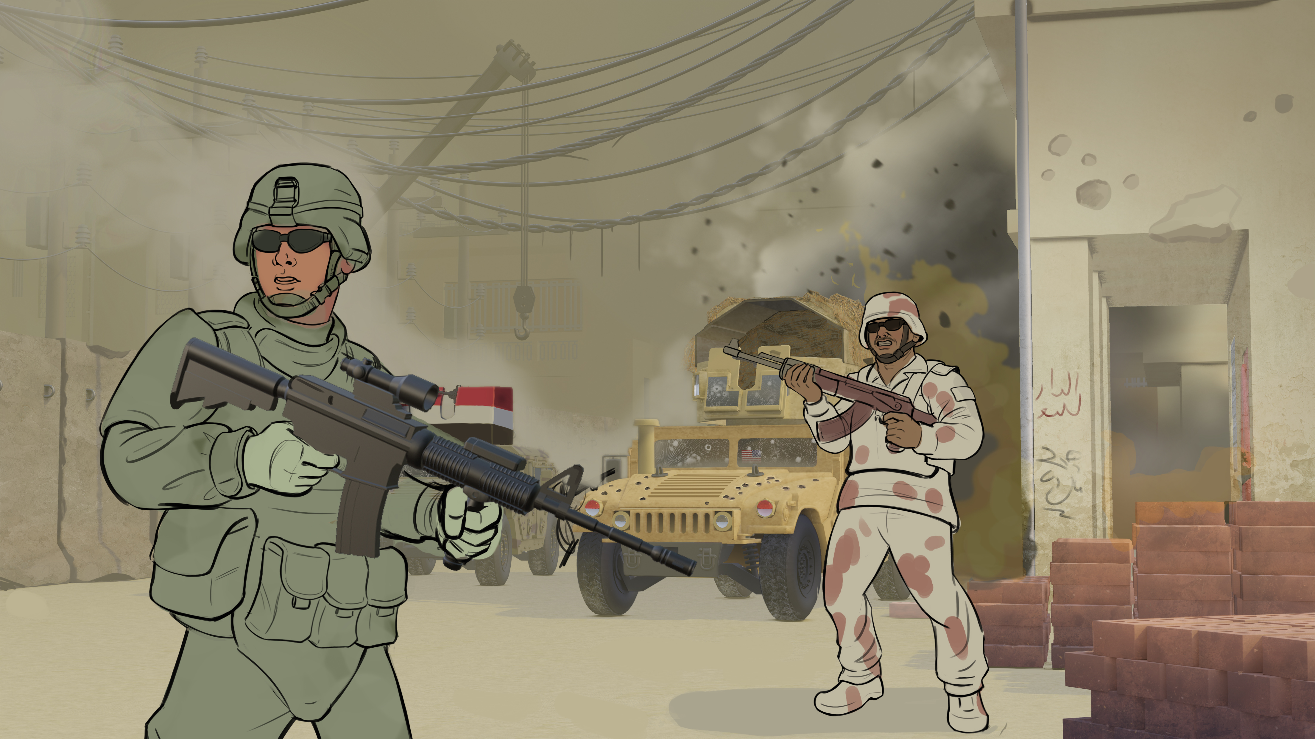 I'm just gonna drop some studies and then I'll actually be gone for 1+ week: 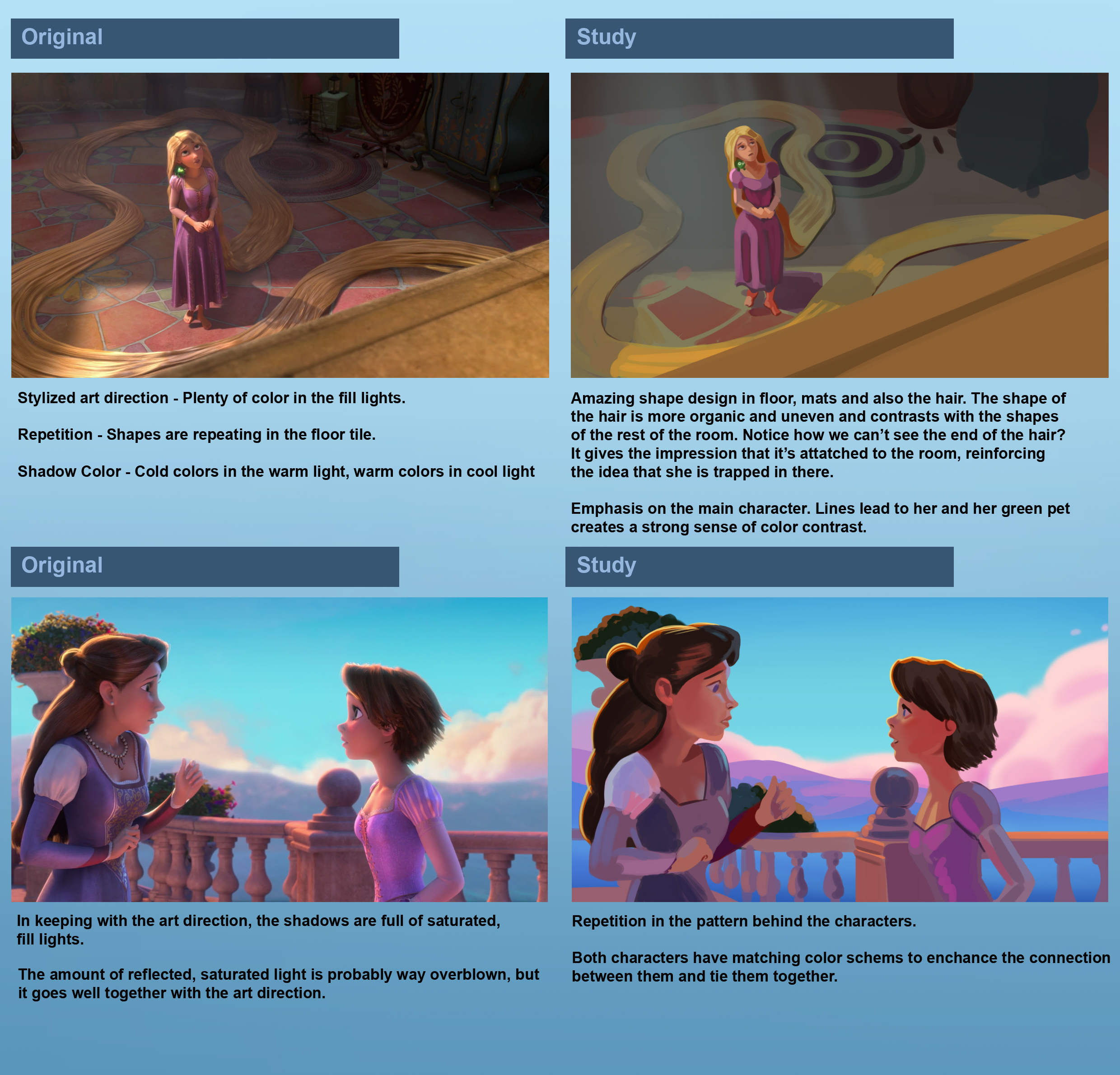 I got another art-test for a company that will take one week to finish. Sadly, I am using the companies assets, so I won't be able to show this test :) Wish me luck guys!
02-18-2021, 07:20 AM
Man your notes are truly amazing, i'm saving them for further reading, but just reading about the 3 levels of details Makes me think of my next stuff differently ! i'm looking forward to read everything ! Keep up with your studies ! I know studying comp and how a picture works might be your main point but also take your time to lay down good poportions that are sometimes off ! Those tiny adjustments in the long run will pay off !
Hope your art test went well ! Cheers
02-21-2021, 05:15 AM
Hey everyone. It's been a busy week for me!
I had an on-site interview with a casino company this Monday. The interview went quite well if you ask me, and I really like the look of the studio, the job, and the team! I would love to work there. I got a test assignment, and it was a pretty big one. Design a slot game mockup - 3-4 fruit symbols 2 characters paytable with a logo Main game screen. Here is what I have so far. Any input and suggestions would be appreciated. Keep in mind it's a slot game, so the lighting on the characters is made for them to pop on the game board, rather than more realistic as they would be in an illustration. 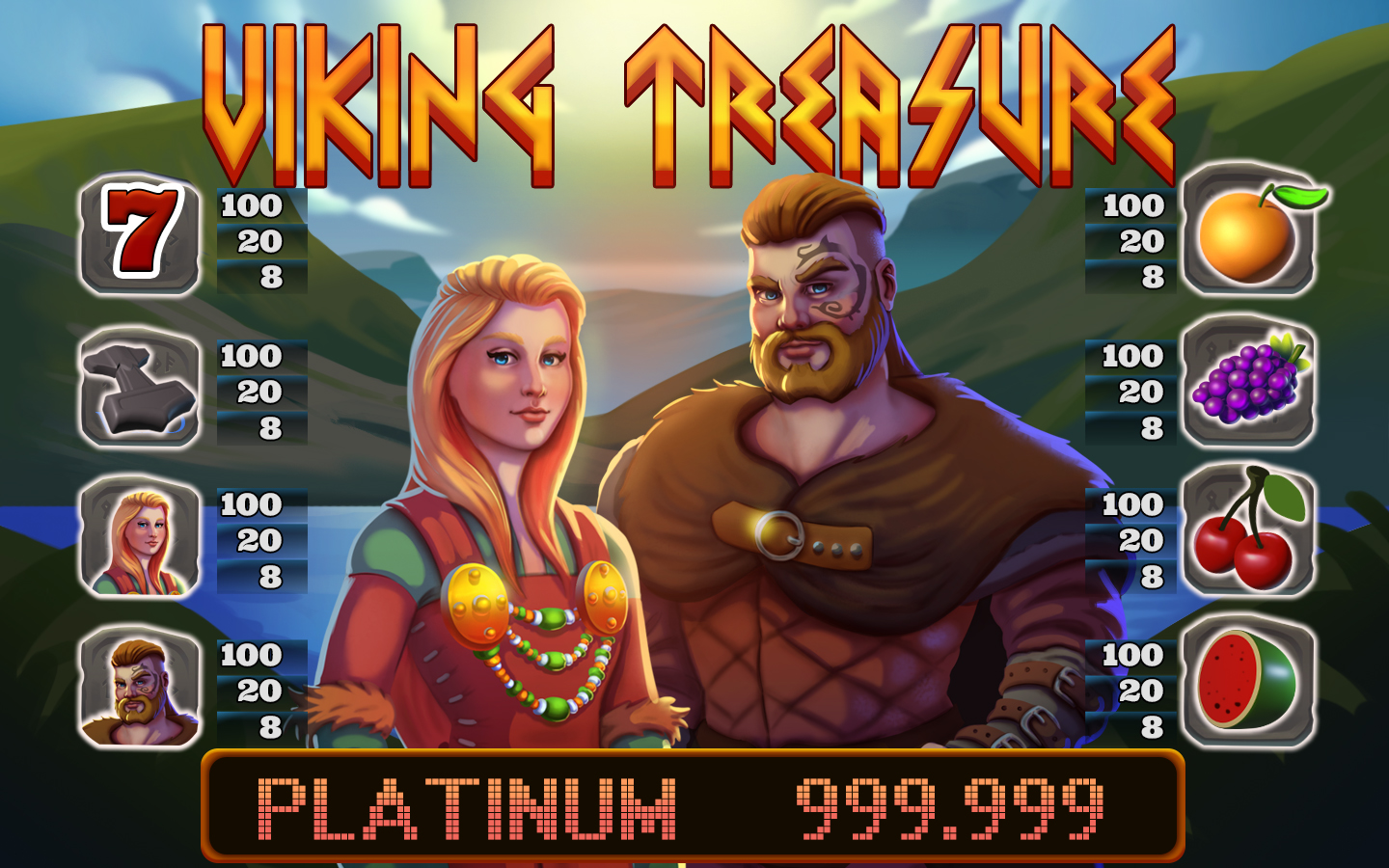 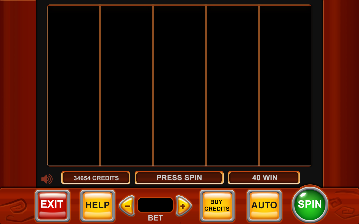
02-21-2021, 09:11 AM
Good for you on the casino thing! That's honestly a really cool opportunity and I'm sure you're going to nail it. I really like the design elements you have so far and the theme. The letters resembling old Norse runes is really clever. Was the theme your own idea, or something the company gave you?
Can I be really honest though? I don't think this reads well. The reason is that I don't think you are working with the masses of value enough to get them to read against each other. The fact of life is, that light doesn't read against light, and dark doesn't read against dark. Whether it's realism or a cartoon or whatever, you just can't put something on a background that is the same value and have it stand out, even if you outline it and double outline it. You have made sure all the edges of your shapes stand out against the things directly next to it, yes. But not the whole mass. When you zoom out, and see it at a small size, you can still barely make out the main shapes, and the title is nearly invisible. Taking away the color also helps to judge it.   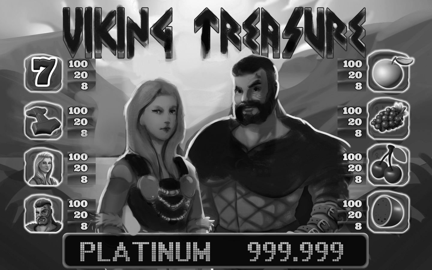 So something like this could be a solution. Maybe it would be better to go the other way and make the skin and hair light against a darker sky, I don't know. There's tons of things you could do, just as long as the large shapes that you want to read clearly are in a range which contrasts the thing they are in front of. but in any case I feel like there's like a battle going on in the image where you are fighting to make stuff stand out, and it is just ending up going toward the same grey value. That being said, I don't think it's a bad painting, and it's not that it doesn't read at all. I imagine you could potentially be going for something more subtle than this. But I still think it's something to think about if you are trying to attract attention with the picture.
02-22-2021, 05:08 AM
@Mariyan-Hristov: Thanks for the visit man! I'm happy you found some use in my notes! Also, thanks for the overpaint at discord! I decided to go with the less stylized version to keep more in line with the companies previous games, but it was good to try out.
@JosephCow: Big thanks for the excellent crits and overpaint! I tried to read it carefully and apply it to the latest version of my artwork. Maybe it reads a bit better in the current state. You have given me a lot to think about in my upcoming artworks! The current version of the painting. I will spend all day tomorrow just polishing and then send it off on Tuesday morning to keep the one-week deadline. 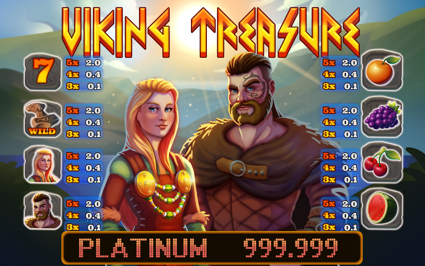
02-22-2021, 06:24 AM
Yeah! Looks really nice. I like how you added the broken shapes on the light on the guy's fur cloak, looks quite cool.
02-23-2021, 08:54 AM
Wow thank you so much for the notes, I’m saving them ,they are really useful and detailed. I like your style ...can’t wait to see more.
02-23-2021, 10:08 PM
Your observational skills and all these notes are really amazing! I really learned a lot going through them! Thank you so much for sharing them!
One small note about the Casino screenshot: Be careful with the blue background of the numbers! I think it looks probably better if it doesn't overlap with the logo or rest on the big score box at the bottom. Adding just a little space between these elements probably helps to make the interface feel less squeezed and gives it a bit of room to "breathe". However, I really like your rendering of the characters and of the small items at each individual score field. Keep up the great work! :)
02-24-2021, 04:14 AM
@JosephCow
Thanks a lot for the kind words and the input! @Kassatay Thanks a lot! I'm really happy you found my notes useful! Stay tuned for more of them! @Kaiko I'm happy you like the notes! Thanks for the input on the casino piece. My references were a bit all over the place with the placement of the elements. Here are the "final" version and the one I sent. I may still go back and touch it up a bit in a few days tho, so if anyone has any more additional feedback, feel free to share it. I made a couple of studies today to get back into the groove of studying. Took some notes as well. 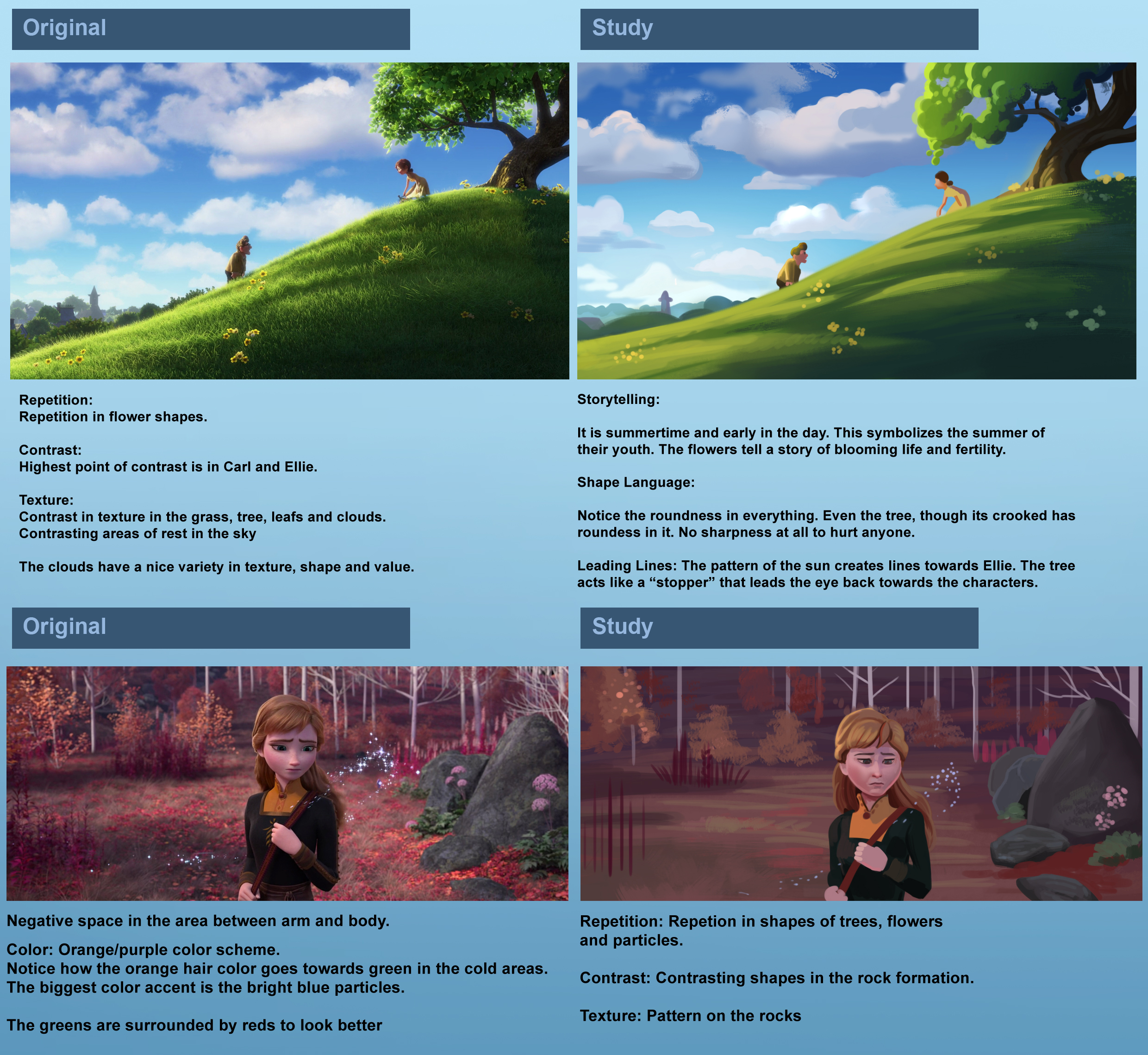 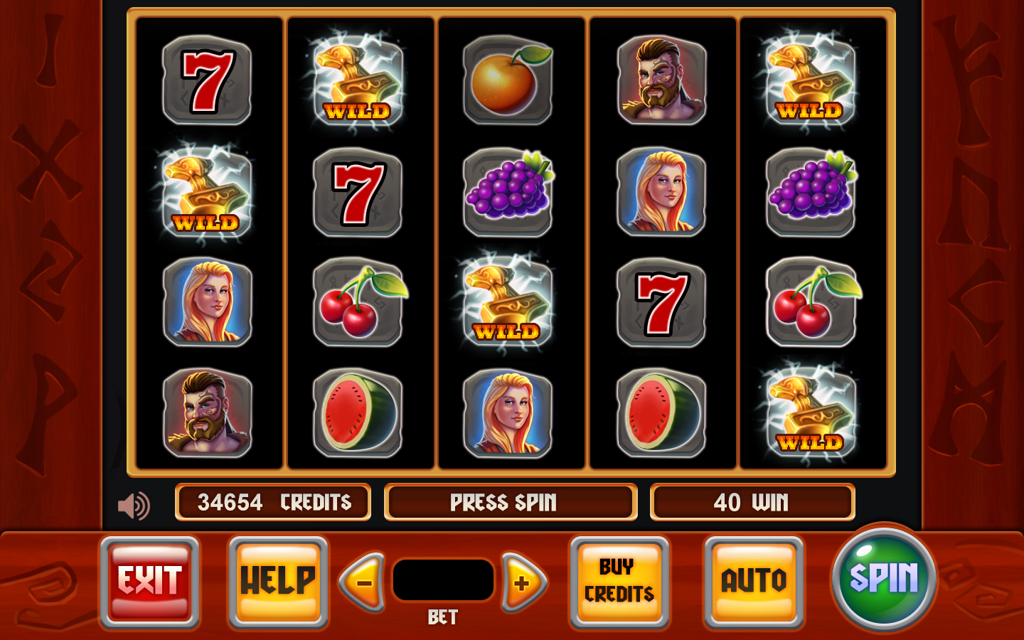 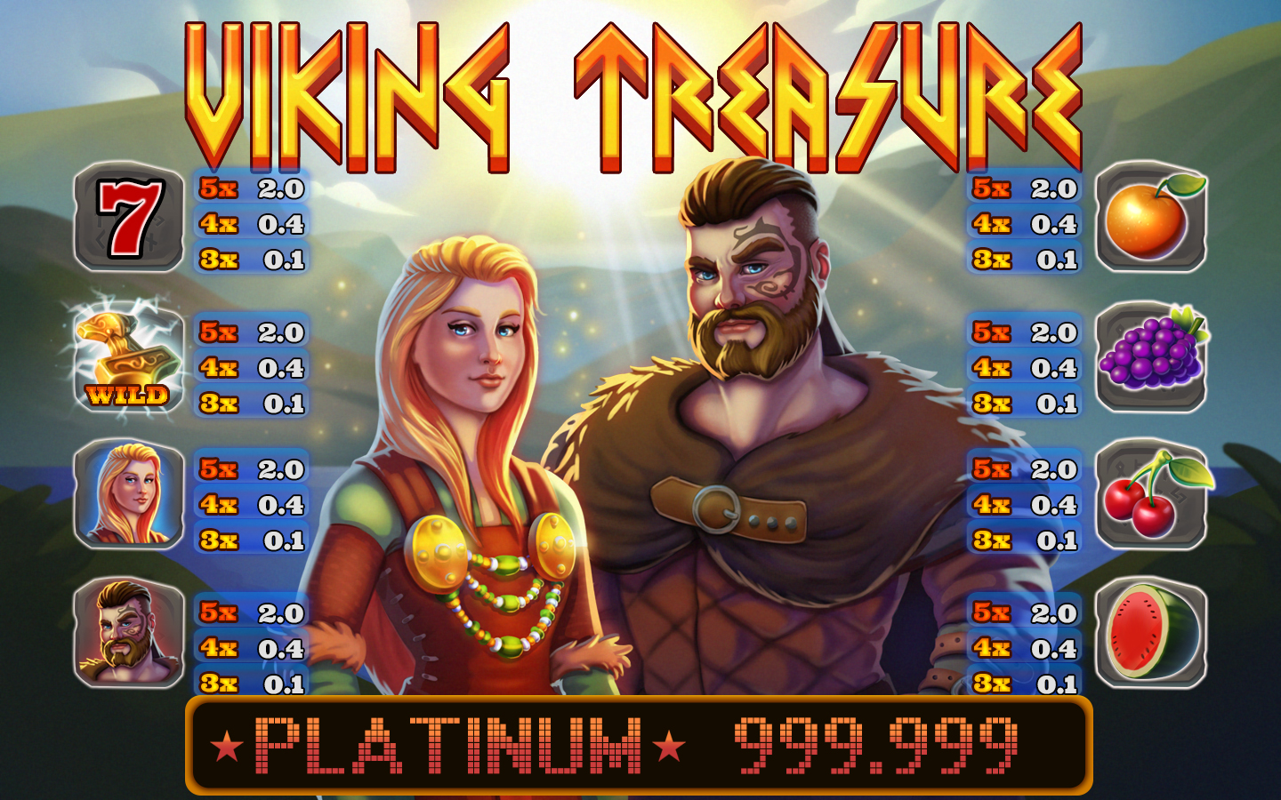
02-24-2021, 07:21 PM
Hi Zorrentos,
Thanks for stopping by my sketchbook and for the helpful advice there. Just spent some time going over your last three pages and love your original art, studies, and very helpful tutorial / tips As others have said — there’s a lot to take in — so I’ll hafta come back and look through them as I have time. Looks like JosephCow already suggested this and you adjusted your Viking Treasure piece very well — but thought I'd add that I also noticed that you tend to use very saturated colors in some of your pieces. Perhaps that’s what game images need — and that’s a bit out of my wheel-house — but I made the attached pic using your images to demonstrate that ( I hope : ) — and it's definitely something I'm still working on!! All in all I really admire what you’re doing. Thanks again for sharing all the tips etc. Keep up the great work!
02-25-2021, 09:10 PM
Thank you so much for the overpaint Jephyr! I am still learning a lot about color, and I find that the more I learn, the more I want to know! It's so cool to test different hues and see what looks good next to each other.
I made a couple of studies and took a lot of notes as usual. These kinds of studies are becoming a daily habit, and I feel like I'm learning a lot from doing them and really trying to think about the design, shape language, and color palette while I'm painting. I'll be back with a big update soon! Until next time! 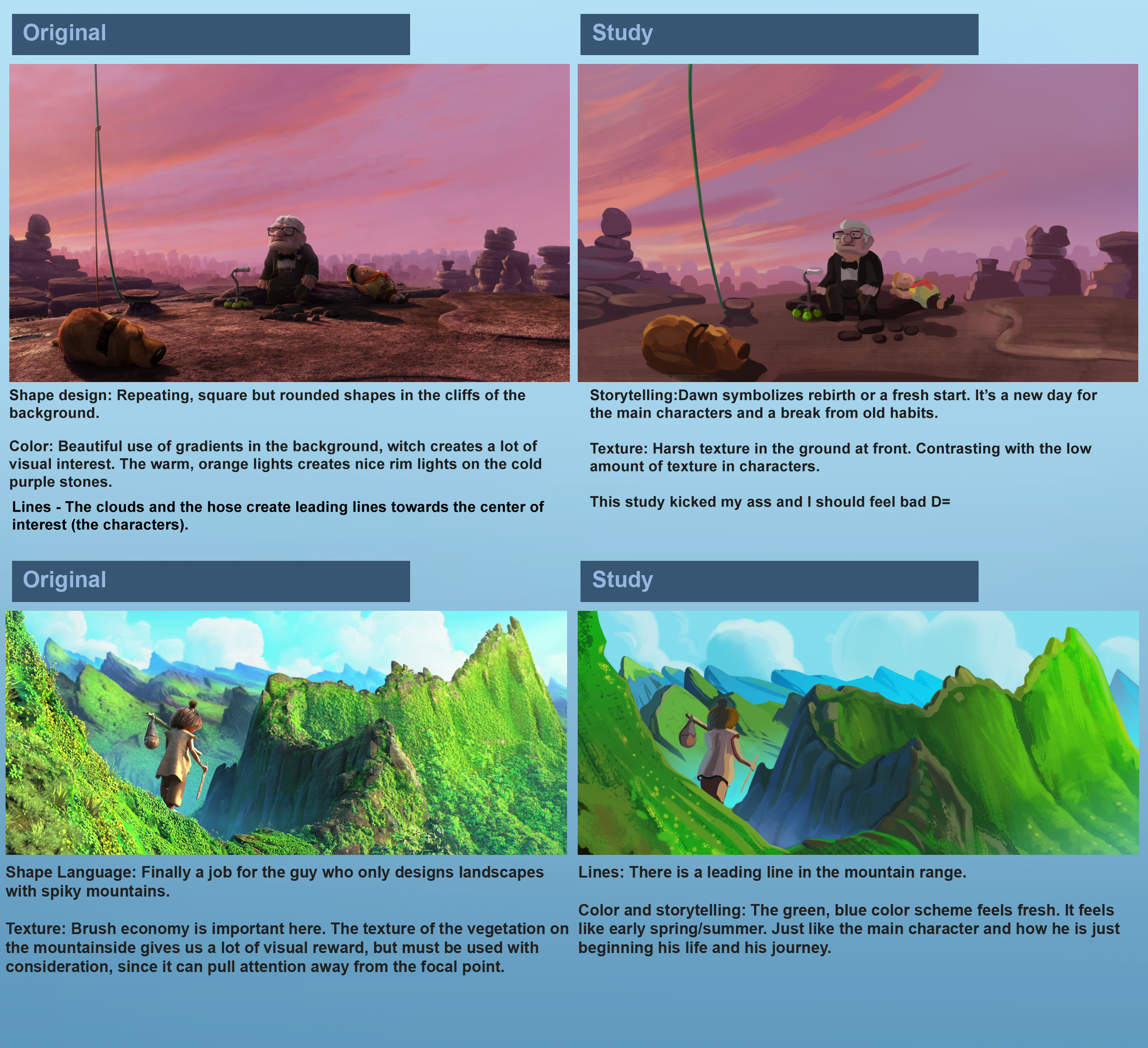
02-27-2021, 07:35 AM
Great studies!
I think with regards to your casino test piece, some attention to edge control could help a lot. For example you have very soft edges on the cheeks, but parts of the neck on the man have just as soft edges when it would be mostly muscle instead of fat. As a general rule of thumb, bone is hard edged, fat is soft edged, and muscle is a firm in between edge of the two. Apologies if I'm just repeating something you already are aware of, haha. The first version you had did a better job of paying attention to those edges, even if the forms weren't super defined yet, but your last one has lost the control and is making some forms read rounder than they should. Hope that's helpful!
03-01-2021, 06:07 AM
@Eny.
Thank you so much for the useful crits! I will definitely keep that in mind for future pieces! Indeed, sometimes you lose somethings as you continue rendering and painting. I made another study today: 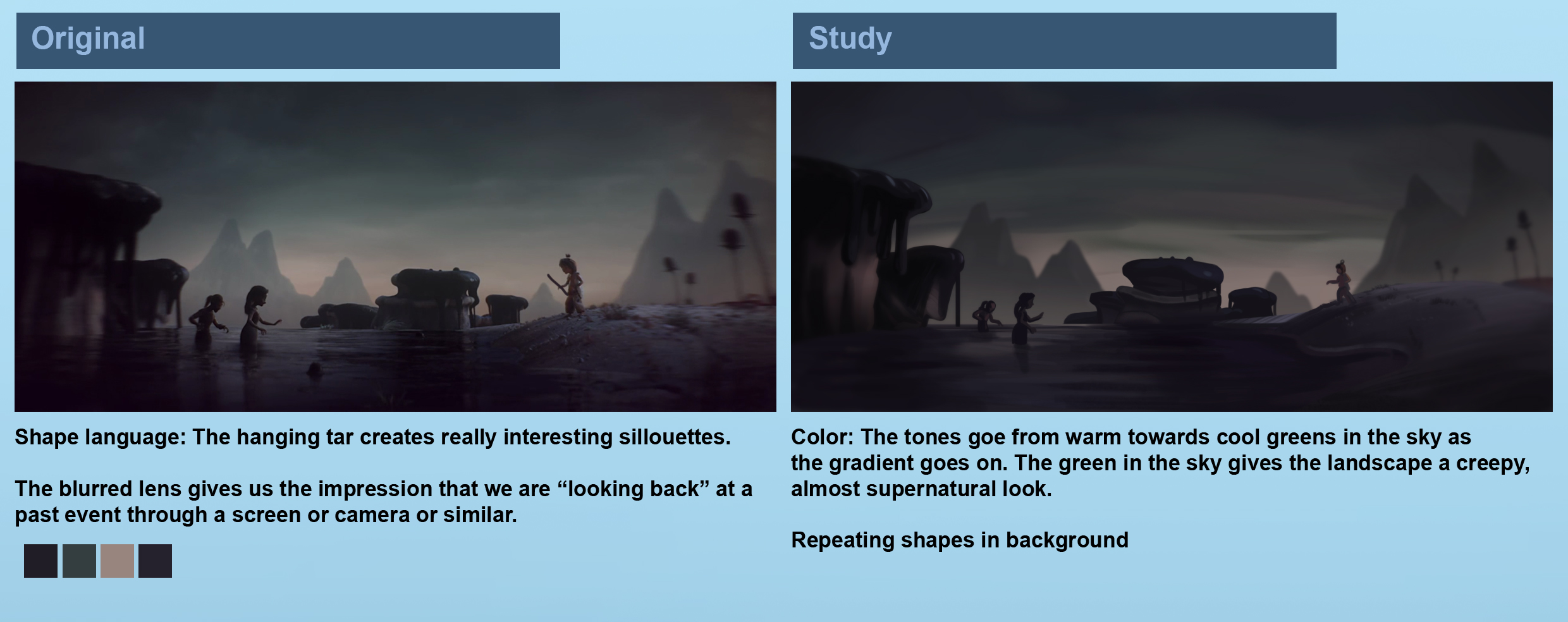 Also continued working on this piece and tried adjusting it according to critiques: 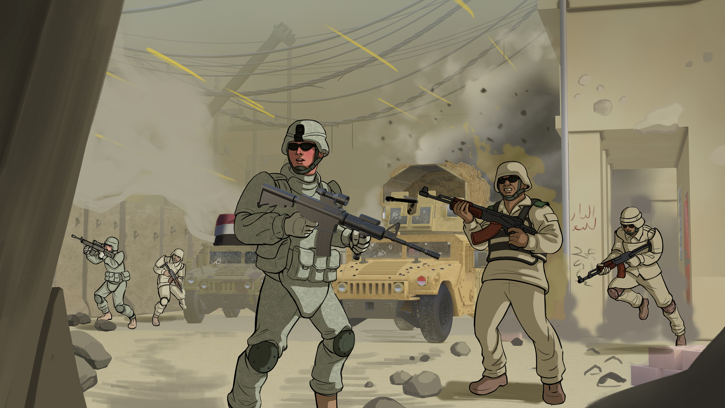 Feel free to share any input! :) Edit: Wow! We reached page 9! It's insane what a roll we are at! 
|
|
« Next Oldest | Next Newest »
|