Paintover needed (ref inlcuded)
#1
Please if something looks wrong, point it out, and if you could do a paintover that would really REALLY help lol

At my wits end with this, I've gotten a few crits with words, and i agree with them, and I'm trying to implement them to the best of my ability, but I think a paintover would really show where I'm going wrong

I'm spending hours at this point just slightly moving proportions and I feel stuck, so maybe you can see the issue better

Thx <3


Attached Files Image(s)


70+Page Koala Sketchbook: http://crimsondaggers.com/forum/thread-3465.html SB

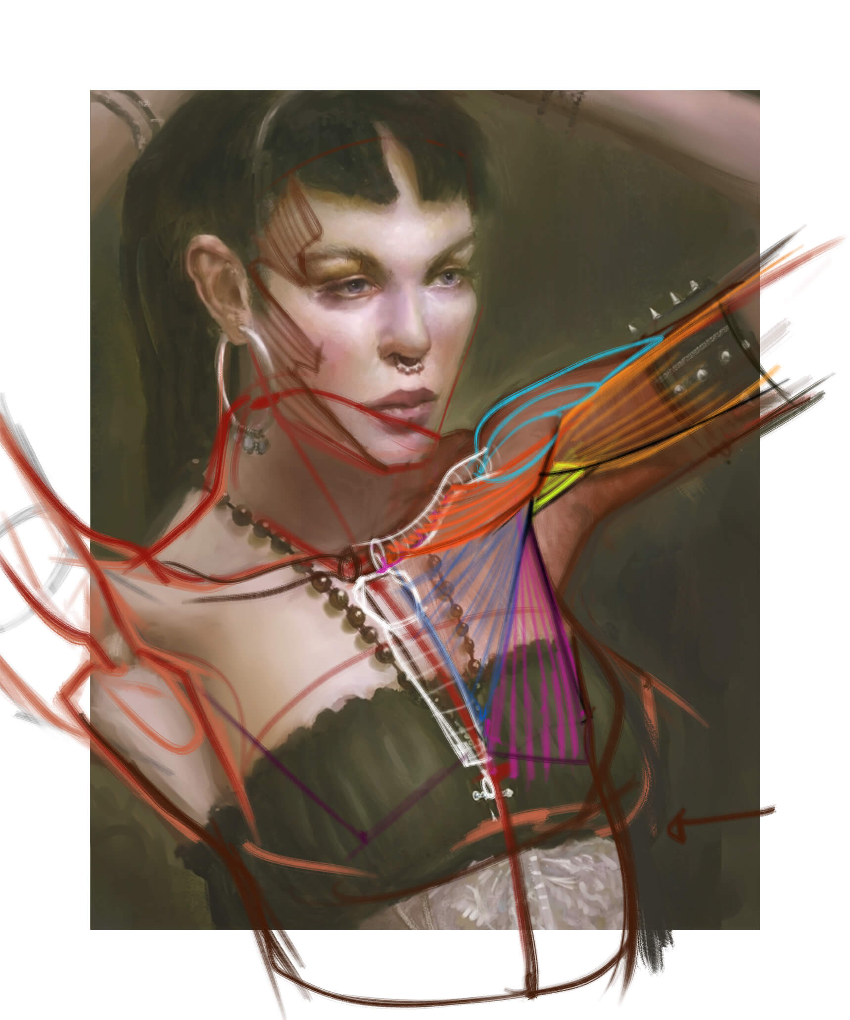
Paintover thread, submit for crits! http://crimsondaggers.com/forum/thread-7879.html
[color=rgba(255, 255, 255, 0.882)]e owl sat on an oak. The more he saw, the less he spoke.[/color]
Reply
#2
Heyo, think if you're referencing the pose closely, try overlaying it on your painting to see where your volumes dont line up?
Reply
#3
Well.. I stand corrected with my comment on your SB..

But daamn... either she *really* has those features or it's been Photoshopped to hell.. I'll get back to you on this.

If you are reading this, I most likely just gave you a crappy crit! What I'm basically trying to say is, don't give up!  
----
IG: @thatpuddinhead
Reply
#4
@Dodeaa I've done that, and most things line up well, it's just I'm wondering about the neck area since it's covered by the necklace in the reference, and I can't see what is going on underneath

70+Page Koala Sketchbook: http://crimsondaggers.com/forum/thread-3465.html SB

Paintover thread, submit for crits! http://crimsondaggers.com/forum/thread-7879.html
[color=rgba(255, 255, 255, 0.882)]e owl sat on an oak. The more he saw, the less he spoke.[/color]
Reply
#5


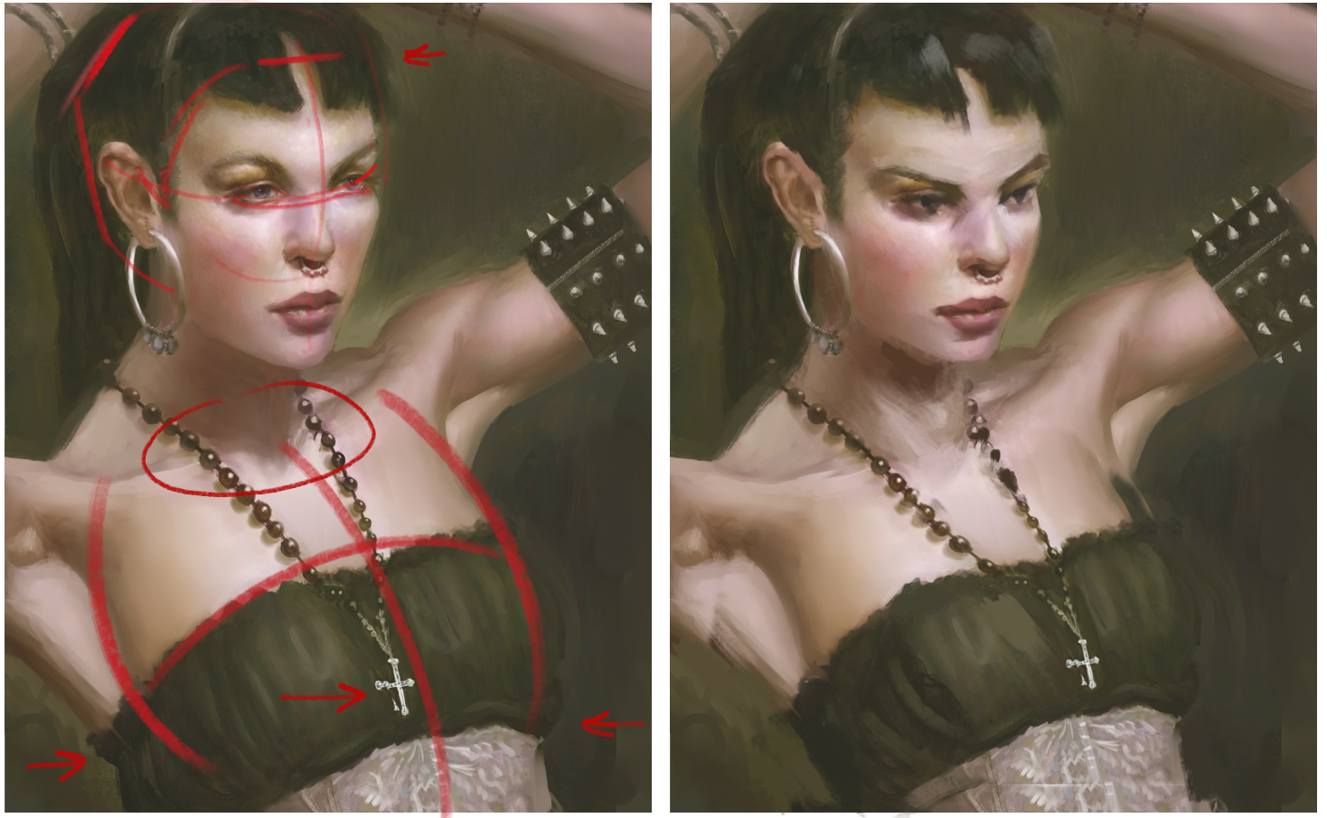
Basing off the reference you gave, I noticed the body is a lot larger in comparison to the head (which might be why the shoulders look off). I've also shifted the pendant to the right to emphasize the volume of her chest, as well as touched her face to reflect her head being looked at at a downwards angle. The shadow beneath her chin could be raised up or lowered-- just so it doesn't tangent right with the clavicle area.
Watch the hairline-- its a tad hard to tell the hairstyle you're going for.

Just nitpicky things, but hope it helps a little. You've got a very Fedodika way of drawing faces.
Reply
#6
Ahh thanks so much Hozure!! Yea, i can totally see it now, it was just that big! Good point on the neck shadow thing, that tangent was bugging me and i didn't know how to fix it haha

"Just nitpicky things, but hope it helps a little."

I don't think it's nitpicky, it's important, people notice this stuff subconsciously and it can really make or break a piece.

" You've got a very Fedodika way of drawing faces."

Yea, that's an interesting comment, I don't know if good or bad. I've actually had a few people say the way i draw women's faces is misogynist, which is interesting how an expression or a face can seem to think i hate women. I mean I'm not drawing them with their mouth wide open to give a BJ or sth jeez.

My best m8 always hates the way I draw women, even if the proportions are correct. He thinks I hate them or something, it's really strange..

70+Page Koala Sketchbook: http://crimsondaggers.com/forum/thread-3465.html SB

Paintover thread, submit for crits! http://crimsondaggers.com/forum/thread-7879.html
[color=rgba(255, 255, 255, 0.882)]e owl sat on an oak. The more he saw, the less he spoke.[/color]
Reply
#7
so here's what i did after Hozure's crit, if anyone else has a suggestion don't hesitate!

(the left is after)


Attached Files Image(s)


70+Page Koala Sketchbook: http://crimsondaggers.com/forum/thread-3465.html SB

Paintover thread, submit for crits! http://crimsondaggers.com/forum/thread-7879.html
[color=rgba(255, 255, 255, 0.882)]e owl sat on an oak. The more he saw, the less he spoke.[/color]
Reply
#8
Hey Fedodika,

First of all, I wanna say you're really brave, that ref is super hard, mainly because of the lens distortion combined with the awkward stuff going on at her shoulders

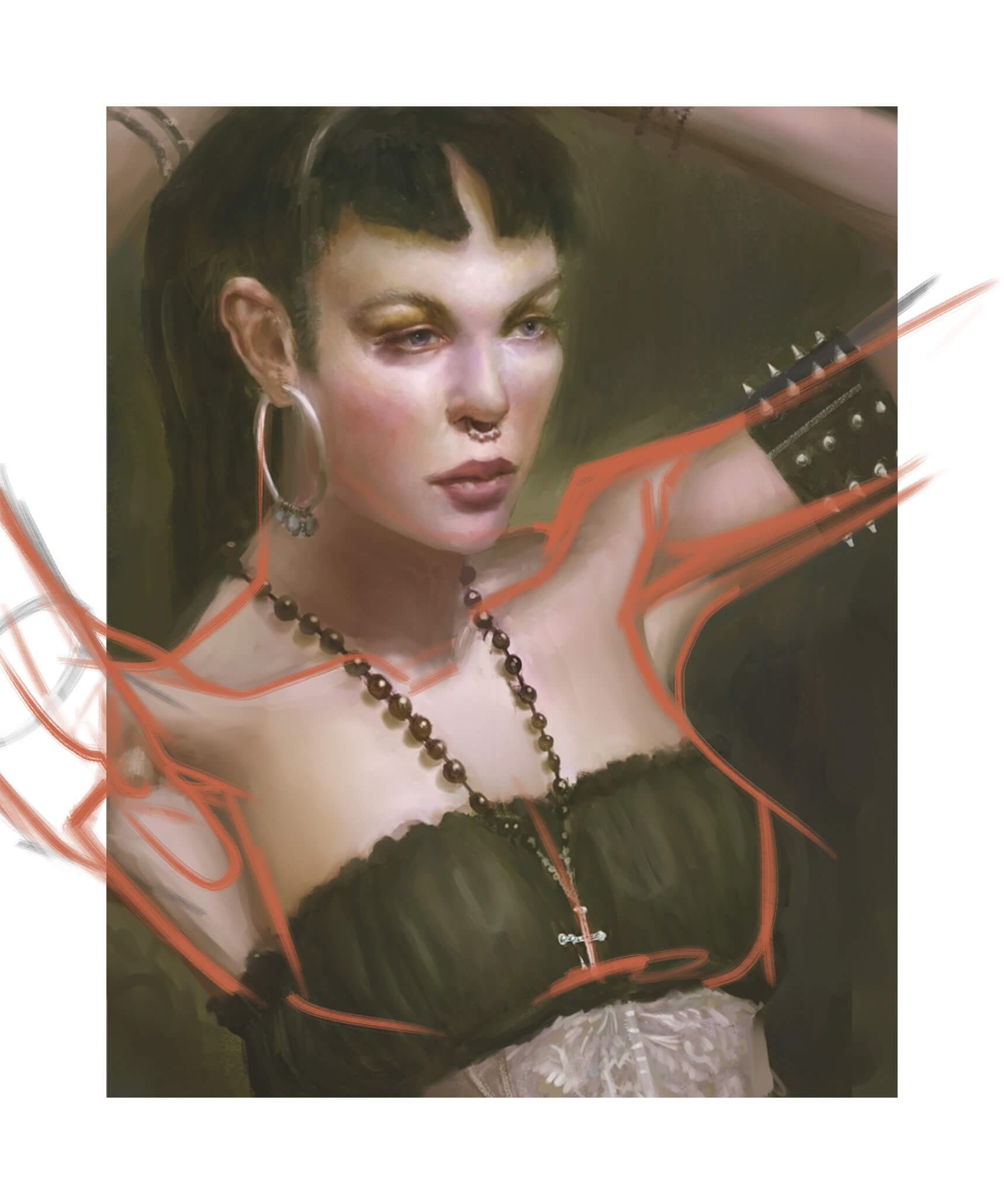
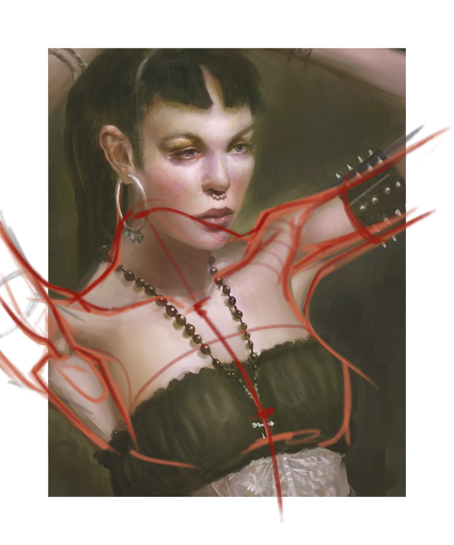
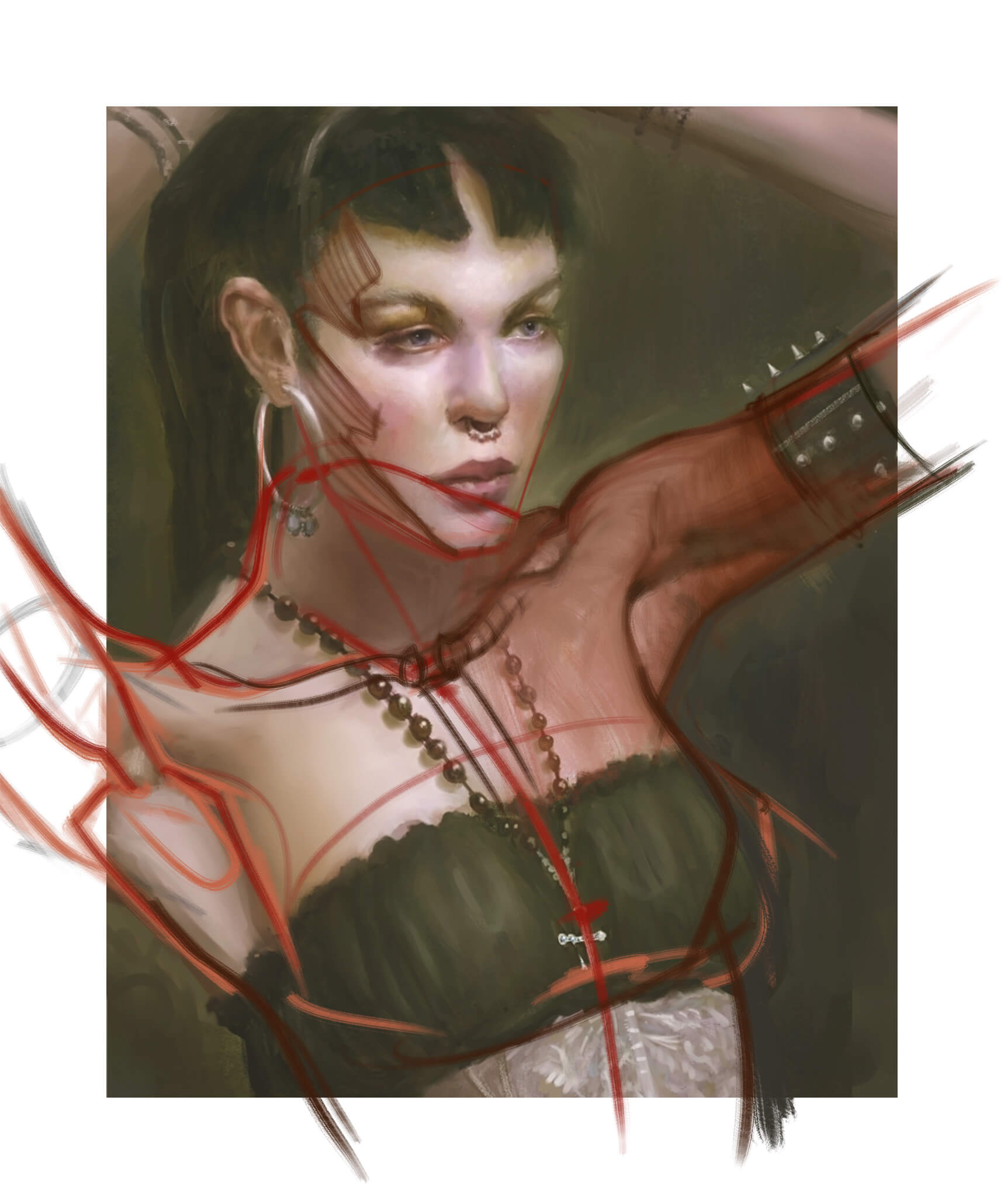
A lot of points about construction and stuff have been already made here, so I wanna focus on those arms. You should first go and study more similar poses, find what's going on with the clavicles. I know I need to do that too.

Copying the image is not the right thing to do. And also, instead of pushing paint around for hours, stop and as I said, go paint similar poses. Then come back to it.

In terms of values, her skin is a bit too bright, or at least the bright spots are too big, should only have accents like the one you see on her forehead. You missed that, that's a beautiful accent right there. Ball of the nose, same thing, bright accent that goes up the bridge and slowly fades - absolutely beautiful. If the accent is not bright enough, it means your skin tone is too bright, so darken it. If you look at old masters, you'll see a lot of red noses, because they needed the darker value to pop that highlight.

Also, don't be scared to use more color. Meaning really adding more hues, use reds, use greens, yellows, saturation vs desaturation.
Of course, I don't think I need to mention knowing the anatomy and using it to change awkward areas that will otherwise give a weird look to your painting.

So here's how I'd do it. I don't usually go that far, and when I do, I try to simplify stuff a hell of a lot and find lighting setups that help create shadow shapes I can play with.


Not sure if this helps, but I can tell you this pose was a challenge. Next time, try something less complicated, without being cropped or distorted.

Reply


Forum Jump:


Users browsing this thread: 4 Guest(s)