Posts: 905
Threads: 39
Joined: Sep 2013
Reputation:
51
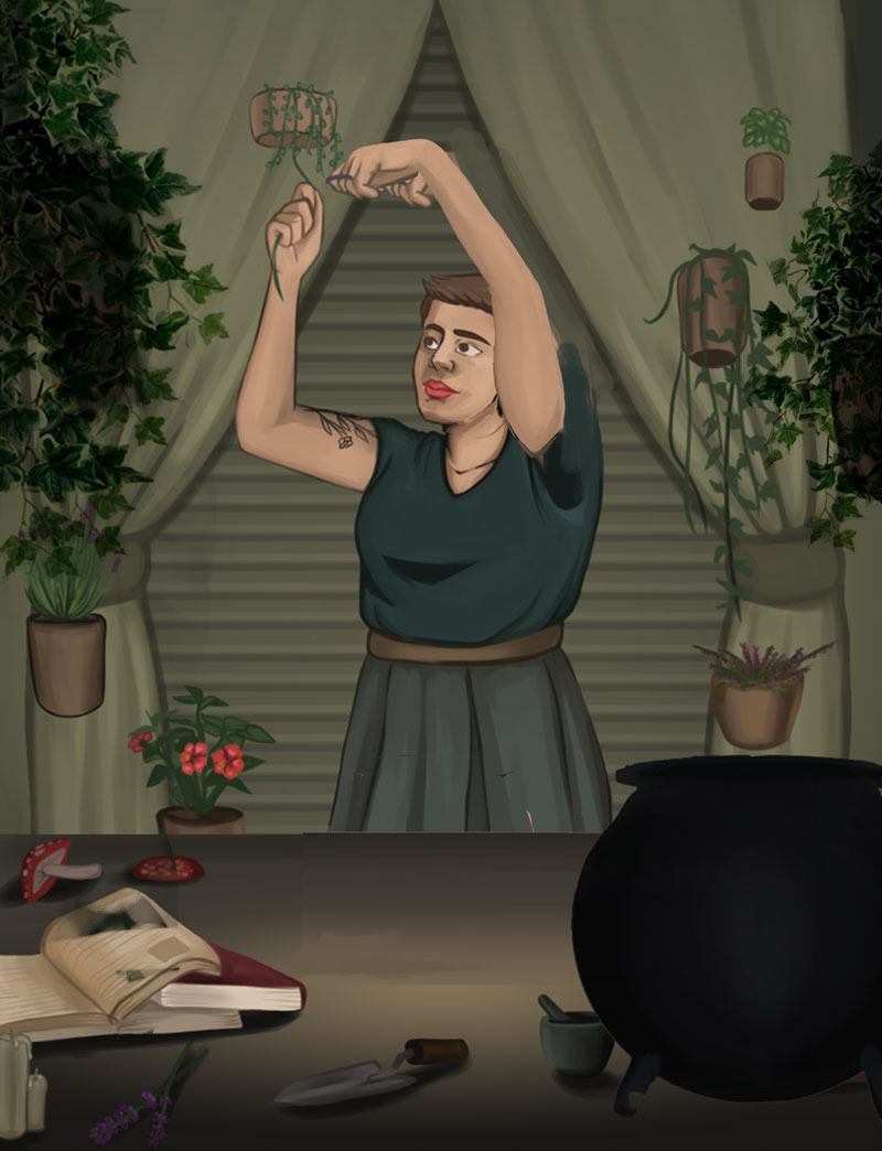
the horizontal strips in the background, combined with that color, really makes me think of those metal curtains a shop would pull down in front of it at the end of a work day. Because of that, I keep wanting to see rust or graffiti on it to make it "more realistic", but I don't that's a shop front metal curtain you're going for...
For a witch themed after plants, the curtains sure dominate a lot more than the plants, and all the plants are equally small looking. Even if you're sticking to realistic sizes for plants, some of them can be a bigger bush/cluster than others - like the Aloe could be a larger cluster, and the draping vines tend to flourish into mops even with just semi-proper care (at least in my experience they're more like weed than orchid), and lavender can certainly grow into a tough gnarly bush like a bonsai.
One other thing is the items on the table also seem to be more or less all equally spaced out. It'll look more interesting if they're grouped in clusters. Also that cauldron's placement feels rather awkward - I don't know if it's because of the lid's almost tangent with her skirt, or the proximity to her private area and thus making me feel awkward for looking in that direction when trying to look at the cauldron, or some other reason I can't explain. It just feels awkward being there.
Lastly, maybe a pile of books really close to us to establish a strong foreground. Right now the space of this image feels pretty flat. Push that not-metal-curtain in the background further back - probably by making the cast shadow on it from the curtain bigger to suggest it's further behind, or darkening it, or something else.
![[Image: plant%20painting%20final%20wip2_zpsje96mgns.png]](http://i233.photobucket.com/albums/ee268/Charlie342/plant%20painting%20final%20wip2_zpsje96mgns.png)
![[Image: plant%20painting%20final%20wip2_zpsje96mgns.png]](http://i233.photobucket.com/albums/ee268/Charlie342/plant%20painting%20final%20wip2_zpsje96mgns.png)


