Posts: 201
Threads: 3
Joined: Jan 2021
Reputation:
3
(02-27-2023, 08:19 PM)Cruptic Wrote: Nice work here! This last piece looks very promising. I'd say don't be afraid to spend a stupid amount of time on finishing pieces. Especially when figuring out digital tools and all that, it can take forever. Just go with it. Seems like you figured out the brighness to opacity thing already. Now you can block in all the colors you want, start some rendering of the form and once you have it all sort of jell together, make a new layer on top of everything and try "painting out" your pencils. It's an ambitious image with all the water, the hair and everything, dont hesitate to get good references at this point. If you want I could do an overpaint once you've pushed it as far as possible, let me know. Have fun!
Hiya, thanks for the encouraging post. I do honestly get anxiety when a piece is taking too long, as I feel it's a reflection on my abilities and 'I'll never improve'. I think it might be my idea of 'being left behind' and not wanting to 'waste anymore time', but seeing your progress lets me know there is a way out if you just give yourself time. I just need to learn to relax and give myself breathing room. Digital is very hard indeed and frustrating. It feels easier in some ways to traditional, like being able to experiment and make copies, but all the controls feel nebulous and the learning curve super steep and less intuitive.
That took a while lol, didn't even know it was possible to paint under the original sketch lines, until someone on discord told me.
I'll try to fill with refs of course, photos and artists for stylisation guidance, like Loish for hair. It's surprisingly hard to find refs of the white water/pattern like part on water, because I don't know the exact name for it.
I would appreciate an overpaint or anatomy help.
By a new layer, do you mean 'flats', then a 'blending/rendering out' layer? However, you said to 'start some rendering of the form', so I'm not too sure what you exactly mean. Like a 'pre-blend', laying out colours to blend, but leaving the actual bulk of that to another layer?
Thanks, again for visiting.
Posts: 88
Threads: 1
Joined: May 2014
Reputation:
5
Hey, yea I know the feeling. But funny enough it's no waste of time at all spending it on a painting you are finishing. The first time I spent like 200 hours on a single painting I really surprised myself. I didnt know I could paint that well. But then you start the next one and it all starts over haha.
Yes so do the flats on a layer beneath. Then another layer perhaps, also beneath, where you start with forms. You create form not with blending or preblending, but with putting in different values (the flats are pretty much just one value, hence the name flats). Good to know where and what your light source is vaguely and figure out where its lighter and where its darker. I like to do this underneath because you still have the structure of your drawing holding everything together. After that feels alright I go make a layer on top of everything and blend and paint over it all. But I mean it's just one way to do it, maybe you want to experiement and find your own way - but for me it's easier this way, like approaching it in single steps that are manageable.
Posts: 369
Threads: 6
Joined: Sep 2019
Reputation:
23
Oh, you're picking up the water piece again! Wonderful! As Cruptic says, take your time, it's worth it.
I like your latest color pencil, you always make them lively. So is the the one just above it with the new brush.
About your technical questions:
Right click an image on any web page, then click Copy Image Address (to the clipboard) and paste the URL into your message, it will become a link.
About working from a scan, you are using the brightness to transparency trick. Another method is to set the scan layer to Multiply mode - it does multiplication on the colors; basically, full black pixels will just remain black (0 x anything = 0), full white pixels will preserve the color beneath (1 x anything = same anything), and gray pixels will shade the color beneath (0.5 x anything = half that anything; 0.25 x anything = a quarter of that anything, etc..)
Posts: 3,359
Threads: 37
Joined: Aug 2013
Reputation:
234
If you ain't done with the piece of the women in water you should take a look at this https://crimsondaggers.com/forum/thread-...ge-28.html it pretty much the same idea... perhaps it where you got the inspiration nothing wrong with copying for learning purpose obviously.
Posts: 201
Threads: 3
Joined: Jan 2021
Reputation:
3
(02-28-2023, 07:38 PM)Cruptic Wrote: Hey, yea I know the feeling. But funny enough it's no waste of time at all spending it on a painting you are finishing. The first time I spent like 200 hours on a single painting I really surprised myself. I didnt know I could paint that well. But then you start the next one and it all starts over haha.
Yes so do the flats on a layer beneath. Then another layer perhaps, also beneath, where you start with forms. You create form not with blending or preblending, but with putting in different values (the flats are pretty much just one value, hence the name flats). Good to know where and what your light source is vaguely and figure out where its lighter and where its darker. I like to do this underneath because you still have the structure of your drawing holding everything together. After that feels alright I go make a layer on top of everything and blend and paint over it all. But I mean it's just one way to do it, maybe you want to experiement and find your own way - but for me it's easier this way, like approaching it in single steps that are manageable. I'm gonna spend more time on this piece, I get nervous about finishing work to post, instead of W.I.Ps of the same picture. Prepare to see more images in stages, maybe half-finished, before I come back to it. So far I have layers for the OG sketch, the flats layer (that I'm using for rendering, too) a water layer and a sea foam layer (know the right term to search for now!). So, just to clarify you have a layer for your sketch, one for flats and light values underneath the sketch, the a blending/paint over layer above the sketch? Might try that later. The biggest problem I'm having is the sea foam, because on the Nguyen image she comes through underneath the water and I'm not sure how to translate that digitally. So far, I don't think the pattern is readable as sea foam, but this is: Sea Foam Painting by Janremi B - Pixels I might go back and create the forms from the OG sketch, even though it seemed more abstract initially. It may seem clearer with colour.
(03-01-2023, 01:31 PM)Leo Ki Wrote: Oh, you're picking up the water piece again! Wonderful! As Cruptic says, take your time, it's worth it.
I like your latest color pencil, you always make them lively. So is the the one just above it with the new brush.
About your technical questions:
Right click an image on any web page, then click Copy Image Address (to the clipboard) and paste the URL into your message, it will become a link.
About working from a scan, you are using the brightness to transparency trick. Another method is to set the scan layer to Multiply mode - it does multiplication on the colors; basically, full black pixels will just remain black (0 x anything = 0), full white pixels will preserve the color beneath (1 x anything = same anything), and gray pixels will shade the color beneath (0.5 x anything = half that anything; 0.25 x anything = a quarter of that anything, etc..) Hi Leo, I'm planning to take my time with this and ask for feedback. Thanks, I think excel at drawing people's likenesses, because I've been practicing faces for ages and love capturing expressions. 'One with the new brush', you mean the girl holding the cigarette? She's Jenny Quantum. I just need to try and make in though the paper 'tooth' doesn't come through. Taking Gabriela Niko's Domestika class, so we'll see what happens.
Tried right-clicking, but it only shows me 'Copy image link', but I'm not sure where the 'Clipboard' is. But, thank you. I know artists shade using 'Multiple mode', but I either don't notice anything, or it messes up the colours. I haven't figured how to use it probably yet, I just end up getting frustrated.
(03-02-2023, 09:15 AM)darktiste Wrote: If you ain't done with the piece of the women in water you should take a look at this https://crimsondaggers.com/forum/thread-...ge-28.html it pretty much the same idea... perhaps it where you got the inspiration nothing wrong with copying for learning purpose obviously. Nope! First time seeing that pic. Pretty sure loads of artists have their variant of 'Girl floating on/in a lake' trope.
![[Image: hKKWD3u.jpg]](https://i.imgur.com/hKKWD3u.jpg)
Teenage Jenny and her daddies finished. Still anatomy mistakes and the sofa isn't even, but ya know rolling with punches and learning to just leave things as they are. Can also be improved on in the next drawing. 

Posts: 105
Threads: 1
Joined: Apr 2021
Reputation:
18
Regarding the water pattern, it has a size hierarchy. It can be broken into larger sections (green) to smaller ones (purple > yellow).
Take note of how the sharper tips and lines of larger and smaller sections don't align. Eg, you don't have a purple boundary continuing as green one. Each section is self-contained. Also, smaller shapes accumulate — almost swirl around — the larger ones.
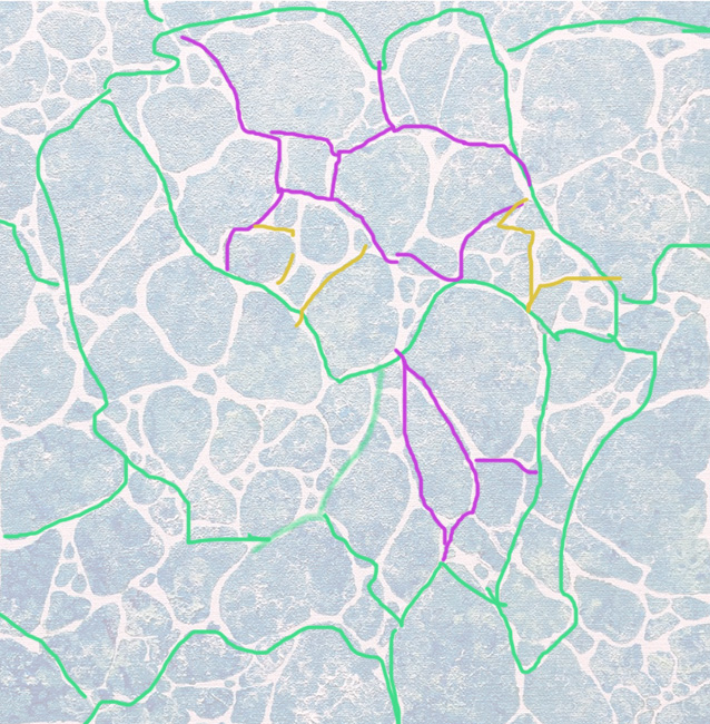
I hope this helps. I'm curious to see where this piece is going.
Posts: 369
Threads: 6
Joined: Sep 2019
Reputation:
23
Looks like I'm light-years away from the DC universe, I didn't know Jenny Quantum. Actually I'm not big on superheroes but I like the more acrobatic ones, they are a constant lesson in extreme gesture, just at the doorstep to the elastic cartoon physics.
Is your problem with paper tooth that the granularity doesn't show enough on the pencil strokes? I hope someone knows enough to answer. A soft pencil is likely to fill in the paper gaps while a hard pencil may flatten the bumps, resulting in the same visual flatness. Maybe the secret is in applying a very gentle pressure (I would fail at this).
The "copy image link" command is exactly what you need. It copies the link/address to the clipboard, and you can paste it somewhere else.
Multiply layers for shading, I don't know how that works, especially if you want to tint your shadows (because ambient light is seldom pure white). I was suggesting this only for grayscale line scans, to see your color layers through the white pixels.
I will refrain from commenting on the lady in the water because I'm curious of your own exploration.
Posts: 201
Threads: 3
Joined: Jan 2021
Reputation:
3
Hi, thanks for the critiques guys! Would have messaged earlier, but I've had an anxious week. Buses in my city were striking, so I couldn't get to work. Followed the protocol of reporting an absence the day of, but because other people did as well. He threatened my job and said I had to come in or lose it, made fun of my anxiety. The manager is known for being an asshole, I did want to eventually leave, but this forced my hand. So, I'm currently out of the job and trying to find a new one, while trying to get work experience in the creative industries. Ah, it's stressful.
(03-19-2023, 09:54 AM)Lydo Wrote: I think I can see where you’re trying to go with this piece, and correct me if I’m wrong.
There’s a sense of hopeless drifting/floating. I tried to amplify the sensation of uncontrolled floating limbs, with the exception of one hand reaching out from the water (near the face like you have it). When you’re floating on water your limbs tend to reach outwards like a net rather than clench inwards to hold surface tension. Picture it like trying to guard a human sized bubble behind you. Containing what’s underneath gently so you don’t break the surface. Wow Lydo, this is great! Thanks for the tips. I will definitely consider this the next time around. At the moment I've just focused on learning to render. I still want her to be in the general pose of her having her arm resting/floating on top of her stomach in shallow(ish) water. I used CSP's build in models as a ref, which probably explains why it's so stiff. I kinda of did what you were suggesting here, but her limbs are more close.
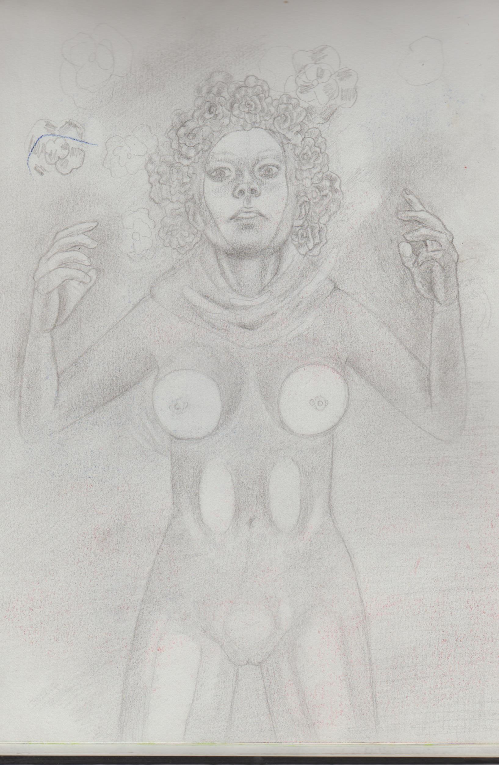.jpg)
(03-19-2023, 10:26 AM)dimensional-knight Wrote: Regarding the water pattern, it has a size hierarchy. It can be broken into larger sections (green) to smaller ones (purple > yellow).
Take note of how the sharper tips and lines of larger and smaller sections don't align. Eg, you don't have a purple boundary continuing as green one. Each section is self-contained. Also, smaller shapes accumulate — almost swirl around — the larger ones.
I hope this helps. I'm curious to see where this piece is going. Thank you! It was definitely difficult for me to configure the pattern layout. In the OG pencil sketch it's more abstract, but still kind of recognisable as sea foam, I think this one completely misses the boat, though. I'll create a new layer and restart with this size hierarchy in mind.
(03-21-2023, 11:05 AM)Leo Ki Wrote: Looks like I'm light-years away from the DC universe, I didn't know Jenny Quantum. Actually I'm not big on superheroes but I like the more acrobatic ones, they are a constant lesson in extreme gesture, just at the doorstep to the elastic cartoon physics.
Is your problem with paper tooth that the granularity doesn't show enough on the pencil strokes? I hope someone knows enough to answer. A soft pencil is likely to fill in the paper gaps while a hard pencil may flatten the bumps, resulting in the same visual flatness. Maybe the secret is in applying a very gentle pressure (I would fail at this).
The "copy image link" command is exactly what you need. It copies the link/address to the clipboard, and you can paste it somewhere else.
Multiply layers for shading, I don't know how that works, especially if you want to tint your shadows (because ambient light is seldom pure white). I was suggesting this only for grayscale line scans, to see your color layers through the white pixels.
I will refrain from commenting on the lady in the water because I'm curious of your own exploration. She's was part of the 'Wildstorm' universe as part of 'The Authority'. Jenny is a reincarnation of Jenny Sparks, the first leads and her dads former boss. When WS was folded into the main DC university, her fathers make the cut, by not all members did. Unfortunately, she's no longer Apollo or Midnighter's daughter, which is disappointing. 'The Authority' were revealed as part of James Gunn's new DC shakeup. That's exciting for the fandom, hope we see he as their daughter in live action. For 'acrobatic' heroes, you are a fan of Spider-Man and Nightwing? For stretch cartoon physics, I would defo refer to Plastic man.
I'm doing Gabriela Niko's domestika class and her grain show through, but it's very soft and not distracting. I may just need to go slower/softer with my pencils. I can 'copy image link', but nothing happens, or at least I can't see my 'clipboard'. I've seen quite a few references to using 'multiply' for shadows, but the knowledge still eludes me.
Thanks for commenting.
Posts: 369
Threads: 6
Joined: Sep 2019
Reputation:
23
Ouch, losing one's job to a bus strike is frustrating. I once had to walk to work for three hours during a bus strike but I don't expect any boss to demand that. Would you consider approaching the bus company with "You guys made me get fired, are you hiring in your communication department?"
Your alternate version of the lady in water is a very different mood, like a paralysis panic, her face is striking. Will you try to render it more or is it just an exploration?
Yes, Spidey and its ilk, when drawn with slightly flexible anatomy with an artist's own style, are fantastic - not all the way to Plastic Man though.
Once you have the image link in the clipboard, you can paste the link into any text with Control-V (or similar shortcut depending on your operating system) or right-click > Paste.
Posts: 105
Threads: 1
Joined: Apr 2021
Reputation:
18
I'm so sorry about your job! I hope you find something better soon.
Despite living in a so called "developing country" thankfully we got solid employment laws here. If my boss tried to pull something similar I could just reply "sure, will you cover my Uber bills then?", since walking the distance is out of question. No at-will fire employment bullshit without prior notice and severance here, and by law commuting expenses must be covered by the employer.
That lady in the water piece is shaping up nicely. Her expression is amazing! The effort you're putting in it is paying off.
Posts: 201
Threads: 3
Joined: Jan 2021
Reputation:
3
(03-29-2023, 12:31 PM)Leo Ki Wrote: Ouch, losing one's job to a bus strike is frustrating. I once had to walk to work for three hours during a bus strike but I don't expect any boss to demand that. Would you consider approaching the bus company with "You guys made me get fired, are you hiring in your communication department?"
Your alternate version of the lady in water is a very different mood, like a paralysis panic, her face is striking. Will you try to render it more or is it just an exploration?
Yes, Spidey and its ilk, when drawn with slightly flexible anatomy with an artist's own style, are fantastic - not all the way to Plastic Man though.
Once you have the image link in the clipboard, you can paste the link into any text with Control-V (or similar shortcut depending on your operating system) or right-click > Paste. I'm sure there was more I wanted to say.) Damn, three hours! I couldn't imagine. Don't think working for the communications for my city's buses would work like that. It only lasted a week in the end, but the way he was being abusive on the phone (that my mum heard) he would not have just given me the option of just taking me off the rota for the time effected. Did wanna eventually leave, but not have my hand forced.  .There are creative events/networking and meetups that I would have liked to been supported through while I look for a more full-time position in an area I'm interested it.
You think she looks 'panicked'? I was trying to make her more relaxed. It was just exploration in the moment. Deffo want to learn to draw gymnastic/dynamic poses from muscle memory. Any tips?
(I had to write this all over again, because the forum ate my comment.  )
Testing copy and pasting image in forum: https://oceandrive.com/get/files/image/g.../B6553.jpg
(03-31-2023, 05:15 AM)dimensional-knight Wrote: I'm so sorry about your job! I hope you find something better soon.
Despite living in a so called "developing country" thankfully we got solid employment laws here. If my boss tried to pull something similar I could just reply "sure, will you cover my Uber bills then?", since walking the distance is out of question. No at-will fire employment bullshit without prior notice and severance here, and
That lady in the water piece is shaping up nicely. Her expression is amazing! The effort you're putting in it is paying off. Ah, me too! Obsessively refreshing Indeed for part-times jobs is very stressful. I've had three interviews so far, but no dice. Tried the 'will you paid for my taxis, then?' Didn't take too well to that suggestion. ' by law commuting expenses must be covered by the employer.' That sounds great! That lady in the water is actually an earlier piece, but I did 'go slow' when it came to rendering, especially her face. Speaking of slowing down... I took a break from my digital work and went back to traditional work, inspired by you and also finished Gabriela Niko's Domestika class on coloured portraiture.
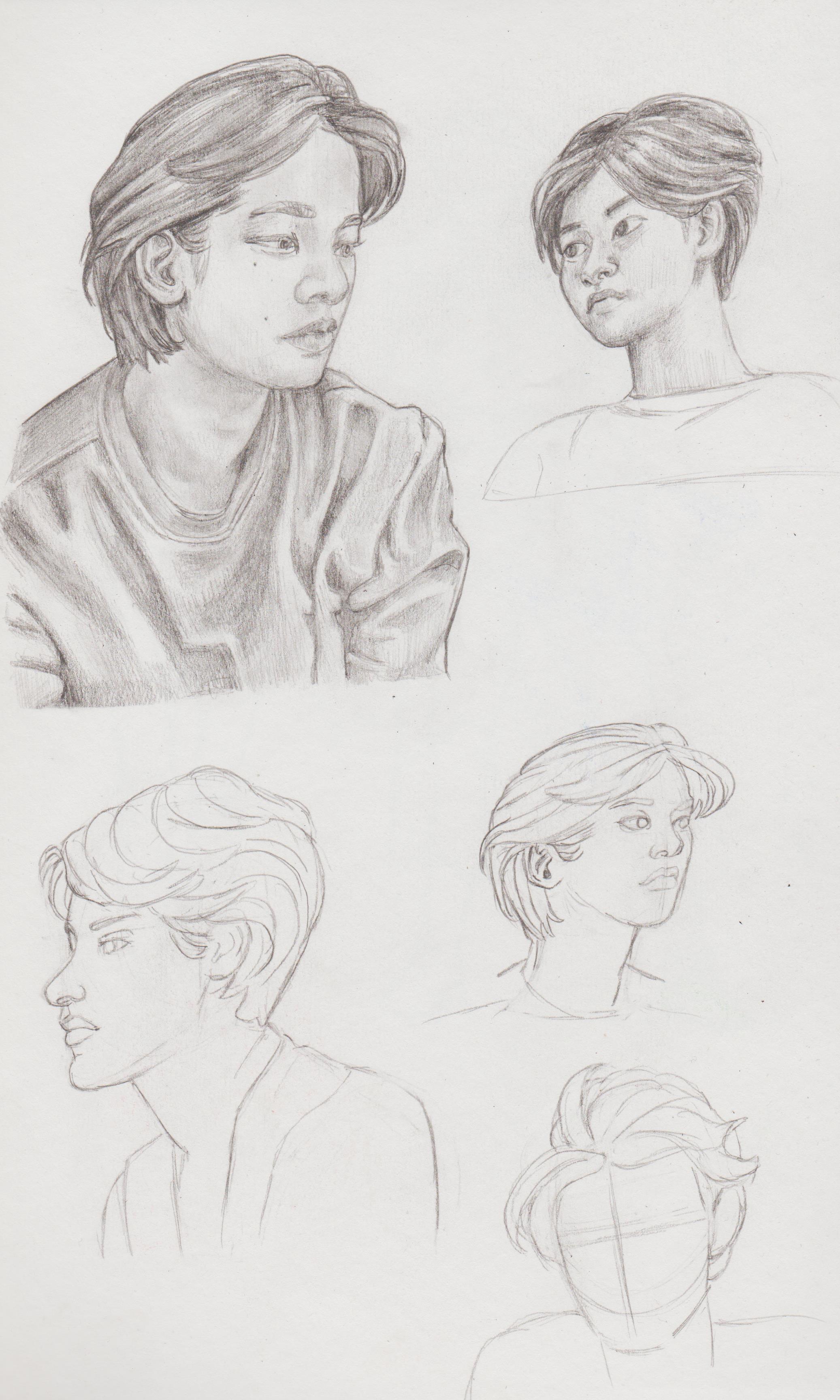
Trying to draw men.
.jpg)
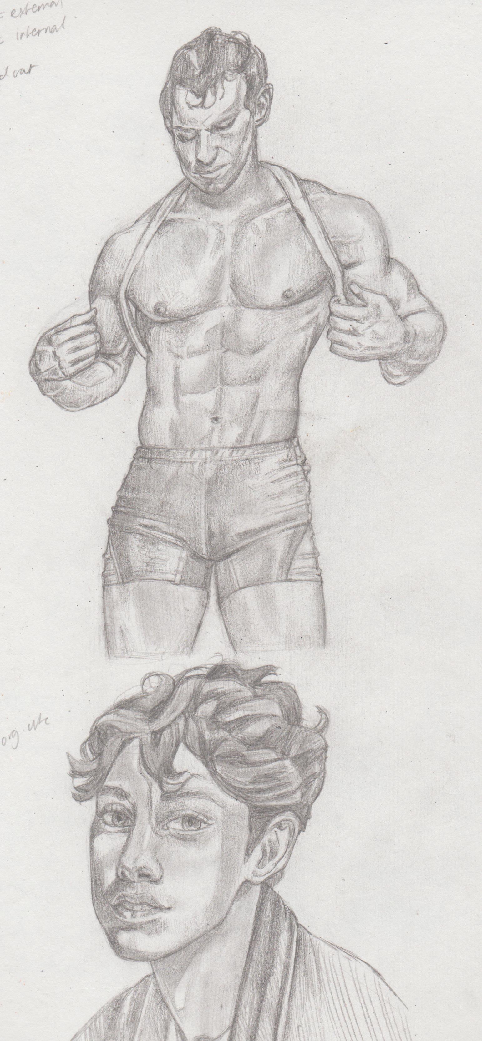.jpg)
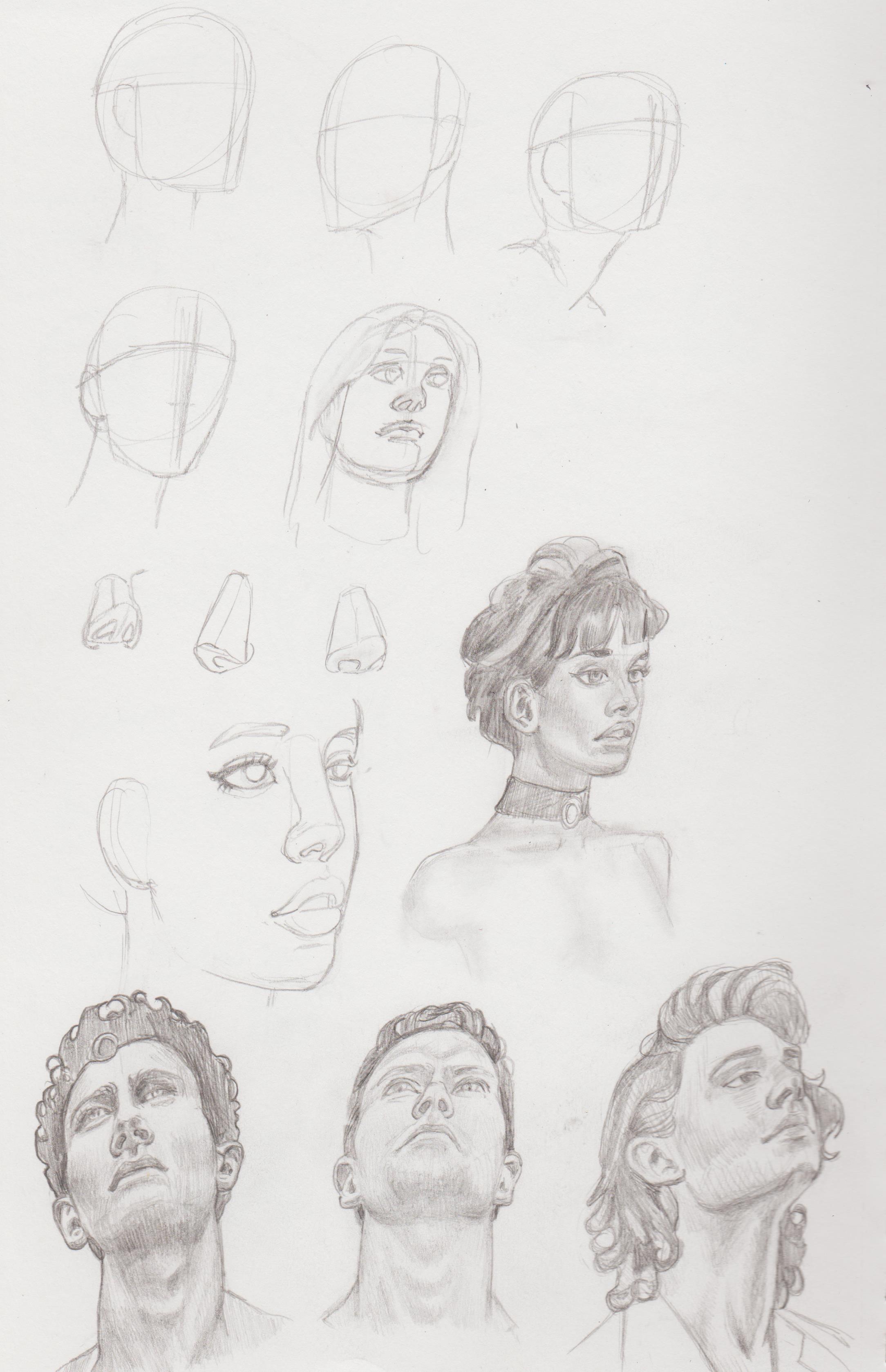.jpg)
.jpg)
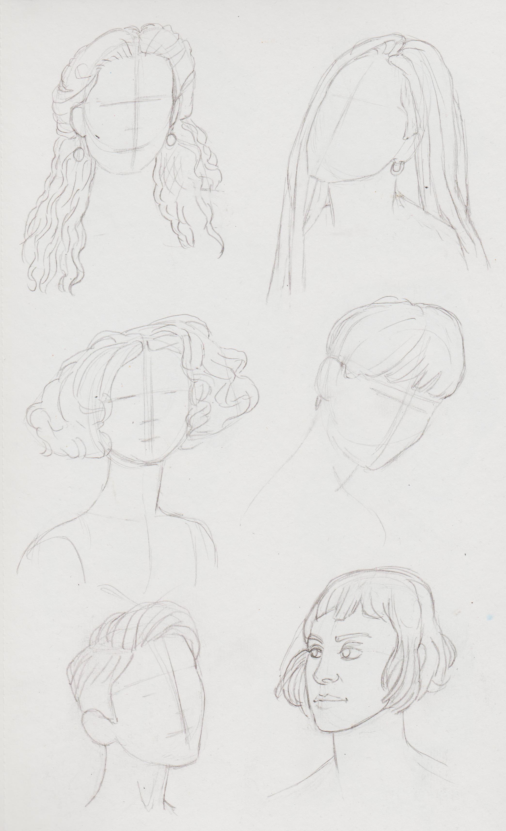
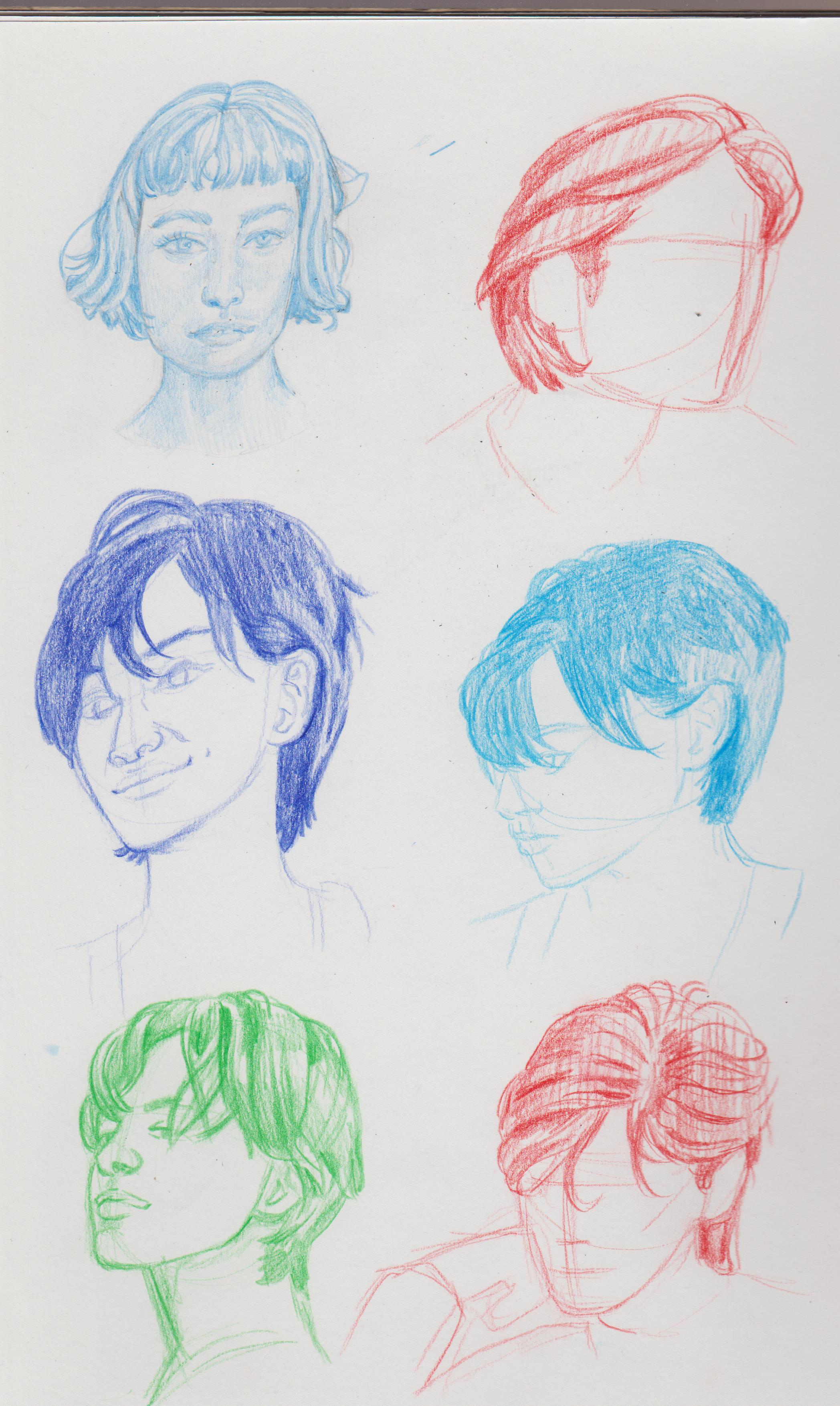
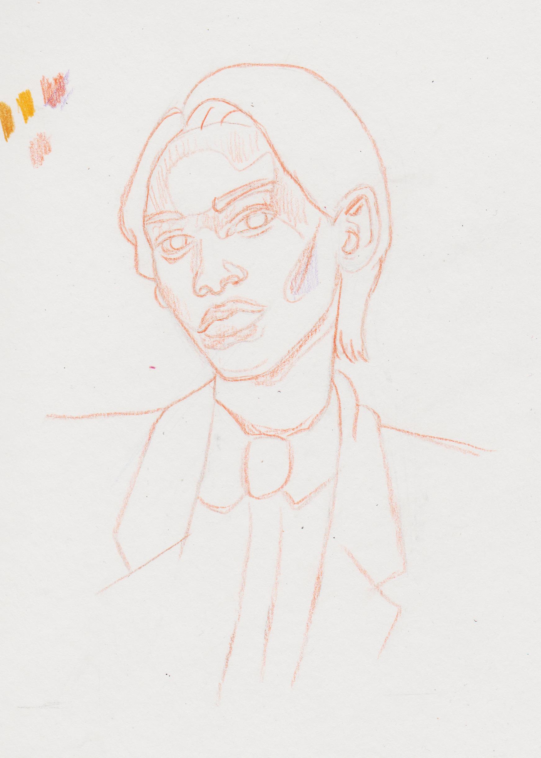
I was tasked with drawing some hairstyles.
.jpg)
.jpg)
.jpg)
.jpg)
.jpg)
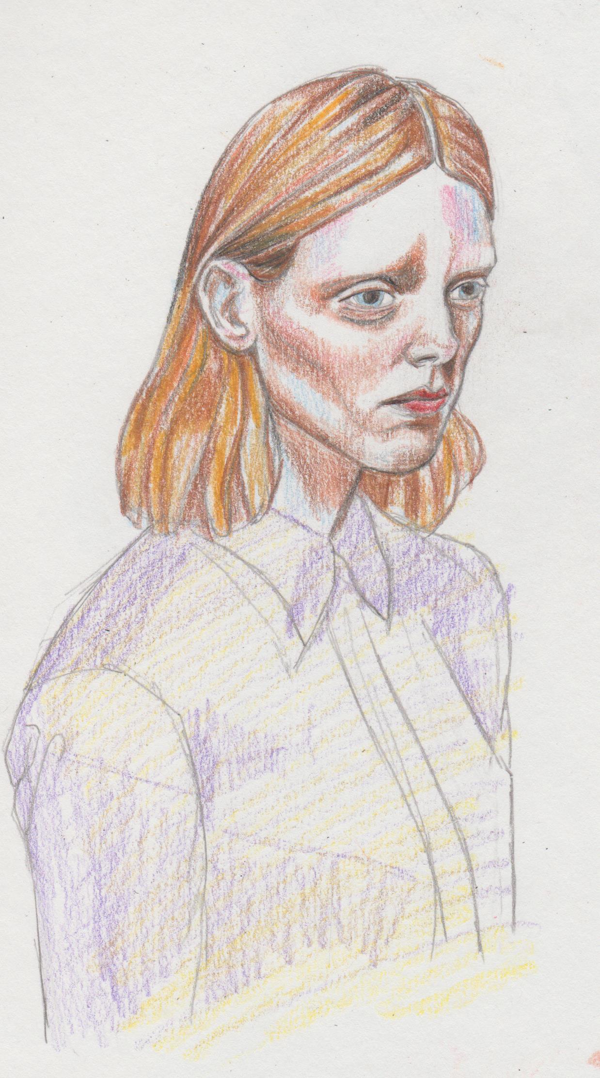
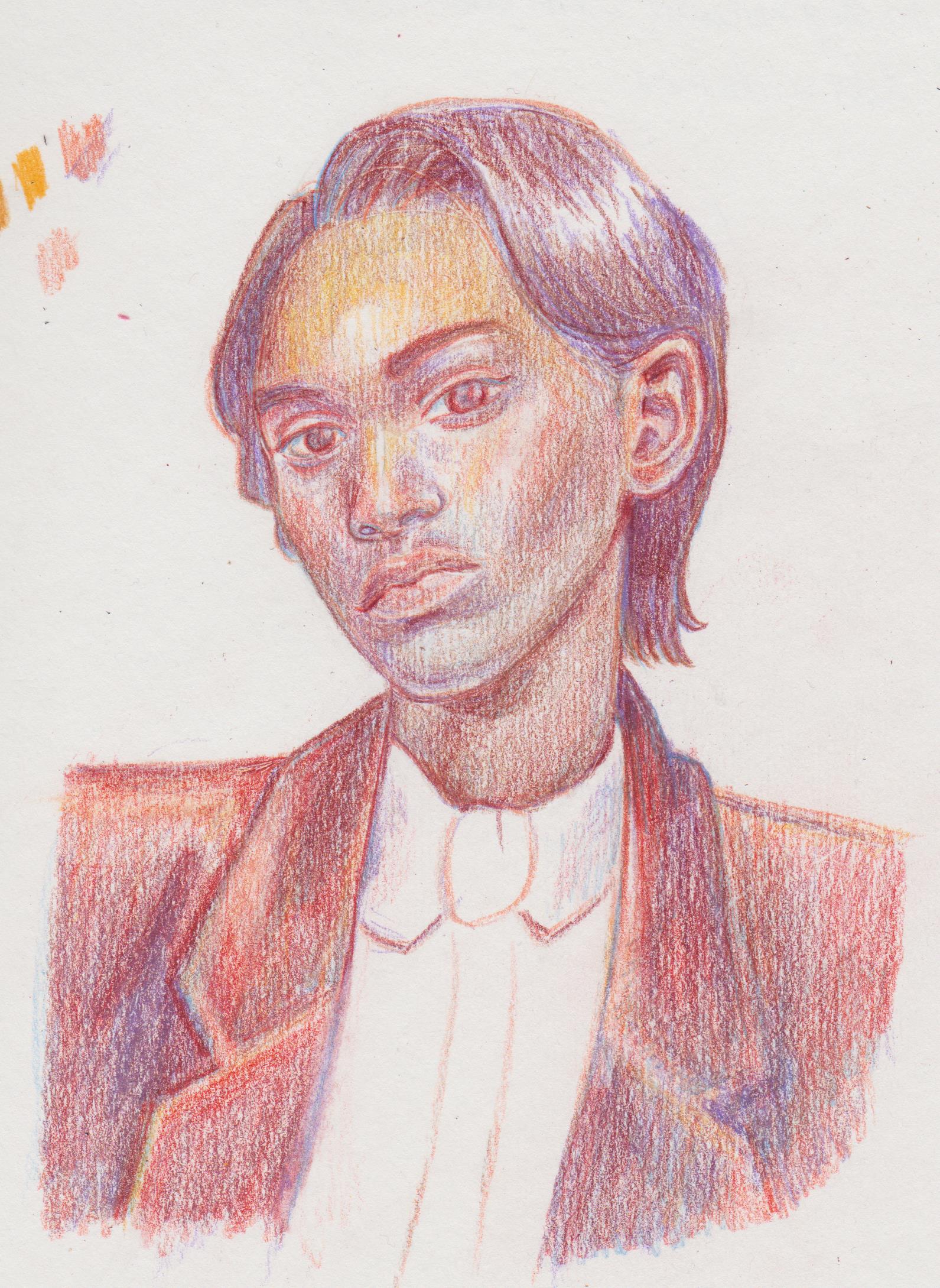
Final project for the course. The adage 'It doesn't matter what colour you use and long as the values are correct started to solidify itself by doing this course, especially when Gabby talked about using cool colours for shadows and warm for the light area and which colours she used. Excited to do some other classes, now. The main thing I learned was to use light layers and gradually built up the values and also the use and application of hues on a face.
.jpg)
.jpg)
When drawing people the exact likeness isn't there, but you know what it doesn't matter. Trying not to swear the small stuff. Character development.
I've paid to attend an atelier type class in my city. I could love to have 'proper' atelier training, where I could spend a solid amount of time honing my technical skills, but it's so fricking expensive and pretty much only in London, but the tutor did train at LARA and some of the things he does, like how he renders light and shadow in charcoal is what I would like to try and know for my own practice. It may help chill me down and slow down further. There's gonna be an illustration meet up in my city in association with the AOI, kinda nervous, but I need to get out of my shell and meet people IRL.
Posts: 369
Threads: 6
Joined: Sep 2019
Reputation:
23
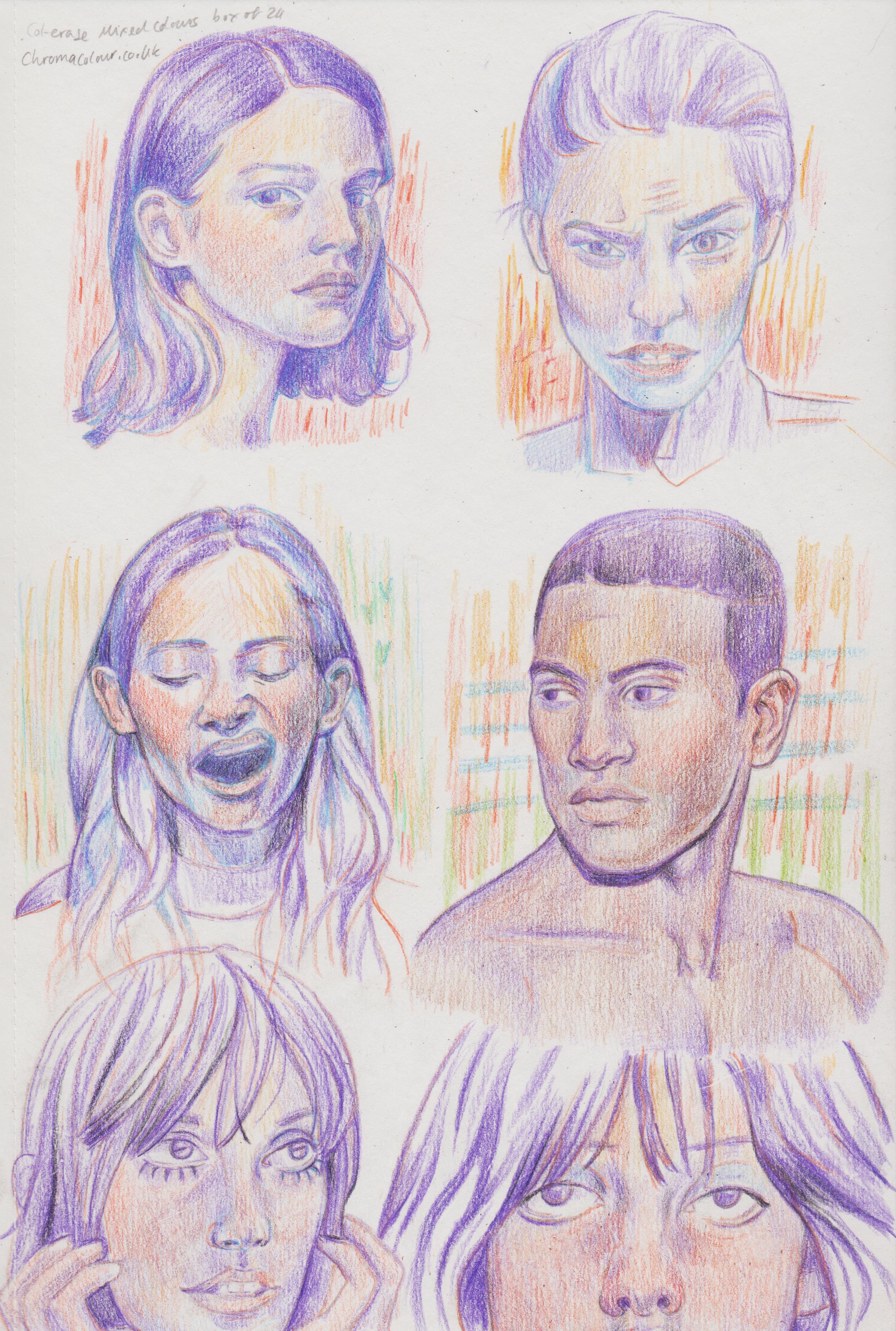
Going to this meetup can be a good experience! During the golden age of the art forums (around 2010) there were regular meetups in every city and study groups across sketchbooks. After the mass migration to Facebook or wherever everybody went, maybe some of that spirit survived there (but I didn't follow the crowd at the time).
Your portraits are great, I especially like the expressions on the last page in purple hues. There is a problem on some of the pages though, and it may be due to an angled camera, they are skewed as if pulled from the bottom left.
The panicked look I read from the eyes wide open. Since there is a foreshortening here maybe you want the lower eyelids less curved, or curved the other way, to achieve the relaxed mood? If you can forgive my awkward drawover:
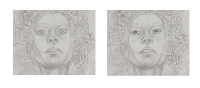
Dynamic poses form imagination, I can't provide any advice because I do them by experimentation. Tweaking lines of actions could be a good start?
Posts: 201
Threads: 3
Joined: Jan 2021
Reputation:
3
(04-17-2023, 08:39 AM)Leo Ki Wrote: Going to this meetup can be a good experience! During the golden age of the art forums (around 2010) there were regular meetups in every city and study groups across sketchbooks. After the mass migration to Facebook or wherever everybody went, maybe some of that spirit survived there (but I didn't follow the crowd at the time).
Your portraits are great, I especially like the expressions on the last page in purple hues. There is a problem on some of the pages though, and it may be due to an angled camera, they are skewed as if pulled from the bottom left.
The panicked look I read from the eyes wide open. Since there is a foreshortening here maybe you want the lower eyelids less curved, or curved the other way, to achieve the relaxed mood? If you can forgive my awkward drawover:
Dynamic poses form imagination, I can't provide any advice because I do them by experimentation. Tweaking lines of actions could be a good start? They had limited tickets, because of the venue. I was umming and ahhing about going, but decided to reserve myself a ticket. Checked back and they are all sold out now. I get worried about people mogging me, but that's just the way it goes. Everyone seem to have percolated out to Twitter and Discord, but it's not the same. Thanks for the compliment on the portraits, I actual felt I was learning new things in that class and that it was sticking. It was super fun! I noticed the girl with the headscarf looks like she's being pulled up right. I tend to do that drawing horizontally, but I'm trying to correct it. It was actually worse, before I brought out the adjustable desk. Ha, I never really noticed that before, but she does have 'Sanpaku eyes', especially her right.
I had the first atelier class today. We just spent 2 hours on two contour drawings. He showed us a rendering that took him 12 hours to do, because I get anxious over taking a long time on something. Also artists like Susan Lyons that took a long time to learn how to draw/paint. Scans from a larger paper, than my scanner.
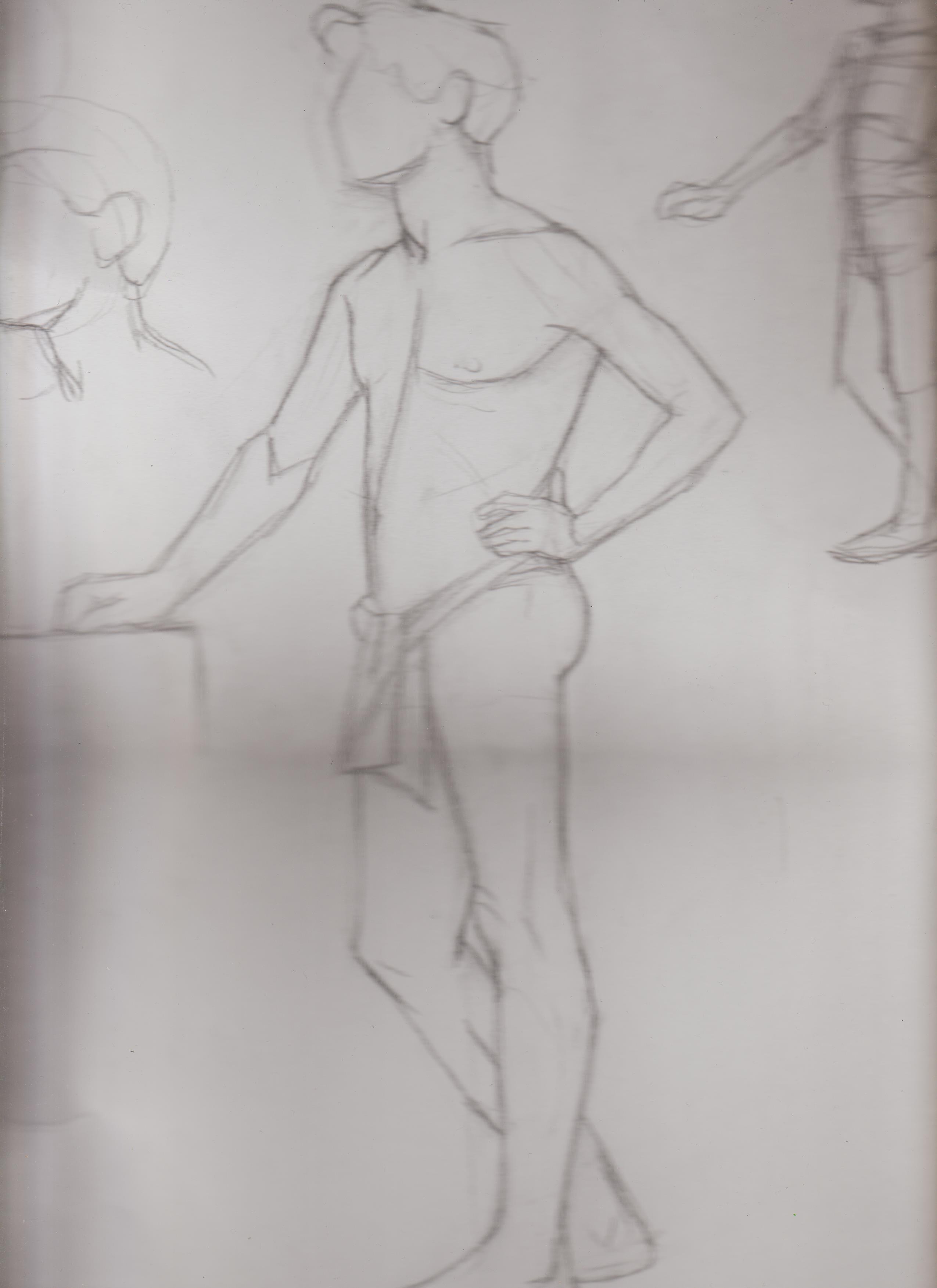.jpg)
.jpg)
--
I want to get more into conceptual illustration.
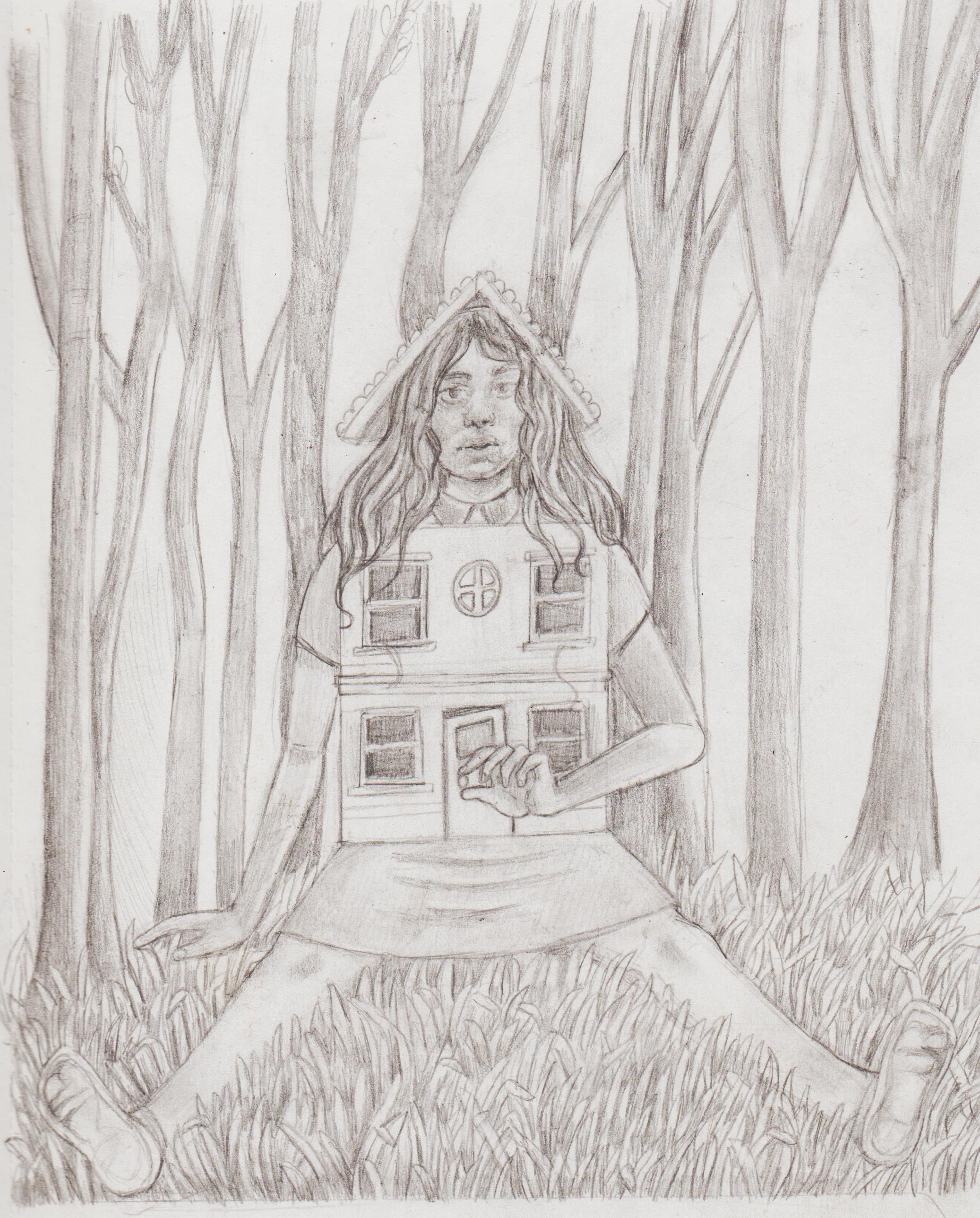.jpg)
Posts: 369
Threads: 6
Joined: Sep 2019
Reputation:
23
Oh, it makes sense that changing the inclination of your board disturbs your muscle memory. When I draw on the tablet, which I set parallel to the edge of the table, I tend to draw everything tilted because of being conditioned by having my sheet of paper at the same angle as my forearm.
Wow, contour drawing is hard. You weren't allowed to do some gesture first to block the general shape?
I'm not understanding the symbolism in your concept drawing, sorry. Opening the door is a welcoming sign but her expression seems absent minded.
So I've been meaning to discuss your comics and conlang for a long time but you are still into other things and it might not be the right moment. Anyway, I wanted to say that in some panels you nailed the expressions and interactions between the characters very well. Some panels are weaker and we can discuss these when you feel like it.
Did you make the conlang just for this linguistics project or was it already part of the world you created? I had some insane conlanging periods but it consumes so much time :O
Posts: 1,076
Threads: 4
Joined: Jan 2016
Reputation:
43
Nice to see you keeping up with your figure studies, very solid proportions with those recent studies. Nice work on the new sketch as well, very interesting concept and composition there. Keep it going!
Posts: 201
Threads: 3
Joined: Jan 2021
Reputation:
3
(05-07-2023, 12:06 PM)Leo Ki Wrote: Oh, it makes sense that changing the inclination of your board disturbs your muscle memory. When I draw on the tablet, which I set parallel to the edge of the table, I tend to draw everything tilted because of being conditioned by having my sheet of paper at the same angle as my forearm.
Wow, contour drawing is hard. You weren't allowed to do some gesture first to block the general shape?
I'm not understanding the symbolism in your concept drawing, sorry. Opening the door is a welcoming sign but her expression seems absent minded.
So I've been meaning to discuss your comics and conlang for a long time but you are still into other things and it might not be the right moment. Anyway, I wanted to say that in some panels you nailed the expressions and interactions between the characters very well. Some panels are weaker and we can discuss these when you feel like it.
Did you make the conlang just for this linguistics project or was it already part of the world you created? I had some insane conlanging periods but it consumes so much time :O
Took a loong break from drawing, because I was depressed and simply didn't have the motivation for it.
I drew a picture of my cousins for my aunty and uncle for Christmas, thinks like that and the images I did earlier for the social enterprise I make sure to use my adjustable table desk, because there is nothing more aggravating then getting having with the layout of a sketch and you lift it up and everyone's been pulled to the side by a broken taffy puller. As I remember correctly not really. We just spend out time trying to compete the one picture and making sure it's to scale/in proportions from the sheet to our sketching paper.
Regarding the latest drawing I see Tran Nguyen and the Miles Johnson's of the art work doing conceptual girls with elements detached, or with houses. If you google, especially Tran's you'll see what I mean. I'm being seeing a lot of art work of 'split people'. (Could have swore, I saved a pin on Pinterest. Will post in an example, if I come across it) I'm just getting in the habit of spitting out any ideas I have onto a page, rather than screwing them up straight away.
The conlang was part of one of my last modules I ever did as part of my undergrad degree in Linguistics. The first assignment was about the basic morphosyntactic elements of 'Thea', the second assignment was about the pragmatic features. I have been interested, but never created an actual constructed language before. However, I had created phases and numbers, before, but with no internal structure. My knowledge of Slavonic languages really helped give me an anchor! I really got into it, it was super fun. That's why I created their designs, map, writing system, and then finally comic. Feel free to give feedback, I want to improve my comic panelling! I can see on Instagram (and Reddit), there are quiet a few eager conlangers out there! I'm really only a beginner, but I'd recommend the book of the course: The Art of Language Intervention by the one and only David J. Peterson. It definitely gave me a good overview of where I could start.
(05-07-2023, 09:26 PM)cgmythology Wrote: Nice to see you keeping up with your figure studies, very solid proportions with those recent studies. Nice work on the new sketch as well, very interesting concept and composition there. Keep it going!
Thanks, Buddy! I can see some of the 'taffy pulling' on the figures, but I enjoyed it nonetheless. :) We'll see if I can develop it.
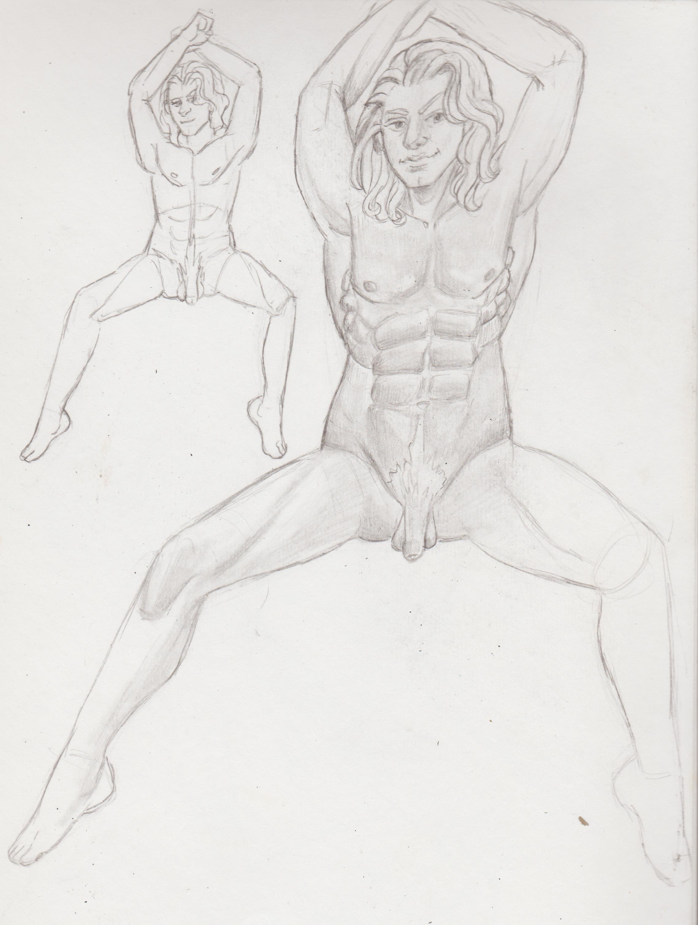
Just uploading some of my latest sketchbook work. I'm trying to get back into digital, but when I follow tutorials the program is still not doing what I want it to.
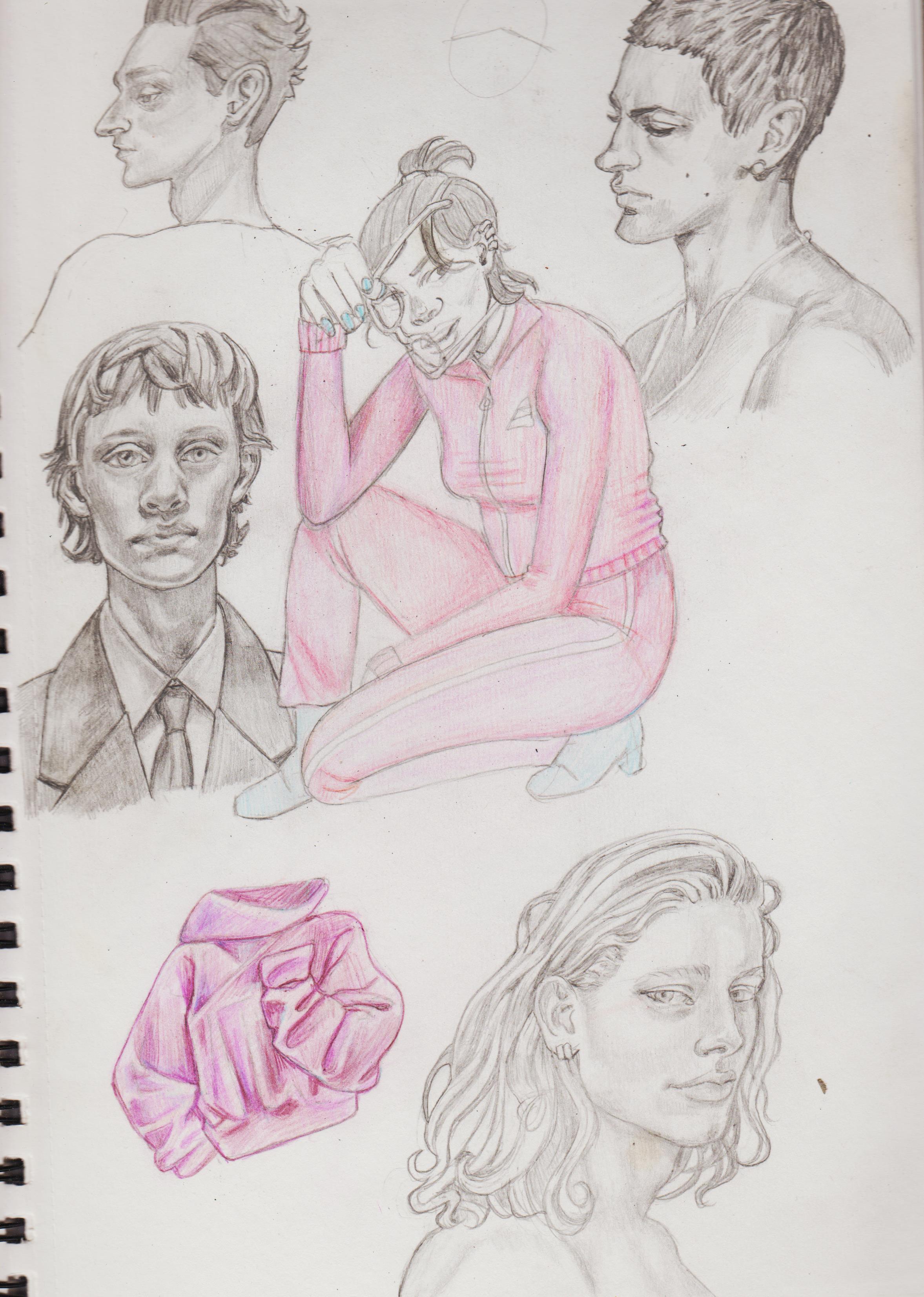.jpg)
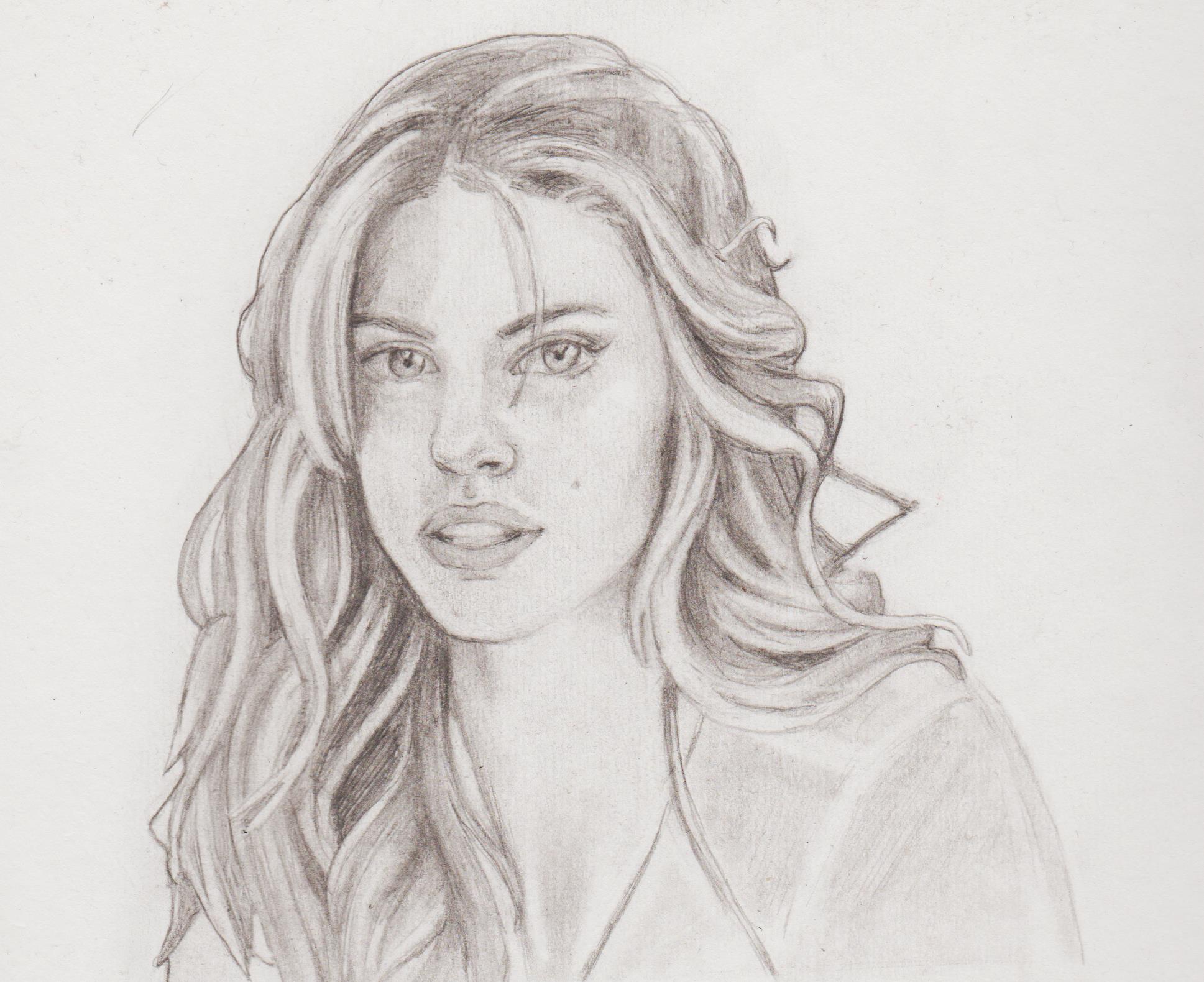.jpg)
.jpg)
.jpg)
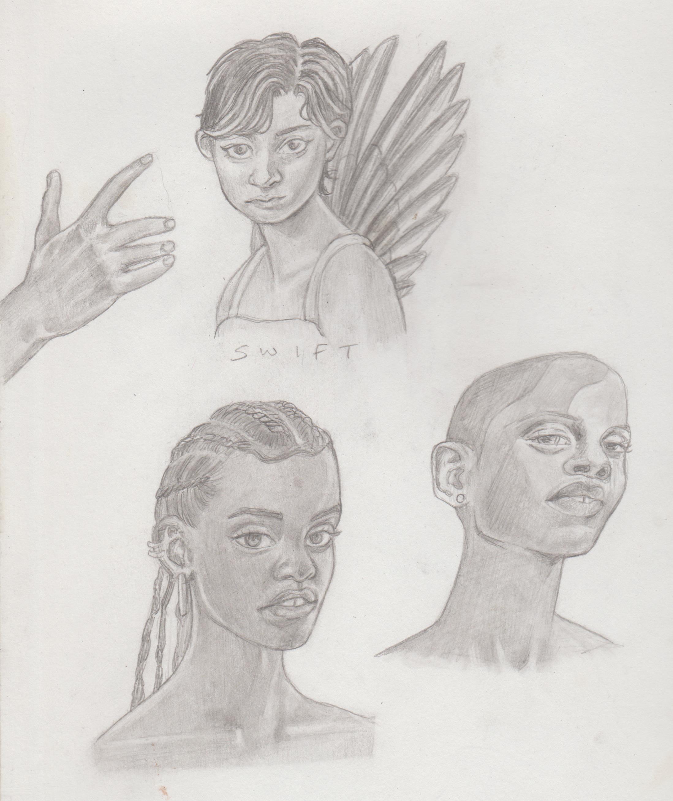
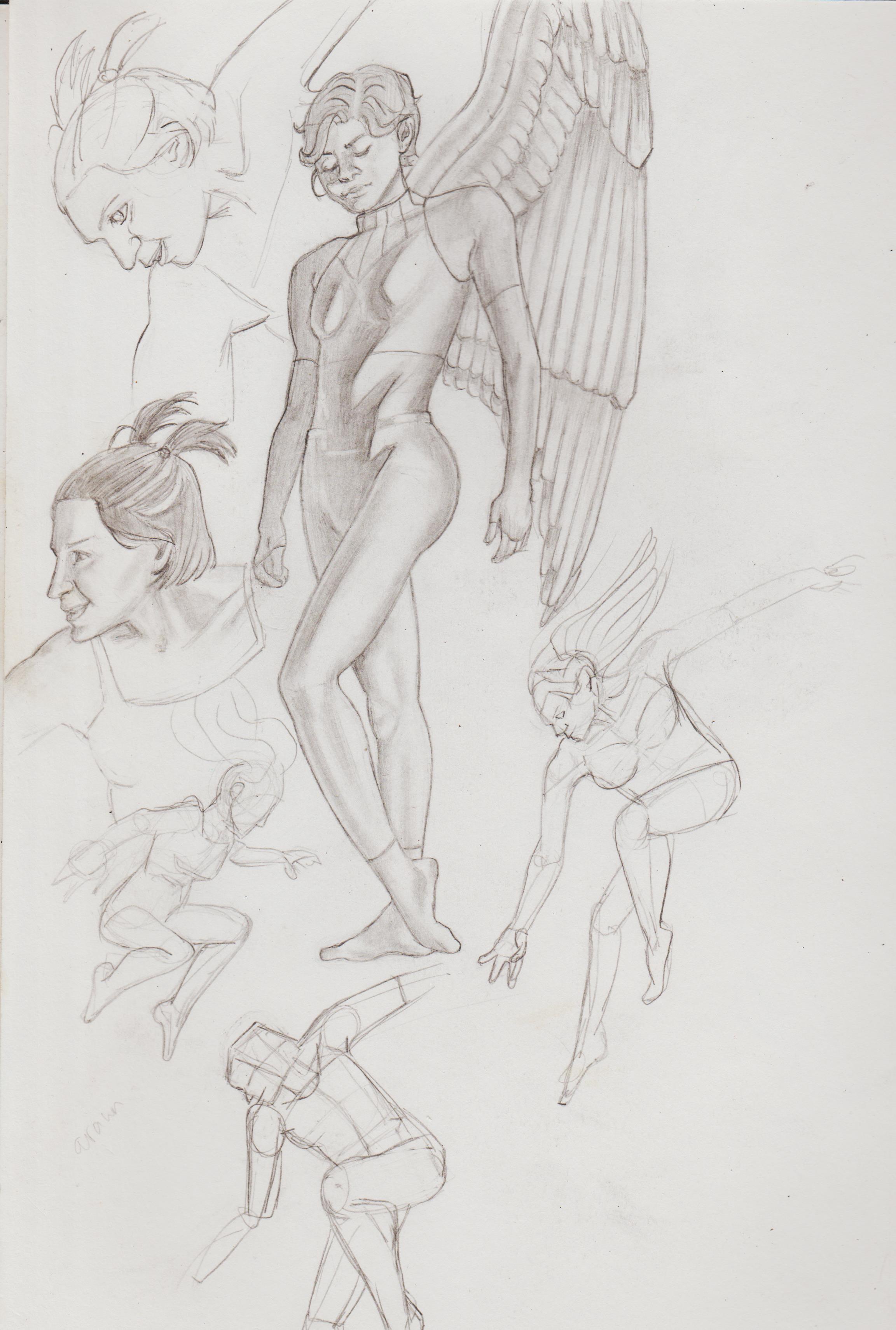
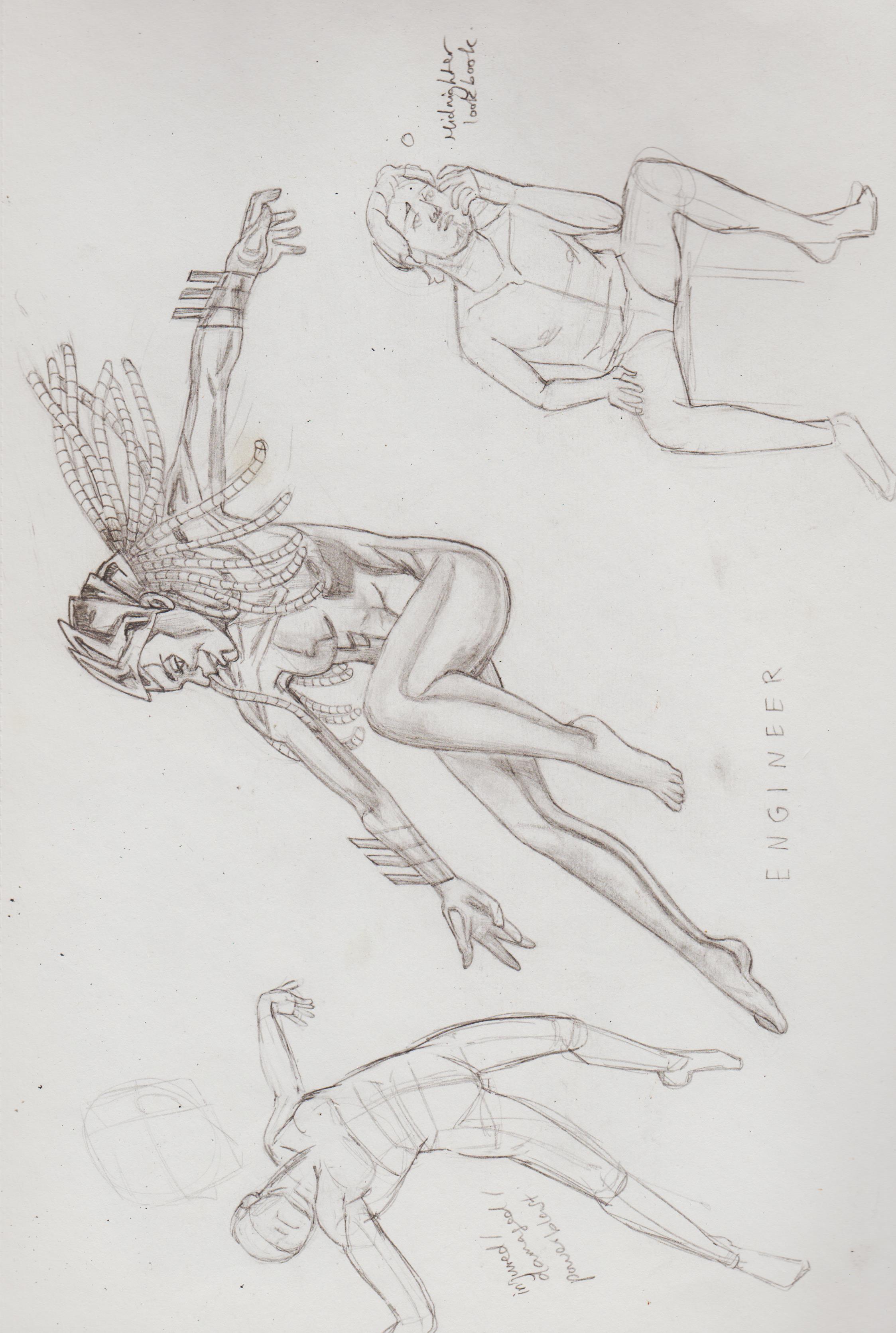
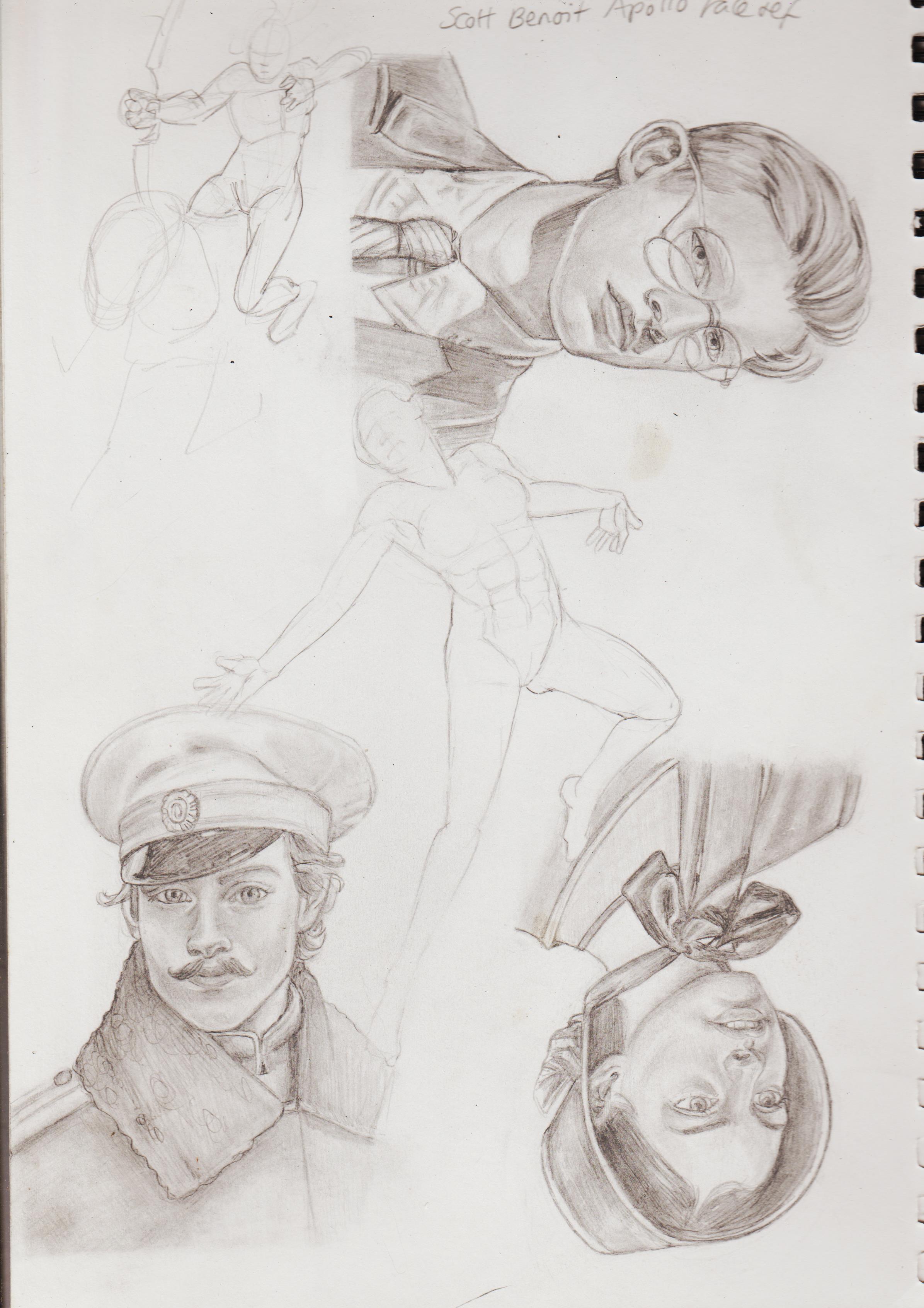
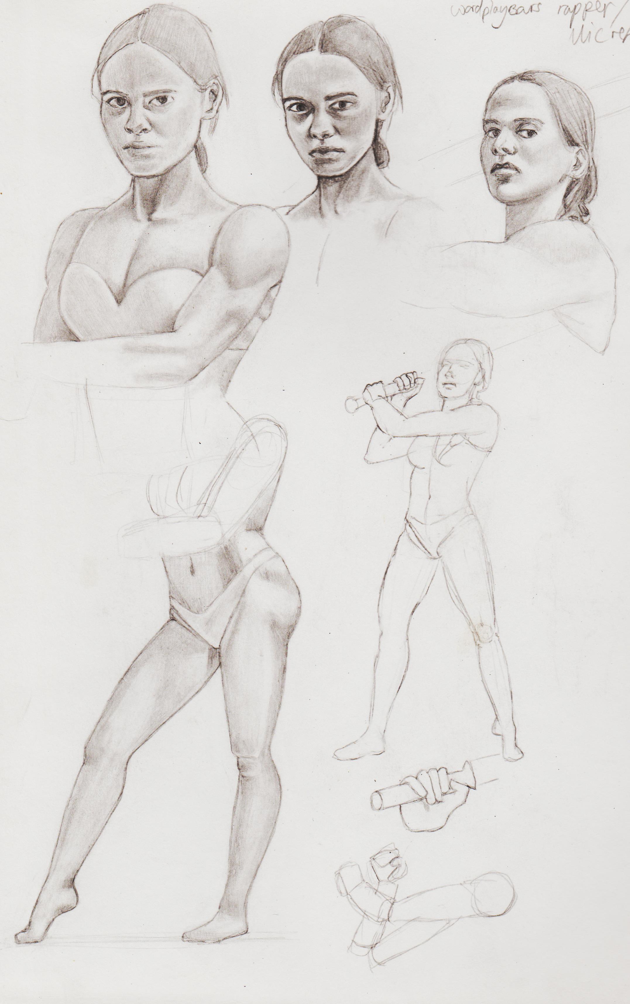
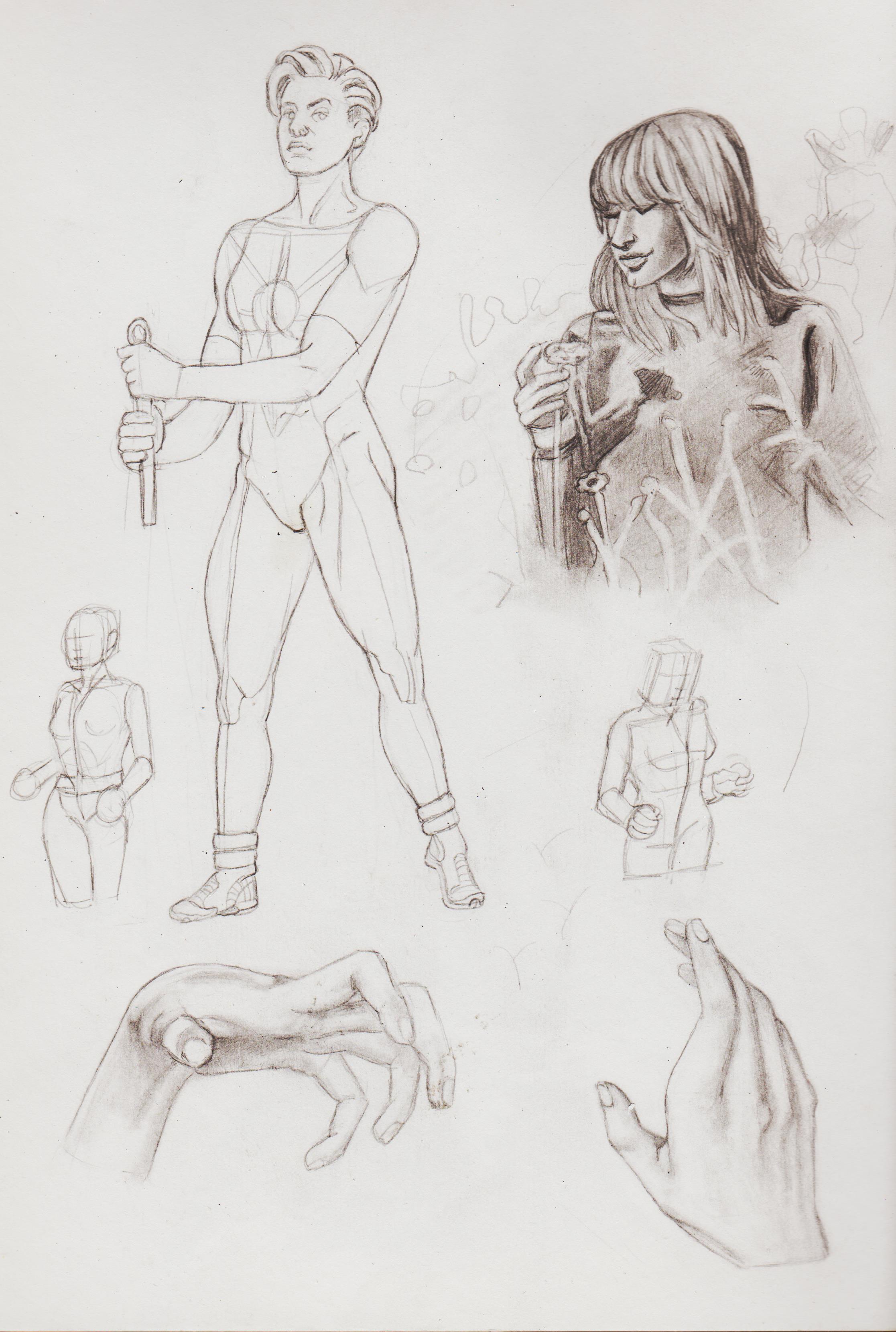
Using refs to create fanart. Here's Swift and The Engineer from The Authority.
.jpg)
.jpg)
.jpg)
.jpg)
.jpg)
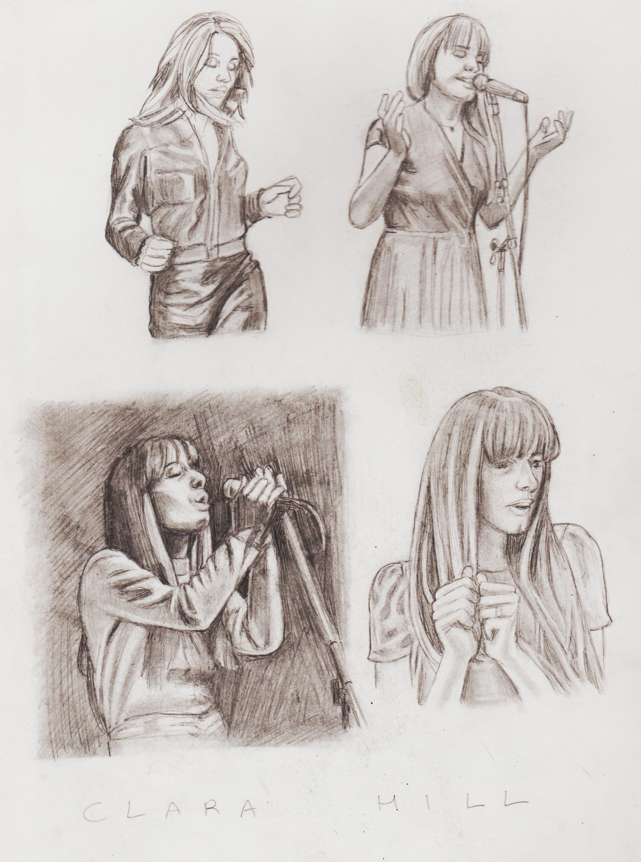
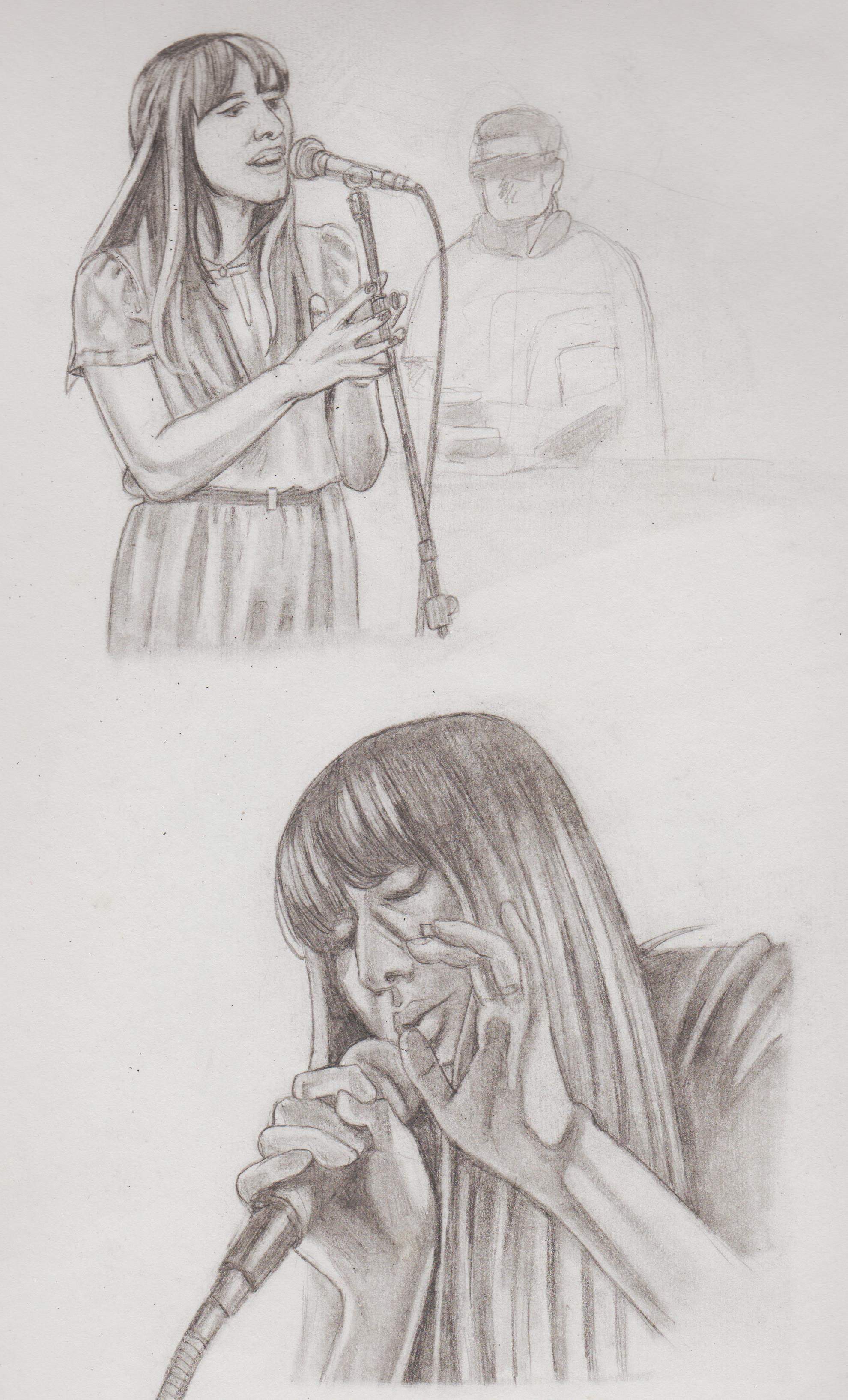
Was looking for references of people holding mics and ending up doing sketches of one of my favourite Nu-Jazz/Deep House singers: Clara Hill
.jpg)
.jpg)
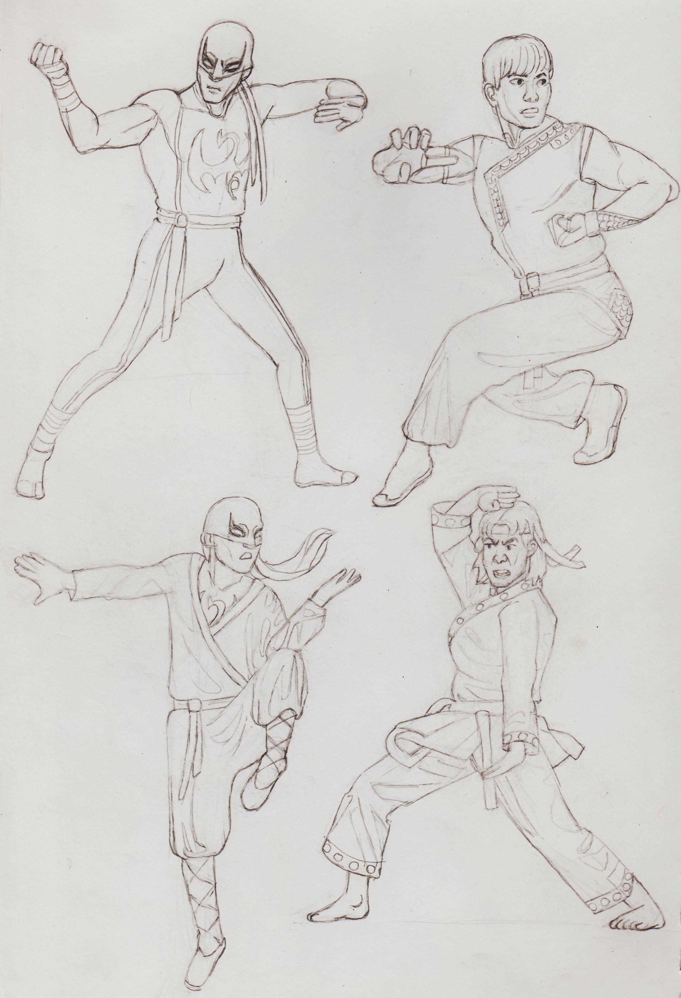
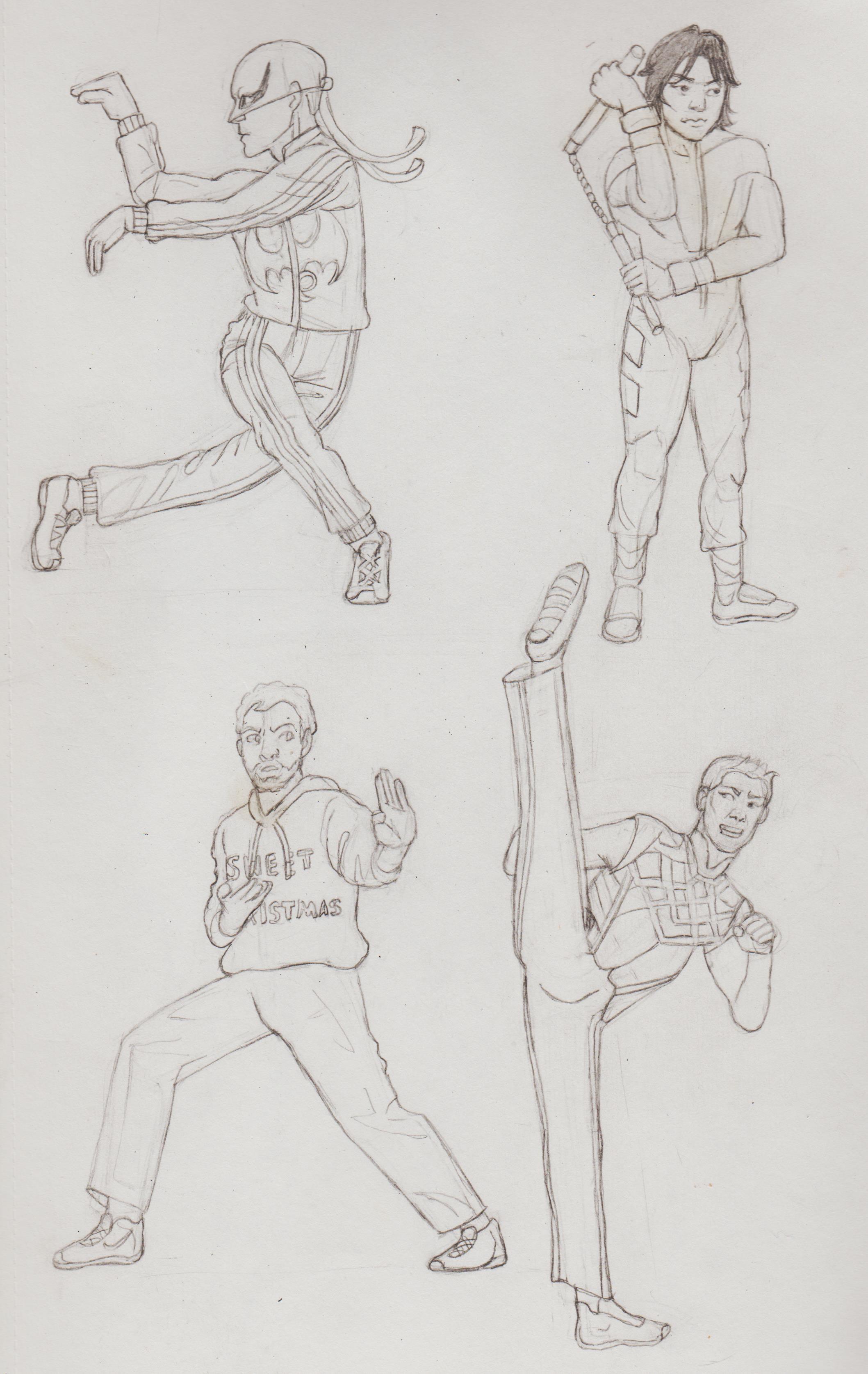
The deadly hands of Kung-Fu bros themselves! Shang-Chi and Iron Fist. Had a lot of fun converting refs into characters! Want to try and colour them at some point.
.jpg)
.jpg)
Drawing these was some of the most fun I've had drawing in a long while. :)
Posts: 559
Threads: 6
Joined: Jul 2015
Reputation:
68
(02-21-2024, 08:17 AM)Dominicque Wrote: Drawing these was some of the most fun I've had drawing in a long while. :)
You can chalk that up as a win :)
Great to see you back and flexing your drawing arm. I am considering going back to or alternating with traditional media for practice too - soemthing I come back to painting programs and forget where to start.
Posts: 191
Threads: 1
Joined: Oct 2012
Reputation:
15
Good stuff in here. One small note for you. I think you tend to divide hair and fabric into evenly split divisions. If you mix it up using big, medium, and small divisions you can get a more interesting/appealing look.
Posts: 201
Threads: 3
Joined: Jan 2021
Reputation:
3
(02-22-2024, 05:46 PM)RottenPocket Wrote: (02-21-2024, 08:17 AM)Dominicque Wrote: Drawing these was some of the most fun I've had drawing in a long while. :)
You can chalk that up as a win :)
Great to see you back and flexing your drawing arm. I am considering going back to or alternating with traditional media for practice too - soemthing I come back to painting programs and forget where to start.
Hi, I got really excited when I actual drew the people/characters I was interested in, who knew? Drawing Clara in particular was pretty meditative. I've just been staying with traditional pencil and paper, but I really want to get to grips with how digital art/Clip works. When I have a break from digital the learning curve starts all over again, because I'm not sure what button does what or how I drew before. I do do my due diligence and research tutorials, for example using the fill tool, but it never seems to do what it's supposed to do. Which is why I would love to attend a live digital drawing/painting classes, but they are few and far between.
I've only just discovered the 'clip to layer' thing, so you can colour inside the lines. I guess that's why artists like to make a grey silhouette at first? Right now I'm oscillating between different images that I haven't finished. I wanna get to a point, like you, where I can say a piece is finished. I'm getting frustrated, because the colour picker isn't right and I'm not sure how to add detail. I want to work on my edges, but I'm not sure which is the best brushes to use for that. Any suggestions as I see you also use Clip?
(02-22-2024, 08:47 PM)ThereIsNoJustice Wrote: Good stuff in here. One small note for you. I think you tend to divide hair and fabric into evenly split divisions. If you mix it up using big, medium, and small divisions you can get a more interesting/appealing look.
Thanks, I tried to look at what you mean. I think I can see it in the Clara Hill pictures? I was following the refs, but I guess I did try to simplify it by dividing them into divisions. But, overall I like the effect, but thanks for the tip to be considered in future pictures.
Posts: 1,076
Threads: 4
Joined: Jan 2016
Reputation:
43
Nice updates, really impressive amount of studies and you're figure work is solid. Keep it up!
|


![[Image: hKKWD3u.jpg]](https://i.imgur.com/hKKWD3u.jpg)


.jpg)
 .There are creative events/networking and meetups that I would have liked to been supported through while I look for a more full-time position in an area I'm interested it.
 .jpg)
.jpg)
.jpg)
.jpg)
.jpg)
.jpg)
.jpg)
.jpg)
.jpg)
.jpg)
.jpg)

.jpg)
.jpg)
.jpg)
.jpg)
.jpg)
.jpg)
.jpg)
.jpg)
.jpg)
.jpg)
.jpg)
.jpg)
.jpg)
.jpg)
.jpg)
.jpg)


