09-06-2015, 05:37 AM
progress, started the over painting today on the african tribe character. I think its looking ok atm. we will see when its finished  very slow process though.
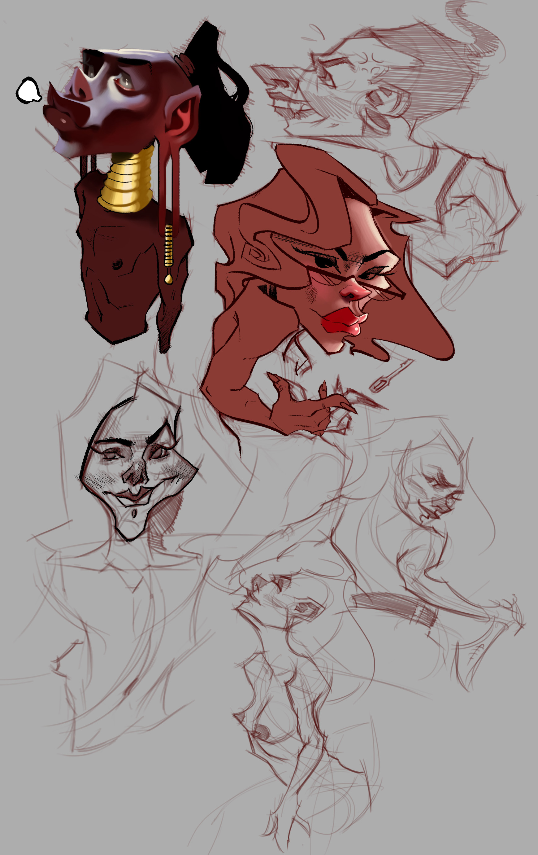
 very slow process though.
|
Sketchboooook!
|
|
09-06-2015, 05:37 AM
progress, started the over painting today on the african tribe character. I think its looking ok atm. we will see when its finished
 very slow process though. very slow process though.
09-06-2015, 06:27 AM
Very interesting! I'm liking the progression. Keep going!

09-06-2015, 09:00 AM
Bookend: thanks again
 hmm.... Im not too sure about the way this looks, style wise.  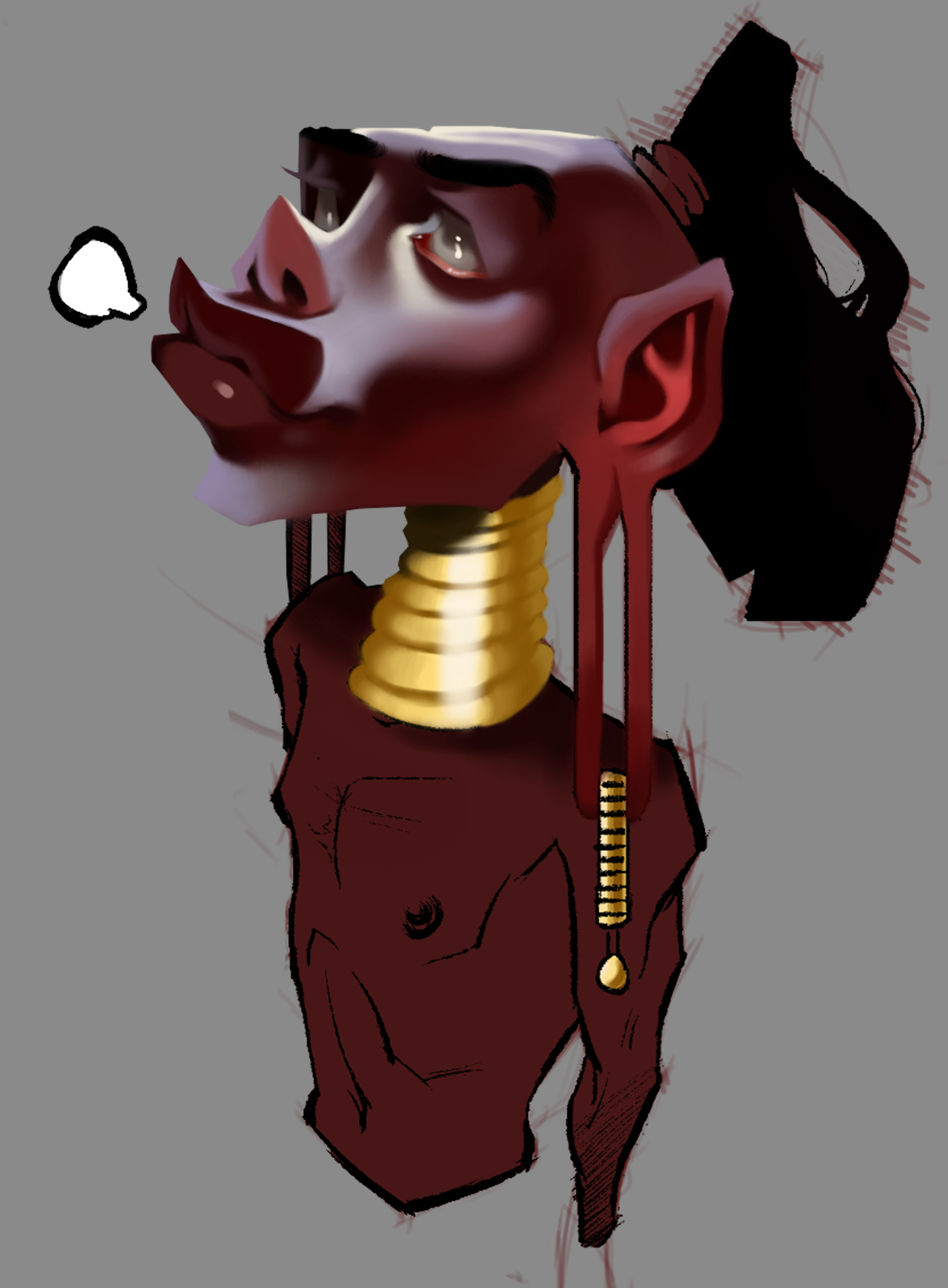
09-07-2015, 02:15 AM
In the interests of saying something constructive beyond just liking your stuff, I think the character could maybe use some harder edges, or lines (facial detail lines, like those deep creases you get under eyes or around noses) to define it a bit more? I dunno tho.
I also thought the far eye looked a little low but I'm not sure, might just be me struggling to translate the angle across! the evil looking girl with the dagger would be a cool one to develop too. Hey I meant to say, if you haven't seen their work already check out etam cru. they drop some nice characters.
09-07-2015, 04:29 AM
(09-07-2015, 02:15 AM)lurch Wrote: In the interests of saying something constructive beyond just liking your stuff, I think the character could maybe use some harder edges, or lines (facial detail lines, like those deep creases you get under eyes or around noses) to define it a bit more? I dunno tho. thanks for the feedback  , yeh I thought that the character needs more hard edges. I think because I softened everything the whole piece lacks a point of interest to look at. Yeh the eye does look a little weird now that you have mentioned it. I will definatly develop the girl though. , yeh I thought that the character needs more hard edges. I think because I softened everything the whole piece lacks a point of interest to look at. Yeh the eye does look a little weird now that you have mentioned it. I will definatly develop the girl though.ahhh yeh im familiar with Etam Cru, their stuff is sooo cool, love the characters they create  thanks for the feedback though Lurch. thanks for the feedback though Lurch.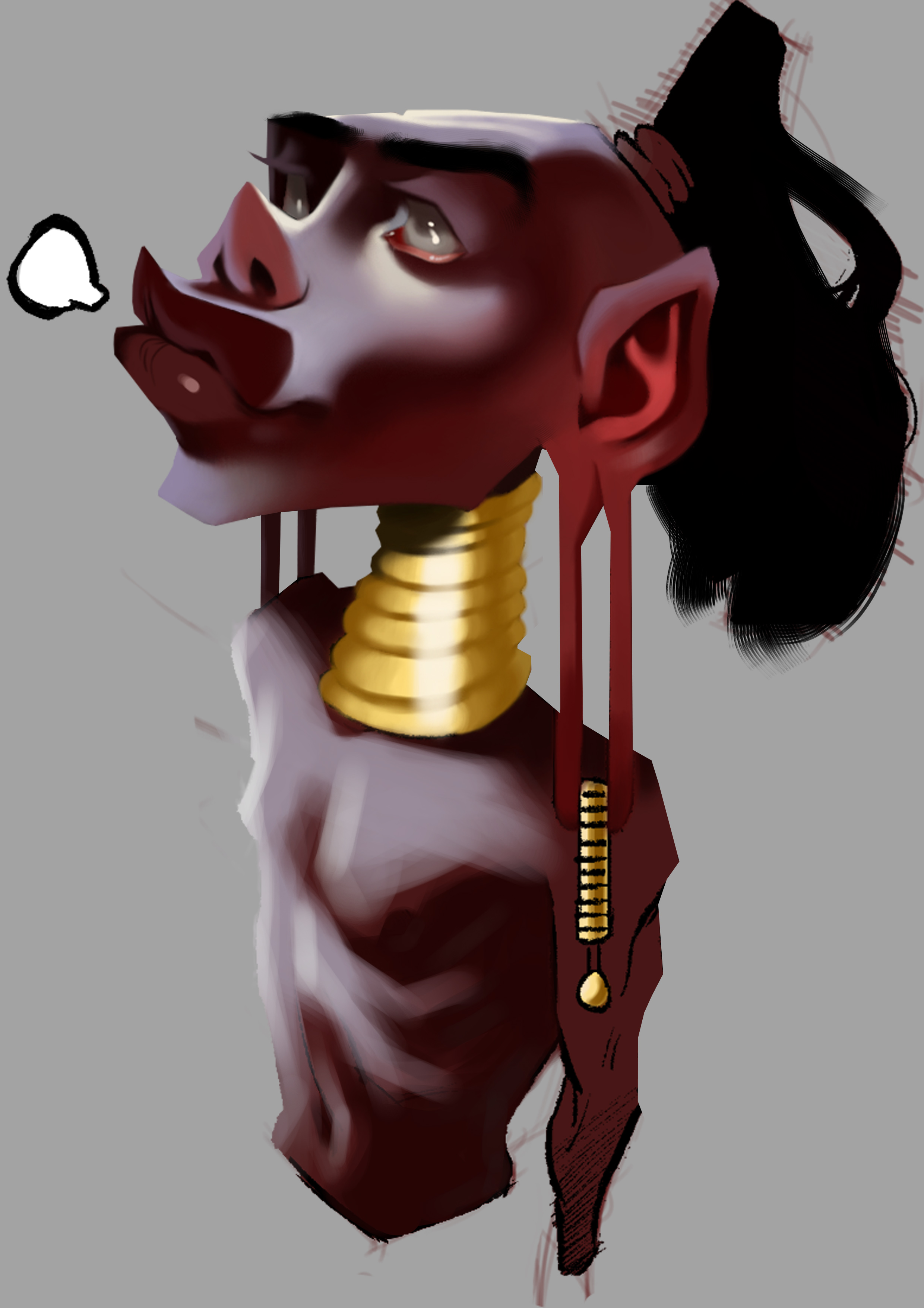 I decided to enter in this weeks CHOW Rusalka. I have done some thumbnails and general ideas, this is what I have atm. 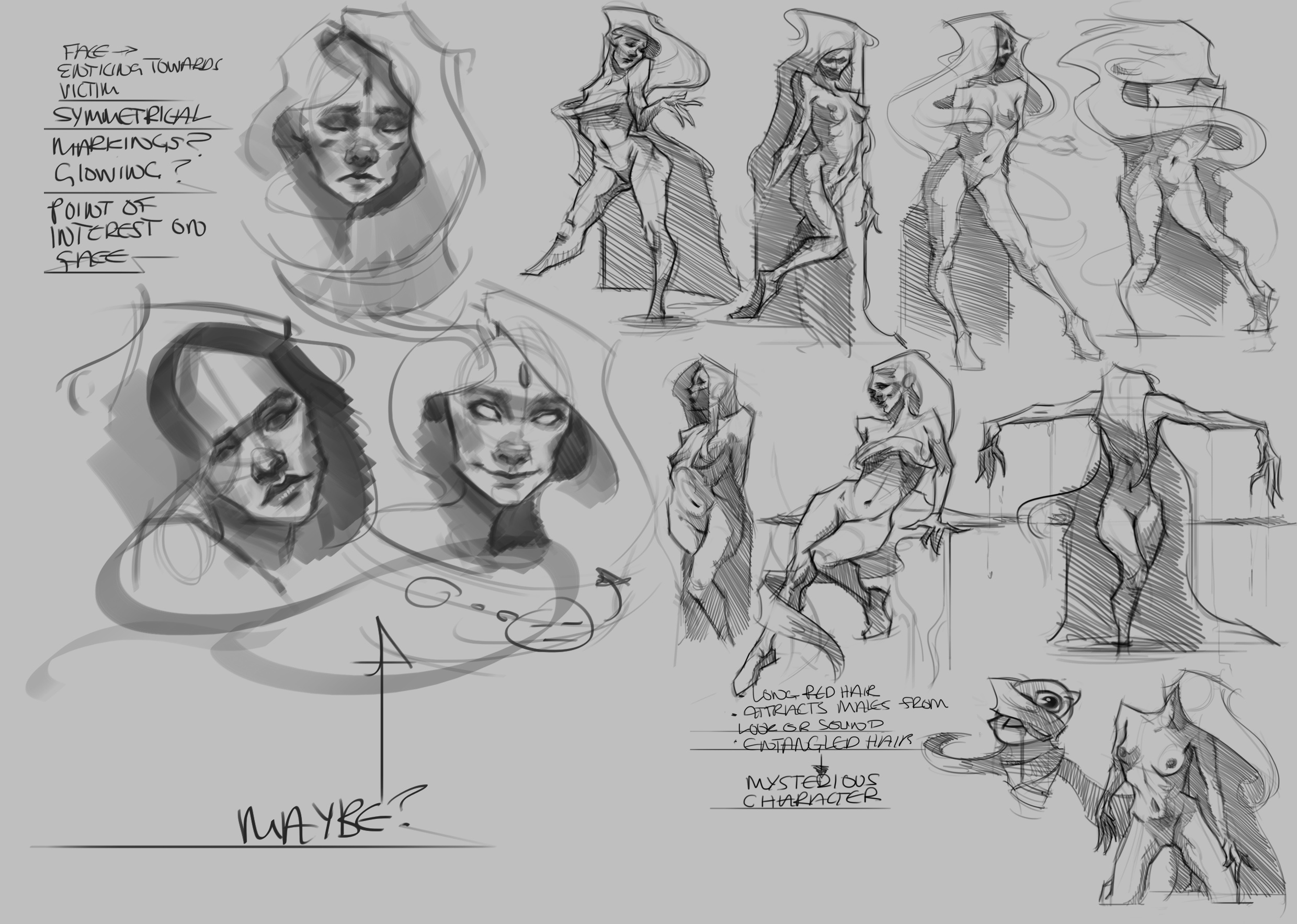
09-08-2015, 02:47 AM
That rusalka is looking really great, man-- Love the seductive yet eeriness of it. I hope I can accomplish the same thing!

09-08-2015, 03:01 AM
Yeah that's cool - her hair kinda looks like an eerie cloak like she could swish it around you or something.
09-08-2015, 03:44 AM
Bookend: Thanks man! yeh I wanted her to be enticing but have that dark expression also. good luck on your Painting man!
 cant wait to see the final result. cant wait to see the final result.lurch: cheers! thats quite a cool concept, yeh I had the idea that her hair could be like a long trench coat or something. glad you like it so far though.  progress of Rusalka  I wanted to go for a colder feeling... colour balance layers are my savior! I wanted to go for a colder feeling... colour balance layers are my savior!  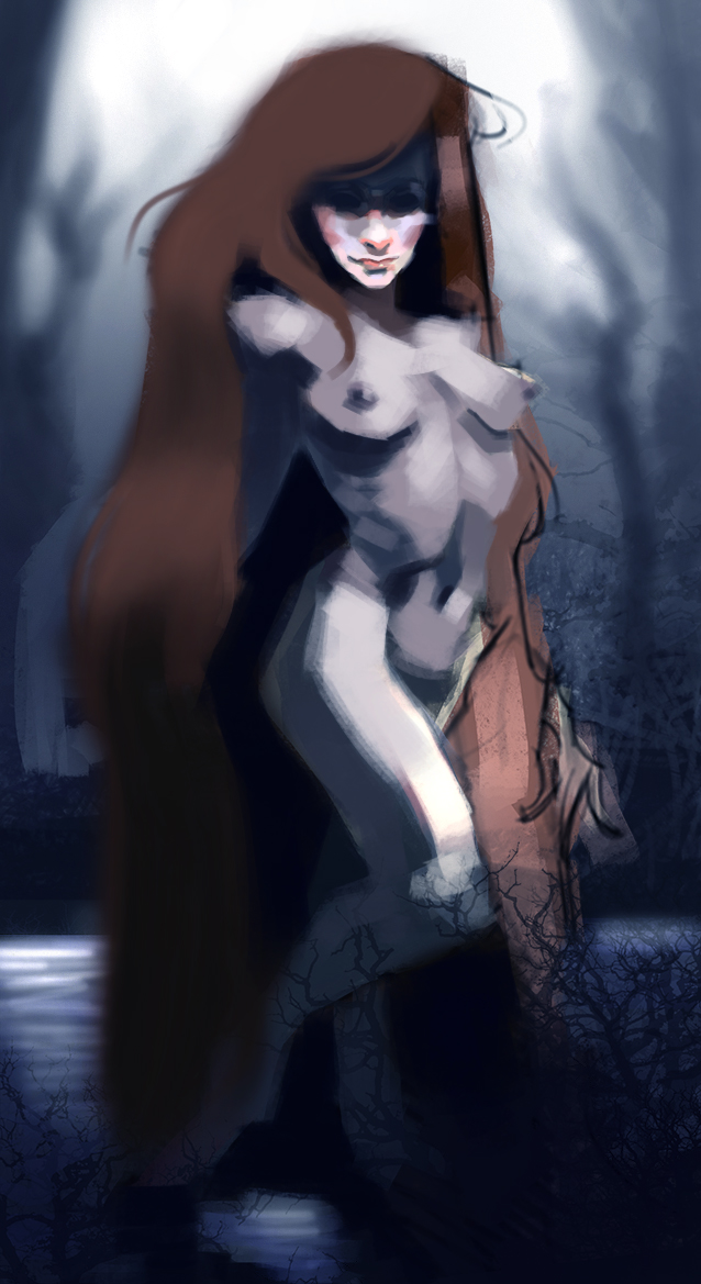
09-08-2015, 06:03 AM
Loving this development. Keep pushing it-- I can see that you could totally refine it more-- Particularly the hands and feet. Maybe give her glowy eyes or something, I dunno. I'm not sure how far you should push the face before it'd take the eeriness away, though. I'm just trying to think of ways to help, haha. Keep at it!

09-09-2015, 05:40 AM
urghh...
 one of those days today. I have been working on the Rusalka painting and I feel like every brush stoke I make is crap. I contemplated scrapping it and staring over but im just going to leave it for tonight and work on it tomorrow. Here is some figure drawings instead, focusing on the female torso. one of those days today. I have been working on the Rusalka painting and I feel like every brush stoke I make is crap. I contemplated scrapping it and staring over but im just going to leave it for tonight and work on it tomorrow. Here is some figure drawings instead, focusing on the female torso.  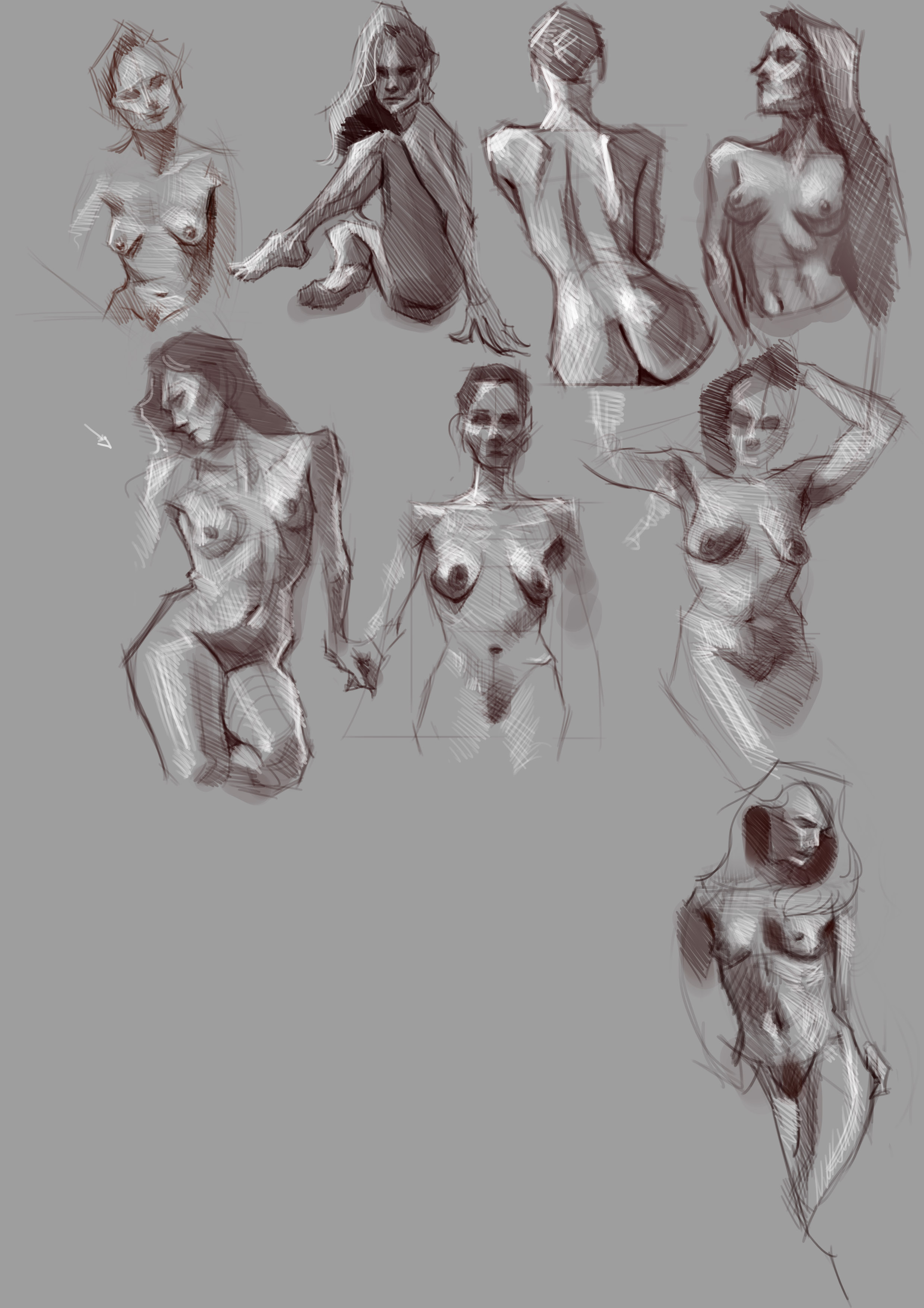
09-09-2015, 05:43 AM
(09-08-2015, 06:03 AM)Bookend Wrote: Loving this development. Keep pushing it-- I can see that you could totally refine it more-- Particularly the hands and feet. Maybe give her glowy eyes or something, I dunno. I'm not sure how far you should push the face before it'd take the eeriness away, though. I'm just trying to think of ways to help, haha. Keep at it! thanks man! yeh I feel like its a little too generic atm. maybe I will add something to spice it up a bit. 
09-09-2015, 06:45 AM
I like the Rusalka. It makes me wonder about her and she is so sexy :) The torso studies are also good but waist parts of some of them seem a bit short.
09-10-2015, 12:08 AM
PurpleScissors: thanks! yeh I need to get out of that habbit of drawing the waist too short, thank you for the advice
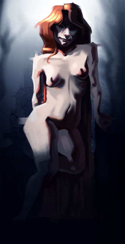
 sooo... I decided to make a start on a second Rusalka painting, I was wondering witch one people prefer and why? I stuck at a crossroads here personally im not sure witch one gets the idea across better. Or witch one looks better.  I would like to see peoples opinions on it. I would like to see peoples opinions on it.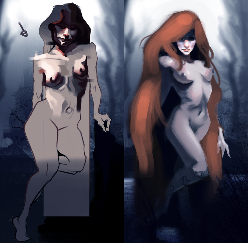
09-10-2015, 02:33 AM
I prefer the right one because she looks more luring and the red hair creates a beautiful contrast with the cold atmosphere.
09-10-2015, 05:28 AM
PurpleScissors: Thanks, im not sure witch one to develop for the CHOW. personally I prefer the lighting on the left one but like you said the right one has a better feeling to it. I might try and carry across that felling to the left one see how it goes.
09-10-2015, 10:50 PM
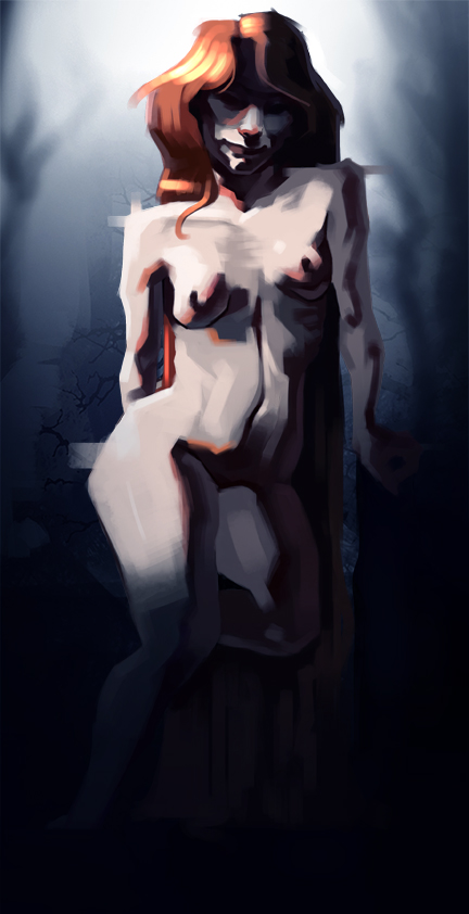
I think the right one had more of a seductive feel, but I like the way you're hitting the lighting on this, the face is looking nice and spooky sad.
at the moment, it's hard to see what's happening with the hair behind her, but that might just be my monitor! Good stuff though, looking forward too seing the final.
09-10-2015, 10:56 PM
(09-10-2015, 10:50 PM)lurch Wrote: I think the right one had more of a seductive feel, but I like the way you're hitting the lighting on this, the face is looking nice and spooky sad. Ok thanks. I will bump up the brightness a bit, its probably the monitor I have. I got a new one recently and can't seem to get the brightness and contrast correct on it. But I will make a few changes to the hair, I might make her hair swoosh in front of her or something. I dunno.
09-11-2015, 07:42 AM
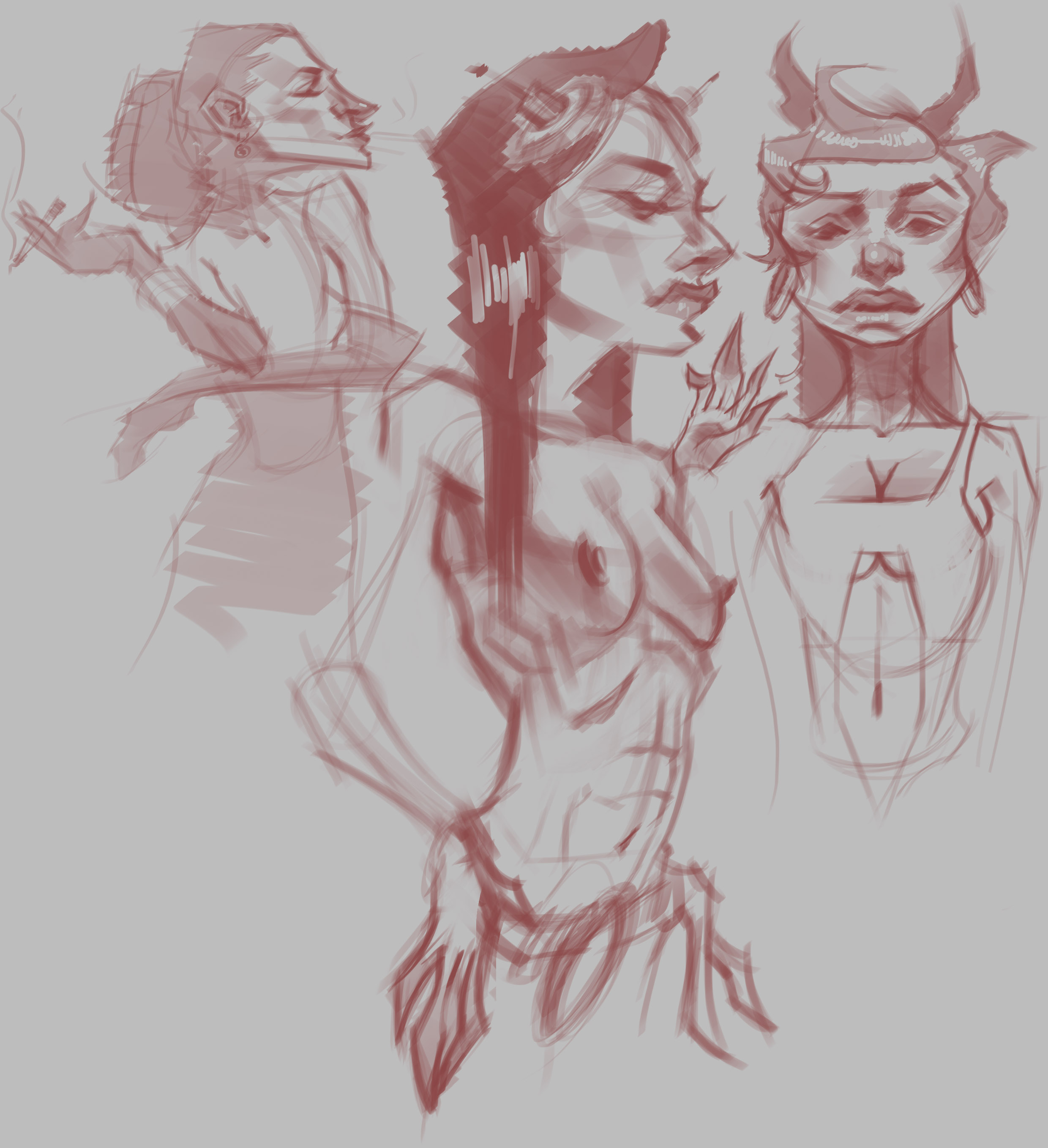
Ive been working on the Rusulka Chow today, but here are some characters I made up.
 |
|
« Next Oldest | Next Newest »
|