Posts: 104
Threads: 7
Joined: Mar 2016
Reputation:
9
So I saw the prompt and I thought... deserts... temples... Ffff, this gives me an excuse to do some concept art of my own, AND play with some styles!
I could not resist!
So I already gathered a lot of refs for this, and here are those. Some are inspiration, some are stylistic refs:

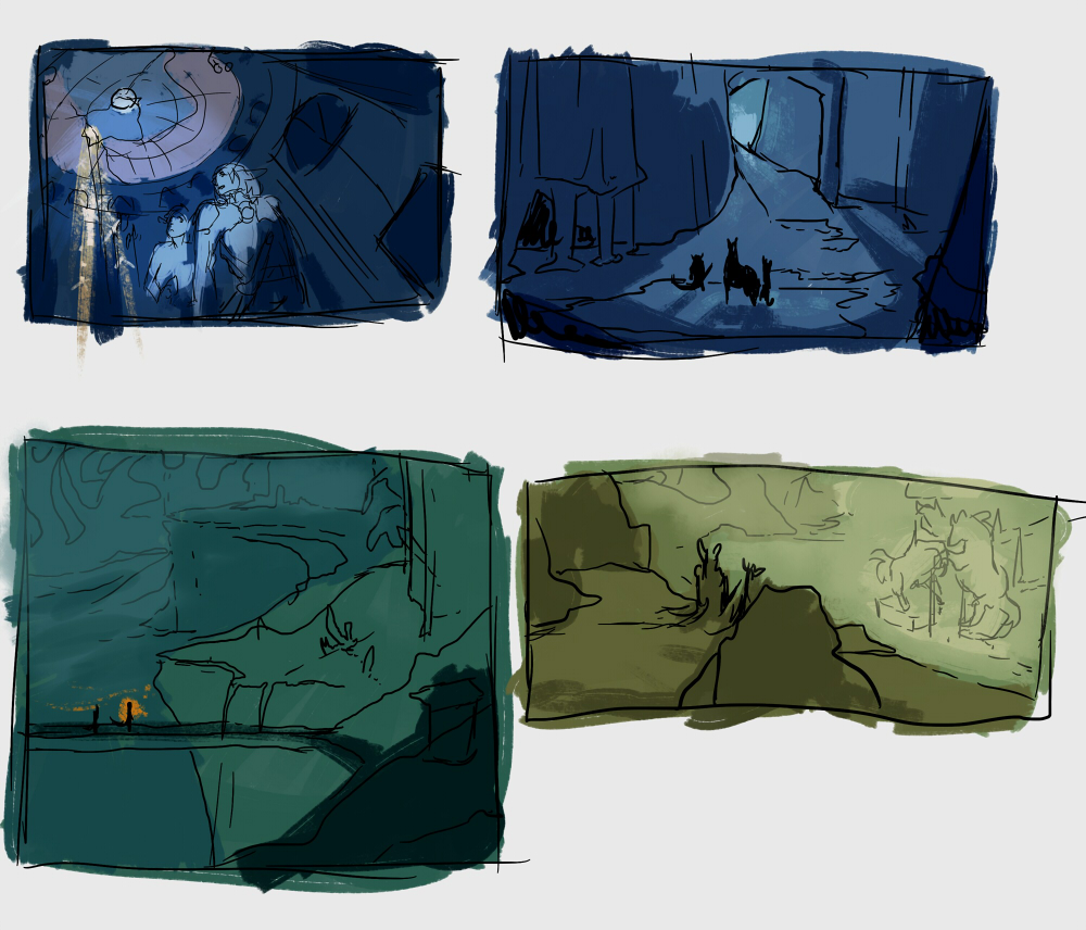
Then I did a few thumbnails. I'm trying to work with cooler colors, since I usually do a lot of warm-colored things.

Posts: 297
Threads: 7
Joined: Mar 2016
Reputation:
14
Nice, specially that first thumb! Looking forward to the cooler colors.
Posts: 501
Threads: 10
Joined: Jan 2013
Reputation:
20
Nice thumbnails have great sense of mood.
Posts: 530
Threads: 14
Joined: Dec 2015
Reputation:
51
Cool comps! Hope to see how you develop them further!
Posts: 47
Threads: 4
Joined: Aug 2014
Reputation:
1
I like your colors/mood on the thumbnails they work quite well together.
Posts: 104
Threads: 7
Joined: Mar 2016
Reputation:
9
Thanks so much everyone! :D
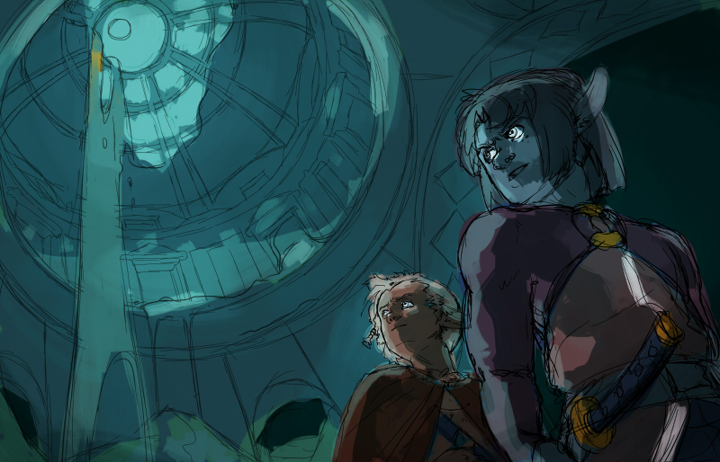
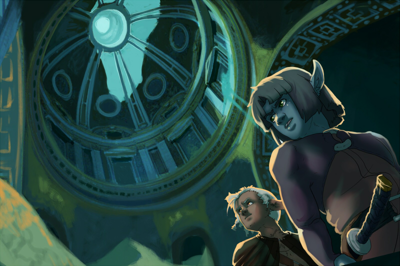
I liked the view of the first thumb so I went in and just sketched it out more, however I used the colors from the 3rd thumb. Trying to figure out how the heck the light is supposed to work. Was thinking of putting something together in a 3D program to figure out the interior lighting, but that's a sharp learning curve and I need a bit more free time for that.
I tried a couple tricks on this one, using the DesignDoll to help me get the proportions right. Then I used a photo ref for the dome. I also stuck in perspective grids, but they are hidden in this image.
I dunno, I'm not really feeling it...

Posts: 501
Threads: 10
Joined: Jan 2013
Reputation:
20
Right now it feels out of balance the heaviest mass is on one side of the painting and theres not enough on the other side , i would say maybe sketch out more thumbnails and see what works and what does not, looking forward to more stuff!
Posts: 530
Threads: 14
Joined: Dec 2015
Reputation:
51
I like that sand falling from the dome! Great idea. And the characters looking at it make a nice triangle. As for the balance which Hobitt wrote about, dunno maybe add some enemies lurking on the dome?
Lighting is tricky for me, too. I'm trying to work on my fundamentals to understand it better, it's a long way. I think, the better we get, the more we feel our pieces!
If you decide to try 3D - I found Sketchup a rather easy and intuitive program for architecture (and V-ray plugin for the lighting, you can try trial). Used it for CC2, it didn't prevent me from screwing up my final :), but it's not software's fault! :)
Good luck with the challenge, hope to see more!
Posts: 104
Threads: 7
Joined: Mar 2016
Reputation:
9
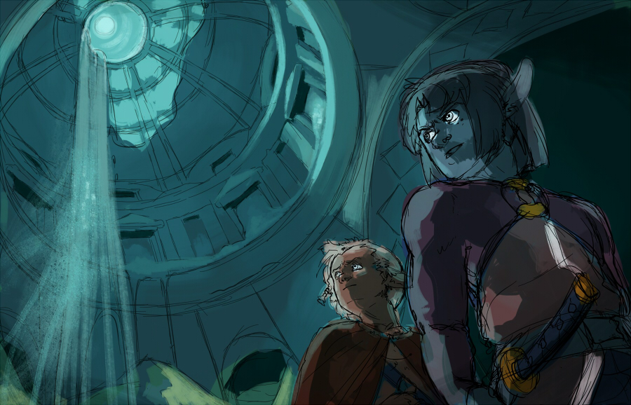
@ Hobitt: Thanks so much for the suggestion! I tried to add more balance by changing the lighting around and looking for some refs. I really like the concept but its looking like it's going to be a challenge to pull off. I'm thinking of going in and making a good clean lineart of the whole thing, and then going with a method like this: http://crimsondaggers.com/forum/thread-3355.html
I was also thinking of going in an doing a photobash with some dome images from morguefile. I've never done a photobash before, and it shows up in so much concept art. I might do a couple studies like that this weekend, and if that gets me nowhere, I'll try sketching out another thumb!
(P.S.: Thanks Amit and John on BrushNoir's thread!! I stole this info off ya~)
@ Neo: Thank you so much! I changed the lighting a bit, hoping that helped a little, but I'm still kinda frustrated with it. I downloaded Sketchup and I'm definitely going to try and learn it--for future projects also. It's been on my list of things to learn. For this one I might try other methods since it's already the second week, but I need to start getting my fingers in the 3D bandwagon!
I'm trying to get more dynamic with my stuff, since it's all so stationary...
----------------
Here's the new image... I also did a couple warmup color studies, trying to figure them out. I reverted to warm colors again! Arghhh....


Posts: 178
Threads: 6
Joined: Jul 2015
Reputation:
18
I love where you're going with this, and the way you stylize your characters faces is also neat. The link you posted for working with different layers was also very interesting.
One thing you need to keep in mind is that you'll need to be much more accurate with clean linewor.k The anatomy on your blue large-eared characters right arm and chest are the biggest weakpoints I think. They're okay for a rough out, but they'll really stick out as wrong if you don't make some major adjustments. Would you mind if I try to do a paintover? I might end up realizing that I don't know what I'm doing after all, but I want to give it a shot.
Posts: 104
Threads: 7
Joined: Mar 2016
Reputation:
9
(05-20-2016, 12:55 PM)Lodratio Wrote: I love where you're going with this, and the way you stylize your characters faces is also neat. The link you posted for working with different layers was also very interesting.
One thing you need to keep in mind is that you'll need to be much more accurate with clean linewor.k The anatomy on your blue large-eared characters right arm and chest are the biggest weakpoints I think. They're okay for a rough out, but they'll really stick out as wrong if you don't make some major adjustments. Would you mind if I try to do a paintover? I might end up realizing that I don't know what I'm doing after all, but I want to give it a shot.
Thanks so much! :DD And thank Amit for that link, he's the one who shared it with BrushNoir~
And I'd really appreciate a paintover, thank you so much!! I really like doing lineart, so I hope I don't ruin it when I do the study, haha.
Posts: 104
Threads: 7
Joined: Mar 2016
Reputation:
9
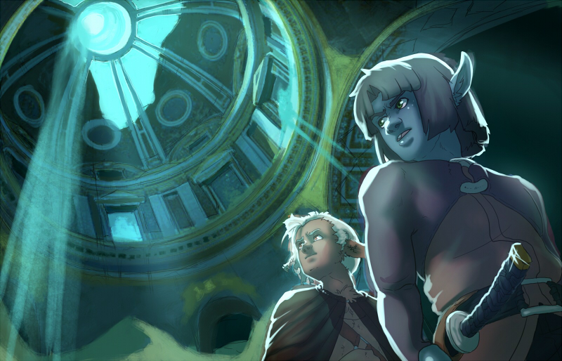
Played with it some more. I lined the characters, and then added in a photo in the BG and bashed it a bit. Played with the lighting. Used those links Amit provided for the shading. The filters work differenrtly in SAI tho, so might have to resort to another program for those blending layers...
I like it a bit more, but it's still a bit meh. It just feels really muddy to me. Not sure how to make it better ;-;
Might go in and sketch up another thumb later tonight. Or tomorrow. We'll see.

Posts: 1,970
Threads: 22
Joined: Apr 2012
Reputation:
243
Nice progress ^.^
I feel the comp is a little too closed in. By that I mean, the scene doesn't really show us too much about the narrative. Perhaps you could just extend the canvas wider a bit to fit a more cinematic aspect (1.85-2.35 :1 ) which will allow you to get perhaps a bit more of what they are looking at? Perhaps they also entered through the roof, so adding ropes or ladders or something might help add to the narrative. Funnily enough it feels like a still frame in an animation :P so I can feel there are other frames before and after this one, which would be a great establishing shot instead. This is great from an animation perspective, probably not as great for a single shot illustration in terms of power.
In terms of rendering, it's nice, though definitely could be tightened up. Your colours are pretty cold. Consider adding some bright warms to your direct lit areas to give it a feeling of hot sun more and contrast against everything else which is very cool. Atey's work is a perfect reference to use to check out shafts of direct lit sunlight against shadow!
Posts: 742
Threads: 28
Joined: Jan 2012
Reputation:
44
Awesome, I love the dynamic perspective. You should fix the lighting a bit - if they are lit with a powerful light source from behind, then the light shouldn't cover the whole side and faces like a spilled milk. Also I don't think the greens work, yellow or orangy colors should be better, it wuld give the whole image a nice contract of cold and warm.
Posts: 178
Threads: 6
Joined: Jul 2015
Reputation:
18

Here we go. I'm not too sure if the changes I made make sense, or if I actually made things worse, especially when it comes to the lighting, so if I butchered your painting I'm sorry.
The main problems with the anatomy were that the shoulders of both figures seemed way too bulky (they generally slope quite a bit more than you'd expect when you're looking up at a person), and the clothing didn't follow the shape of the torso with enough accuracy. I also think the rear guys chin extended too far outward, and the eyes weren't aligned with the tilt of his head. The backside of his head seemed too large and the neck probably got warped as a result.
With the figure in front, there's the problem that the fact that the arm goes off-screen already makes it look awkward, no matter if it's technically correct or not, so I figured maybe you could have her (?) have it rest on her sword hilt.
Again, if you think I made things worse, tell me.
Posts: 104
Threads: 7
Joined: Mar 2016
Reputation:
9
@ Amit: You know, I totally agree about the animation thing... I'm thinking extending the canvas will be a good next step, and also introducing some warm colors too. And definitely gonna take a look at Atey, and clean up that background more; the BG was mostly for playing with, so I'll put more work into it! :D Thank you so much, you've helped me over the bump! XD
@ Piotr: Thank you so much! And yeah, I agree, I thought the highlights were kinda overkill too but I was on the fence... will definitely tone them down and add in some of those warm colors. Thank you so much! :D
@ Lodratio: Ohmisgosh, thank you so much for looking at that anatomy for me!!! And the paintover!! They already look better, and I really like the warm added in on the right. Seeing it that way puts a new perspective into it; thank you so so much for taking the time to look at it!!
I think the arm resting on the sword really takes away some of the awkwardness in the composition, it just felt unbalanced, but seeing it with his arm over the sword really works. Ahhh, thank you so very much! I'm gonna take it and shift it up this week--hopefully I can make the deadline long before instead of one hour out like my first one, haha!
Wow, thank you all so much for your thoughts, I really, really appreciate it! :D
Posts: 104
Threads: 7
Joined: Mar 2016
Reputation:
9
I have had a really not great week IRL and haven't gotten to sit with this like I wanted. And now it's Thursday. Sigh.
So I still have to fix the following:
- Character anatomy--gonna move his hand to rest on the sword and fix his shoulders/girth and the back guy's chin
- Lighting/warm colors
- Making the dome more interesting
- Rendering
I tried to extend the canvas as Amit suggested! Removed the falling sand because my ineptitude with perspective is really showing now. I tried adding some ropes on the roof but again, perspective. I'm thinking of adding a monster hanging out up in the dome as Neo suggested, but didn't get the chance to do it in my spare 3 hours this week.
Gonna see what I can do tonight.
Mostly frustrated with myself. I don't think I did enough studies in the beginning, and that's really coming back to bite me.
Things to keep in mind for my next illustration:
- Do studies of the actual painting goddammit, ::pokes self in eye::
- Start in black and white
- Practice perspective like a crazy person

Posts: 178
Threads: 6
Joined: Jul 2015
Reputation:
18
You have something good going here, so don't lose sight of the big picture. The falling sand made a lot of sense as a compositional element because it broke up the composition and created a tangent to where the characters were looking so it didn't feel ike they were staring into nothing. Even if it wasn't quite in perspective it was a good idea to have it there. Maybe you could make your composition even wider, and make room for your characters to look at something in the foreground. I really should be working on my own final right now, but I couldn't resist the urge to fiddle with your comp some more. I hope you don't mind.

Posts: 104
Threads: 7
Joined: Mar 2016
Reputation:
9
:) You are the best Lodratio! Thank you so much!!
I'm gonna work it up to a polish tonight! Thank you thank you thank you!
Gonna listen to this while I do it: https://www.youtube.com/watch?v=GiHVUlPa62k
Posts: 66
Threads: 3
Joined: May 2016
Reputation:
1
I wish you the best Arapersonica, i believe in you :D
(still on my working night/morning too^^)
already looking forward to your final 
|

