07-28-2016, 08:48 AM
Awesome stuff.
|
Walent's sketchbook
|
|
08-03-2016, 02:56 AM
Thanks, Vicianus!
Here's some more stuff, kept working on anatomy, specifically the torso, but this time I'm slowly trying to also twist it or combine elements together. What do you guys think of the Prisma app? It sure looks pretty impressive.  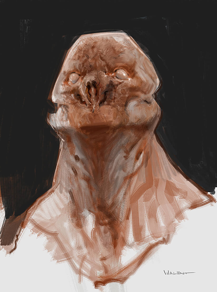  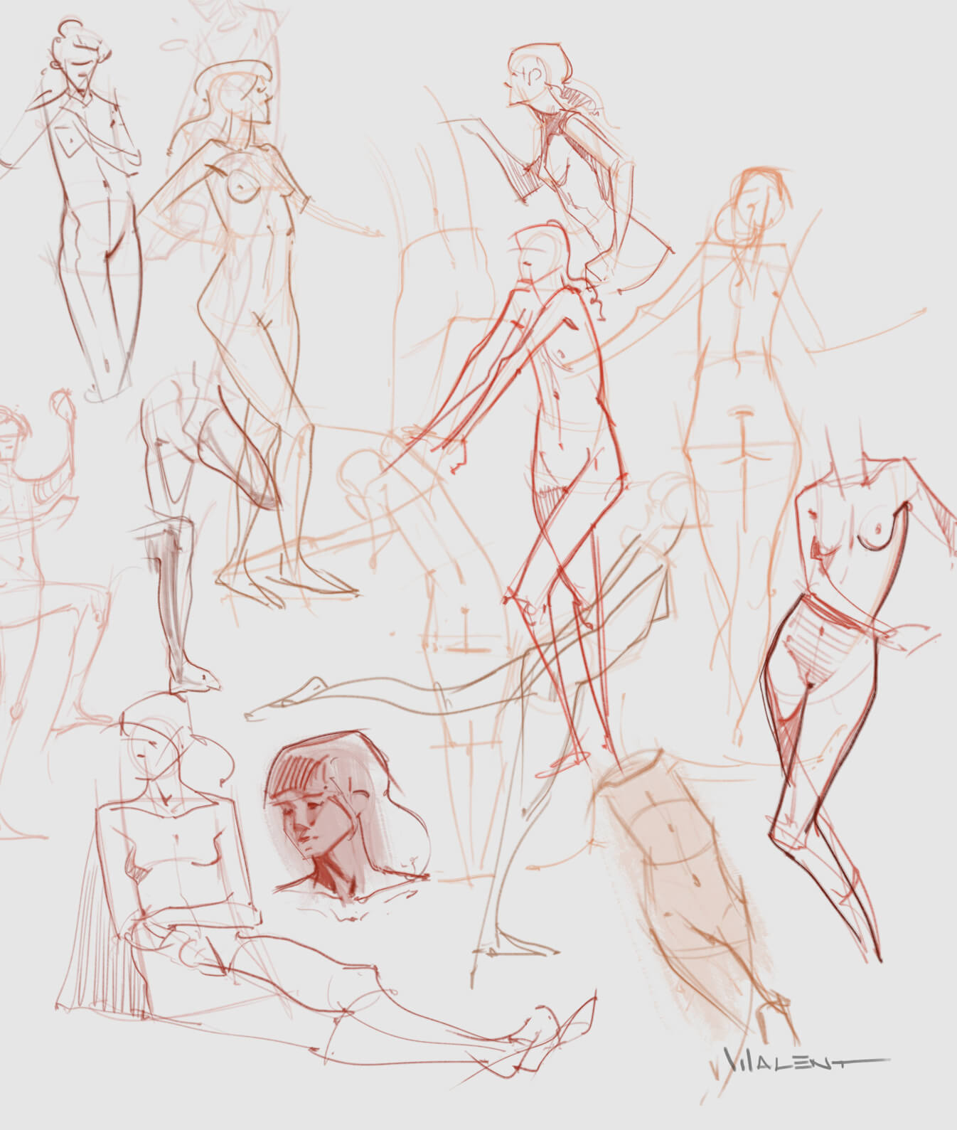 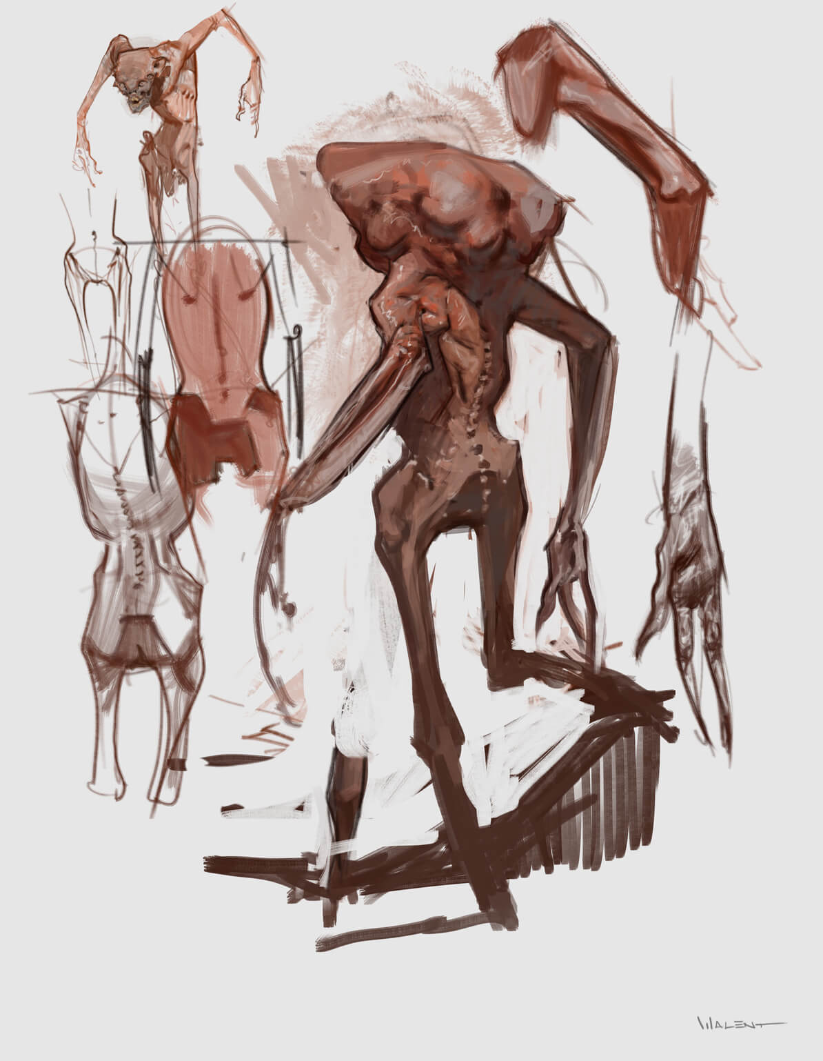 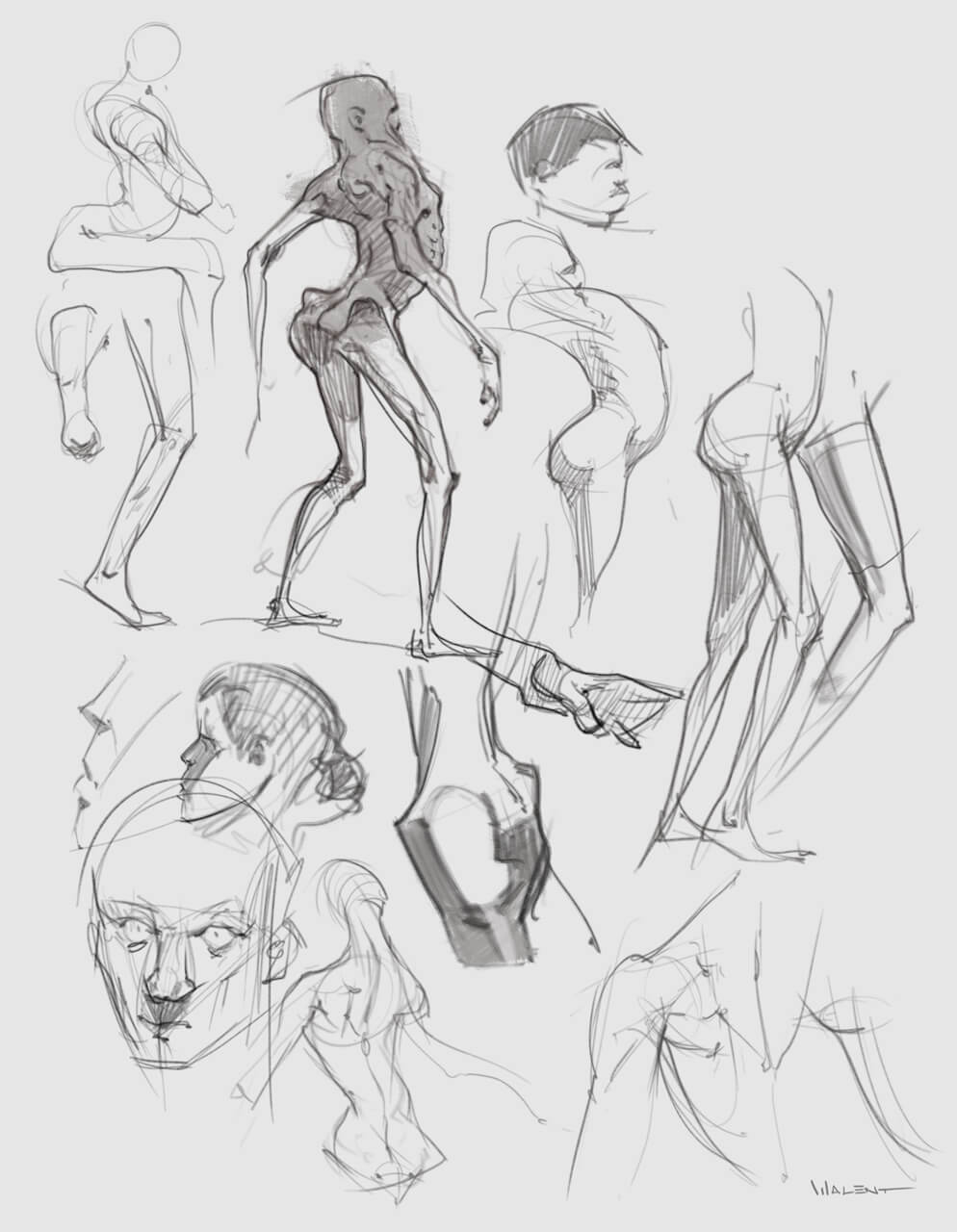 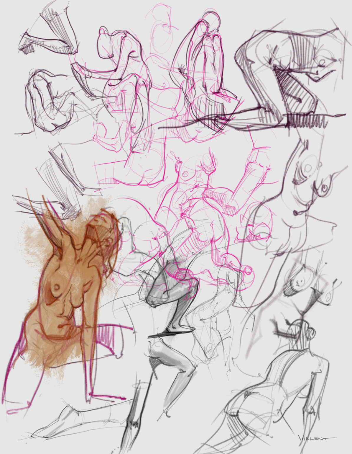 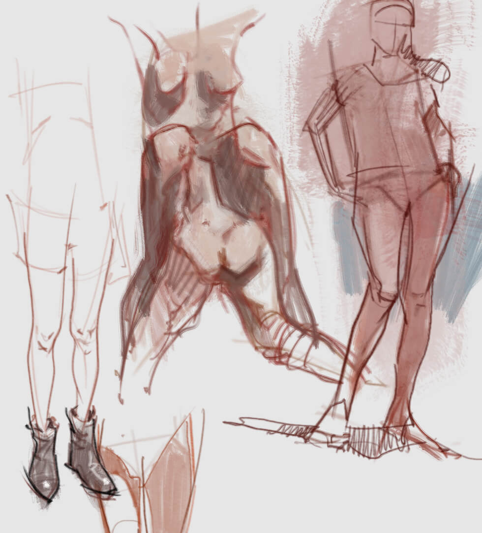  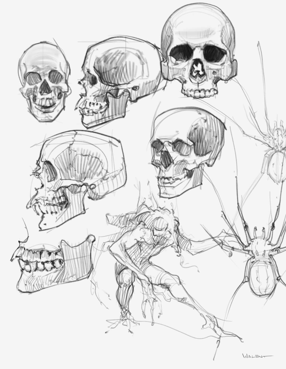  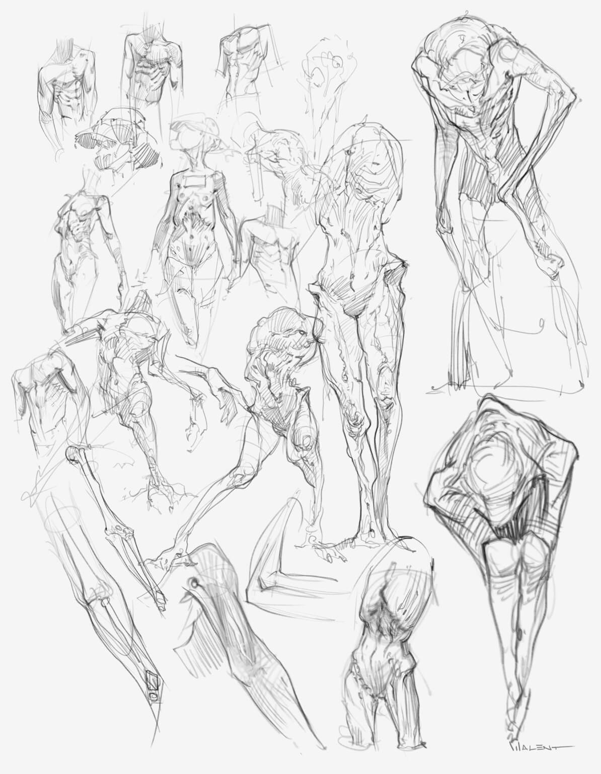
08-03-2016, 09:14 PM
Hey Walent, glad to hear I could help. ;u; And it's awesome that you got your motivation back, keep up bro! Diet does help with mood (as does exercise).
>I wanna push myself into doing one sketch a day. But I'm only gonna start posting once I know I have it as a routine. I'll also try coming up with a finished creature piece, I'm thinking maybe I'll do a creature that fits in the Silent Hill universe. I remember how those designs blew my mind a few years ago. Sounds like a great idea. Definitely suggest coming with a creature design. I'm thinking of setting myself a weapon design project myself. XD And maaaaan all your practice stuff looks so cool, even if it is super sketchy. I can see how you are working creature designs into your anatomy practice. Now I'm inspired to get back to work, LOL! Looking forward to your next update.
"Drawing is a skill like hammering a nail. You might not be great at it yet, but there is nothing stopping you from gettin' down and hammering away." -Irshad Karim
Sketchbook!
08-05-2016, 01:38 AM
Yeah, Mechanizoid, thanks, that was a huge problem for me, studying a lot but not knowing what to do with it. I think I solved that now. Hey, good luck with your project!
More stuff, I feel I need a ton more study though, like getting into animal anatomy as well. BUT what I'm actually gonna do is choose a sketch and just try to push it to a finish, which is kinda what I did with the last image, but I'm not satisfied with it, pose is boring as hell...  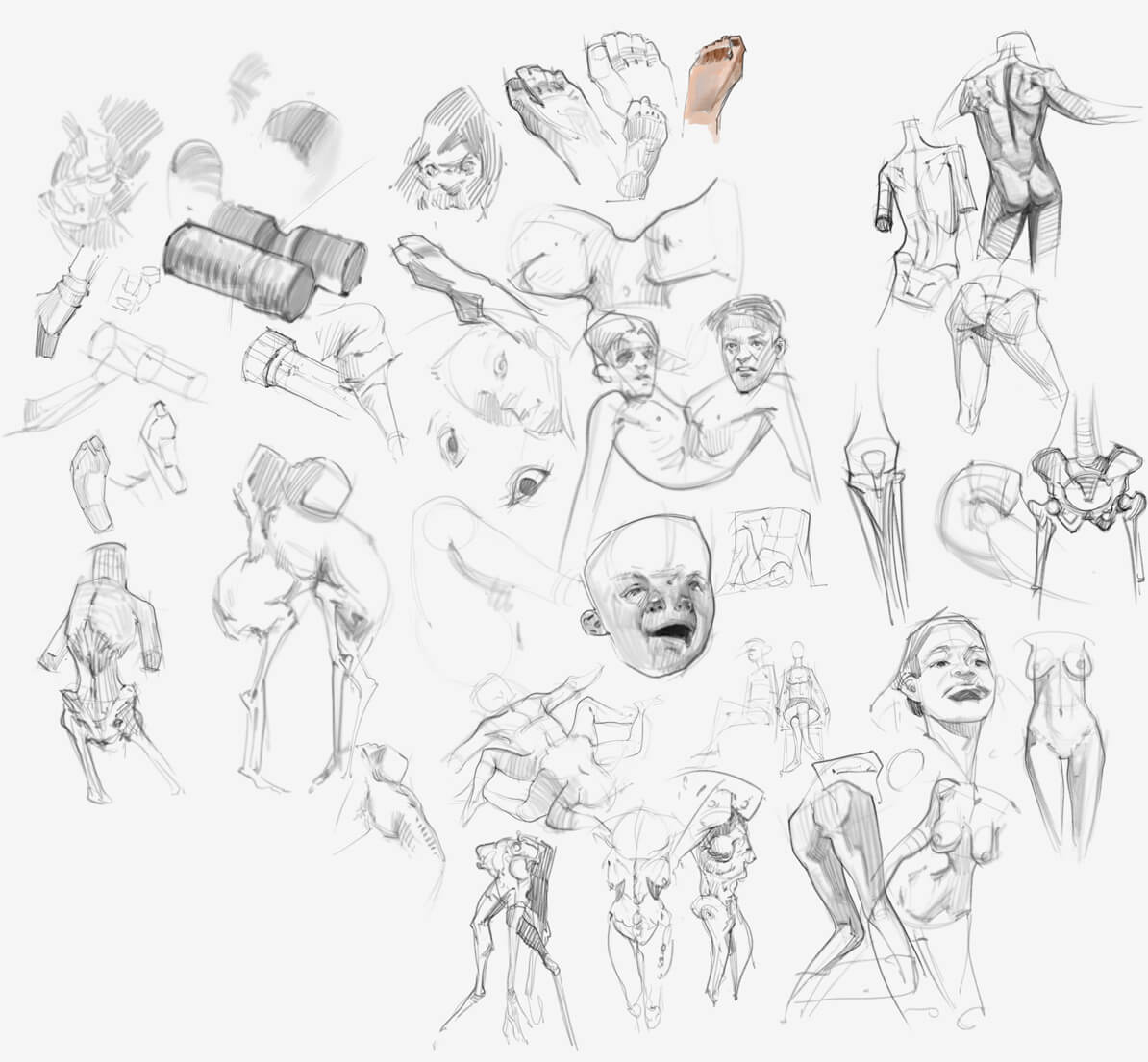 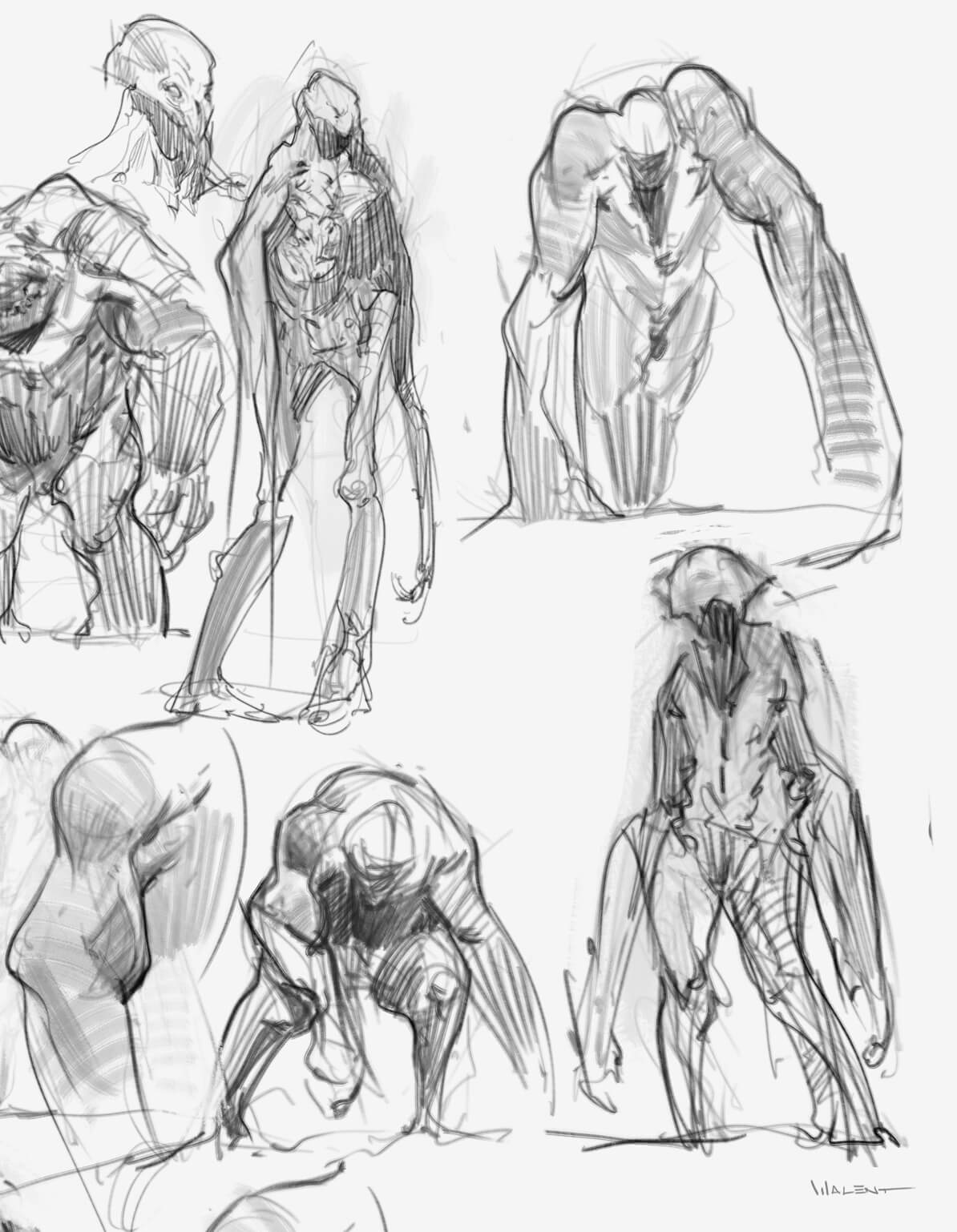  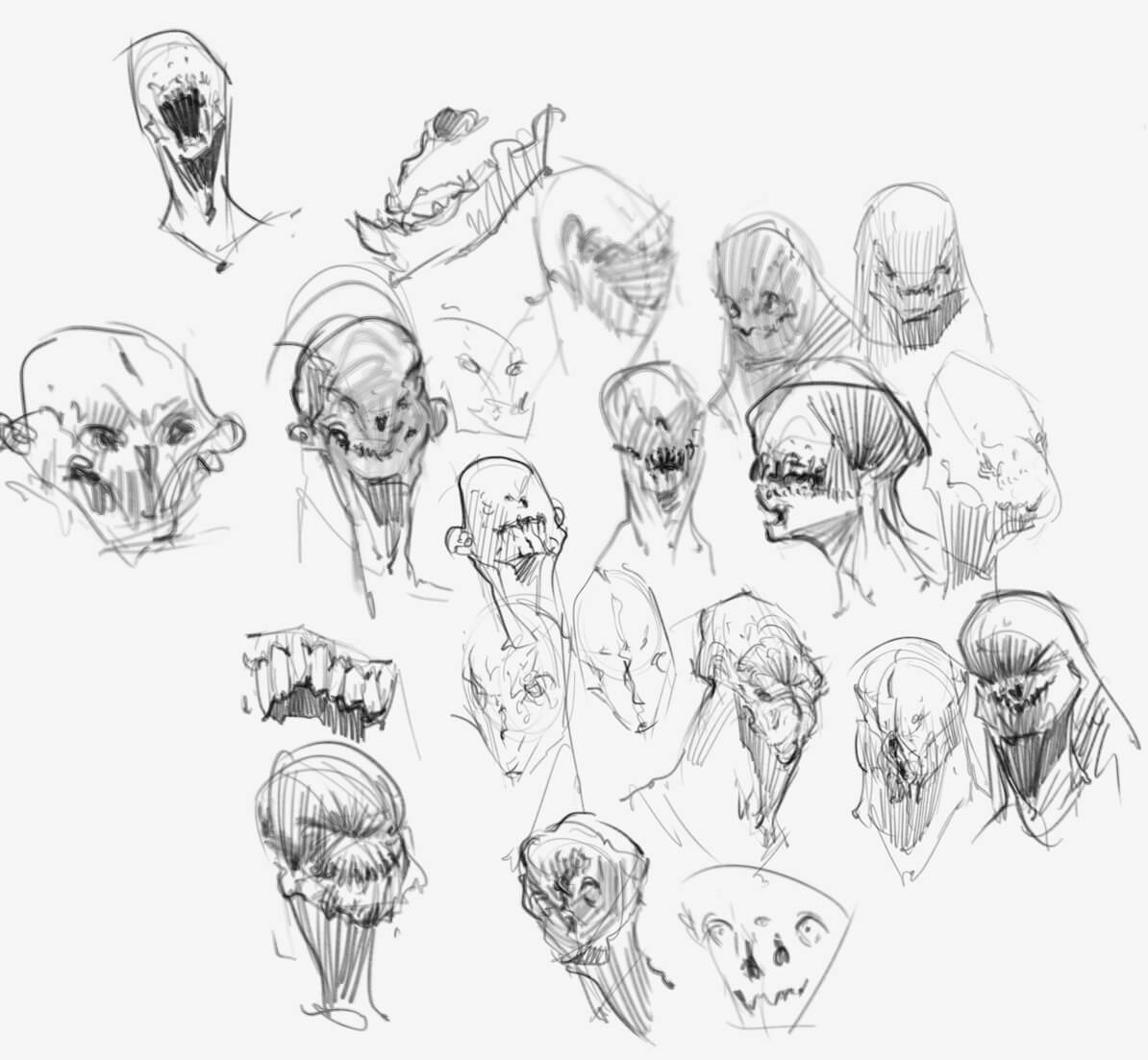 
08-05-2016, 04:20 PM
Impressive work. Doin some profound stuff with your knowledge of anatomy. Likin all these variations where you're playing around with shapes and anatomy to get something interesting to happen.
08-06-2016, 05:33 AM
Thanks, Dennis! Hoping I can go a lot further with those variations.
More from today: 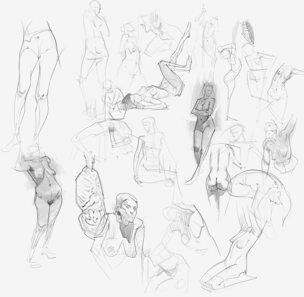 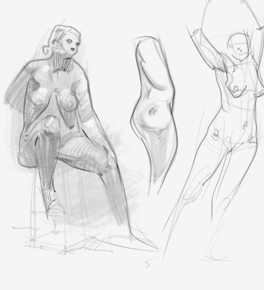 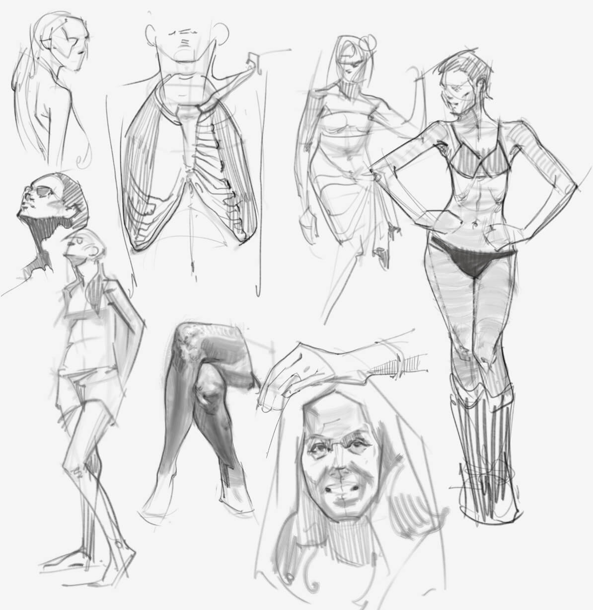 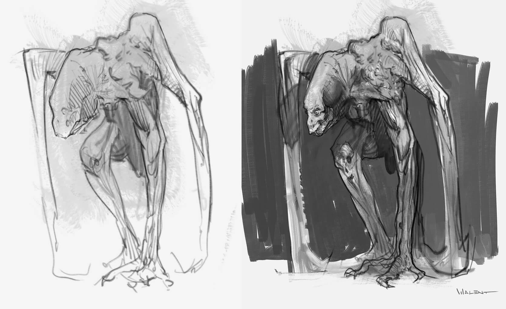
08-09-2016, 09:22 AM
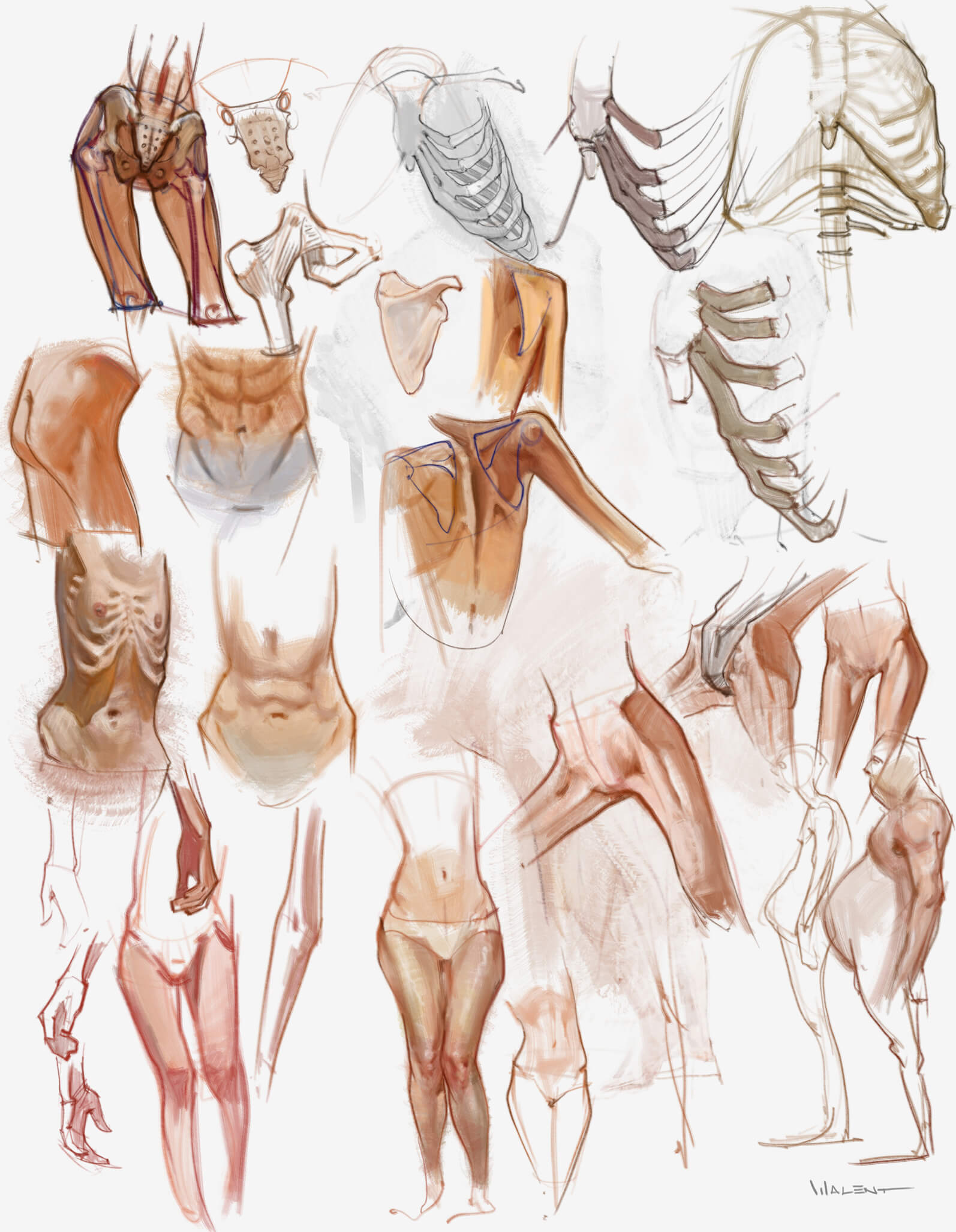
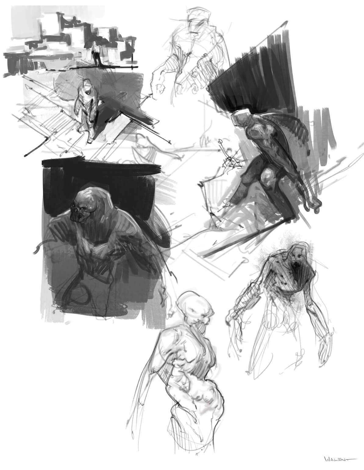
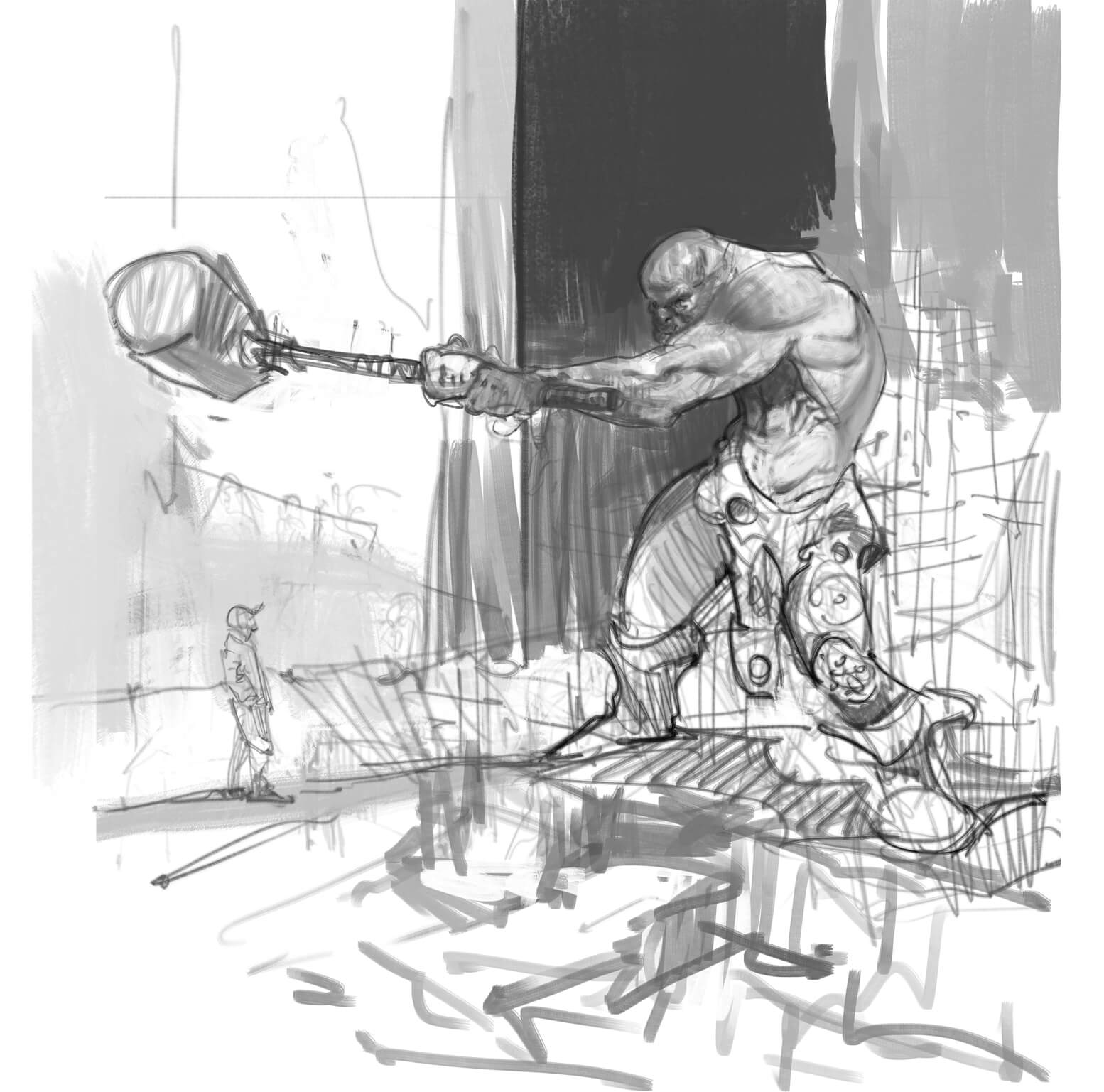
More stuff:
08-12-2016, 10:10 AM
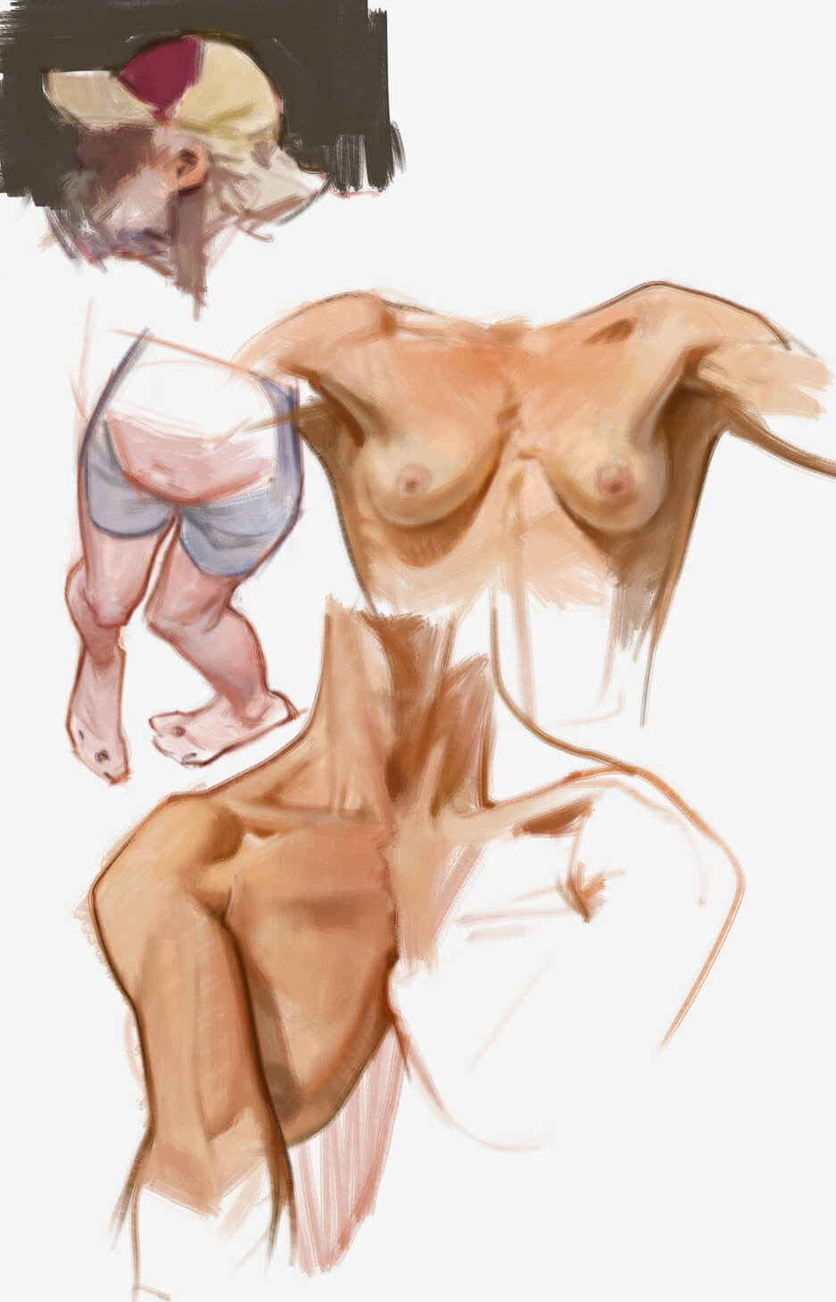
More torso practice
08-12-2016, 09:22 PM
Awesome torso studies. Pure eye candy in here.
08-12-2016, 10:13 PM
Wow your artwork is really nice. Your style is very technical and focused...I love it.
08-17-2016, 09:46 PM
Thanks, Dennis and Chris!
Been out of town for a few days, so not so much stuff lately. Finally starting to get a real grasp on the torso anatomy, especially scapular region (which is insanely hard thanks to the huge motion range) and serratus, obliques and lats relationship. 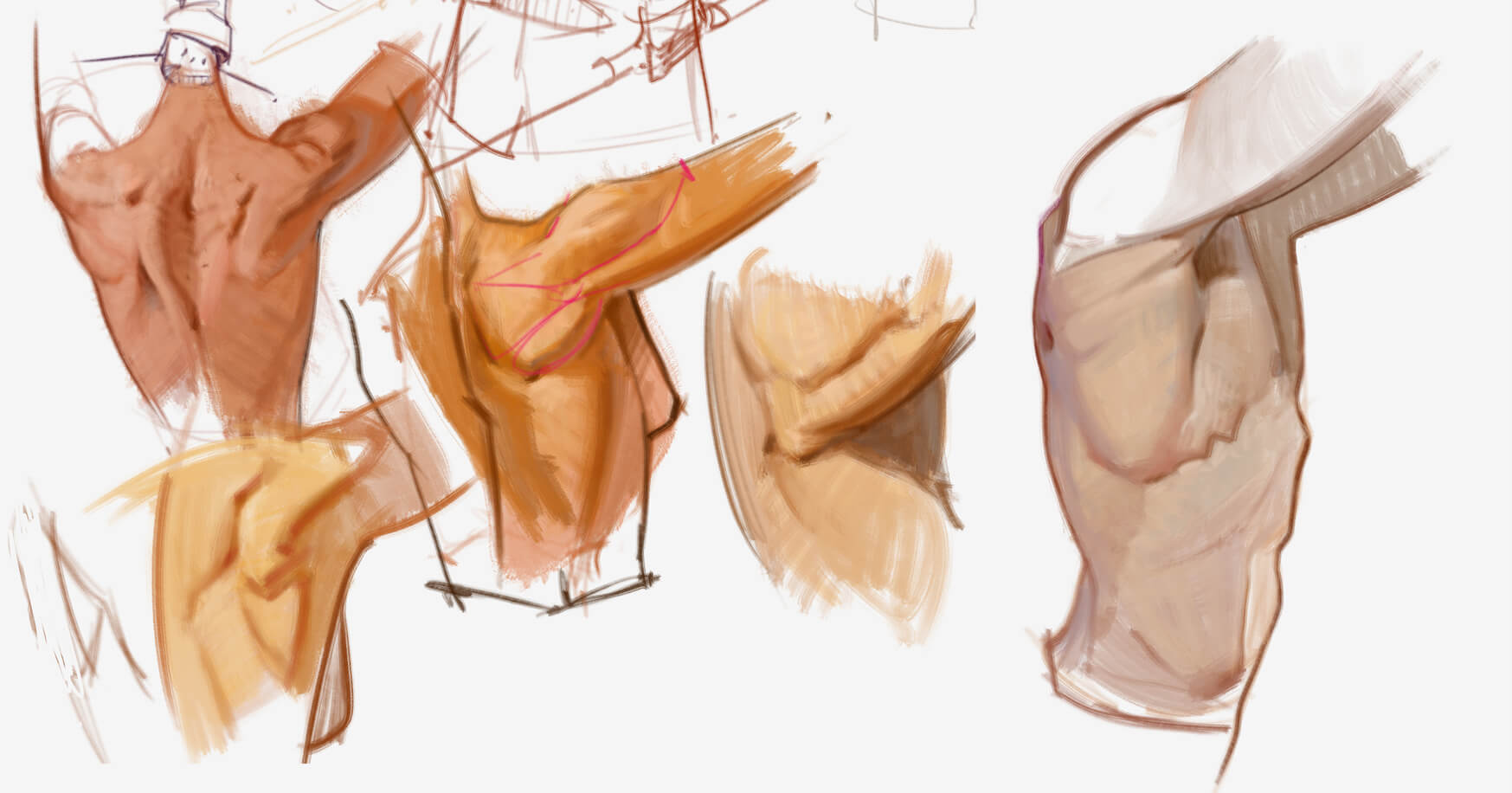 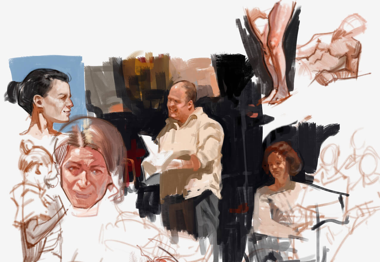  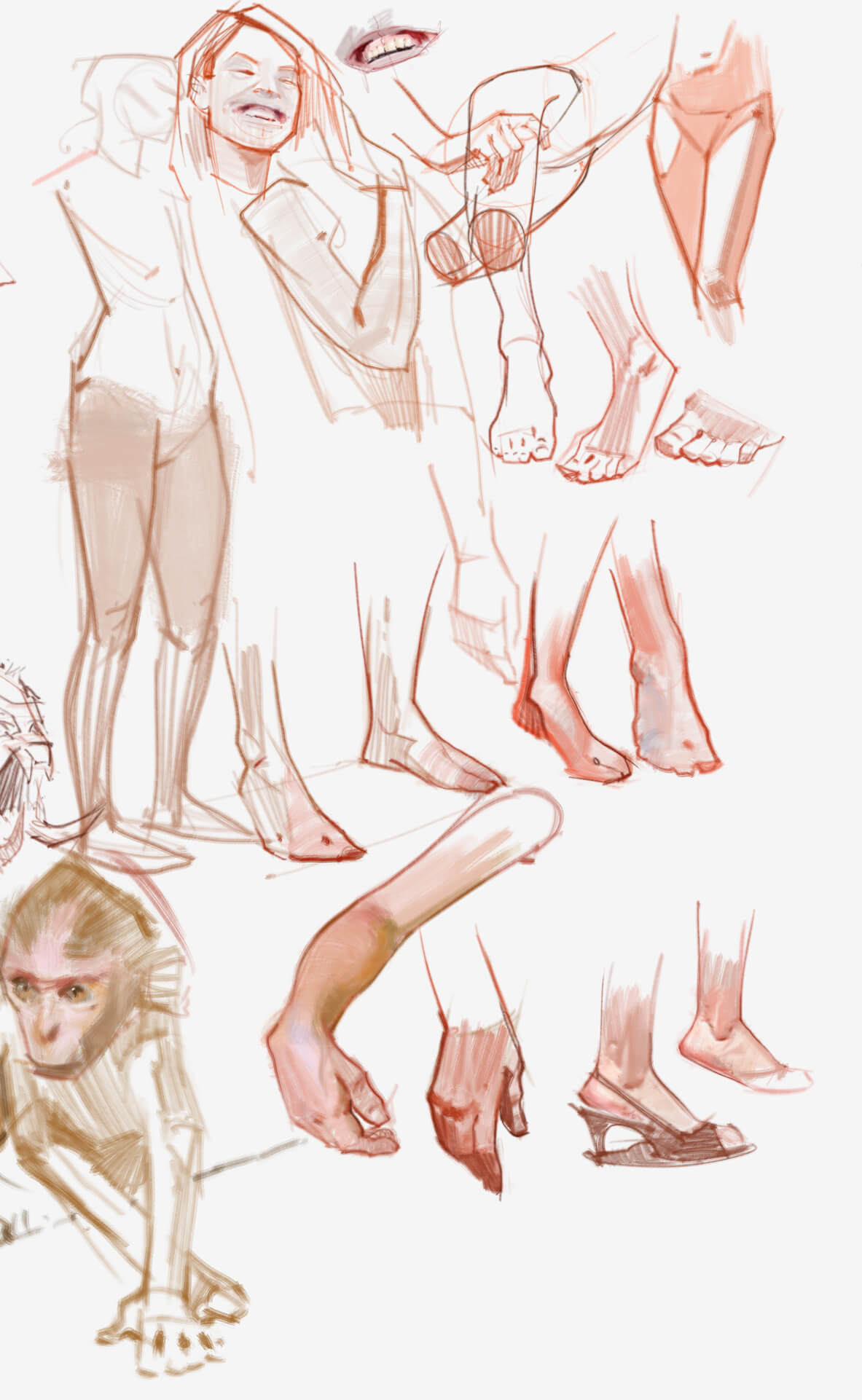  I had a commission where I had to take and existing old master artwork and modify the characters a bit. Having the comp already established has made it easier for me to bring it to a more finished stage. For what I've done so far, this was extremely complex for me, but I think it's the first finished piece I can say I'm satisfied with. So I realized my weak spot is with planning an image, composition and subject matter, not so much with rendering. 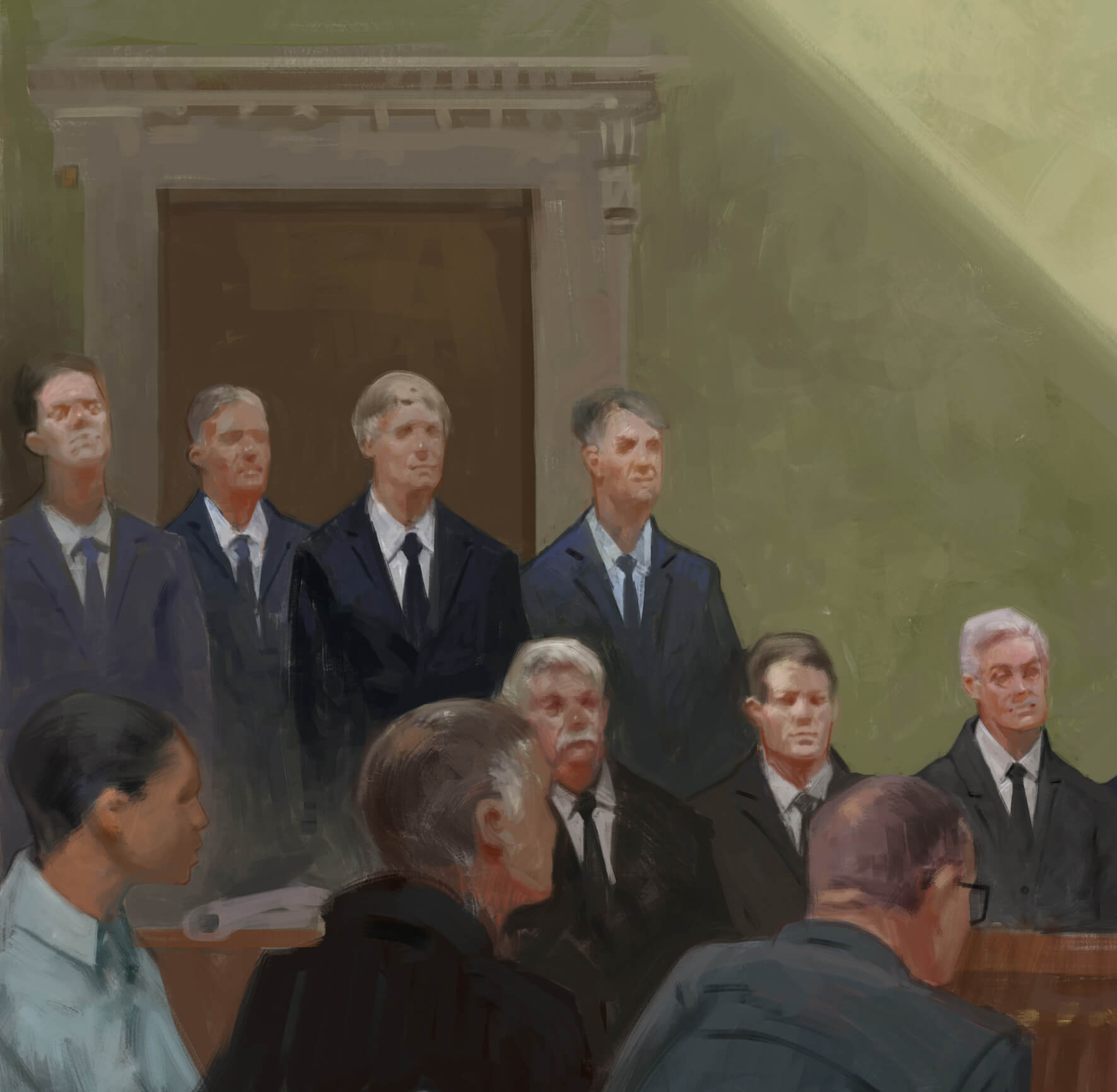  I'm trying to constantly push myself into finishing more pieces and it seems that after that last commission, I find it a bit easier to do. I have to do more full master studies. This study below is exactly what I want my art to look like! Damn, can't believe I'm finally where I wanted to be. Now all I have to do is bring out the illustrations! 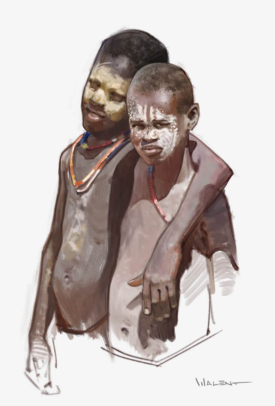
08-27-2016, 08:39 AM
Some updates, more sketches, some Frazetta studies.
Portraits are starting to come out better. Also focusing on some design. Getting closer, I feel some real stuff coming up soon 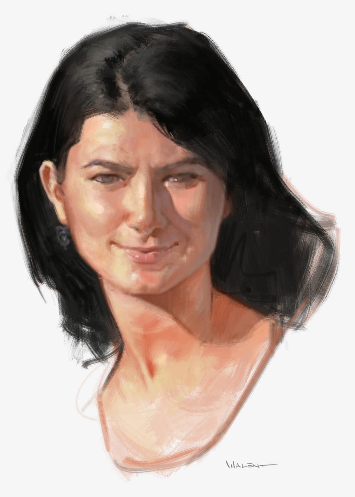    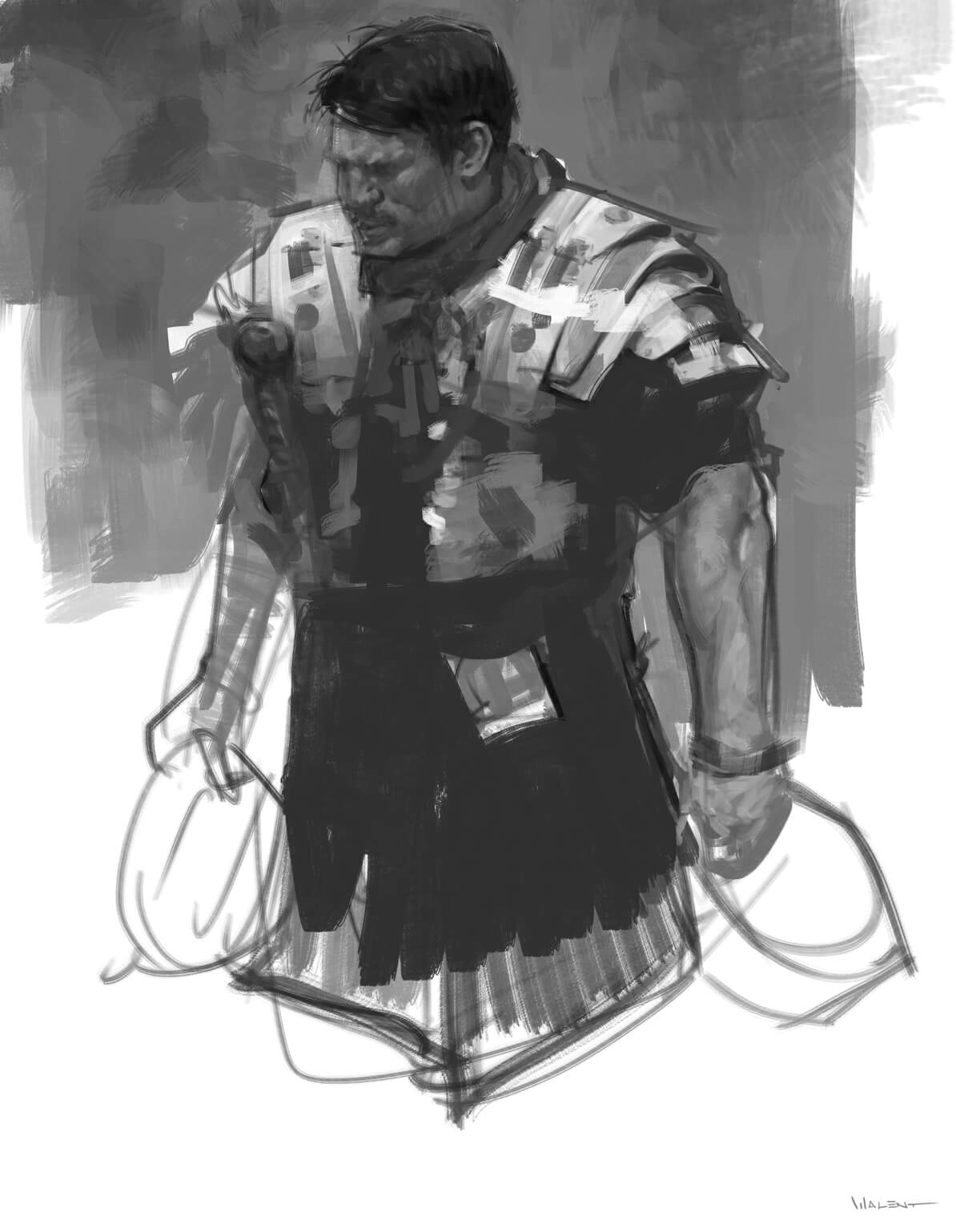 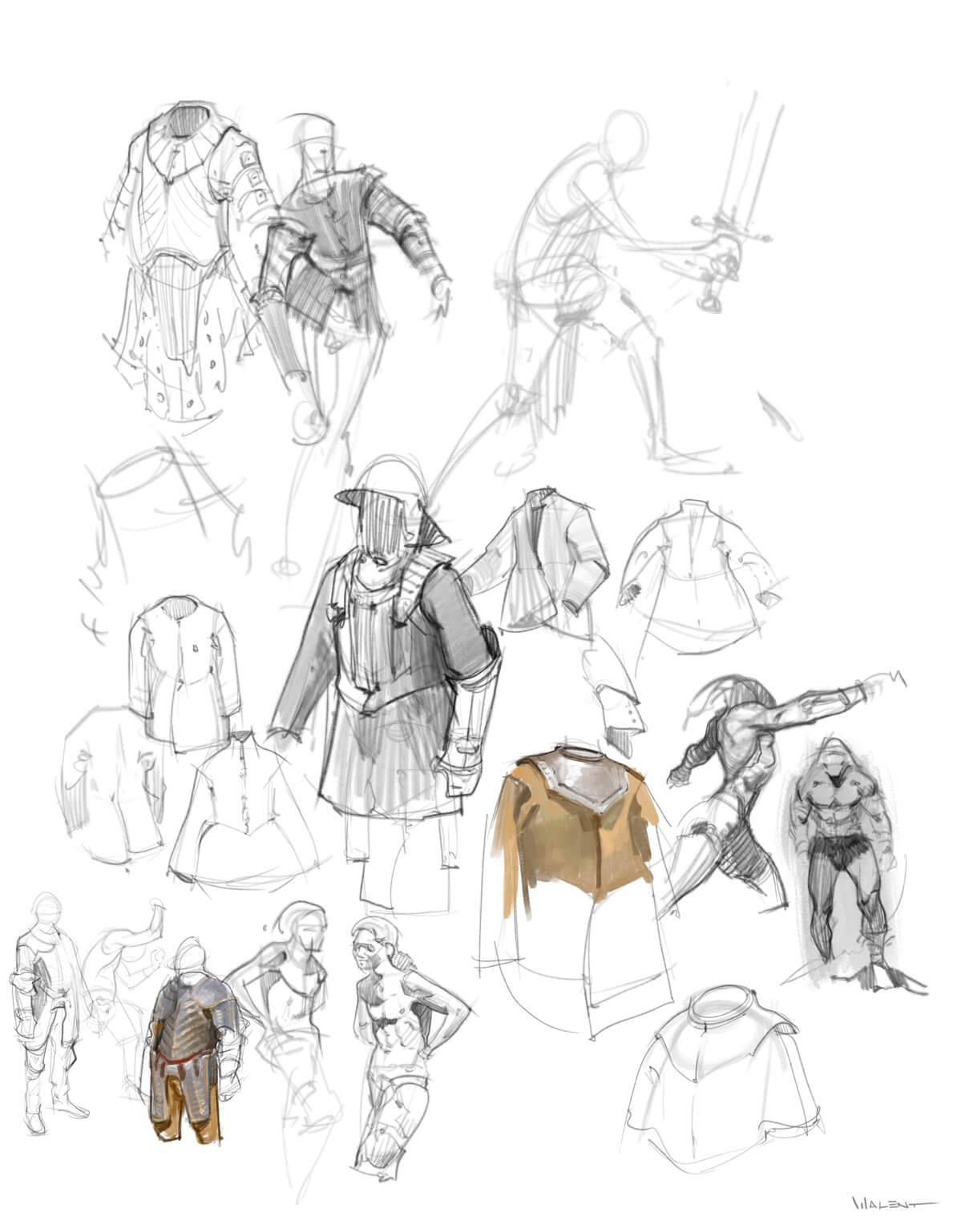
08-28-2016, 02:49 PM
That portrait did come out very nice. Lovin the studies as always, keep it up.
08-28-2016, 03:04 PM
Hey! Very inspiring work. Keep it up.
I love the creatures in particular.
08-31-2016, 05:17 AM
Thanks guys!
Here's more stuff from the last couple of days 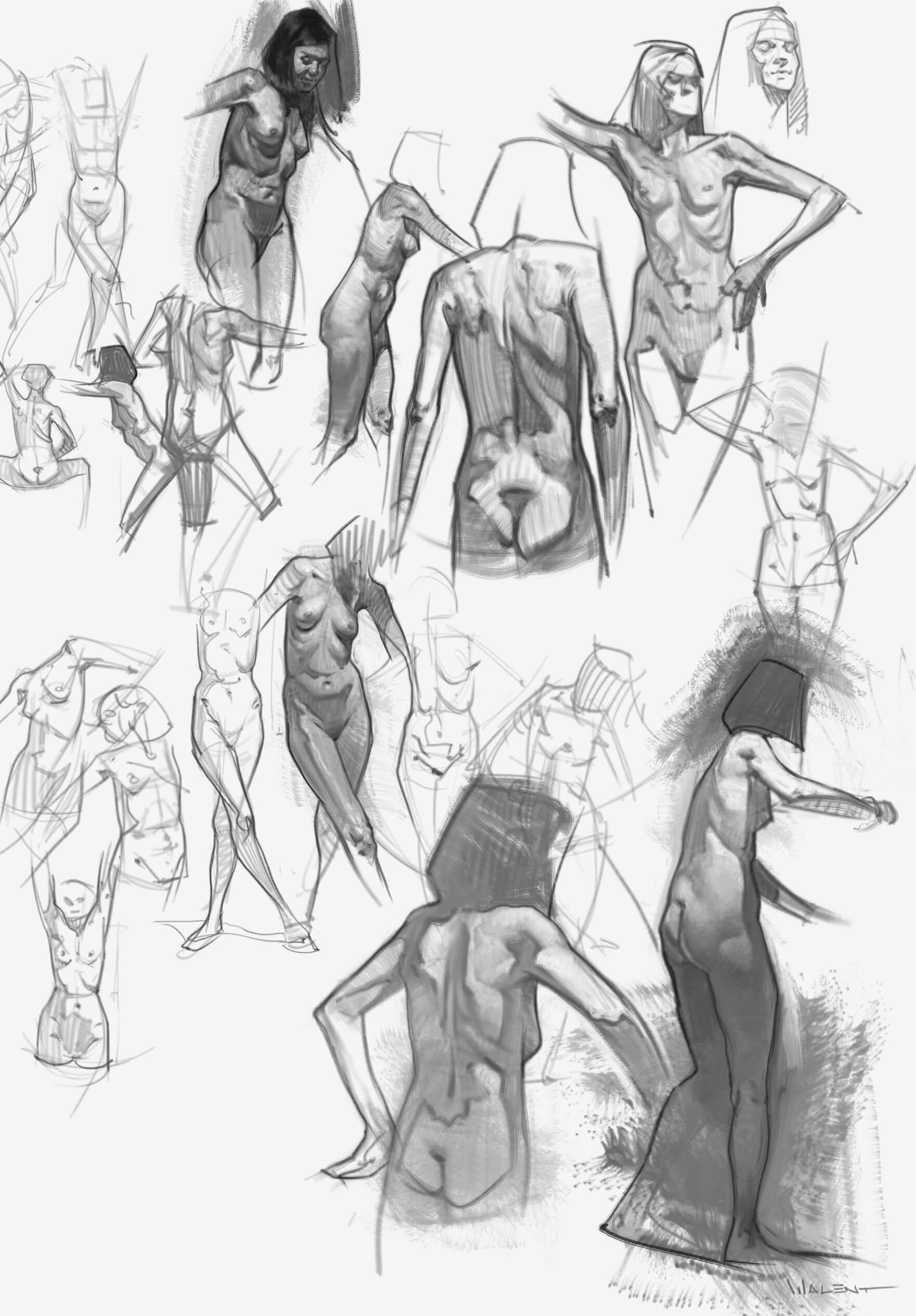   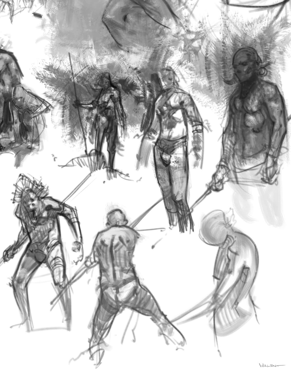 
08-31-2016, 07:14 PM
Went through your entire sketchbook and it blew me away man. Your improvement is staggering, really shows how hard work pays off. Your linework is absolutely beautiful as well, a lot of it looks exactly like conte on newsprint, so goood dude!
I love that you post your thoughts about how you're progressing as an artist too,it's nice to see your perspective on that facet of art. Checked out that Steve Houston video on one of the earlier pages too, it's very useful so thanks for sharing that. You've inspired me to pay more attention to my brushwork in my drawings too. Keep it up buddy, can't wait to see more :)
09-03-2016, 11:27 PM
(08-31-2016, 07:14 PM)The Lama Wrote: Went through your entire sketchbook and it blew me away man. Thanks man, again thanks for taking the time, glad it got you inspired. I pinned down my huge weakness, the ability to create an interesting scene/comp and I'm planning to keep at it until I'm comfortable with creating scenes from scratch. And after that, design. I don't know, I guess that's how it makes sense to me: 1. learn to draw stuff, simplify, learn anatomy, flow, movement 2. create interesting compositions, focus on shapes, positive/negative space 3. design stuff I also have to start working on those hands, I've been staying away from them for far too long. So here's some more practice, trying to design stuff and come up with interesting scenes. I also find that trying to use different colors on the figure, while keeping the right values can be an interesting exercise.  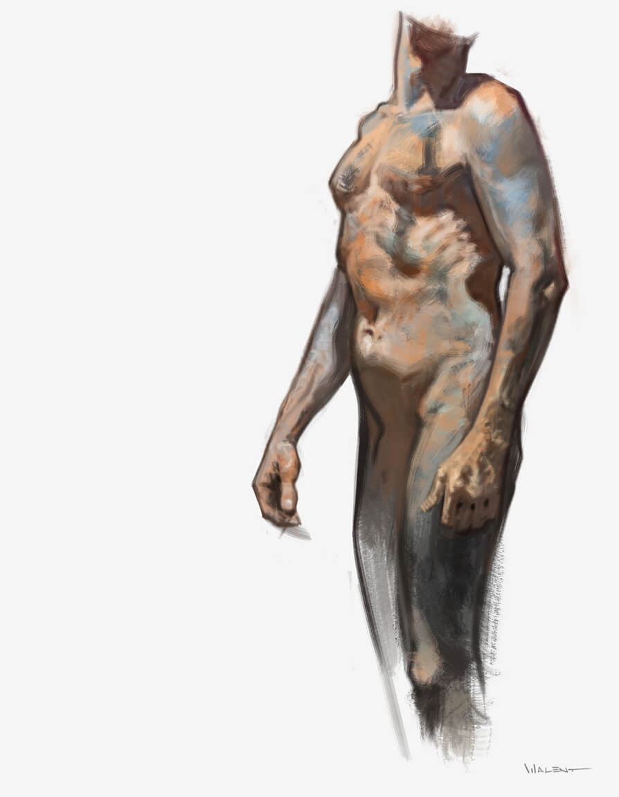 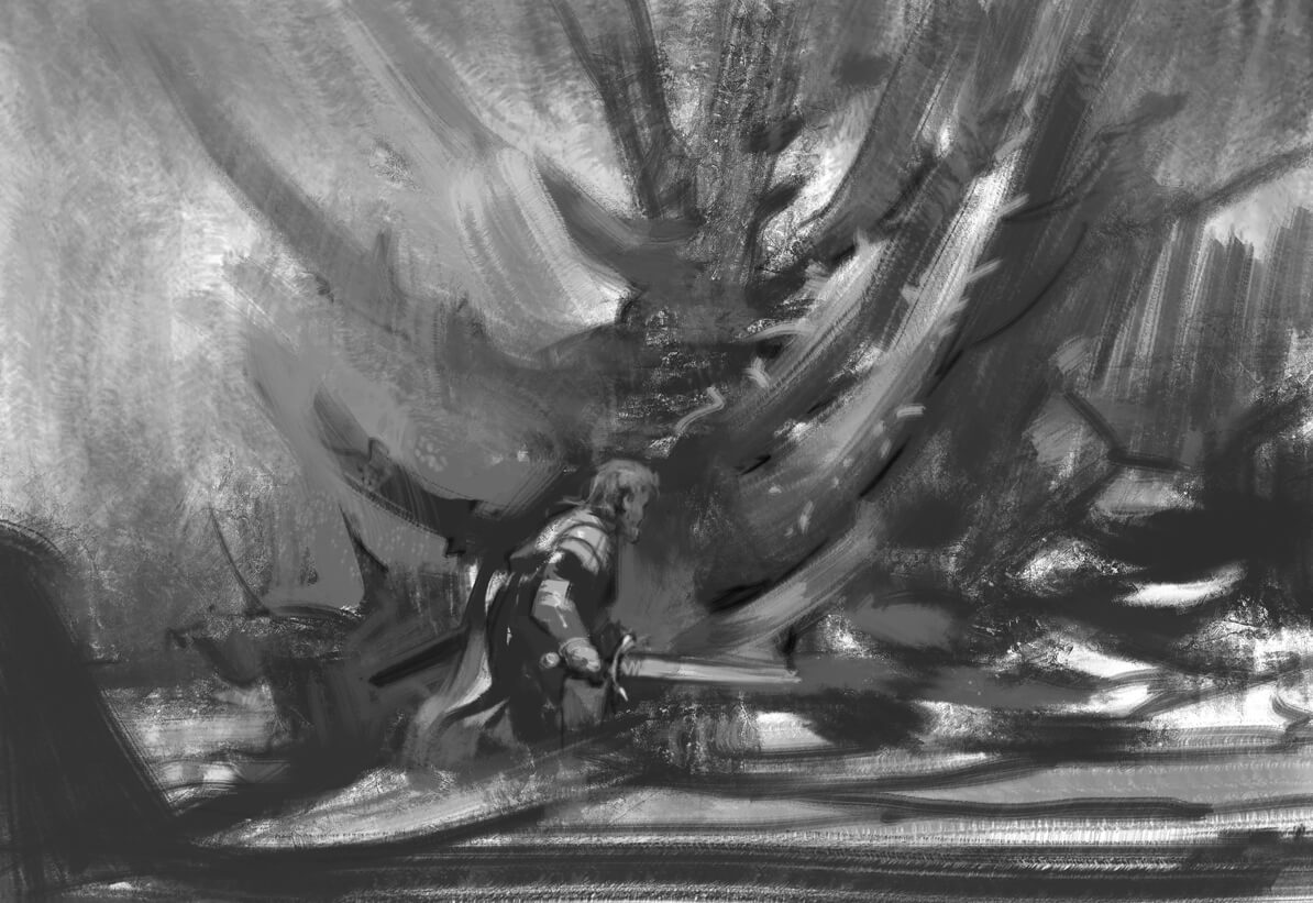 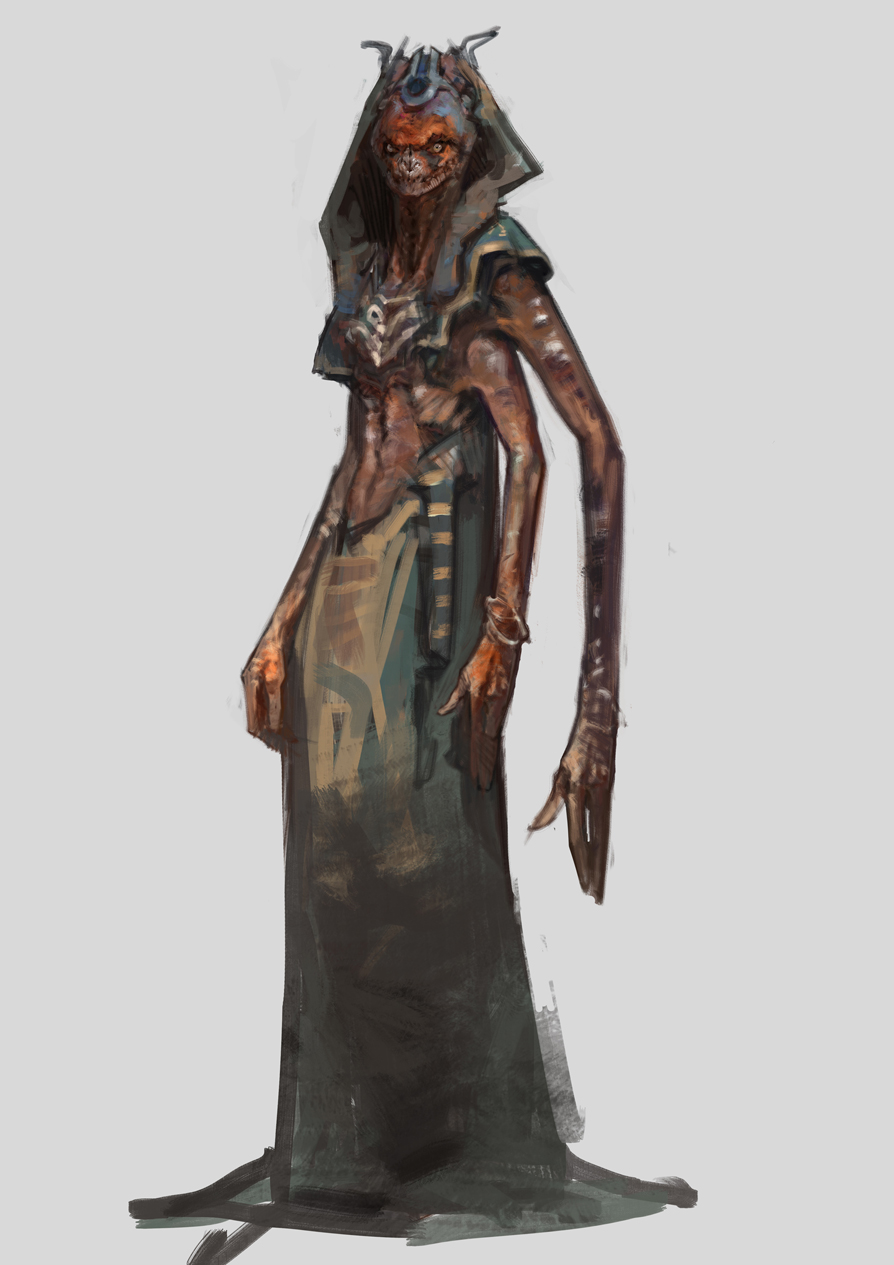
09-05-2016, 05:01 AM
Amazing sketchbook! I have to ask how did you learn to render stuff and get such variety in texture? Been struggling with my own work, and your stuff just keeps me impressed and motivated!
09-05-2016, 08:51 PM
Thanks Hobitt!
There are a few tips I can think of, but of course, you're also gonna hear the most common answer: lots of practice! So just like that, choose a brush and learn how to use it. I've been practicing my brush for 3 years and only in the last year I understood the importance of canvas size. The brush I commonly use reacts very bad on low resolution, so I just have to work big if I want any details. So I don't usually work under 6k px on the long side. Another important thing is study clever, think about what shapes you're trying to paint. I find that if I don't think about it too much and I keep rendering mindlessly I get that photo look, where brush strokes, marks and textures are all gone and it just looks too close to the picture I was studying. It happened to me recently, I was practicing portraits, and I was so focused on rendering stuff up close that at some point I realized I overworked it and all the beautiful energy in the sketch stage is gone. So now I try to keep that in mind and be aware of the danger of overworking it and making it look lifeless. Another interesting concept that helps with the texture is mark making, meaning that you try to plan each brush stroke to describe the exact shape you need. Something you often see in hatching on form. Form change = change of hatch direction. You can look at Durer, a wonderful example of mastering form hatching. This goes hand in hand with simplification. Learn to reduce complicated shapes to simple geometrical shapes. You can look up Peleng's work, he got me really inspired to work on my mark making even though my style is quite different. But the brush I use most often is from his set. Steve Huston is still my no. 1 inspiration though. Yeah, those are some of the tips I could think of, hope it helps! |
|
« Next Oldest | Next Newest »
|