03-28-2017, 11:50 PM
Really nice story telling and style. can't wait to see more!
Sketchbook : http://crimsondaggers.com/forum/thread-7501.html
|
Them sketchies
|
|
03-28-2017, 11:50 PM
Really nice story telling and style. can't wait to see more!
Sketchbook : http://crimsondaggers.com/forum/thread-7501.html
04-03-2017, 03:46 AM
Leaving on a month long trip where I won't have access to my usual digital setup. Gonna be tons of...fun.
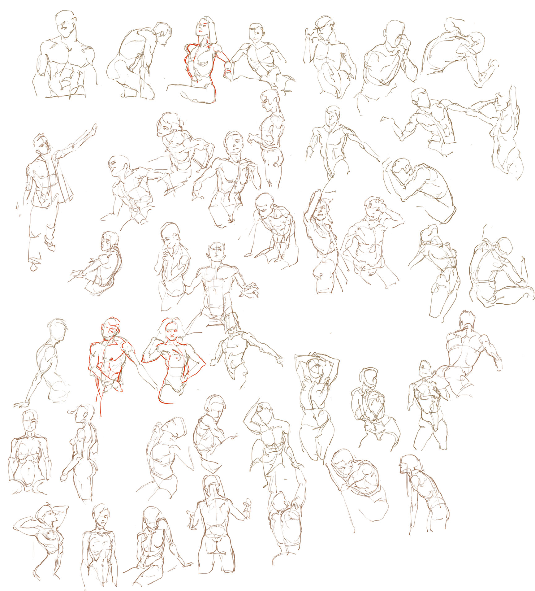 What better way to apply the studies of the lower torso than by painting the upper torso? 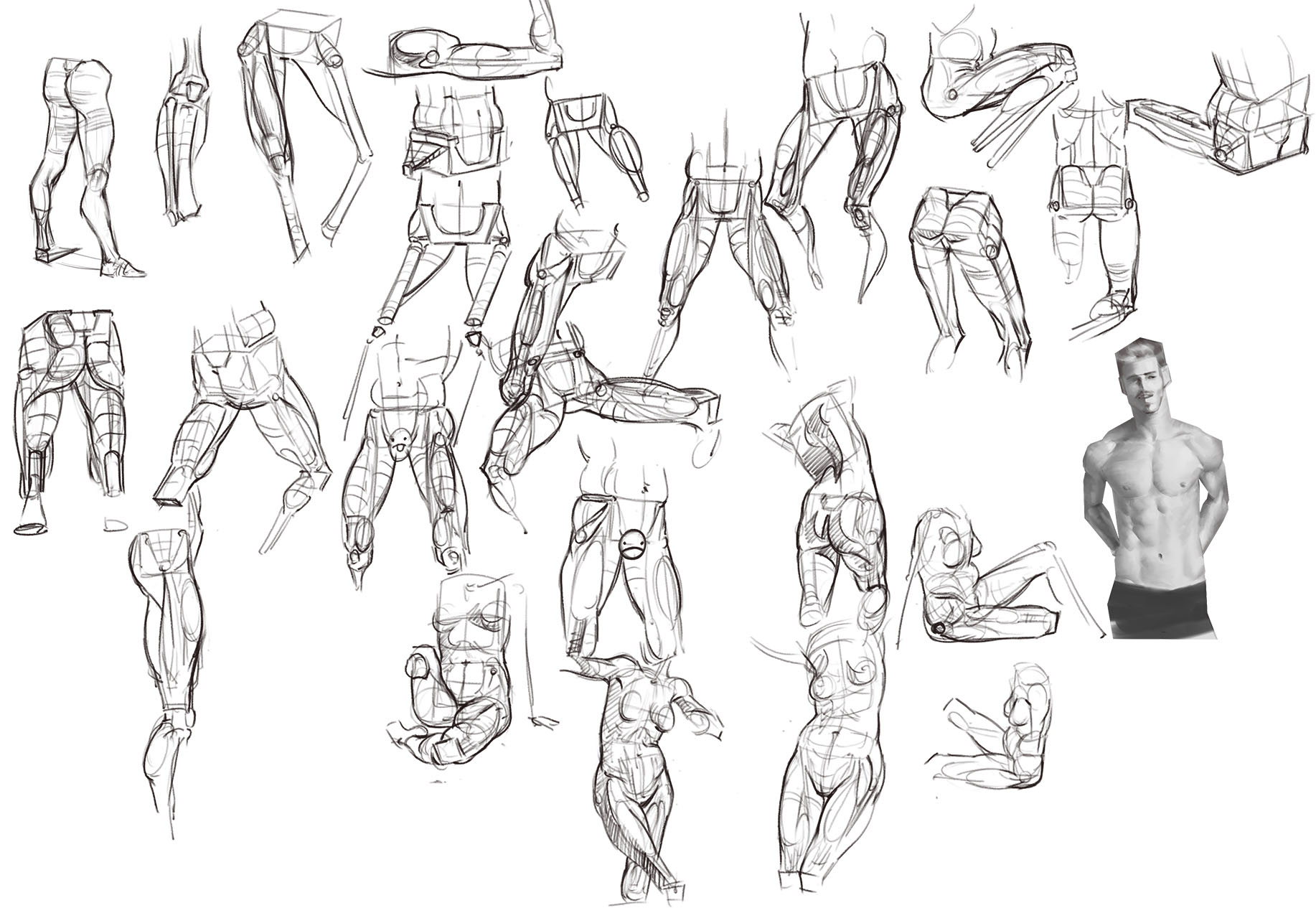 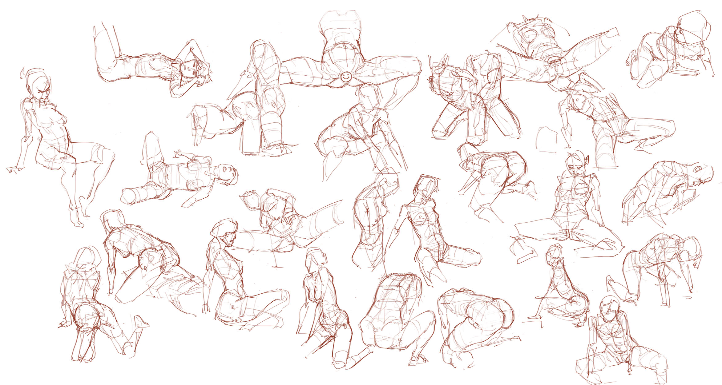 One of those coloring using layer modes attempts. It's so convenient for making adjustments on the spot but it's not as appealing compared to full-painterly imo. 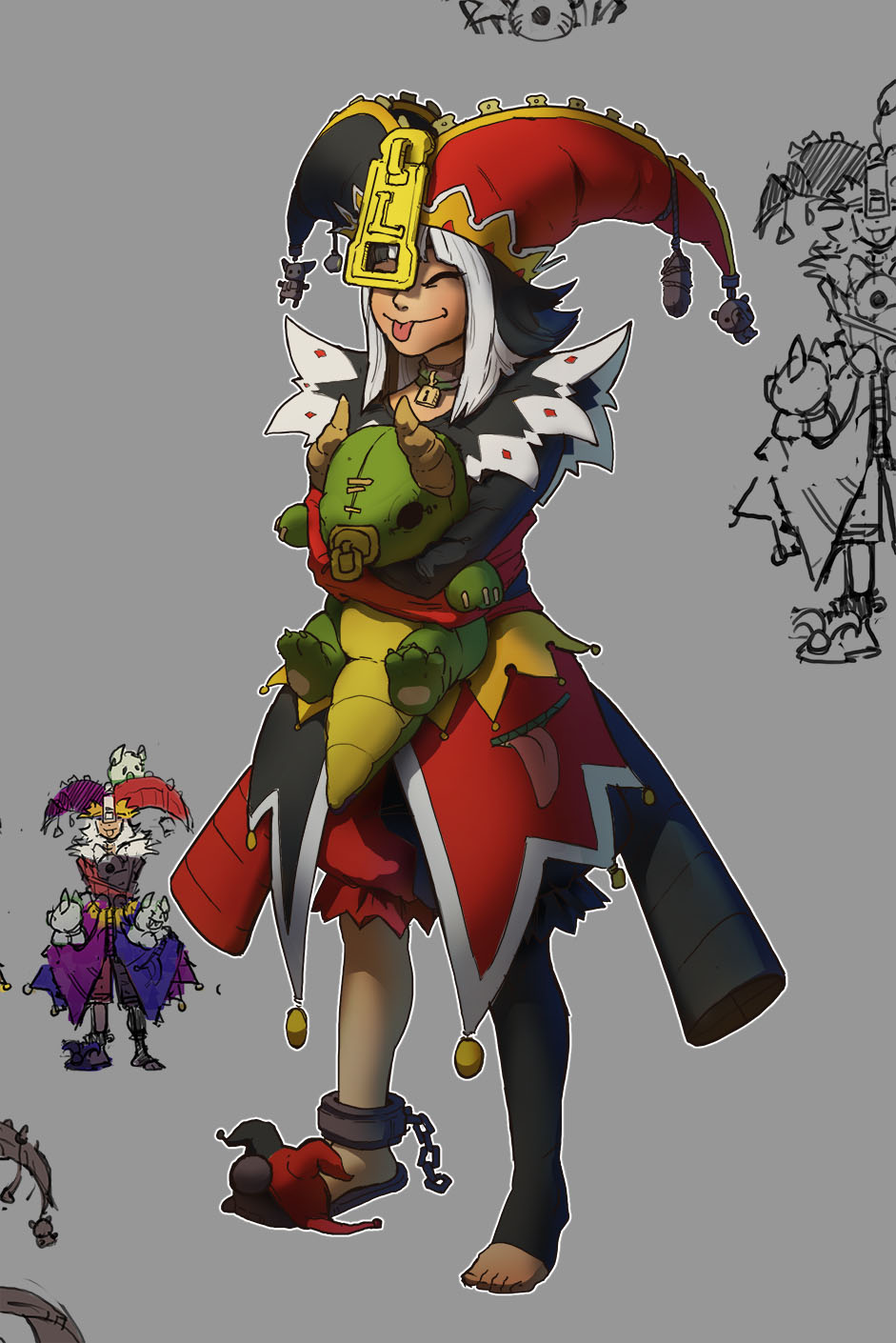 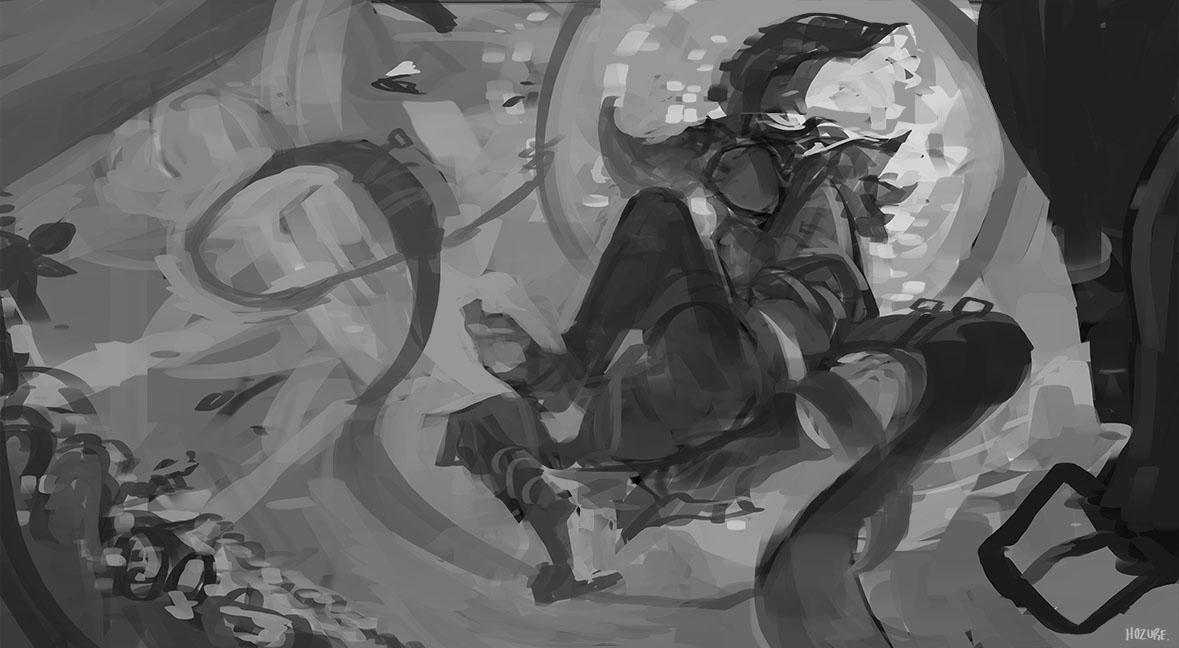 WIP on the splash art for Lhettie. Trying to stick in some fake dynamic perspective. Background's still wonky.
04-03-2017, 05:25 AM
diggin so far! you can fake the perspective sometimes as long as it isn't glaringly obvious.
70+Page Koala Sketchbook: http://crimsondaggers.com/forum/thread-3465.html SB
Paintover thread, submit for crits! http://crimsondaggers.com/forum/thread-7879.html [color=rgba(255, 255, 255, 0.882)]e owl sat on an oak. The more he saw, the less he spoke.[/color]
04-12-2017, 12:25 PM
hey! really digging your illustrations!
the colors and lighting are just beautiful *0* I agree with you regarding the layer modes. I much prefer the painterly look as well ;)
04-13-2017, 02:56 AM
Man your stuff looks Awesome :D your illustrations and your composition is beautiful as well
04-21-2017, 07:57 PM
@Fedo: "I don't need to know what I'm doing, as long as it looks like I know what I'm doing!"
@Voodoo: Hear, hear. Thanks man. I do feel bad that I can't force myself to like layering modes despite really wanting to. Same goes for lineart. @allen: 'Preciate it! Been stuck in Taiwan for a while with no access to my usual setup, which means back to the ol' sketchbook. No real subject in mind, just being really conscious of my strokes and visualizing. Also out of nowhere, I fucking love goats now. Oh my god, trying to upload these through an iPad is the absolute worst experience. Please pardon the shoddy stitching and camerawork. I'll just wait til I get back to upload the rest. It's not worth it.
04-22-2017, 12:27 AM
Great sketches Hozure :). You must have so much patience to be able to include so much detail - especially in the meeting sketch and the random street sketch.
Keep posting!
“Today, give a stranger one of your smiles. It might be the only sunshine he sees all day.” -- H. Jackson Brown Jr.
CD Sketchbook
06-22-2017, 08:24 PM
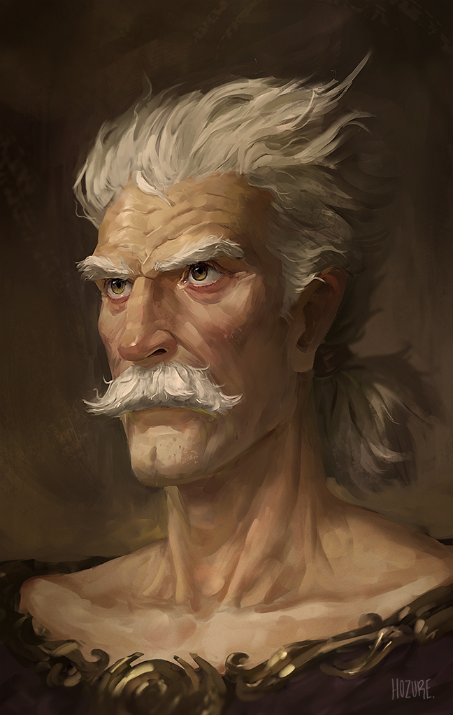
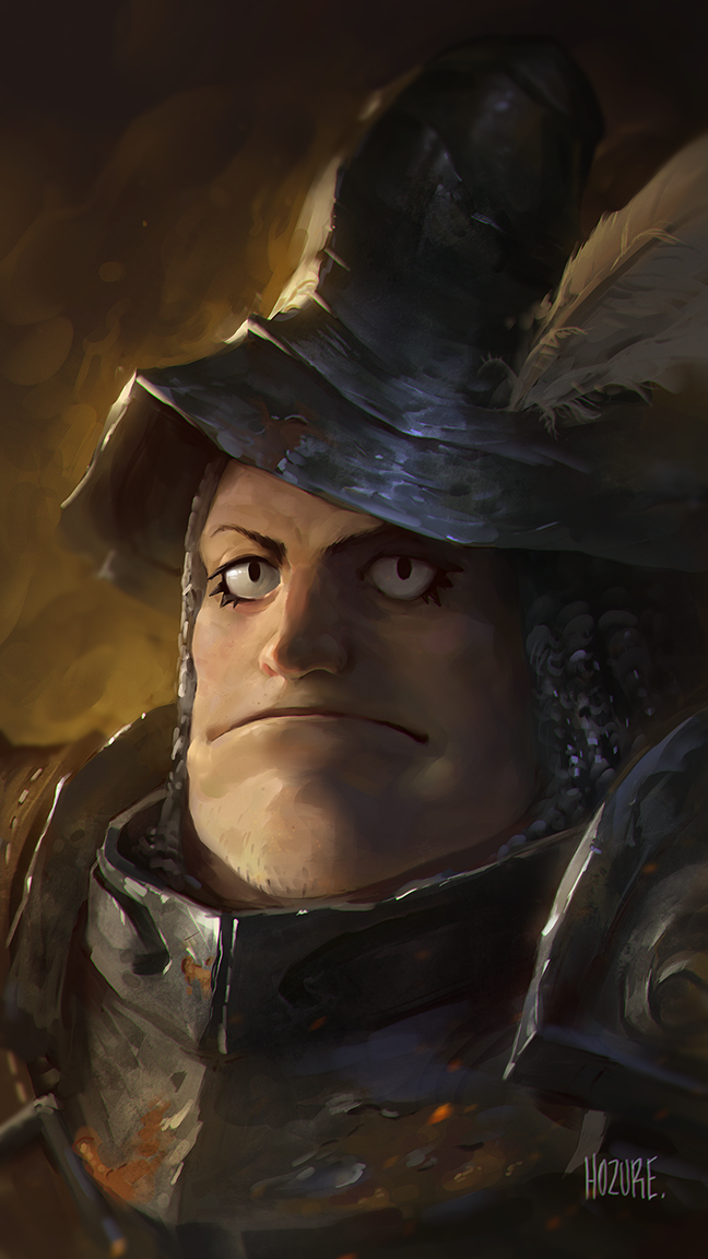
The frustration continues. I feel like my inability to produce satisfactory lineart causes an inconsistent painting style each time.
06-22-2017, 11:41 PM
Awesome, I dig the way you painted the old man's feathures and lighting/metal material on the 2nd one. Oh and brushwork.
Frustration is something we all encounter I think. I'm not very much familiar with your artwork but based on what I rememer, seems like you improved :)
06-23-2017, 01:07 AM
Hold up. The old man is from Final Fantasy 5 right?
Anyways, your knowledge on facial structure shines through all of these portraits, even the knight (who I believe is suppose to be ultra stylized in his game so kudos to making something look so real and fiction at the same time) Keep up the good work!
06-25-2017, 08:36 PM
I thought that was the old man from one punch man lol.
I don't think the painting style seems inconsistent, it's probably the design of the characters you're basing it off that's throwing you off, I don't know much about the old man but that character from ff9 had a pretty cartoony design and you captured it well here, the old man on the other hand looks a lot more based in realism. |
|
« Next Oldest | Next Newest »
|