Posts: 740
Threads: 1
Joined: Mar 2017
Reputation:
11
(08-01-2017, 11:00 PM)Anton_Fort Wrote: I went through you sb and I saw a lot of pictures here but I didn't see any studies that could help you. You're trying to do very complex things without any basic knowledge of it. You draw faces, but you don't know the structure of it, how a face looks like in different angles, how light works, how perspective works. Draw simple things, study fundamentals. And don't do studies just because you need to do it. Try to understand what you need and then do it. There is a hell lot of info on the internet. Dig in, try hard, fail, try more.
Yea I agree with everything you said. I've never really done proper studies meaning I've never spend a whole day just drawing a specific type of rock to learn how it works or studying a specific type of lighting. I'm not sure why but I normaly start doing a photo study of some random place I find on google maps and when it starts to look like the picture instead of rendering it I start using it as a reference. So its kind of like doing a study and then drawing over the study from imagination. Idk that's how I go about doing studies but this approach doesn't work with everything. English is not my first language so its hard to explain things but I'm going to try and do more real studies from now on. Drawing people is my greatest weakness because I've always like'd environment art more than character but you can't have one without the other. I'm just gonna keep trying and see what happens
![[Image: tumblr_ou0jg4LU3v1suoh70o1_1280.jpg]](https://68.media.tumblr.com/53f0f692a5b51aae7eaea69cf9bc958b/tumblr_ou0jg4LU3v1suoh70o1_1280.jpg) ![[Image: 1182f4810f.jpg]](https://puu.sh/wXNso/1182f4810f.jpg)
Posts: 740
Threads: 1
Joined: Mar 2017
Reputation:
11
Posts: 11
Threads: 2
Joined: May 2017
Reputation:
0
(07-19-2017, 02:33 AM)Coinhero Wrote: When I save an image to jpeg all the dark areas become pure black while it looks good in photoshop. What should I do?
try saving as PNG-24 so you won't lose quality
Posts: 740
Threads: 1
Joined: Mar 2017
Reputation:
11
Posts: 740
Threads: 1
Joined: Mar 2017
Reputation:
11
I'm happy with this ![[Image: tumblr_ou5zrtFPlJ1suoh70o1_1280.jpg]](https://68.media.tumblr.com/f3720cbb718e57dbcaf5c78709a4b0ec/tumblr_ou5zrtFPlJ1suoh70o1_1280.jpg)
Posts: 352
Threads: 2
Joined: Dec 2016
Reputation:
22
Damn man zou are improving so much its crayz! The colors on zour last piece are bautiful and vibrant.
Posts: 740
Threads: 1
Joined: Mar 2017
Reputation:
11
I find painting buildings or just hard surface in general is very hard for me, simplifying forms that are simple to begin with feels very odd. I'm trying to figures stuff out. ![[Image: CKVJ7tB.jpg]](http://i.imgur.com/CKVJ7tB.jpg)
Posts: 29
Threads: 1
Joined: Apr 2017
Reputation:
0
Even though it's not matching your natury landscapes, it also isn't looking half bad though. Maybe it's just that perspective get's a lot more punishing in hard surface stuff? Keep going, good work mate!
Posts: 740
Threads: 1
Joined: Mar 2017
Reputation:
11
This is very exhausting to paint I probably not going to work on this anymore. I'm going to try and stick with the desert theme for the next thing I draw (unless I can't come up with anything interesting). ![[Image: tumblr_ou9sk0ZdWg1suoh70o1_1280.jpg]](https://68.media.tumblr.com/fe77d1ecab2803a1bcbe819cc1e9adf7/tumblr_ou9sk0ZdWg1suoh70o1_1280.jpg)
Posts: 48
Threads: 2
Joined: Jul 2017
Reputation:
6
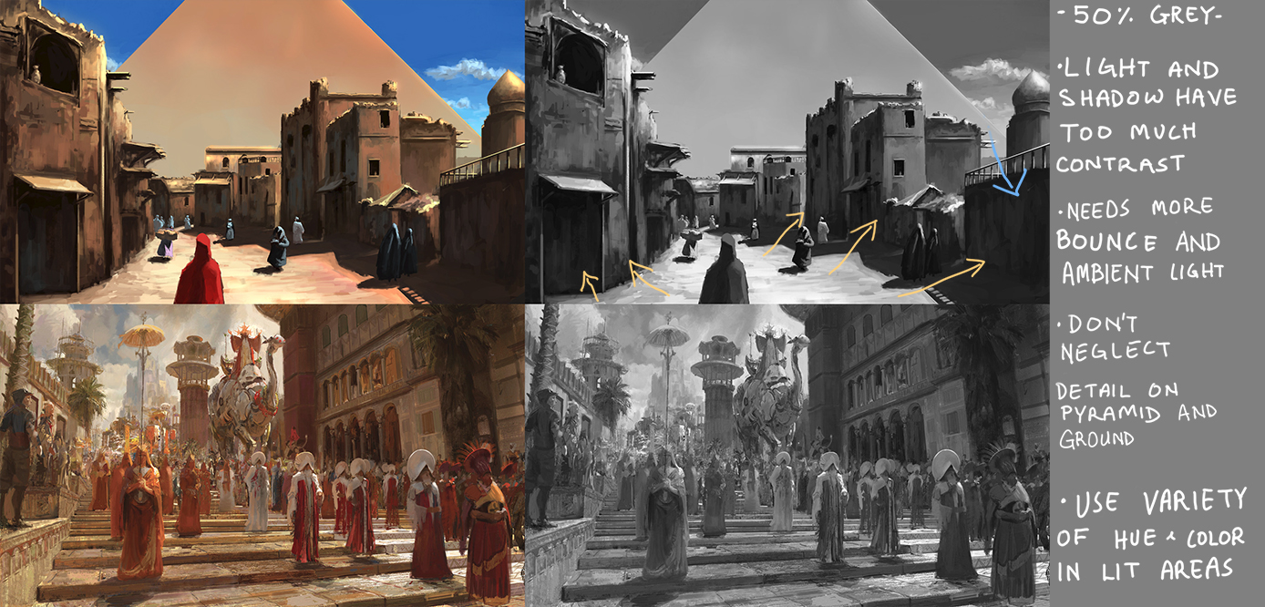
I'm blown away by the diversity of environments your tackling. The compositions in all of these check out nicely, great job so far. It's good you're getting exhausted, that means you're forcing your brain to adapt and improve through challenging pieces. Here are a few things I've noticed in your latest piece when compared to a similar scene painted by Craig Mullins(?) (Taken from Karakter Design Studio's Artstation):

Sorry for the bad handwriting. But other points to consider is how bright the sun is, making the second image awash in a lighter value. There's also hardly any pure black in the second painting because of the intensity of the bounce and ambient light. It might be daunting to compare personal work to the top artists, but seeing the areas that differ and working to close those gaps will get you very far. I hope these points will give you some ideas to push further, keep up the fantastic paintings!
Posts: 740
Threads: 1
Joined: Mar 2017
Reputation:
11
(08-07-2017, 03:48 AM)ubem Wrote: I'm blown away by the diversity of environments your tackling. The compositions in all of these check out nicely, great job so far. It's good you're getting exhausted, that means you're forcing your brain to adapt and improve through challenging pieces. Here are a few things I've noticed in your latest piece when compared to a similar scene painted by Craig Mullins(?) (Taken from Karakter Design Studio's Artstation):
Sorry for the bad handwriting. But other points to consider is how bright the sun is, making the second image awash in a lighter value. There's also hardly any pure black in the second painting because of the intensity of the bounce and ambient light. It might be daunting to compare personal work to the top artists, but seeing the areas that differ and working to close those gaps will get you very far. I hope these points will give you some ideas to push further, keep up the fantastic paintings!
Wow thanks for all the great feedback it's very helpful! I noticed that the contrast was way too strong in that drawing but I could't figure out how to fix it.It looked like there was a brown fog covering everything and in order to fix that I increased the contrast which fixed the problem but made another one. When it comes to bounce light I"m struggling with so many things at once that I just forget about it. For the pyramid and ground I was just lazy and wanted to get it over with and start a new painting. I'm going to try and make my values better for the next one.
Posts: 740
Threads: 1
Joined: Mar 2017
Reputation:
11
For today I wanted to make a second Egyptian themed painting where I show more of a bird eyes view because I've never done anything like that. I spend a long time looking at reference and my sketch changed a lot. Most of the super early stuff I deleted but here is an example of an early sketch before I decided to go with a 2 point perspective and change things around. ![[Image: yagsENF.jpg]](http://i.imgur.com/yagsENF.jpg)
I like the guy in the foreground I think he adds more of a story to the image but I'm not sure how to use him in the final version. ![[Image: Kd7X6VS.jpg]](http://i.imgur.com/Kd7X6VS.jpg)
it took a while till I got to this point but I'm happy with how the sketch turned out. I'm not sure how to paint this but I'm going to try and find some reference to help out.
Posts: 740
Threads: 1
Joined: Mar 2017
Reputation:
11
I'm being forced to learn a lot of new things with this one. ![[Image: XrAY0Wl.jpg]](https://i.imgur.com/XrAY0Wl.jpg)
also did some oil painting for fun
Posts: 740
Threads: 1
Joined: Mar 2017
Reputation:
11
I wasn't sure what to do with the floor they are standing on, at first I tried making a lot of carpets but it was kind of boring and drawing patterns sucks. Then I thought that it would be cool to have the floor be a giant reflective surface like a mirror, a couple of hours later this came out. ![[Image: tumblr_oufdqynoca1suoh70o1_1280.jpg]](https://68.media.tumblr.com/5915b47d0b03971d9acd8622e09c4173/tumblr_oufdqynoca1suoh70o1_1280.jpg)
There's a lot of things in this that I'm doing for the first time but I had a lot of fun the entire time. I'm thinking of doing one more Egyptian themed painting.(too lazy to fix the tangents)
Posts: 740
Threads: 1
Joined: Mar 2017
Reputation:
11
Don't know what happened today I just didn't do anything. I'm gonna go out and socialize with some friends to get my humanity back. ![[Image: MqDs5cE.jpg]](http://i.imgur.com/MqDs5cE.jpg)
Posts: 740
Threads: 1
Joined: Mar 2017
Reputation:
11
Today is my birthday so I don't have much time to paint, I need to wash my car, go out with friends bla bla bla excuses and stuff. ![[Image: A4X2ndJ.jpg]](http://i.imgur.com/A4X2ndJ.jpg)
Posts: 27
Threads: 2
Joined: May 2017
Reputation:
0
Wow, you have some amazing compositions! And seeing your previous work, you're improving really fast :D keep goin' dude!
Posts: 352
Threads: 2
Joined: Dec 2016
Reputation:
22
Happy Birthday! Enjoy ittt <3
Posts: 740
Threads: 1
Joined: Mar 2017
Reputation:
11
Tnx I had a lot of fun ![[Image: tumblr_ouksu4pFPT1suoh70o1_1280.jpg]](https://68.media.tumblr.com/431b2a5d980d0c2530b48311fe821bc8/tumblr_ouksu4pFPT1suoh70o1_1280.jpg)
Posts: 740
Threads: 1
Joined: Mar 2017
Reputation:
11
I want to make this a very bright scene and I'm not sure how to do that in a pleasing way.
![[Image: pacLcHb.jpg]](http://i.imgur.com/pacLcHb.jpg)
|
![[Image: tumblr_ou0jg4LU3v1suoh70o1_1280.jpg]](https://68.media.tumblr.com/53f0f692a5b51aae7eaea69cf9bc958b/tumblr_ou0jg4LU3v1suoh70o1_1280.jpg)
![[Image: 1182f4810f.jpg]](https://puu.sh/wXNso/1182f4810f.jpg)


![[Image: Ym0eoix.jpg]](http://i.imgur.com/Ym0eoix.jpg)
![[Image: fi6WDSf.jpg]](http://i.imgur.com/fi6WDSf.jpg)
![[Image: tumblr_ou5zrtFPlJ1suoh70o1_1280.jpg]](https://68.media.tumblr.com/f3720cbb718e57dbcaf5c78709a4b0ec/tumblr_ou5zrtFPlJ1suoh70o1_1280.jpg)
![[Image: CKVJ7tB.jpg]](http://i.imgur.com/CKVJ7tB.jpg)

![[Image: tumblr_ou9sk0ZdWg1suoh70o1_1280.jpg]](https://68.media.tumblr.com/fe77d1ecab2803a1bcbe819cc1e9adf7/tumblr_ou9sk0ZdWg1suoh70o1_1280.jpg)

![[Image: yagsENF.jpg]](http://i.imgur.com/yagsENF.jpg)
![[Image: Kd7X6VS.jpg]](http://i.imgur.com/Kd7X6VS.jpg)
![[Image: XrAY0Wl.jpg]](https://i.imgur.com/XrAY0Wl.jpg)
![[Image: tumblr_oufdqynoca1suoh70o1_1280.jpg]](https://68.media.tumblr.com/5915b47d0b03971d9acd8622e09c4173/tumblr_oufdqynoca1suoh70o1_1280.jpg)
![[Image: MqDs5cE.jpg]](http://i.imgur.com/MqDs5cE.jpg)
![[Image: A4X2ndJ.jpg]](http://i.imgur.com/A4X2ndJ.jpg)
![[Image: tumblr_ouksu4pFPT1suoh70o1_1280.jpg]](https://68.media.tumblr.com/431b2a5d980d0c2530b48311fe821bc8/tumblr_ouksu4pFPT1suoh70o1_1280.jpg)
![[Image: pacLcHb.jpg]](http://i.imgur.com/pacLcHb.jpg)