Posts: 83
Threads: 2
Joined: Apr 2020
Reputation:
4
(06-03-2020, 08:50 AM)Fedodika Wrote: I think most of his parts are too similar in size like his knife blade is almost the same size as his head, and almost cuts on the same horizontal line of the canvas as his head. Id suggest making his blade much longer to contrast the shapes overall.
Also his pose is silly, but doesnt feel too involved. I think it kinda works for the cartoon style, but ultimately he could be way more engaged in what hes doing. Its like hes doing 4 things at once? hes kicking his legs out, hes throwing a green ball, hes screaming, and hes got a sword. Pick one thing and make the image about that action. Where's Waldo is a book where theres just too much to look at, it doesnt feel powerful gesture wise.
https://i.redd.it/f0hdwidwpmi31.jpg
See how his whole body is engaged in the action, always think of that when making a dynamic pose! Always appreciated!
Looking at it now, there really is quite a lot of shape repetition here. Probably shoulda tweak the actual design after pulling it from my sketchbook.Agree with the pose too- good analogy.
I do kinda like this guy, so I was thinking of tackling another painting of him. Maybe this time around I'll try to tighten up the design and find a more purposeful and unified action/pose.
-
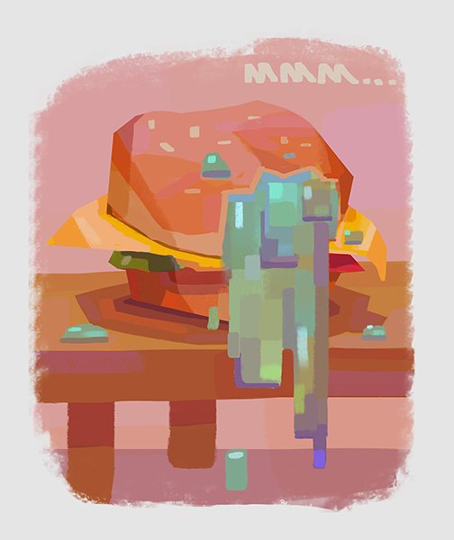
A friend recently told me about Peleng/Sergey's new speedpainting forum, so I thought I'd try out one of his prompts and do my first "speedpaint" in a few years haha. Hoping in the coming days I can make an account there and share more there if I do (hopefully) make a habit out of it! But honestly, just posting updates on this site can be hard some days just because how busy I've been, but we'll see.
Anyways, this prompt was bitter truth.

Posts: 83
Threads: 2
Joined: Apr 2020
Reputation:
4
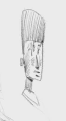
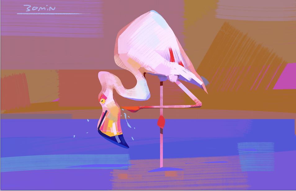
Today's class. Still figuring out capturing the gesture in the longer poses

Posts: 83
Threads: 2
Joined: Apr 2020
Reputation:
4
Posts: 240
Threads: 8
Joined: Dec 2012
Reputation:
39
you have very nice shapes and colors
Posts: 83
Threads: 2
Joined: Apr 2020
Reputation:
4
Wow, I haven't updated my thread in about a year! Hope everyone here has been well. I've since gotten a job at a local studio and have been suuuper busy with that- and unfortunately without as much time for personal work as i used to have. I'm starting to feel my skills are plateauing, so maybe it's time to really get back in to actively learning and studying :)
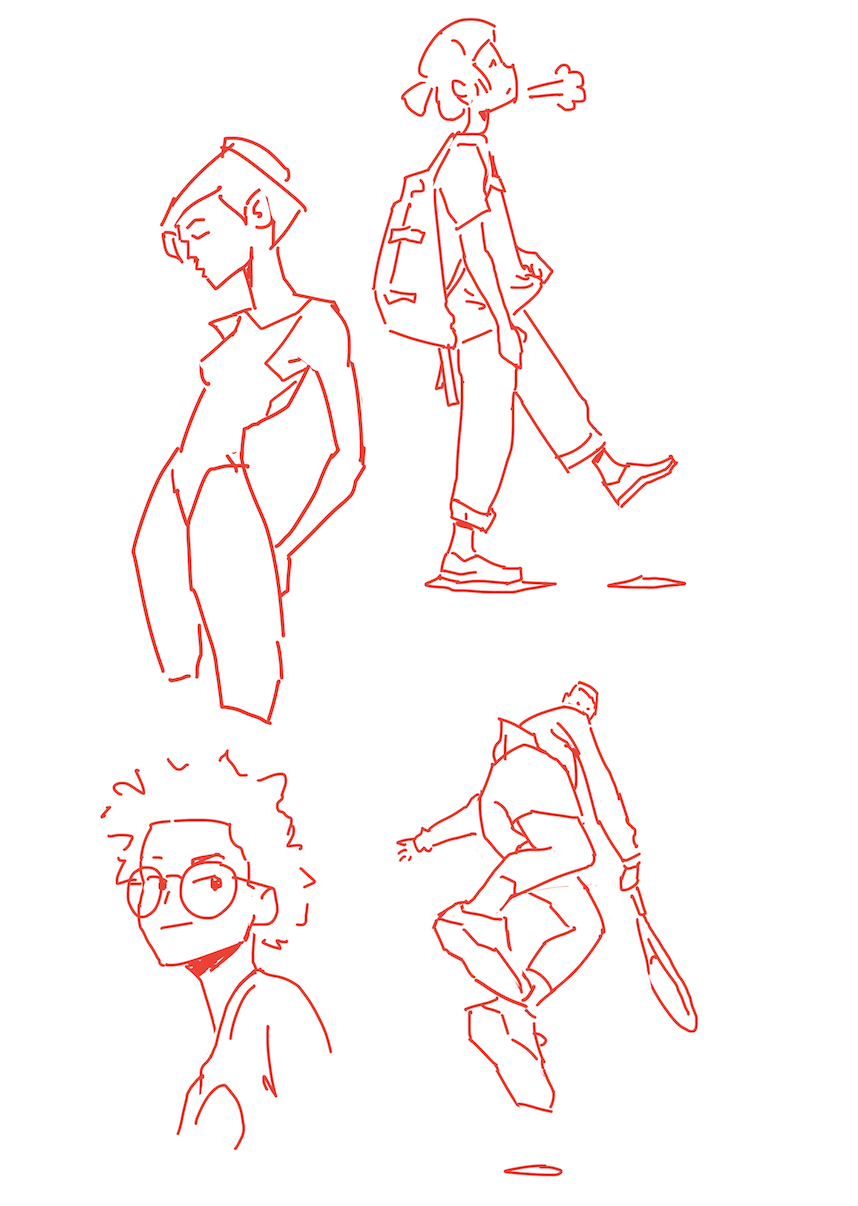
Here's a lil page of some drawings i've done over the past few months. it's certainly not all of them, but hopefully can serve as an update on where my art's been

Posts: 83
Threads: 2
Joined: Apr 2020
Reputation:
4
older gesture class

Posts: 83
Threads: 2
Joined: Apr 2020
Reputation:
4
Some of my more recent gesture classes along with today's... these are not too good. I need to get back into it and brush up on my Mattesi which helped me out so much earlier on


Posts: 304
Threads: 1
Joined: Aug 2020
Reputation:
14
Dig the choice of colors in your works, nice!
Posts: 83
Threads: 2
Joined: Apr 2020
Reputation:
4
Posts: 83
Threads: 2
Joined: Apr 2020
Reputation:
4
(07-04-2021, 05:54 PM)one_two Wrote: Dig the choice of colors in your works, nice! Appreciate it!
Posts: 83
Threads: 2
Joined: Apr 2020
Reputation:
4
Beep boop. some of tonight's stuff.
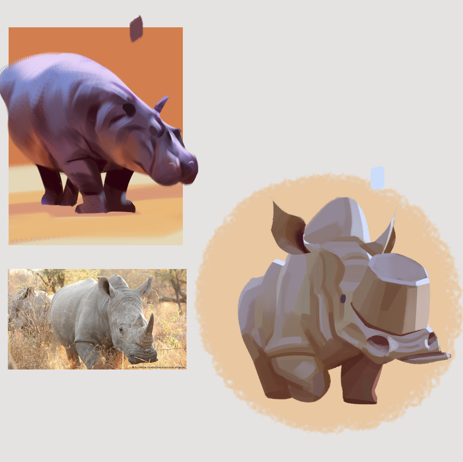
Spitpaint study of a Ford bronco. Sometimes (especially at the beginning of a sesh) i hit a wall and don't know what do do, or where to even start. The typical "blank white page paralysis" thing yknow? Seems like these types of loose comfort-zone studies are a great way for me to get my head in the right space.

Wokin on my linework, design, and general neatness lol


Mega comfort zone paintiness from the other night

Wrapped this mario kart fanart up earlier today. This seems to be another example fo me rushing the lines/inks phase and jumping into paint a bit too early. Luckily, most things that arent mario here ended up being motion-blurred lol so i kinda lucked out with most details being unresolved anyways. For future reference, I'd go back in and maybe tweak his complexion and uuh eyes a bit too.
I also realized a lot of my pieces are pretty stagnant and dont have much motion ever happening, so I'm trying to tackle that too from now on.

Posts: 460
Threads: 10
Joined: Mar 2016
Reputation:
64
The colors in your latest piece are amazing, but I feel like the composition and placement of elements could use some work. I had a hard time seeing how the road turns and continues to the left in the picture (to me, it almost seems like Mario is going to run off the road).
Nice expressions and life in the piece! I really dig your style a lot!
Posts: 42
Threads: 1
Joined: Jul 2021
Reputation:
3
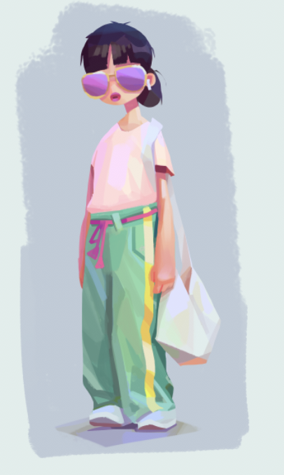
The way you simplify color, value and shape is really inspiring. The way you render clothing for example. :)
Great progress through out the sketchbook, looking forward to more!
Posts: 1,076
Threads: 4
Joined: Jan 2016
Reputation:
43
Loving your style; Your colors in particular are very impressive, always very lush and unique. Keep it up!
Posts: 83
Threads: 2
Joined: Apr 2020
Reputation:
4
(09-07-2021, 02:11 AM)Zorrentos Wrote: The colors in your latest piece are amazing, but I feel like the composition and placement of elements could use some work. I had a hard time seeing how the road turns and continues to the left in the picture (to me, it almost seems like Mario is going to run off the road).
Nice expressions and life in the piece! I really dig your style a lot!
That's a great note- i knew something looked off with the composition, but couldn't quite put my finger on it. I think that's something i should have planned out earlier while i was sketching out the piece. I think it explains the lack of depth between the foreground and background too.
Thanks so much!
(09-12-2021, 08:53 PM)Midnight Rambler Wrote: The way you simplify color, value and shape is really inspiring. The way you render clothing for example. :)
Great progress through out the sketchbook, looking forward to more!
Appreciate the comment! :) thank you
(09-19-2021, 07:38 PM)cgmythology Wrote: Loving your style; Your colors in particular are very impressive, always very lush and unique. Keep it up!
Wow thank you :D I'm really stoked that atleast a few peeps are liking and inspired by my sketchy brain dumps haha!
Posts: 83
Threads: 2
Joined: Apr 2020
Reputation:
4
Posts: 304
Threads: 1
Joined: Aug 2020
Reputation:
14
I like your way of breaking down form into simpler shapes. Great work!
Posts: 1,076
Threads: 4
Joined: Jan 2016
Reputation:
43
Loving your style as always. I'm impressed with your color choices as well, you take some great artistic liberties even when working from reference which is very impressive! Keep it going!
Posts: 83
Threads: 2
Joined: Apr 2020
Reputation:
4
more brain dumps incoming!
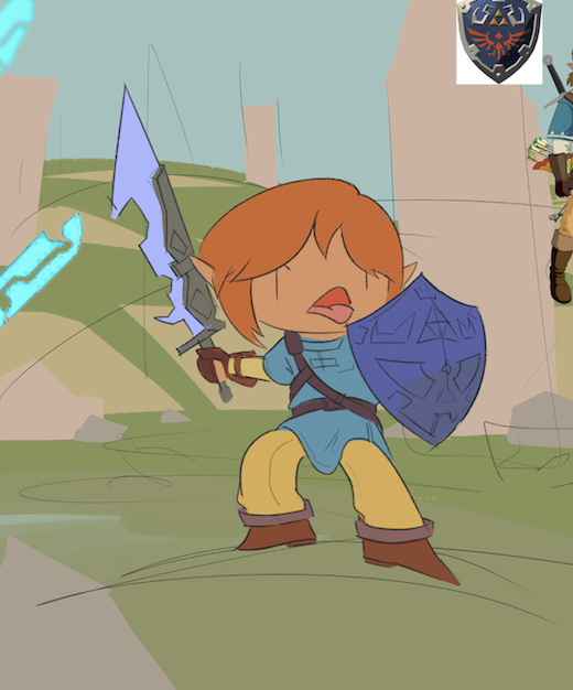
I was sketching link from Zelda a couple nights ago and figured i'd render him out a bit. Here's progress from the past few days:
Started out as this quick idea... now that I look back on it, i'm not a big fan of the pose- pretty sure i've used the same exact one a couple of times before. It's sort of action-y but still not very dynamic. uuuh whatevs lol too late now

Tight lines. This is a step in my process i typically neglect quite often!! Happy with this

Base tones

Slapping down some light

Here's how it currently looks. Thinking of ditching the hard-light daytime scene and going for nighttime so I can really emphasize his guardian sword's glow :) The night background could be fun to paint as well.

Other stuff


Also thank u guys for the kind comments. I super appreciate it and it helps motivate me to study more!
Posts: 3,352
Threads: 37
Joined: Aug 2013
Reputation:
234
Personally i find the sword shape in the link piece to be to chaotic i would suggest something more symmetrical. Since the shape are so chaotic perhaps you could turn the piece it into a shadow link piece...
|
