05-04-2020, 06:28 AM
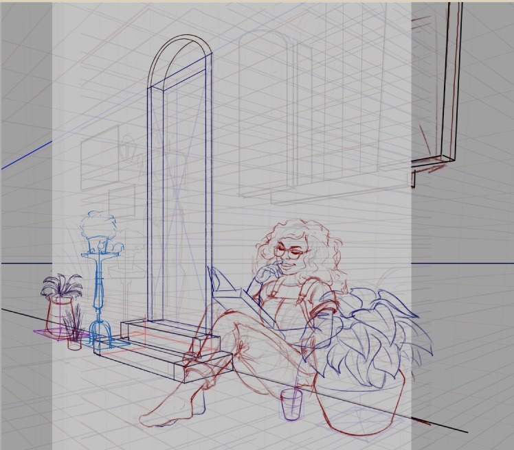
drawing a new personal piece

|
Tfantoni's Sketchbook
|
|
05-04-2020, 11:28 PM
Looking good, perspctive looks ace and the composition is fairly strong. The figure is well done, the expression is particular is very natural and interesting, very much looking forward to seeing this one develop further!
05-15-2020, 01:46 PM
05-15-2020, 02:44 PM
The last sketch is looking quite nice, but I think you need to keep in mind more the kinetic forces of the image. She is moving very quickly into one direction and swinging over an obstacle with her leg. This should show more in the image (Her body should twist and "throw" the leg over the obstacle). Try to show this in the foreshortening of the leg.
Also, making "countermoves" into the other direction with her hair, any lose clothing etc can really help give the impression of quick movement. I made this very quick overpaint. Hope it helps :) 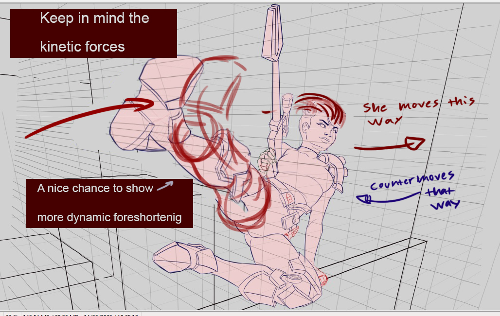
05-16-2020, 09:09 AM
Really liking the piece so far, the drawing is cool. Like zorrentos mentioned, that one is a good opportunity to show some nice foreshortening, and it doesnt necessarily need to be what he drew over, is a good one, but point is you can play with that foreshortening more, play with t he angles maybe make that foot even bigger.
PORTFOLIO http://www.artstation.com/artist/Jeso
Sketchbook: http://crimsondaggers.com/forum/thread-2586.html
05-16-2020, 11:29 AM
I am not a big fan of the weapon due to how i see it as subliminally point out of the composition.Also be mindful that the more an object approch an edge the more it tend to mess with the viewer.It ok to have object that are out of frame but try to avoid object that create tangente with the frame itself it a big no no in many artist book.Also avoid line going toward directly throught one of the four corner of the frame it not the case here but i just want to mention it as a bonus tips.For me if anything here what i see as an opportunity is to utilize the concept of foreshortening in every element for example maybe trying to create and even more foreshorting pose for that gun so it almost like it point at the viewer.Like Zorrentos said any loose fabric you could add will really help sell a feeling of movement.Maybe also add bullet flying like it a matrix scene type vibe.Bullet impacting and explosing the element in the scene that would add an other element of story.It those little attention to detail that pay in the end.
06-12-2020, 01:46 AM
thank you guys for the feedbacks! to be honest I'm not totally sure if/when I'm going to refine this piece (had to "finish" it because of a tight deadline and then got out of gas :P). but I do intend to invest some more time and fine-tune it eventually.
(and sorry for my very short answer, to me it's still really tough to think and write down any complex thoughts in English properly even though I'm using a translator to help me lol) 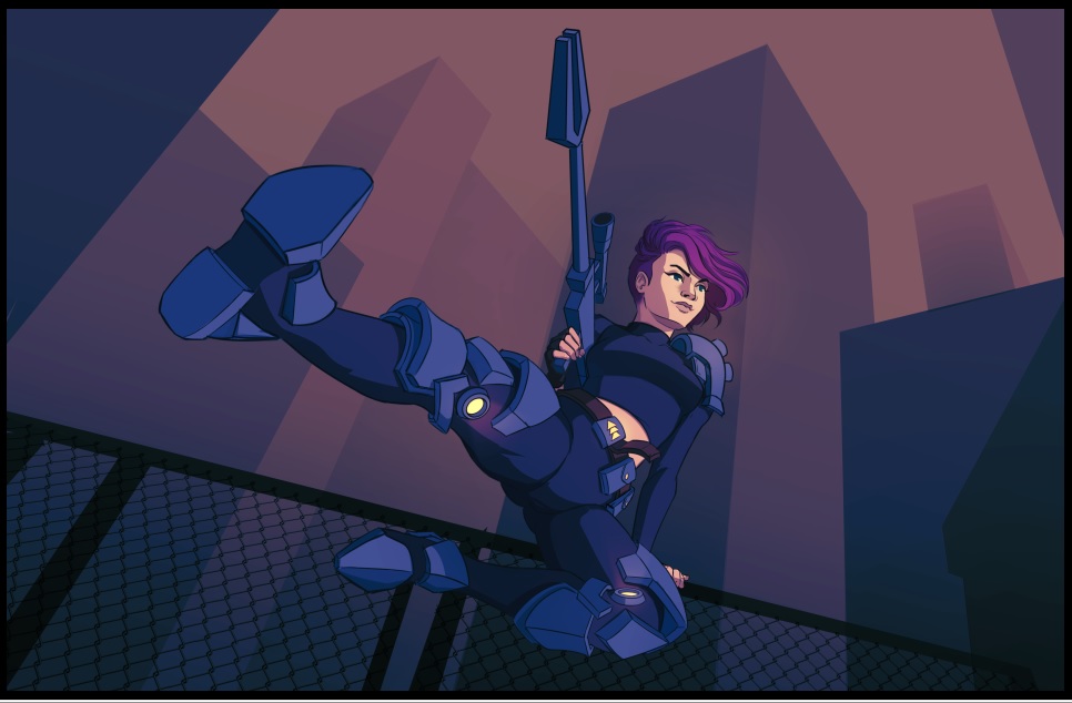 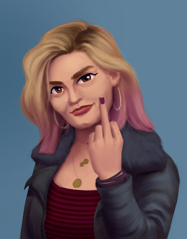 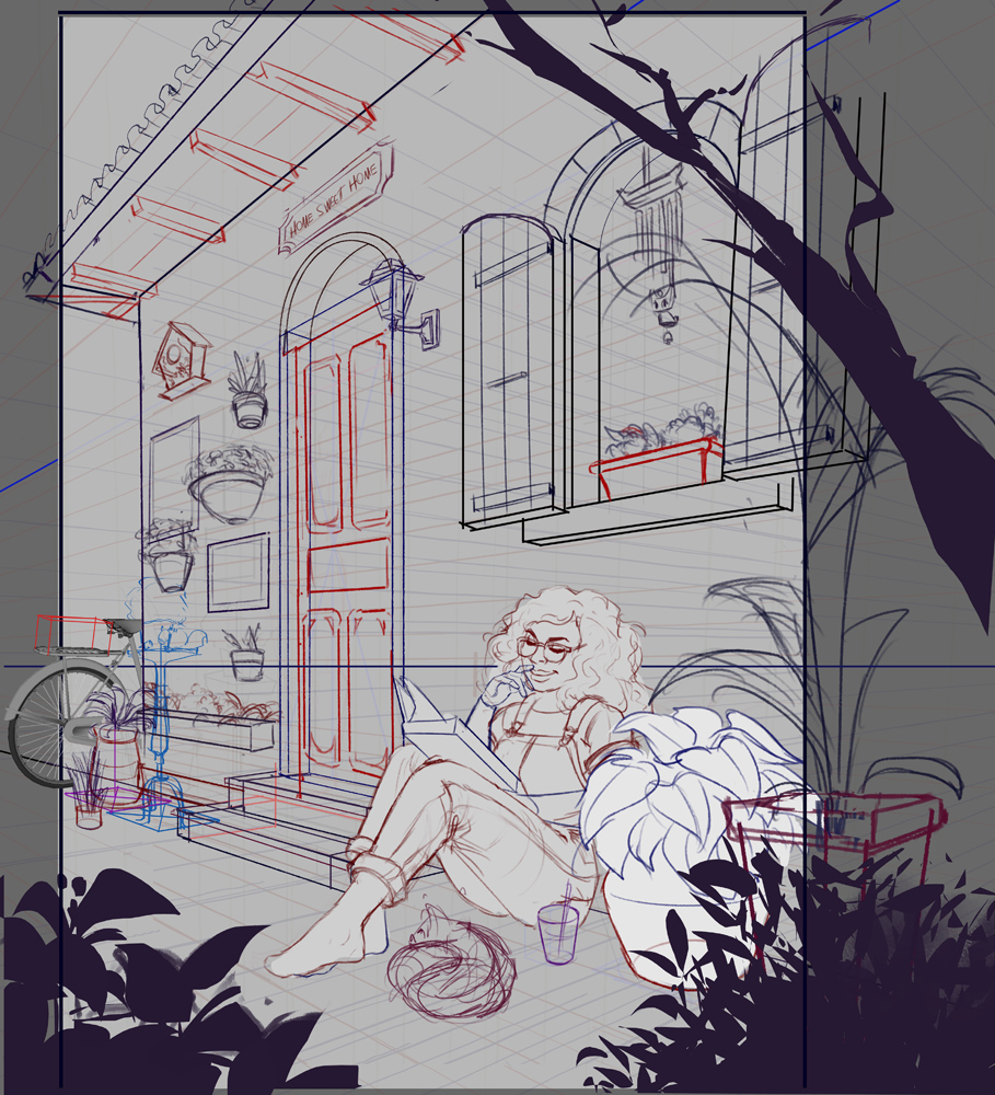 just a silly copy based on a Pinterest picture to ~relax a little :P 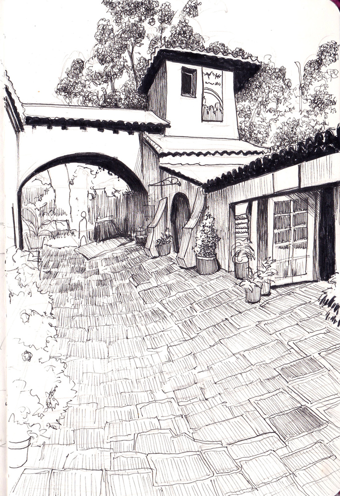 newest commissions I made  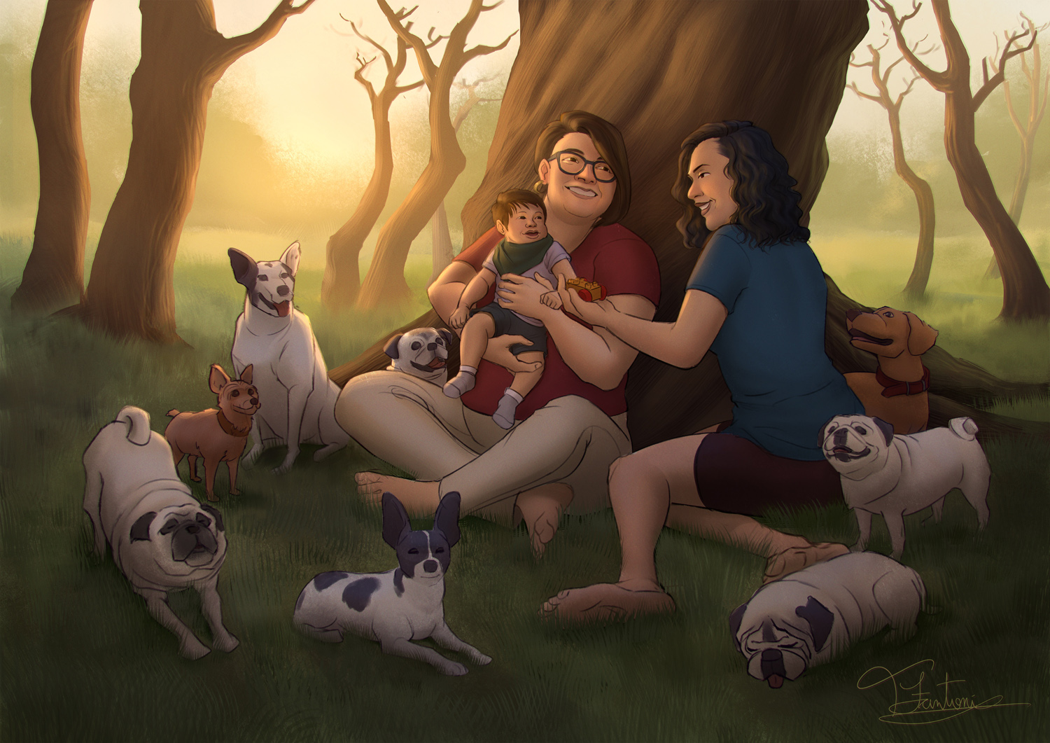
06-22-2020, 05:48 AM
The drawing with the girl sitting & reading is really charming, the black & white sketch as well, and I think if you took a little bit off the lower side of that B&W sketch, the composition would be even stronger.
10-16-2020, 03:24 PM
little update for ya guys. there's more stuff to show but I must confess I'm a bit lazy right now lol
current commission 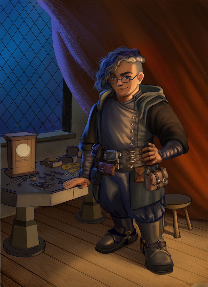
06-15-2021, 05:07 AM
Hi folks, it's been a while, isn't it?
In this last couple of months I've been doing some stuff here and there, so I came back to show them for ya all. I'm not feeling very well right now, so I decided to procrastinate a bit by doing this little update heh. 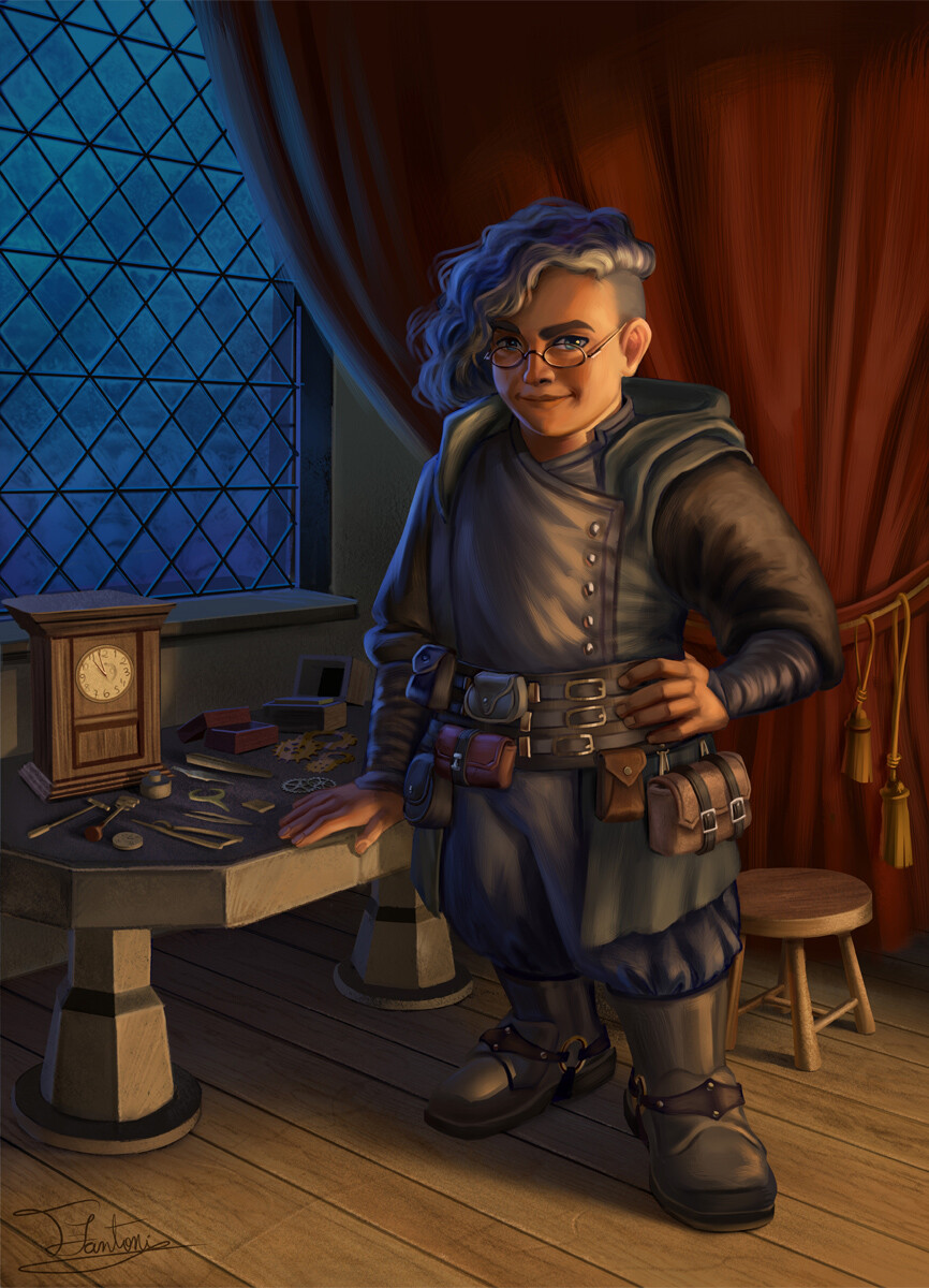 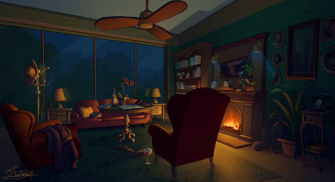 This one was made to a kickstarter campaign 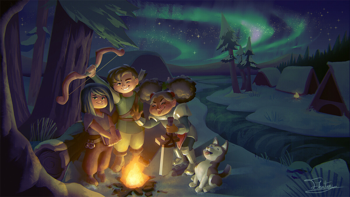 Maeve and Otis from Sex Education TV Series 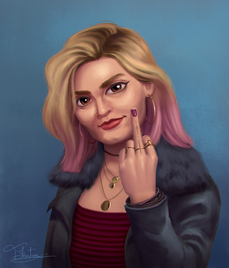 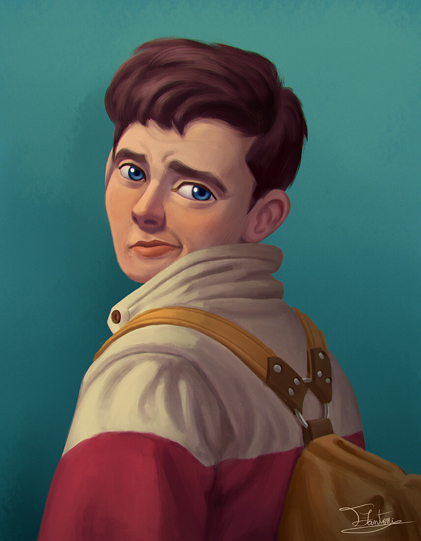 Eric Effiong, not finished yet 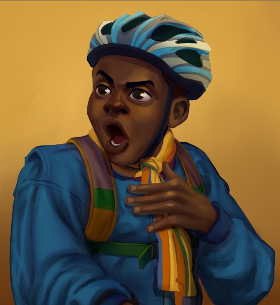 Lastest personal commissions 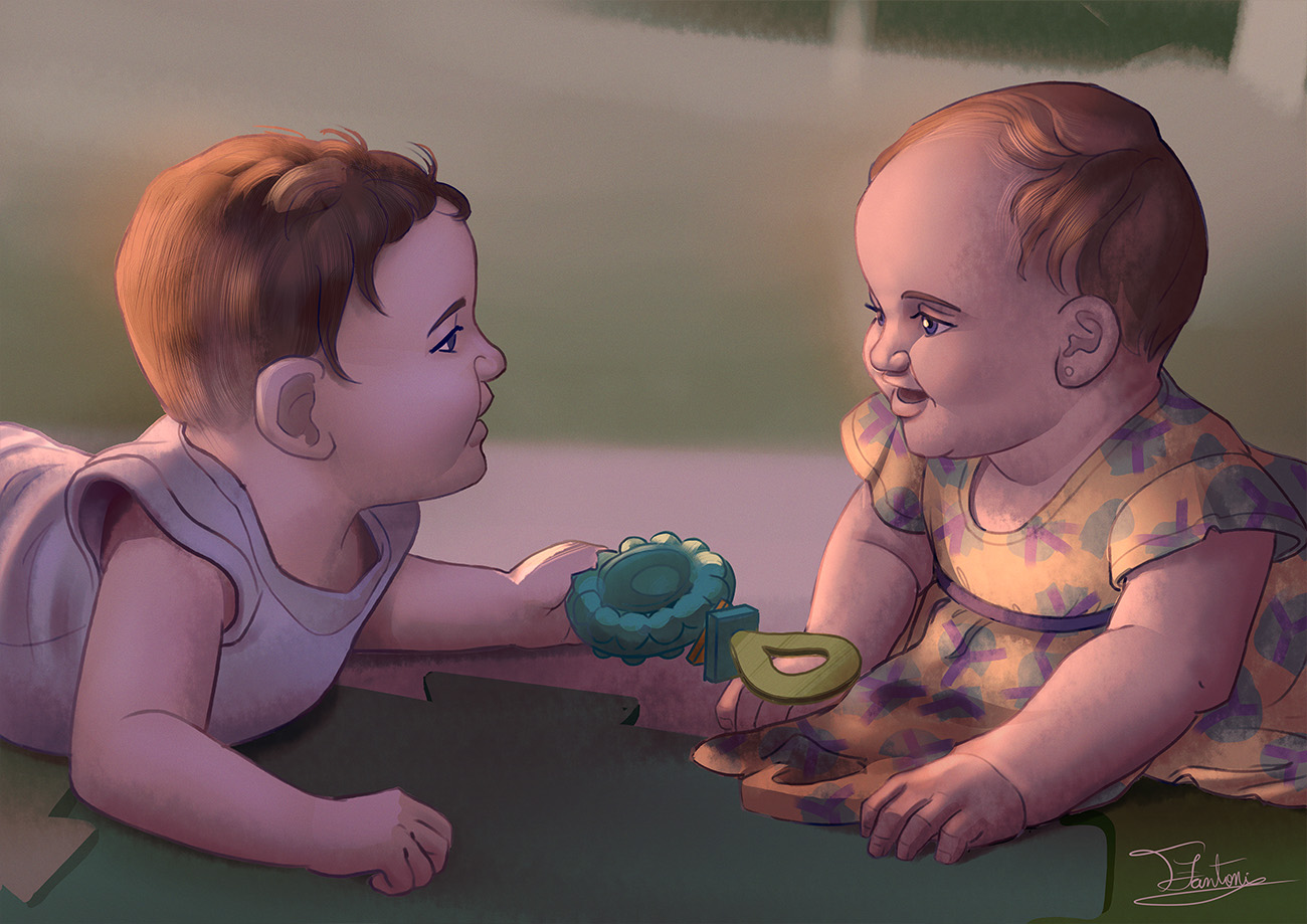 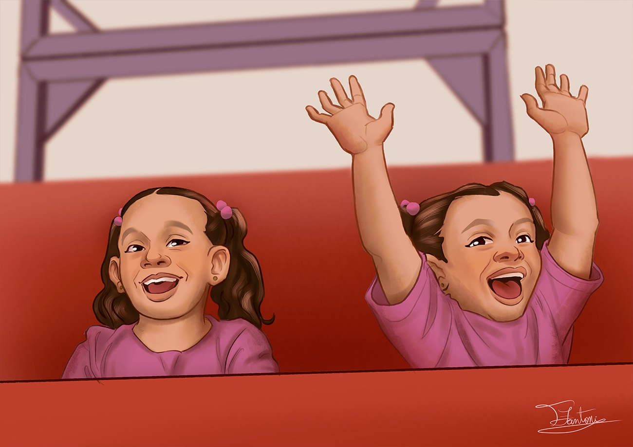 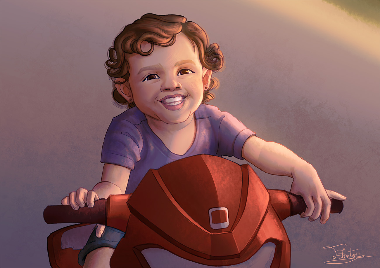 Some recent studies/copies 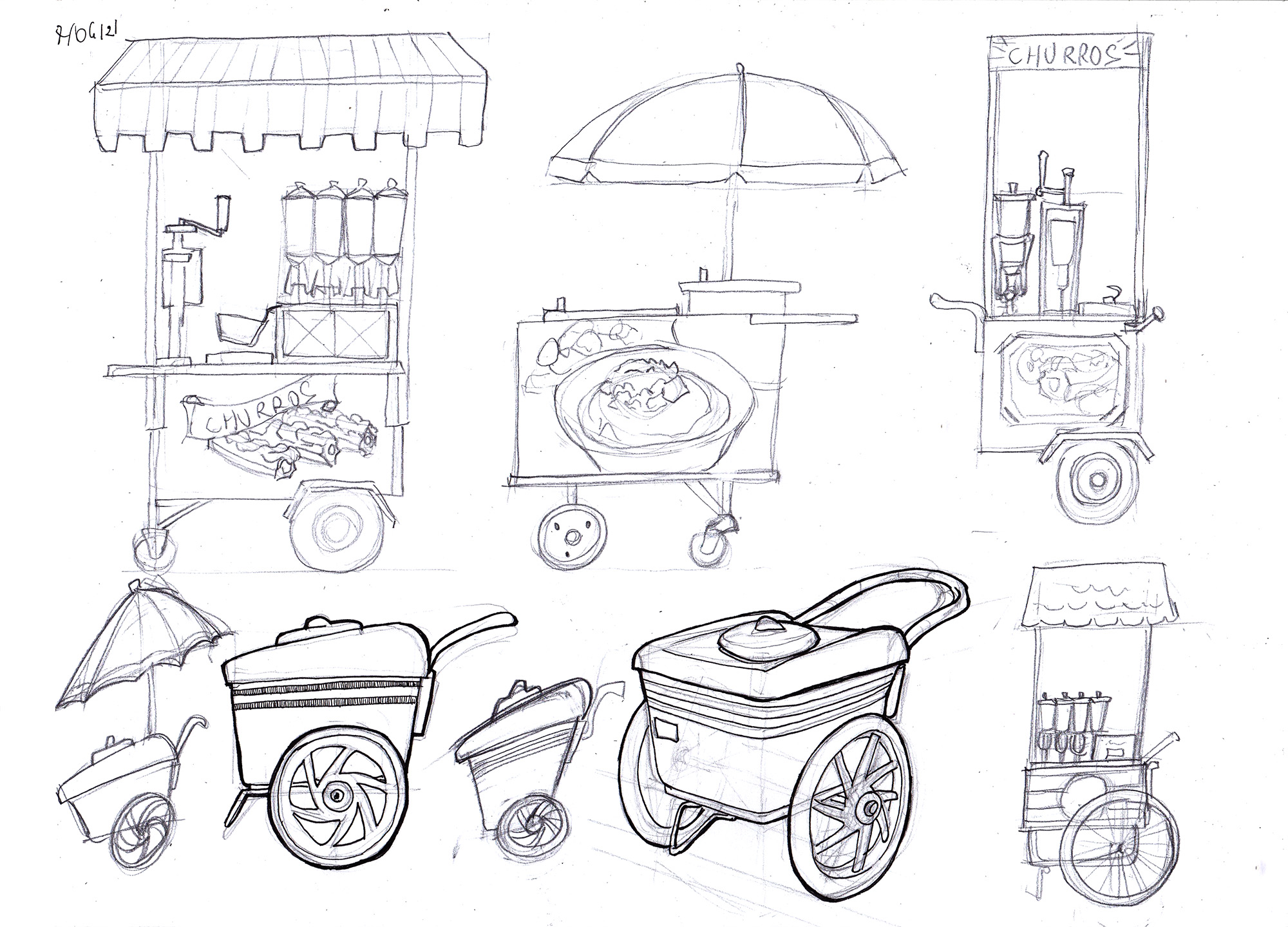 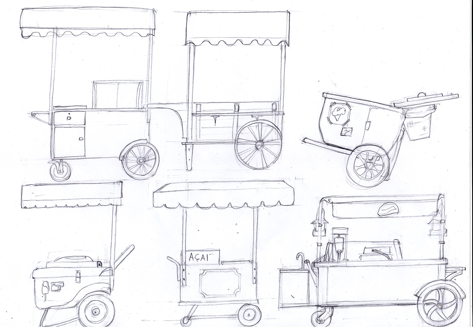 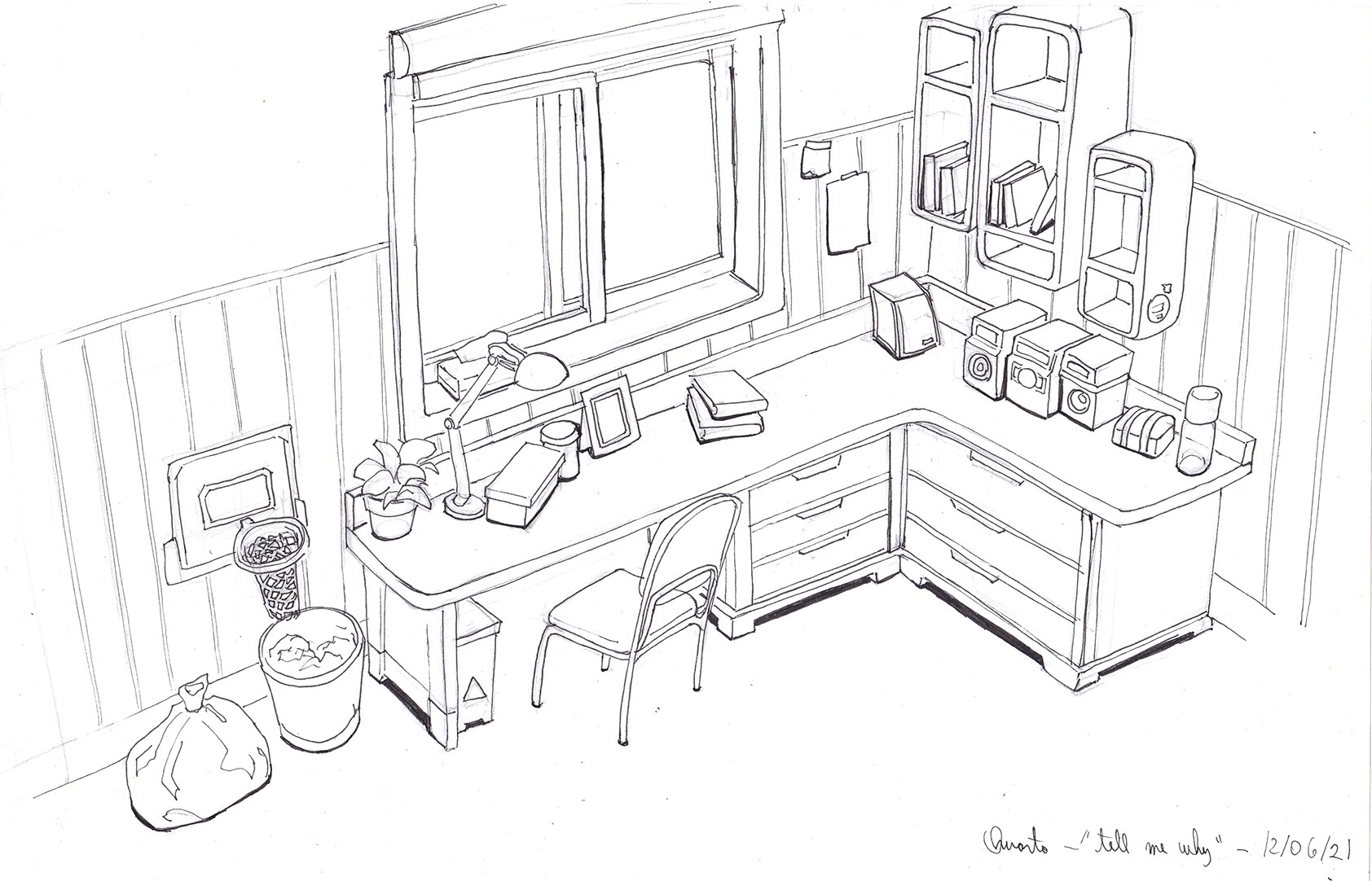
06-23-2021, 07:13 AM
I really enjoy your interior design/furniture studies.I've done a couple of these in the past and boy it was hard to get all the angles and perspectives right. You make it look really easy which speaks for your skill! :) I also like seeing the progress of your illustration from post #233. Your lighting and rendering there is really great!
Keep up the amazing work! :) |
|
« Next Oldest | Next Newest »
|