11-20-2012, 07:58 PM
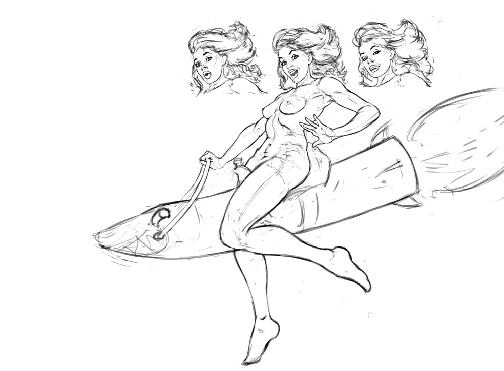
Did some more sketches, gonna do some more and work on the costumes design.
What do you guys think? Are these better?
What do you guys think? Are these better?
|
Anatomy of a Pinup - Class Closed
|
|
11-20-2012, 07:58 PM
Did some more sketches, gonna do some more and work on the costumes design.
What do you guys think? Are these better?
11-20-2012, 08:08 PM
try to develop no. 2 but make sure you move that rocket a bit lower..right now its kind of too much inside her body...work on the anatomy, use ref. for the body as well as for the facial expressions.
11-20-2012, 10:08 PM
wow razvan - leaps and bounds man, they all look sooo good!
11-22-2012, 08:09 PM
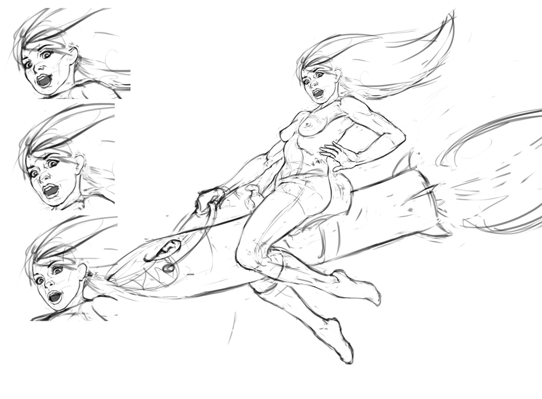
Did some work on this, made a few expresions. Got to do some more work on the anatomy:
 Should I lower that rocket some more ?
11-22-2012, 09:51 PM
Hey Raz, nice attempt...rocket looks fine just try to avoid the straight lines and add some interest, you can even add cuteness in the rocket (hint - EVE from Wall-E)
try to add some variation in one of her leg, 'her' right arm is too long & the other hand needs more love as well..check her palm/fingers expression, use your own hand as a reference..try for a cute face/beautiful face..again, look for reference.her head looks kind of pasted on her shoulder at the moment. you can show her hair way shorter as we are going to show those flames/fire at the bottom of the rocket so both the shapes i.e. hair and that fire looks kind of competing with each other..think about it, its just my observation and i could be wrong :D about expression, i know its kind of hard to show a girl beautiful in this kind of situation..but we are not making a 'serious' illustration here, add some fun and make her cute as if shes just pretending that shes scared or something like that. you can make her legs bigger, longer so that we can have more depth/levels. here are some references for you - http://www.tumblr.com/tagged/pin%20up%20...1340720247 try to add some grace/rhythm. keep it up !
11-23-2012, 10:21 AM
Hi everyone !
a gentle reminder ( in case you missed my post on the previous page) please do not post at the last minute i.e. when class starts or few minutes before the class, please give me at least 3-4 hours to go through your works and think about the possible enhancement/feedback Thank you.
11-23-2012, 11:33 PM
11-24-2012, 01:11 AM
Sweet sketches Shyam!
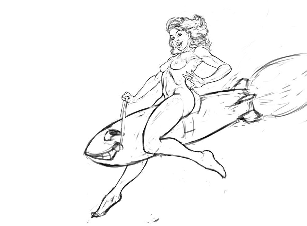
Now i don't know if I should keep mine :). Worked on this :  And some mods after seeing your sketches : 
11-24-2012, 01:42 AM
2nd sketch looks great Raz ! try to polish it now, maybe try to move the rocket a bit lower, also make her head a bit smaller, hand expressions are nice...cool stuff !
11-24-2012, 04:30 AM
wip!
Futuristic punk girl. Still playing around with ideas, I was thinking about throwing a passed out guy under one of her feet. background is still sorta a place holder. We'll see~ ![[Image: Future_Punk_Girl.png]](http://i1139.photobucket.com/albums/n558/Zesiul/Future_Punk_Girl.png) See you guys in the stream tomorrow!
Available for Freelance - Portfolio | CD Sketchbook | Blog | Email
11-24-2012, 05:28 AM
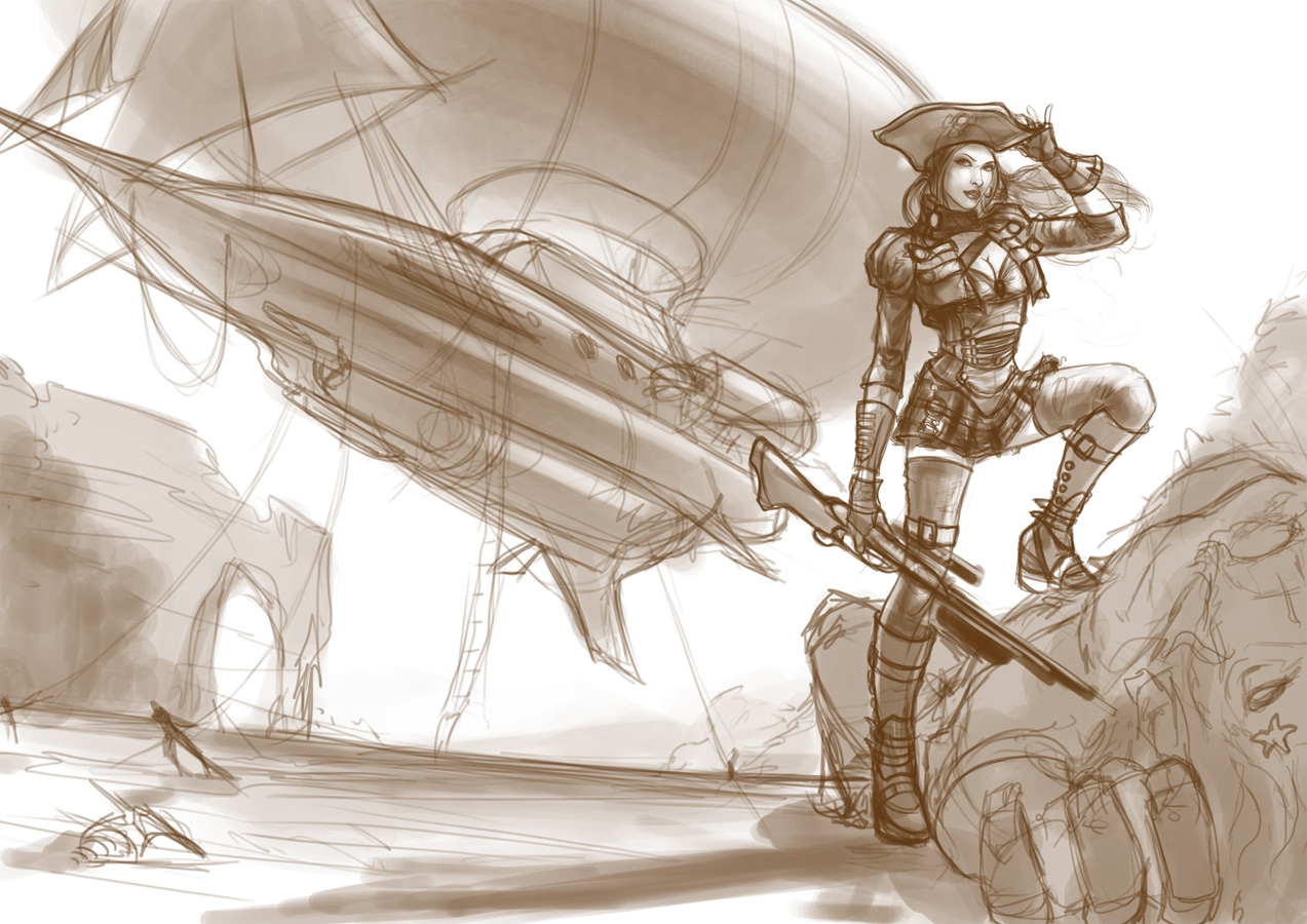
Here is my revised attempt at drawing the steampunk pirate. Threw in an airship in the mix instead of a conventional ship. Still counts as a pirate :P
This is more or less the final idea.. although I am still undecided about the design of the monster. I don't want it to have too much detail or else it will draw the attention away from the rest of the stuff. Maybe a giant jellyfish or a squid! gotta think about it a bit more. Maybe I will submit one more iteration before the class tomorrow. 
11-24-2012, 02:44 PM
Good going guys ! i'm so excited now :D
edit : Deepak : not sure about the composition..it feels like that space at the left is just to show off that airship and other background elements, we need to balance the overall composition...maybe try a portrait/vertical composition..will discuss more about it in the class.
11-24-2012, 05:13 PM
(11-24-2012, 02:44 PM)shyamshriram Wrote: Good going guys ! i'm so excited now :D @Shyam: I completely agree with you Shyam on the composition aspect. I wanted to give a good atmospheric feel to the final piece so I made the pinup a landscape/horizontal composition. If that is something not required then I can totally go with a vertical art for now and add the rest of it later on. :)
11-24-2012, 06:13 PM
i know what you mean but, the composition is not balanced...maybe you need to add some figures or other elements in the left side but it seems a bit overkill (for a pinup) so the choice is yours :D
11-24-2012, 06:36 PM
Woah! Crazy steps forward since last week - gonna have to catch up ;P !
So posting two things, face line up with the rework of my original sketch, as well as A1-A2 (lip shape) & B1-B2 (eye value - light or dark) face options. Following that there are a bunch of hair cuts, though not sure yet what I want - went with the more butch D option as place holder. I'm also posting my re-worked pose, based on the paint over shyam had done, as well as lots of mirror studying. I think it works better now, more movement, more balanced, sexier too. We'll see what everyone thinks. I included two versions as there are a couple elements I'm not sure about. Specifically the holster, not sure if it interferes with the nice line of action from the curve of the leg. Can't wait for class! Likely to keep noodling away at it until then :P
11-25-2012, 04:21 AM
Hi there all to your great!
I am new in class and new in Crimson Daggers so nice to meet you here and overall thank you for this opportunity Here I am with assignment #1 I can see lot of problems in this first step already I am not able to good render edges in skulls as you can see and they seems made in plastic not in bone material. Same problem with much others in Master Copies! eheh they seems a painted wall not a portrait, with STUCCO in their face. However here I am, now I'll try to do all the other assignments to gain your position. Big Up and gz to other great artists here. Hope we can exchange much! [img] ![[Image: skullslineart.jpg]](http://imageshack.us/a/img809/5411/skullslineart.jpg) [/img] [/img][img] ![[Image: skullsvalue.jpg]](http://imageshack.us/a/img819/5452/skullsvalue.jpg) [/img] [/img][img] ![[Image: masterstudycopy.jpg]](http://imageshack.us/a/img827/3963/masterstudycopy.jpg) [/img] [/img]
11-25-2012, 01:59 PM
hey mate, thanks for posting your sketches here..those skull drawings looks nice.
keep up the good work !
11-26-2012, 01:21 AM
Thank you
May I know when exactly will you do another stream and which is the channel? I would like to followyou even if I haven't reached you yet Thanks g |
|
« Next Oldest | Next Newest »
|