01-13-2013, 10:23 AM
I feel sooo sooo bad for missing this class.....
|
From a cube to a cathedral (CLASS CLOSED)
|
|
01-13-2013, 10:23 AM
I feel sooo sooo bad for missing this class.....
01-13-2013, 09:21 PM
Just because it isn't live any more doesn't mean you can't learn. Isra's instructions can easily be followed on your own and I think he said he would keep an eye on the thread to help out when he could.
Go for it =)
Opinions are like assholes... we've all got one of 'em
Blog - DA Profile "Eraza" - CD Sketchbook "Mathias' Markings"
01-16-2013, 06:25 AM
Thanks Mathias, yup, I don't look at it daily, but every now and then :)
Any assignments you want to post here or anything can be useful for you or other people coming in the future. Though I understand following the mentorship without the "pressure" of submitting work every week can be harder. And I know there are a lot of hours to watch, but sometimes questions you may have in first week are answered in 3rd or something like so if you're really interested in take a look at every week's video
01-20-2013, 04:45 PM
Week one Jan 13-19
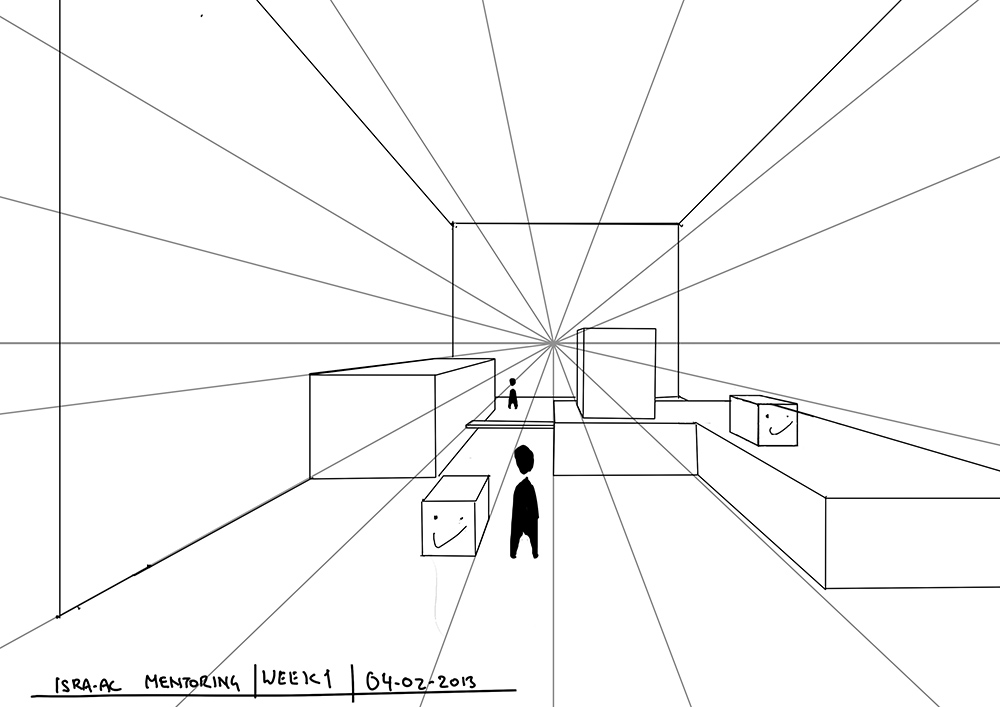
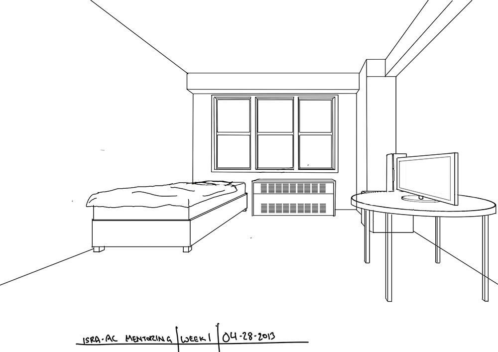
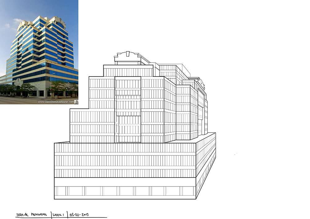
Well here is week one from me. I knew most if not all of the info about first perspective, but hearing it all again was a great refresher, also I don't think I ever actually did any perspective studies so that was incredibly helpful. I was genuinely surprised how much I got wrong about the building. There were so many AHA moments (although I am pretty sure the lobby portion is wrong even now. Will have to re-do that exercise with a different building) Anyway, thank you for this class. ![[Image: perspective_zpseed2fe2b.jpg]](http://i144.photobucket.com/albums/r183/dracken23/Perspective/perspective_zpseed2fe2b.jpg) ![[Image: perspective2_zps9937f9a0.jpg]](http://i144.photobucket.com/albums/r183/dracken23/Perspective/perspective2_zps9937f9a0.jpg) ![[Image: perspective-3_zps539f33bd.jpg]](http://i144.photobucket.com/albums/r183/dracken23/Perspective/perspective-3_zps539f33bd.jpg) Week Two Jan 20-27
Here is week two, I figured it would be better to put everything in one post. ![[Image: perspective-4_zpse91cdd6f.jpg]](http://i144.photobucket.com/albums/r183/dracken23/Perspective/perspective-4_zpse91cdd6f.jpg) ![[Image: perspective-5_zps0f2b1b1f.jpg]](http://i144.photobucket.com/albums/r183/dracken23/Perspective/perspective-5_zps0f2b1b1f.jpg)
02-05-2013, 03:42 PM
Week Three Jan 27-Feb 04
A bit late but here is week 3. Constructing the building was by far the hardest part so far, probably because I never did 3 point before. I really struggled with the door since it was so close to the horizon. Either way learned a lot. ![[Image: perspective-6b_zps0e9d252f.jpg]](http://i144.photobucket.com/albums/r183/dracken23/Perspective/perspective-6b_zps0e9d252f.jpg) ![[Image: perspective-7_zpscae7fe8e.jpg]](http://i144.photobucket.com/albums/r183/dracken23/Perspective/perspective-7_zpscae7fe8e.jpg)
02-10-2013, 05:08 AM
Ok, finally I'm back, didn't imagine to have such intense exam session, but it's over and I am free again. Dracken you are doing great by the way!
Here's my final assignment, crits are welcome because this is my first work with values and I don't know anything about rendering and I'm confused with some shadows so any help and tips will be appreciated! There are still things to do on the piece, but I don't want to spend more time on it. Thanks Isra for everything you taught us! ![[Image: lastweekassignmentsmall.jpg]](http://imageshack.us/a/img51/2117/lastweekassignmentsmall.jpg)
02-10-2013, 08:27 AM
I'm so sorry for not saying anything before, I see some great stuff here, proud of you. I have some busy days at the moment, once I have sometime I'll be back to see if I can point out something.
But I'm very happy to still se activity here :)
02-11-2013, 05:05 PM
Karnich- this last piece looks great. I followed the whole thread and you improved along the way quite a lot. The shadows look good to me, the only thing that stands out is that maybe because your VP is too close some things look more distorted than normal, like the car looks longer than it should be and the windshields look a bit squished. Not a lot of room for the driver too see the road :P
Isra- Thanks for the encouragement, but please don't worry (at least from my end) Watching your videos is a great way to learn, and while personalized tips would be appreciated :) between the critiques and the classes I am finding plenty of mistakes and stuff to learn. Week 4 is a bit late Feb 5- 12
I wanted to add some human interest in the empty right side, like a guy riding in on a horse or a woman saying goodbye to a cowboy. it ended up looking horrible. Will have to revisit once I do a few animals in perspective. Also halfway through I realized the main store building probably looks too modern, but I didn't want eveyrthing to be made out of wood so I kept it. Hopefully it doesn't clash too badly...although that roof is slanted... damn it... will have to fix that. ![[Image: perspective-9_zpsc51613cb.jpg]](http://i144.photobucket.com/albums/r183/dracken23/Perspective/perspective-9_zpsc51613cb.jpg) ![[Image: ref_zpsec1d68f8.jpg]](http://i144.photobucket.com/albums/r183/dracken23/Perspective/ref_zpsec1d68f8.jpg) Week 5 Curved shapes Feb 12-Feb 17 (a bit early ;)
![[Image: hero-path_zps207d7242.jpg]](http://i144.photobucket.com/albums/r183/dracken23/Perspective/hero-path_zps207d7242.jpg)
02-23-2013, 06:59 PM
Just some very quick points
Karnich - use some gradients over the road and the fence from the foreground (dark) to background (light) because such big and continuous surfaces can easily look flat without gradients. The background is a bit empty so to make it interesting enough the mountains in the background should look interesting and a bit more sharpen, also the contrast is that using photorealistic brushes kinda "forces" you to keep a similar level of realisim or detail along your piece, something you achieve with the car and the house but not in the background. Besides add some highlits to the trees they look flat now because of the custom brush. Dracken - In your last drawing the mix of textures in the bridge on the left makes the perspective confusing because you go from a wall with bricks to a wall with lines and there's even a thick stroke splitting them :S But you're killing it! Your architecture drawings are getting really good!
05-25-2013, 10:19 AM
Thank you Isra for making this class available! I always felt perspective was one of the aspects that I need to work on and it's great that your resource is available for me to study with.
I started the week 1 assignments a while back but I just recently finished them. I wish I listened to the critiques first before starting them because then I would have paid more attention to line thickness.   
06-17-2013, 10:50 PM
a bit late to start..but anyway here's mine first week
My Gallery: http://enricocamerra.deviantart.com
My Facebook: https://www.facebook.com/enrico.camerra My Sketchbook: http://crimsondaggers.com/forum/thread-3...ht=camerra
06-25-2013, 05:31 AM
Here's my second assignment..
My Gallery: http://enricocamerra.deviantart.com
My Facebook: https://www.facebook.com/enrico.camerra My Sketchbook: http://crimsondaggers.com/forum/thread-3...ht=camerra
07-02-2013, 04:02 AM
here's my third week assignment
My Gallery: http://enricocamerra.deviantart.com
My Facebook: https://www.facebook.com/enrico.camerra My Sketchbook: http://crimsondaggers.com/forum/thread-3...ht=camerra
02-10-2014, 11:24 PM
Hi guys, i know its really to late for me to join this class, however i really want to study perspective, and thankfully isra make the video about it, so i will post my assignment here.
Cheers
01-22-2015, 03:36 PM
Massive thanks to Isra for putting this class together and making it available to everyone.
Planning to get through all the assignments over the next couple of weeks. ![[Image: Isra-1.jpg]](https://lh4.googleusercontent.com/-jYspWyIwW44/VL5Zt7XOoLI/AAAAAAAAHUw/ZOlOm45ydzk/w1000-h796-no/Isra-1.jpg) ![[Image: Isra-2.jpg]](https://lh6.googleusercontent.com/-geGe9Fy-_G4/VL5ZuwRaqyI/AAAAAAAAHVI/JqK-nROKo5s/w2238-h978-no/Isra-2.jpg) ![[Image: Isra-3.jpg]](https://lh5.googleusercontent.com/-6jBCB-4y8ys/VL5ZuA659xI/AAAAAAAAHUk/iSliTIV91_g/w2048-h1128-no/Isra-3.jpg) ![[Image: Isra-4.jpg]](https://lh4.googleusercontent.com/-ex76xWyKMFM/VMCKrpIRRKI/AAAAAAAAHVQ/g2r_6qnIJz4/w1200-h958-no/Isra-4.jpg) ![[Image: Isra-5.jpg]](https://lh4.googleusercontent.com/-oCyXyA40RdM/VMJX5ef853I/AAAAAAAAHWg/fdjR49b8pk8/w1939-h1200-no/Isra-5.jpg)
01-27-2015, 02:32 PM
Decided to push that last one a little further (as well as fix some problems)
![[Image: Isra-5b.jpg]](https://lh5.googleusercontent.com/-1YTQJ6suIos/VMcUhCgBLKI/AAAAAAAAHW0/32SF3KZ4T5Q/w1556-h1265-no/Isra-5b.jpg)
02-07-2015, 08:30 PM
![[Image: Isra-6.jpg]](https://lh5.googleusercontent.com/-cwjrXkohtDE/VNTGbrEdu1I/AAAAAAAAHZ0/a4Sf8zhY7rE/w1800-h1204-no/Isra-6.jpg) ![[Image: Isra-6clean.jpg]](https://lh5.googleusercontent.com/-k9MpZxsAlfg/VNTGbpL6OGI/AAAAAAAAHZ8/QXRFEveGOfo/w1318-h1265-no/Isra-6clean.jpg)
06-14-2017, 10:19 AM
I think I failed miserably at EDROCKS cause I don't have enough practice with color/value & perspective so I'll try this first :) and thanks for putting the class together for us!
personal blog: http://razvanc-r.gitlab.io/
twitter: https://twitter.com/razvanc_r facebook: https://www.facebook.com/razvancosmin.radulescu deviantart: http://razvanc-r.deviantart.com/ cd sketchbook: http://crimsondaggers.com/forum/thread-8057.html
07-18-2017, 02:52 AM
So all this time I was thinking why the heck does the room look so bad... and I just realized that I wanted to create the square (off center relative to perspective point) with the rule from 2 point perspective with ellipse... wrong.. so with that in mind I recreated the room... I think it might be slightly better... I just forgot to keep the construction lines around..
personal blog: http://razvanc-r.gitlab.io/
twitter: https://twitter.com/razvanc_r facebook: https://www.facebook.com/razvancosmin.radulescu deviantart: http://razvanc-r.deviantart.com/ cd sketchbook: http://crimsondaggers.com/forum/thread-8057.html |
|
« Next Oldest | Next Newest »
|