02-25-2013, 12:13 AM
A bipedal observation, because foot/feet-study sounds so medieval! Used an even more textured brush. Hopefully it doesn't look like conjoined toes this time around. But I bet that it does.


|
Bjulvar's Sketchbook
|
|
02-25-2013, 12:13 AM
A bipedal observation, because foot/feet-study sounds so medieval! Used an even more textured brush. Hopefully it doesn't look like conjoined toes this time around. But I bet that it does.

03-01-2013, 08:04 AM
Moviestill with the incredibly Gaff from Blade Runner. Love that movie.
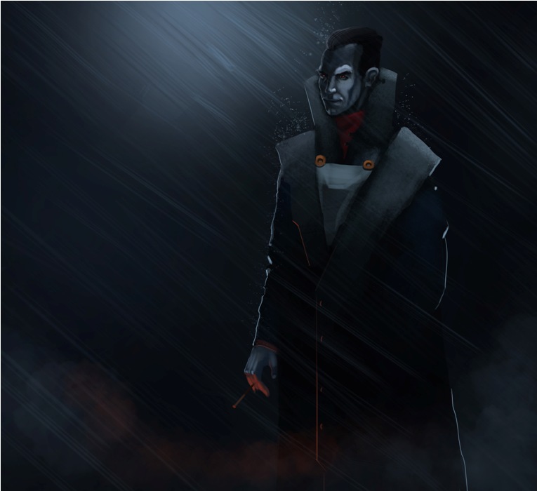
 Warmups   Had fun with this cyberpunkish sketch, threw in some text. Super-poorly written! :D 
03-02-2013, 11:21 PM
Morning study, value with a new textured brush. Now onto feeling miserable while applying :D

03-04-2013, 08:14 AM
Sunday Funday! HAving a hard time chosing between imaginative work and studies, not sure on what is the most productive anymore haha! Here's some morning sketches and the start of a monthlong project that will span a 100 eyes across all the continents! No but seriously, I'll just sit at my computer.
   
03-09-2013, 10:29 PM
Heya, posting slow again! Done a lot of unpostable stuff this week!
Going to try and finish my piece for this weeks ChoW over at conceptart, can't miss out on some centaur action. Here's my initial sketch and some progress. Also posting more eyes from my little project. Mixing imagination with reference. Having a lot of fun and learning tons. Can't figure out why I haven't done this before.   
03-10-2013, 01:32 AM
Still need a lot more variety in my materials. So here I am trying to figure out metal

03-10-2013, 05:36 AM
cool Chow piece dude I feel like hes coming right at me! haha, keep it up the hard work :)
03-10-2013, 08:43 AM
You really nailed that chows perspective and the material study in the last post is good too, i really like the colours in it. You might benefit from the loomis face book for your portraits though, I feel like the furthest side of your face is a bit too shot in some and long in others. Keep up the good work though :D
03-10-2013, 08:59 AM
Bjulvar, that name rings a bell. :)
Very nice stuff in here, if something I'd suggest keeping an eye on the structure of your characters. Keep up with the studies!
03-10-2013, 09:03 AM
That study looks great!
I think it just lacks a few harder edges/brush strokes. Blending all your values and color this much make the whole thing look a little bit "soggy". This is visible in your personal pieces too. Doesn't sound like a big deal but I think this could improve your rendering a lot :)
03-10-2013, 04:39 PM
good studies mate!
i second Prospass on the edges :) also, for your centaur pieces ( which is looking real sweet :D) you could try making the chest and the forelegs of the horse portion slightly larger, this will -push the sense of perspective more (for the greyscale piece) -push the strength of the character and prevent the hind heavy look (for the coloured piece) imo of course. keep goin!
03-10-2013, 08:57 PM
You work really hard man and it shows. Your passion and hard work inspires me greatly.
03-13-2013, 07:57 AM
Hey guys really appreciate your comments. Warms my heart and motivates me!
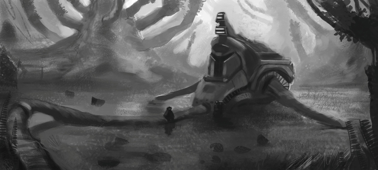
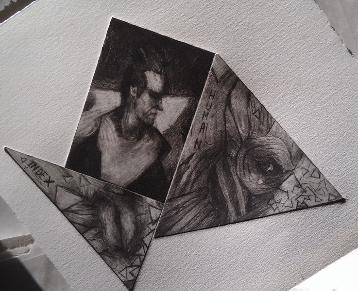
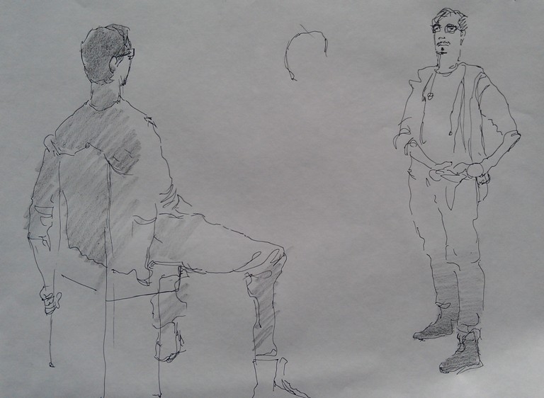
Mr. Toodles Hey thanks man, I hope that I didn't lose that in the finished piece! I will! Jaik Thank you, kinda happy with how it came out aswell! Yeah I've been meaning to read/study Loomis for a while. So I'm gonna put that on my to-do list! I will :D Markus Haha it does? :D Thanks, I'm trying to improve it! Hopefully some Loomis will pay off. Prospass Thank you! After some intense though I think I understand what you mean. Hard edges is something that I don't really know how to observe/study. But I'm grasping it more and more. I think I put in too much value on one surface, and then blend it all together into a nice soup of sog. Great advice, sounds big to me :D anzhou Thanks! And I'll third him then! And thanks a lot for those two pointers, I tried pushing them both in the colored piece. Can't believe that I missed that hind heavy look, became blatantly obvious after your comment. It helped a lot though! I will! Patrik Thank you mate, I hope you'll work twice as hard and kick my butt! Feels good to inspire for once! Here's a nice little update for all your viewing pleasures. Containing a bit of linedrawing livemodeling, wanted to try and capture the personality without much guidelines (which some of them have anyways), had a blast. A graphical print done with a dry needle on a copper plate. More work on eyes, the left one is the result of bad lightning. The finished CHoW and something that I want to turn into a moving picture!          
03-14-2013, 07:14 AM
Moviestill from The Hobbit and an Odin sketch, guess that I'm trying to figure out hard edges a bit more now! ( I hope)
 
03-14-2013, 08:39 AM
Hey man, nice work!
Your studies are totally showing in your recent pieces. Really nice figure sketches from life too. Keep at it!
03-14-2013, 08:43 AM
I can definitely see some improvement! I especially like the eyes and the material study. Look forward to seeing more.
03-16-2013, 07:38 PM
jneumann26 Hey thanks man!
Great, now I know they aren't useless! Gonna keep it up til I drop ;D Nylelevi Sweet! Nice to hear that, don't notice it myself. Thank you, there will hopefully be a lot of more eyes coming around :D Three moar eye-studies 
03-17-2013, 02:35 AM
My artjourney is taking me through the lands of hard edges and architecture. The comfort zone is out of sight.
 |
|
« Next Oldest | Next Newest »
|