Posts: 1,098
Threads: 11
Joined: Aug 2012
Reputation:
34
Couldnt ressist to start working on this, its been too long since my last illustration. :)
Kinda inspired by the Soundtrack of Soul Calibur V, which is fucking amazing.
Check on youtube Soul calibur V "The breeze of dawn"

Posts: 1,098
Threads: 11
Joined: Aug 2012
Reputation:
34
Just a quick sketch so i dont get rusty.
Metal gear fanart, of course. This scene is the trailer was so powerful...
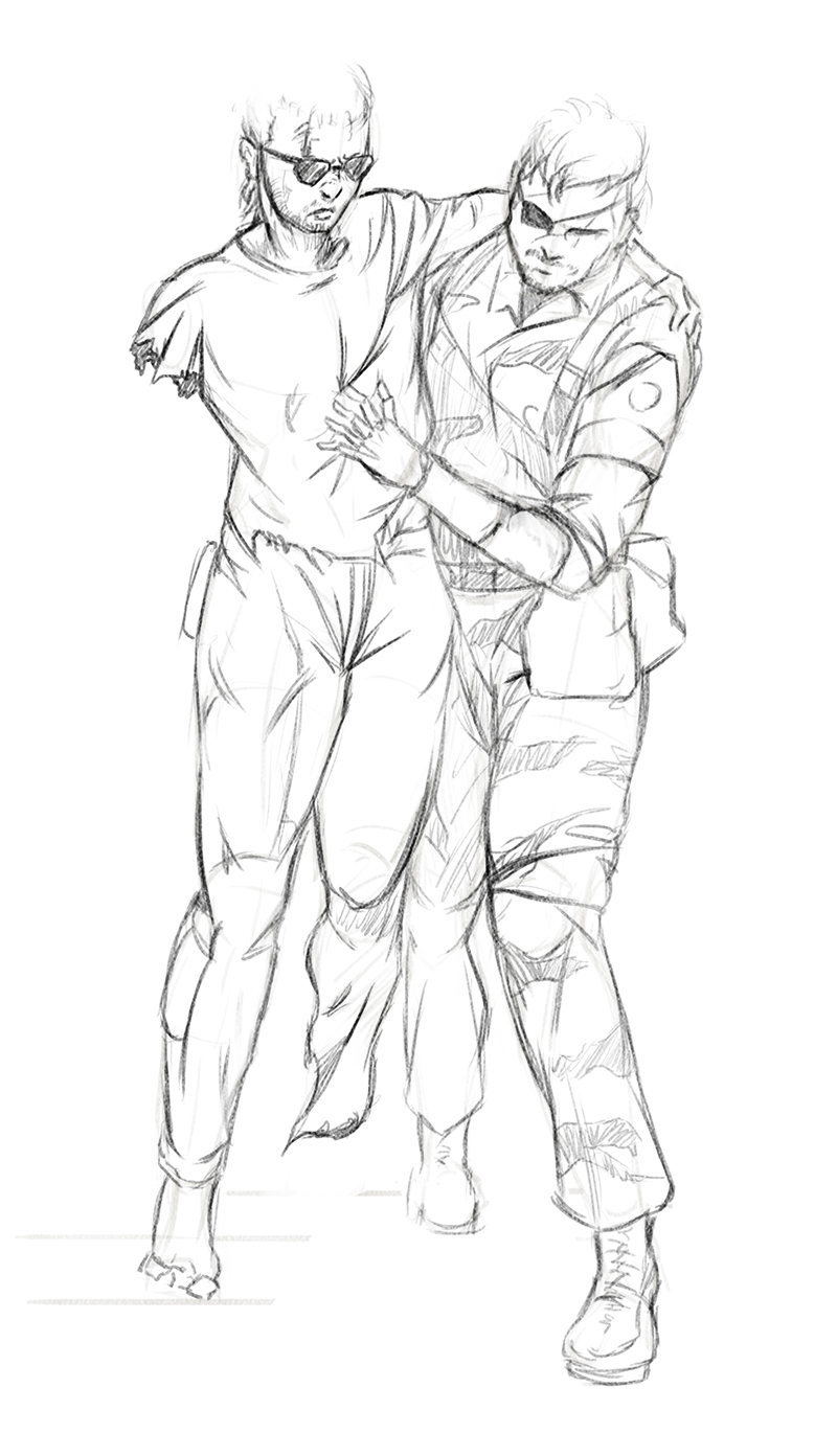
"Why are we still here? Just to suffer? Every night...I can feel my leg...and my arm...even my fingers... The body I've lost...the comrades I've lost...it won't stop hurting...it's like they're all still there... You feel it too, don't you? I'm gonna make them give back our past..."
Posts: 656
Threads: 6
Joined: May 2013
Reputation:
12
Really love that Joan of Arc type lady--the serious expression, the awesome armor design, the hint of an army behind her...
(06-13-2013, 09:16 AM)EduardoGaray Wrote: In the mean time, here is a drawing i did today, another artwork for The Sacred Flame.
Really tempted to work more on it...
_________________________________________________________________________
The best time to plant a tree was 20 years ago. The second best time is now.
-Chinese proverb
Sketchbook
Posts: 903
Threads: 54
Joined: Feb 2012
Reputation:
18
Your stuff is lookin better and better man. To offer a crit, I think if you worked on edge control and some material studies it would bring a lot to your work. I'm especially liking that photo study of the girl with the tech suit on, that's pretty awesome. Keep it up!
Posts: 184
Threads: 4
Joined: May 2013
Reputation:
11
hey! real nice work, your studies seem to be coming along great. your imagination pieces are cool, i like the zelda one and the photo study of the girl with the tech suit is indeed awesome : )
this last piece is great! i really like the red/blue going on, and her armour design with the little wings. real nice work capturing the facial expression and shape of her head/hair
for a crit on it, the pose might look stronger if the sword were rotated slightly in her hand, so that the long edge of the blade (the hand-guard, long-wise) were parallel to her arm. how it is now, to me, it doesn't look like she's really got a good grasp, she couldn't strike someone with it if holding it like that.
"If you want liberation in this life, there is no area that you do not watch. Watch the breathing, watch the posture, watch the flow of energy, watch the texture of the mind, watch the response to objects." - Namgyal Rinpoche
Posts: 1,098
Threads: 11
Joined: Aug 2012
Reputation:
34
Tygerson: thanks! i´m still working on it, pretty slowly, though. I will upload a new WIP soon.
Pnate: thanks for the crit! much appreciated. I've been focusing on drawing lately, i better follow your advice and start doing some texture studies as soon as possible.
aks9: thank you! yep, the study on the girl (cosplaying raiden from MGS4 btw) was great, i learned a ton about values and color temperature. For the paladin redhead piece, the pose was kinda improvised, so i´m still deciding what i want to do with the sword and that arm.
But thanks for the suggestion!
Kept you waiting huh? xD I'm still a bit stressed :S but there is light at the end of the tunnel! as i´m going to take a vacation. I will spent the next week on the beach, bathing, sketching, some beers, relaxing stuff. As it looks like i´m going to be real busy again by august, cant tell anything yet. :)
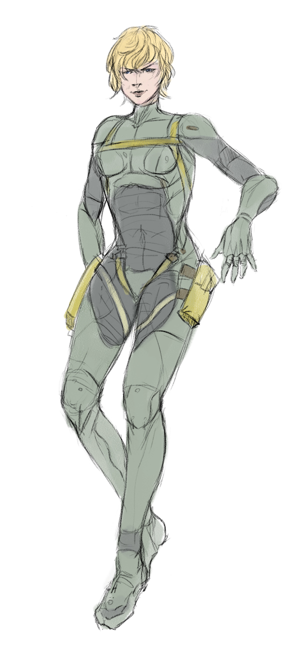
Oh, and here is a sketch from today, hottest garl in the BB corps. (And the one with the most disturbing trauma, imo)
Posts: 184
Threads: 4
Joined: May 2013
Reputation:
11
real nice sketch, feet could use a little work, but already showing lots of pose/character. its not clear what her right hand is up to
enjoy your vacation!
"If you want liberation in this life, there is no area that you do not watch. Watch the breathing, watch the posture, watch the flow of energy, watch the texture of the mind, watch the response to objects." - Namgyal Rinpoche
Posts: 1,098
Threads: 11
Joined: Aug 2012
Reputation:
34
aks9: thanks! :) yep, in case you dont know this character, she is suspended in the air by an exoesqueleton with tentacles, but i didnt drew it. :P But still you are totally right, feets are less glamourous than hands, but equally challenging.
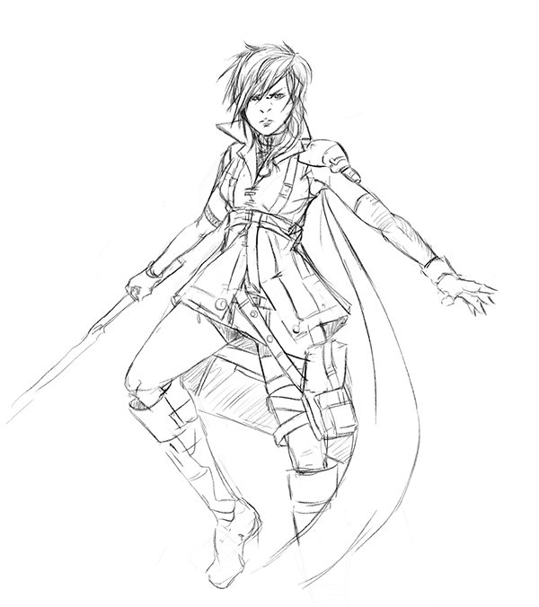
Also, today i received my new Intuos V and i did a little sketch to test it, and i have to say...
It is a complete different experience. The bamboo is like a damn toy in comparison.
I still have to get accustomed to the Intuos, but i can see a bright future with her haha.
Posts: 6
Threads: 1
Joined: Apr 2013
Reputation:
0
well pretty good SB man
i cant give tips or anything but i can only say to keep it up!
i like your chara designs
Posts: 340
Threads: 10
Joined: May 2013
Reputation:
23
Congratulations for your new Intuos :D hope she will help you in creating many awesome drawings :D
Your characters are great, you can pretty easily capture proportions and anatomy I can only suggest to avoid "snowman" in shapes. I saw it on few of your other drawings too :) You draw stylized comic like characters so I thought you might be interested in this approach.
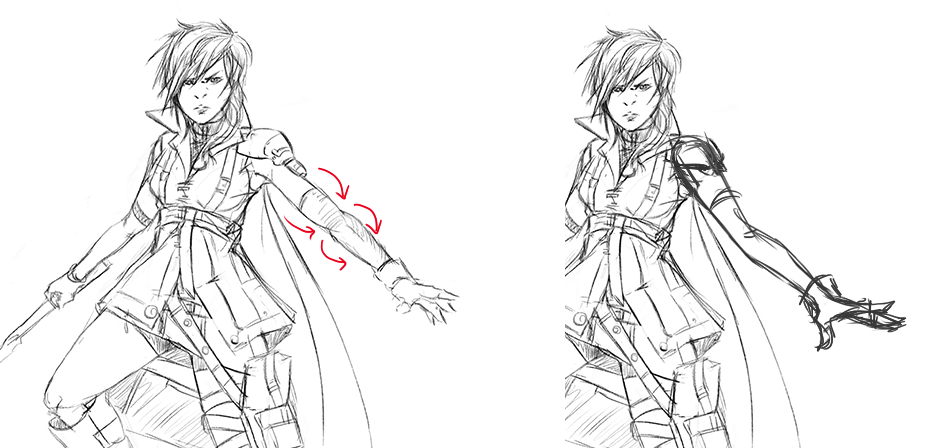
Interesting fact is womens elbows can bend farther than mens, almost outward :D
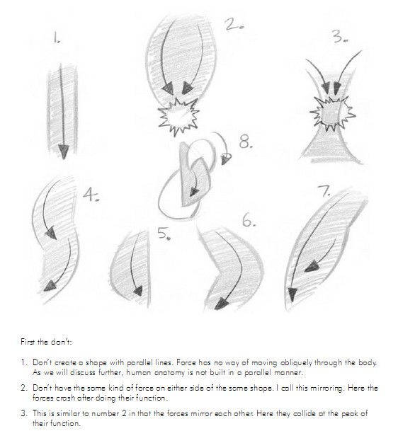
1,2 & 3 are bad shapes 4,5,6,7 & 8 are good
It's from "Force - Dynamic life drawing for animators" book http://pl.scribd.com/doc/63823638/Force-...-Animators Is available on Amazon too.
Posts: 1,098
Threads: 11
Joined: Aug 2012
Reputation:
34
Yuzero: thanks mate! :)
Madzia: that was awesome, thanks a lot for the advice! you are right, i will be doing my next sketches with that in mind. And i´m really tempted to purchase that book to have something to read during my vacation.
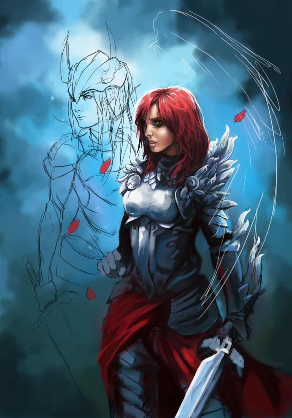
And now, another wip! The second character is something like... a Stand. :)
Read Jojo's Bizarre Adventures if you dont know what i´m talking about haha.
Posts: 488
Threads: 10
Joined: Jun 2013
Reputation:
38
Nice stuff man.
With this latest painting, you seem to have two light sources, but they aren't interacting! You have one to her right side, but her face is lit from top left.
Define a light source and stick to it. Light sources have to be as solid as perspective, otherwise the realism of the piece will break down.
Pay serious attention to your planes, and make sure to respect them properly, a flat plane will have a flat colour assuming the light isn't close enough for the inverse square law to affect it.
Also specular reflections! Speculars are horribly misunderstood by most (they are really hard to understand granted).
I'm sure you know that a specular is a reflection of a light source? Well in most cases most lights are fairly diffused, and this means speculars are really large and soft, and if it is the one large light source it makes no sense to paint a small hard specular inside a large soft one. Also because it is a reflection you can visualize where they should be if you know your light source.
try and imagine if you had a mirror, what angle would you have to hold that mirror to get the light source in the dead center of it. Now look at your image and find anywhere that angle will be, that's where the speculars are.
A good thing to keep in mind is that soft speculars can have hard edges if they go over a plane change.
![[Image: hFr5sCJ.jpg?1]](http://i.imgur.com/hFr5sCJ.jpg?1)
I've painted my paintover assuming hard speculars, but i implore you to experiment with both.
have a look at a bouguereau piece, his work has this soft dream like feeling because he always used super soft lighting, like you would get from a cloudy day. Note the specular on the plane change below the closest eye, it is really soft but has a plane change making a hard edge.
http://uploads0.wikipaintings.org/images...t-1890.jpg
Posts: 411
Threads: 1
Joined: May 2013
Reputation:
11
You've gotten some really great advice in here, man, not much more I can add to them I'm afraid. Just keep your lighting in mind, as was mentioned above me by OtherMuzz as well as your constructions while drawing your figures! Keep up the hard work.
Posts: 1,098
Threads: 11
Joined: Aug 2012
Reputation:
34
I´m back! :)
OtherMuzz: that was awesome, i already thanked you, but just one time isnt enough. I´m eager to start applying your advice to the piece. :)
MrFrenik: thanks! yeah, it was a great advice, i just need to get in shape again and start applying it.
And now, some drawings i did today, trying to get into the mood, damn only a week doing nothing and already feel rusty. Hopefully, i will be on the run again tomorrow.


i was about to write a nice description of my vacation on the beach, but because i do not want to kill anyone with boredom, i will just leave this picture.
Which sums pretty much the whole thing:
![[Image: image.png]](http://memecrunch.com/meme/HLDG/stoned-sloth/image.png)
Posts: 45
Threads: 1
Joined: Jun 2013
Reputation:
0
nice stuff and great evolution! I like your line drawings, you do have great skills on that! Also nice colors! keep posting and all the best dude!;)
Posts: 1,098
Threads: 11
Joined: Aug 2012
Reputation:
34
Thanks a lot Lex_paul! i really appreciate your comment. :)
No updates these days, thats why i´m busy with my summer pitch: project Aegis.
I will post everything here too once i have more stuff to show.
For now, another wip for my ongoing illustration.
I rejected the idea of the spectral valkyrie and returned to my initial idea of having an army behind the character. Any thoughs? do you think its a change for the better, or worse?

Posts: 656
Threads: 6
Joined: May 2013
Reputation:
12
Love the work in progress!
The Valkyrie is cool, but kind of implies she needs protection. To me she looks tougher and more independent at the head of an army. Are those going to be tanks, or trebuchets, or a fortress?
_________________________________________________________________________
The best time to plant a tree was 20 years ago. The second best time is now.
-Chinese proverb
Sketchbook
Posts: 504
Threads: 9
Joined: Apr 2012
Reputation:
6
duuuuude :D so cool! I love the sloth btw hahaha, definately getting a lot cleaner forms then before. Hows the new job buddy?
Posts: 184
Threads: 4
Joined: May 2013
Reputation:
11
her hair is ace
"If you want liberation in this life, there is no area that you do not watch. Watch the breathing, watch the posture, watch the flow of energy, watch the texture of the mind, watch the response to objects." - Namgyal Rinpoche
Posts: 1,098
Threads: 11
Joined: Aug 2012
Reputation:
34
Tygerson: yeah i didnt think about that! then an army behind her is the best way to go, because she obviously dont need a protector haha. Also, those are going to be WWI like artillery batteries and soldiers.
Mr.Toodles: haha thanks! sloths are awesome. Also, new job? i will start illustrating the first part of a graphic novel for an american company this august. Were you refering to that? i´m sorry mate my mid-short term memory is pretty fucked up. :S
aks9: thanks! :) hair always gives me trouble, so i´m glad you like it.
I dont want to spam the sketchbook with the same stuff i´m putting on my summer pitch thread but i would use some feedback on this picture:

As i said on the summer pitch thread, this anime stuff is way more difficult that it seems.
This would be more or less the style i want for the comic, animation like characters and painted backgrounds.
Not sure how good this idea is haha.
|


![[Image: hFr5sCJ.jpg?1]](http://i.imgur.com/hFr5sCJ.jpg?1)


![[Image: image.png]](http://memecrunch.com/meme/HLDG/stoned-sloth/image.png)

