Posts: 182
Threads: 2
Joined: Jun 2012
Reputation:
2
Love the the last sketchbook page, and those self portrait's are getting better and better, you are really gathering momentum, soon you'll be unstoppable :D
Posts: 2,817
Threads: 15
Joined: Jun 2013
Reputation:
109
There's a hero inside of you ;)
Anyways, Algenpfleger/jana really inspired me as well (you resemble him in like everything, even that pyramid head sketch you did, nothing wrong with that though, you will find your own voice soon); i'd have to say though, if you wanna push something, get out that soft brush, and zoom in and just baby stroke that sht at low opacity, that is how you get the realism.
I'll def sub, because i believe in you!
Don't kill yourself dude, breaks are cool too because time doesn't stop when you get to a certain point...
Posts: 56
Threads: 1
Joined: Dec 2012
Reputation:
2
That 100 brush strokes idea is great, Imma steal it. :)
Also your anatomy still needs some proportional work, You draw the heads maybe a bit large. But your lines are very clean and pretty.
and thanks for your comment on my SB
Posts: 191
Threads: 3
Joined: Feb 2012
Reputation:
8
Egbu : thanks, i hope to be unstoppable someday ! Let the drive grows inside of me !
fedodika : thanks ! though concerning the sorf brush, i find it's actually better to use a hard brush, or something around 80-85 % hardness, and baby stroke, but you know, i'm focused on the blending, and i loose the main volume, because i blended too much, or didn't blend at the right area, etc, sometimes i change the values witout noticing it ..
yarrnick : steal it dude, you're allowed ! Thanks for your advice, will def work on anatomy !
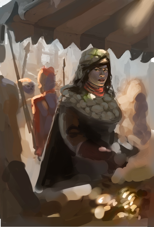
Sorry for the lack of recent updates ! i actuelly tried to work on an illustration, but i miserably failed at it. At least i learned from my mistakes, and know what i'm doing badly ..
- I have a quite decent dynamic overall composition, but when i try to start the rendering process, i just ruin everything by changing the little values .
- i can't handle layers in a good way
- i fail at rendering because i try to render everything, the hood isn't working at all, it looks cartoon, not believable, i should more suggest things instead of painting everything .
- i fail at colors, and especialy skintones ! i think about bounced light !
- i fail at volumes . it doesn't look solid, still cartoonish ..
i fail at creating depth, we don't feel the space in the picture, i didn't let enough space for the background and middle ground to understand what's happening behing the girl ..
when i work with colors, it's like i'm forgetting about values underneath them, i'm focused on getting the right temperature , and when working with overlay layer, i end up sometimes with the good temperature but lost the values ... aah, should be more focused !!!
and 2 other painting studies, i decided to take a break on my selfportraitfor a week, taking a step back might be a good thing !


Posts: 537
Threads: 1
Joined: May 2012
Reputation:
8
Hey man! Thanks for the helpful tip!
Loving the workload you're putting out it's very inspirational. Totally a warrior mindset!
You obviously don't suck at any of those things you listed, but you can always get better at them. I know the feeling though and it's the worst. There's always a million things to study :P
I guess I'll try to help you if I can!
First off, how much time did you spend on the illustration?
It might take a long while before it starts looking good. I think that there's always room to continue with a painting if you believe that it still has potential. Patience is a good friend here! If not, you should just move on. Polishing a turd gets you nowhere!
I myself like the painting and I think the girl is framed pretty well. But there are some things that distract my eye. The person standing behind her has a more saturated color compared to the girl. So my eye jumps between the two. Could also be intentional, but you might be better off restricting the most saturated colors to her. Keeping most of the things in the background desaturated.
The same goes for the gold(?) in the foreground. It's very orange and bright at the same time as the values around it shares it's range with the girl. You could try and darken the foreground to create definite stages of depth.
Her skintones is also very gray which pushes her to the side as a focal point.
Everytime I use overlay layers everything goes supergray for me :(
A nice tool is creating silhouettes of the different objects and locking the pixels. It's like an underpainting beneath the lineart!
I think you did great studies in the same post that you could apply to the piece!
I hope you find any of this useful, keep kicking butts :D
Posts: 411
Threads: 1
Joined: May 2013
Reputation:
11
I don't think I can add much onto what Bjulvar said, so I'll just like his post and tell you to focus on one thing at a time and keep working hard on those fundamentals :)
Posts: 191
Threads: 3
Joined: Feb 2012
Reputation:
8
thanks bjulvar for your big comment, it really helped me to better understand what i was doing ! it's really useful, and really made me think differently about what i was doing !
thanks MrFrenick , i'll kick those fundamentals in the face and become great !
Well guys, no paintings or drawing in this post ! my parents have been there the previous week, and now i can finally work my ass off ! i found internet a bit distracting the last day, and wanted to tackle a silly, but yet exciting challenge : live without internet for a whole month ! I'll still work my ass off so expect some improvments ! and hope to see everyone improving too ! it'd mean no series, no anime, ne dose of daily inspiration, etc ... it'll be really hard, but i hate the fact that i'm kind of " dependant " to those things ...
Anyway, i hope everything will go well during this month, be prepared for the future kikindaface !
Posts: 850
Threads: 4
Joined: Mar 2013
Reputation:
21
I like your sketchbook - lovely digital studies and also very nice pencil lines. Some more clean, some show character - and only getting better with time, so keep them coming :)
Don't worry about failing... it's part of the learning process. But I know how you feel, it can be quite overwhelming to have to apply all those things at once (color theory, values, composition etc)!
Handling layers and rendering is just practice - experiment with different techniques and you'll eventually figure out what works best for you. Just play around a bit. For creating more depth, you can either try to place your elements in a way so that you get nice shapes - the (dark) figure in the foregorund, and placing something lighter behind her for contrast. Or you could just lighten the figures in the middle ground behind her a bit with (fake) atmospheric perspective - say, some sunlight or dust, making her stand out more.
Always check your values during the painting process, by converting the painting to black and white, or adding a black layer on top of everything else in 'saturation' layer mode. It helps to see if the image still reads without colors. And btw, I don't think you failed, I actually like it so far :)
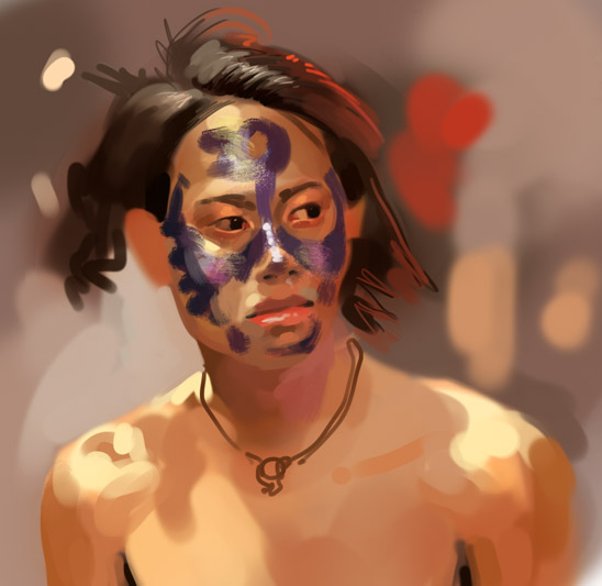
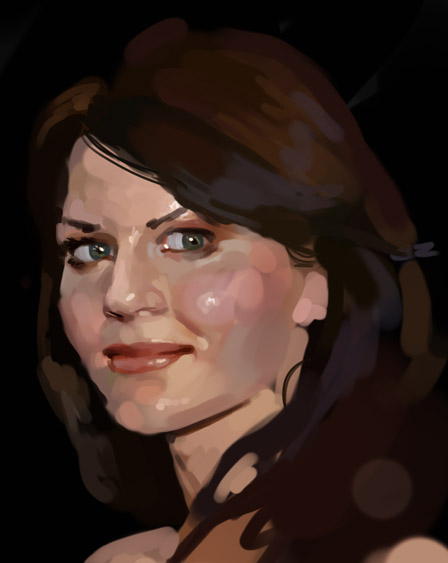
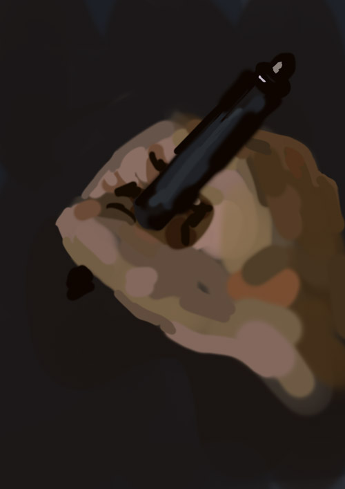
I like those rough digitals btw. Confident & nice strokes without over-rendering anything. Looks good!
Good luck with the internet-free month. Good idea, but hard O_O
Posts: 2,817
Threads: 15
Joined: Jun 2013
Reputation:
109
ITS BEEN A MONTH BRO COME BACK!!! AHHHH
Posts: 101
Threads: 3
Joined: Jan 2013
Reputation:
0
Came here, hoping for daily updates, but apparently you got rid of your modem for a while hehe.
It's been two months now, think about coming back sometime
Posts: 1,527
Threads: 24
Joined: Dec 2012
Reputation:
70
Bruh, where the heck are you?
I know I never commented in your sketchbook, but I sure as hell lurked the shit outta it!
At least take the "(daily update)" part out or something 'cause ahahahaaaaaa... you're killin' us--!
sketchbook | pg 52
"Not a single thing in this world isn't in the process of becoming something else."
I'll be back - it's an odyssey, after all
|


