Posts: 1,098
Threads: 11
Joined: Aug 2012
Reputation:
34
Triggerpigking: Hey thanks mate! i defintely love drawing from pixels, its something i will keep doing. xD And i encourage you to do it too, because its fun, you will probably learn something and because i want to see other people results.
Well, i'm back! hello daggers, something unexpected kicked my ass recently, i had to stay in the hospital with my oldman because he had back surgery and couldnt move a single muscle.
But the surgery was a success, everything seems to be fine again, so enough personal stuff, back to practice!!!
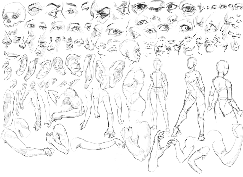
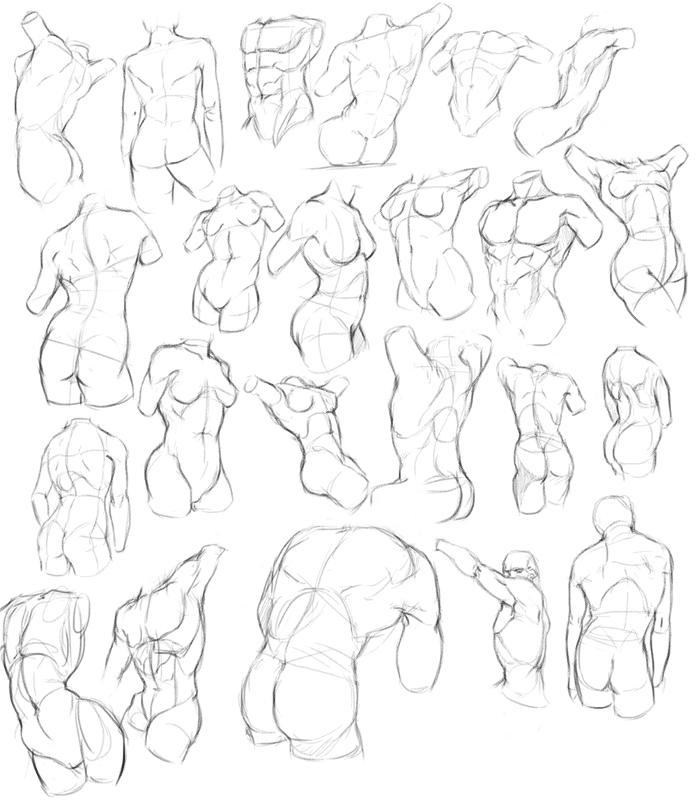
I started studying from Vanderpoel and i'm loving it so far, his drawings and explanations make it easy to find the different landmarks of the body.
I'm more focused on developing a method of construction and memorizing landmarks and structures rather than trying to make it look pretty or accurate to Vanderpoel original.
This is still hard as fuck, but i will admit, i'm starting to have some fun.


I will try to be more active on the coming days, its been too long since it took a good look at your sketchbooks and wips you lovely people. :D
Posts: 1,527
Threads: 24
Joined: Dec 2012
Reputation:
70
Shit. I'm sorry to hear that, man. Though it's nice to hear the good news; also good that you took the time you needed, working through that kind of energy doesn't usually help with... anything, really.
But hell yeah dude!
Welcome bloody back! And what a homecoming :D these studies are awesome!
Looks like you've learned a bunch from these.
Can't wait to see you apply it!
sketchbook | pg 52
"Not a single thing in this world isn't in the process of becoming something else."
I'll be back - it's an odyssey, after all
Posts: 812
Threads: 4
Joined: May 2012
Reputation:
35
Hey Ed, I'm glad to hear the surgery for your dad went well. It's nice you were able to be there for him.
The anatomy studies are looking hella good. Just compared to the last sets they're looking a lot tighter.
Happy to have you back, keep it coming homie :D
Posts: 690
Threads: 7
Joined: Jan 2012
Reputation:
12
Heeey, glad everything went allright and you're back on track. those studies are great and i bet they'll show in your personal stuff which i'm eager to see. keep it up!
Posts: 411
Threads: 1
Joined: May 2013
Reputation:
11
Welcome back and it's great to hear your dad's in good shape, man.
On your work, great construction studies! To quote you -
"I'm more focused on developing a method of construction and memorizing landmarks and structures rather than trying to make it look pretty or accurate to Vanderpoel original."
You say this as if it's a bad thing, but it's entirely the opposite - you want to be focused on constructing and understanding your forms instead of trying to copy from the photograph/model or whatever else. You're doing great, keep going.
Posts: 70
Threads: 1
Joined: Nov 2013
Reputation:
0
yeah..xenogears..your pixel study is inspiring, where do you get the screencap from? and your latest study from vanderpoel is wonderful, keep pushing it man
Posts: 1,098
Threads: 11
Joined: Aug 2012
Reputation:
34
smrrfette: hey thanks a lot! yeah i'm fully focused now, already starting to apply all these stuff. :D
Jonesoda: thanks a lot mate! yeah, fortunately i could be there, i'm thankful for that. And its nice that you are seeing improvement. :)
ramalooke: thanks man! yup, i'm starting to plan a new illustration but i will still have to wait and do some preliminar studies. (And find a good composition too!)
MrFrenik: thanks man! oh i wasnt trying to make it sound negative haha i guess i need to learn to express myself better. Yeah its exactly what you are saying, studying isnt really copying.
rioriorio: haha i'm glad you like that tiny excercise! :) thanks, for the screencap i simply put on google images "xenogears screenshot" and i took one of the first ones.
Thanks to all of you for your support with my dad and stuff, it really means a lot!
Now onto the update:
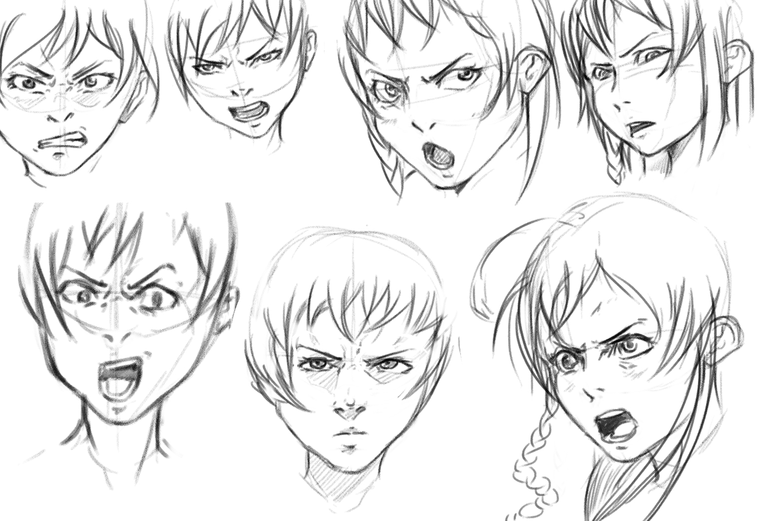
Expressions:

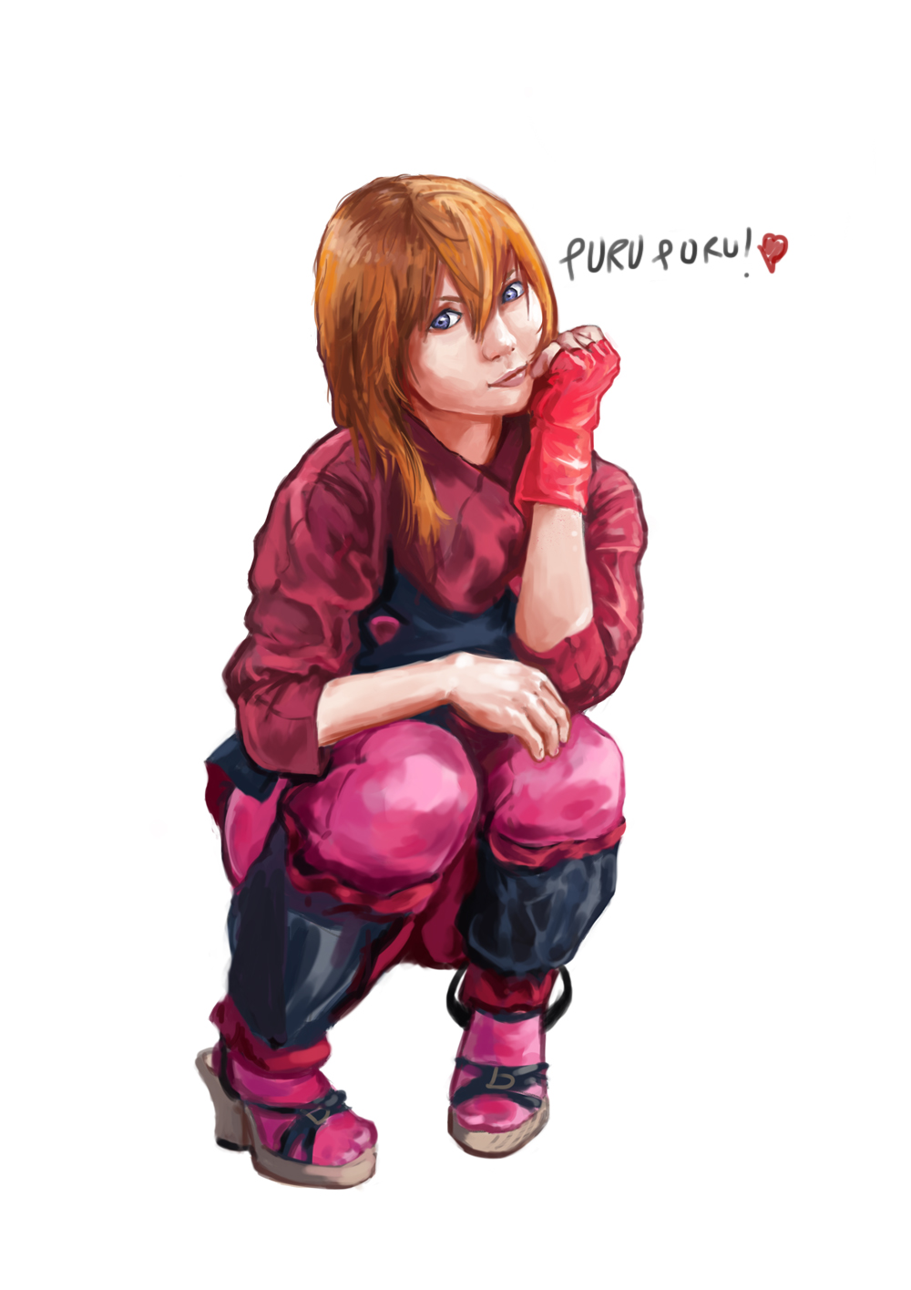
Photo study:

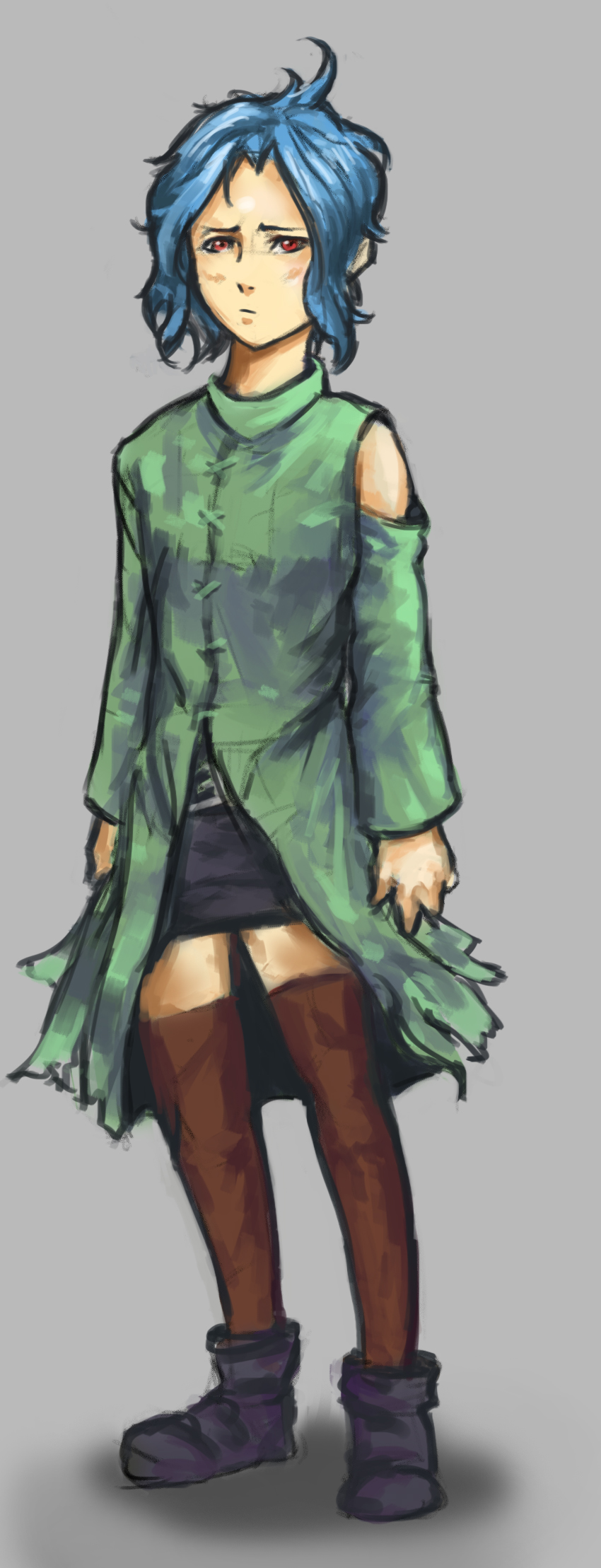
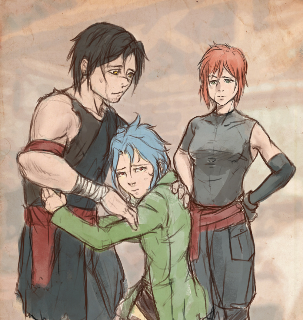
Concepts and a portrait for my personal project:
I dont really know how to draw kids :P


Do you like plot driven Yanderes?

Posts: 1,098
Threads: 11
Joined: Aug 2012
Reputation:
34
Just one more thing before i go to sleep xD
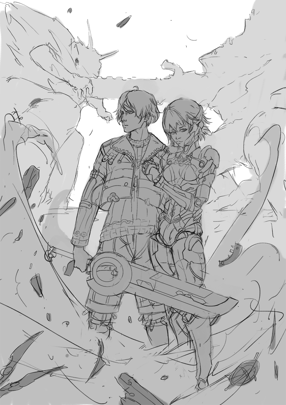
what do you guys think about this composition? any opinion, crit, etc would be much appreciated its my first idea for a xenoblade fanart. Edit: the thing in the background are supposed to be two enormous titans. (They are so big that the game takes place in their bodies)

Posts: 1,098
Threads: 11
Joined: Aug 2012
Reputation:
34
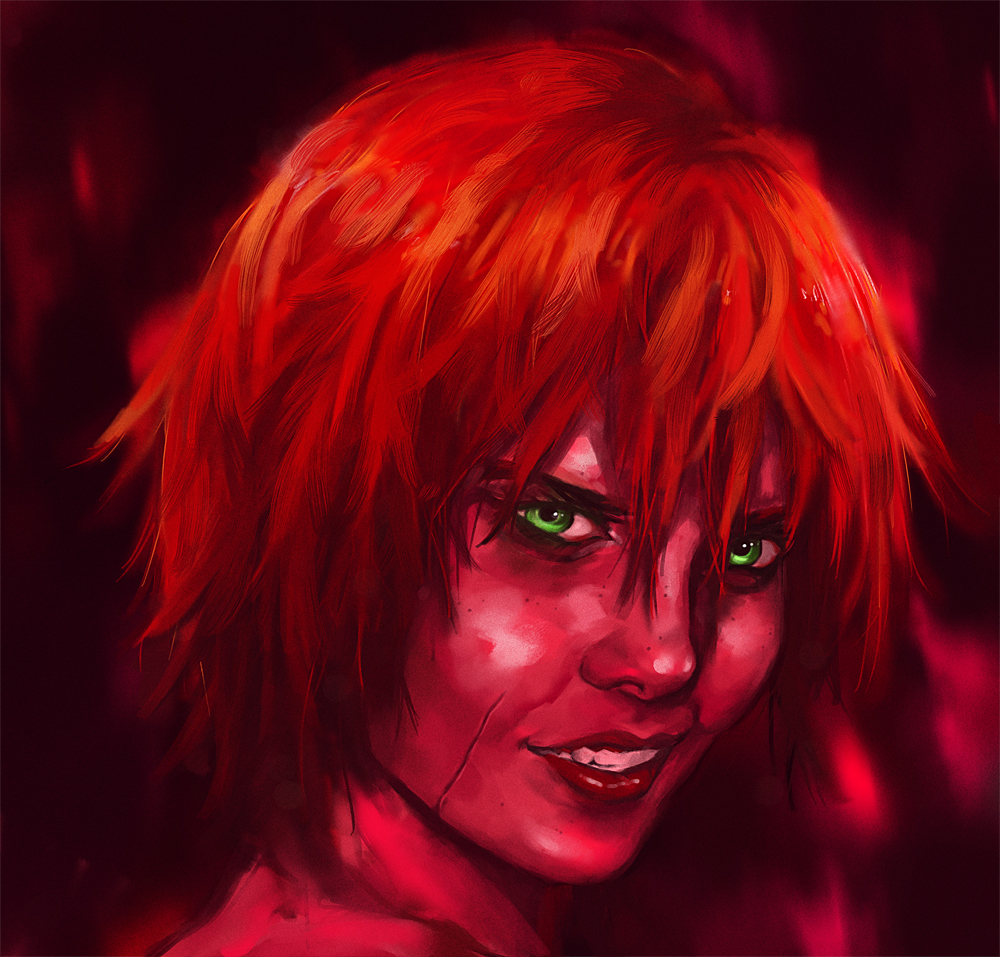
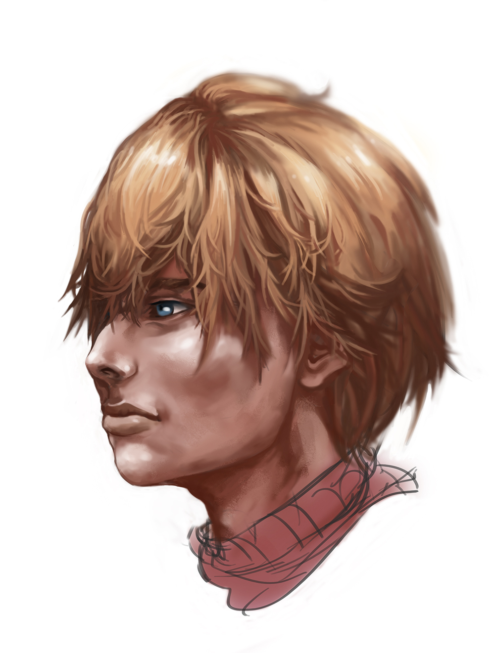
First preliminar Photo study for my next illustration.
Fiorung/Fiora from Xenoblade.
Now i know that i will have to study non reflective metallic objects, a lot.
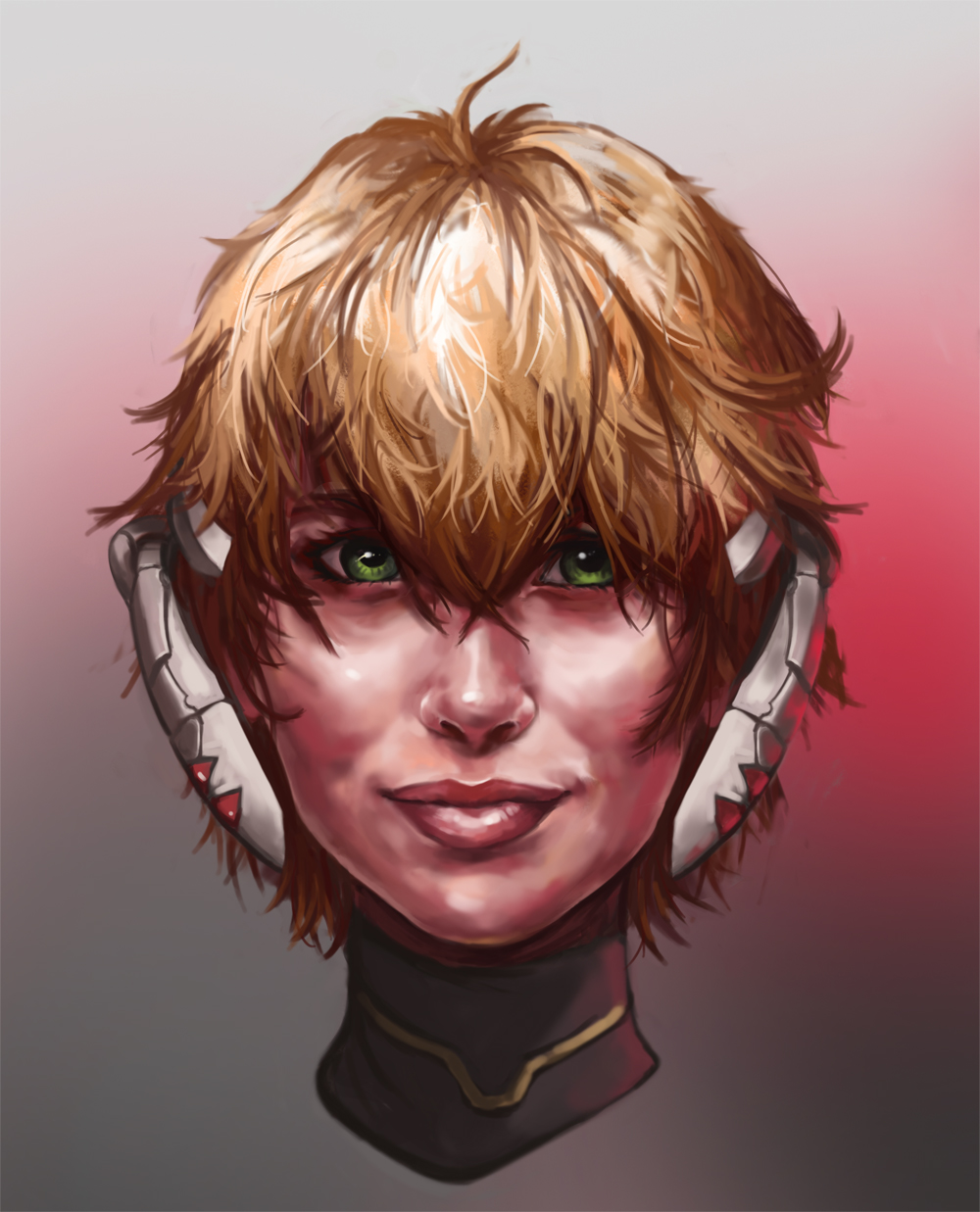
Plus, one day i will learn to paint hair, i´m sure of it.
Thats the best part about studies, they show you in which areas you specially suck so you can work on it. :)

Posts: 491
Threads: 6
Joined: Jan 2012
Reputation:
4
Your latest piece reminds me of Kj Kallio, which is a very very good thing. Keep it up, you've been inspiring me a lot lately, friend.
Posts: 848
Threads: 20
Joined: Jan 2012
Reputation:
29
Wooooaaahhh this sketchbook is amazing.
First technical point, watch the height aswell as the width of the drawings you post up. The kid with the blue hair was a little too long to fit on one screen, so seeing things like flaws in anatomy or perspective etc gets a lot harder when you have to scroll to see the whole image.
The portraits look amazing. You really like playing with the saturated light and it looks really cool. You may do this already, and it could just be a couple of the angles, but keep in mind the cranium under the hair. A few pics (the cute asian character) looks like they are missing a little bit off the top of their head.
Keep up the good work though :D Cant wait to see more.
Posts: 1,098
Threads: 11
Joined: Aug 2012
Reputation:
34
Zesiul: Damn mate, that really means a lot. And i could say the same to you! your Metroid/Adventure time fanart is beyond awesome. Thanks a lot man. :)
Jaik: thanks! for the size of the pictures, i wasnt sure if they were too big, but i will make them smaller from now on. Also, yeah i try to keep in mind the skull, and that was probably right in the sketch phase but i probably fucked up something during the rendering and didnt notice.
Thanks for noting that though, i will try to be more aware of the head structure.
Its been a while since i uploaded one of these, studying from Vanderpoel rather than just copying stuff, thats probably why those legs look worse than in previous practices.
There is also some random cute manga stuff for no reason.

Posts: 690
Threads: 7
Joined: Jan 2012
Reputation:
12
Awesome updates man ;3 I saw everything on facebook but I can't help myself and not comment here ;) Those studies you're doing really shine through. Your characters getting stronger especially in the head, there's the biggest improvement there. Cool stuff, waiting for more <3
Posts: 654
Threads: 4
Joined: May 2013
Reputation:
22
Great to hear your dad came out fine man.
Nice updates, you're portraits and characters are coming out really nicely, oh and dem skin tones in the last two portraits, awesome just awesome.
As for the xenoblade composition, i'm not really sure, I can sorta tell whats going on but I think you should block in a few quick colours for the background then see how it looks.
oh and i'll defineitly try drawing from pixel art, can't think of a character to draw off the top of my head(been ages since I played a pixel game) but i'll think of something.
Posts: 1,098
Threads: 11
Joined: Aug 2012
Reputation:
34
ramalooke: thaaanks! :) even if we see each other in facebook i always appreciate a good ol comment in the sketchbook. Also its nice that you see improvement in the head department, i feel like studying the structure of the head has helped me a lot so far, but there is still so much to study!
Triggerpigking: thanks a lot buddy! :D also, i just posted a new WIP for the xenoblade illustration, everything should be more easy to see now. Also, for the pixel excercise, it doesnt really have to be pixel art, it can also be poligons! haha think about the PSX/N64 era maybe you played something like that more recently.
Aand i'm still trying to discover how to paint hair, not there yet, but im getting closer, i can feel it. So here it is the second preliminar study for the Xenoblade fanart and an update for the fanart itself, take a look at the new composition. (And your opinion would much appreciated, as always!) I received some real good feedback on the facebook group Team Awesome.
If you use facebook, go check that group, because like the name implies, its a pretty cool place.


Posts: 690
Threads: 7
Joined: Jan 2012
Reputation:
12
Nice update. Your illustration looks very promising. Can't wait to see it finished ;)
Posts: 101
Threads: 0
Joined: Nov 2013
Reputation:
7
Posts: 70
Threads: 1
Joined: Nov 2013
Reputation:
0
the last post is great, in my opinion, the sword above the char in BG is too horizontal, maybe you can try make it diagonal to make viewers eye wander to the char.
Posts: 411
Threads: 1
Joined: May 2013
Reputation:
11
Really like your lines and constructions and you're renderings are getting better and better!
Posts: 903
Threads: 54
Joined: Feb 2012
Reputation:
18
Great updates! And coming right back and arting it up after a family situation like that, that is pure awesomeness and determination. I can tell how much you are enjoying creating those recent illustrations, keep up the hard work man
|
