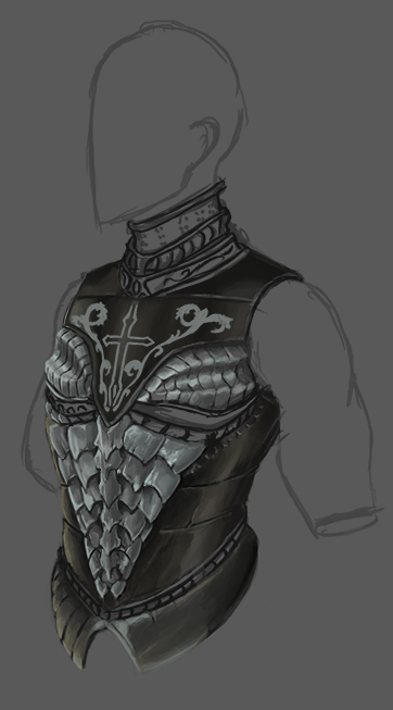
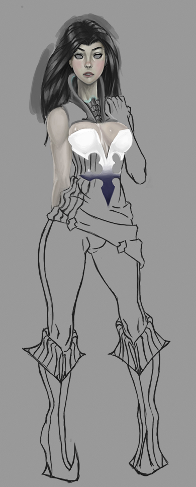
08-10-2014, 01:21 PM
thanks to rafa zanchetin for the advice and help the process was really smooth and fast


|
vymnis sketchbook
|
|
08-10-2014, 01:21 PM
thanks to rafa zanchetin for the advice and help the process was really smooth and fast

08-13-2014, 07:43 PM
working on thumbs im really liking this one but i want to see if i can push it farther...

08-13-2014, 10:52 PM
I suggest you to try handle the picture as whole from the beginning, not to work on a part, then jump another, render it out, jump to another, render it out.. but to try to establish your focus first and then "elevate" the image as a whole, it willbe more organic and you'll learn faster. Your sketches & anatomy studies are spot on! Keep it up! :)
08-14-2014, 07:04 AM
(08-13-2014, 10:52 PM)Kaffer Wrote: I suggest you to try handle the picture as whole from the beginning, not to work on a part, then jump another, render it out, jump to another, render it out.. but to try to establish your focus first and then "elevate" the image as a whole, it willbe more organic and you'll learn faster. Your sketches & anatomy studies are spot on! Keep it up! :) i know what you mean but its really easy for me to get snagged on a small detail here or there and i end up rendering out an entire section before anything else. do you have any tips or advice to keep from getting bogged down in minor details?
08-14-2014, 06:46 PM
1.
Don't zoom in the picture until you are about 80% done and only need to put more details to the focal areas. It's pretty hard at the beginning but once you get used to it you'll definitely see the advantage 2. Well.. just don't get bogged down :) Once you start detailing ask yourself a question: "Is this an important part in the story and the composition?" If the answer is no, then stop detailing :) This actually works both ways.. if a part is too detailed and draws attention from the important areas, its perfectly OK to "paint it back", to push it more to the background. (This takes a bit of self-discipline..) A key thing to remember: you're selling the whole image, not just a part of it. Hope this helps :)
08-14-2014, 07:17 PM
  (08-14-2014, 06:46 PM)Kaffer Wrote: 1. thanks alot! that certainly does help :)
08-14-2014, 10:48 PM
Kaffer explained it much better than I did, haha, check this out: http://karakter.de/wordpress/wp-content/...4x1000.jpg
Look how unfinished the surroundings are, most building are done with a single stroke. I have the same issue with my paintings too, trying to overcome that. Overall you're working hard, just try to make bigger lines when gesturing and keep it up!
08-15-2014, 02:34 PM
(08-14-2014, 10:48 PM)rafa zanchetin Wrote: Kaffer explained it much better than I did, haha, check this out: http://karakter.de/wordpress/wp-content/...4x1000.jpg Thanks! even if you didn't put the point across that you wanted to you still helped me. I was on the fence about using too much reference, like at what point does it become unoriginal but with reference I move much faster and I am still able to make it mine.
08-15-2014, 11:55 PM
Yea, I'm my earlier years I was appalled by using reference when studying or trying to finish a piece, now I see that to make your personal things you need a vast visual library of how things are and how things work and you can't have a good library if you've never studies these pieces, it's like trying to solve a big math problem without knowing math, that's why you get stuck sometimes and have to render and render and render and still won't get good.
08-19-2014, 08:00 AM
It's nice to see some figure studies. Looking at them, I think you'd benefit from studying some constructive methods of drawing the figure. What you have now looks a little impractical for portraying a realistic anatomy. You're not constructing the major masses and things like the big ball at the elbow don't really exists. The part of the bone in that area is very angular and the surrounding muscles look like a squashed cylinder (or two cylinders fused together) if the arm is laid out flat. So a ball just isn't describing what's happening in the anatomy and because of that, it makes it harder to study and learn what is happening there. The only joints that where a ball would describe what is happening there is the shoulder socket and the thigh bone going into the hip (some might argue for the knee but that's really more like a hinge with a flat ball at the end. I hope I'm making sense.
I'd recommend studying Bridgman to gain a very strong sense of construction in the body and I think that's what you'd need to push your drawings further. Another thing I'd like to say is that your dark grey background is crushing your values. It keeps you in this very limited range of values and you never push your way out of it. Toned canvases are great but only if you manage to lay in strong values on top of then. Try and push your values so when you (for example) paint scenes, can blur your eyes and see 3 (or so) levels that differ from light medium and dark. Right now you just have a medium/dark color that dominates everything and it's very crushing. Check out something like what James Paick does here http://3.bp.blogspot.com/-b7Vbb0HE3JI/TW...Bcopy2.jpg where you can clearly see a well structured value system that reads very nicely. Even though it's a limited range, you can still separate the different levels of depth from light, medium and dark. Having a good tonal composition is very important to your images so really try and push your values further. I think that would do a big difference in your work. Anyway, hope this crit helps and I hope I don't sound grumpy. I just feel like I maybe could help because I used to have this problem and it wasn't easy to get out of and not have what I did look crappy, haha. Keep on studying and keep working hard!
Discord - JetJaguar#8954
08-21-2014, 06:27 PM
 i spent 3 hours trying to convert the face from greyscale to color using photoshop tricks and eventually gave up. i went to bed and when i woke up i just painted over the face in color for 45 minutes with much better results. alot of times the traditional ways of doing things can be much better.  (08-19-2014, 08:00 AM)Tristan Berndt Wrote: It's nice to see some figure studies. Looking at them, I think you'd benefit from studying some constructive methods of drawing the figure. What you have now looks a little impractical for portraying a realistic anatomy. You're not constructing the major masses and things like the big ball at the elbow don't really exists. The part of the bone in that area is very angular and the surrounding muscles look like a squashed cylinder (or two cylinders fused together) if the arm is laid out flat. So a ball just isn't describing what's happening in the anatomy and because of that, it makes it harder to study and learn what is happening there. The only joints that where a ball would describe what is happening there is the shoulder socket and the thigh bone going into the hip (some might argue for the knee but that's really more like a hinge with a flat ball at the end. I hope I'm making sense. Thanks for the critique! I tried out lightening the tinted background and you were right the value range became much more expansive. on your point of the ball for the elbow joint, however, those are not meant to signify what kind of joint the area is they're just meant to signify that there is a joint there. It's really just a shorthand reference because speed is a factor in these timed figure studies. If I was trying to go for an anatomically correct skeletal structure you would be right in pointing that out as incorrect but that's not what I'm trying to do.
08-23-2014, 05:07 AM
Speed shouldn't factor into your abstraction of a gesture drawing. I'm not saying that you should sketch exactly what type of joint there is in gesture drawing. What I am saying is that a gesture drawing is an abstraction of the human body and it seems like you're doing yourself a disservice in the way you handle that.
If you take a look at several of the big anatomy teachers (Bridgman, Loomis, Vanderpoel, Vilppu, Hogarth and all those guys) none of them apply a method similar to what you're doing and for good reason. I don't want to tell you that what you're doing is wrong because there is no "wrong" or right way to do any of that but I'd advise you to consider other methods that have proven to help countless students for several years. I strongly advice you to study the methods of great anatomy teachers because I genuinely believe that it will be beneficial to your learning. A lot of learning anatomy comes from studying the methods of classical artists, not just drawing the figure as you see it.
Discord - JetJaguar#8954
08-23-2014, 10:45 PM
(08-23-2014, 05:07 AM)Tristan Berndt Wrote: Speed shouldn't factor into your abstraction of a gesture drawing. I'm not saying that you should sketch exactly what type of joint there is in gesture drawing. What I am saying is that a gesture drawing is an abstraction of the human body and it seems like you're doing yourself a disservice in the way you handle that. I sat here for quite a while thinking on how best to reply to this without sounding defensive. The bottom line of my issue with this criticism is that you haven't really explained to me how this is detrimental. You said "none of them apply a similar method to what your doing and for good reason" without explaining what that reason is. In your earlier critique you say that the sphere isn't signifying the kind of joint is there, such as ball and socket in the shoulder or thigh, but we've established that's not what I'm using them for, that they are simply marker points for a pivot point and what kind of pivot point that is is fleshed out later in the drawing. You mention artists such as Loomis and Vanderpoel and I took a look at there figure drawings and most of them are at least three hours or more in length. While you say time is not a factor the very opposite has been hammered into me since my enrollment in art education. I appreciate you taking the time to critique and if you could elaborate more on why you think having this shorthand guide is so hurtful in the long run perhaps I could see your point of view more clearly. some stuff from yesterday  
08-25-2014, 10:42 AM
worked for about 3 hours on this and did some figure studies but its a little bit of a hassle to put those together so just this for tonight.

08-25-2014, 11:29 AM
Really nice to see your improvement dude :) if i may give you advice on this piece you are doing, the buildings almost all have the same values if I squint my eyes I can distinguish whats closer or far away, so maybe putting so atmospheric fog to get a better sense of depth might help you to achieve the look you're striving for :)
08-26-2014, 09:39 PM
(08-25-2014, 11:29 AM)RenatoCaria Wrote: Really nice to see your improvement dude :) if i may give you advice on this piece you are doing, the buildings almost all have the same values if I squint my eyes I can distinguish whats closer or far away, so maybe putting so atmospheric fog to get a better sense of depth might help you to achieve the look you're striving for :) Sorry for the late response school started up again yesterday and there was a lot of running around. Thanks for the advice I'll be putting in some atmosphere to separate the foreground middle-ground and background. 
08-31-2014, 09:41 AM
been a really hecktic week but i still managed to get in about two hours a day most of these breakdowns were around 1-2 hours each. i'm trying to familiarize myself with the tera art style.
 |
|
« Next Oldest | Next Newest »
|