01-26-2015, 01:28 PM
Update before bed :)


|
Rosolino Sketchbook
|
|
02-13-2015, 10:50 PM
@pindurski: Heyyy thank you ^^
Adding colors and volumes! 
02-19-2015, 08:44 AM
Moaaaaaaaaaar characterssss
I Decided to go first on doing all lines on my characters before i get to the painting Lets see! o/
02-19-2015, 01:03 PM
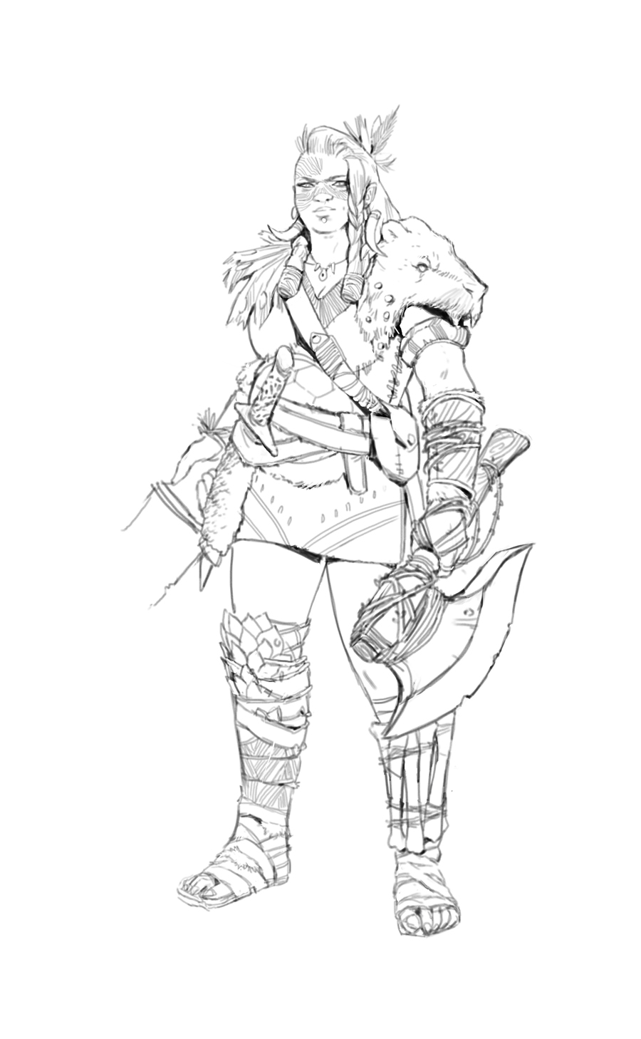
Character: Savageee
I'm still undecided what weapon should i put on the right hand 
02-25-2015, 11:37 PM
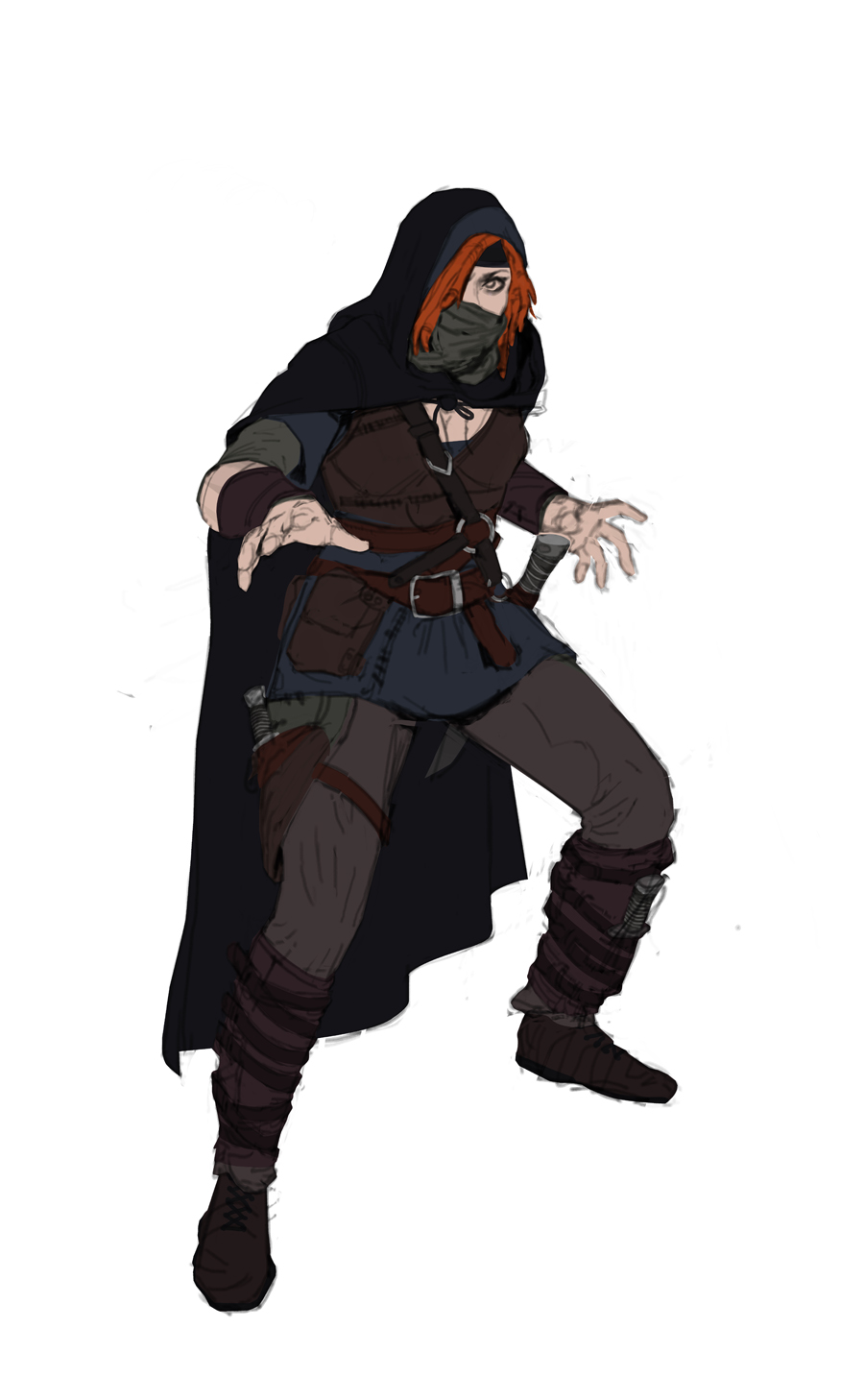
Thief - I changed a little bit her gesture and painted some basic colors :)

02-26-2015, 02:53 AM
Savage/Barbarian - Another basic colorsss, not pretty sure about this one

03-01-2015, 01:41 AM
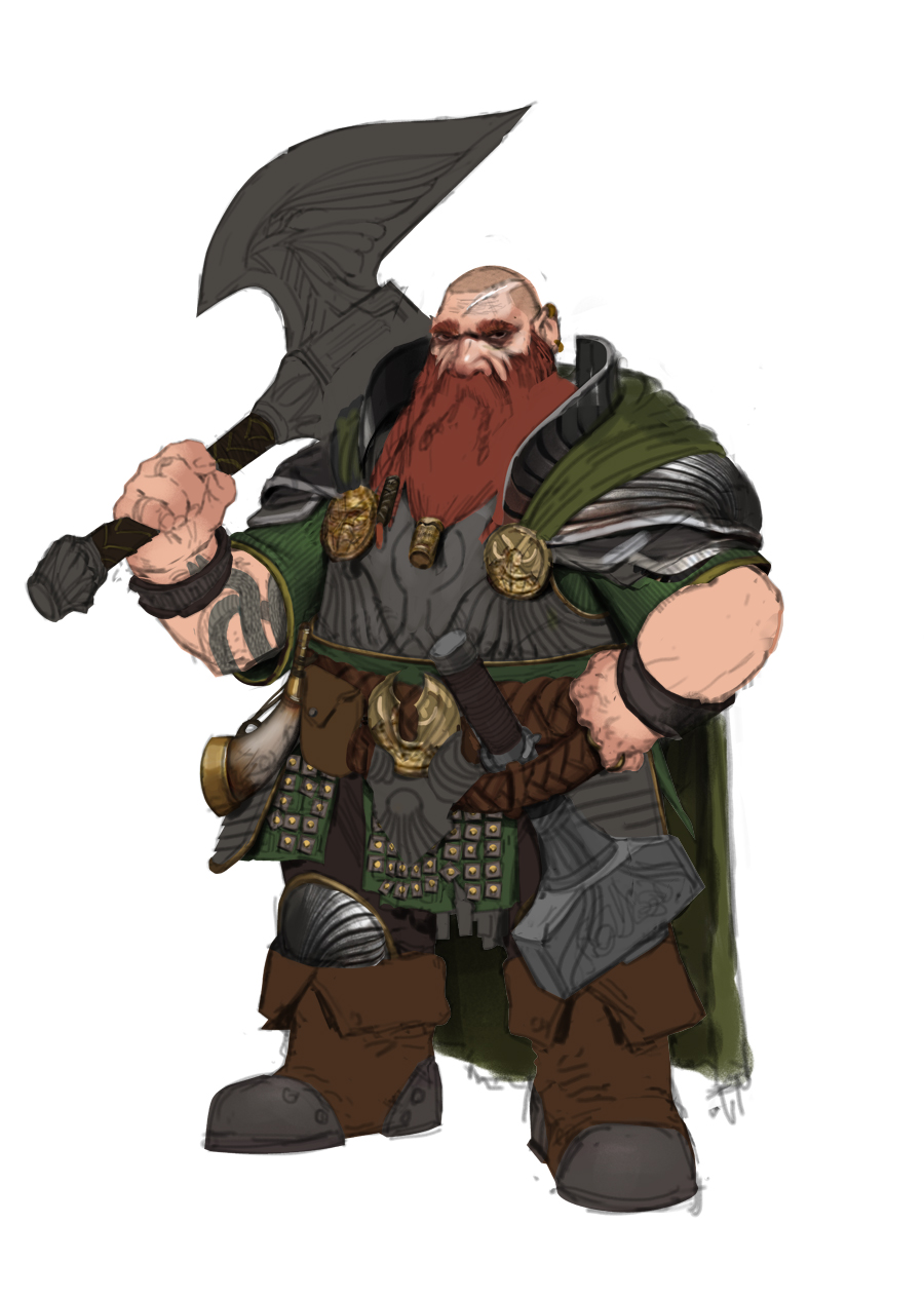
Dwarf!!
I changed a little his design, but I'm still not comfortable with his belt :T 
03-03-2015, 01:57 AM
Sweet to see so many character ideas, you've got a real good sense of design and posture on all of them I think. If you want to go more realistic I think you could get some more color variation in there, especially on the armors. Reflections from the sky and the ground. Maybe from bright cloth next to the armor pieces.
Also love how the dwarf is both a race AND a class. Mage, thief, and...Dwarf? ;D 'Cause being a hammer swingy fighter suits them best more often then not I suppose.
03-03-2015, 12:13 PM
@Adzerak: wooow, thanks for the tips Adzerak, i will definitely try what you said! hahaa he is a warrior :p
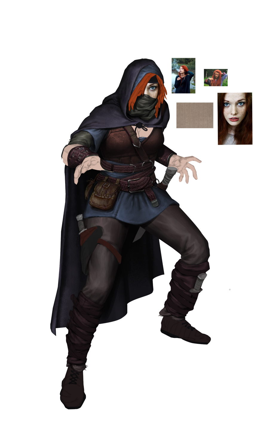
And for now, that's where I get so far, thinking about using more photobashing! But i dont know if is too weird comparing to the other one. Got a lot to do yet, like bring more realistic appearance to the woman, and kill some edges with the smudge tool for both! Will see :)  
03-03-2015, 12:17 PM
Aahhhhh dude your character designs are so nice! Really clean, uniform, juicy...your stuff really inspires me. Keep it up.
03-04-2015, 03:15 PM
@Zombiechinchilla: Thank you! But i gotta do better ^^
Sooo, here it is what i did today! 
03-05-2015, 12:09 AM
Love your character design! It reminds me a little bit of Adrian Wilkins.
Do you use the multiply to darken the value? Cheers! |
|
« Next Oldest | Next Newest »
|