07-23-2015, 09:56 PM
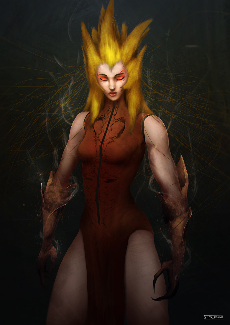
Trying to limit my color palette and experimenting.

|
Critiques are welcome
|
|
07-23-2015, 09:56 PM
Trying to limit my color palette and experimenting.

07-24-2015, 07:37 AM
Hey, man!
Color palette looks good, I think the biggest critique I have is the gesture/pose. Nobody really stands like that. Her arms are going off straight to her sides, her legs are far apart and it kinda looks like her hips are awkwardly tilted. I did a paintover and gave her a more natural/serene pose to match her face. I also added more form to her torso to and slimed down that hair stuff. It's at that point where the size became comical so a little slimmer makes it look natural. 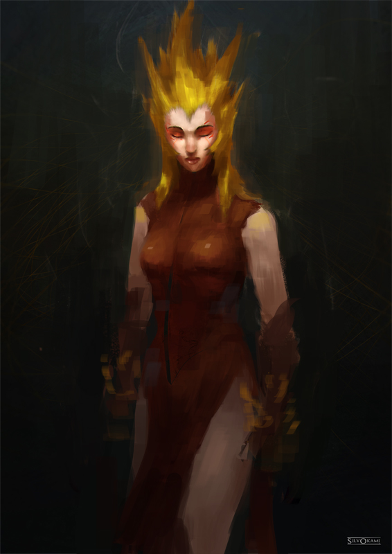
Discord - JetJaguar#8954
10-07-2015, 08:10 AM
Thanks for the overpaint, Tristan !
 Here's something new. Your thoughts ?
08-25-2016, 08:24 PM
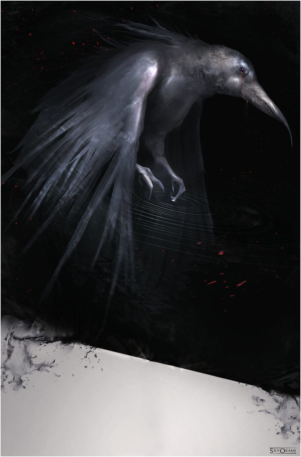
Some paintover or tips of how this piece could be better are welcome. :)
09-02-2016, 09:50 AM
Did a paintover for ya on my stream! hope it helps :)!
https://www.twitch.tv/russellrjones/v/87049991 |
|
« Next Oldest | Next Newest »
|