smrr's P.T [paintover thread/physical therapy, who knows! n_n]
#1
Hey dagz, 

This is a PSA ~ 

I'm gonna be doing a thing! 

In an act of wanting to help others out, while in turn, becoming more involved in the community (I tend to slip away every couple of months... for a couple of months nowadays :/) -- I'm gonna be doing paintoverssssssssss :D!

I've always wanted to make a thread and give paintovers to people, but never felt like I was in the position to do any that were of any worth/able to communicate my thoughts coherently. 
I feel I'm up to scratch now and am gonna get into it!

If you want, you can submit work you want me to check out -- I'd be more than happy help out with it <3

Either way, I'm gonna be posting paintovers I've done in here n_n

25042016:
>> http://crimsondaggers.com/forum/thread-7364.html
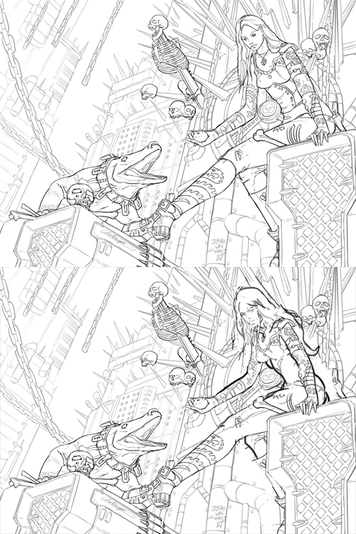

>> http://crimsondaggers.com/forum/thread-7454-page-2.html
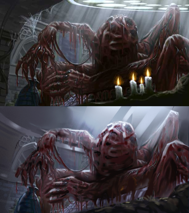

>> http://crimsondaggers.com/forum/thread-7456-page-2.html
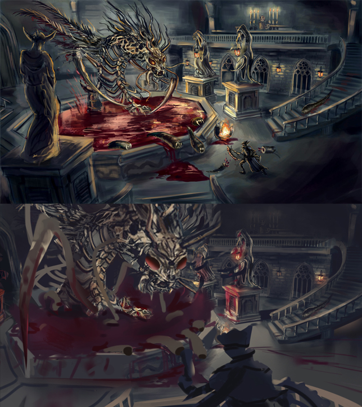

26042016:
>> http://crimsondaggers.com/forum/thread-7...#pid100426
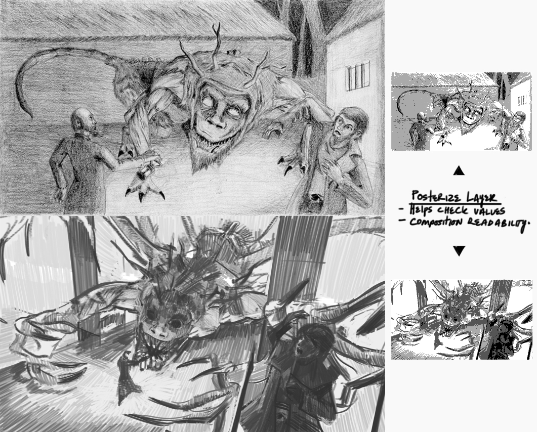

28042016:
>> http://crimsondaggers.com/forum/thread-7391.html
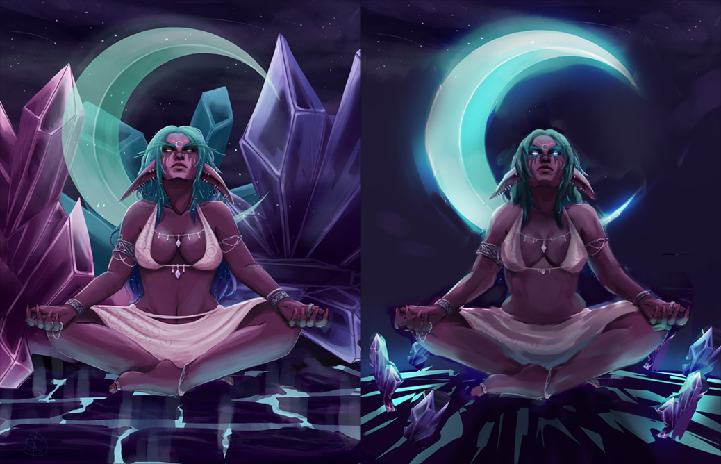

10052016:
>> http://crimsondaggers.com/forum/thread-7544.html
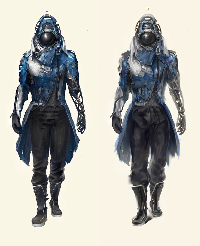

19052016:
>> http://crimsondaggers.com/forum/thread-4570-page-2.html
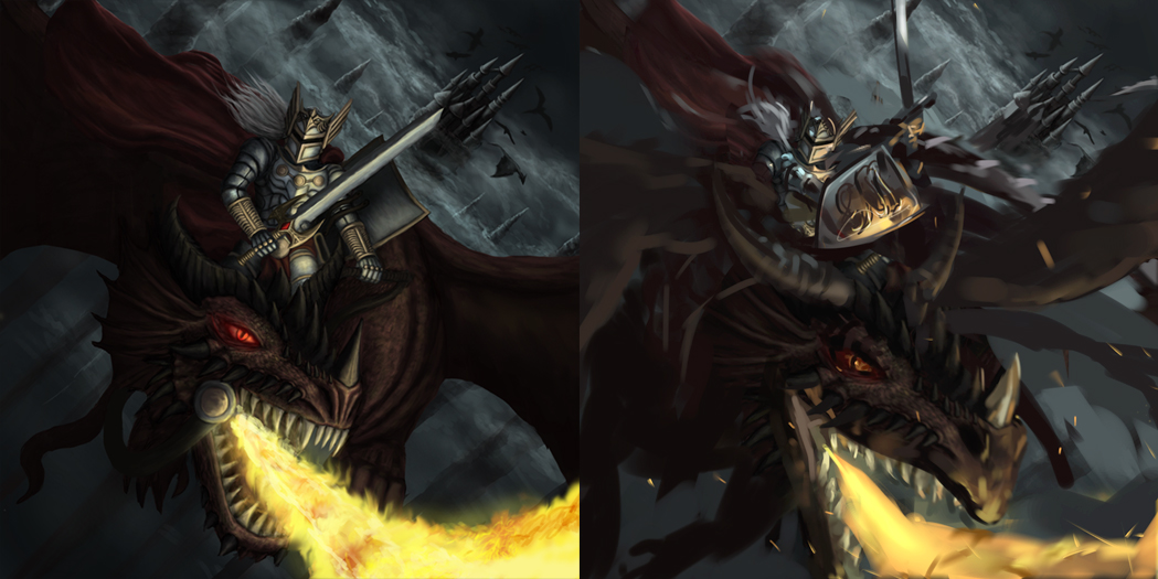

18083016:
>>http://crimsondaggers.com/forum/thread-3...ge-28.html
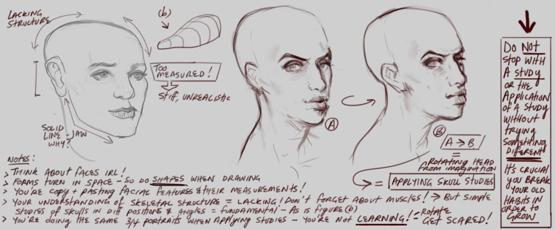

18082016:
>>http://crimsondaggers.com/forum/thread-1...ge-13.html
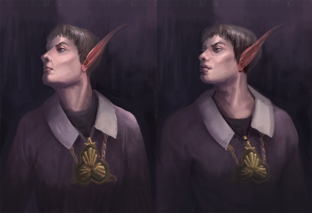

20082016:
>> vv

sketchbook | pg 52
"Not a single thing in this world isn't in the process of becoming something else."
I'll be back - it's an odyssey, after all
Reply
#2
Did you mean submit them here in this thread? Also, good on you, Steph!


Focus.
Reply
#3
@meat: Yes I think that's the case.

Reply
#4
Yeah n_n!

Otherwise, if I find work from like people asking for critiques/people posting wips unsure where to go/etc - I'll go ahead and give a paintover in their thread, then post it here.

If Dagz submit work here, there'll be a write up of my thought process and how I went about changing things

Cheers Yen <3

sketchbook | pg 52
"Not a single thing in this world isn't in the process of becoming something else."
I'll be back - it's an odyssey, after all
Reply
#5
You are a beautiful person....it brings misty tears of joy to my old face.

 YouTube free learnin! | DeviantArt | Old Folio | Insta
Reply
#6
@Amit - no u <3 D16c4689 Th_087_

(edit: I'll just update my original post with recent paintovers and add a timestamp)

sketchbook | pg 52
"Not a single thing in this world isn't in the process of becoming something else."
I'll be back - it's an odyssey, after all
Reply
#7
Totes gonna hit you up on this.

Sketcherinos

Link Tree

Discord: emnida
Reply
#8
[Image: tumblr_nmm95eIB6N1qcctn2o2_250.gif]

Looking forward to it <3

sketchbook | pg 52
"Not a single thing in this world isn't in the process of becoming something else."
I'll be back - it's an odyssey, after all
Reply
#9
Hey Smrr,
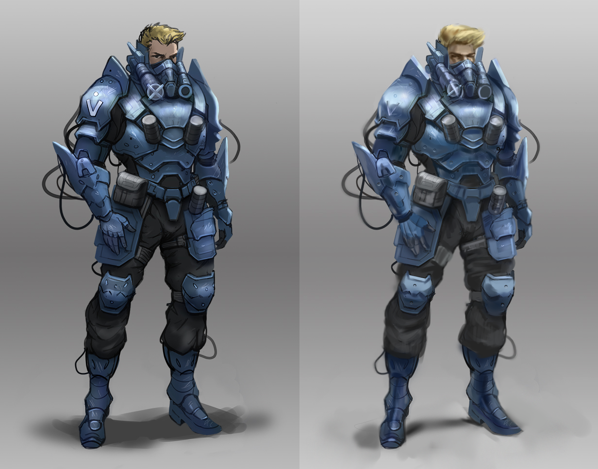
Would you be so kind as to critique my futuristic fighter pilot dude?


Reply
#10
oh shit!
I need to subscribe to this thread so I get emailed when there are replies!
Sorry for the late show of face, DQ - I'll be more than happy to crit this armoured-up babe in the near future (just need to hit a deadline due tomorrow, then it's on!)

Also, *bump*
(after like 2 months M.I.A lmao)

sketchbook | pg 52
"Not a single thing in this world isn't in the process of becoming something else."
I'll be back - it's an odyssey, after all
Reply
#11
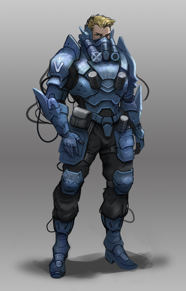
DQ_Nick - Alrighty man, so firstly, I really dig the design, pose + perspective of the character. For real, top level stuff \o/ ! I can see this guiy in a game/movie for sure!

What's letting the piece down is the rendering. 
It looks as if you were going for a style that left the linework in.... but in some areas, you painted over the lines?  I was confused by this and concluded that you wanted to paint the dude realistically, but couldn't be bothered haha. Idk I could be wrong though lmao

So honestly, the biggest change I made to the piece was painting over the solid black linework as much as possible. I wanted to try and make the character *pop* and feel like he could be standing in front of the viewer (if I allocated more time, this probs could have been possible). 

Before I got into that, I noticed that your darks were real dark, so I used a level adjustment to lighten the image, then got stuck into it. When your values are either too light or too dark when you're in the middle of working on a piece, you become limited in the way that you can work. I always find it better to work in the mid-range values for the majority of the piece - adding the darkest darks and lightest lights toward the end - and sparingly. Although this could ofc vary from piece to piece. But with a general top-down lighting scenario, you're set. 

You pretty much nailed the matte metal look and feel, I added a little bounce light to the underside of the armour to enhance the form "coming out" if you get me. I used the light grey from the background to achieve this. I noticed you added little scratched details to the metal, which was a cool addition - I do feel like any details of the sort should be added after you've described the form thoroughly though.

Paying attention to edges could really breathe life into this piece (read: yeah, I may have went a little overboard with my application lmao yolo) - add dynamism through playing with the focus. E.g. I blurred some edges around the bottom half and sides of the dude to create a focus in the mid-top half of the design. Though, if you're selling all components of the design to a 3d guy - certainly do it subtly. 

Couple of quick notes:

*the cast shadow underneath looks half-assed D: make sweet love to every bit of the piece. Make it look professional, because you are professional - that's the mentality you should make stick. What would a shadow look like irl? (Note: always ask this question - super helpful)

*circular pattern designs - removed and added ellipse shapes > reduced the size > ctrl+J to duplicate as many as I wanted > repositioned where I wanted them > locked layer transparency > painted over and considered how light would fall around the rim. Why do this instead of drawing each by hand? Looks more man-made/technical, repetition in adesign creates consistency. Would have used ctrl+T > distort to fit the right perspective if I had the time too.

*probably could have added ambient occlusion underneath where his right hand is resting on the plate.

*most important of all - understanding how to paint realistically all comes from a solid understanding of how to paint a sphere under different lighting setups, as well as with differing materials i.e. metals, wood, plastic, etc. Nail your understanding of that and rule the world.  
__

So yeah that was basically the gist of it, I hope this has helped you out even a little bit - my apologies for the late reply once again --- annnnndddd yeah, go kick ass and chew s'more bubblegum \o/

sketchbook | pg 52
"Not a single thing in this world isn't in the process of becoming something else."
I'll be back - it's an odyssey, after all
Reply


Forum Jump:


Users browsing this thread: 1 Guest(s)