07-24-2017, 08:30 AM
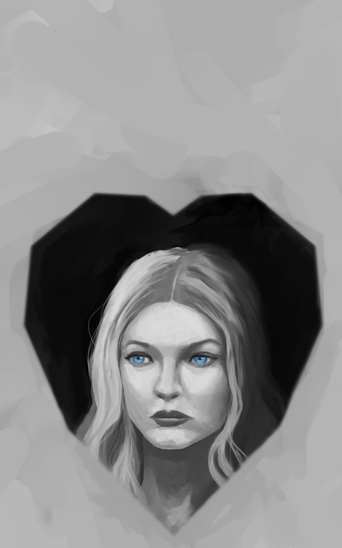
@Xelfereht: Yeah the space at the top is for the title text. Good points dude - I tried to make the heart more central and fix the tangents (really useful video on tangents by the way - thanks!).
@Fedodika: Yeah I've gone for a more geometric design for the heart shape now and tried to change the sides slightly. Thanks for the feedback dude.
OK so here's the final version that I submitted last night:
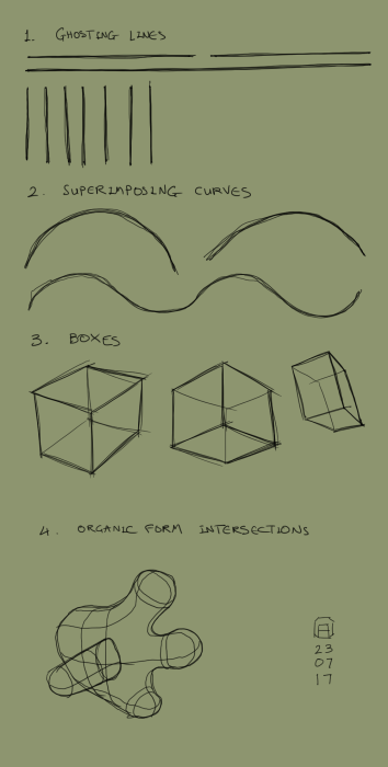
Another daily drill:
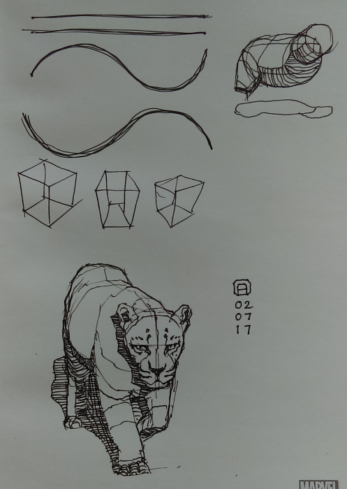
And a daily sketch:
@Fedodika: Yeah I've gone for a more geometric design for the heart shape now and tried to change the sides slightly. Thanks for the feedback dude.
OK so here's the final version that I submitted last night:

Another daily drill:

And a daily sketch:

“Today, give a stranger one of your smiles. It might be the only sunshine he sees all day.” -- H. Jackson Brown Jr.
CD Sketchbook
CD Sketchbook


