12-11-2017, 11:39 PM
@Amit: I do have an eventual goal for doing art for a living but it's probably not a conventional goal compared to others on here. I am currently exploring different avenues of making a living online with my art e.g. blogging, selling art via print on demand services, patreon, web-comics etc ... I am in no hurry as I have a steady day job and also I expect the art road to be a long and winding one.
This is the Holy Grail for me, I've been reading up on Flow and Savouring the Moment etc ... because as you say, if a person can achieve this state of mind, then everything else is secondary. Also the ironic thing is, they might end up making better art as a result.
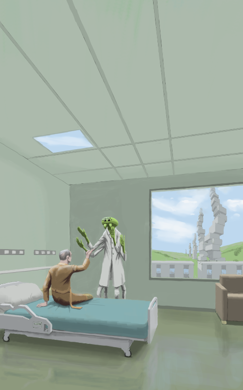
@Darktiste: Thanks for the feedback mate, yeah that leg looks a bit wrong there - it's supposed to be half folded across and hooked under his other knee (half cross-legged) - good spot, I've tried to remedy by adding some form indications (the hem of his dressing gown etc ...). Also the big space at the top is for the book title (it's supposed to be a book cover). Good point about design as well - I was a bit lazy with the composition design here - I think there are a few tangents that look bad e.g. the corner of the room hitting the buy's face.
Anyway I pushed on and finished this piece as I am under a bit of a tight timescale, I will try to do better with the next piece. Here's the finished version of this piece anyway:

Quote:1. Deriving great satisfaction from the moment to moment engrossment and being in flow that one gets from creative (and learning) process itself.
This is the Holy Grail for me, I've been reading up on Flow and Savouring the Moment etc ... because as you say, if a person can achieve this state of mind, then everything else is secondary. Also the ironic thing is, they might end up making better art as a result.
@Darktiste: Thanks for the feedback mate, yeah that leg looks a bit wrong there - it's supposed to be half folded across and hooked under his other knee (half cross-legged) - good spot, I've tried to remedy by adding some form indications (the hem of his dressing gown etc ...). Also the big space at the top is for the book title (it's supposed to be a book cover). Good point about design as well - I was a bit lazy with the composition design here - I think there are a few tangents that look bad e.g. the corner of the room hitting the buy's face.
Anyway I pushed on and finished this piece as I am under a bit of a tight timescale, I will try to do better with the next piece. Here's the finished version of this piece anyway:

“Today, give a stranger one of your smiles. It might be the only sunshine he sees all day.” -- H. Jackson Brown Jr.
CD Sketchbook
CD Sketchbook


