11-22-2020, 09:16 AM
@Darktiste: Thanks dude!
@Jyonny: Thanks for the kind words and the advice about the using textures purposefully - useful stuff :). Although I would have to disagree that I have out-levelled you in any way - but thank you :).
@Fedodika: Thanks for the tip-off about those brushes - 600 brushes for $14? Sounds like a bargain!
@Cgmythology: Thanks dude - all those drawabox exercises are coming through - everything is either a box or an egg or something in between!
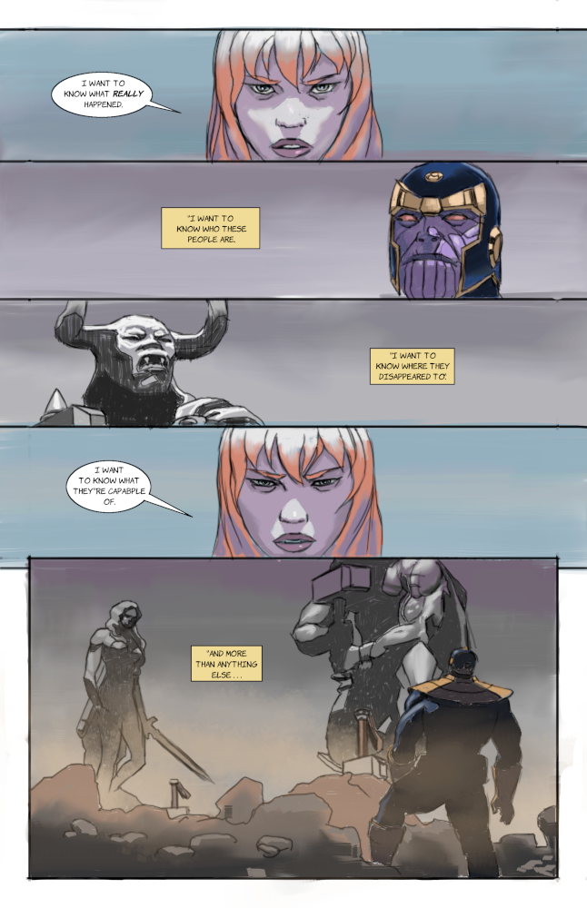
I've been busy with doing stuff for other people in recent weeks but I'm determined to get stuck into making my comic so I thought I study my favourite comic book artist - Esad Ribic. I did a study of one of his pages from Secret Wars (I'm hoping to get the graphic novel for Christmas :)).
Here's my study - proportions and likeness are all over the place but my aim was just to get it done and see what I could learn from the experience:

Things I think I learned:
1. Use thinner lines - my lines feel too thick and clumsy.
2. Make the lettering more bold - my lettering seems to faint to be read clearly.
3. Make my shadows darker - I think I was a bit timid with the lighting.
Here's the reference from the main man himself - love this guy's artwork:
![[Image: oiC0u1CO_0709191232571gpaiadd.jpg]](https://cafans.b-cdn.net/images/Category_2246/subcat_196568/oiC0u1CO_0709191232571gpaiadd.jpg)
Any other pointers would be appreciated - thanks!
@Jyonny: Thanks for the kind words and the advice about the using textures purposefully - useful stuff :). Although I would have to disagree that I have out-levelled you in any way - but thank you :).
@Fedodika: Thanks for the tip-off about those brushes - 600 brushes for $14? Sounds like a bargain!
@Cgmythology: Thanks dude - all those drawabox exercises are coming through - everything is either a box or an egg or something in between!
I've been busy with doing stuff for other people in recent weeks but I'm determined to get stuck into making my comic so I thought I study my favourite comic book artist - Esad Ribic. I did a study of one of his pages from Secret Wars (I'm hoping to get the graphic novel for Christmas :)).
Here's my study - proportions and likeness are all over the place but my aim was just to get it done and see what I could learn from the experience:

Things I think I learned:
1. Use thinner lines - my lines feel too thick and clumsy.
2. Make the lettering more bold - my lettering seems to faint to be read clearly.
3. Make my shadows darker - I think I was a bit timid with the lighting.
Here's the reference from the main man himself - love this guy's artwork:
![[Image: oiC0u1CO_0709191232571gpaiadd.jpg]](https://cafans.b-cdn.net/images/Category_2246/subcat_196568/oiC0u1CO_0709191232571gpaiadd.jpg)
Any other pointers would be appreciated - thanks!
“Today, give a stranger one of your smiles. It might be the only sunshine he sees all day.” -- H. Jackson Brown Jr.
CD Sketchbook
CD Sketchbook


